

Green blue palettes blend the calm of blue with the growth energy of green, giving you a versatile spectrum from deep teal to airy mint. They’re easy to trust, easy to read, and flexible across modern UI, branding, print, and decor.
Below are curated green blue color palette ideas with HEX codes, mood notes, and practical ways to pair and apply them in real designs.
In this article
Why Green Blue Palettes Work So Well
Green blue sits in a “comfort zone” for many audiences: it feels clean like water and dependable like deep ocean tones, while still carrying the freshness and optimism associated with green. That makes it a strong default for brands that want to feel calm, modern, and trustworthy.
From a design standpoint, teal-to-mint ranges provide both depth and lightness without needing aggressive saturation. You can build clear hierarchy with one dark anchor, one vivid accent, and a couple of soft tints for spacious backgrounds.
They’re also highly adaptable across mediums. Green blue palettes translate well to screens (UI states, charts, icons) and print (brochures, packaging, stationery), especially when paired with warm neutrals to keep the look human.
20+ Green Blue Color Palette Ideas (with HEX Codes)
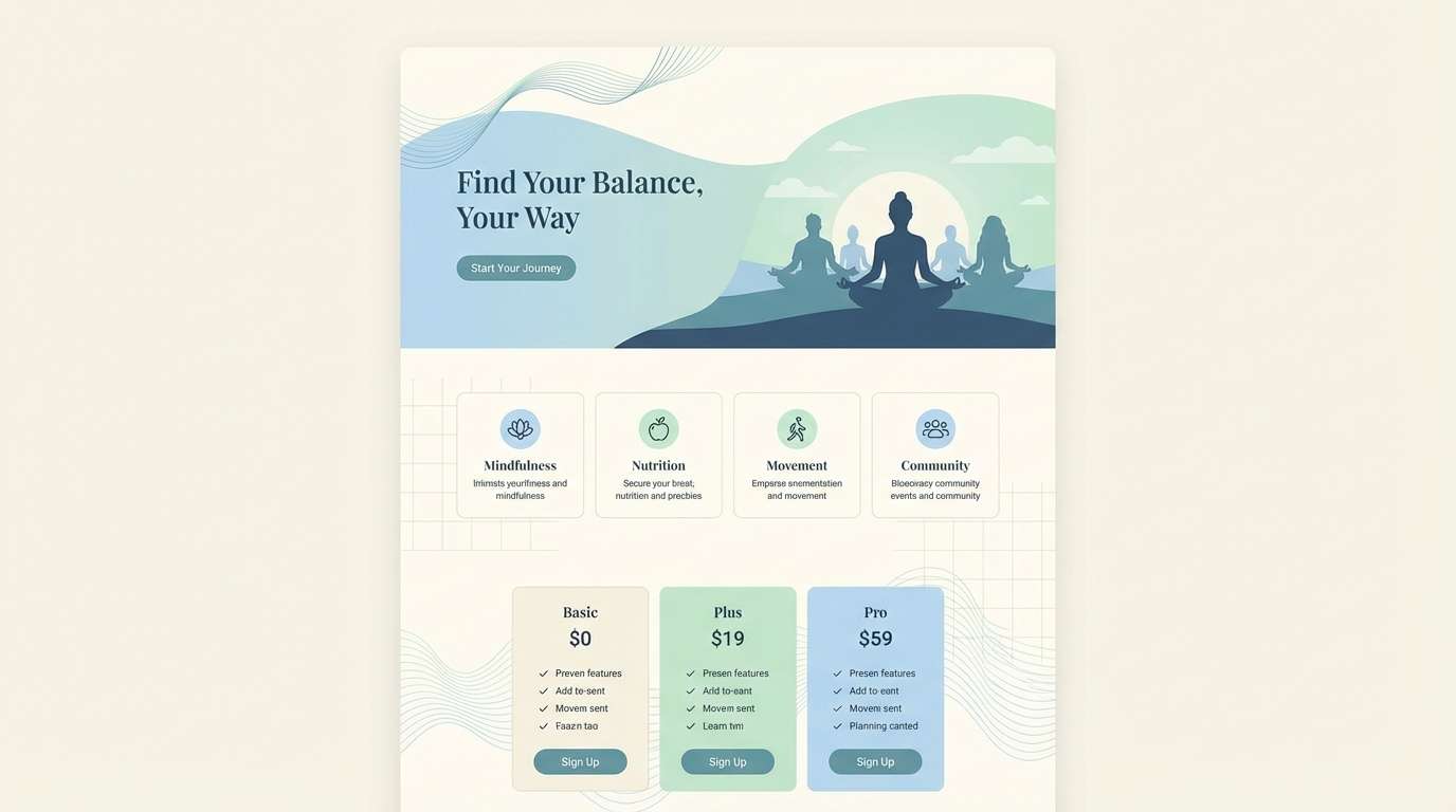
1) Sea Glass Harbor
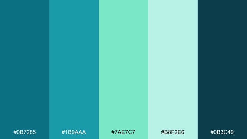
HEX: #0B7285 #1B9AAA #7AE7C7 #B8F2E6 #0B3C49
Mood: coastal, clean, refreshing
Best for: wellness landing page ui
Coastal and cleansing, these tones feel like sea glass washed smooth by saltwater. They work beautifully for wellness, skincare, and calm SaaS brands that want clarity without looking cold. Pair with warm sand neutrals or soft off-white to keep the layout breathable. Usage tip: reserve the darkest teal for headers and primary buttons to anchor the page.
Image example of sea glass harbor generated using media.io
Media.io is an online AI studio for creating and editing video, image, and audio in your browser.

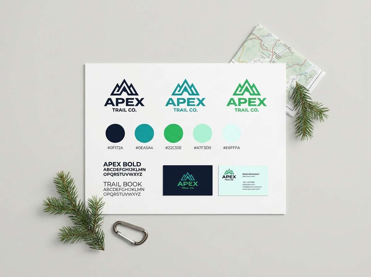
2) Alpine Lagoon
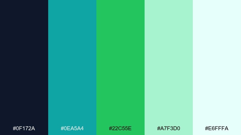
HEX: #0F172A #0EA5A4 #22C55E #A7F3D0 #E6FFFA
Mood: crisp, modern, high-altitude
Best for: outdoor brand identity
Crisp and invigorating, it reads like glacier water meeting bright pine. This green blue color palette suits outdoor gear, eco startups, and travel brands that want a modern edge. Pair it with charcoal typography and a touch of metallic silver for a premium finish. Usage tip: keep the mint tint as a background wash and let the emerald pop in badges and icons.
Image example of alpine lagoon generated using media.io
3) Tropical Rain
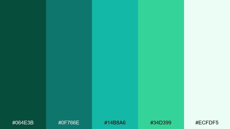
HEX: #064E3B #0F766E #14B8A6 #34D399 #ECFDF5
Mood: lush, humid, lively
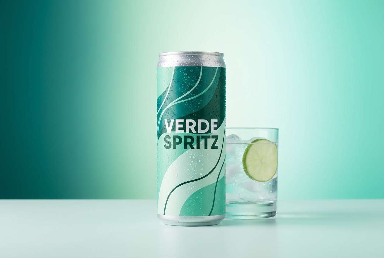
Best for: beverage product ad
Lush and energetic, these shades feel like a warm rainstorm over jungle leaves. They shine in beverage ads, refreshment messaging, and summer campaigns where you want instant vitality. Pair with bright citrus accents or clean white type to keep the composition snappy. Usage tip: use the deep green as a grounding strip behind product claims for better contrast.
Image example of tropical rain generated using media.io
4) Mint Circuit
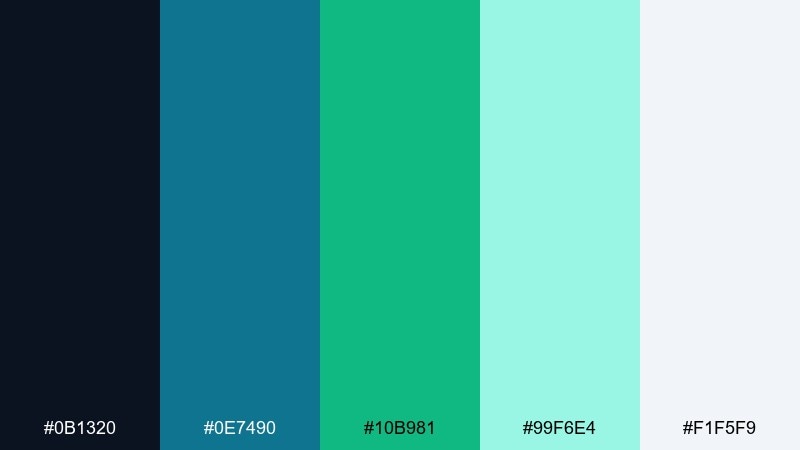
HEX: #0B1320 #0E7490 #10B981 #99F6E4 #F1F5F9
Mood: techy, sleek, optimistic
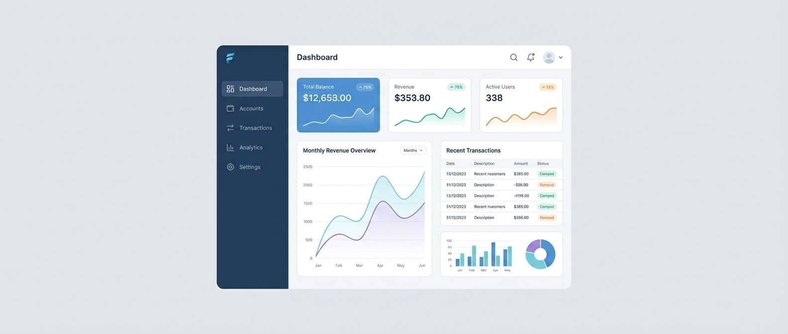
Best for: fintech dashboard ui
Sleek and optimistic, it evokes LED indicators and clean circuit lines. These tones fit fintech dashboards, analytics tools, and productivity products that need confidence without heavy saturation. Pair with cool grays and plenty of spacing for a crisp, trustworthy look. Usage tip: apply the mint as success states and micro-interactions, not as the main text color.
Image example of mint circuit generated using media.io
5) Botanical Tide
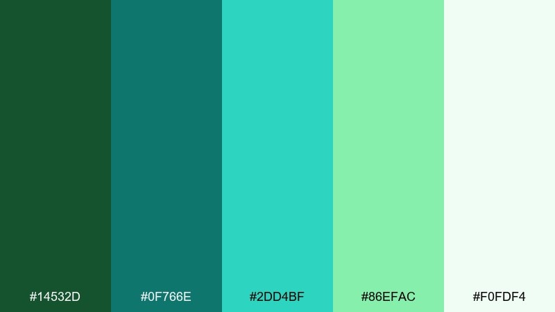
HEX: #14532D #0F766E #2DD4BF #86EFAC #F0FDF4
Mood: fresh, botanical, restorative
Best for: spring botanical illustration
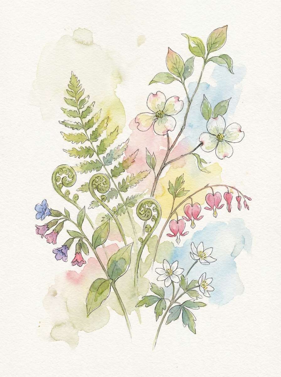
Fresh and restorative, it feels like new leaves beside clear water. The mix works well for seasonal promos, eco packaging, and gentle lifestyle content. Pair with textured paper whites and a muted clay accent to keep it grounded. Usage tip: let the aqua sit in small highlights so the greens stay natural and believable.
Image example of botanical tide generated using media.io
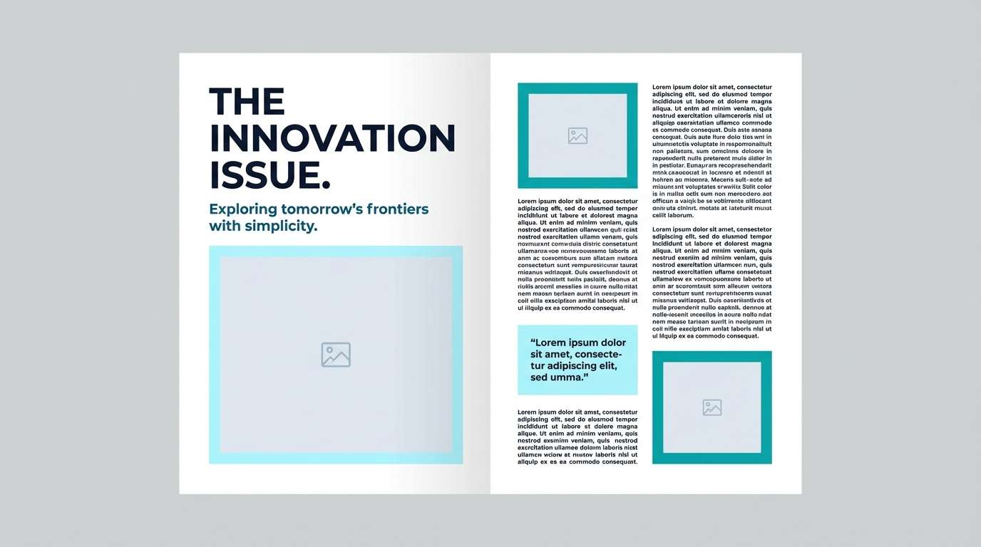
6) Nordic Fjord
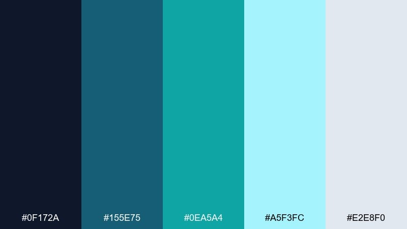
HEX: #0F172A #155E75 #0EA5A4 #A5F3FC #E2E8F0
Mood: cool, minimal, serene
Best for: editorial magazine spread
Cool and serene, it brings to mind misty fjords and quiet mornings. The restrained contrast is ideal for editorial layouts, lookbooks, and design-forward blog posts. Pair with black serif headlines and generous margins to emphasize sophistication. Usage tip: keep the light cyan as a tint behind pull quotes for subtle structure.
Image example of nordic fjord generated using media.io
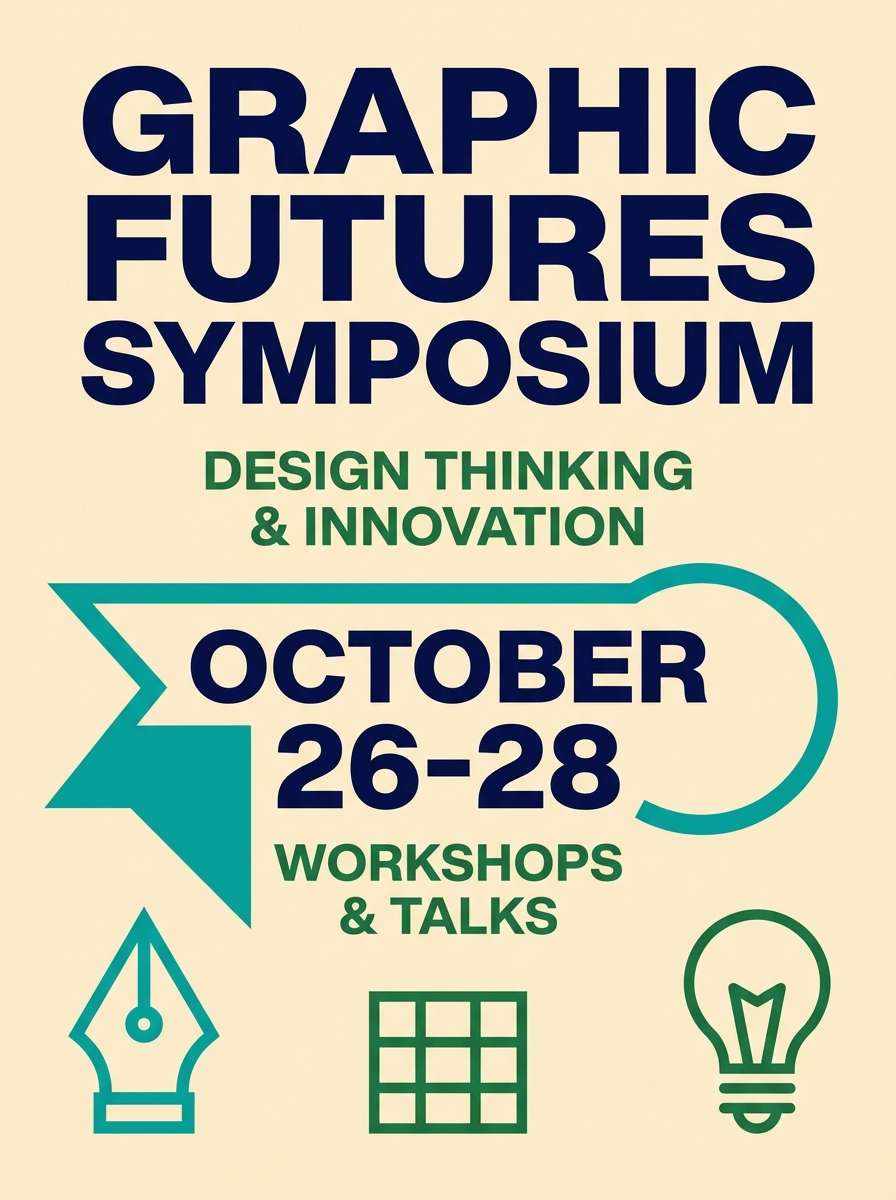
7) Retro Surf
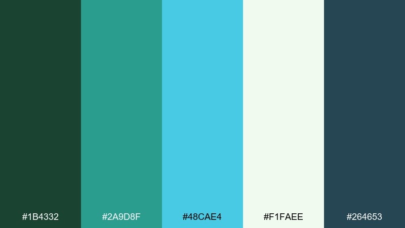
HEX: #1B4332 #2A9D8F #48CAE4 #F1FAEE #264653
Mood: playful, vintage, sun-faded
Best for: summer event poster
Playful and sun-faded, it channels vintage surf boards and boardwalk signs. These green blue color combinations are perfect for summer events, pop-up markets, and casual music nights. Pair with a warm coral accent and chunky sans-serif type for an upbeat retro feel. Usage tip: use the off-white as the poster base to keep the colors looking authentically aged.
Image example of retro surf generated using media.io
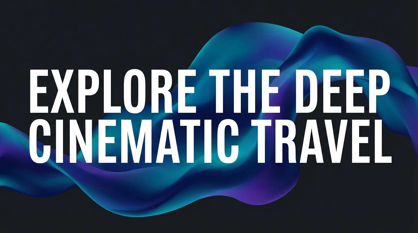
8) Deep Reef
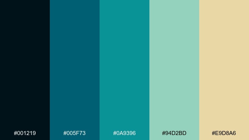
HEX: #001219 #005F73 #0A9396 #94D2BD #E9D8A6
Mood: moody, aquatic, cinematic
Best for: travel video thumbnail
Moody and cinematic, it feels like diving into deeper water where light turns teal. It works for travel thumbnails, documentary covers, and storytelling visuals that need atmosphere. Pair with a warm sand highlight to add human warmth and prevent the palette from feeling too cold. Usage tip: keep text in near-white and use the darkest shade as a gradient base for readability.
Image example of deep reef generated using media.io
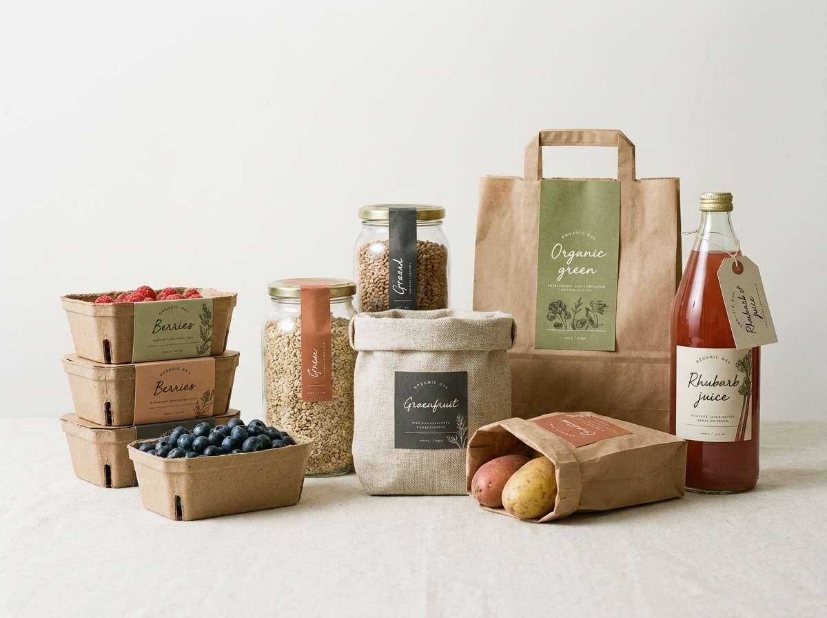
9) Aqua Orchard
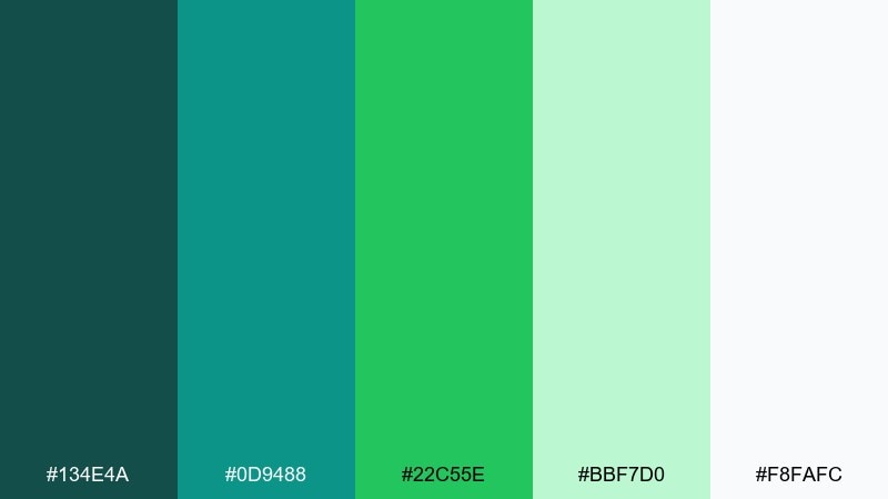
HEX: #134E4A #0D9488 #22C55E #BBF7D0 #F8FAFC
Mood: bright, friendly, wholesome
Best for: organic grocery packaging
Bright and wholesome, it reads like fresh produce under morning light. These tones are great for organic groceries, farmers market brands, and clean-label packaging. Pair with kraft textures and simple line icons to reinforce trust and simplicity. Usage tip: put the bold teal on the product name, then use the lighter greens for flavor cues and ingredient callouts.
Image example of aqua orchard generated using media.io
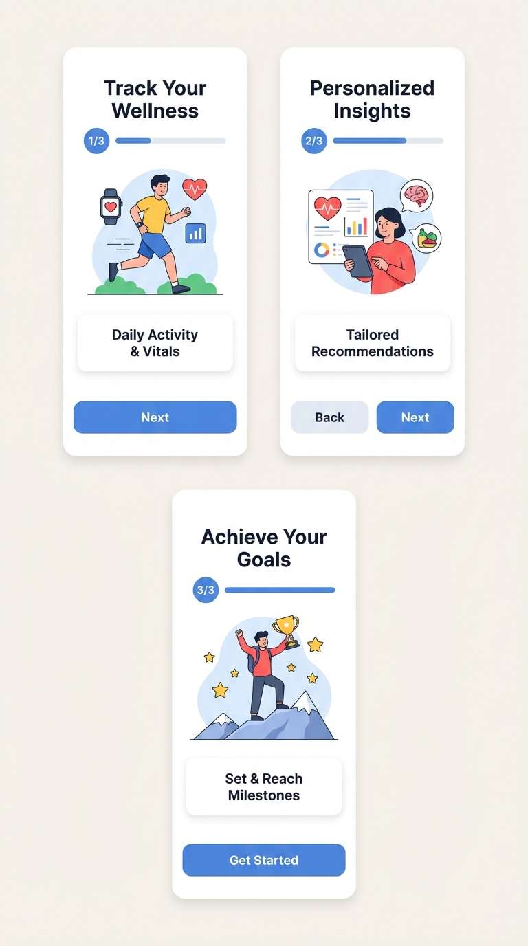
10) Glacier Meadow
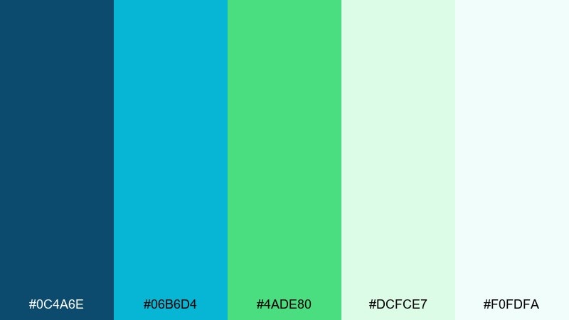
HEX: #0C4A6E #06B6D4 #4ADE80 #DCFCE7 #F0FDFA
Mood: airy, uplifting, clean
Best for: health app onboarding ui
Airy and uplifting, it feels like a clear sky opening over green fields. It fits health and habit apps where you want encouragement without visual noise. Pair with soft gray dividers and rounded components to keep onboarding friendly. Usage tip: use the cyan for progress and the brighter green for completion states to create an intuitive hierarchy.
Image example of glacier meadow generated using media.io
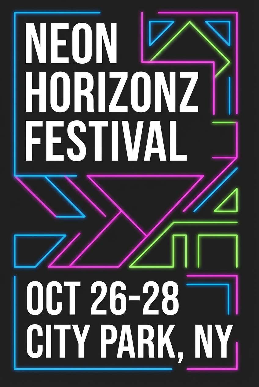
11) Neon Kelp
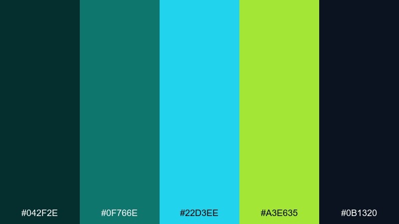
HEX: #042F2E #0F766E #22D3EE #A3E635 #0B1320
Mood: bold, electric, night-life
Best for: music festival flyer
Bold and electric, it suggests neon signage glowing against deep ocean dusk. Use these green blue color combination ideas for festival flyers, DJ lineups, and nightlife promos that need punch. Pair with black backgrounds and tight typography to keep the energy controlled. Usage tip: treat the lime as a single high-impact accent for dates and CTAs.
Image example of neon kelp generated using media.io
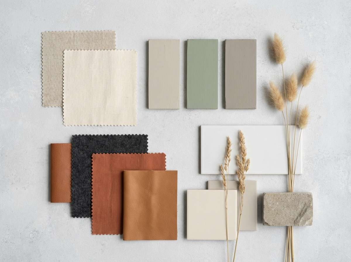
12) Sage Bay
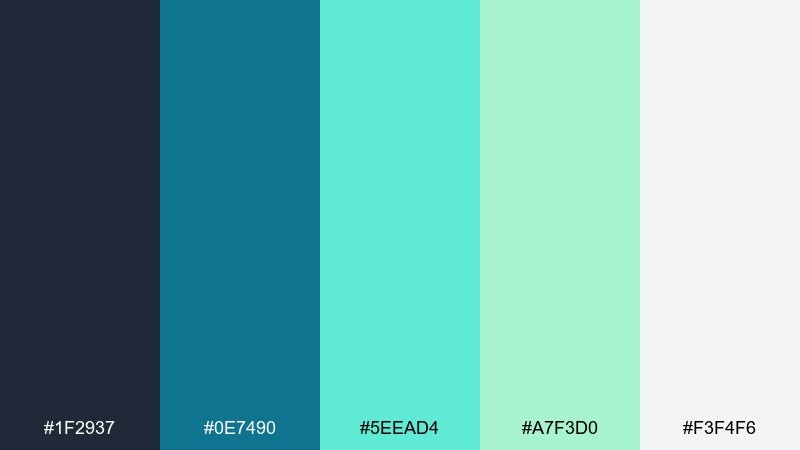
HEX: #1F2937 #0E7490 #5EEAD4 #A7F3D0 #F3F4F6
Mood: calm, soft, contemporary
Best for: interior design mood board
Calm and contemporary, it feels like linen curtains near a quiet bay. It works well for interior mood boards, home brands, and minimal lifestyle content. Pair with warm wood tones and matte black hardware for balance. Usage tip: keep the pale mint as the dominant base, then add teal in smaller, repeatable accents to guide the eye.
Image example of sage bay generated using media.io
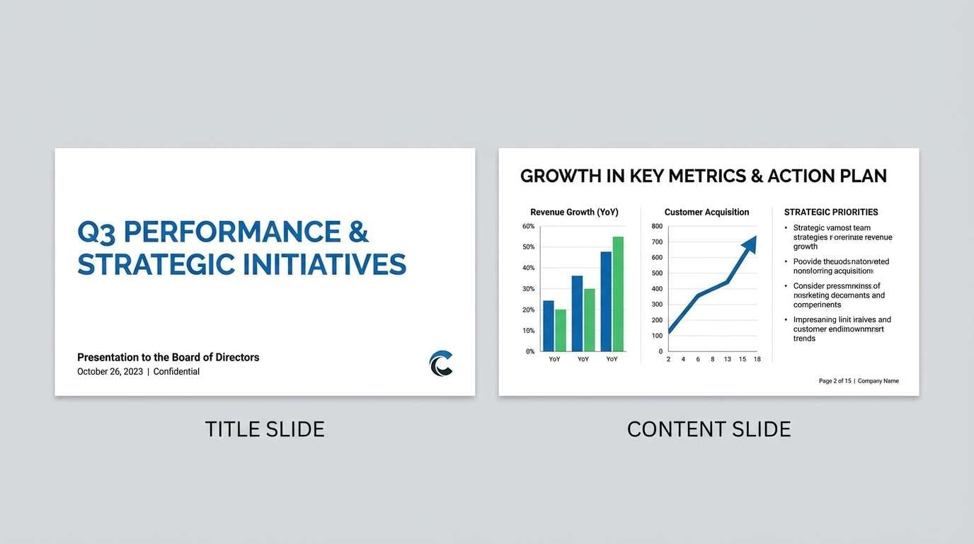
13) Rainy Terrace
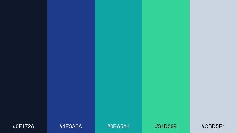
HEX: #0F172A #1E3A8A #0EA5A4 #34D399 #CBD5E1
Mood: stormy, urban, focused
Best for: corporate presentation slides
Stormy and focused, it evokes wet pavement and city lights reflected in glass. The darker foundation makes it suitable for corporate decks that still want modern color. Pair with crisp white space and a single bright highlight per slide to avoid clutter. Usage tip: use teal for charts and keep green strictly for positive deltas to maintain meaning.
Image example of rainy terrace generated using media.io
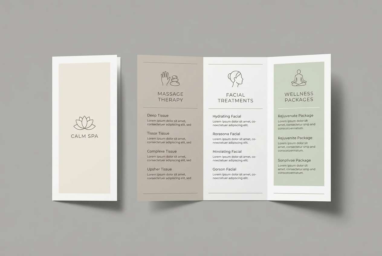
14) Riverstone Spa
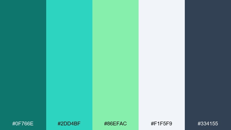
HEX: #0F766E #2DD4BF #86EFAC #F1F5F9 #334155
Mood: soothing, balanced, spa-like
Best for: spa brochure design
Soothing and balanced, it feels like warm steam over river stones. These hues are a natural fit for spa brochures, massage menus, and calm service brands. Pair with soft gray typography and plenty of breathing room to reinforce relaxation. Usage tip: keep the brightest mint for small icons and section dividers so the page stays tranquil.
Image example of riverstone spa generated using media.io
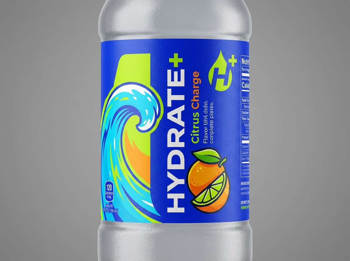
15) Emerald Ice
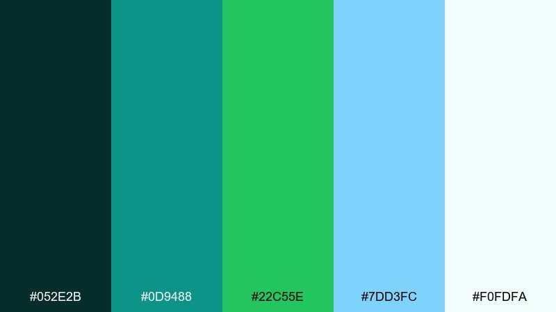
HEX: #052E2B #0D9488 #22C55E #7DD3FC #F0FDFA
Mood: fresh, high-contrast, crisp
Best for: sports drink label
Fresh and crisp, it mixes icy blue highlights with a sporty emerald core. It is well suited to performance branding, sports drink labels, and energetic retail moments. Pair with bold condensed type and clean white space for an athletic feel. Usage tip: place the icy blue in shine effects and keep emerald for the main brand block so it reads instantly on shelves.
Image example of emerald ice generated using media.io
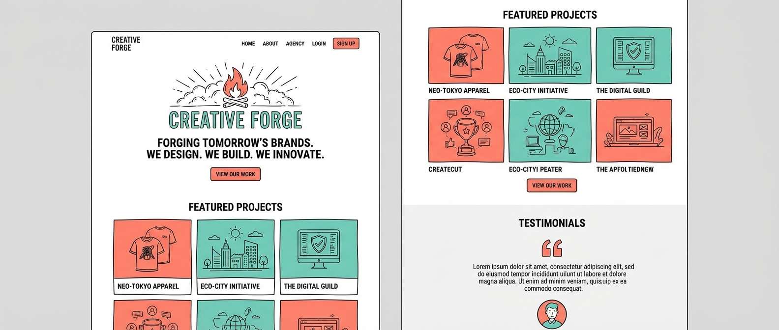
16) Pinewave Studio
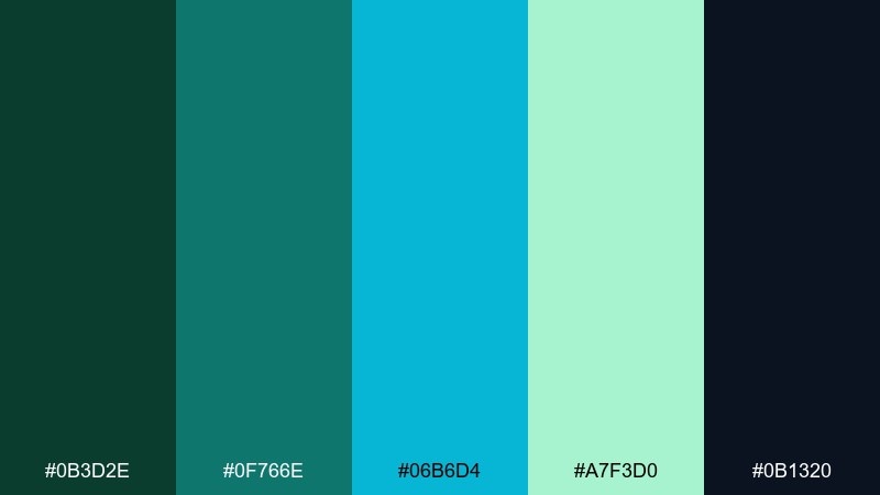
HEX: #0B3D2E #0F766E #06B6D4 #A7F3D0 #0B1320
Mood: creative, moody, studio-modern
Best for: creative agency website
Creative and studio-modern, it feels like a dark room lit by teal LEDs and a hint of coastal air. The contrast works for agency websites, portfolios, and case-study pages where you want depth and polish. Pair with off-white body text and a warm tan accent for friendly balance. Usage tip: use cyan sparingly for links and hover states so interactions feel premium, not loud.
Image example of pinewave studio generated using media.io
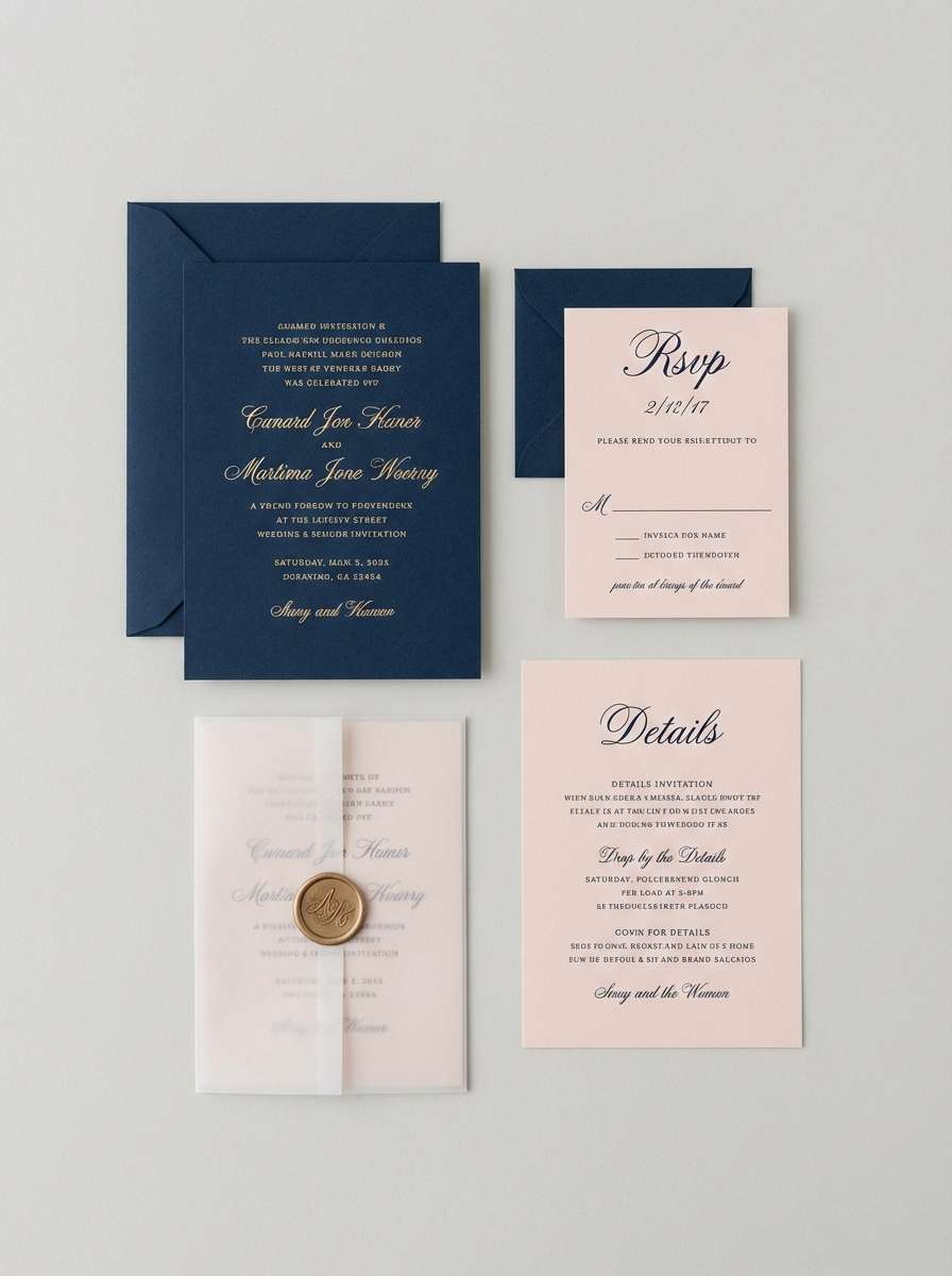
17) Celadon Current
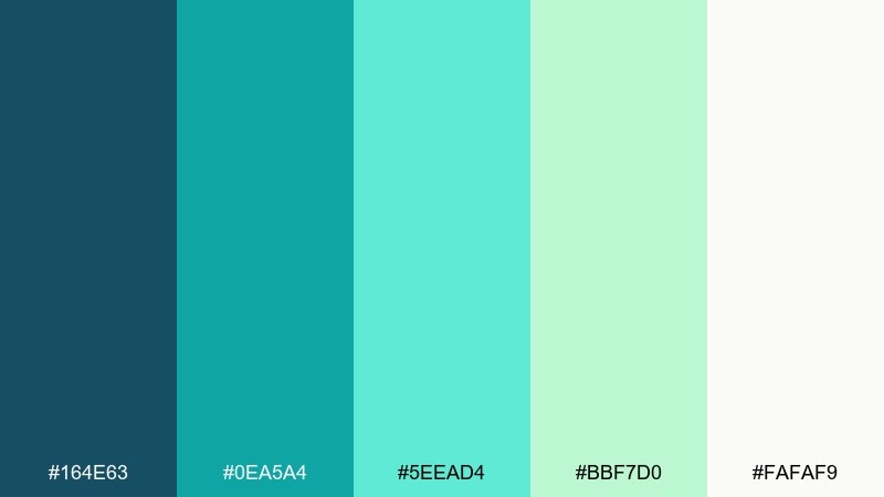
HEX: #164E63 #0EA5A4 #5EEAD4 #BBF7D0 #FAFAF9
Mood: gentle, airy, optimistic
Best for: wedding invitation set
Gentle and airy, it looks like translucent celadon glaze in sunlight. It is a lovely fit for wedding stationery, bridal showers, and elegant invites that want color without heaviness. Pair with gold foil details or a soft charcoal type to keep it refined. Usage tip: print the lightest tint as the paper base and use teal only for names and key lines.
Image example of celadon current generated using media.io
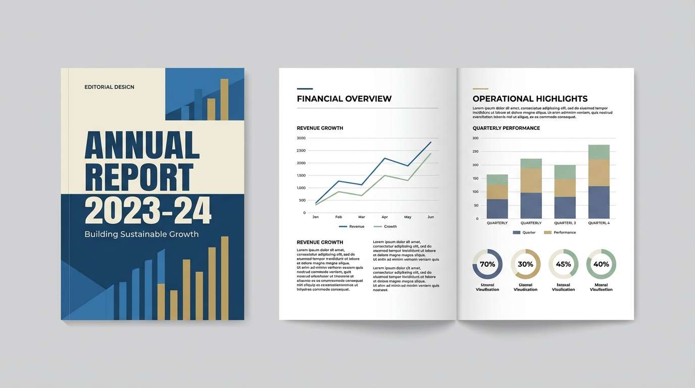
18) Teal Spruce
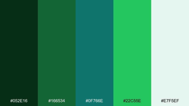
HEX: #052E16 #166534 #0F766E #22C55E #E7F5EF
Mood: grounded, forested, confident
Best for: eco nonprofit annual report
Grounded and confident, it evokes spruce needles and deep woodland shade. It works well for nonprofit reports, sustainability messaging, and long-form documents that need credibility. Pair with warm off-white pages and restrained photography to keep it human. Usage tip: use the deepest green for section headers and let teal differentiate charts from body content.
Image example of teal spruce generated using media.io
19) Lagoon Linen
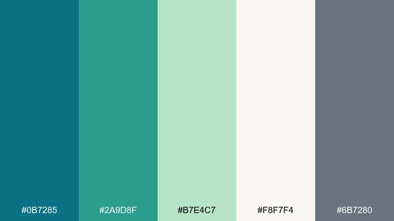
HEX: #0B7285 #2A9D8F #B7E4C7 #F8F7F4 #6B7280
Mood: soft, natural, relaxed
Best for: home textile catalog page
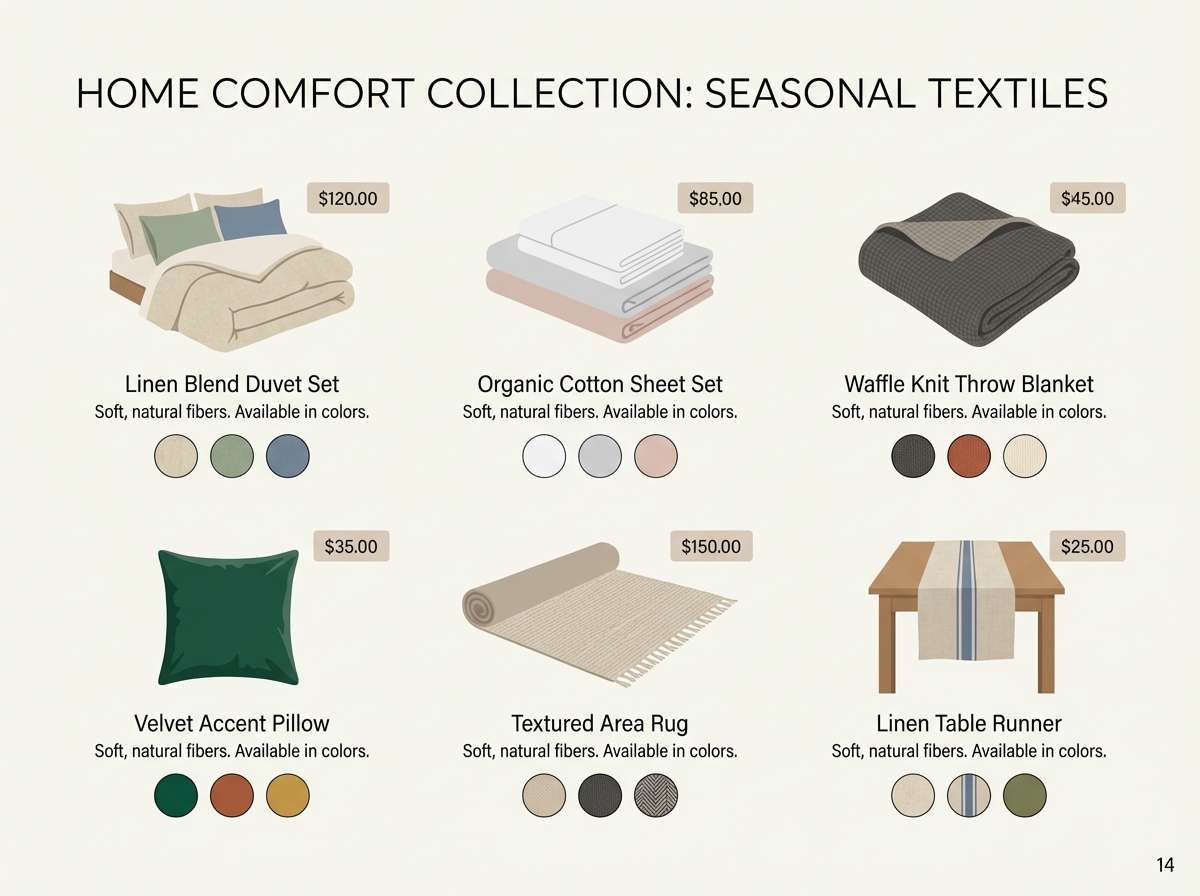
Soft and relaxed, it suggests washed linen by a bright lagoon. The muted saturation makes it great for catalogs, product lists, and calm e-commerce pages. Pair with warm neutrals and subtle shadows for a tactile, premium feel. Usage tip: keep teal for category tags and let the pale linen shade dominate backgrounds for an airy grid.
Image example of lagoon linen generated using media.io
20) Ocean Garden
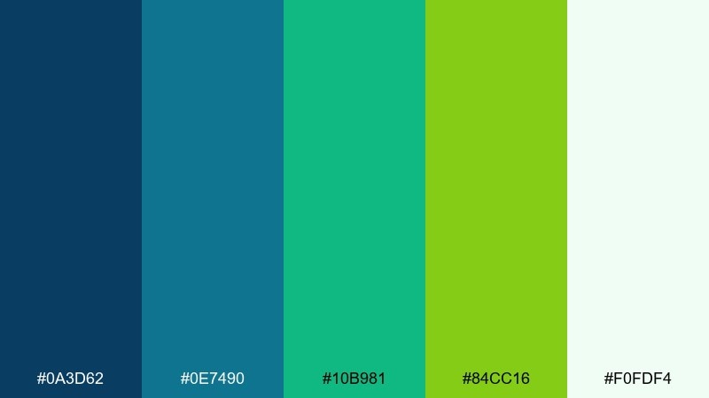
HEX: #0A3D62 #0E7490 #10B981 #84CC16 #F0FDF4
Mood: vibrant, garden-fresh, joyful
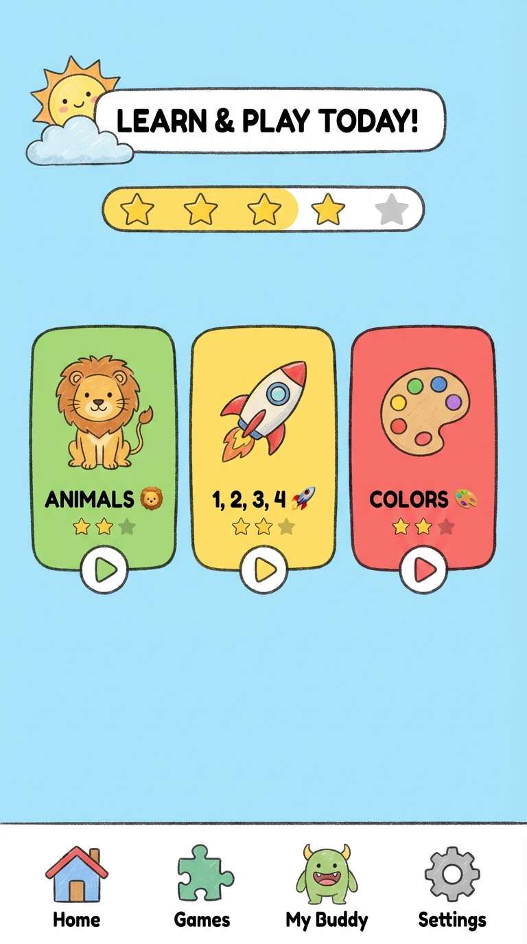
Best for: kids education app ui
Vibrant and joyful, it feels like sea water feeding a bright garden bed. This green blue color palette is ideal for kids education apps, friendly onboarding, and gamified learning screens. Pair with rounded illustrations and plenty of white space so it stays playful rather than chaotic. Usage tip: use the lime as a reward color and keep teal for navigation so kids learn the UI pattern fast.
Image example of ocean garden generated using media.io
What Colors Go Well with Green Blue?
Warm neutrals are the easiest match: sand, beige, ivory, and creamy off-whites soften teal and cyan so the overall look feels approachable. They’re especially helpful for print, packaging, and lifestyle branding where you want “clean” but not clinical.
For contrast, pair green blue with charcoal, slate, or near-black to create crisp hierarchy in UI and editorial layouts. If you need a more expressive accent, try coral, terracotta, or warm gold—these sit opposite the cooler base and instantly add energy.
In data-heavy designs, keep your palette disciplined: reserve a single bright green for “success/positive,” keep teal for primary actions or navigation, and use pale tints for background panels to preserve readability.
How to Use a Green Blue Color Palette in Real Designs
Start by assigning roles: one dark shade for headers/navigation, one mid teal for primary UI elements, one bright accent for highlights, and two light tints for surfaces. This simple structure prevents teal-heavy designs from looking flat.
In branding, green blue works best when you add a warm counterbalance—kraft textures, wood tones, or a small warm accent color can make the identity feel more human. For print, test inks or CMYK conversions early, since some bright cyans shift on uncoated paper.
For accessibility, check contrast for text and interactive elements. If you love light aqua backgrounds, keep text in deep slate/charcoal and use saturated teal only for buttons, badges, or charts where the color carries meaning.
Create Green Blue Palette Visuals with AI
If you want to preview how a green blue palette feels in a real layout, generate quick mockups with AI—landing pages, posters, packaging, invitations, and more. This helps you validate mood, contrast, and accent placement before committing to production.
With Media.io’s text-to-image tool, you can paste a prompt (like the examples above), iterate styles fast, and keep your visuals consistent with the HEX direction you’re exploring.
Try generating a few variations: one minimal, one high-contrast, and one warm-neutral version. You’ll quickly see which balance of teal, cyan, and green best matches your brand voice.
Green Blue Color Palette FAQs
-
What is a green blue color palette?
A green blue color palette is a set of hues that sit between green and blue (often teal, cyan, aqua, and emerald), typically balanced with light tints and one darker anchor for contrast. -
Is teal considered green or blue?
Teal is commonly treated as a blue-green. In design systems, it often behaves like a cool blue for trust and clarity, while still carrying green’s “fresh/healthy” association. -
What accent colors work best with green blue?
Warm accents like coral, terracotta, peach, and gold create strong contrast. For subtle accents, use sand, ivory, warm gray, or light taupe to keep the look natural. -
How do I keep green blue UI designs from looking too cold?
Add warmth with off-white backgrounds, soft shadows, and a small warm accent (tan or coral). Also, avoid using pure cyan as the dominant background—use it as a highlight instead. -
Which green blue palette is best for branding?
For modern, versatile branding, look for a palette with one deep anchor plus a clean teal and a soft tint (for example, Sea Glass Harbor or Alpine Lagoon) so it scales across logo, web, and print. -
Do green blue palettes print well?
They can, but bright cyan/teal may shift in CMYK, especially on uncoated stock. Always request a proof and consider slightly muting saturated cyans for more predictable results. -
How can I generate mockups that match my green blue palette?
Use Media.io text-to-image prompts that describe the layout type (UI, poster, packaging) and the mood (coastal, modern, minimal), then iterate until the greens and blues align with your intended feel.
Next: Dark Red Color Palette


