

Green, yellow, and purple make a high-energy trio that can feel either fresh and modern or rich and dramatic—depending on the shades you pick. It’s a go-to combination for designs that need instant contrast while still feeling creative and approachable.
Below you’ll find 20+ green yellow purple color palette ideas with HEX codes, plus practical tips for pairing, layout balance, and using these colors across branding, UI, and print.
In this article
- Why Green Yellow Purple Palettes Work So Well
-
- citrus orchid
- meadow amethyst
- sunset iris
- vintage market
- forest lemonade
- lavender field picnic
- festival meadow
- art class pop
- deep jungle gold
- springtime boutique
- cosmic citrus
- neon garden ui
- olive orchid minimal
- cottage garden
- playful classroom
- luxe velvet lime
- modern spa label
- harvest orchid
- quiet botanic
- retro arcade
- gallery night
- What Colors Go Well with Green Yellow Purple?
- How to Use a Green Yellow Purple Color Palette in Real Designs
- Create Green Yellow Purple Palette Visuals with AI
Why Green Yellow Purple Palettes Work So Well
Green yellow purple palettes often feel “alive” because they mix nature cues (greens and sunny yellows) with an expressive, imaginative accent (purple). That balance creates contrast without relying only on black-and-white.
They also span temperature well: green can read cool or earthy, yellow brings warmth and attention, and purple can shift from soft and floral to deep and premium. This flexibility makes the trio useful for everything from playful UI to high-end campaigns.
When applied with restraint—especially using yellow and purple as accents—these combinations stay readable and modern while still looking distinctive in feeds, posters, and interfaces.
20+ Green Yellow Purple Color Palette Ideas (with HEX Codes)
1) Citrus Orchid
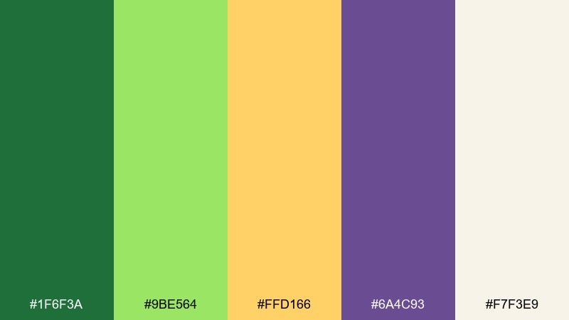
HEX: #1f6f3a #9be564 #ffd166 #6a4c93 #f7f3e9
Mood: bright, optimistic, modern
Best for: startup branding and social headers
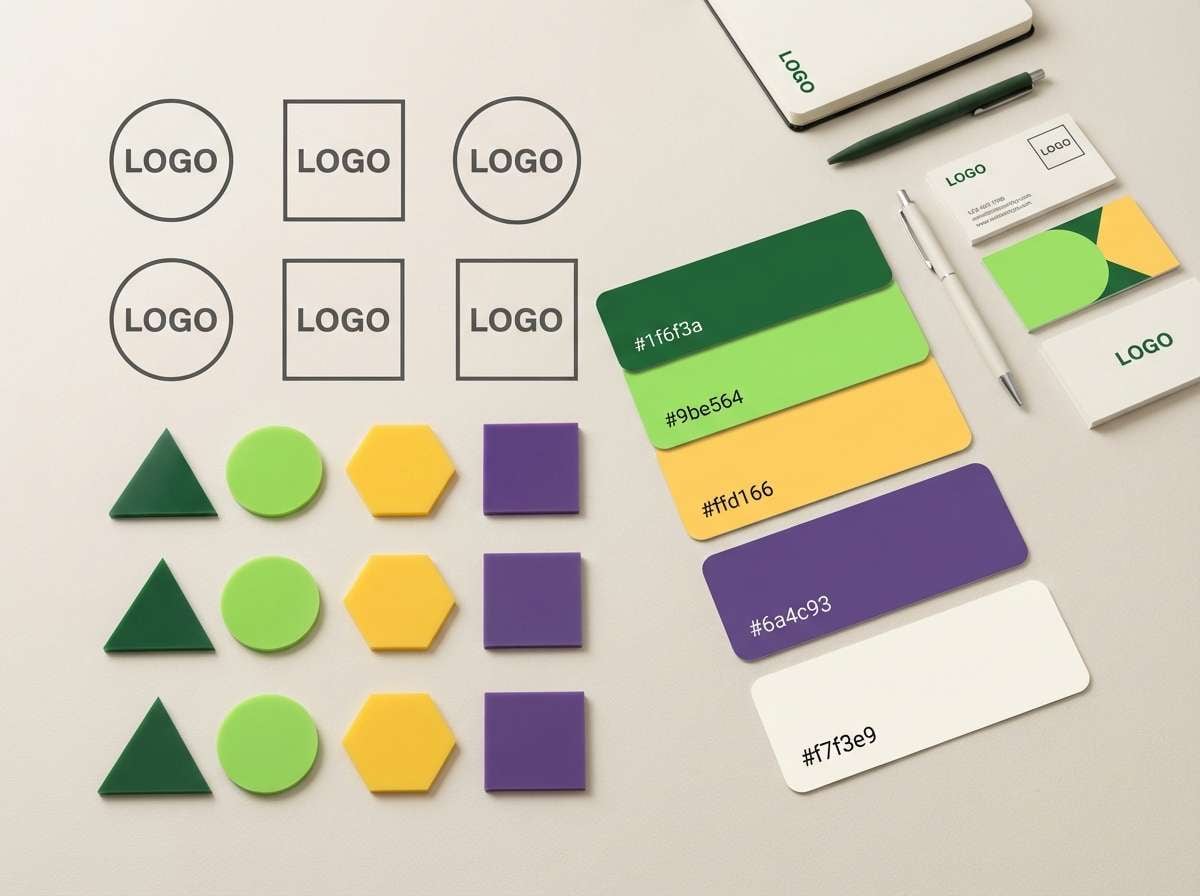
Bright and optimistic, this mix feels like citrus peel, fresh leaves, and orchid petals under clean daylight. It works beautifully for modern startup branding, creator kits, and punchy social headers where you want warmth without losing clarity. Keep the purple for headlines and key CTAs, and let yellow do the highlighting sparingly. For a balanced green yellow purple color palette, pair it with off-white space and simple geometric shapes.
Image example of citrus orchid generated using media.io
Media.io is an online AI studio for creating and editing video, image, and audio in your browser.

2) Meadow Amethyst
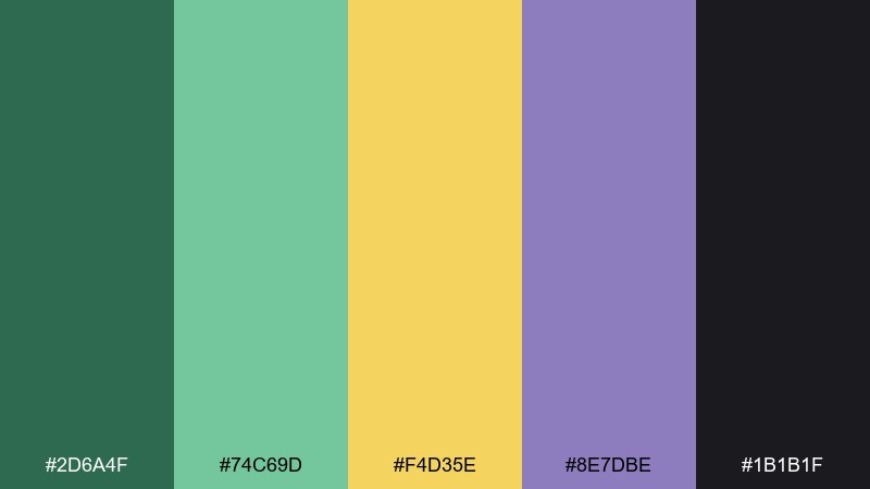
HEX: #2d6a4f #74c69d #f4d35e #8e7dbe #1b1b1f
Mood: calm, nature-led, grounded
Best for: eco packaging and wellness labels
Calm and grounded, these tones evoke shaded meadows, soft mint, and a quiet amethyst glow. They suit eco packaging, wellness labels, and sustainable product messaging where trust matters. Use the dark charcoal for typography to keep contrast strong, and reserve the yellow for badges or callouts. A matte paper stock makes the greens feel especially natural.
Image example of meadow amethyst generated using media.io
3) Sunset Iris
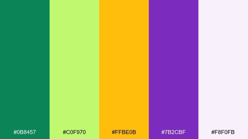
HEX: #0b8457 #c0f970 #ffbe0b #7b2cbf #f8f0fb
Mood: energetic, playful, creative
Best for: event posters and creator thumbnails
Energetic and playful, this set reads like a sunset walk past neon-green leaves and blooming irises. It shines on event posters, creator thumbnails, and bold announcements that need instant lift. Let the purple carry your main type, then add yellow as a spotlight behind key words. Keep the pale lilac as your background to avoid harsh contrast.
Image example of sunset iris generated using media.io

4) Vintage Market

HEX: #2f7d32 #f2e86d #6d597a #b56576 #f6f1e9
Mood: nostalgic, cozy, artisanal
Best for: boutique identity and handmade tags
Nostalgic and cozy, the tones feel like a weekend market with herb bundles, sun-faded signage, and a hint of plum. They work well for boutique identities, handmade tags, and small-batch product storytelling. Use the dusty purple for your brand mark and the warm yellow for price stickers or highlights. Pair with textured paper or subtle grain to lean into the artisanal vibe.
Image example of vintage market generated using media.io

5) Forest Lemonade
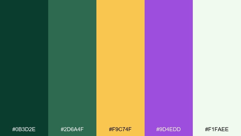
HEX: #0b3d2e #2d6a4f #f9c74f #9d4edd #f1faee
Mood: fresh, confident, outdoorsy
Best for: sports brands and campaign landing pages
Fresh and confident, this palette feels like deep forest shade cut with a glass of lemon drink and a violet accent. It fits sports brands, outdoor campaigns, and landing pages that need bold contrast without looking harsh. Keep the darkest green for nav bars and footers, and use yellow for buttons that must pop. A soft off-white background keeps the overall look breathable.
Image example of forest lemonade generated using media.io

6) Lavender Field Picnic
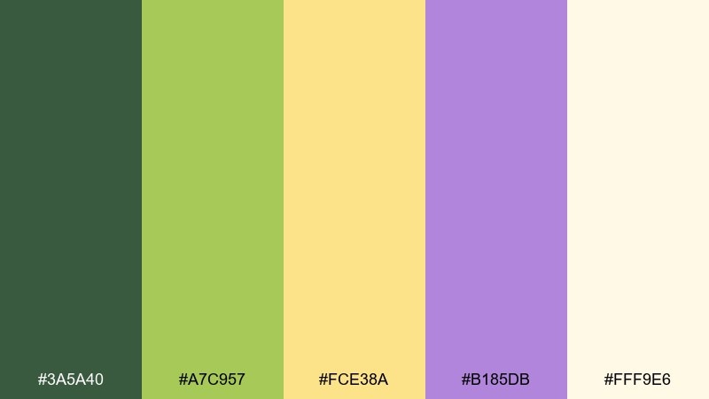
HEX: #3a5a40 #a7c957 #fce38a #b185db #fff9e6
Mood: soft, sunny, relaxing
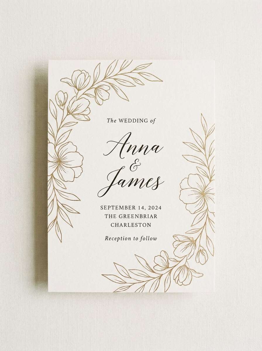
Best for: wedding stationery and spring invitations
Soft and sunny, these tones suggest a picnic blanket near lavender rows with warm light on new grass. They are ideal for wedding stationery, spring invitations, and lifestyle brands that want gentle charm. Use the lavender for names and headings, while the muted yellow works as a subtle border or motif. Print on warm white stock to keep the pastels flattering.
Image example of lavender field picnic generated using media.io
7) Festival Meadow
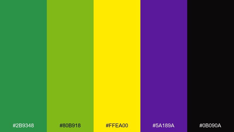
HEX: #2b9348 #80b918 #ffea00 #5a189a #0b090a
Mood: bold, loud, high-contrast
Best for: music promo graphics and merch
Bold and loud, the colors feel like stage lights hitting fresh grass and deep violet velvet at night. These green yellow purple color combinations are perfect for music promo graphics, merch drops, and energetic announcements. Anchor layouts with the near-black, then let yellow and lime carry icons and stickers. Keep purple for the hero element so the design reads instantly from a distance.
Image example of festival meadow generated using media.io
8) Art Class Pop
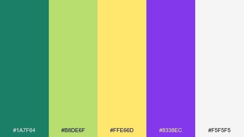
HEX: #1a7f64 #b8de6f #ffe66d #8338ec #f5f5f5
Mood: fun, youthful, friendly
Best for: kids apps and education slides
Fun and friendly, this set brings to mind markers, paper cutouts, and a bright classroom wall display. It works well for kids apps, education slides, and playful onboarding flows. Use the vivid purple for primary actions and the light yellow for progress states or highlights. Keep plenty of white so the palette stays clean instead of chaotic.
Image example of art class pop generated using media.io
9) Deep Jungle Gold
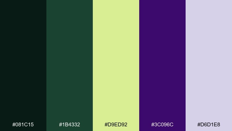
HEX: #081c15 #1b4332 #d9ed92 #3c096c #d6d1e8
Mood: mysterious, luxe, cinematic
Best for: book covers and premium campaigns
Mysterious and luxe, these shades feel like jungle canopy at dusk with a rare purple flower and a pale golden glow. They suit book covers, premium campaigns, and cinematic key art where depth matters. Use the near-black greens for big blocks and let the soft yellow-green act as a glow or rim light. A subtle gradient in the lavender can add polish without adding clutter.
Image example of deep jungle gold generated using media.io
10) Springtime Boutique
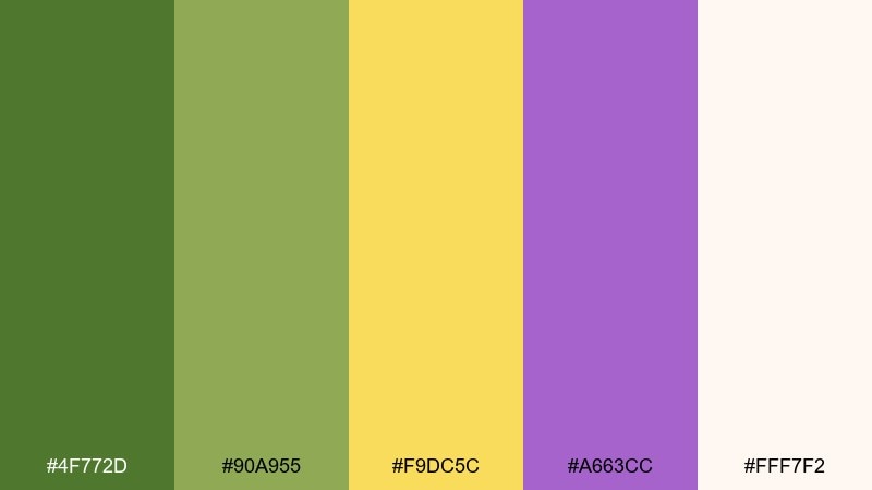
HEX: #4f772d #90a955 #f9dc5c #a663cc #fff7f2
Mood: fresh, approachable, stylish
Best for: shopify themes and product banners
Fresh and stylish, the tones read like new leaves, buttercream sunlight, and a soft pop of violet. They are a great fit for boutique ecommerce, Shopify themes, and product banners that need warmth and trust. Use green for navigation and category labels, then reserve violet for promotions and new arrivals. Keep backgrounds creamy to maintain a gentle, premium feel.
Image example of springtime boutique generated using media.io

11) Cosmic Citrus
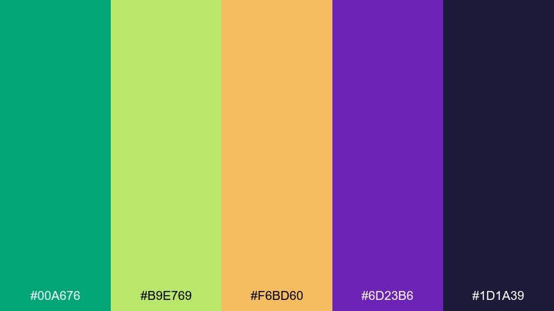
HEX: #00a676 #b9e769 #f6bd60 #6d23b6 #1d1a39
Mood: futuristic, vibrant, night-sky
Best for: tech ads and app launch graphics
Futuristic and vibrant, it feels like a night sky lit by neon botanicals and citrus flare. These colors work for tech ads, app launch graphics, and motion-friendly layouts with big gradients. Use the deep navy as your base and let green and yellow create luminous accents. Purple is perfect for glow effects around icons and headline highlights.
Image example of cosmic citrus generated using media.io

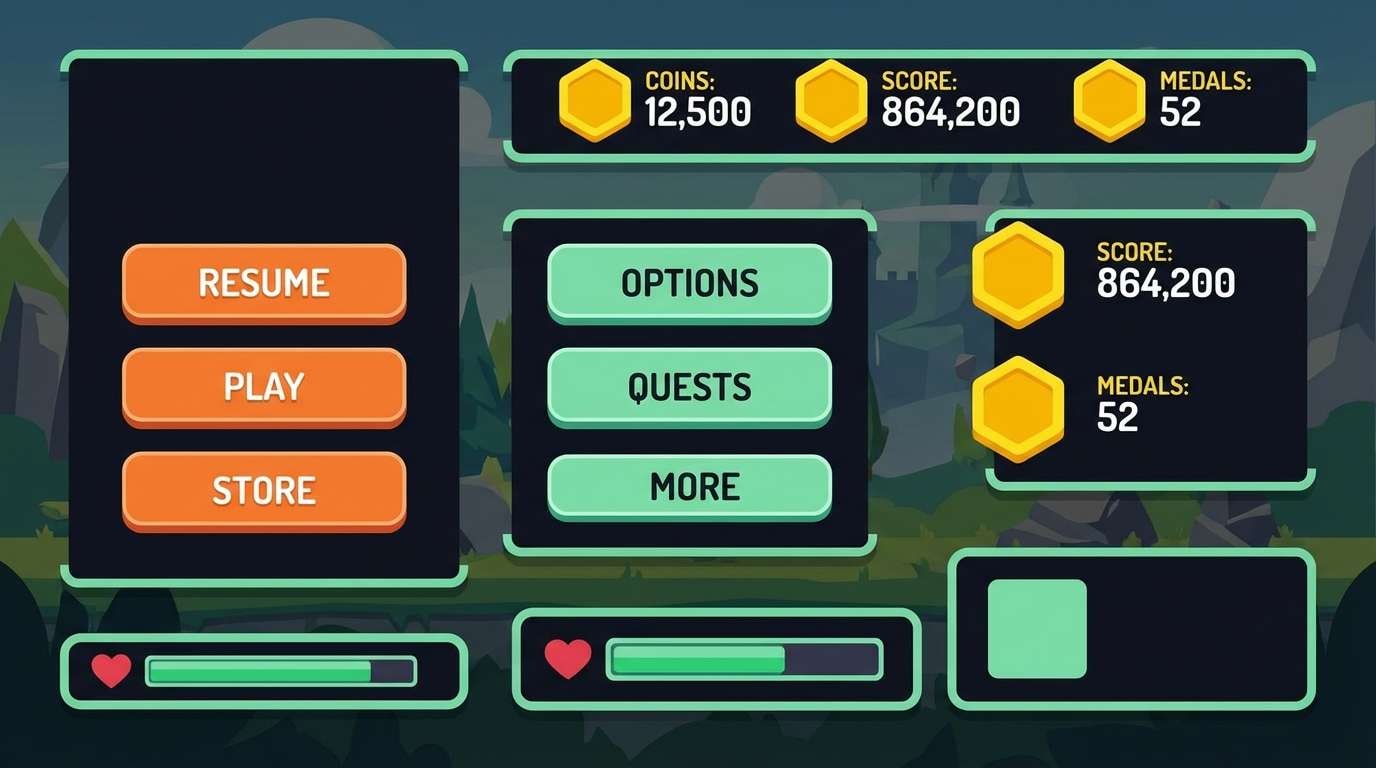
12) Neon Garden UI
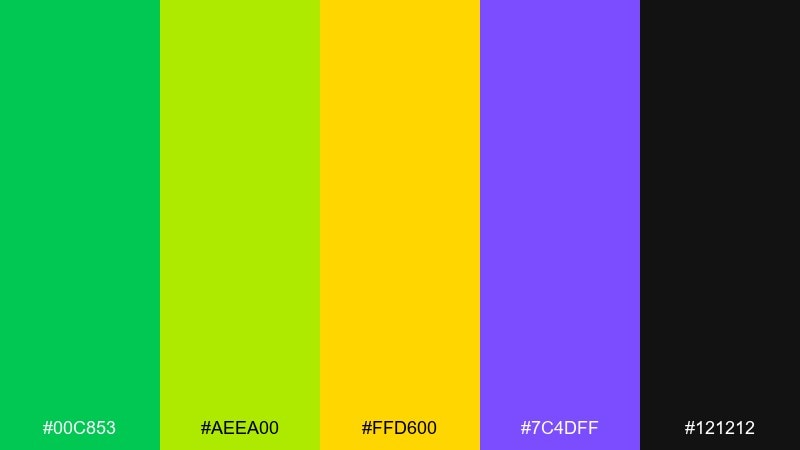
HEX: #00c853 #aeea00 #ffd600 #7c4dff #121212
Mood: electric, sharp, high-impact
Best for: dark mode dashboards and analytics UI
Electric and sharp, the colors look like glowing garden signage against a midnight interface. This green yellow purple color combination is strong for dark mode dashboards and analytics UI where status colors need to be unmistakable. Use yellow for alerts and key metrics, green for success states, and purple for active tabs. Keep spacing generous so the neons feel intentional, not noisy.
Image example of neon garden ui generated using media.io

13) Olive Orchid Minimal
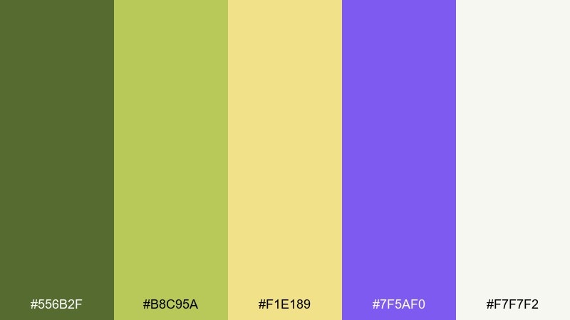
HEX: #556b2f #b8c95a #f1e189 #7f5af0 #f7f7f2
Mood: minimal, earthy, contemporary
Best for: editorial layouts and clean brand systems
Minimal and contemporary, it evokes olive branches, pale parchment, and a restrained orchid accent. It fits editorial layouts, clean brand systems, and portfolio sites that need a calm base with one modern punch. Use olive for body text and UI chrome, and keep purple as an accent for links or section dividers. A tight grid and lots of negative space will make it feel premium.
Image example of olive orchid minimal generated using media.io
14) Cottage Garden
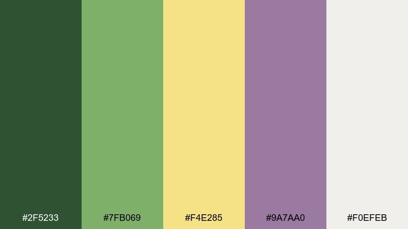
HEX: #2f5233 #7fb069 #f4e285 #9a7aa0 #f0efeb
Mood: warm, homey, relaxed
Best for: blog headers and lifestyle branding
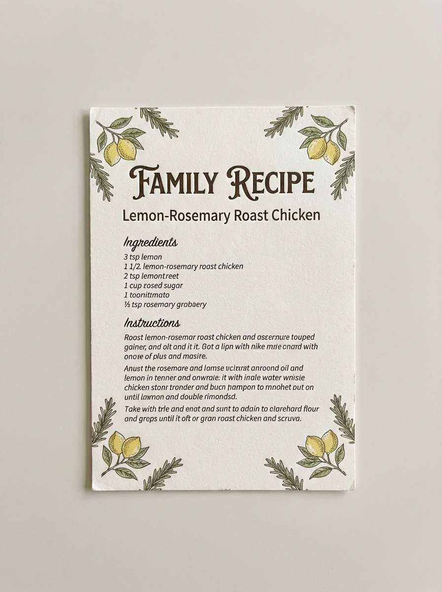
Warm and homey, these colors feel like a cottage garden with sunlit petals and leafy shadows. They are great for blog headers, lifestyle branding, and recipe cards that need a welcoming tone. Use the muted green for backgrounds and frames, then highlight key labels with the soft yellow. The dusty purple works nicely for subheads and decorative flourishes.
Image example of cottage garden generated using media.io
15) Playful Classroom
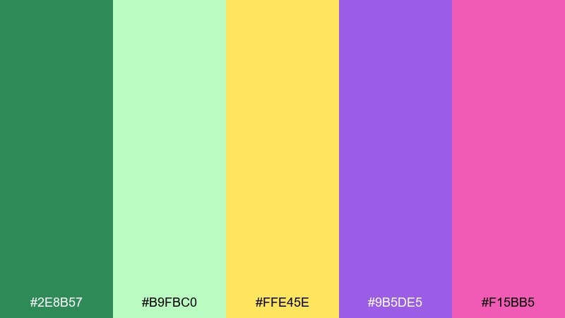
HEX: #2e8b57 #b9fbc0 #ffe45e #9b5de5 #f15bb5
Mood: cheerful, expressive, kid-friendly
Best for: learning posters and classroom resources
Cheerful and expressive, it brings to mind sticky notes, colorful pens, and upbeat classroom charts. It is ideal for learning posters, classroom resources, and friendly explainer graphics. Use green and purple to separate categories, and let yellow highlight key rules or steps. Keep type bold and simple so the bright accents stay readable.
Image example of playful classroom generated using media.io
16) Luxe Velvet Lime
HEX: #16302b #3a7d44 #cddc39 #5e2b97 #faf3dd
Mood: luxury, dramatic, trendy
Best for: beauty ads and premium packaging
Luxury and dramatic, these hues suggest velvet drapes, lime zest, and jewel-toned lighting. They are made for beauty ads, premium packaging, and high-end promotions that want a trendy edge. Use the deep green as the hero background, then apply lime sparingly for sparkle and contrast. Purple works best as a foil-stamped accent or a thin line detail.
Image example of luxe velvet lime generated using media.io
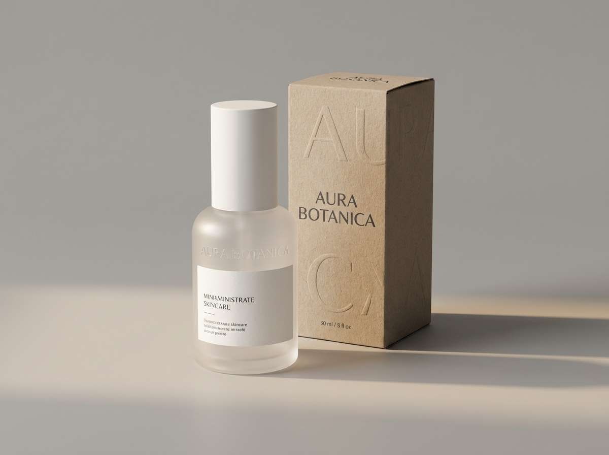
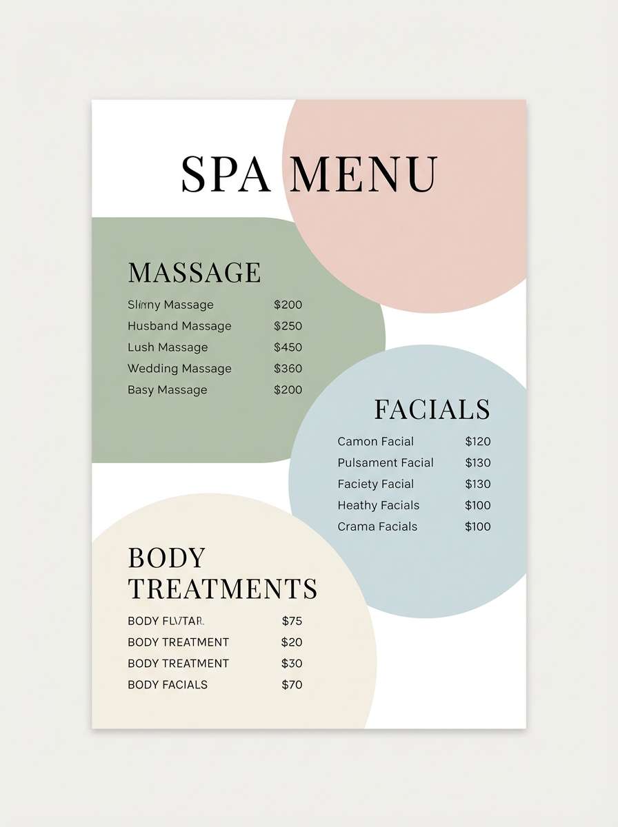
17) Modern Spa Label
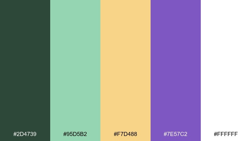
HEX: #2d4739 #95d5b2 #f7d488 #7e57c2 #ffffff
Mood: clean, soothing, restorative
Best for: spa menus and wellness packaging
Clean and restorative, the palette feels like eucalyptus steam, warm towel light, and a calm lavender note. It works for spa menus, wellness packaging, and self-care newsletters that need softness without looking bland. Keep purple for section headers and gentle dividers, and let the minty green lead as the main brand color. Use warm yellow as a subtle glow behind icons or pricing.
Image example of modern spa label generated using media.io
18) Harvest Orchid
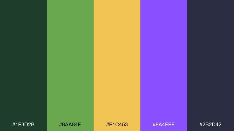
HEX: #1f3d2b #6aa84f #f1c453 #8a4fff #2b2d42
Mood: rich, seasonal, confident
Best for: campaign banners and email headers
Rich and seasonal, it looks like late-summer leaves, harvest gold, and an orchid accent in shadow. This set is a strong choice for campaign banners, email headers, and promotional blocks that need warmth plus authority. Use the dark slate for text and structure, then pop in yellow for offer highlights. Purple adds a confident accent for badges or small graphic marks.
Image example of harvest orchid generated using media.io

19) Quiet Botanic
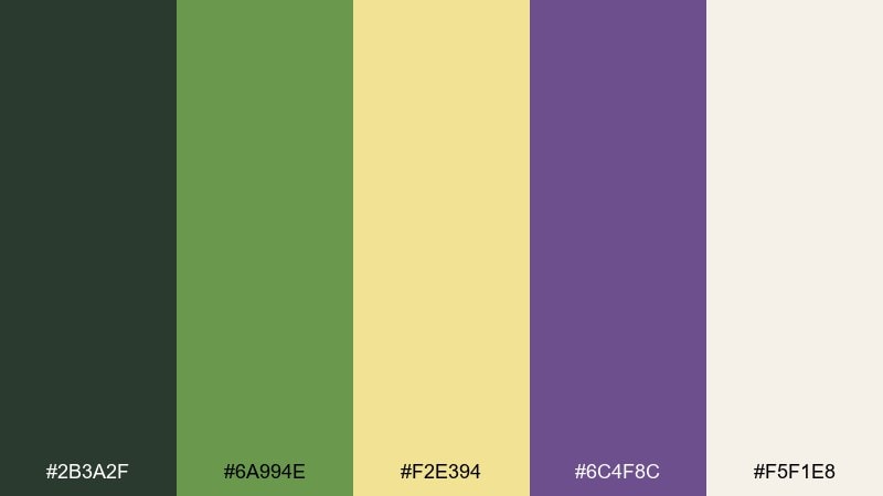
HEX: #2b3a2f #6a994e #f2e394 #6c4f8c #f5f1e8
Mood: serene, natural, understated
Best for: journals, stationery, and calm websites
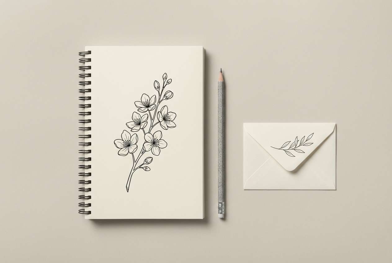
Serene and understated, these tones feel like pressed leaves, sun-bleached paper, and a small lavender bloom. They are perfect for journals, stationery, and calm websites that need a gentle personality. Use the warm off-white as your canvas, then layer greens for structure and navigation. For a softer green yellow purple color palette, keep purple to small accents like icons, bullets, or section rules.
Image example of quiet botanic generated using media.io
20) Retro Arcade
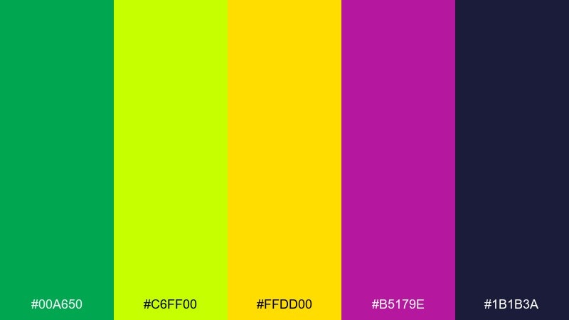
HEX: #00a650 #c6ff00 #ffdd00 #b5179e #1b1b3a
Mood: retro, punchy, playful
Best for: gaming thumbnails and stream overlays
Retro and punchy, it evokes arcade LEDs, coin-op screens, and neon signage after dark. It is ideal for gaming thumbnails, stream overlays, and bold channel branding where visibility is everything. Use the navy as a base layer, then stack neon green and yellow for energy and depth. Keep the magenta-purple for highlights so it feels like a classic arcade glow.
Image example of retro arcade generated using media.io
21) Gallery Night
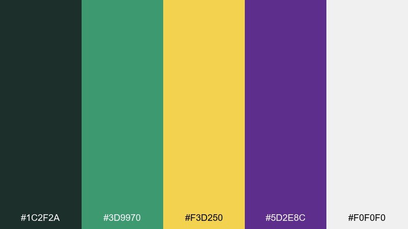
HEX: #1c2f2a #3d9970 #f3d250 #5d2e8c #f0f0f0
Mood: artful, sophisticated, modern
Best for: exhibition posters and cultural branding
Artful and sophisticated, these colors suggest a quiet gallery, spotlit frames, and a velvet purple accent in the corner. They are excellent for exhibition posters, cultural branding, and event programs that need polish. Use the off-white as negative space, then bring in yellow as a spotlight element behind dates or locations. Keep green and purple for typography and key shapes to maintain a modern, curated look.
Image example of gallery night generated using media.io

What Colors Go Well with Green Yellow Purple?
Neutrals are the easiest support: warm off-white, cream, and light gray keep the palette breathable, while charcoal or near-black makes typography crisp and accessible. If your yellow is bright, a softer background (like #f7f3e9 or #f0f0f0) helps reduce glare.
For extra depth, add a deep navy or slate as a structural color—especially for UI and hero sections. If you want more warmth, a muted terracotta or dusty rose can bridge yellow and purple without competing with them.
Metallics also work well: gold pairs naturally with yellow, while silver/pearl complements cool greens and purples for a more modern finish.
How to Use a Green Yellow Purple Color Palette in Real Designs
Start with roles: use green as your primary base (navigation, large panels, or backgrounds), keep purple for emphasis (headlines, active states, or brand marks), and treat yellow as a highlight color (badges, key metrics, price tags, or button accents).
Control contrast by limiting high-saturation areas. If both yellow and purple are vivid, give them plenty of negative space and simplify shapes so the layout stays clean and intentional.
For print, test on paper stock: matte finishes make greens feel natural, while warm white stock keeps yellows soft. For screens, check accessibility contrast—especially yellow text on light backgrounds (often better as a fill or underline than body text).
Create Green Yellow Purple Palette Visuals with AI
If you’re pitching a concept or building a brand board, generating quick mock visuals helps you validate the vibe before you commit to full design production. With AI, you can explore poster styles, UI hero sections, packaging shots, and more—using the same palette repeatedly for consistency.
Try describing your layout first (poster, dashboard, invitation, product label), then add lighting/style notes (studio lighting, flat vector, cinematic) and finish with your aspect ratio. Iterate by changing just one variable at a time, like “minimal” vs “neon,” to keep results comparable.
Use Media.io to turn palette ideas into on-brand images fast, then refine color balance and contrast once you see how the green, yellow, and purple interact in real compositions.
Green Yellow Purple Color Palette FAQs
-
What does a green yellow purple color palette communicate?
It usually communicates freshness and growth (green), optimism and attention (yellow), and creativity or premium flair (purple). Together, the trio can feel energetic and modern, or rich and dramatic when you use darker shades. -
Is green, yellow, and purple a good combo for branding?
Yes—especially for brands that want to look approachable but distinctive. Use green as the primary brand color, purple for recognizable accents, and yellow sparingly for highlights so the identity stays consistent across web and print. -
How do I keep yellow from overpowering the design?
Use yellow as an accent (badges, underlines, small shapes, or CTA fills) instead of large backgrounds. Pair it with off-white space and keep body text in charcoal or deep green for readability. -
What’s the best neutral to pair with green yellow purple?
Warm off-white/cream works for softer palettes, while cool light gray works for more modern UI. For strong contrast in digital designs, add charcoal or near-black for text and structure. -
Can I use green yellow purple palettes in UI design?
Absolutely. Map each color to a role: green for success/primary structure, yellow for warnings or key KPIs, and purple for active states and highlights. In dark mode, keep neon tones spaced out so the interface doesn’t feel noisy. -
How do I choose the right purple for a green and yellow scheme?
If your greens and yellows are bright, a cleaner violet reads modern. If your palette is earthy or muted, choose a dusty lavender or plum to match the softness and keep the overall look cohesive. -
What’s a quick rule for balancing the three colors?
Try a 60/30/10 approach: 60% neutral or green base, 30% secondary green/neutral, and 10% accents split between yellow and purple. This keeps contrast high without making the layout feel chaotic.
Next: Maroon Red Color Palette


