

Black and red is a high-contrast pairing that instantly communicates power, urgency, and premium focus. Used well, it can feel cinematic, modern, or elegantly restrained—depending on which reds and neutrals you choose.
Below are 20 black red color palette ideas with HEX codes, plus practical tips for branding, posters, UI accents, packaging, and more.
In this article
- Why Black Red Palettes Work So Well
-
- crimson noir
- velvet ember
- garnet studio
- ruby smoke
- neon rose edge
- burgundy leather
- cherry espresso
- scarlet cinema
- rosewood minimal
- carbon cranberry
- firelight shadow
- merlot nightfall
- redline tech
- cabernet editorial
- satin poppy
- brick & ink
- dark valentine
- signal red contrast
- cinder rose
- blackened raspberry
- What Colors Go Well with Black Red?
- How to Use a Black Red Color Palette in Real Designs
- Create Black Red Palette Visuals with AI
Why Black Red Palettes Work So Well
Black provides structure, weight, and negative space, while red injects emotion and attention. Together, they create instant hierarchy—black holds the layout, red tells viewers exactly where to look.
This pairing is flexible: shift red toward burgundy for heritage luxury, or toward neon pink-red for futuristic energy. Add soft whites or warm creams to keep readability high and avoid visual fatigue.
Because red is naturally “loud,” the most successful black and red color schemes use red intentionally—often as an accent for headlines, CTAs, badges, or key product details.
20+ Black Red Color Palette Ideas (with HEX Codes)
1) Crimson Noir
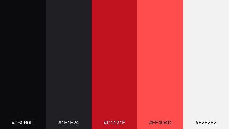
HEX: #0B0B0D #1F1F24 #C1121F #FF4D4D #F2F2F2
Mood: dramatic, luxe, confident
Best for: luxury branding and logo systems
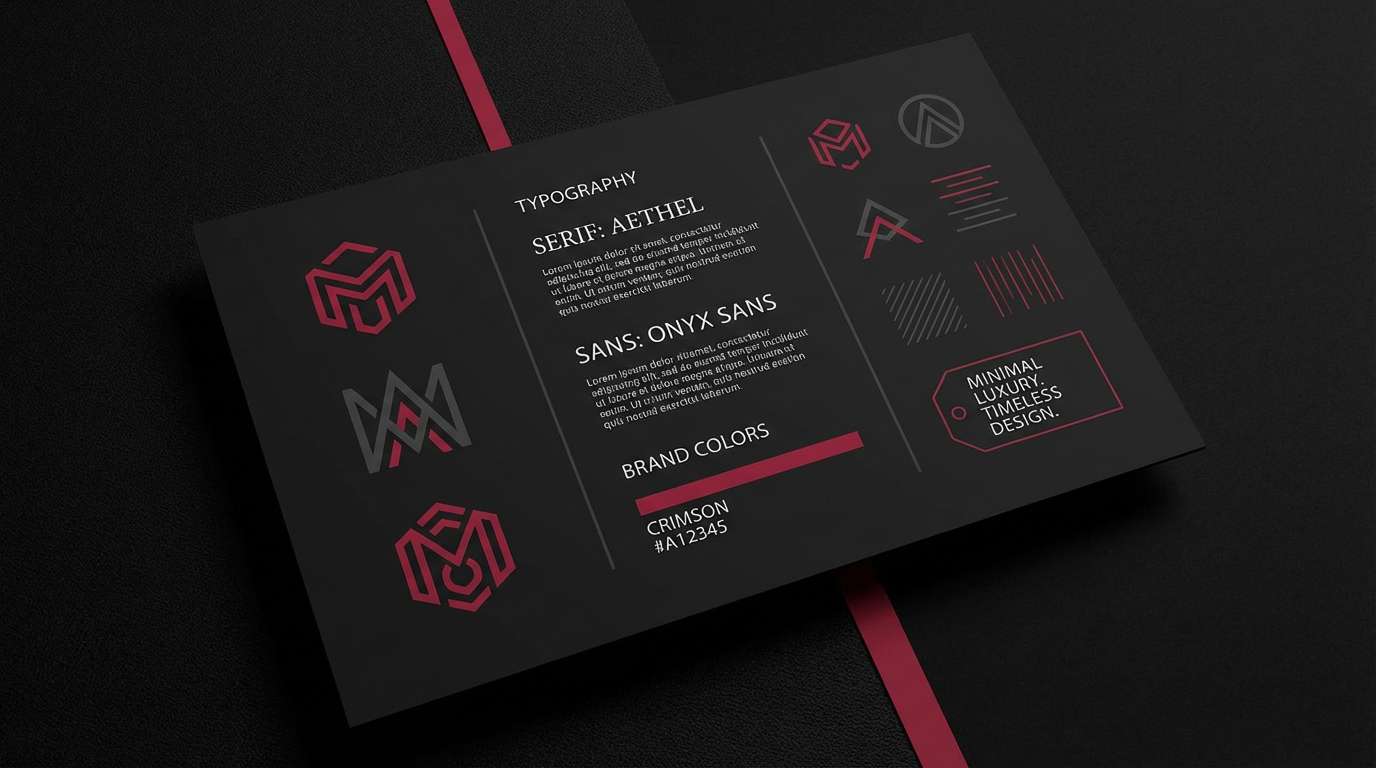
Dramatic and luxe, it feels like a spotlight cutting through a dark theater. The deep blacks anchor the bright reds for a premium look on logos, labels, and brand marks. Pair with plenty of whitespace and one metallic foil finish for extra polish. For a balanced black red color palette, keep red to headlines and seals, and let black do the heavy lifting.
Image example of crimson noir generated using media.io
Media.io is an online AI studio for creating and editing video, image, and audio in your browser.

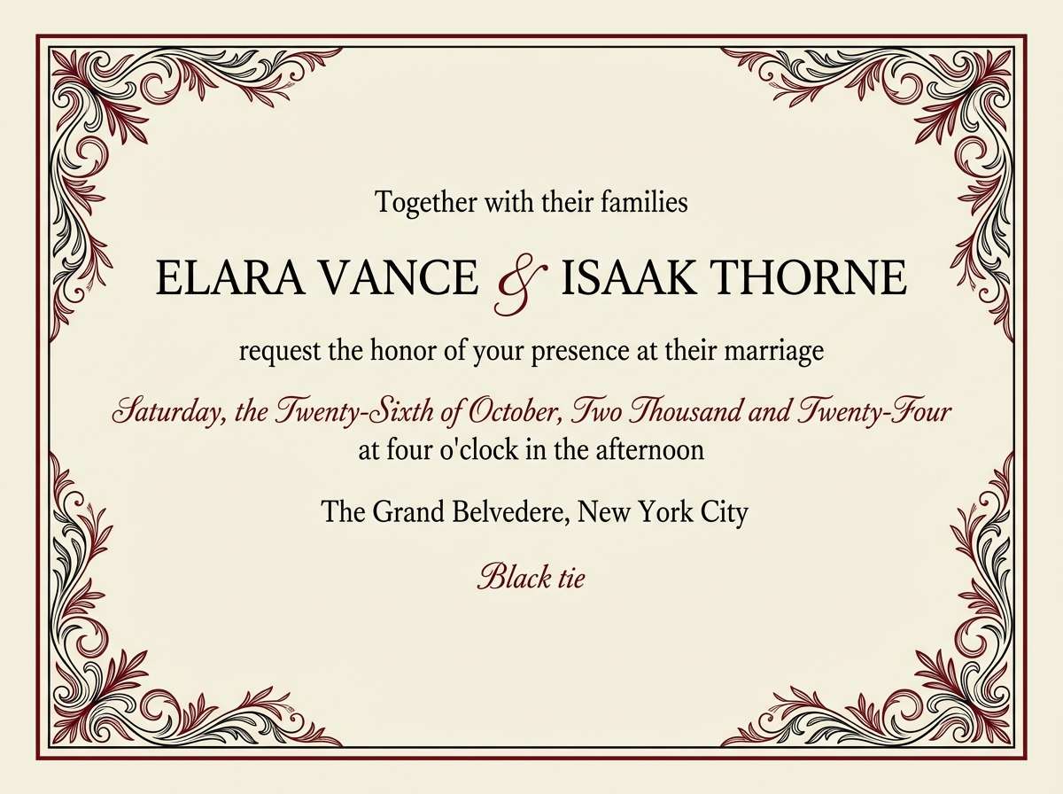
2) Velvet Ember
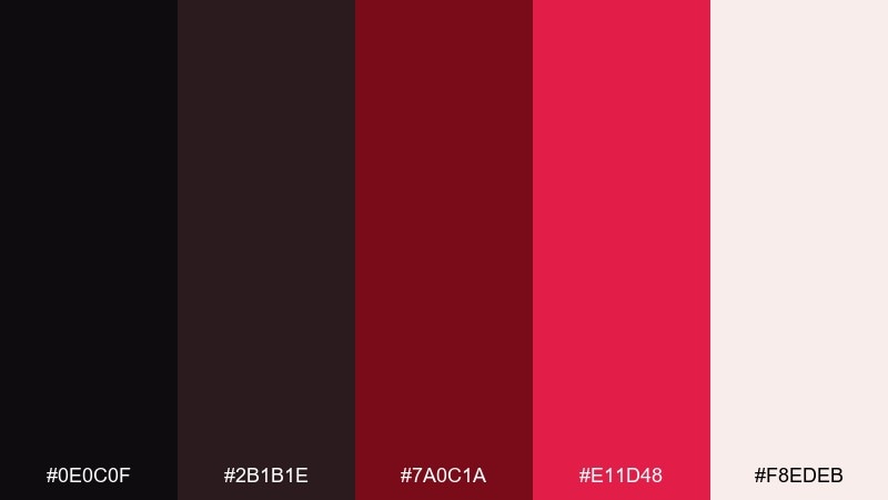
HEX: #0E0C0F #2B1B1E #7A0C1A #E11D48 #F8EDEB
Mood: romantic, moody, refined
Best for: wedding invitations and evening event stationery
Romantic and moody, it evokes velvet drapes and candlelit dinners. The burgundy-to-rose reds feel elegant against near-black, while the warm off-white keeps text readable. Use it for invitations, menus, and RSVP cards with serif type and subtle texture. Tip: print the darkest tone as a rich charcoal instead of pure black to avoid muddy shadows.
Image example of velvet ember generated using media.io
3) Garnet Studio
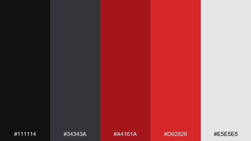
HEX: #111114 #34343A #A4161A #D62828 #E5E5E5
Mood: modern, editorial, assertive
Best for: portfolio websites and creative studio homepages
Modern and assertive, it looks like a clean gallery wall with one bold artwork. The reds read as intentional calls to action, while the grays keep layouts calm and professional. It works best with large typography, grid spacing, and restrained iconography. Tip: reserve the brightest red for one primary button style to maintain hierarchy.
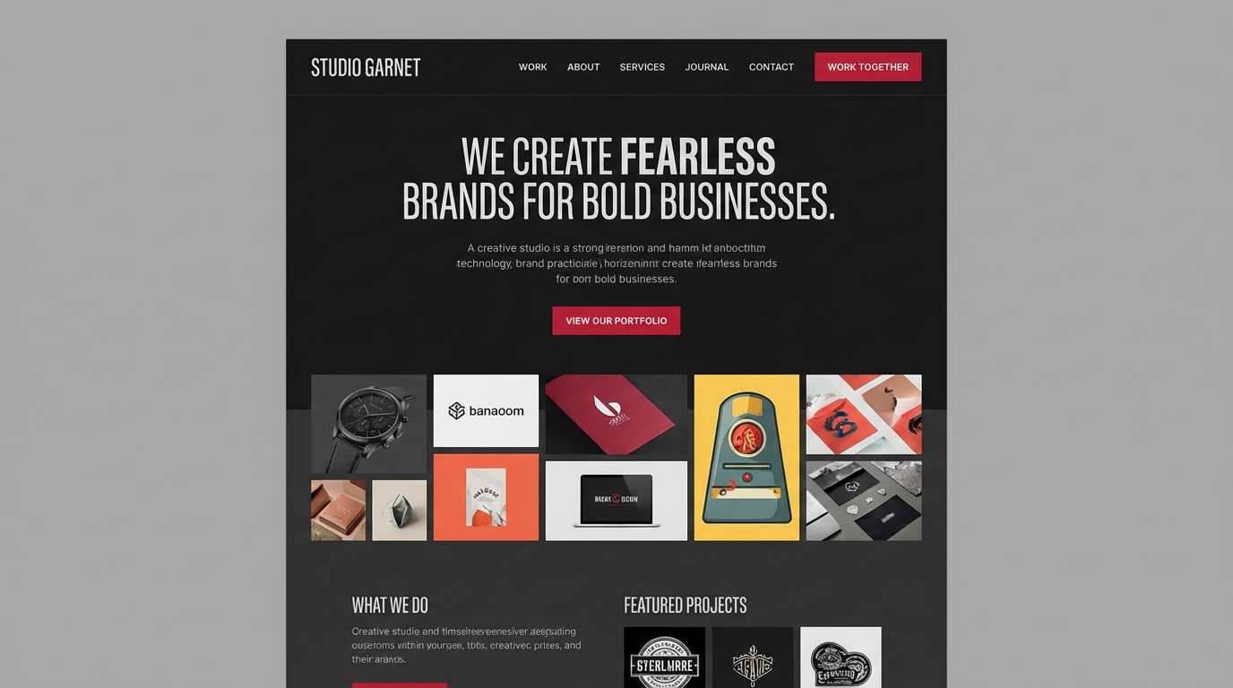
Image example of garnet studio generated using media.io
4) Ruby Smoke
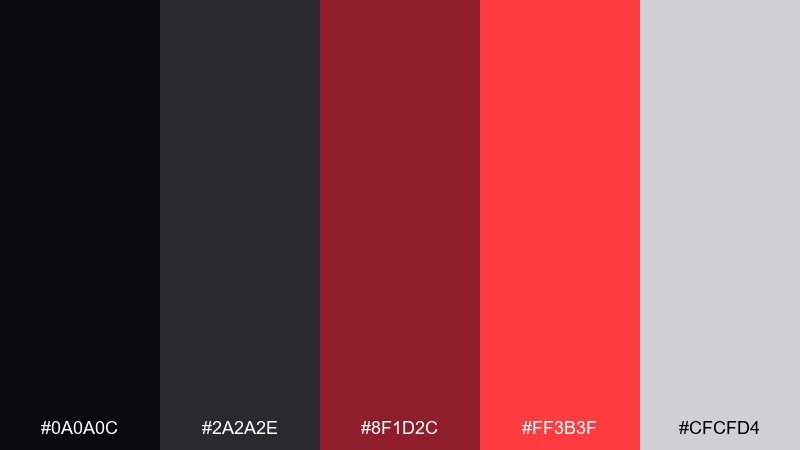
HEX: #0A0A0C #2A2A2E #8F1D2C #FF3B3F #CFCFD4
Mood: sleek, nocturnal, energetic
Best for: music festival posters and nightlife flyers
Sleek and nocturnal, it feels like neon cutting through city smoke. High-contrast reds pop for artist names and ticket details, while the smoky grays soften the overall intensity. Use bold sans type, tight leading, and a simple geometric motif. Tip: add a faint grain overlay to unify the dark tones and avoid banding in gradients.
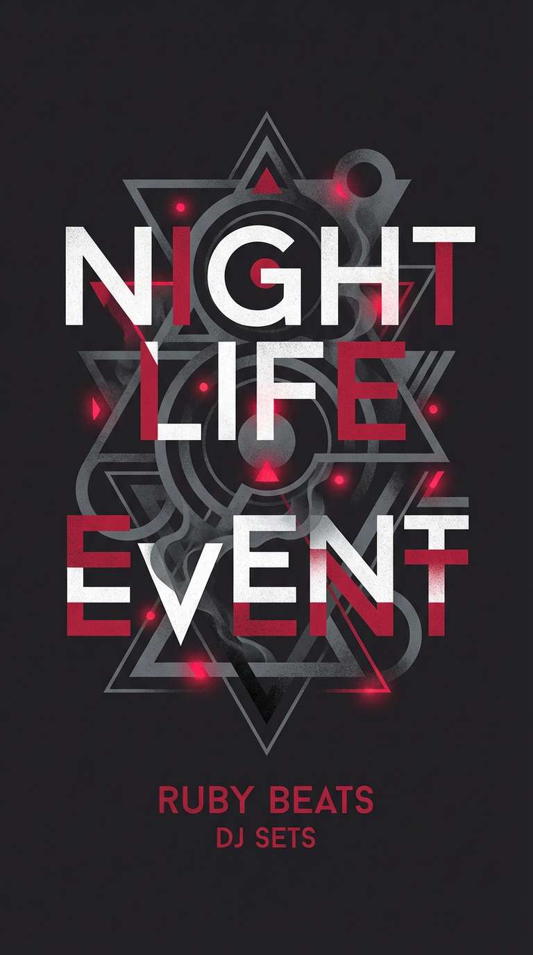
Image example of ruby smoke generated using media.io
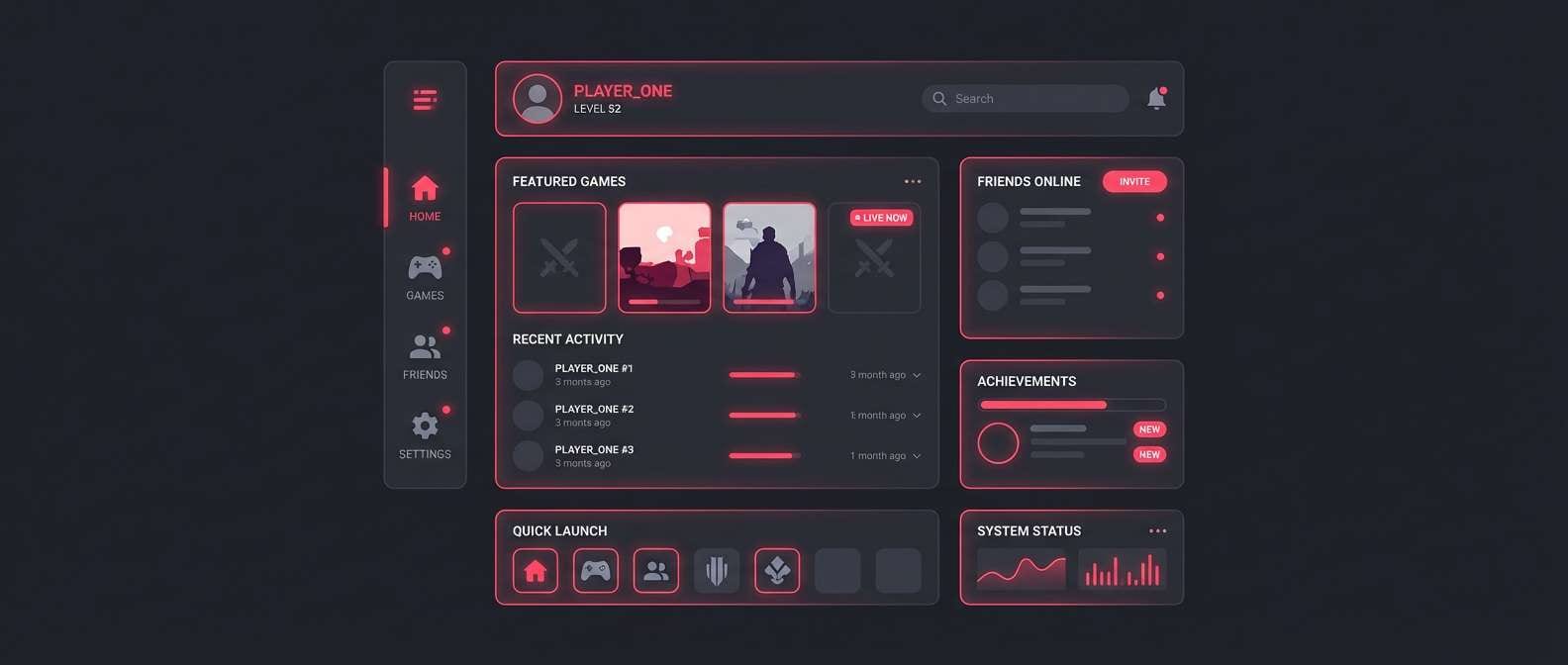
5) Neon Rose Edge
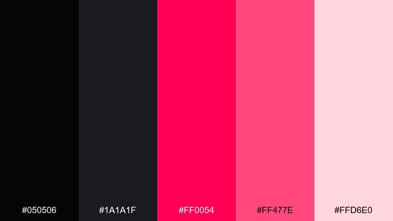
HEX: #050506 #1A1A1F #FF0054 #FF477E #FFD6E0
Mood: bold, playful, futuristic
Best for: stream overlays and gaming UI accents
Bold and playful, it reads like arcade lights against a midnight backdrop. The hot pink-reds make perfect highlight states for tabs, badges, and hover effects. Keep body text in pale blush or near-white for comfort during long sessions. Tip: use the brightest tone only for active states so the interface feels fast, not frantic.
Image example of neon rose edge generated using media.io
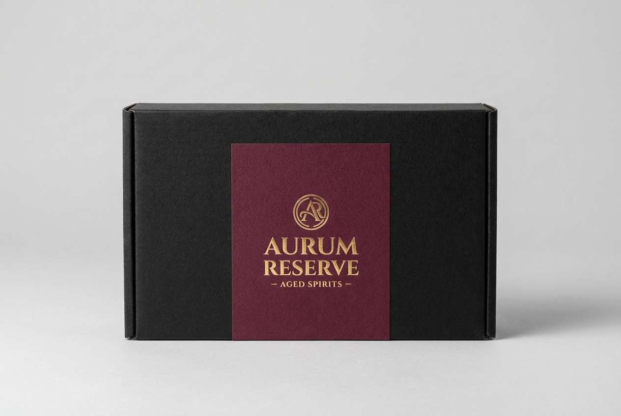
6) Burgundy Leather
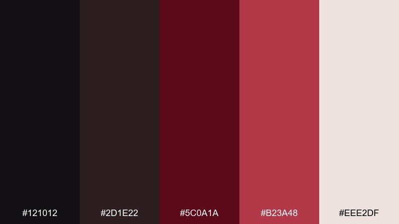
HEX: #121012 #2D1E22 #5C0A1A #B23A48 #EEE2DF
Mood: heritage, warm, upscale
Best for: premium packaging for spirits or coffee
Heritage and warm, it brings to mind worn leather, dark wood, and an old bar counter. These black red color combinations feel especially rich on paper stocks with a soft-touch finish. Pair with cream labels, embossing, and a restrained monogram for a classic look. Tip: keep the deepest burgundy for large fields and use the brighter red only as a small stamp detail.
Image example of burgundy leather generated using media.io
7) Cherry Espresso
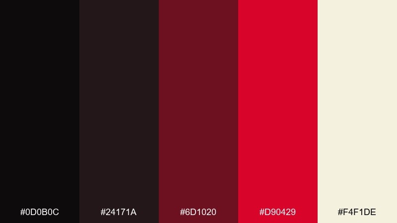
HEX: #0D0B0C #24171A #6D1020 #D90429 #F4F1DE
Mood: cozy, intense, appetizing
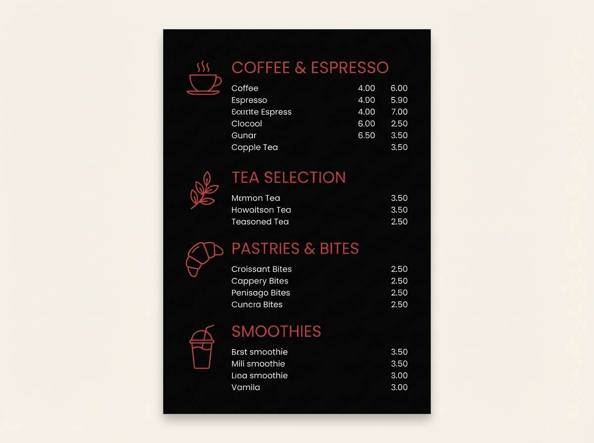
Best for: coffee shop menus and cafe signage
Cozy and intense, it feels like espresso crema with a cherry bite. The creamy off-white keeps menus readable while the reds guide attention to specials and pricing. Use it on chalkboard-style layouts, loyalty cards, and window decals. Tip: limit red to category headers so the menu stays appetizing instead of aggressive.
Image example of cherry espresso generated using media.io
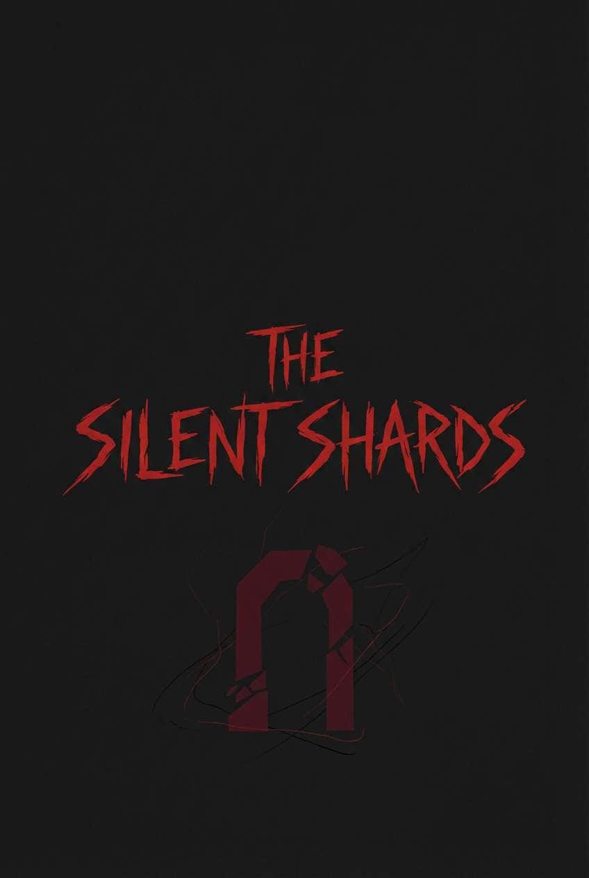
8) Scarlet Cinema
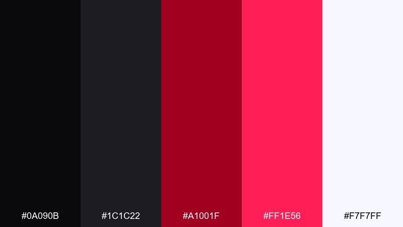
HEX: #0A090B #1C1C22 #A1001F #FF1E56 #F7F7FF
Mood: cinematic, suspenseful, high-impact
Best for: film posters and trailer title cards
Cinematic and suspenseful, it suggests a thriller title card on a dark screen. The scarlet tones are built for credits, release dates, and dramatic taglines. Pair with condensed typefaces, sharp alignment, and lots of negative space. Tip: add a subtle red glow behind key text to improve legibility without losing the mood.
Image example of scarlet cinema generated using media.io
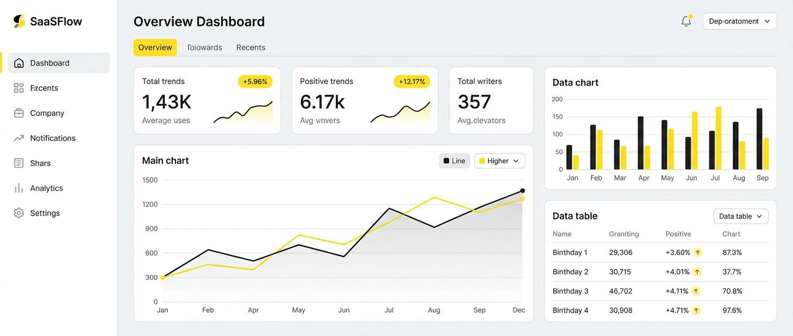
9) Rosewood Minimal
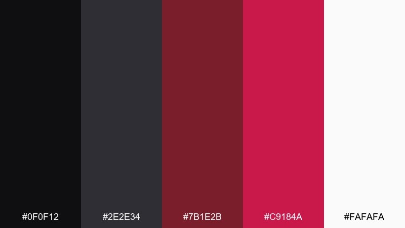
HEX: #0F0F12 #2E2E34 #7B1E2B #C9184A #FAFAFA
Mood: clean, stylish, confident
Best for: SaaS landing pages and dashboard UI
Clean and stylish, it feels like a minimalist studio with one rosewood accent chair. This black red color scheme works best when reds are treated as functional signals for primary actions and key stats. Pair with neutral grays, thin dividers, and generous padding to keep the interface calm. Tip: set error states to a slightly different red tint so actions and alerts do not compete.
Image example of rosewood minimal generated using media.io
10) Carbon Cranberry
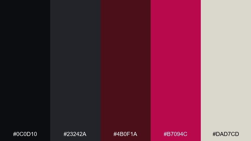
HEX: #0C0D10 #23242A #4B0F1A #B7094C #DAD7CD
Mood: sharp, urban, contemporary
Best for: streetwear lookbooks and social ads
Sharp and urban, it echoes carbon fiber, concrete, and a cranberry punch of color. The muted cranberry reads premium on apparel tags, while the deeper red supports bold headlines. Pair with monochrome photography and blocky type for a clean streetwear vibe. Tip: keep the light neutral for captions so posts stay readable on small screens.
Image example of carbon cranberry generated using media.io

11) Firelight Shadow

HEX: #0B0A0C #1F1618 #7A0019 #E5383B #FCEFEF
Mood: warm, dramatic, storytelling
Best for: book covers and podcast artwork
Warm and dramatic, it feels like firelight flickering across a dark room. The vivid red is perfect for titles, icons, and a single focal element, while the pale tint adds breathing room. Use it with textured backgrounds or subtle gradients for more depth. Tip: choose one hero graphic and let the rest stay quiet so the cover reads instantly at thumbnail size.
Image example of firelight shadow generated using media.io
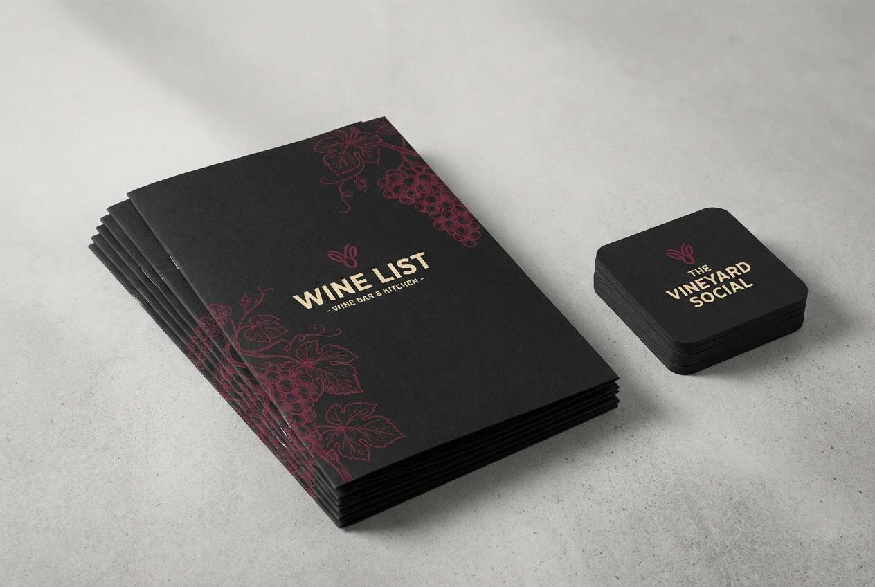
12) Merlot Nightfall
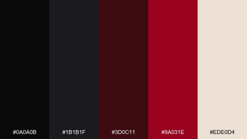
HEX: #0A0A0B #1B1B1F #3D0C11 #9A031E #EDE0D4
Mood: mature, moody, intimate
Best for: restaurant menus and wine bar branding
Mature and intimate, it recalls merlot in a low-lit glass. The darker reds feel sophisticated on menu covers, coasters, and signage, while the warm neutral reads like aged paper. Pair with classic serif typography and small decorative rules. Tip: use the mid red for section dividers rather than full blocks to keep the experience upscale.
Image example of merlot nightfall generated using media.io
13) Redline Tech
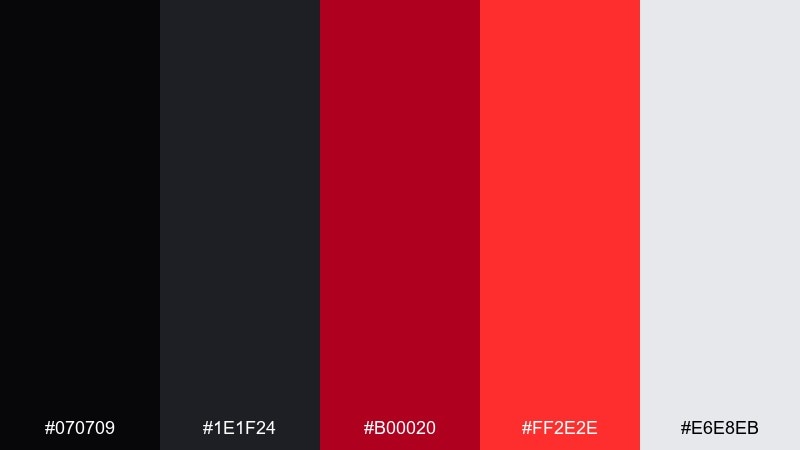
HEX: #070709 #1E1F24 #B00020 #FF2E2E #E6E8EB
Mood: fast, precise, high-tech
Best for: app onboarding screens and fintech UI
Fast and precise, it feels like a tachometer needle snapping into place. The high-contrast reds create urgency for progress steps, highlights, and micro-interactions. When you need a black red color palette with strong accessibility, keep text in light gray and avoid red body copy. Tip: use the brightest red only on the final step or primary action to reinforce completion.
Image example of redline tech generated using media.io
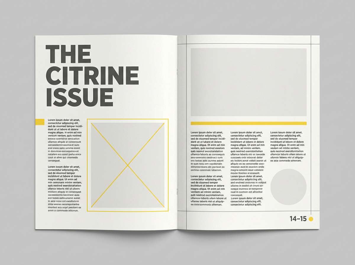
14) Cabernet Editorial
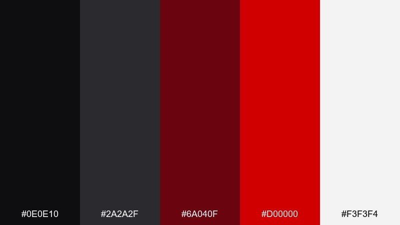
HEX: #0E0E10 #2A2A2F #6A040F #D00000 #F3F3F4
Mood: bold, polished, magazine-like
Best for: editorial spreads and fashion zines
Bold and polished, it looks like a high-end magazine spread with a red pull-quote. The grayscale base supports long-form readability, while the cabernet red makes callouts feel intentional. Pair with strong grid systems, generous margins, and one statement font. Tip: keep red to headers and rules so the page stays elegant in print.
Image example of cabernet editorial generated using media.io
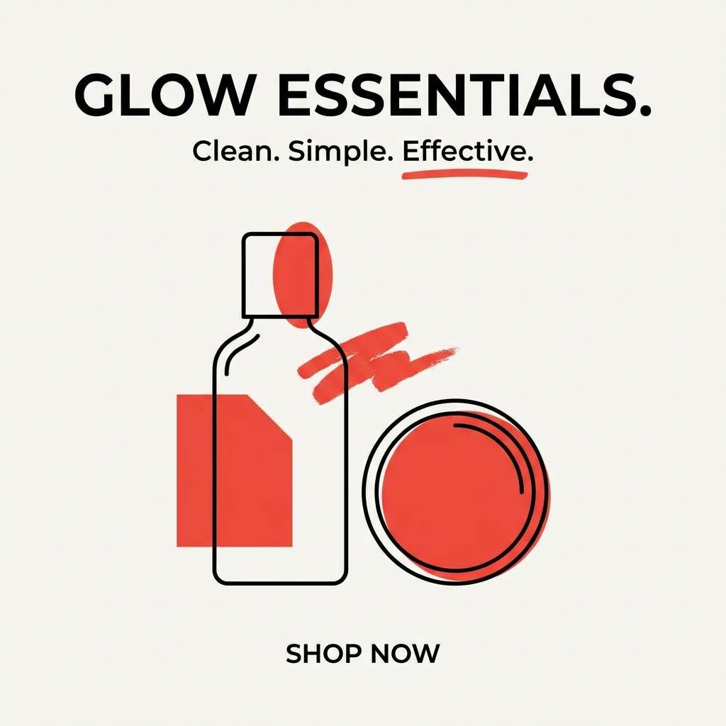
15) Satin Poppy
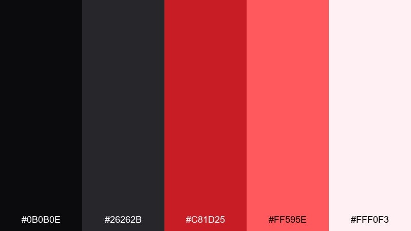
HEX: #0B0B0E #26262B #C81D25 #FF595E #FFF0F3
Mood: bright, charming, modern
Best for: beauty product ads and skincare promos
Bright and charming, it feels like satin fabric and a fresh poppy bloom. The soft pale tint keeps the design friendly, while the reds add punch for product names and discount badges. Use it in clean layouts with glossy highlights and minimal copy. Tip: let the lighter pink-white handle backgrounds so the reds stay crisp on screens.
Image example of satin poppy generated using media.io
16) Brick & Ink

HEX: #101114 #2B2D33 #8D1B1B #D64545 #E9ECEF
Mood: grounded, industrial, practical
Best for: construction company branding and signage
Grounded and industrial, it suggests brick dust, ink lines, and solid workmanship. The reds are sturdy rather than flashy, making them great for safety notes and bold brand marks. Pair with heavy sans fonts, simple icons, and high-contrast signage layouts. Tip: use the light gray for large background panels to reduce glare on outdoor prints.
Image example of brick & ink generated using media.io

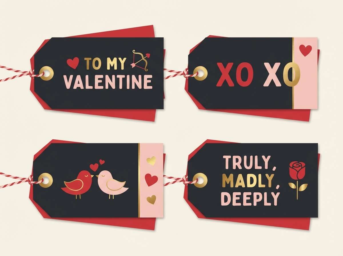
17) Dark Valentine
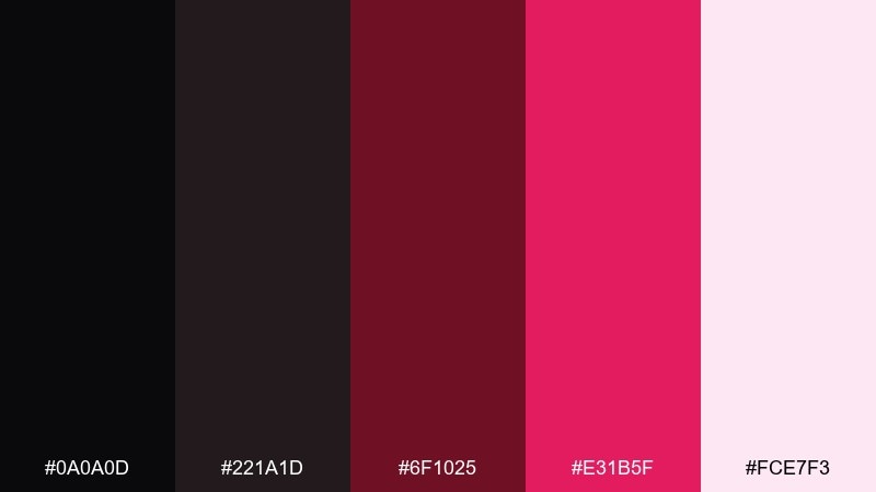
HEX: #0A0A0D #221A1D #6F1025 #E31B5F #FCE7F3
Mood: sweet, moody, flirtatious
Best for: Valentine campaigns and gift tags
Sweet but moody, it feels like dark chocolate wrapped with a glossy ribbon. The pinkish red lifts the palette for seasonal promos, while the deep shades keep it grown-up. Pair with hand-lettered accents, small hearts, and minimal patterns. Tip: keep the brightest tone for stickers and tags so the main design stays sophisticated.
Image example of dark valentine generated using media.io
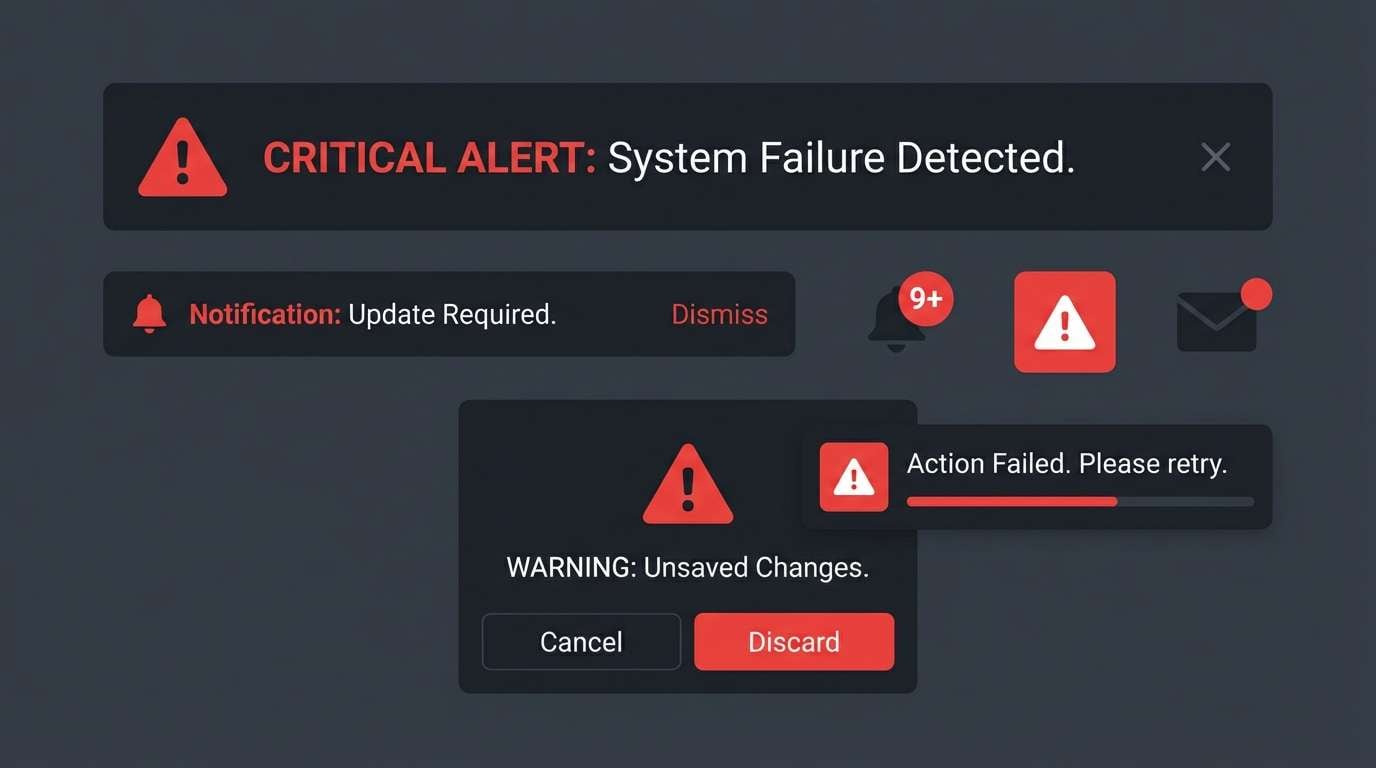
18) Signal Red Contrast
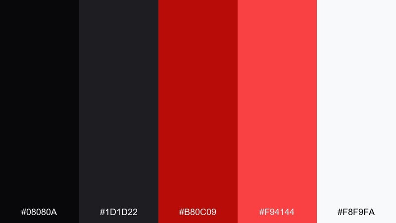
HEX: #08080A #1D1D22 #B80C09 #F94144 #F8F9FA
Mood: urgent, clear, high-contrast
Best for: warning labels and high-visibility UI states
Urgent and crystal clear, it reads like a warning light in a dark control room. These black red color combinations are ideal for alerts, critical status badges, and safety messaging. Pair with simple iconography and short copy so users can scan instantly. Tip: avoid using red for neutral links, and reserve it for true exceptions or high-priority actions.
Image example of signal red contrast generated using media.io
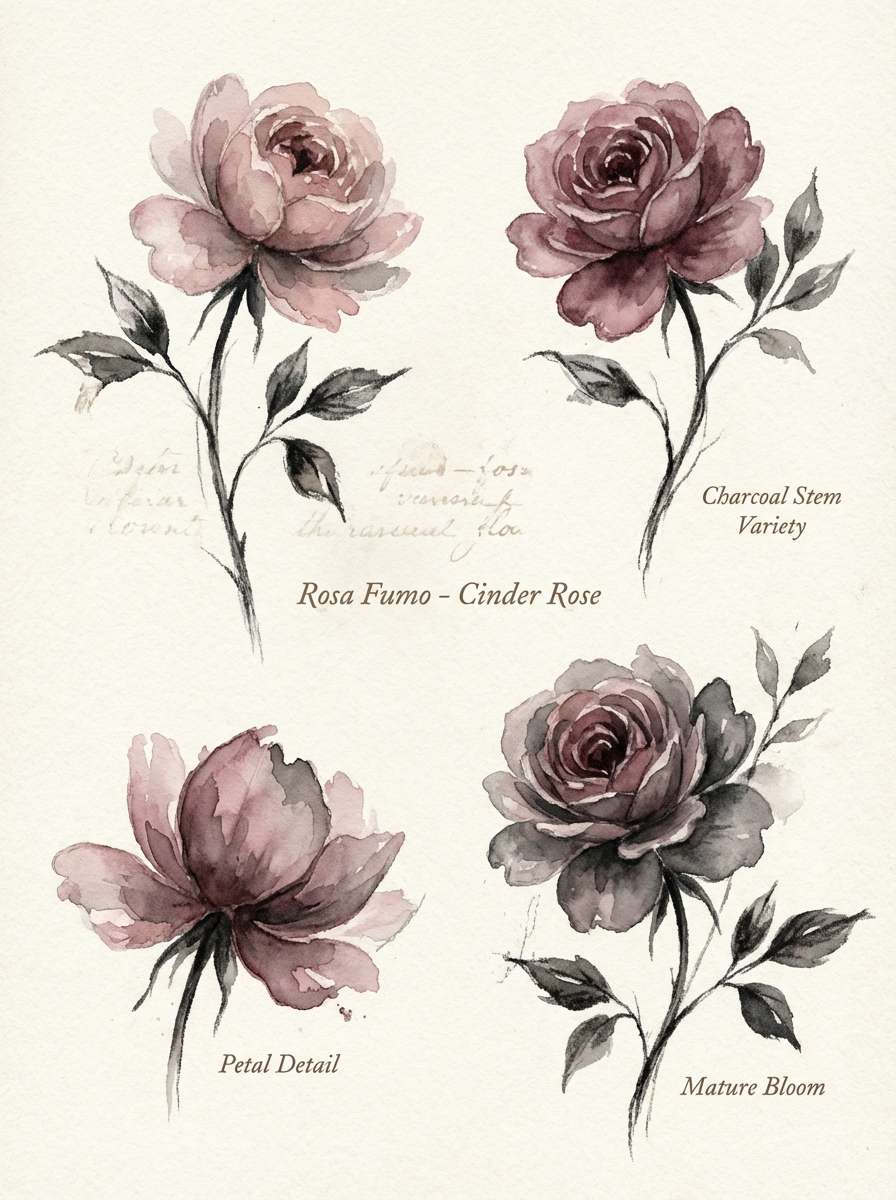
19) Cinder Rose
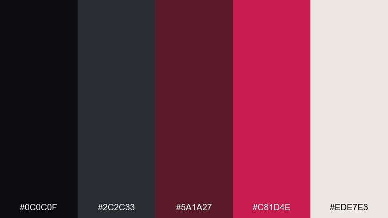
HEX: #0C0C0F #2C2C33 #5A1A27 #C81D4E #EDE7E3
Mood: soft, smoky, modern-romantic
Best for: botanical illustrations and stationery sets
Soft and smoky, it feels like rose petals scattered over warm cinders. The dusty reds suit watercolor florals, pattern borders, and gentle accent lines. Pair with textured paper backgrounds and muted greens if you want a more natural feel. Tip: keep outlines in charcoal rather than pure black for a hand-painted finish.
Image example of cinder rose generated using media.io
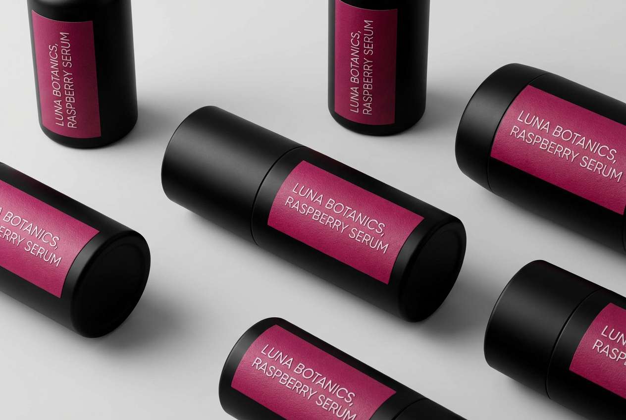
20) Blackened Raspberry
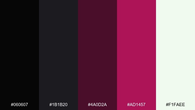
HEX: #060607 #1B1B20 #4A0D2A #AD1457 #F1FAEE
Mood: edgy, trendy, nightlife-chic
Best for: cosmetics packaging and product shots
Edgy and nightlife-chic, it brings to mind a raspberry cocktail under dim lights. The deeper magenta-red adds personality without losing the dark, premium base. For a strong black red color combination, pair matte black packaging with a glossy raspberry label for contrast. Tip: photograph on a neutral gray sweep so the red stays accurate and does not oversaturate.
Image example of blackened raspberry generated using media.io
What Colors Go Well with Black Red?
Neutrals are the easiest win: white, off-white, and light gray improve readability and help red feel intentional instead of overwhelming. Charcoal and cool grays also smooth the jump between pure black and bright red.
For a premium feel, try metallic accents (gold, copper, silver) or warm creams that mimic paper and fabric. For a modern edge, add a small dose of electric cyan/blue, or keep it minimal with only black, red, and one neutral.
If you need softer emotion (beauty, lifestyle, romance), lean into blush tones and dusty reds rather than pure primary red.
How to Use a Black Red Color Palette in Real Designs
In branding, let black carry the core identity (wordmark, background, or layout grid) and use red as a signature accent—think seals, underline strokes, or one “hero” detail. This keeps the system premium and scalable across print and digital.
In UI, reserve bright red for primary actions, active states, or critical alerts; use softer reds for secondary highlights and charts. Avoid red body text, and test contrast (especially on dark mode) to maintain accessibility.
For posters and packaging, increase impact with large negative space, tight typography hierarchy, and one dominant red focal point. A subtle texture or grain can help dark areas print cleanly and reduce banding on screens.
Create Black Red Palette Visuals with AI
If you already have HEX codes, you can turn them into quick moodboards, poster concepts, UI mockups, or packaging scenes—without starting from a blank canvas. The key is to describe the layout, lighting/style, and where red should appear (accents vs. large fields).
Use the prompts above as a baseline, then swap in your product type (app, menu, label, cover art) and specify “high contrast” or “soft charcoal” depending on the vibe you want.
Black Red Color Palette FAQs
-
Is black and red a good color combination for branding?
Yes—black adds authority and structure, while red adds energy and attention. It works especially well for luxury, entertainment, sports, and tech, as long as red is used as an accent instead of everywhere. -
How do I keep a black red palette from feeling too aggressive?
Shift red toward burgundy, rose, or dusty cranberry, and introduce a warm neutral like cream or blush. Also increase whitespace and keep the brightest red for small highlights (CTA, badges, titles). -
What background color is best with red accents: pure black or charcoal?
Charcoal is often better for screens and print because it preserves detail in dark areas and reduces harsh contrast. Pure black is great for dramatic, high-impact moments like title cards and hero sections. -
Can I use red for body text on black?
It’s usually not recommended for readability and accessibility. Use light gray/off-white for body copy, and keep red for headings, buttons, icons, and status states. -
What “third color” pairs well with black and red?
Safe options are white, cream, and gray. For a premium accent, try gold/copper; for a modern contrast, add a small amount of cool blue or cyan—used sparingly. -
Which black red palettes are best for UI design?
Try Garnet Studio, Rosewood Minimal, Redline Tech, or Signal Red Contrast—each includes supportive grays and light neutrals that help maintain hierarchy and contrast in interfaces. -
How do I choose the right red shade for packaging?
For premium goods, deeper reds (burgundy/merlot) feel richer and print beautifully on textured stocks. For fast-moving promos, brighter reds increase shelf impact—pair them with neutrals to avoid visual overload.
Next: Black Blue Color Palette


