

Dark red is one of those rare colors that can feel timeless and modern at the same time. Depending on what you pair it with, it can read luxurious, cozy, edgy, or cleanly professional.
Below are curated dark red color palette ideas (with HEX codes) you can apply to branding, UI, print, packaging, and campaign visuals—plus practical pairing tips and AI prompt examples.
In this article
- Why Dark Red Palettes Work So Well
-
- wine and walnut
- garnet noir
- velvet rosewood
- brick and bone
- cabernet and sage
- cranberry copper
- merlot and mist
- oxblood and linen
- spiced pomegranate
- ruby nightfall
- claret and olive
- burnt rose and charcoal
- cherrywood and goldleaf
- red velvet and pearl
- mahogany and denim
- scarlet ink and sand
- dark rose and ice
- burgundy citrus pop
- plum ember and slate
- hearth red and cocoa
- What Colors Go Well with Dark Red?
- How to Use a Dark Red Color Palette in Real Designs
- Create Dark Red Palette Visuals with AI
Why Dark Red Palettes Work So Well
Dark red tones (burgundy, garnet, oxblood, maroon) signal depth and intention. They’re emotionally expressive like bright red, but calmer and more premium—so they fit both classic and contemporary aesthetics.
They also deliver strong contrast options. You can pair dark red with soft neutrals for a refined editorial look, or with near-black for dramatic, high-end visuals that still feel warm instead of cold.
Finally, dark red is versatile across mediums. It prints richly on textured stock, looks sophisticated on packaging, and remains readable in UI when balanced with light surfaces and clear hierarchy.
20+ Dark Red Color Palette Ideas (with HEX Codes)
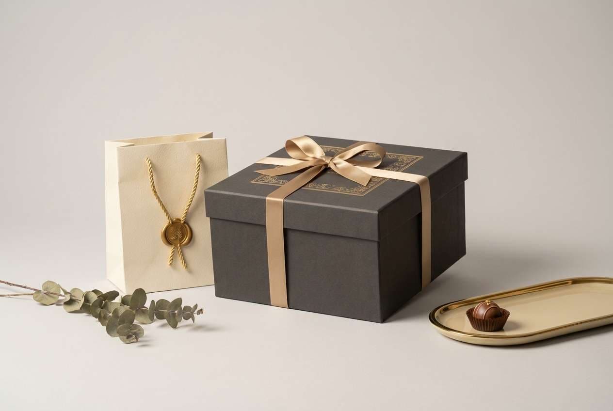
1) Wine and Walnut
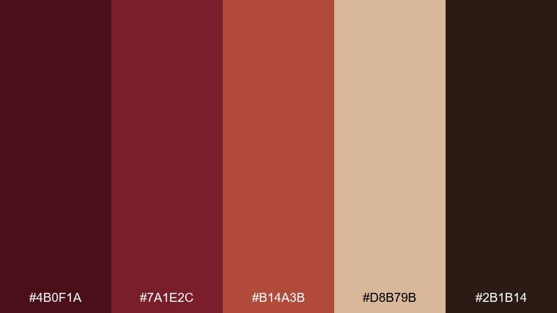
HEX: #4B0F1A #7A1E2C #B14A3B #D8B79B #2B1B14
Mood: rich, intimate, classic
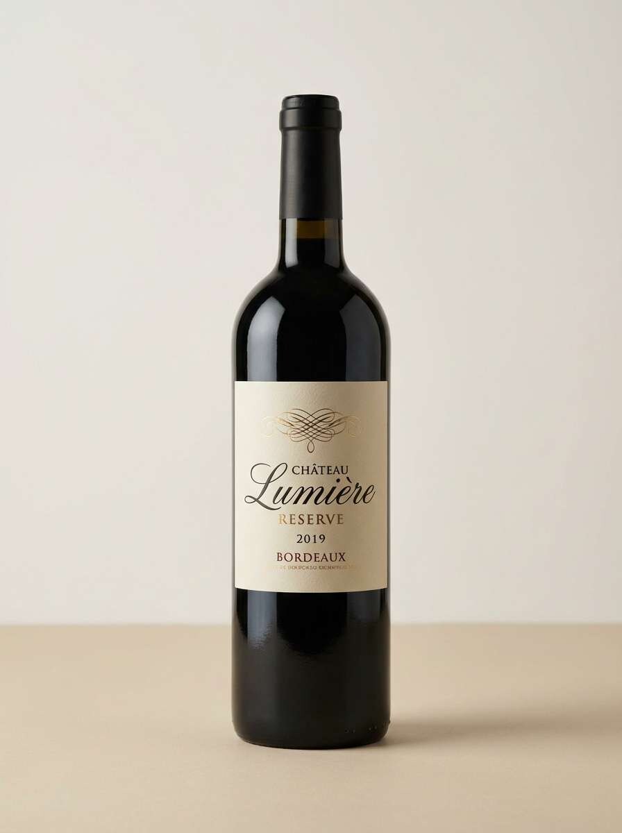
Best for: wine label and premium packaging design
Rich and intimate like candlelit dinners and aged barrels, these reds feel grounded and luxurious. Use the deep wine and walnut brown as anchors, then lift the look with warm clay and a creamy tan. It works especially well for premium labels, boutique food packaging, and heritage branding. Tip: keep typography minimal and let the darkest shade carry contrast for a more expensive finish.
Image example of wine and walnut generated using media.io
Media.io is an online AI studio for creating and editing video, image, and audio in your browser.

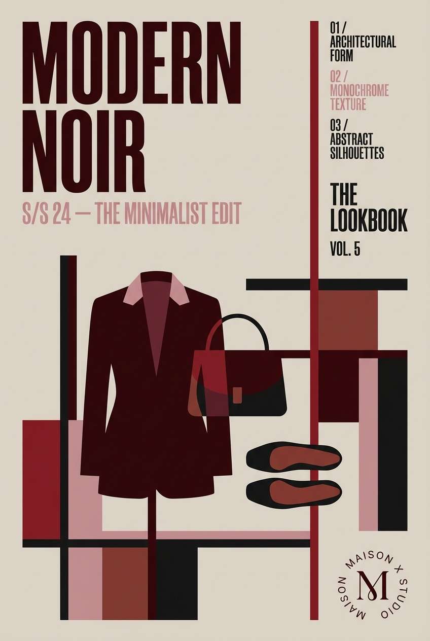
2) Garnet Noir
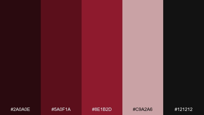
HEX: #2A0A0E #5A0F1A #8E1B2D #C9A2A6 #121212
Mood: dramatic, sleek, high-contrast
Best for: fashion branding and lookbook covers
Dramatic and sleek, it evokes velvet curtains, flash photography, and late-night galleries. Let near-black and garnet set the mood, then soften edges with dusty rose for legibility. It shines on fashion lookbooks, cosmetics branding, and cinematic campaign art. Tip: reserve the pale rose for small text blocks and spacing so the palette stays sharp rather than pastel.
Image example of garnet noir generated using media.io
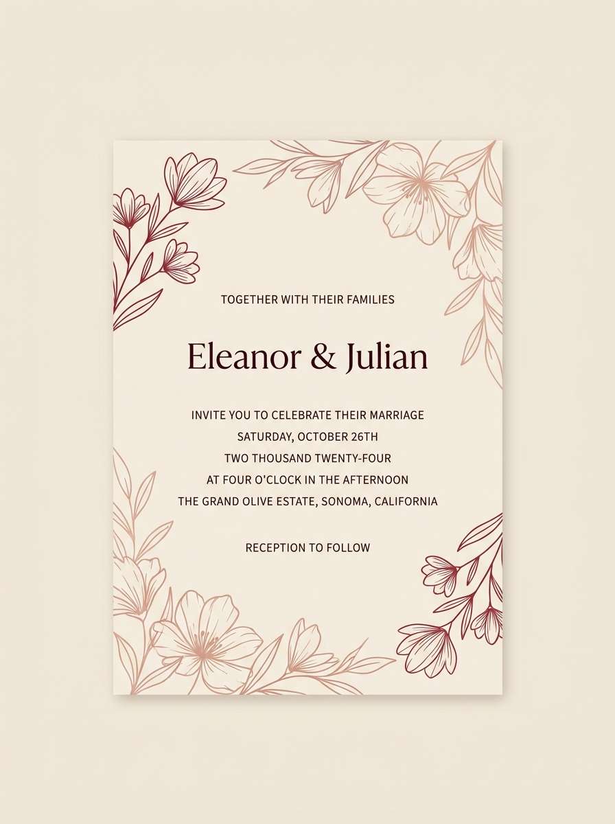
3) Velvet Rosewood
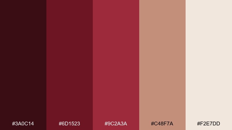
HEX: #3A0C14 #6D1523 #9C2A3A #C48F7A #F2E7DD
Mood: romantic, warm, handcrafted
Best for: wedding invitations and event stationery
Romantic and warm, it brings to mind pressed flowers, satin ribbons, and rosewood details. This dark red color palette works best when the creamy off-white is your background and the mid reds become accents. Pair it with fine serif typography, subtle emboss effects, and plenty of whitespace for a timeless invite. Tip: use the muted blush tone for floral line art so it feels delicate, not busy.
Image example of velvet rosewood generated using media.io
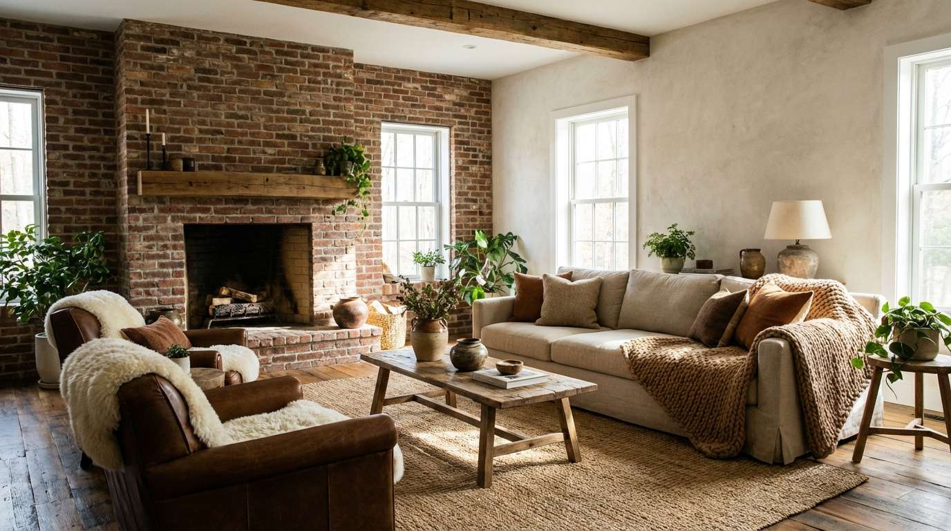
4) Brick and Bone
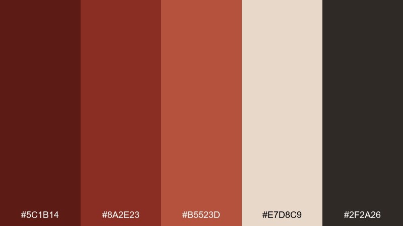
HEX: #5C1B14 #8A2E23 #B5523D #E7D8C9 #2F2A26
Mood: earthy, architectural, grounded
Best for: interior mood boards and rustic modern spaces
Earthy and architectural, it feels like sun-warmed brick, plaster walls, and iron fixtures. Build your base with bone and charcoal, then layer brick and terracotta for depth. It fits interior mood boards, café branding, and lifestyle photography presets. Tip: keep large surfaces in the light neutral and use the red tones in textiles to avoid a heavy room.
Image example of brick and bone generated using media.io
5) Cabernet and Sage
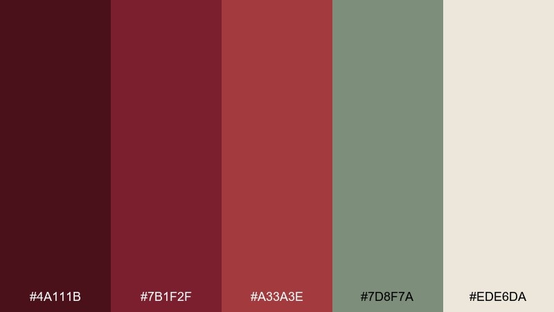
HEX: #4A111B #7B1F2F #A33A3E #7D8F7A #EDE6DA
Mood: balanced, organic, elevated
Best for: wellness brands and natural product lines
Balanced and organic, it suggests vineyard rows, herbal notes, and calm rituals. Sage gives the reds breathing room, while the creamy neutral keeps layouts clean and modern. Use it for wellness branding, natural packaging, and calm social templates where you want warmth without noise. Tip: set the sage as your supporting color for icons and dividers, and keep the deepest red for calls to action.
Image example of cabernet and sage generated using media.io
6) Cranberry Copper
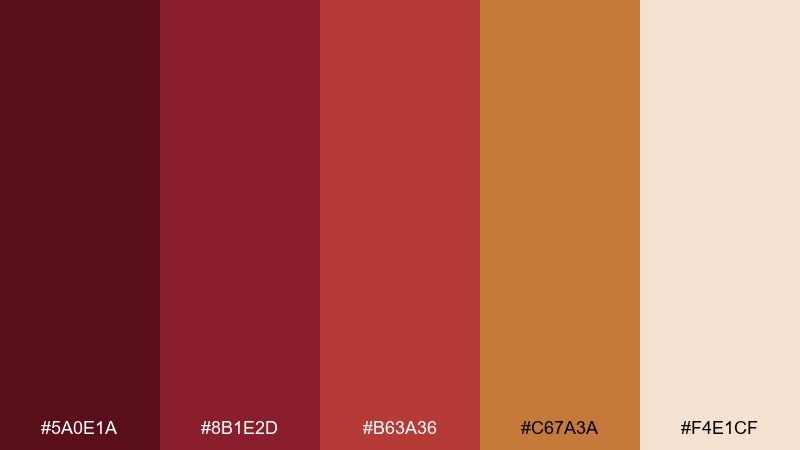
HEX: #5A0E1A #8B1E2D #B63A36 #C67A3A #F4E1CF
Mood: festive, spicy, radiant
Best for: holiday promos and seasonal product ads
Festive and spicy, it recalls mulled wine, copper foil, and bakery-window glow. These dark red color combinations get extra energy from the copper orange, especially on a soft cream base. Try it for seasonal product ads, gift guides, or limited-edition packaging where warmth sells the story. Tip: mimic metallics by using the copper as a gradient highlight rather than a flat fill.
Image example of cranberry copper generated using media.io
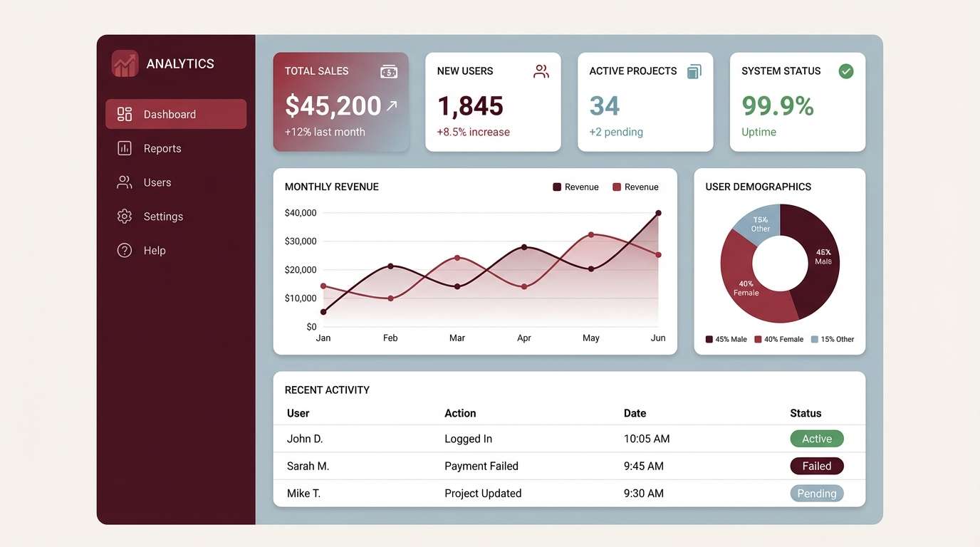
7) Merlot and Mist
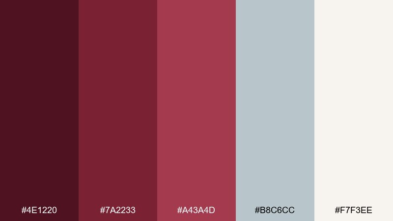
HEX: #4E1220 #7A2233 #A43A4D #B8C6CC #F7F3EE
Mood: modern, airy, confident
Best for: SaaS landing pages and dashboard UI
Modern and airy, it feels like a cool morning fog against a bold merlot coat. The misty blue-gray makes the reds look sharper and more contemporary for digital screens. Use it for SaaS landing pages, analytics dashboards, and product UI where you want warmth without looking heavy. Tip: keep primary surfaces light, then assign the darkest red to primary buttons to maintain clear hierarchy.
Image example of merlot and mist generated using media.io
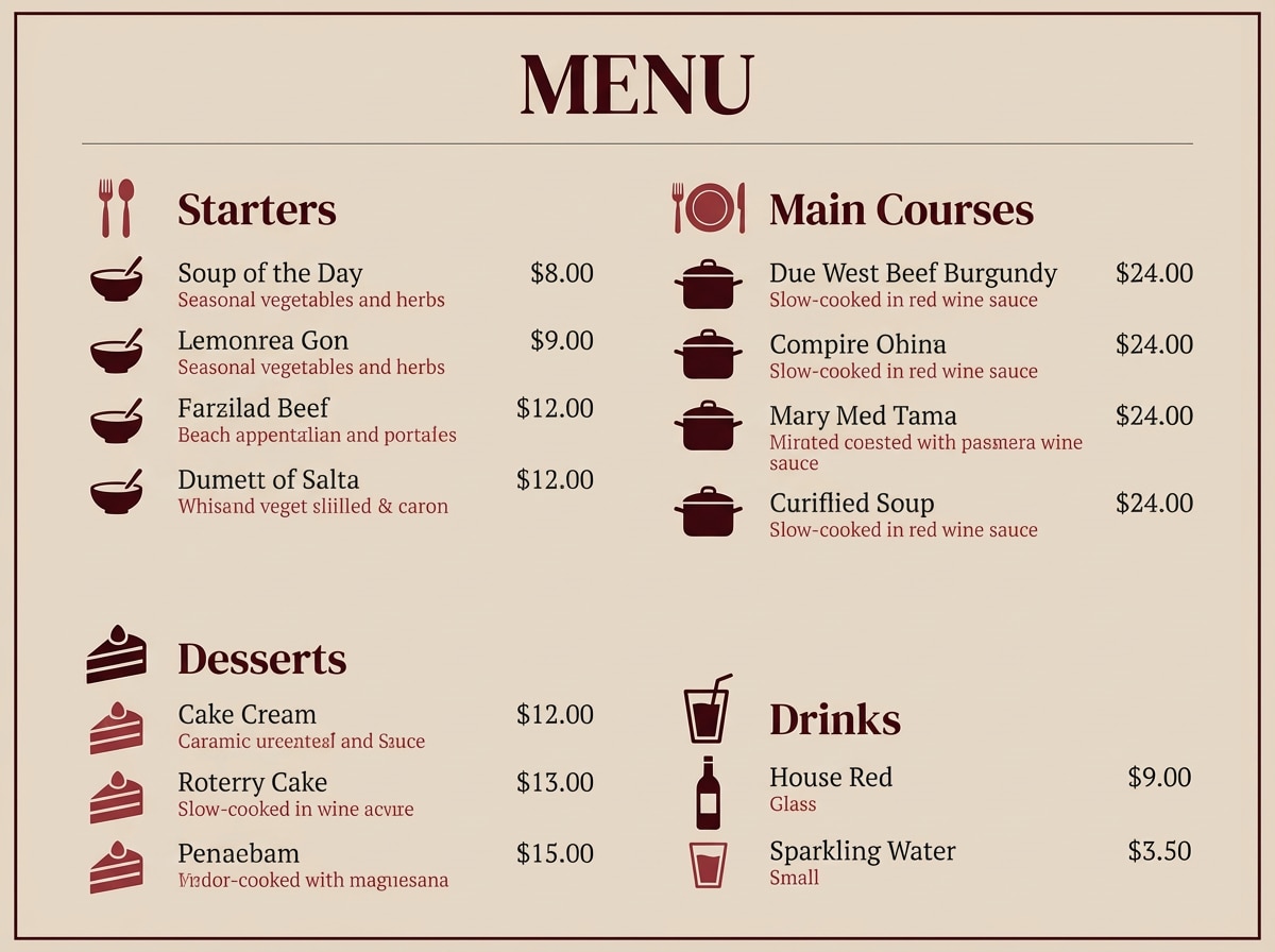
8) Oxblood and Linen
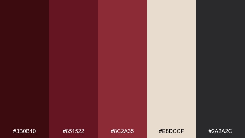
HEX: #3B0B10 #651522 #8C2A35 #E8DCCF #2A2A2C
Mood: heritage, tactile, understated
Best for: restaurant menus and craft food brands
Heritage and tactile, it evokes worn leather covers and linen napkins in a quiet bistro. As a dark red color scheme, it reads confident without needing bright accents. Use linen as the menu background, then set headings in oxblood and body text in charcoal for easy readability. Tip: add small border rules and icon accents in the mid red to guide the eye without clutter.
Image example of oxblood and linen generated using media.io
9) Spiced Pomegranate
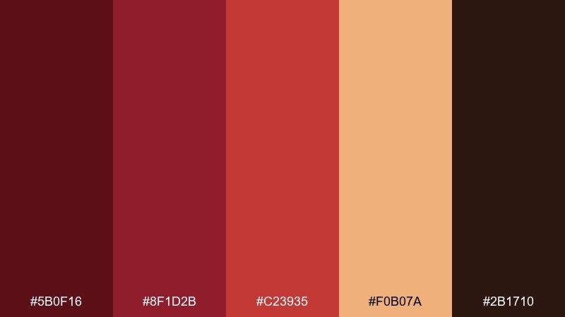
HEX: #5B0F16 #8F1D2B #C23935 #F0B07A #2B1710
Mood: bold, appetizing, energetic
Best for: food posters and social media promos
Bold and appetizing, it feels like pomegranate seeds, spice markets, and smoky roasted flavors. The peachy accent adds a fresh highlight that keeps the reds from turning too formal. It works great for food posters, restaurant promos, and social posts that need instant warmth. Tip: use the peach tone for price tags or promo bursts so calls to action pop without neon.
Image example of spiced pomegranate generated using media.io

10) Ruby Nightfall
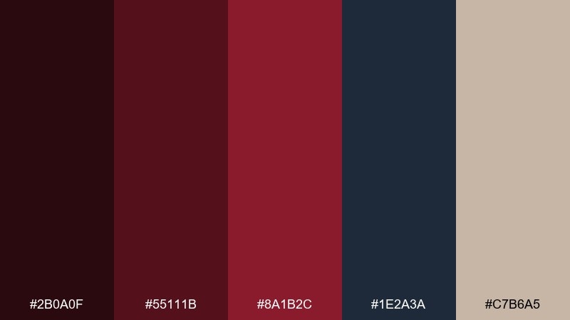
HEX: #2B0A0F #55111B #8A1B2C #1E2A3A #C7B6A5
Mood: mysterious, luxe, cinematic
Best for: album covers and entertainment branding
Mysterious and cinematic, it suggests midnight streets, velvet seats, and a ruby spotlight. The deep navy adds a modern twist that keeps the reds from leaning vintage. Use it for album covers, film branding, or dramatic hero sections with minimal text. Tip: place the beige as a small highlight for credits or secondary info so it stays readable against the dark base.
Image example of ruby nightfall generated using media.io
11) Claret and Olive
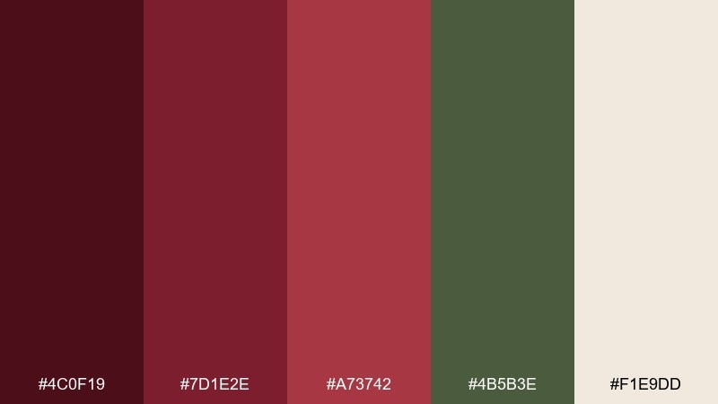
HEX: #4C0F19 #7D1E2E #A73742 #4B5B3E #F1E9DD
Mood: classic, earthy, sophisticated
Best for: boutique hotels and hospitality branding
Classic and earthy, it brings to mind old libraries, olive groves, and brass door plaques. Olive green steadies the reds and makes the whole set feel more lived-in and premium. Use it for boutique hotel identities, restaurant signage, and elegant loyalty materials. Tip: keep the olive for background panels and reserve claret for logos and key navigation elements.
Image example of claret and olive generated using media.io
12) Burnt Rose and Charcoal
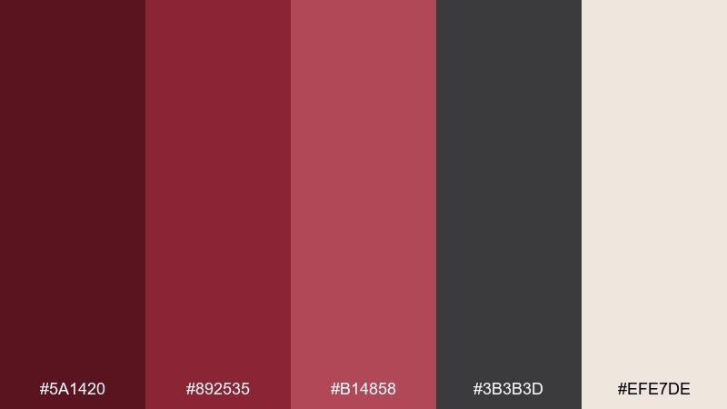
HEX: #5A1420 #892535 #B14858 #3B3B3D #EFE7DE
Mood: editorial, refined, softly bold
Best for: magazine layouts and lifestyle blogs
Editorial and refined, it feels like matte lipstick, textured paper, and quiet confidence. Charcoal keeps type crisp while burnt rose brings personality to headlines and pull quotes. It suits magazine layouts, lifestyle blogs, and portfolio sites that want grown-up warmth. Tip: use the pale neutral for margins and negative space so the darker tones never crowd the page.
Image example of burnt rose and charcoal generated using media.io
13) Cherrywood and Goldleaf
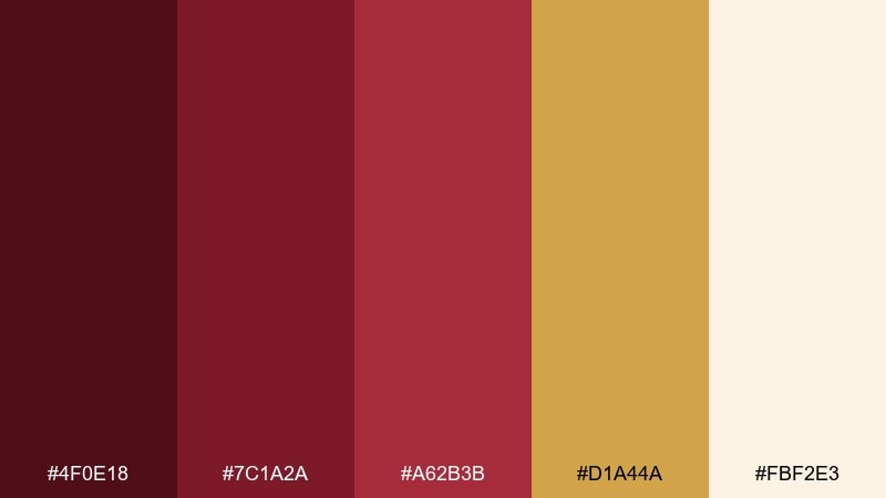
HEX: #4F0E18 #7C1A2A #A62B3B #D1A44A #FBF2E3
Mood: opulent, celebratory, polished
Best for: luxury product tags and gift packaging
Opulent and celebratory, it evokes gilded edges, cherrywood cabinets, and warm spotlighting. The gold tone adds instant prestige when you keep it restrained as a trim or seal. Use it for luxury product tags, gift packaging, and premium membership cards. Tip: set gold accents at small scale and let the darkest red do the heavy lifting for contrast.
Image example of cherrywood and goldleaf generated using media.io
14) Red Velvet and Pearl
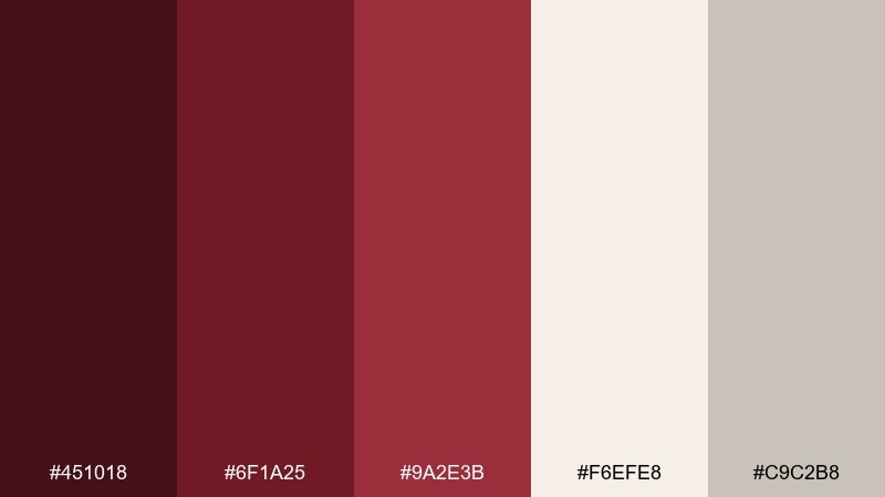
HEX: #451018 #6F1A25 #9A2E3B #F6EFE8 #C9C2B8
Mood: soft, elegant, romantic
Best for: beauty branding and feminine UI themes
Soft and elegant, it feels like pearl earrings against a red velvet dress. This dark red color palette is ideal when you want depth without harsh contrast, thanks to the gentle neutrals. Use it for beauty branding, feminine UI themes, and premium email templates with lots of white space. Tip: keep the mid red for hover states and highlights, and avoid using the darkest shade for long paragraphs.
Image example of red velvet and pearl generated using media.io
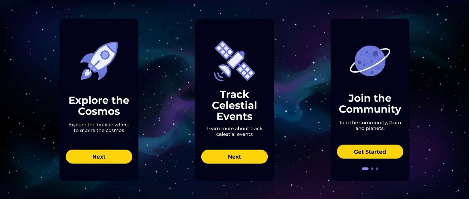
15) Mahogany and Denim
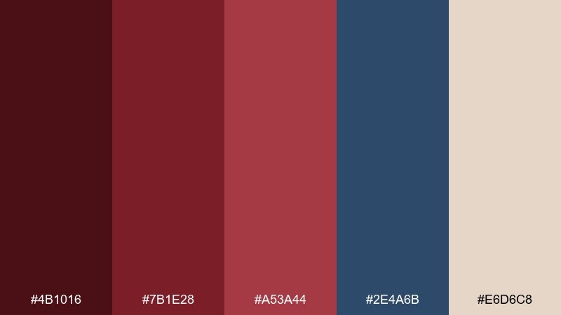
HEX: #4B1016 #7B1E28 #A53A44 #2E4A6B #E6D6C8
Mood: confident, modern, approachable
Best for: tech branding and app onboarding screens
Confident and modern, it combines mahogany warmth with the reliability of denim blue. The blue cools the reds just enough to feel tech-forward rather than traditional. Use it for app onboarding, tech branding, or presentation decks that need authority and friendliness. Tip: assign denim to secondary buttons and links, and keep the deepest red for primary actions.
Image example of mahogany and denim generated using media.io
16) Scarlet Ink and Sand
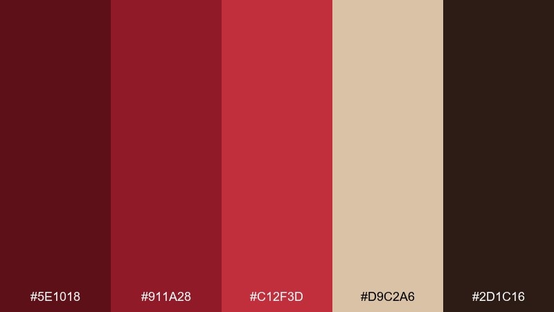
HEX: #5E1018 #911A28 #C12F3D #D9C2A6 #2D1C16
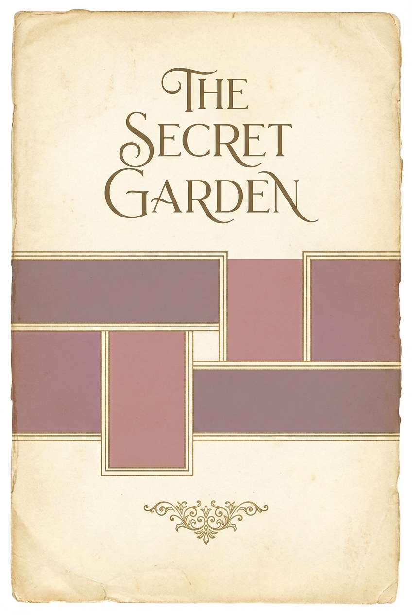
Mood: vintage, warm, story-driven
Best for: book covers and editorial posters
Vintage and story-driven, it suggests ink on parchment and sun-faded travel posters. Sand keeps the reds readable and adds a tactile, printed feel. Use it for book covers, editorial posters, or literary event branding that needs warmth and weight. Tip: try a slightly textured background in the sand tone to enhance the old-print vibe without hurting legibility.
Image example of scarlet ink and sand generated using media.io
17) Dark Rose and Ice
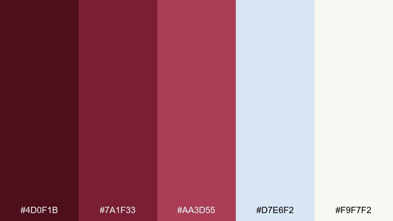
HEX: #4D0F1B #7A1F33 #AA3D55 #D7E6F2 #F9F7F2
Mood: fresh, romantic, wintery
Best for: holiday cards and winter campaign creatives
Fresh and wintery, it looks like dark roses against pale ice and snow. The icy blue gives the reds a crisp edge that feels seasonal without going full holiday cliché. Use it for holiday cards, winter campaigns, or social templates that need warmth and clarity. Tip: keep the pale tones dominant and use the darkest red only for the headline and key accents.
Image example of dark rose and ice generated using media.io
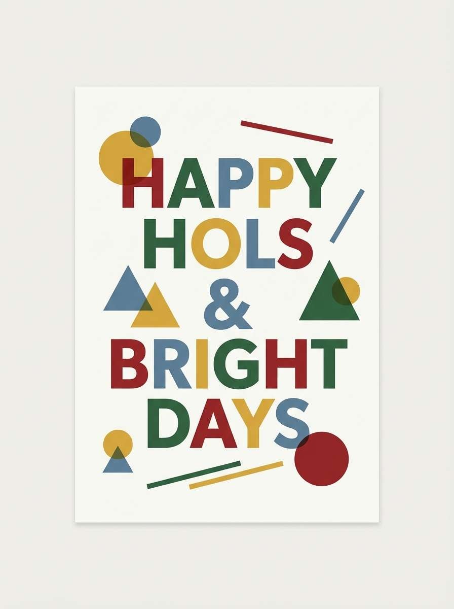
18) Burgundy Citrus Pop
HEX: #4A0E18 #771A2A #9F2E3D #F2A900 #FFF1D6
Mood: playful, punchy, modern
Best for: sports posters and energetic brand campaigns
Playful and punchy, it feels like stadium lights and a bright citrus twist. The yellow-orange accent creates a bold dark red color combination that reads energetic and youthful. Use it for sports posters, streetwear drops, or campaign graphics that need instant impact. Tip: keep the citrus tone for small bursts and badges so it stays exciting instead of overwhelming.
Image example of burgundy citrus pop generated using media.io
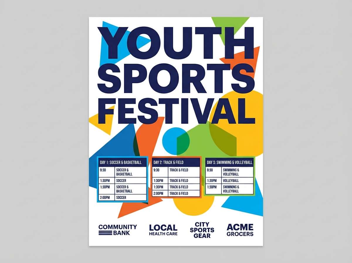
19) Plum Ember and Slate
HEX: #3C0B16 #611327 #8D2642 #5B6670 #E9E2DA
Mood: moody, intellectual, contemporary
Best for: finance UI and data-heavy dashboards
Moody and intellectual, it brings to mind plum ink, slate tiles, and quiet focus. Slate gray keeps the reds professional and helps charts and tables feel calmer. It is a strong fit for finance UI, analytics tools, and B2B branding where trust matters. Tip: apply slate to backgrounds and separators, then use ember red sparingly for alerts and key metrics.
Image example of plum ember and slate generated using media.io
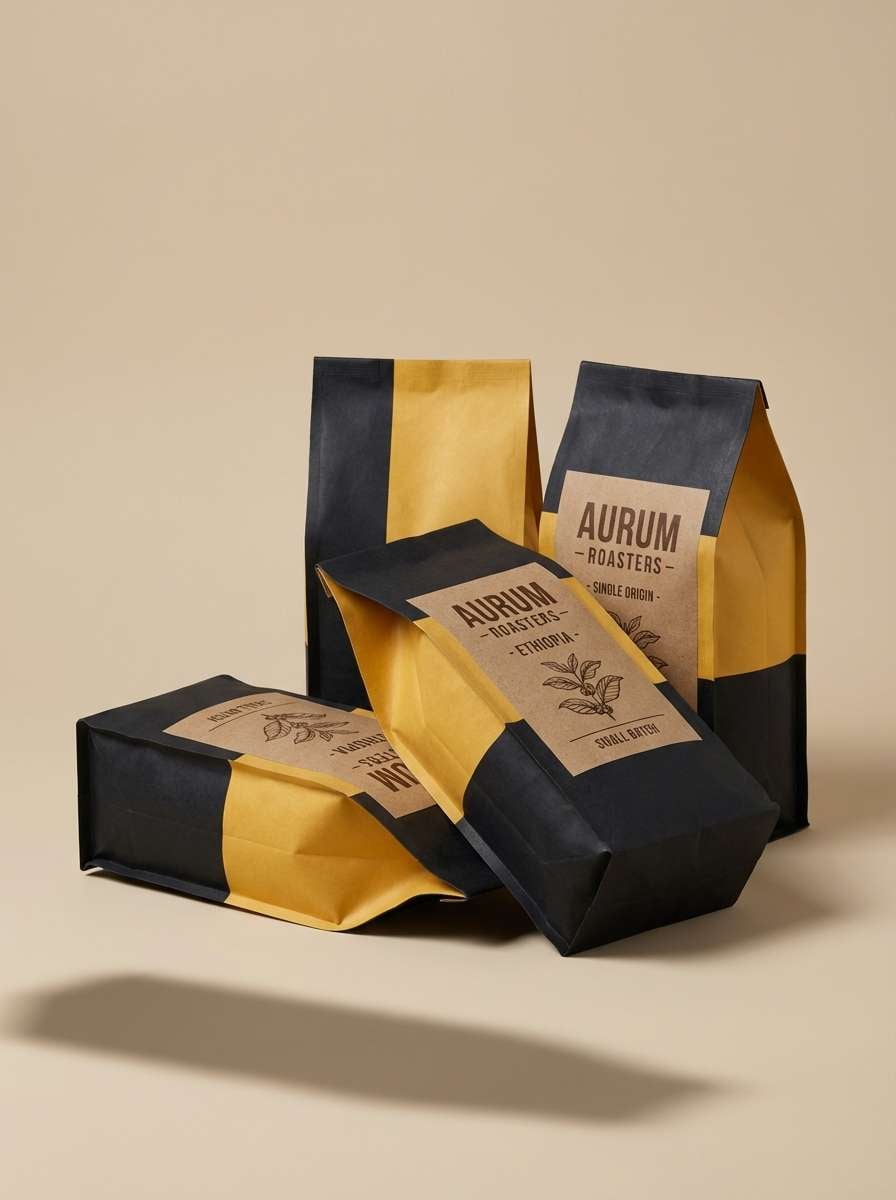
20) Hearth Red and Cocoa
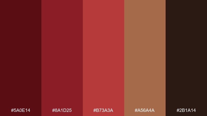
HEX: #5A0E14 #8A1D25 #B73A3A #A56A4A #2B1A14
Mood: cozy, rustic, comforting
Best for: coffee packaging and café branding
Cozy and rustic, it feels like a winter hearth, cocoa powder, and worn wood. The brown notes make the reds friendlier and more edible, perfect for small-batch products. Use it for coffee packaging, café menus, or craft labels where warmth is part of the brand promise. Tip: print the darkest shade as your main ink and use the lighter cocoa for secondary panels to keep costs and contrast in check.
Image example of hearth red and cocoa generated using media.io
What Colors Go Well with Dark Red?
Neutrals are the easiest win: ivory, cream, linen, warm beige, and charcoal make dark red look expensive and intentional. If you want a sharper, more modern feel, move toward cool light grays and blue-grays.
For elevated contrast, pair dark red with near-black, deep navy, or slate. For warmth and “heritage” character, add cocoa browns, walnut, sand, and olive greens.
Metallic-like accents also work beautifully: gold (luxury), copper (festive warmth), and brass (vintage hospitality). Use these as small highlights—borders, icons, seals—so the palette stays refined.
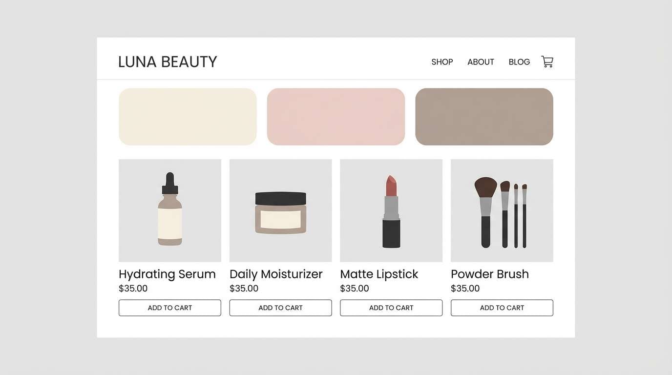
How to Use a Dark Red Color Palette in Real Designs
Start with role assignment: pick one dark red as your primary brand anchor (logo, headline, primary button), then choose a light neutral for the main background. This keeps layouts readable and prevents the reds from feeling too heavy.
For UI, reserve the deepest shade for high-emphasis actions and key states (primary CTA, selected tab) and use mid reds for hover/active accents. If charts are involved, keep red for “alerts” only and rely on slate/blue-gray for structure.
For print and packaging, dark red looks best when you lean into texture: uncoated paper, emboss/deboss, subtle grain, or soft gradients. Keep typography clean and let negative space do the premium work.
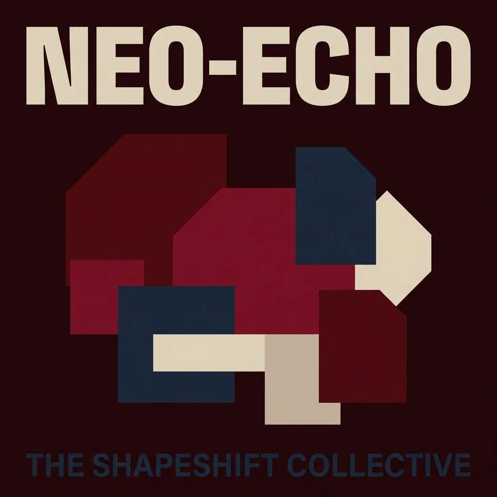
Create Dark Red Palette Visuals with AI
If you want to see how a dark red color scheme behaves in real compositions (labels, UI, posters, cards), generating quick mock visuals is often faster than guessing from swatches alone.
With Media.io’s text-to-image tool, you can paste a prompt (like the examples above), iterate lighting and composition, and keep your palette direction consistent across concepts.
Once you like a direction, create a few variants (more neutral, more contrast, one accent shift) to compare before committing to a final brand or campaign system.
Dark Red Color Palette FAQs
-
What is considered a “dark red” color?
Dark red typically refers to deep, low-lightness reds such as burgundy, maroon, garnet, claret, and oxblood. These shades often have added black, brown, or purple undertones that make them feel richer and less bright than pure red. -
Is burgundy the same as maroon?
They’re close but not identical. Burgundy usually leans wine-like with cooler or purple undertones, while maroon often feels warmer with more brown undertone. Both work well in dark red palettes, but they set slightly different moods. -
What neutral colors pair best with dark red?
Cream, ivory, linen, warm beige, and charcoal are the most reliable. For a more modern digital look, use light gray or blue-gray; for a more heritage feel, use sand and cocoa browns. -
What’s the best accent color for dark red branding?
Gold or brass accents suggest luxury; copper/orange adds energy and seasonal warmth; sage/olive adds an organic, premium calm; and navy adds a sleek, cinematic contrast. Keep accents small so the palette doesn’t become noisy. -
How do I keep dark red readable in UI design?
Use a light neutral for primary surfaces, assign the deepest red to primary buttons only, and keep body text in charcoal or near-black. For accessibility, check contrast ratios and avoid placing saturated red text on dark backgrounds. -
Does dark red print well?
Yes—dark red often prints beautifully, especially on uncoated or textured stocks where it feels tactile and premium. Do a proof when possible, because deep reds can shift depending on paper warmth and ink saturation. -
How can I quickly preview dark red palettes in real scenes?
Generate mock visuals (packaging, posters, UI screens) with an AI image tool using consistent prompts and lighting. This helps you validate contrast, mood, and how the palette behaves at scale before final design production.


