

A gray white color palette is the fastest way to make designs feel clean, modern, and intentional. It gives you contrast, hierarchy, and breathing room without fighting your content.
Below are 20 gray and white palette combinations (with HEX codes) you can use for UI, branding, print, and interiors—plus example prompts you can recreate with Media.io.
In this article
Why Gray White Palettes Work So Well
Gray white color combinations are naturally flexible: they can look warm (creamy whites + taupe grays) or cool (blue-leaning grays + crisp whites) while staying minimal and readable.
They also create reliable hierarchy. With just a few steps from white to charcoal, you can separate sections, build depth in cards, and guide attention to buttons or headlines without adding visual noise.
Most importantly, neutral tones make your content the hero—photos, products, typography, and data visualizations tend to look more premium when the palette isn’t competing for attention.
20+ Gray White Color Palette Ideas (with HEX Codes)
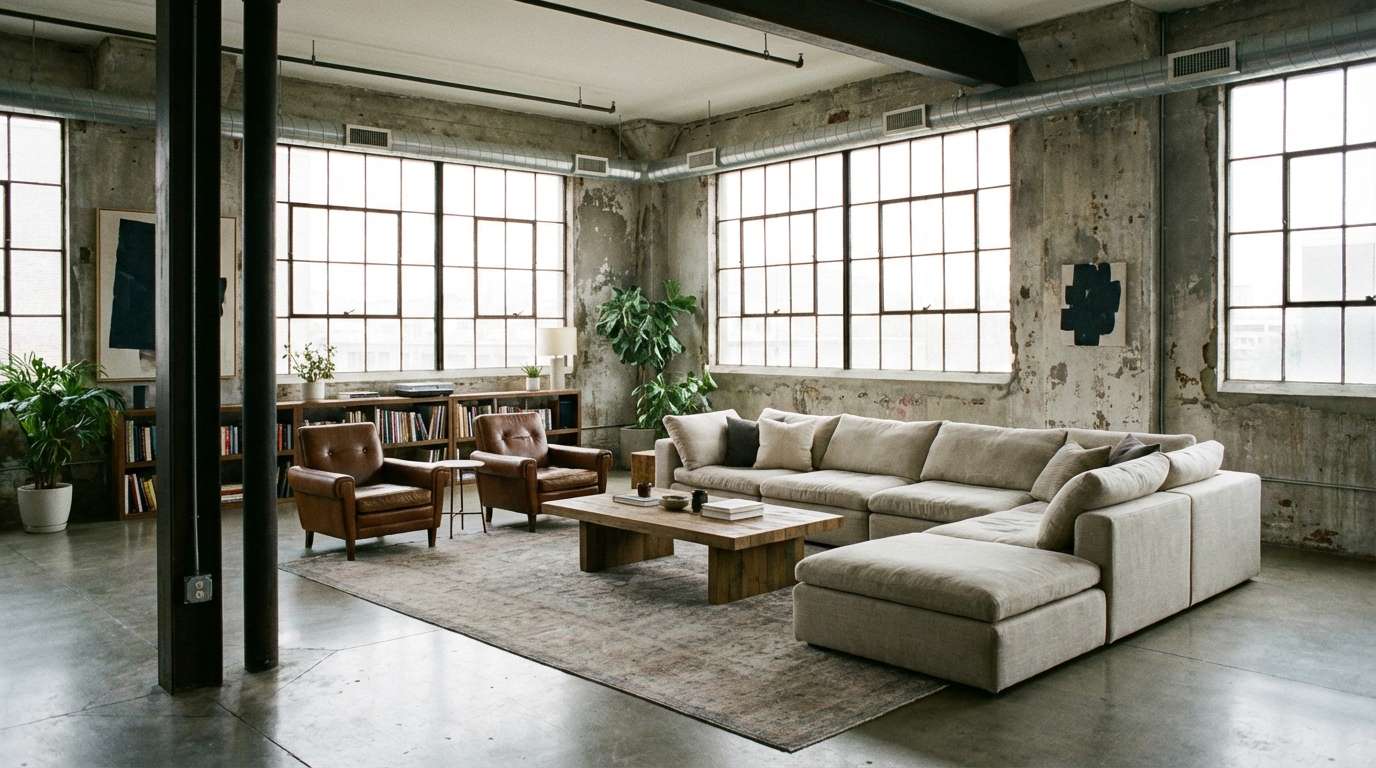
1) Frosted Concrete
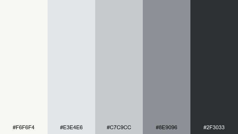
HEX: #f6f6f4 #e3e4e6 #c7c9cc #8e9096 #2f3033
Mood: cool, grounded, architectural
Best for: industrial loft interiors
Cool and architectural, these tones feel like polished concrete under winter light. They work beautifully on large surfaces like walls, cabinetry, and built-ins where subtle contrast matters. Pair with matte black hardware, brushed steel, or warm oak to keep it from feeling sterile. Usage tip: put the darkest charcoal on trim or window frames to sharpen the space without overpowering it.
Image example of frosted concrete generated using media.io
Media.io is an online AI studio for creating and editing video, image, and audio in your browser.

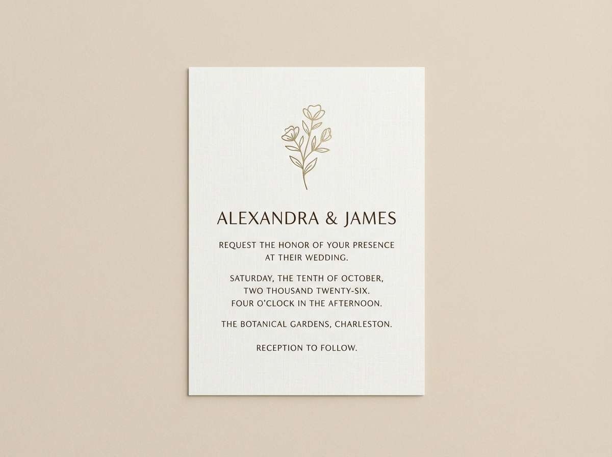
2) Winter Linen
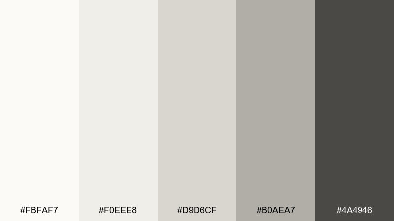
HEX: #fbfaf7 #f0eee8 #d9d6cf #b0aea7 #4a4946
Mood: warm, calm, intimate
Best for: wedding invitations
Warm and calming, it reads like linen fabric, vellum paper, and soft candlelight. The creamy whites keep typography elegant, while the deeper gray adds just enough structure for names and dates. Pair with gold foil, blush accents, or pressed-flower illustrations for a romantic finish. Usage tip: keep the background off-white and reserve the darkest tone for headings to maintain print clarity.
Image example of winter linen generated using media.io
3) Graphite Mist
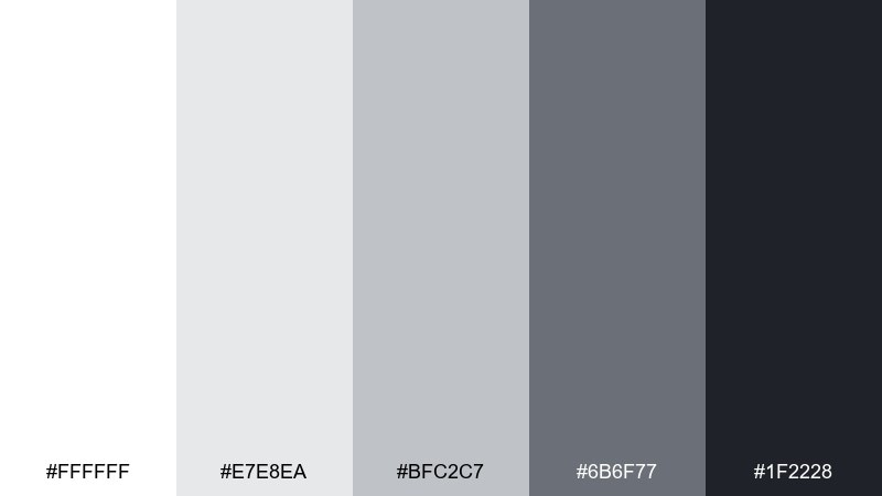
HEX: #ffffff #e7e8ea #bfc2c7 #6b6f77 #1f2228
Mood: sleek, modern, focused
Best for: dark-mode app UI
Sleek and focused, the range feels like fog rolling over graphite, with crisp highlights that keep things readable. It suits dark-mode interfaces where hierarchy depends on subtle steps rather than loud color. Pair with one electric accent like cyan or lime for active states and notifications. Usage tip: use the near-black for the main canvas and the mid-gray for cards to avoid muddy contrast.
Image example of graphite mist generated using media.io
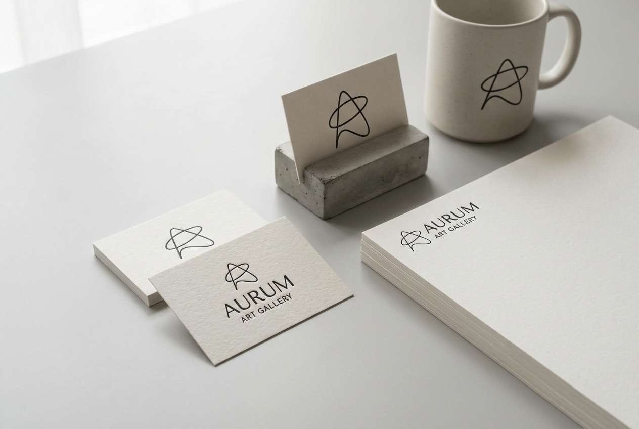
4) Gallery Walls
HEX: #f8f8f8 #ededed #cfcfcf #9a9a9a #2a2a2a
Mood: clean, curated, minimalist
Best for: art gallery branding
Clean and curated, it evokes white walls, soft track lighting, and quiet negative space around artwork. This gray white color palette is ideal for brands that need the content to lead while still feeling premium. Pair with a single bold signature color for exhibition highlights or event tags. Usage tip: keep logos in charcoal and let light grays handle backgrounds so prints stay crisp.
Image example of gallery walls generated using media.io
5) Steel & Snow
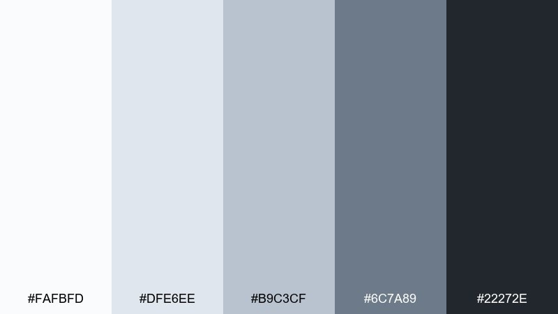
HEX: #fafbfd #dfe6ee #b9c3cf #6c7a89 #22272e
Mood: crisp, tech-forward, airy
Best for: tech product landing pages
Crisp and tech-forward, these cool grays feel like snow glare against brushed steel. The tones create depth for sections and cards without heavy borders, which is perfect for modern web layouts. Gray white color combinations like this pair well with cobalt, teal, or neon green CTAs for instant focus. Usage tip: use the lightest tint for hero space and bring in the slate-gray for navigation to anchor the page.
Image example of steel & snow generated using media.io
6) Pearl Charcoal
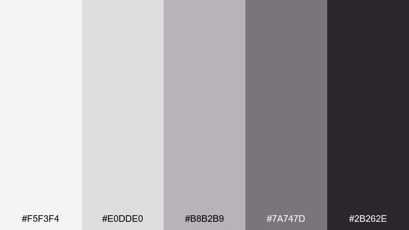
HEX: #f5f3f4 #e0dde0 #b8b2b9 #7a747d #2b262e
Mood: soft, luxe, sophisticated
Best for: beauty packaging
Soft and luxe, the palette reads like pearl powder and smoky charcoal in a vanity mirror. It works well for cosmetics where subtle contrast signals quality and restraint. Pair with rose-gold foil, glossy black caps, or a muted mauve accent for a modern boutique feel. Usage tip: keep copy in the darkest shade and use the mid-tones for secondary panels so labels stay legible under glare.
Image example of pearl charcoal generated using media.io
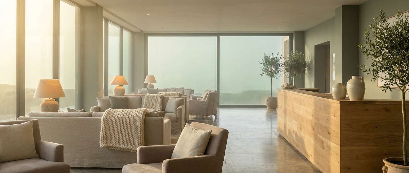
7) Foggy Harbor
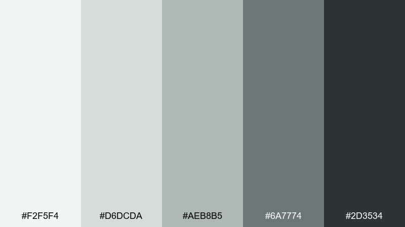
HEX: #f2f5f4 #d6dcda #aeb8b5 #6a7774 #2d3534
Mood: misty, coastal, relaxed
Best for: coastal hotel lobbies
Misty and relaxed, it brings to mind sea fog, driftwood, and slate stone near the shoreline. The green-gray notes keep the neutrals from feeling flat, especially in open public spaces. Pair with sand beige, weathered wood, and warm brass for a welcoming coastal vibe. Usage tip: use the darkest tone in wayfinding signage so it stays readable against pale walls.
Image example of foggy harbor generated using media.io
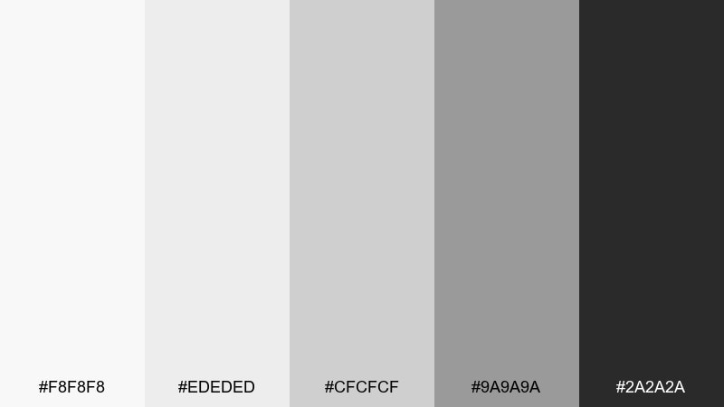
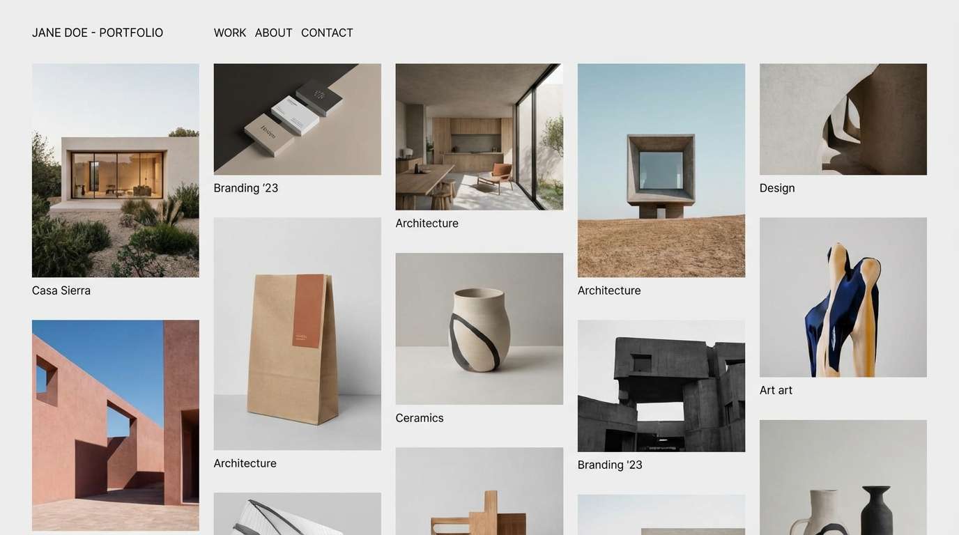
8) Monochrome Studio
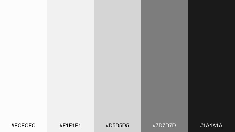
HEX: #fcfcfc #f1f1f1 #d5d5d5 #7d7d7d #1a1a1a
Mood: sharp, editorial, timeless
Best for: portfolio websites
Sharp and timeless, it feels like a bright studio with black flags and clean paper backdrops. The strong endpoints make typography and imagery look intentional, even with minimal styling. Pair with one accent color for hover states and project tags, but keep it restrained. Usage tip: set body text in deep gray rather than pure black to reduce glare on white sections.
Image example of monochrome studio generated using media.io
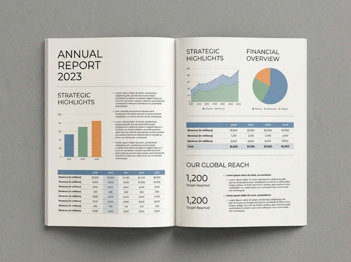
9) Soft Slate
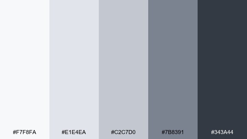
HEX: #f7f8fa #e1e4ea #c2c7d0 #7b8391 #343a44
Mood: professional, calm, dependable
Best for: corporate reports
Professional and calm, these blue-leaning grays suggest polished slides, tidy tables, and trustworthy data. They are excellent for reports where charts need separation without harsh lines. Pair with a restrained accent like navy or emerald for key metrics and callouts. Usage tip: use the palest tint for page backgrounds and reserve the slate for headings to keep long documents easy to scan.
Image example of soft slate generated using media.io
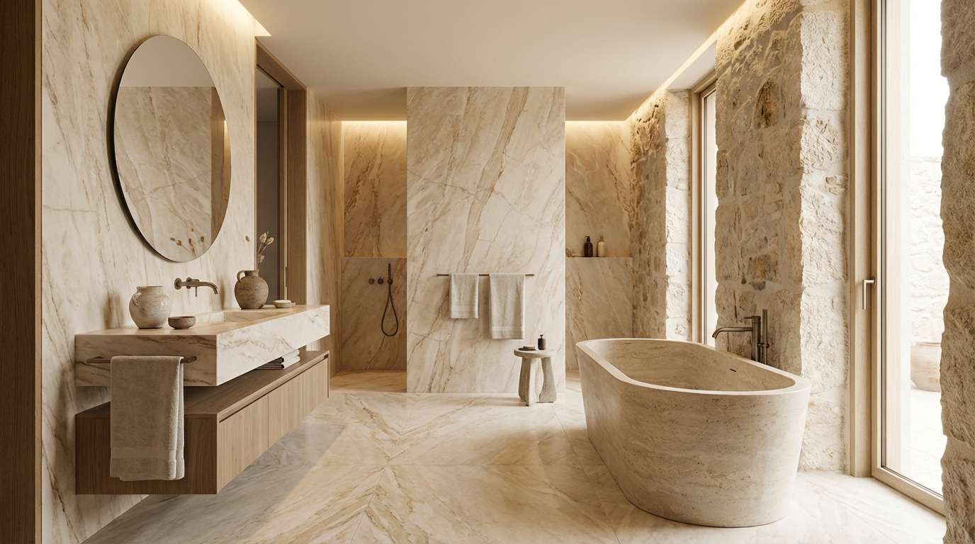
10) Marble Ledger
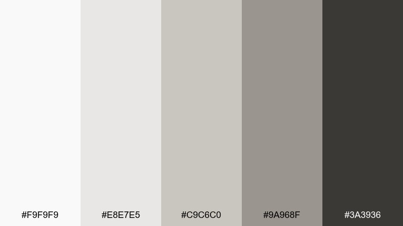
HEX: #f9f9f9 #e8e7e5 #c9c6c0 #9a968f #3a3936
Mood: elegant, quiet, refined
Best for: luxury bathroom design
Elegant and quiet, it recalls marble veining, limestone tile, and soft hotel lighting. The warm grays keep the space feeling spa-like rather than clinical. Pair with champagne metal finishes, creamy towels, and pale wood for a relaxed luxury look. Usage tip: echo the mid-tone gray in grout or stone details to make the whole room feel cohesive.
Image example of marble ledger generated using media.io
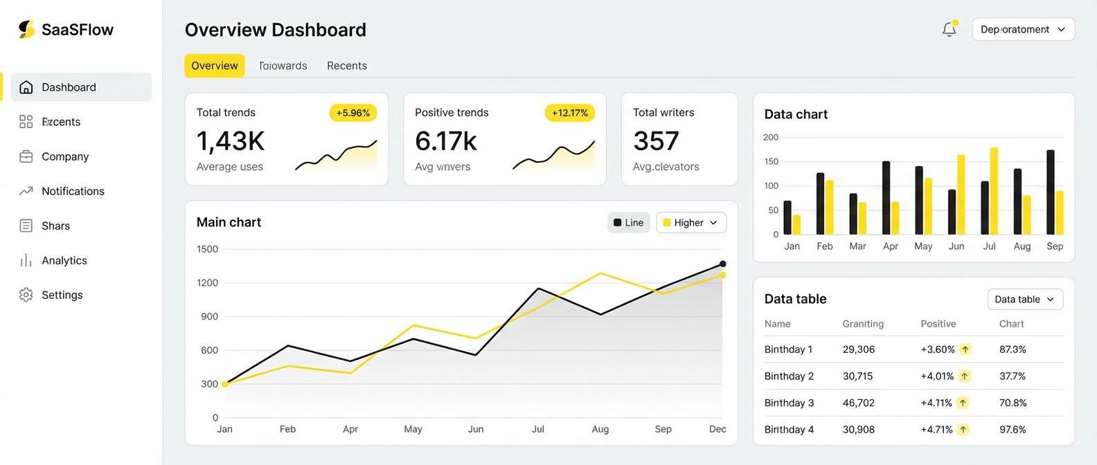
11) Cloud Office
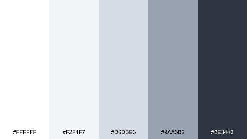
HEX: #ffffff #f2f4f7 #d6dbe3 #9aa3b2 #2e3440
Mood: clear, airy, productive
Best for: SaaS dashboards
Clear and airy, it feels like daylight through big windows in a quiet office. This gray white color scheme is built for dashboards that need calm surfaces and unmistakable hierarchy. Pair with a single brand color for primary buttons and use subtle tints for states and alerts. Usage tip: keep grid lines extremely light and rely on spacing plus the mid-gray for structure.
Image example of cloud office generated using media.io
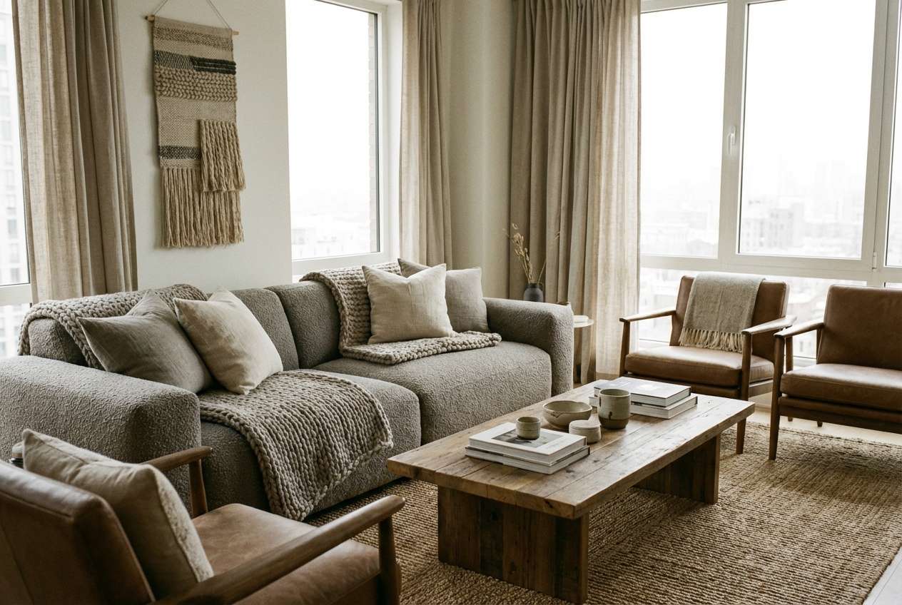
12) Quiet Loft
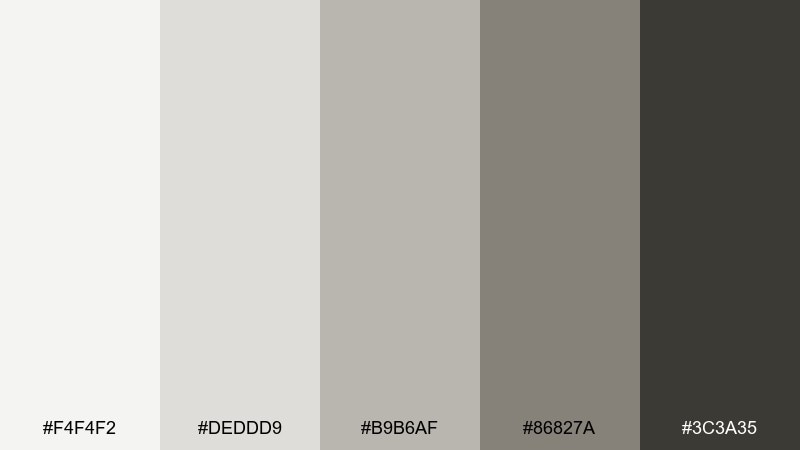
HEX: #f4f4f2 #deddd9 #b9b6af #86827a #3c3a35
Mood: cozy, modern, lived-in
Best for: modern apartment staging
Cozy and lived-in, these warm neutrals evoke wool throws, natural paper, and soft shadows. They are ideal for staging because they flatter wood floors and make spaces photograph well. Pair with terracotta ceramics, olive plants, and textured textiles to add warmth. Usage tip: use the darkest shade sparingly in frames and lighting so the room stays bright.
Image example of quiet loft generated using media.io
13) Snowcap Branding
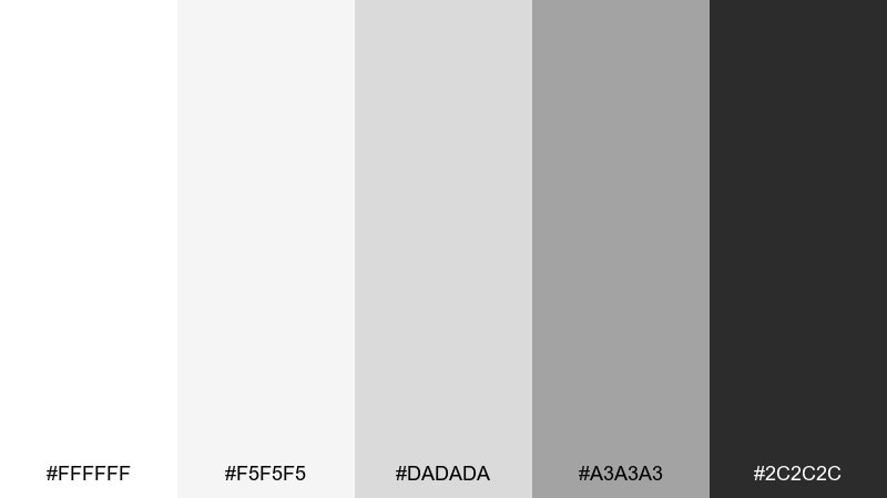
HEX: #ffffff #f5f5f5 #dadada #a3a3a3 #2c2c2c
Mood: clean, confident, versatile
Best for: startup logos and pitch decks
Clean and confident, it looks like fresh paper with crisp ink and modern typography. The contrast is strong enough for logos, icons, and charts without leaning too harsh. A gray white color combination like this pairs nicely with a bold brand accent such as cobalt, coral, or lime. Usage tip: keep slides mostly light and use the charcoal only for titles and key numbers.
Image example of snowcap branding generated using media.io

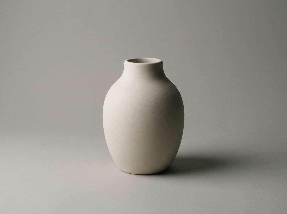
14) Ashen Minimal
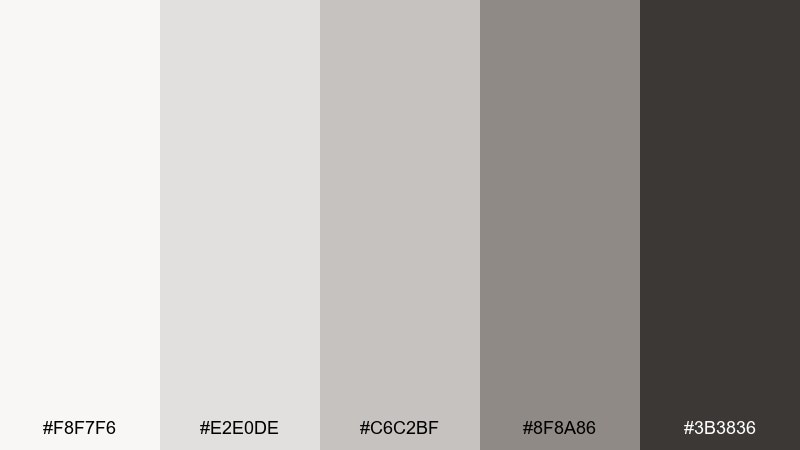
HEX: #f8f7f6 #e2e0de #c6c2bf #8f8a86 #3b3836
Mood: simple, soft, understated
Best for: product photography backdrops
Simple and understated, it resembles soft plaster, ash, and diffused studio light. These tones make products stand out without aggressive contrast or color casts. Pair with one tactile material like kraft paper, linen, or ceramic to add depth in shots. Usage tip: use the mid-gray as the surface and keep the lightest shade for seamless background sweeps.
Image example of ashen minimal generated using media.io
15) Silver Birch
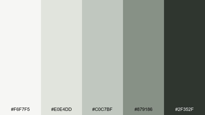
HEX: #f6f7f5 #e0e4dd #c0c7bf #879186 #2f352f
Mood: fresh, natural, balanced
Best for: eco skincare labels
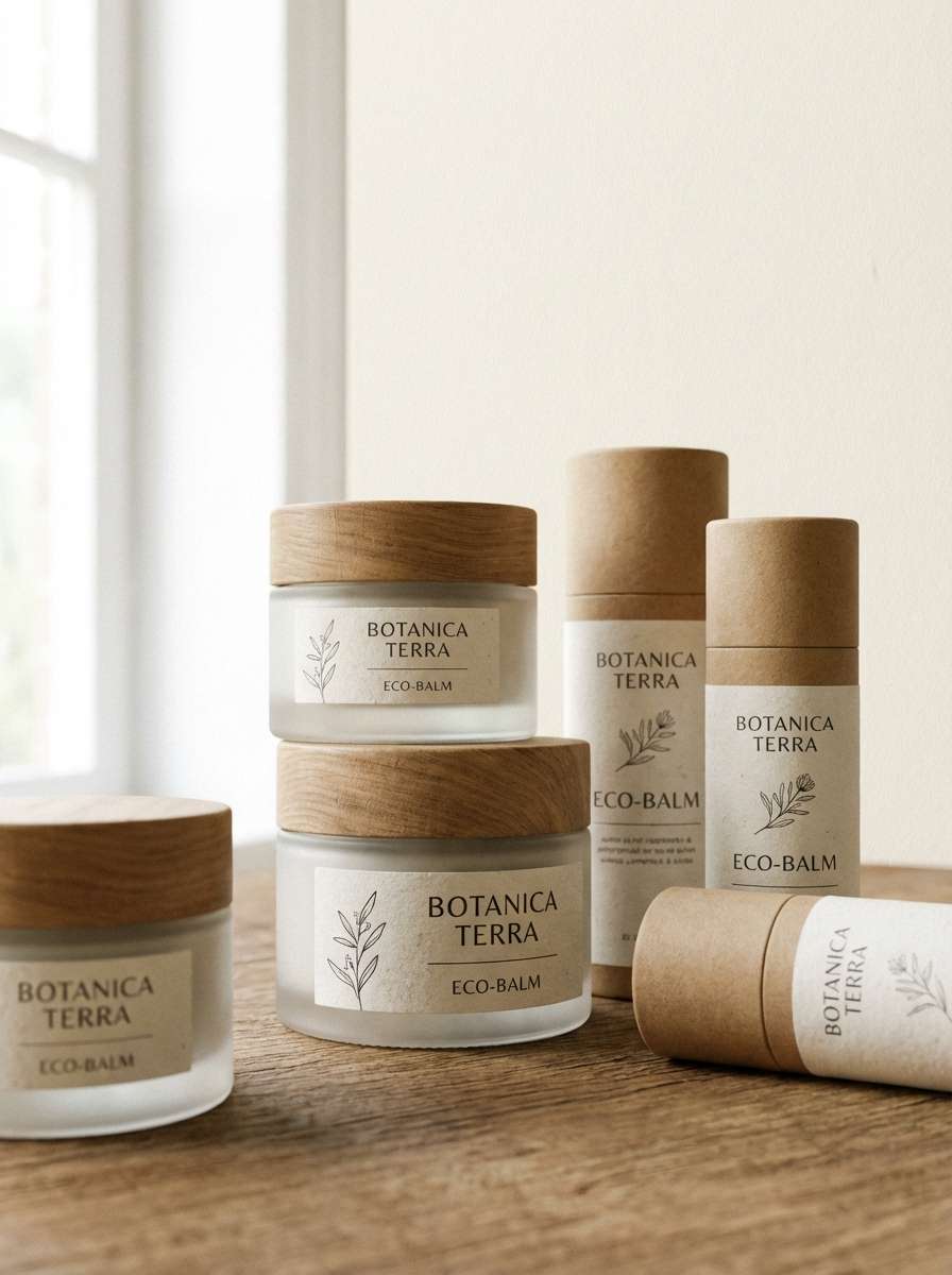
Fresh and natural, it hints at birch bark, sage leaves, and early-morning light. The green-gray undertone adds an organic feel that suits clean beauty and wellness brands. Pair with recycled paper textures and a muted botanical accent like eucalyptus or clay. Usage tip: keep ingredient blocks on the lightest background and use the deep tone for regulatory text to ensure readability.
Image example of silver birch generated using media.io
16) Polar Night
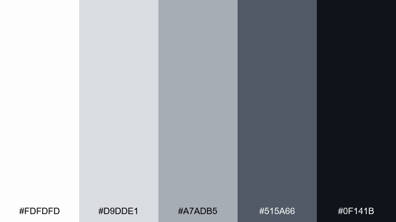
HEX: #fdfdfd #d9dde1 #a7adb5 #515a66 #0f141b
Mood: dramatic, cinematic, high-contrast
Best for: cinematic posters
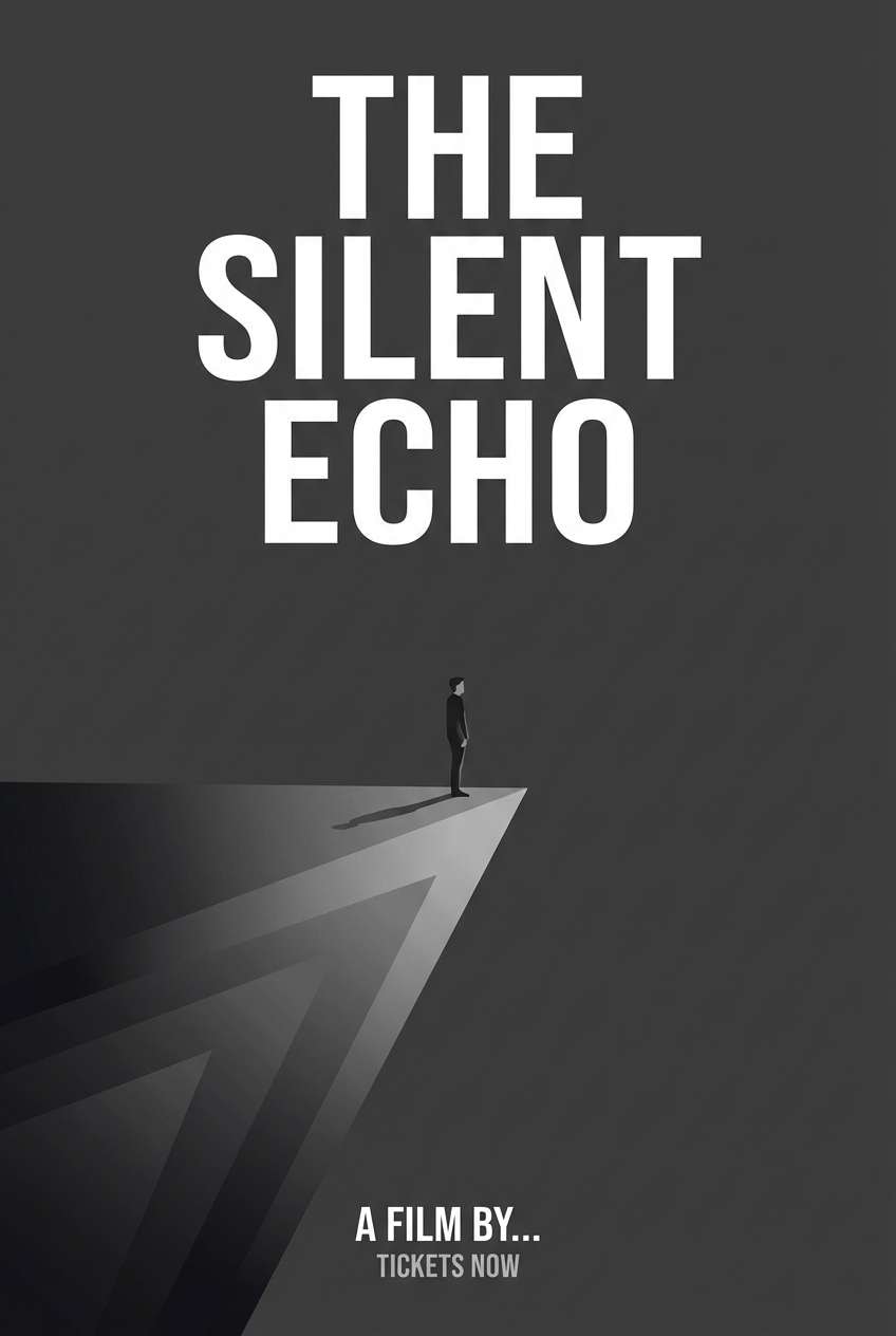
Dramatic and cinematic, it feels like snow under moonlight with a deep, inky horizon. The wide contrast range supports bold type, moody gradients, and strong silhouettes. Pair with a single saturated accent like crimson or electric blue for title hits. Usage tip: keep mid-grays for background texture so the near-black text and focal elements stay sharp.
Image example of polar night generated using media.io
17) Concrete Chic
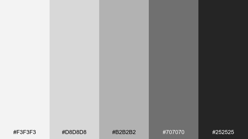
HEX: #f3f3f3 #d8d8d8 #b2b2b2 #707070 #252525
Mood: urban, stylish, modern
Best for: restaurant menus
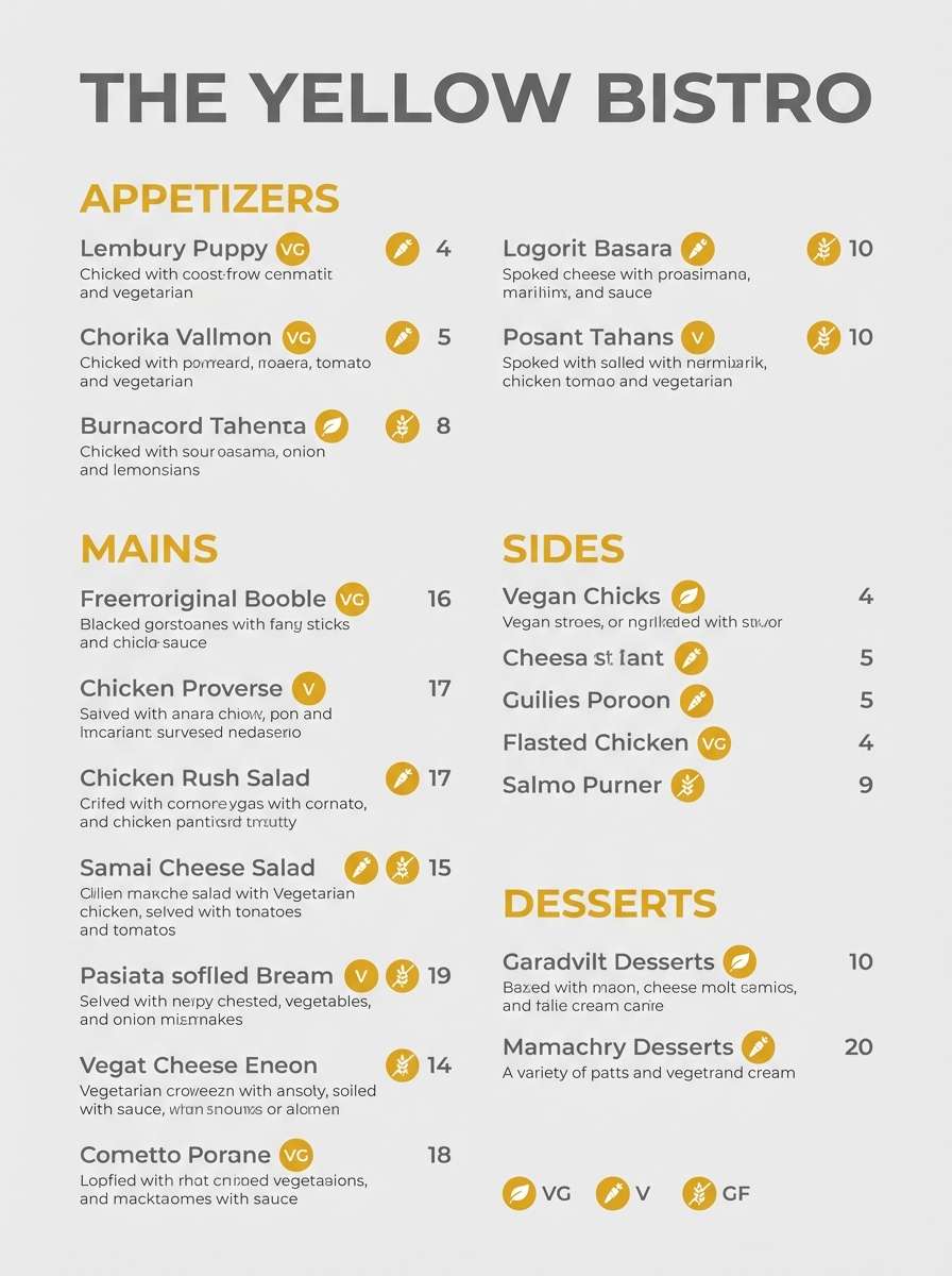
Urban and stylish, it evokes concrete counters, brushed metal, and a dimly lit dining room. This gray white color palette is a strong fit for menus because it keeps layouts clean while highlighting prices and section headers. Pair with a pop of color for signature dishes, like deep red or herb green. Usage tip: avoid using the lightest shade for small text and keep fine print on mid-gray for better legibility.
Image example of concrete chic generated using media.io
18) Misted Type
HEX: #fafafa #e6e8eb #c8ccd3 #818896 #303643
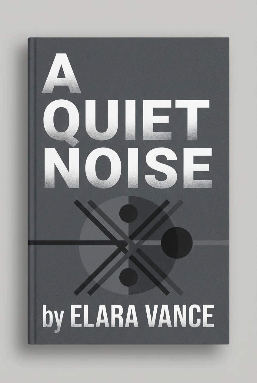
Mood: thoughtful, literary, modern
Best for: book covers
Thoughtful and literary, it suggests soft fog, layered paper, and quiet bookstores. The cooler midtones help titles stand out without needing loud color, especially for nonfiction and contemporary fiction. Pair with one texture element like grain, watercolor wash, or a subtle photo overlay. Usage tip: keep the author name in the darkest tone and set the title in the slate shade for a refined hierarchy.
Image example of misted type generated using media.io
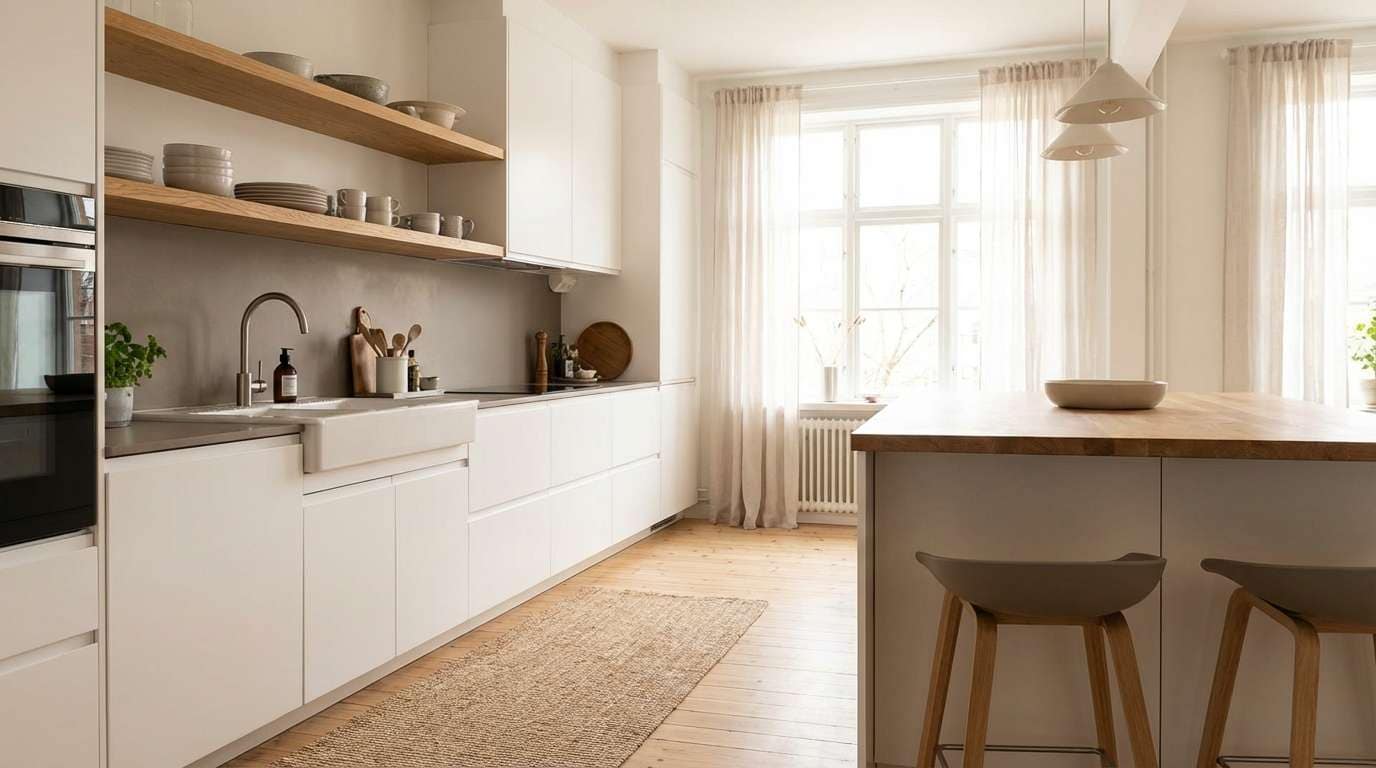
19) Nordic Kitchen
HEX: #fcfbf9 #ecebe7 #d1cec7 #9c978d #3f3c36
Mood: bright, homely, Scandinavian
Best for: scandinavian kitchens
Bright and homely, it feels like morning light on painted cabinets and pale stone counters. The slightly warm grays prevent the whites from looking stark, which is ideal for kitchens with lots of reflective surfaces. Pair with light ash wood, matte black fixtures, and soft green plants for balance. Usage tip: use the deeper gray on the island or lower cabinets to ground the space.
Image example of nordic kitchen generated using media.io
20) Stormy Stationery
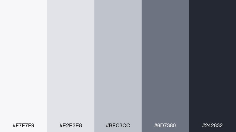
HEX: #f7f7f9 #e2e3e8 #bfc3cc #6d7380 #242832
Mood: polished, modern, slightly moody
Best for: minimal stationery sets
Polished with a hint of mood, it brings to mind rainy afternoons, smooth paper, and clean ink lines. The cool grays make letterheads, envelopes, and notecards feel professional without being severe. Pair with a single spot color like navy, forest green, or muted burgundy for seals and small marks. Usage tip: print large fields in the lightest tones and keep the dark shade for monograms and contact details.
Image example of stormy stationery generated using media.io
What Colors Go Well with Gray White?
Gray and white pair well with almost any accent color because they’re neutral and predictable. For a modern UI feel, try vivid accents like cobalt, cyan, lime, or coral to make CTAs and active states instantly noticeable.
If you want warmth, add sandy beige, caramel, terracotta, or soft blush—these turn a monochrome design into something more inviting without losing the minimalist look.
For premium or editorial branding, metallics (gold/rose-gold) and deep tones (navy, forest green, burgundy) add richness while keeping the overall palette controlled.
How to Use a Gray White Color Palette in Real Designs
Start with a job for each tone: lightest for backgrounds, light-mid for surfaces (cards/sections), mid for borders and dividers, dark-mid for secondary text, and charcoal for titles and key numbers.
Watch contrast carefully—especially on white. For long reading, deep gray text is often more comfortable than pure black, and very light grays should be reserved for large areas rather than small type.
To avoid a flat look, introduce texture: subtle grain, soft shadows, paper/linen cues, or a single high-saturation accent for interactive moments.
Create Gray White Palette Visuals with AI
If you’re pitching a brand direction or building a UI moodboard, visuals matter as much as HEX codes. Turning a gray white color scheme into realistic scenes (interiors, packaging, posters, landing pages) makes decisions faster.
With Media.io’s text-to-image tool, you can paste a prompt, iterate styles, and generate consistent examples for presentations, client reviews, or content planning.
Use the prompts above as a starting point, then swap in your industry (e.g., “fintech dashboard” or “skincare label”) and your preferred aspect ratio.
Gray White Color Palette FAQs
-
What is a gray white color palette?
A gray white color palette is a neutral set built from whites, light grays, mid-grays, and a deep charcoal/near-black. It’s commonly used in minimalist design, modern UI, and clean branding because it creates hierarchy without strong hues. -
Is gray and white considered monochrome?
It can be. If your palette is strictly grayscale (no warm/cool tint), it’s a monochrome scheme. Many “gray white” palettes are still neutral but slightly tinted (blue-gray, green-gray, warm gray), which adds character while staying minimal. -
How do I choose the right gray for text on white?
Use a deep gray or charcoal for body text instead of pure black to reduce glare. Keep very light grays for backgrounds and large surfaces, not for small typography—light text on white often fails contrast and readability. -
What accent colors work best with gray and white?
Bold accents like cobalt, cyan, lime, and coral work well for CTAs and highlights. For a softer look, use terracotta, blush, or sand tones. For premium branding, try navy, forest green, burgundy, or metallic gold. -
How do I make a gray white design feel less “flat”?
Add controlled depth: soft shadows, subtle gradients, and texture (paper grain, concrete, linen). You can also introduce a single accent color for interactions or key information while keeping the rest neutral. -
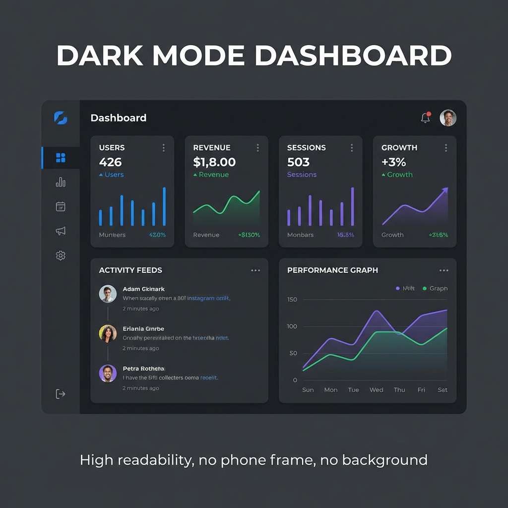
Which gray white palettes are best for dark mode?
Look for sets with a near-black base and multiple mid-gray steps for cards and dividers, plus a bright white highlight for key text. In this list, “Graphite Mist” is designed specifically for dark-mode UI hierarchy. -
Can I generate palette mockups from prompts?
Yes. You can use Media.io text-to-image to create consistent mockups (UI screens, packaging, posters, interiors) from prompts. Start with the example prompts above, then tweak style, lighting, and aspect ratio to match your project.
Next: Black Color Palette


