Gray green sits in that sweet spot between neutral and nature-inspired, so it feels modern without looking cold. It’s a go-to for brands and spaces that want calm confidence, not loud color.
Below are 20 curated gray green color palettes with HEX codes, mood notes, and real-use tips—plus AI prompts you can reuse to generate matching visuals fast.
In this article
- Why Gray Green Palettes Work So Well
-
- misty sage studio
- lichen and linen
- rainy courtyard
- eucalyptus concrete
- coastal fog
- vintage herbarium
- minimal moss ui
- forest glass branding
- pebble and pistachio
- winter garden wedding
- urban greenhouse
- sage latte packaging
- alpine spa retreat
- dusty olive editorial
- soft fern nursery
- slate meadow poster
- botanical ink wash
- ceramic tile kitchen
- calm workspace dashboard
- twilight sage landscape
- What Colors Go Well with Gray Green?
- How to Use a Gray Green Color Palette in Real Designs
- Create Gray Green Palette Visuals with AI
Why Gray Green Palettes Work So Well
Gray green tones read as “designed” while still feeling organic. The gray mutes the green, so the palette stays sophisticated and easy to live with across branding, interiors, and UI.
They’re also incredibly forgiving: gray green pairs cleanly with warm whites, wood, stone, and metals, which helps your designs feel cohesive even when you introduce texture or photography.
Most importantly, gray green supports long viewing time. On screens, it reduces visual fatigue compared to brighter greens; in rooms, it feels restful without becoming bland.
20+ Gray Green Color Palette Ideas (with HEX Codes)
1) Misty Sage Studio
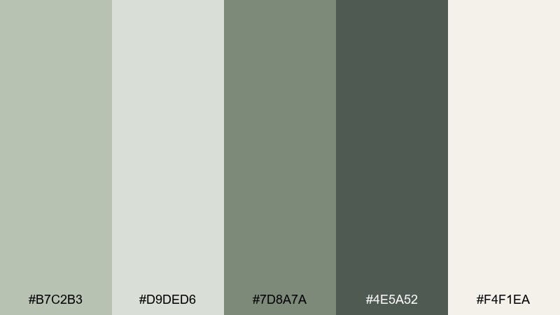
HEX: #B7C2B3 #D9DED6 #7D8A7A #4E5A52 #F4F1EA
Mood: airy, calm, gallery-like
Best for: modern living rooms and minimalist branding
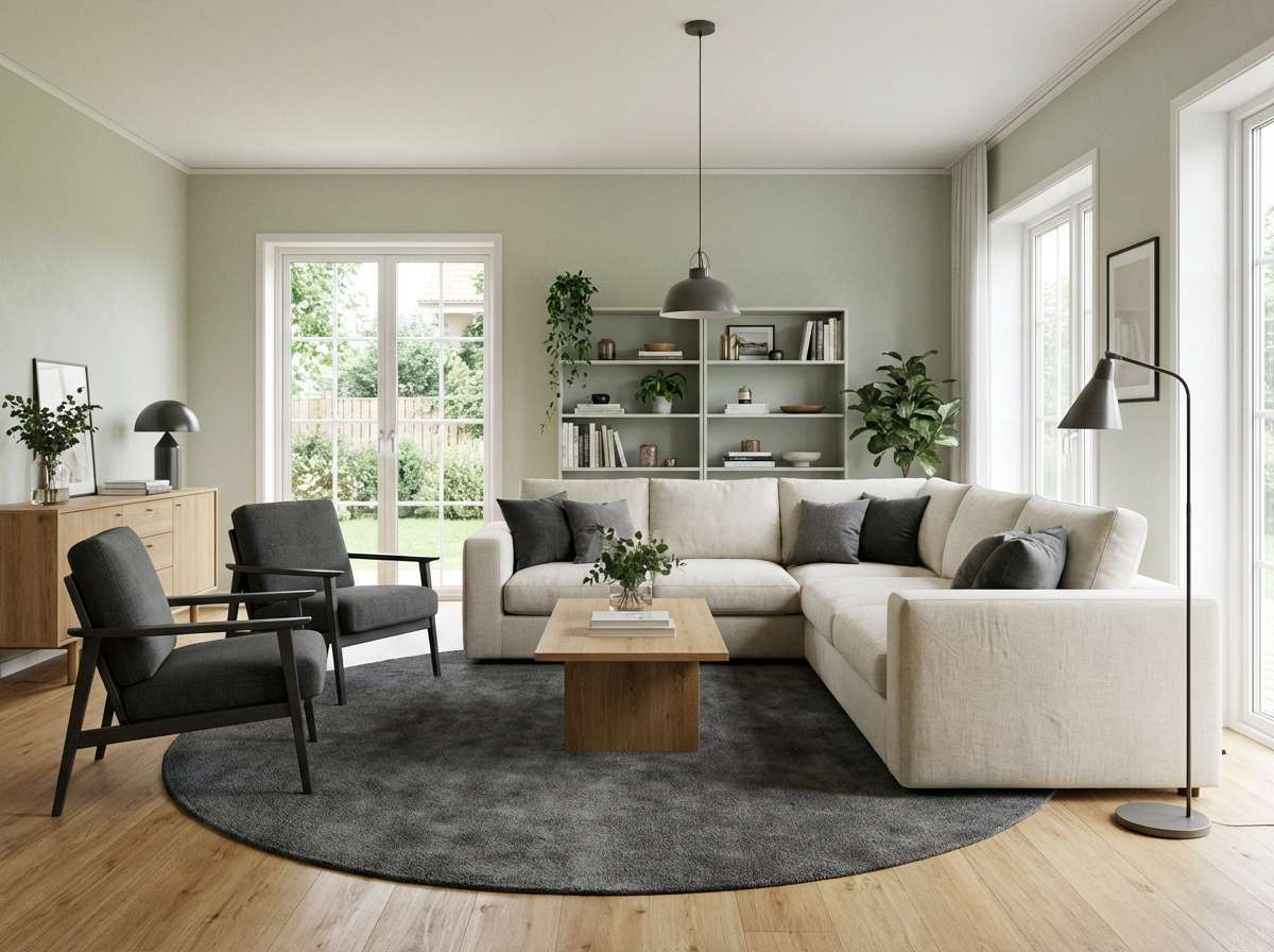
Airy and quiet like morning light through sheer curtains, these soft sage-grays feel instantly calming. Use it in living rooms, wellness brands, or portfolio sites where you want a clean, confident tone. Pair the deep charcoal green with warm whites and a touch of natural wood to keep it from feeling flat. Tip: reserve the darkest shade for outlines and hardware to sharpen the whole look.
Image example of misty sage studio generated using media.io
Media.io is an online AI studio for creating and editing video, image, and audio in your browser.

2) Lichen and Linen
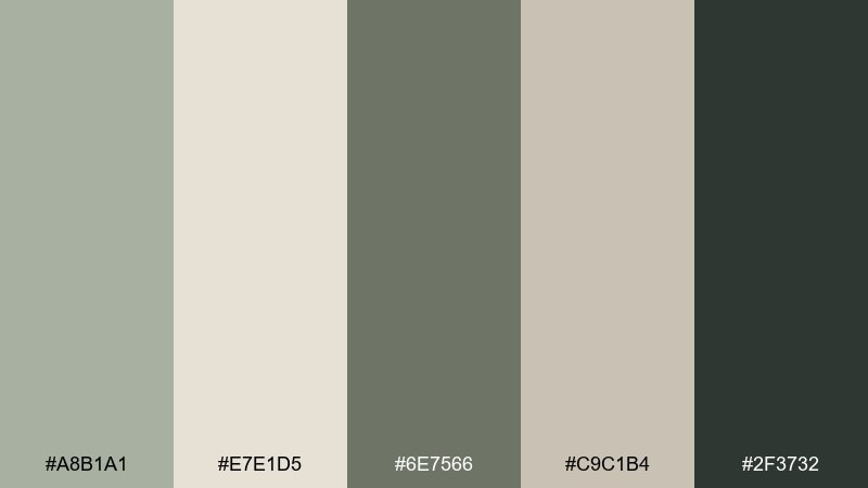
HEX: #A8B1A1 #E7E1D5 #6E7566 #C9C1B4 #2F3732
Mood: cozy, natural, understated
Best for: boutique interiors and sustainable packaging
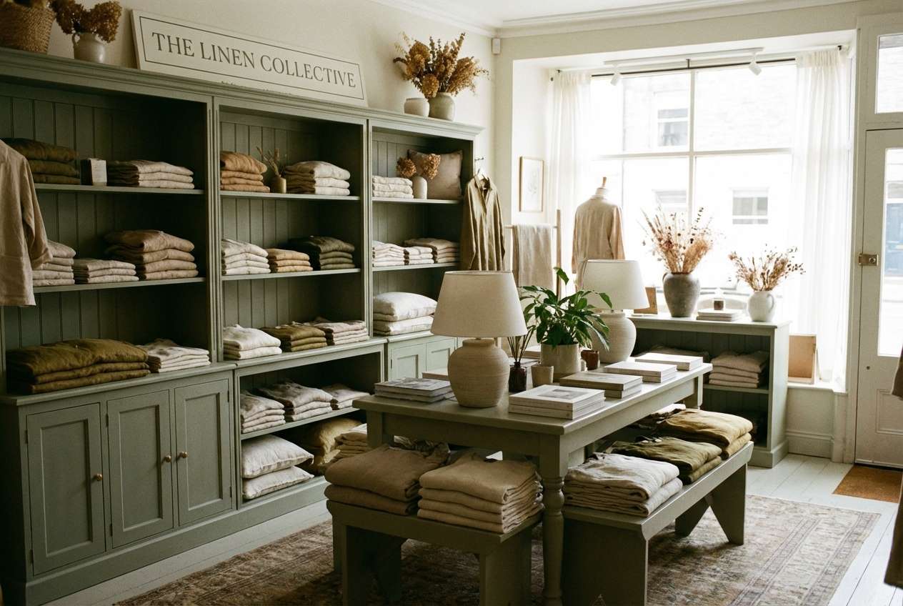
Soft, earthy neutrals with a lichen-green undertone evoke linen textiles and quiet mornings. They work beautifully for eco-minded product labels, craft brands, and cozy retail spaces. Add black-green for typography, and keep the lighter creams for breathing room and readability. Tip: use the warm beige as your bridge color between green and charcoal so the palette stays cohesive.
Image example of lichen and linen generated using media.io
3) Rainy Courtyard
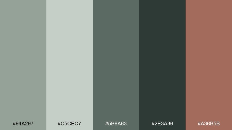
HEX: #94A297 #C5CEC7 #5B6A63 #2E3A36 #A36B5B
Mood: moody, grounded, cinematic
Best for: exterior design concepts and lifestyle campaigns
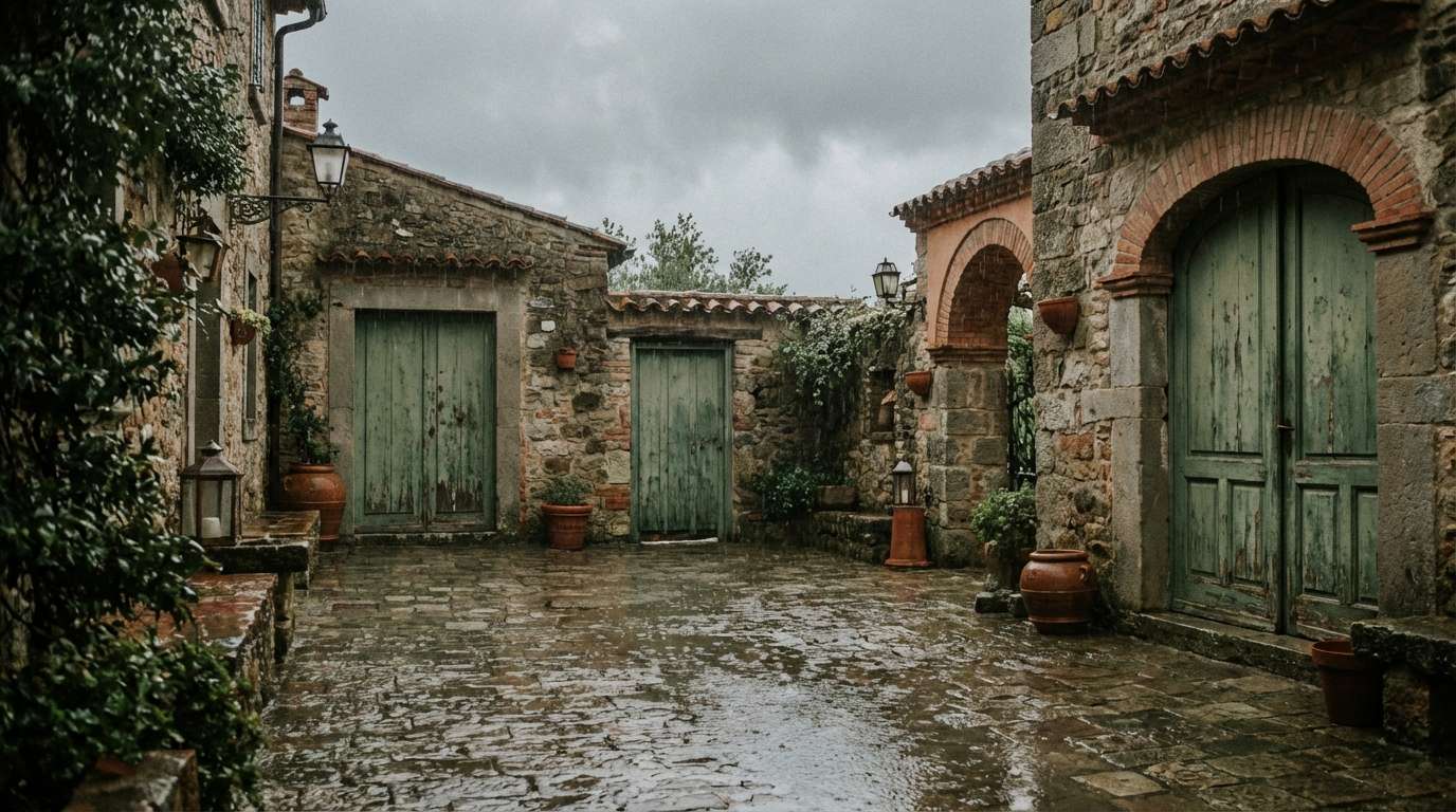
Moody greens and wet-stone grays feel like a courtyard after rainfall, reflective and serene. Use these tones for outdoor hospitality visuals, architectural presentations, or storytelling campaigns. The clay-red accent adds warmth without breaking the calm, especially in callouts or small decorative details. Tip: keep the reddish tone to under 10 percent to maintain the misty atmosphere.
Image example of rainy courtyard generated using media.io
4) Eucalyptus Concrete
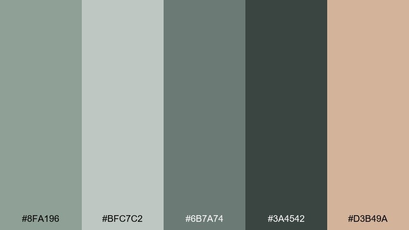
HEX: #8FA196 #BFC7C2 #6B7A74 #3A4542 #D3B49A
Mood: modern, tactile, quietly warm
Best for: skincare packaging and product ads
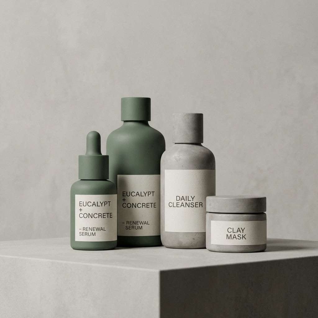
Cool concrete grays softened by eucalyptus green create a clean, contemporary feel with just enough warmth. These gray green color combinations are ideal for skincare, apothecary labels, and product ads that need to look premium but approachable. Pair with matte textures, minimal typography, and soft shadows for a studio-fresh finish. Tip: use the sand beige as a highlight color for seals, badges, or small foil details.
Image example of eucalyptus concrete generated using media.io
5) Coastal Fog
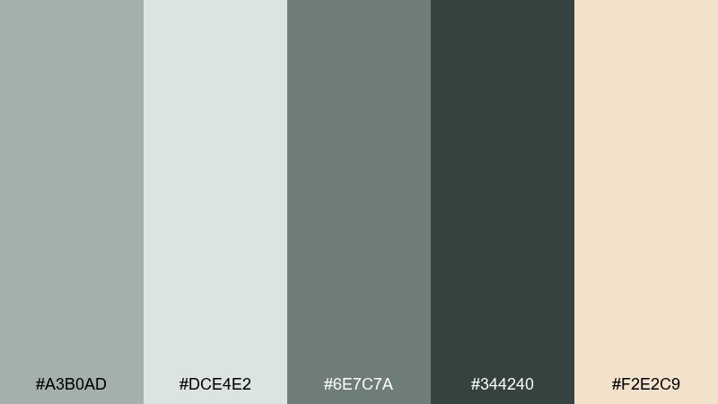
HEX: #A3B0AD #DCE4E2 #6E7C7A #344240 #F2E2C9
Mood: fresh, breezy, relaxed
Best for: hotel branding and calm website hero sections
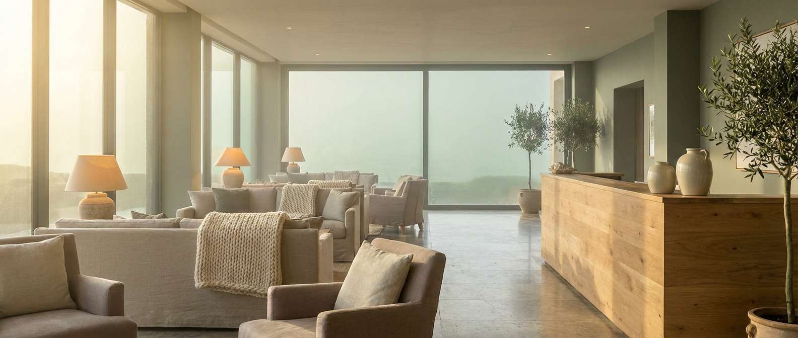
Breezy fog tones with a hint of sea-glass green bring a relaxed coastal clarity. It suits hotel branding, travel blogs, and airy landing pages that need a soft, welcoming first impression. Pair the deep teal-gray with warm cream for headlines, and keep the pale mist shades as background layers. Tip: add subtle gradients between the lightest two colors for a modern, atmospheric hero area.
Image example of coastal fog generated using media.io
6) Vintage Herbarium
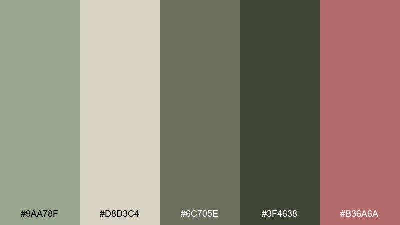
HEX: #9AA78F #D8D3C4 #6C705E #3F4638 #B36A6A
Mood: nostalgic, botanical, refined
Best for: botanical prints and heritage-style labels
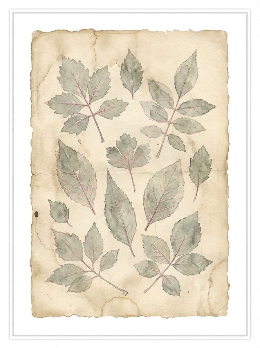
Pressed leaves, aged paper, and quiet library corners come to mind with these vintage botanicals. The muted green and parchment tones fit heritage packaging, tea labels, and art prints. Add the dusty rose sparingly for stamps, ribbons, or small illustrative accents. Tip: use slightly textured paper stock or grain overlays to amplify the old-world charm.
Image example of vintage herbarium generated using media.io
7) Minimal Moss UI
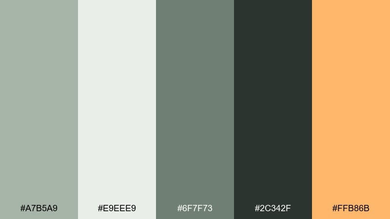
HEX: #A7B5A9 #E9EEE9 #6F7F73 #2C342F #FFB86B
Mood: clean, focused, modern
Best for: SaaS dashboards and productivity apps
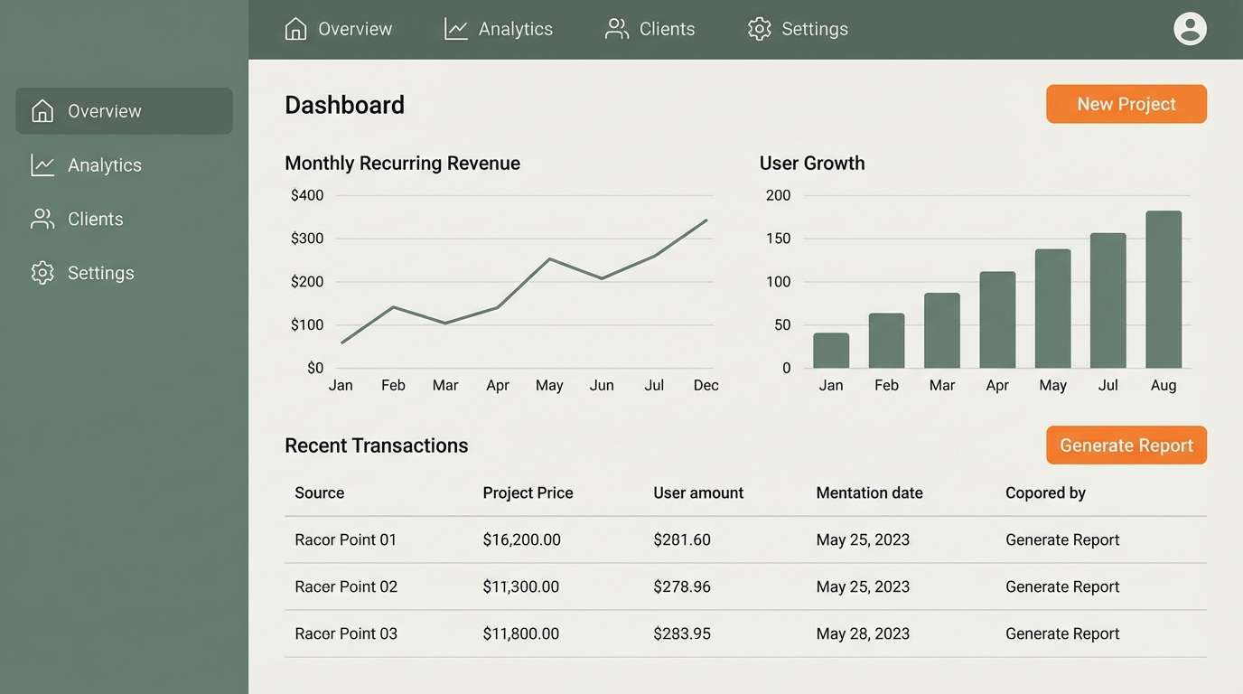
Crisp and focused like a tidy desk setup, these mossy neutrals keep screens feeling calm. A gray green color palette like this works well for dashboards where you want long-session comfort and clear hierarchy. Pair the dark green-gray with generous spacing, and use the orange accent for primary actions only. Tip: reserve the accent for one button style to make clicks feel effortless.
Image example of minimal moss ui generated using media.io
8) Forest Glass Branding
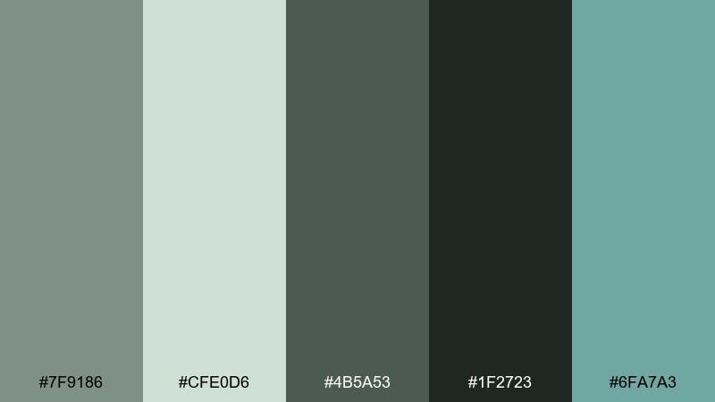
HEX: #7F9186 #CFE0D6 #4B5A53 #1F2723 #6FA7A3
Mood: sleek, cool, premium
Best for: brand identity and stationery systems
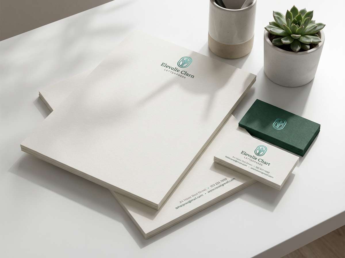
Deep forest tones with a cool glassy teal feel polished and a little mysterious. They are strong for premium branding, stationery suites, and packaging where you want sophistication without stark black. Pair with off-white paper and subtle embossing to keep everything tactile and upscale. Tip: use the teal as a secondary brand color for links, highlights, and social templates.
Image example of forest glass branding generated using media.io
9) Pebble and Pistachio
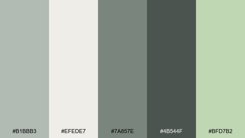
HEX: #B1BBB3 #EFEDE7 #7A857E #4B544F #BFD7B2
Mood: soft, friendly, everyday
Best for: casual lifestyle brands and social templates
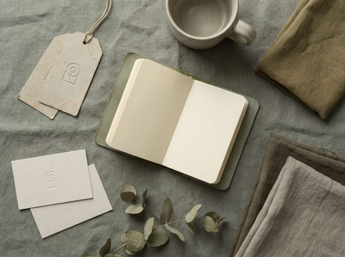
Gentle pebble grays and pistachio green create a friendly, easygoing look. Use it for lifestyle brands, casual cafes, or social templates that need to feel light without being sugary. Pair the darker green-gray with simple sans-serif type and plenty of white space. Tip: let pistachio lead in illustrations and icons while neutrals handle backgrounds.
Image example of pebble and pistachio generated using media.io
10) Winter Garden Wedding
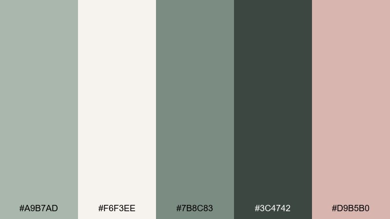
HEX: #A9B7AD #F6F3EE #7B8C83 #3C4742 #D9B5B0
Mood: romantic, quiet, wintry
Best for: wedding invitations and event stationery
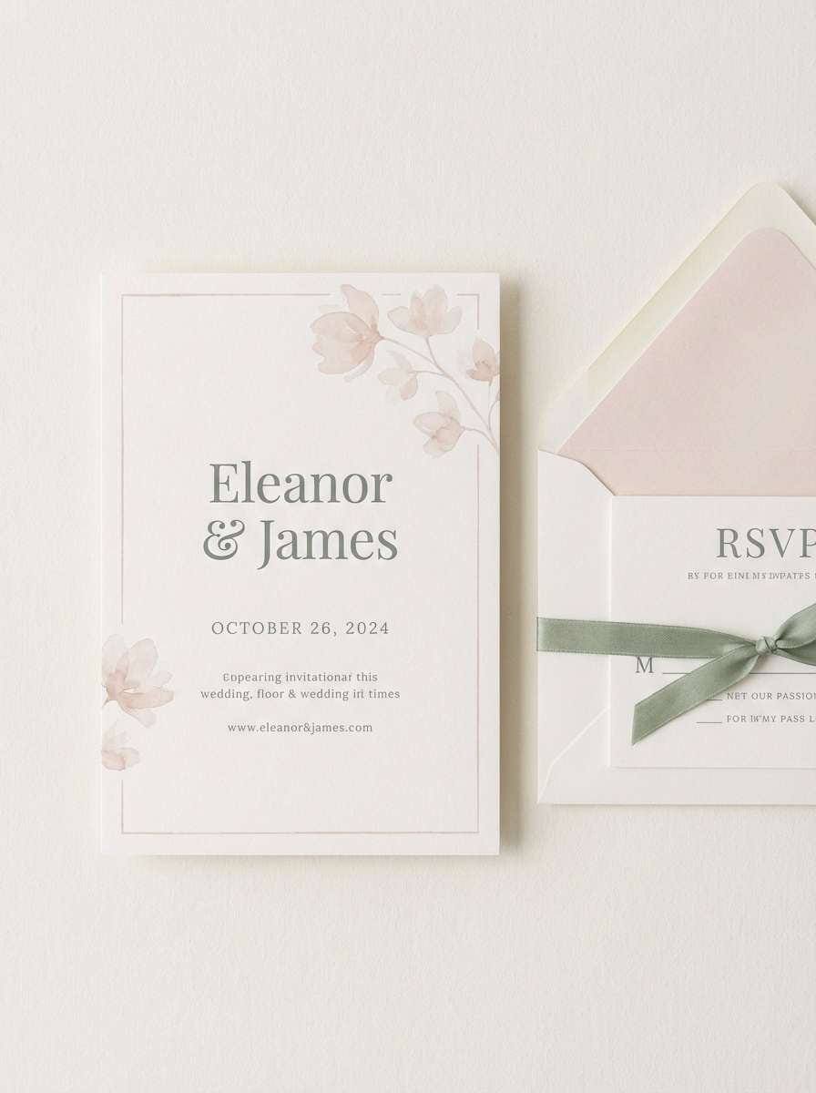
Soft winter greens with warm ivory feel like evergreen sprigs on crisp paper. They are perfect for wedding invitations, menus, and seating charts that aim for elegance without heavy contrast. Pair the blush accent with delicate serif type and subtle floral line art. Tip: use the darkest shade for names and headings to keep the typography legible on ivory.
Image example of winter garden wedding generated using media.io
11) Urban Greenhouse
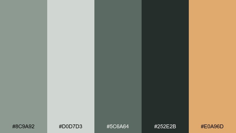
HEX: #8C9A92 #D0D7D3 #5C6A64 #252E2B #E0A96D
Mood: industrial, lively, warm
Best for: restaurants, cafes, and signage
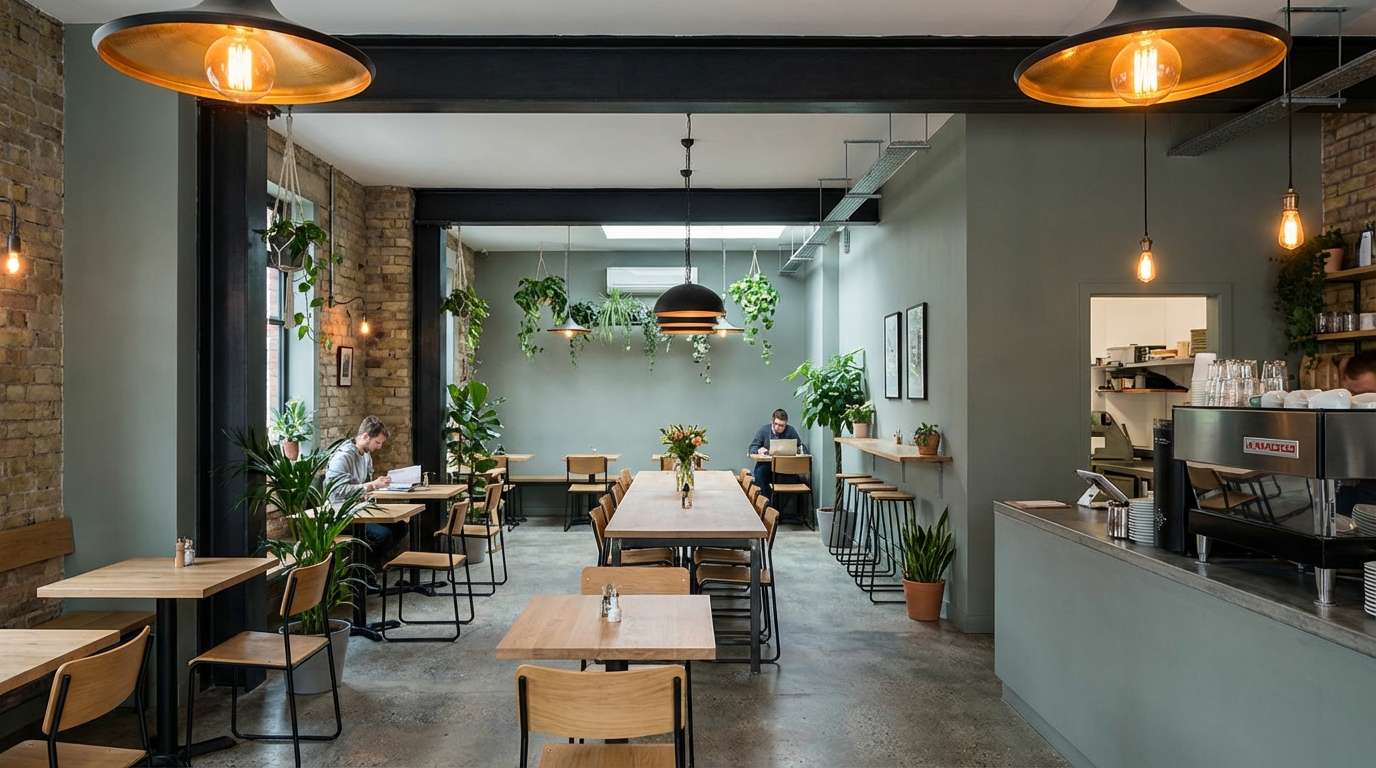
Industrial greens with a warm amber accent feel like plants against steel and glass. This mix fits restaurant branding, wayfinding, and signage where you want a modern urban vibe. Pair the amber with black-green for high-contrast callouts, and keep the lighter gray-green for walls and menus. Tip: repeat the amber in small details like icons or divider lines to guide the eye.
Image example of urban greenhouse generated using media.io
12) Sage Latte Packaging
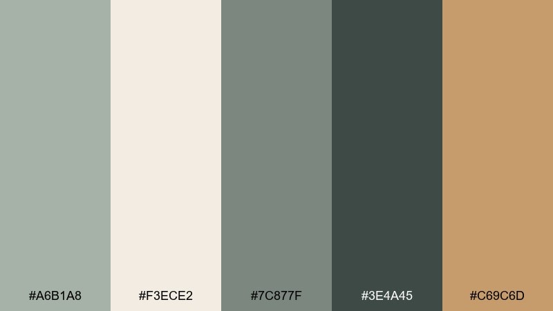
HEX: #A6B1A8 #F3ECE2 #7C877F #3E4A45 #C69C6D
Mood: warm, craft, approachable
Best for: coffee packaging and food labels
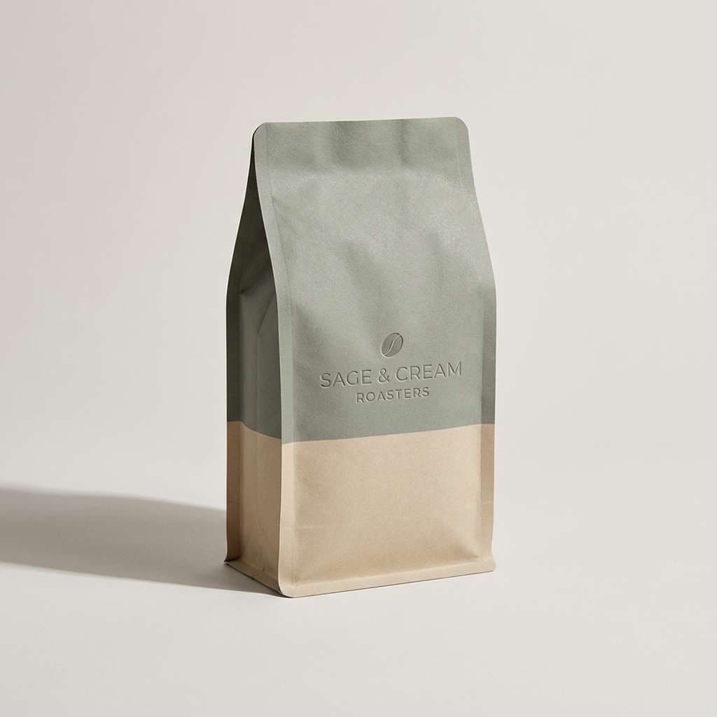
Warm latte creams and grounded sage feel comforting, like a favorite mug on a quiet morning. These tones suit coffee bags, bakery labels, and small-batch food packaging. Pair the dark green-gray with hand-drawn illustrations, and use the caramel tone for badges or roast notes. Tip: keep the cream as the main label field to maintain readability on shelves.
Image example of sage latte packaging generated using media.io
13) Alpine Spa Retreat
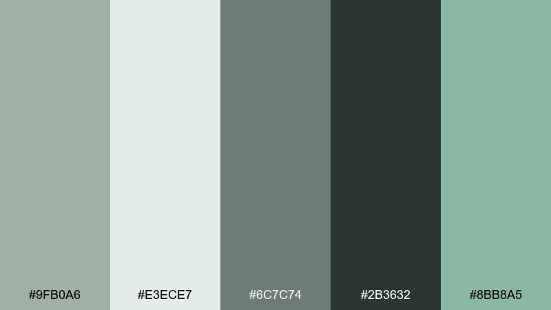
HEX: #9FB0A6 #E3ECE7 #6C7C74 #2B3632 #8BB8A5
Mood: refreshing, clean, restorative
Best for: spa websites and wellness brochures
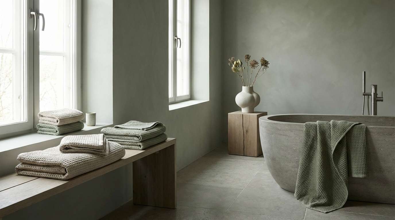
Cool, restorative greens like mountain air create a calming spa atmosphere. Use it for wellness websites, brochures, or signage where clarity and quiet are the goal. Pair the mint-teal with lots of white space and gentle photography to keep it airy. Tip: choose one cool accent shade for links and highlights so the experience stays serene.
Image example of alpine spa retreat generated using media.io
14) Dusty Olive Editorial
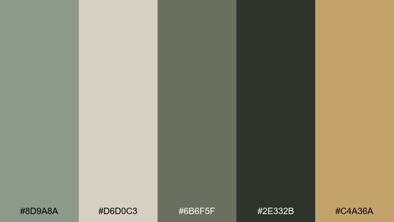
HEX: #8D9A8A #D6D0C3 #6B6F5F #2E332B #C4A36A
Mood: smart, vintage-modern, print-ready
Best for: magazine layouts and lookbooks
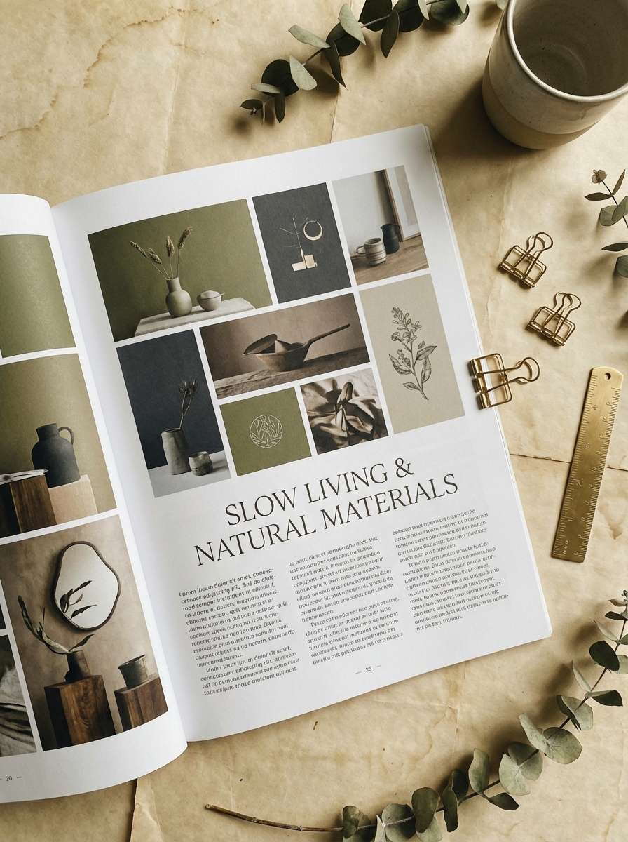
Dusty olive with parchment neutrals feels like a modern magazine with a vintage soul. It works well for editorial spreads, lookbooks, and long-form content where contrast must stay gentle. Pair the brass tone with thin rules and small caps for a refined, print-forward finish. Tip: keep body text in the near-black green to avoid muddy readability on warm paper tones.
Image example of dusty olive editorial generated using media.io
15) Soft Fern Nursery
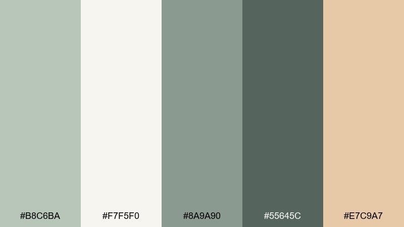
HEX: #B8C6BA #F7F5F0 #8A9A90 #55645C #E7C9A7
Mood: gentle, soothing, family-friendly
Best for: nursery interiors and baby brand identity
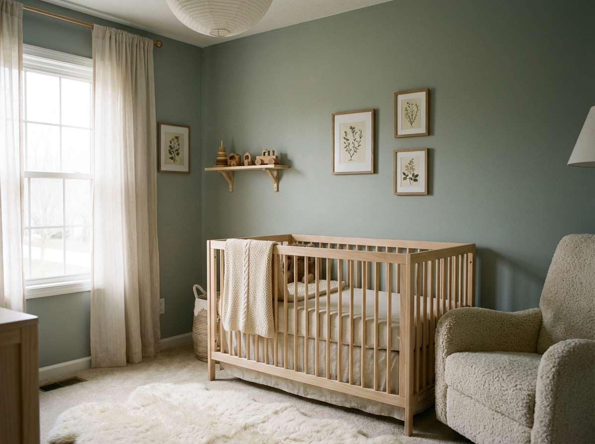
Gentle fern greens and warm creams feel soft and safe, perfect for a calm nursery. Use these tones for baby brands, pediatric clinics, or home spaces where you want comfort without pastel overload. Pair the warm sand accent with natural fabrics like cotton and rattan for a cozy finish. Tip: paint the darkest shade on trim or shelves to add structure without harsh contrast.
Image example of soft fern nursery generated using media.io
16) Slate Meadow Poster

HEX: #96A49A #D9E0DA #66756C #2F3A35 #F2B1A2
Mood: fresh, graphic, contemporary
Best for: event posters and social announcements
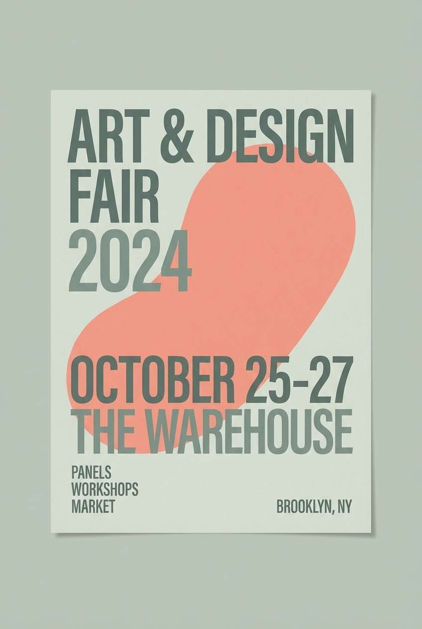
Slate greens with a soft coral lift feel like spring grass under a cloudy sky. These gray green color combinations are great for posters and social announcements where you want a modern neutral base with one friendly pop. Pair the coral with bold headlines and keep backgrounds in the pale green-gray for a clean, airy layout. Tip: echo the coral in small geometric shapes to create rhythm without clutter.
Image example of slate meadow poster generated using media.io
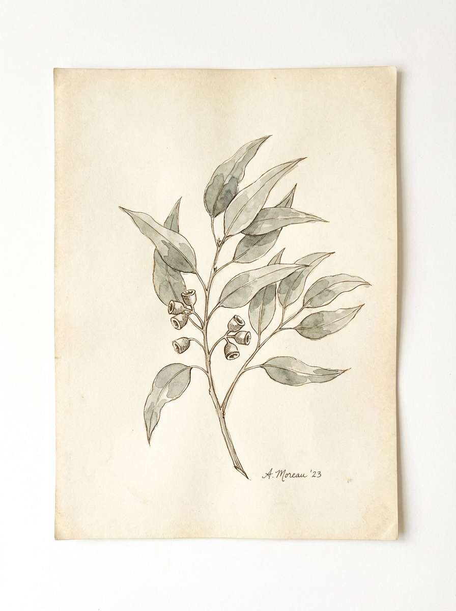
17) Botanical Ink Wash
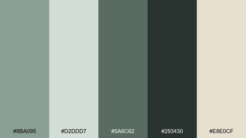
HEX: #8BA095 #D2DDD7 #5A6C62 #293430 #E8E0CF
Mood: artful, calm, organic
Best for: botanical illustrations and art prints
Inky greens and washed neutrals evoke a sketchbook of leaves and quiet brush strokes. Use it for botanical illustrations, art prints, or journal covers that need a natural, handmade touch. Pair the near-black green with fine linework and keep the pale tones for paper and negative space. Tip: introduce gentle watercolor blooms around edges to soften transitions between dark and light.
Image example of botanical ink wash generated using media.io
18) Ceramic Tile Kitchen
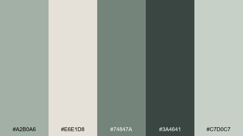
HEX: #A2B0A6 #E6E1D8 #74847A #3A4641 #C7D0C7
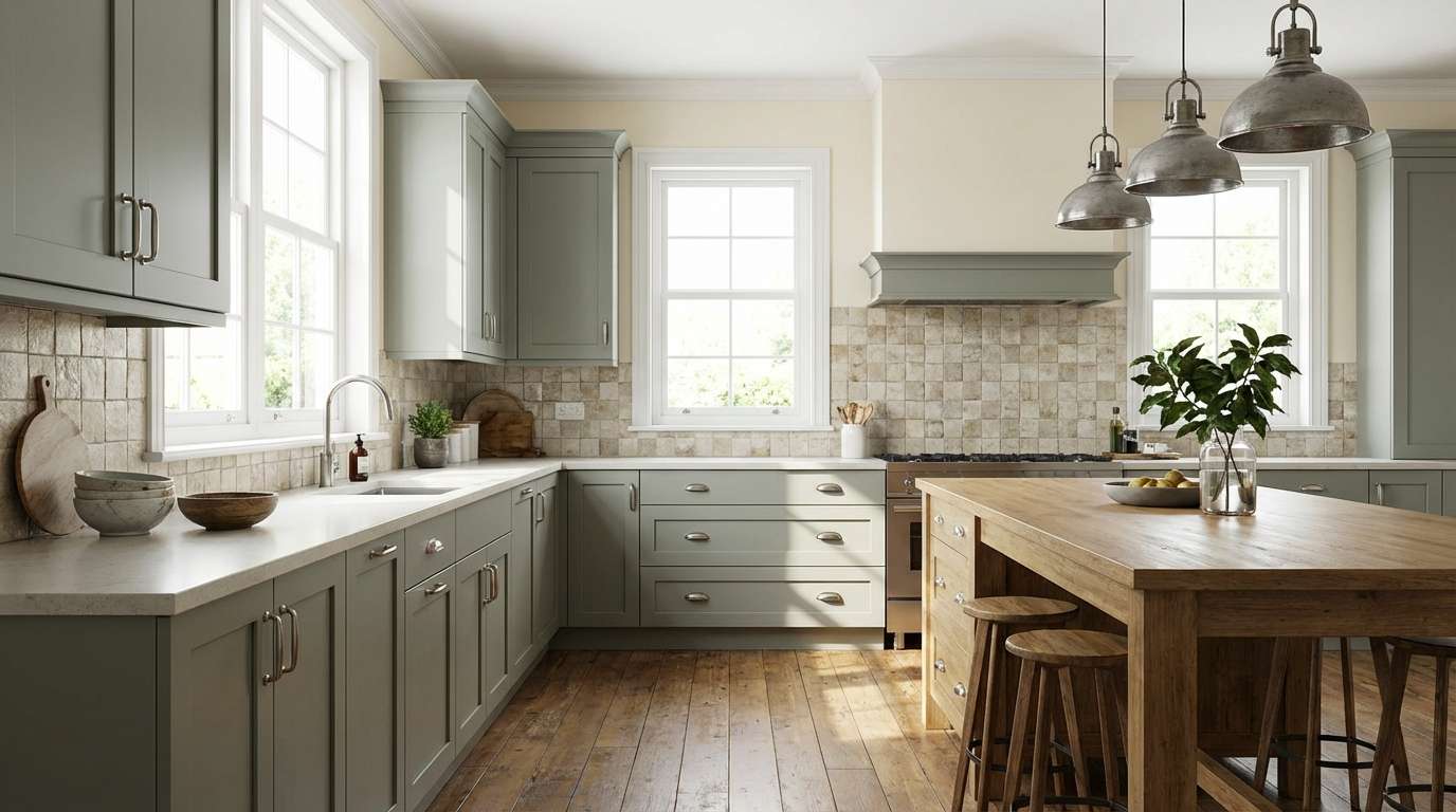
Mood: clean, homey, timeless
Best for: kitchen remodel concepts and interior moodboards
Quiet greens with creamy neutrals feel like handmade ceramic tiles and tidy countertops. They work well for kitchen remodel concepts, interior moodboards, and home brand photography. Pair with brushed nickel, pale oak, and warm lighting to prevent the palette from skewing cold. Tip: use the mid gray-green on cabinetry and keep walls in the light cream for a brighter room.
Image example of ceramic tile kitchen generated using media.io
19) Calm Workspace Dashboard
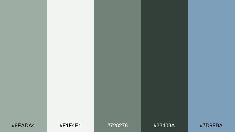
HEX: #9EADA4 #F1F4F1 #728278 #33403A #7D9FBA
Mood: professional, calm, efficient
Best for: analytics dashboards and admin panels
Muted gray-greens with a cool blue accent feel organized and trustworthy. Use this set for analytics, admin panels, and enterprise UI where the interface needs to stay neutral around dense data. Pair the blue with charts and selected states, and keep backgrounds in the lightest neutral to reduce visual fatigue. Tip: use the darkest tone for navigation and the mid tone for secondary labels to keep hierarchy clear.
Image example of calm workspace dashboard generated using media.io

20) Twilight Sage Landscape
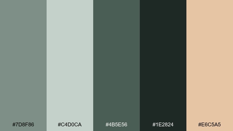
HEX: #7D8F86 #C4D0CA #4B5E56 #1E2824 #E6C5A5
Mood: quiet, atmospheric, outdoorsy
Best for: poster art and nature-themed illustrations
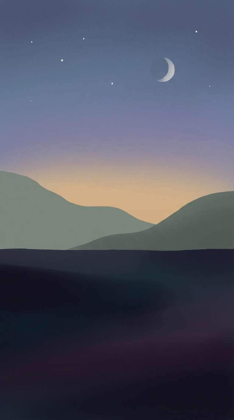
Twilight greens and deep shadows feel like a trail at dusk, peaceful and a little dramatic. These tones are strong for poster art, outdoor brands, and nature-themed illustrations that need depth without harsh black. Pair the warm sand as a moonlit highlight or subtle horizon glow to balance the coolness. Tip: layer the two mid greens in soft gradients to create distance and atmospheric perspective.
Image example of twilight sage landscape generated using media.io
What Colors Go Well with Gray Green?
Warm neutrals are the easiest match: ivory, cream, oatmeal, and sand soften gray green and keep it inviting. This pairing is especially strong for interiors, packaging, and calm editorial layouts.
For contrast, use near-black green-charcoal instead of pure black. It keeps the palette cohesive while still giving you crisp typography and clear UI hierarchy.
If you want a “designed” accent, try muted terracotta, dusty rose, amber/caramel, or sea-glass teal. Keep accents small and intentional so the gray green stays the main atmosphere.
How to Use a Gray Green Color Palette in Real Designs
Start with roles: pick a light gray green for backgrounds, a mid tone for surfaces (cards, cabinetry, sections), and a dark green-gray for type, borders, and navigation. Then add one warm accent for buttons or highlights.
Texture matters with muted greens. Wood grain, paper stock, stone, linen, and matte finishes prevent gray green tones from feeling flat—especially in product photos and interiors.
In UI, prioritize readability: keep body text on the lightest neutral, reserve the darkest shade for key labels, and use your accent color for a single primary action so it always feels obvious.
Create Gray Green Palette Visuals with AI
If you already have HEX codes, you can generate on-brand mockups and scene images by describing the setting (room, packaging, UI), lighting, materials, and where your accent color should appear.
For consistent results, reuse the same subject, camera style, and aspect ratio—then swap only the palette keywords (sage gray, eucalyptus, olive, fog green) to explore variations without changing the vibe.
Media.io makes it simple to turn any gray green color scheme into polished visuals for presentations, moodboards, and brand concepts.
Gray Green Color Palette FAQs
-
What is a gray green color?
A gray green is a muted green with added gray (reduced saturation), often seen as sage, eucalyptus, soft olive, or foggy green-gray tones. -
Is gray green a warm or cool color?
It can be either. Gray green leans cool when it has blue/teal undertones, and warm when it tilts toward olive, beige, or yellow-green undertones. -
What accent colors work best with gray green?
Muted terracotta, caramel/amber, dusty rose, sea-glass teal, and soft coral are reliable accents. Use them sparingly to keep the palette calm and modern. -
What neutral colors pair well with gray green?
Warm whites (ivory, cream), greige, linen beige, light stone gray, and green-charcoal pair well and keep the overall look cohesive. -
How do I keep gray green from looking dull?
Add contrast (a deep green-charcoal for type), introduce texture (wood, paper, linen, stone), and use one warm accent for small highlights or CTAs. -
Is gray green good for UI and dashboards?
Yes—muted green-grays are comfortable for long sessions. Keep backgrounds very light, use dark green-gray for navigation/text, and reserve one accent color for primary actions. -
How can I generate images that match my gray green palette?
Use a text-to-image tool and specify the setting, materials, lighting, and your palette keywords (sage gray, eucalyptus green, fog green), then lock an aspect ratio for consistent outputs.


