

Gray brown is a warm neutral that blends the stability of gray with the comfort of brown. It’s a go-to choice for modern rustic interiors, premium branding, and UI systems that need to feel calm and trustworthy.
Below are 20+ gray brown color palette ideas with HEX codes, plus practical tips for pairing accents and generating palette visuals with AI.
In this article
- Why Gray Brown Palettes Work So Well
-
- mushroom mocha
- pebble and cedar
- taupe studio ui
- desert fog poster
- cocoa oat latte
- stonewashed denim
- walnut sage garden
- smoked clay kitchen
- ash brown minimal logo
- riverbank neutrals
- coffeehouse menu board
- warm concrete workspace
- rustic cabin evening
- sepia film grain
- clay pottery market
- foggy pine trail
- biscuit and charcoal dashboard
- antique paper invitation
- mocha rose accent
- bronze mist e-commerce
- cinder and sandstone
- harvest dusk pairing
- What Colors Go Well with Gray Brown?
- How to Use a Gray Brown Color Palette in Real Designs
- Create Gray Brown Palette Visuals with AI
Why Gray Brown Palettes Work So Well
Gray brown tones (often close to taupe, mushroom, or mocha) sit in a “safe middle” of the color spectrum, which makes them flexible across print, web, and interiors. They add warmth without going overly yellow or orange.
Because they’re muted, gray brown color combinations keep attention on typography, photography, and materials. That’s why they’re common in premium packaging, minimal brand systems, and modern dashboards.
They also layer beautifully with texture—paper grain, wood, stone, linen, and ceramic. Even a simple palette can feel rich when the finish and lighting do the heavy lifting.
20+ Gray Brown Color Palette Ideas (with HEX Codes)
1) Mushroom Mocha
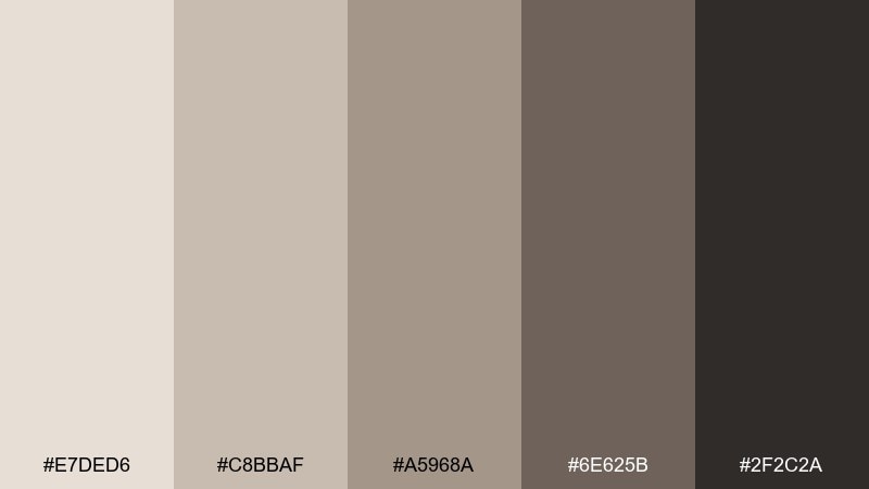
HEX: #E7DED6 #C8BBAF #A5968A #6E625B #2F2C2A
Mood: calm, cozy, grounded
Best for: warm minimalist interiors and lifestyle photography
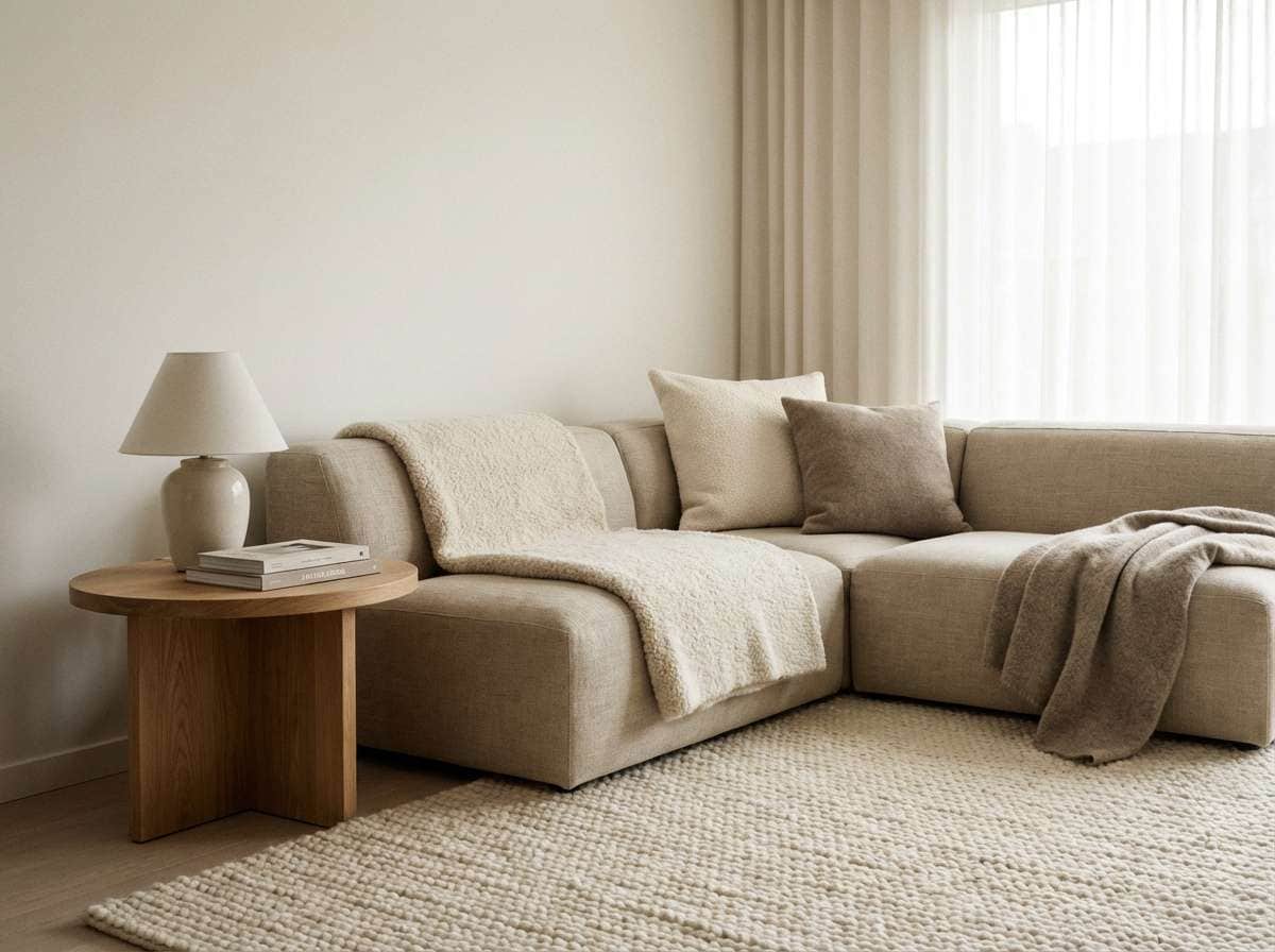
Calm and cozy like a linen throw in soft window light, these tones read warm without feeling heavy. Use it for interior moodboards, coffee shop visuals, or calm lifestyle edits where texture matters. Pair with matte black hardware and creamy whites to keep it modern. Usage tip: keep the darkest shade for small anchors like type or trim, not large walls.
Image example of mushroom mocha generated using media.io
Media.io is an online AI studio for creating and editing video, image, and audio in your browser.

2) Pebble and Cedar
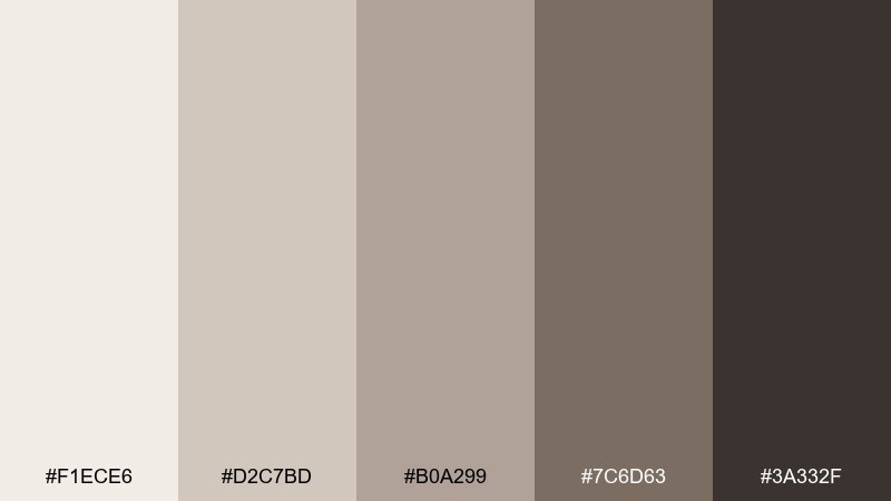
HEX: #F1ECE6 #D2C7BD #B0A299 #7C6D63 #3A332F
Mood: natural, steady, modern rustic
Best for: outdoor brands, woodworking logos, and packaging systems
Natural and steady like river pebbles beside cedar bark, the contrast feels quietly confident. It works especially well for brand identities that need warmth without going too vintage. Pair with off-white paper textures and a single muted green accent for freshness. Usage tip: print tests matter here, so slightly brighten midtones for uncoated stock.
Image example of pebble and cedar generated using media.io
3) Taupe Studio UI
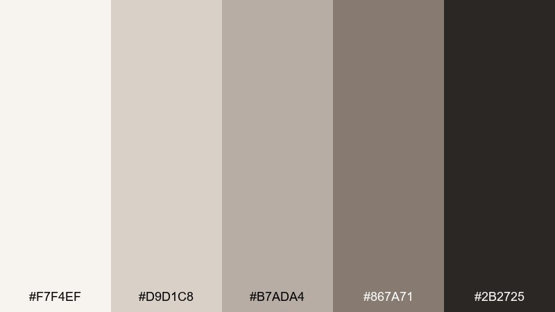
HEX: #F7F4EF #D9D1C8 #B7ADA4 #867A71 #2B2725
Mood: quiet, focused, premium
Best for: dashboard UI, settings screens, and SaaS onboarding
Quiet and focused like a tidy studio desk, these neutrals keep attention on content rather than chrome. Use the lightest tone for surfaces, mid taupes for dividers, and the near-black for text to hit accessible contrast. Pair with one restrained accent, such as dusty blue or sage, for states and highlights. Usage tip: reserve the darkest shade for headings and primary buttons, not body text everywhere.
Image example of taupe studio ui generated using media.io
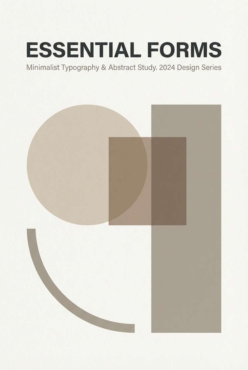
4) Desert Fog Poster
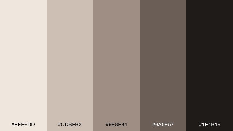
HEX: #EFE6DD #CDBFB3 #9E8E84 #6A5E57 #1E1B19
Mood: moody, cinematic, understated
Best for: event posters, gallery promos, and minimalist art prints
Moody and cinematic like desert haze at dusk, the palette feels artsy without being cold. It is ideal for typographic posters where you want a soft background and confident dark type. Pair with grain textures and a single warm spotlight shape to add movement. Usage tip: keep backgrounds slightly warm so blacks do not look harsh against them.
Image example of desert fog poster generated using media.io
5) Cocoa Oat Latte
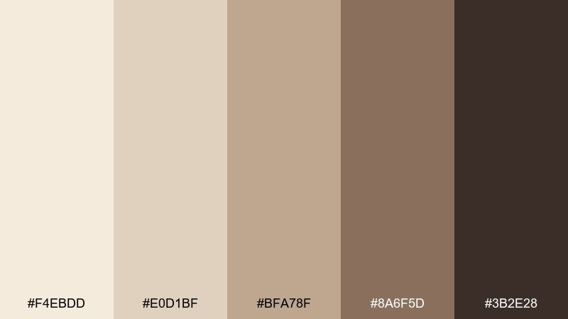
HEX: #F4EBDD #E0D1BF #BFA78F #8A6F5D #3B2E28
Mood: sweet, welcoming, artisanal
Best for: coffee packaging, bakery labels, and menu branding
Sweet and welcoming like foam on a cocoa latte, these shades look handcrafted and edible. They are great for packaging systems where you need warmth across multiple SKUs. Pair with kraft textures and minimal line icons to keep it contemporary. Usage tip: use the cocoa tone for callouts and badges so the lighter oats stay airy.
Image example of cocoa oat latte generated using media.io
6) Stonewashed Denim
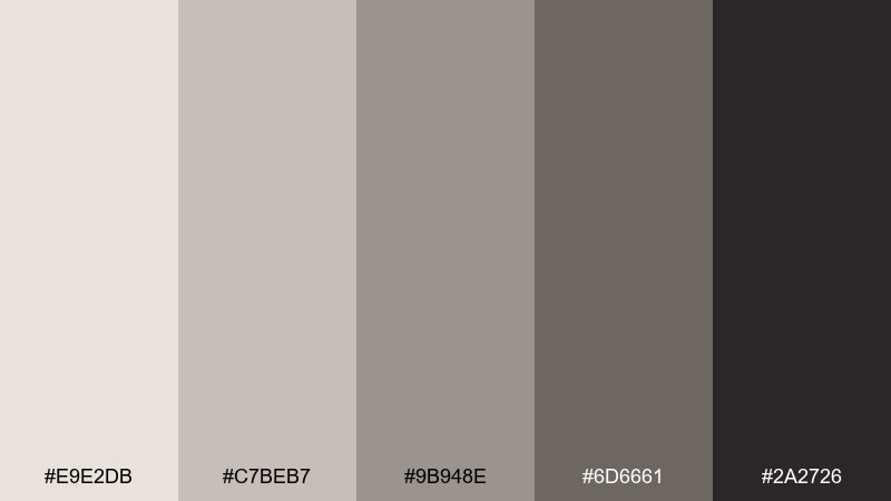
HEX: #E9E2DB #C7BEB7 #9B948E #6D6661 #2A2726
Mood: cool, casual, editorial
Best for: fashion lookbooks and product catalog layouts
Cool and casual like stonewashed fabric, the muted contrast feels effortless and modern. Use it for editorial spreads where photography should stay dominant and typography needs restraint. Pair with a single faded indigo accent for links or section headers. Usage tip: keep plenty of white space so the mid grays do not make pages feel dense.
Image example of stonewashed denim generated using media.io
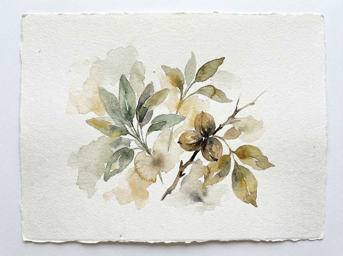
7) Walnut Sage Garden
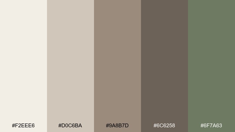
HEX: #F2EEE6 #D0C6BA #9A8B7D #6C6258 #6F7A63
Mood: earthy, restorative, botanical
Best for: wellness brands, natural skincare, and botanical illustrations
Earthy and restorative like garden soil under herbs, the mix balances warmth with a quiet green lift. It suits wellness branding, candle labels, and gentle social templates where calm matters. Pair with soft cream backgrounds and subtle leaf motifs to reinforce the natural story. Usage tip: let the sage act as the only chroma so the neutrals stay elegant.
Image example of walnut sage garden generated using media.io
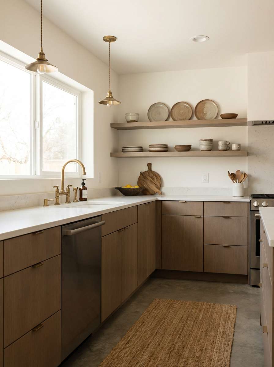
8) Smoked Clay Kitchen
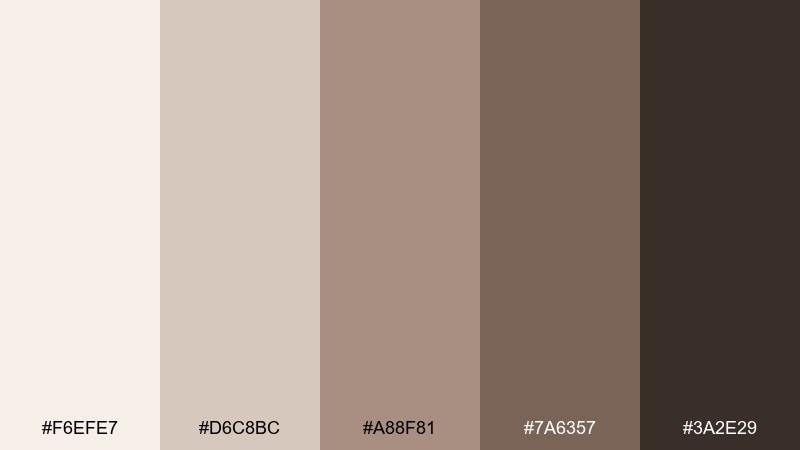
HEX: #F6EFE7 #D6C8BC #A88F81 #7A6357 #3A2E29
Mood: homey, warm, tactile
Best for: kitchen remodel concepts and home decor catalogs
Homey and tactile like smoked clay cookware, these tones make spaces feel lived-in and warm. They work beautifully for cabinetry concepts, tile selections, and catalog photography where wood grain is a feature. Pair with brushed brass and creamy stone to avoid a flat, overly beige look. Usage tip: repeat the darkest tone in small details like handles to unify the room.
Image example of smoked clay kitchen generated using media.io
9) Ash Brown Minimal Logo
HEX: #F8F6F2 #DAD4CD #B0A9A2 #7B736D #1F1D1C
Mood: clean, refined, understated
Best for: professional services branding and minimalist logos
Clean and refined like letterpress on soft paper, the contrast stays subtle yet professional. Use it for consultants, architects, and studios that want quiet authority. Pair with a sharp geometric sans and a warm white background to keep everything crisp. Usage tip: make the logo mostly dark with lighter tones reserved for stationery and web sections.
Image example of ash brown minimal logo generated using media.io
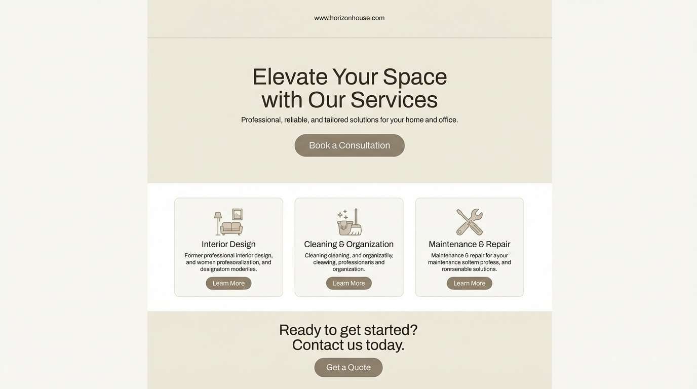
10) Riverbank Neutrals
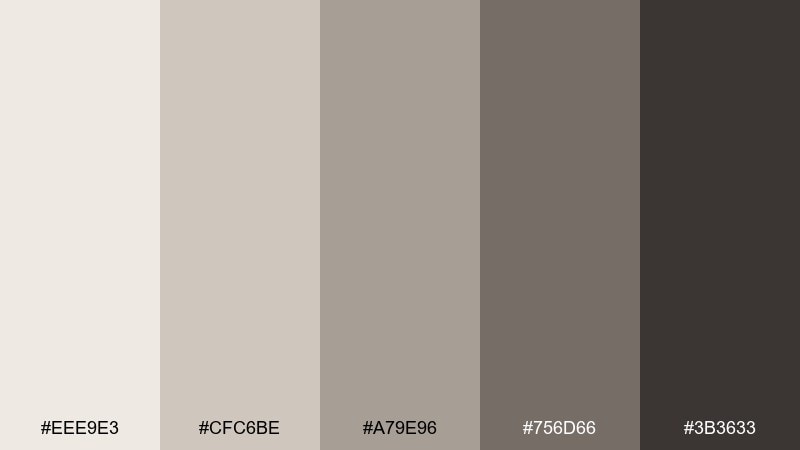
HEX: #EEE9E3 #CFC6BE #A79E96 #756D66 #3B3633
Mood: balanced, grounded, dependable
Best for: websites for builders, real estate, and local businesses
Balanced and dependable like a riverbank path, these neutrals feel familiar and trustworthy. They are a strong choice for service websites that need readability and a calm, practical tone. Pair with a muted blue accent for links and a warm cream for section breaks. Usage tip: keep body text on the lightest background to maintain contrast across long pages.
Image example of riverbank neutrals generated using media.io
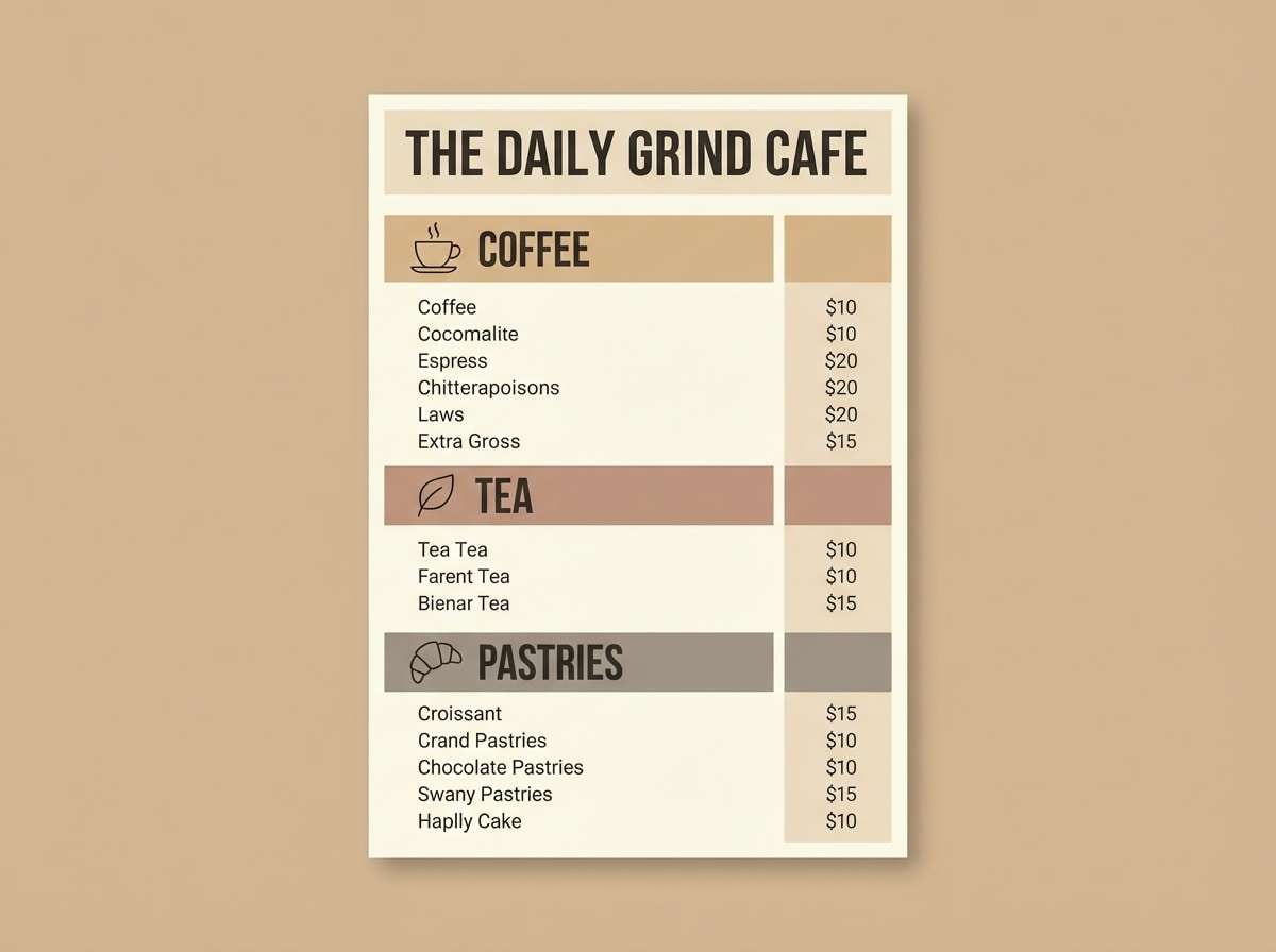
11) Coffeehouse Menu Board
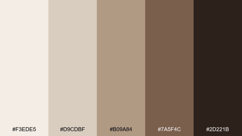
HEX: #F3EDE5 #D9CDBF #B09A84 #7A5F4C #2D221B
Mood: friendly, craft, inviting
Best for: menu design, cafe signage, and promo flyers
Friendly and inviting like the smell of espresso in a small cafe, the warm browns feel handcrafted. Use it for menu boards, seasonal flyers, and loyalty card design where legibility matters. Pair with simple iconography and a cream base so prices and headings read clearly. Usage tip: limit the darkest tone to headings and key prices to guide scanning.
Image example of coffeehouse menu board generated using media.io
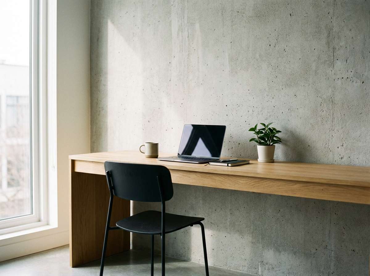
12) Warm Concrete Workspace
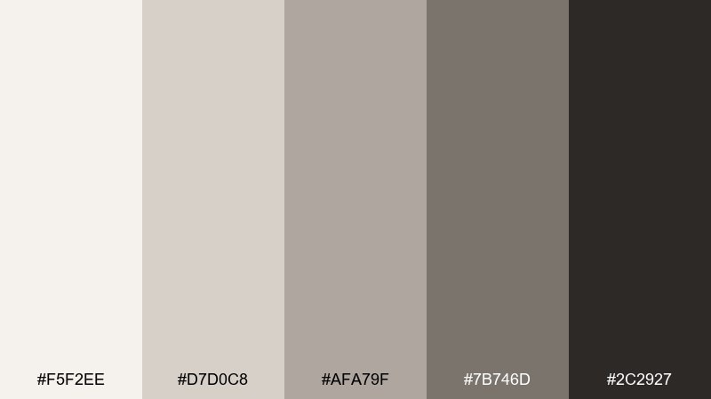
HEX: #F5F2EE #D7D0C8 #AFA79F #7B746D #2C2927
Mood: productive, modern, calm
Best for: workspace interiors and productivity brand visuals
Productive and calm like warm concrete under morning light, the palette feels modern without turning sterile. It works well for coworking spaces, desk setups, and productivity content that needs a neutral foundation. Pair with light wood, black metal, and a single muted teal accessory for a crisp accent. Usage tip: use the mid gray for shadows and depth instead of adding extra colors.
Image example of warm concrete workspace generated using media.io
13) Rustic Cabin Evening
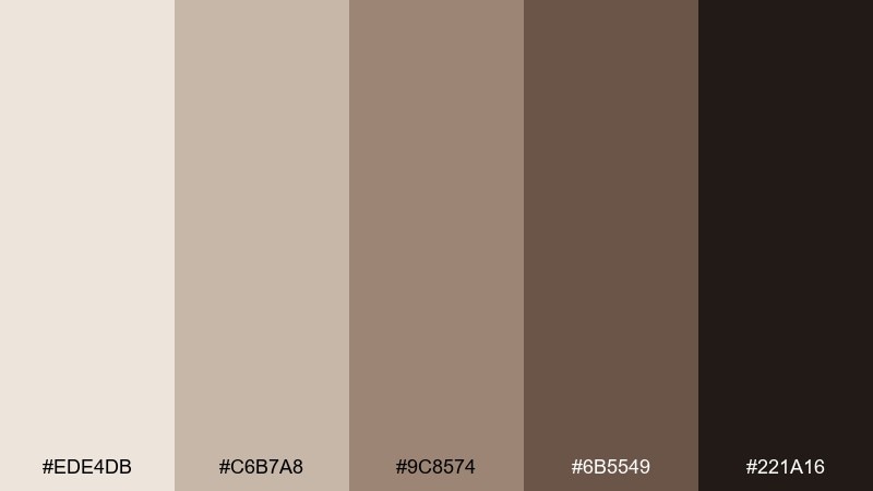
HEX: #EDE4DB #C6B7A8 #9C8574 #6B5549 #221A16
Mood: cozy, rustic, intimate
Best for: travel ads, lodge websites, and hospitality branding
Cozy and intimate like a cabin lamp at night, the darker browns add warmth and depth. Use it for lodge sites, travel promos, and hospitality branding where comfort is the headline. Pair with soft photography, subtle gradients, and a clean serif to lean into the rustic story. Usage tip: keep backgrounds lighter and let the deep shade act as the footer and navigation anchor.
Image example of rustic cabin evening generated using media.io
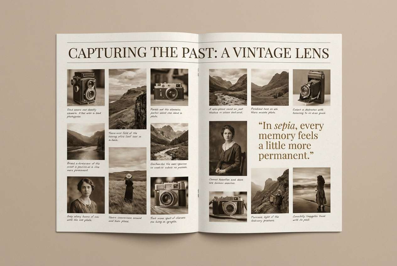
14) Sepia Film Grain
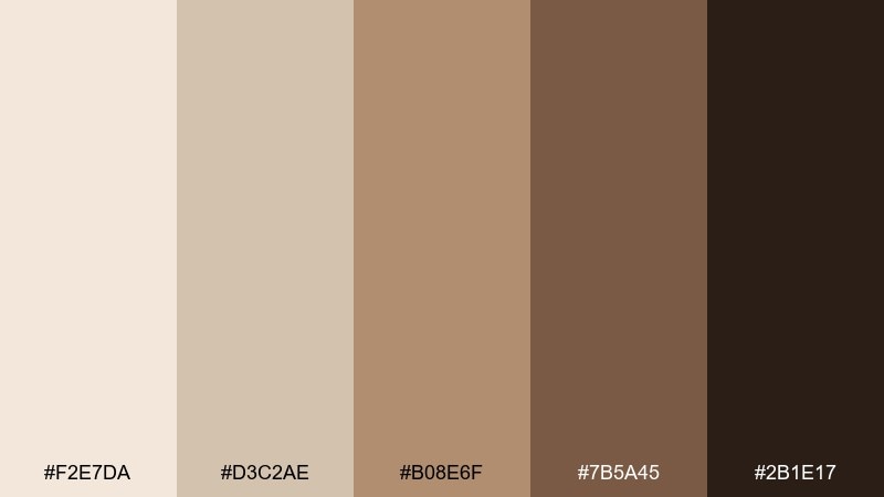
HEX: #F2E7DA #D3C2AE #B08E6F #7B5A45 #2B1E17
Mood: nostalgic, cinematic, warm
Best for: photography presets, vintage posters, and storytelling pages
Nostalgic and cinematic like sepia film grain, these tones add instant story and warmth. They suit long-form storytelling pages, photo preset promos, and retro-inspired posters. Pair with cream margins and subtle noise textures to keep it authentic rather than costume-like. Usage tip: use the mid sepia for overlays at low opacity to unify mixed photos.
Image example of sepia film grain generated using media.io
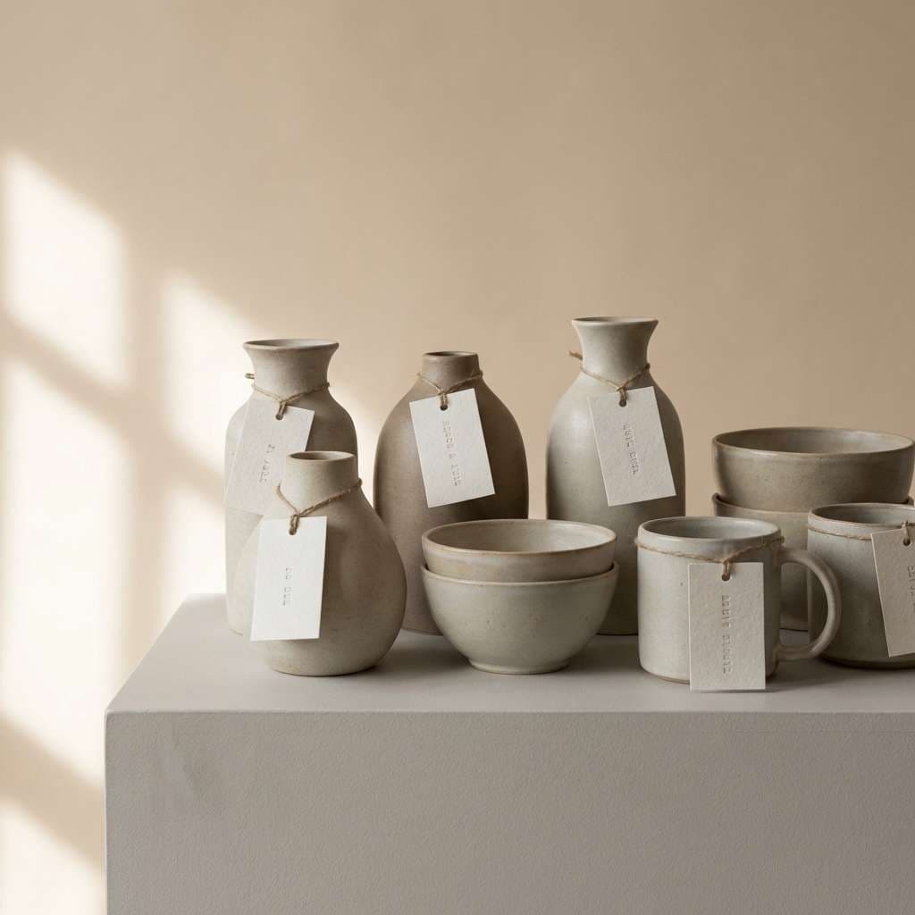
15) Clay Pottery Market
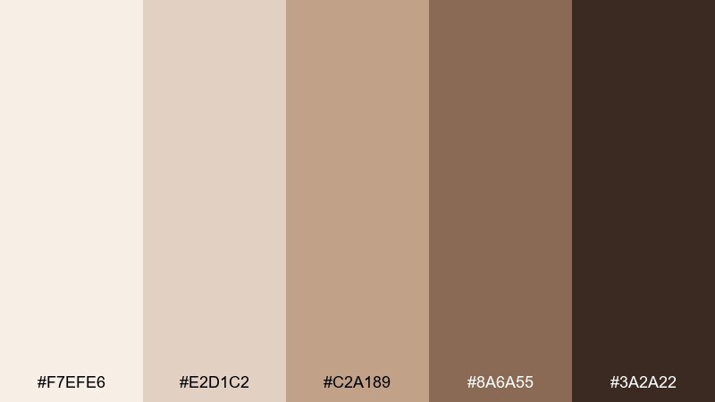
HEX: #F7EFE6 #E2D1C2 #C2A189 #8A6A55 #3A2A22
Mood: handmade, earthy, artisanal
Best for: ceramics packaging, craft fairs, and product ads
Handmade and earthy like sun-baked clay, the palette feels artisan and tactile. It is a strong fit for ceramics brands, craft fair promotions, and product photography where texture sells. Pair with simple sans typography and plenty of negative space to keep it premium. Usage tip: use the warm midtone as the primary brand color and reserve the deep brown for stamps and seals.
Image example of clay pottery market generated using media.io
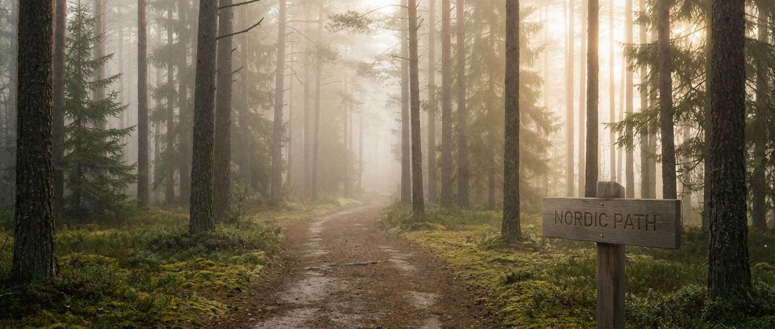
16) Foggy Pine Trail
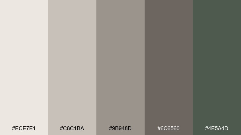
HEX: #ECE7E1 #C8C1BA #9B948D #6C6560 #4E5A4D
Mood: fresh, outdoorsy, grounded
Best for: hiking brands, outdoor newsletters, and nature content
Fresh and grounded like a foggy trail through pines, the muted green keeps the neutrals from feeling flat. Use it for outdoor newsletters, gear landing pages, or nature-first social templates. Pair with crisp white space and a strong photo style to keep it airy. Usage tip: let the pine tone handle interactive elements while neutrals carry the layout.
Image example of foggy pine trail generated using media.io
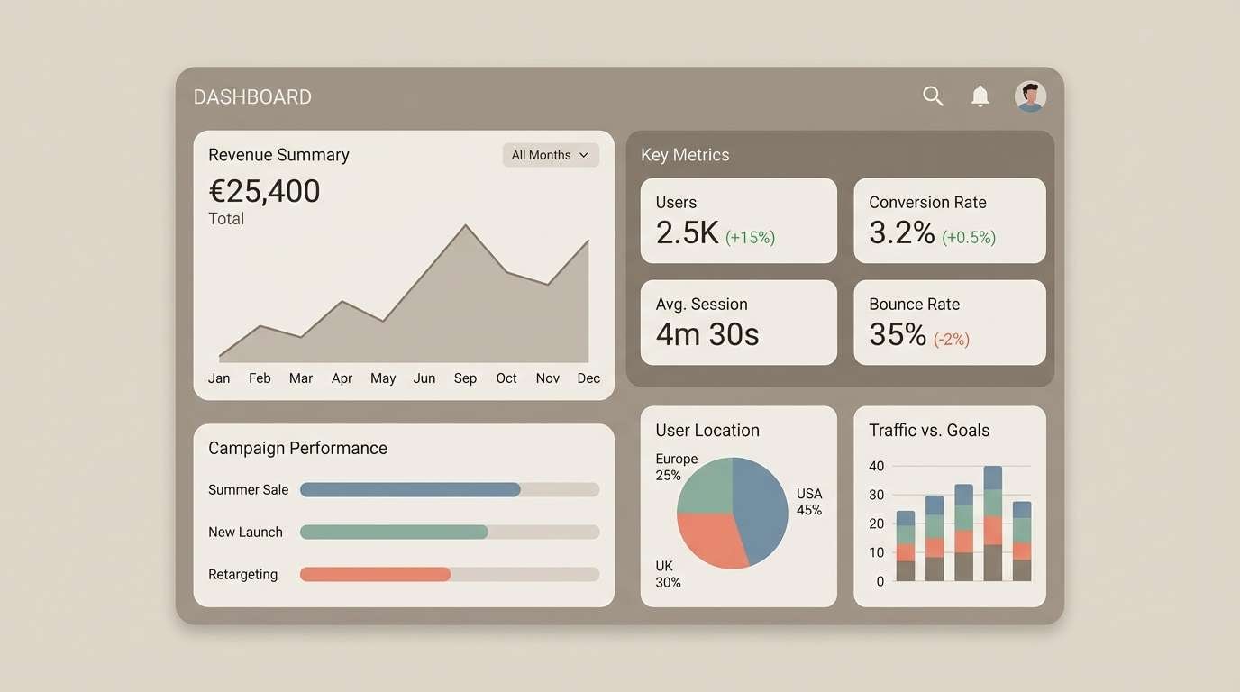
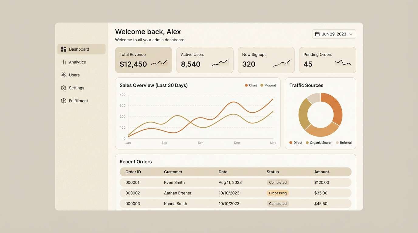
17) Biscuit and Charcoal Dashboard
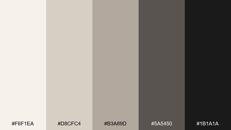
HEX: #F6F1EA #D8CFC4 #B3A89D #5A5450 #1B1A1A
Mood: sharp, modern, high-contrast
Best for: data-heavy UI, fintech apps, and admin panels
Sharp and modern like charcoal on warm paper, the contrast feels premium and readable. It is built for data-heavy UI where charts, tables, and dense navigation need structure. Pair with a single accent color for alerts and success states so the interface stays calm. Usage tip: use charcoal for text and icons, and keep panels in the biscuit range to reduce glare.
Image example of biscuit and charcoal dashboard generated using media.io
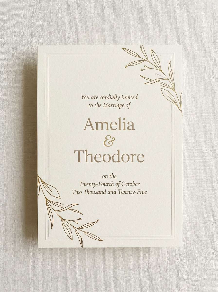
18) Antique Paper Invitation
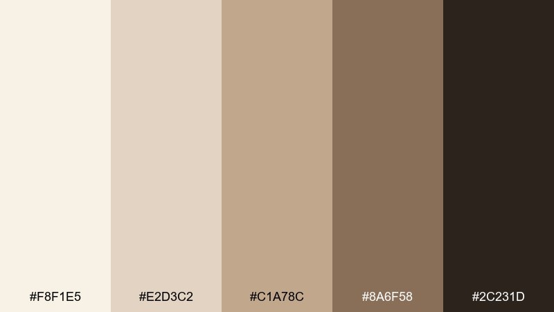
HEX: #F8F1E5 #E2D3C2 #C1A78C #8A6F58 #2C231D
Mood: romantic, vintage, elegant
Best for: wedding invitations, stationery, and formal announcements
Romantic and vintage like antique stationery, the warm neutrals feel timeless and soft. Use it for wedding invitations, formal announcements, or boutique event stationery where paper texture shines. Pair with a classic serif, delicate borders, and restrained flourishes for an elevated look. Usage tip: keep the background in the lightest shade and use the darkest tone only for names and key details.
Image example of antique paper invitation generated using media.io
19) Mocha Rose Accent
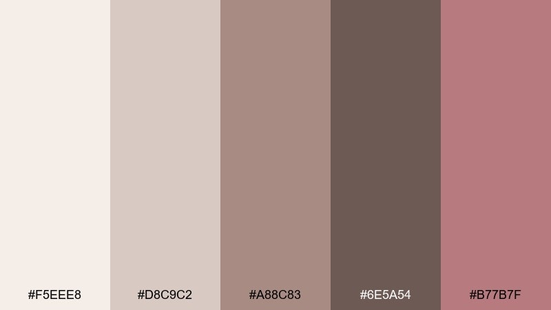
HEX: #F5EEE8 #D8C9C2 #A88C83 #6E5A54 #B77B7F
Mood: soft, modern, subtly playful
Best for: beauty branding, boutique socials, and creator kits
Soft and modern like mocha with a rosy swirl, the accent adds personality without breaking the neutral base. It is ideal for beauty brands, creator media kits, and boutique social templates that need warmth and approachability. Pair with clean sans typography and generous spacing to keep it sophisticated. Usage tip: use the rose only for highlights like tags, buttons, or price markers so it stays special.
Image example of mocha rose accent generated using media.io
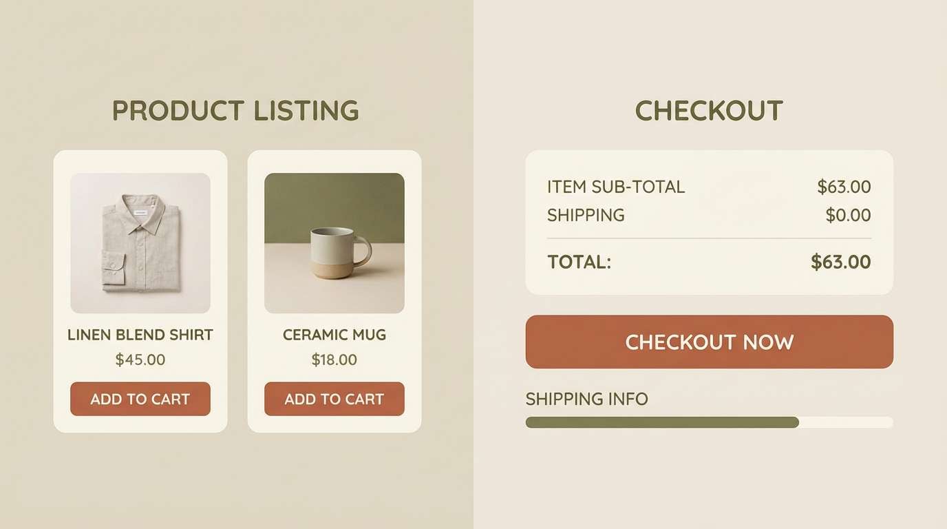
20) Bronze Mist E-commerce
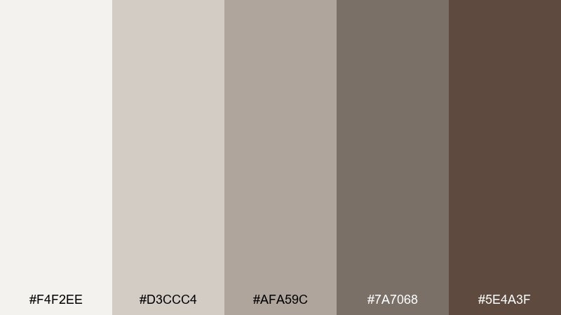
HEX: #F4F2EE #D3CCC4 #AFA59C #7A7068 #5E4A3F
Mood: polished, trustworthy, upscale
Best for: e-commerce UI, product listings, and checkout flows
Polished and trustworthy like bronze in a soft mist, these neutrals feel upscale and steady. They make a strong base for e-commerce UI where product photos must stay true and CTAs need clarity. Pair with one saturated accent for primary actions to avoid a monotone checkout experience, and keep secondary buttons muted. Usage tip: test hover and disabled states early, since subtle neutrals can blur without clear contrast steps.
Image example of bronze mist e-commerce generated using media.io
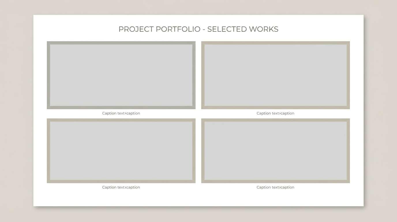
21) Cinder and Sandstone
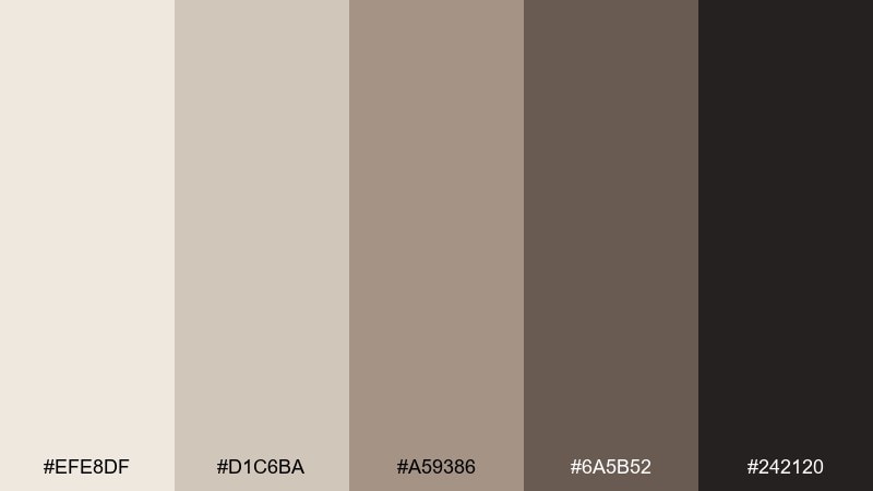
HEX: #EFE8DF #D1C6BA #A59386 #6A5B52 #242120
Mood: architectural, grounded, confident
Best for: architecture portfolios and construction presentations
Architectural and grounded like cinder against sandstone, the tones feel structured and confident. Use it for portfolios, proposal decks, and presentation templates that need clarity and restraint. Pair with thin rules, grid systems, and strong photography of materials like concrete and wood. Usage tip: use the darkest tone for section dividers and titles to keep slides crisp from a distance.
Image example of cinder and sandstone generated using media.io
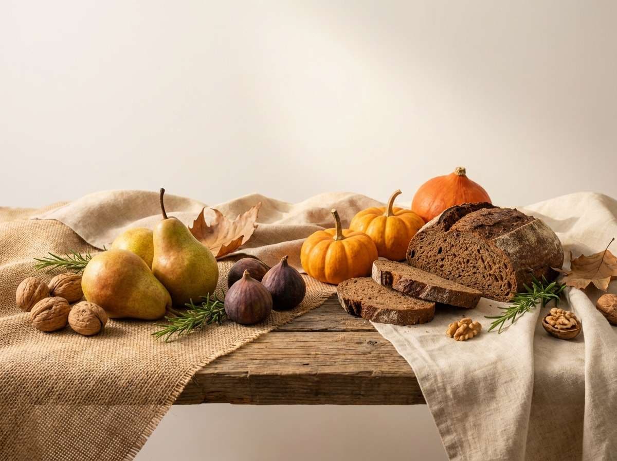
22) Harvest Dusk Pairing
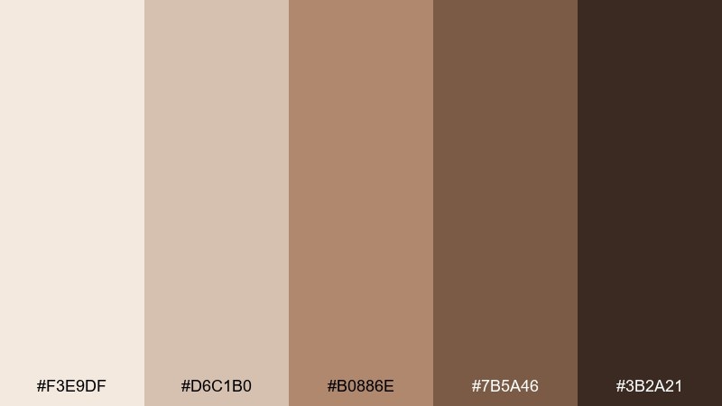
HEX: #F3E9DF #D6C1B0 #B0886E #7B5A46 #3B2A21
Mood: warm, seasonal, inviting
Best for: autumn campaigns, food photography, and seasonal landing pages
Warm and seasonal like harvest dusk, the palette feels inviting without turning orange-heavy. It is one of those gray brown color combinations that works for food content, autumn sales pages, and cozy email headers. Pair with natural props like linen, wood, and soft shadows to keep the mood consistent. Usage tip: put the deepest shade behind white type for hero banners and promo ribbons.
Image example of harvest dusk pairing generated using media.io
What Colors Go Well with Gray Brown?
Gray brown pairs naturally with warm whites, cream, and oatmeal tones for a soft, cohesive neutral range. This is the easiest way to keep layouts airy while still feeling cozy.
For contrast, try charcoal or near-black for typography and thin dividers—this keeps readability high without introducing harsh pure black. In interiors, matte black hardware works especially well.
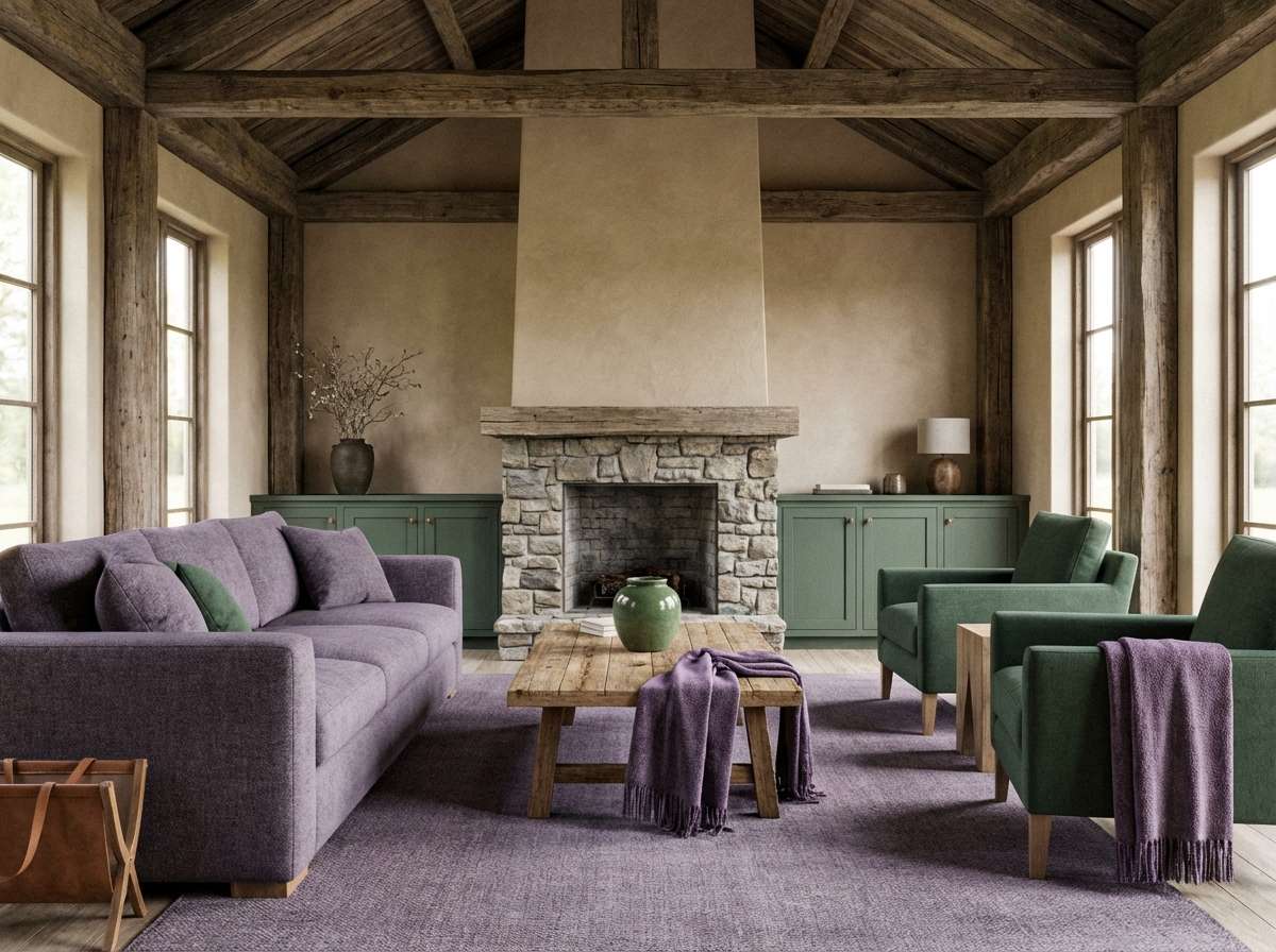
If you want a single accent color, muted greens (sage, pine), dusty blues, or a restrained rose/pastel pink can add personality while keeping the palette grounded.
How to Use a Gray Brown Color Palette in Real Designs
Start with roles, not swatches: pick a light base (background), a mid tone (cards/sections), a darker neutral (borders), and a near-black (text). Then add one accent color for CTAs or highlights.
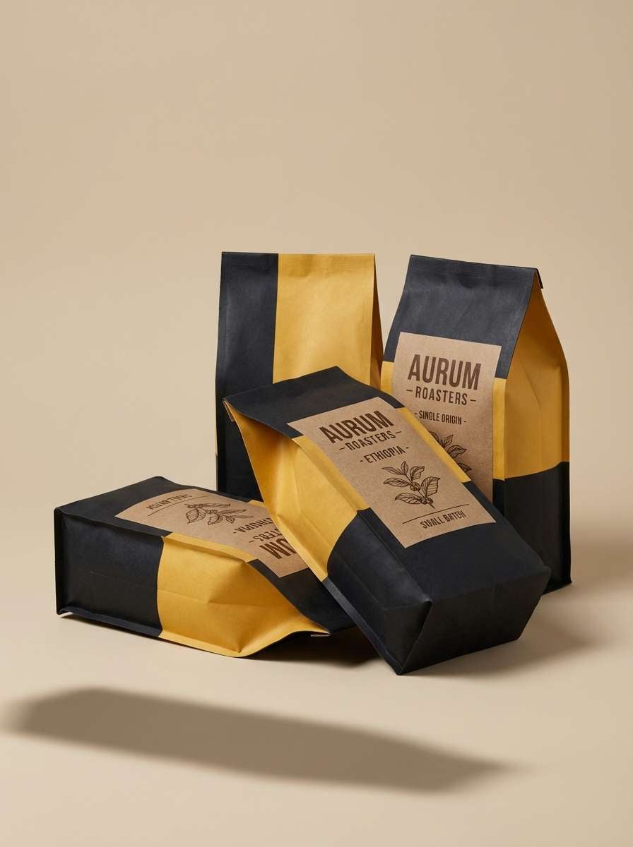
In branding, gray brown tones shine when you lean into materials—uncoated paper, embossing, kraft textures, and natural photography. Let texture and lighting create depth instead of adding extra colors.
For UI, test accessibility early: ensure body text sits on the lightest shade, and reserve the darkest tone for headings, icons, and key navigation so the interface doesn’t feel heavy.
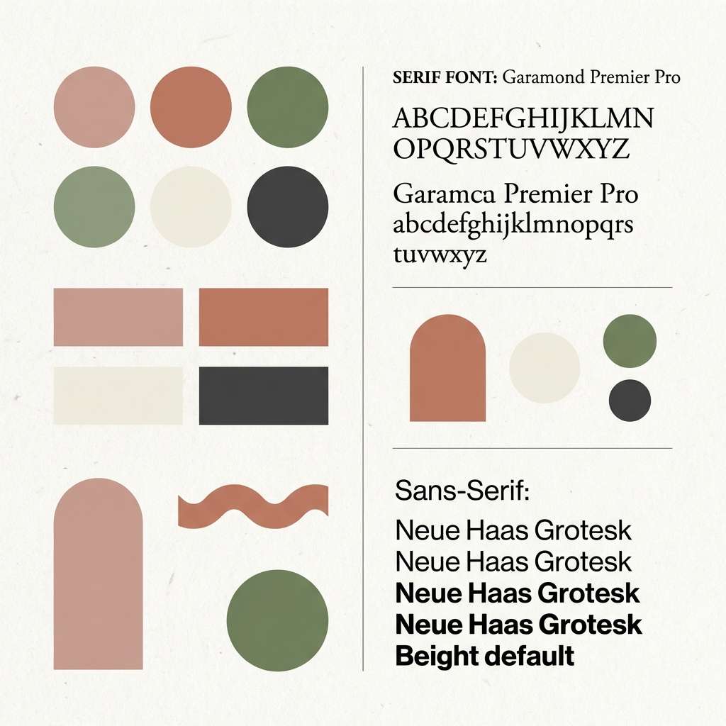
Create Gray Brown Palette Visuals with AI
If you’re building a moodboard, brand kit, or UI concept, generating a few consistent images helps you validate the vibe fast. With AI, you can test “linen minimal,” “modern rustic,” or “premium dashboard” looks in minutes.
Use your palette keywords (mushroom, taupe, mocha, sandstone) plus a clear scene description, then iterate by changing lighting (soft daylight vs. cinematic dusk) to match your use case.
When your visuals look right, reuse the same prompt structure across multiple outputs to keep style consistency for ads, landing pages, and social templates.
Gray Brown Color Palette FAQs
-
What is a gray brown color (is it the same as taupe)?
Gray brown is a broad warm-neutral family that mixes brown with gray undertones. Taupe is a common subset of gray brown (often slightly cooler), but gray brown can also lean more mocha, mushroom, or clay depending on the undertone. -
How do I keep a gray brown palette from looking muddy?
Increase value separation (use a lighter base and a darker anchor), add texture instead of extra colors, and introduce a single accent (sage, dusty blue, or muted rose). Avoid placing mid-tones next to each other without a clear contrast step. -
What accent color works best with gray brown?
Muted greens (sage/pine) are the most natural pairing, while dusty blue adds a modern, calm contrast. For a softer, more playful look, a restrained pastel pink/rose works well as an accent. -
Is gray brown good for website and app UI?
Yes—gray brown is excellent for calm, premium UI foundations. Use the lightest shade for backgrounds, keep text near charcoal/near-black for accessibility, and add one saturated accent for primary actions so CTAs don’t blend in. -
Which gray brown tones are best for interiors?
“Mushroom,” “oat,” and “smoked clay” styles work well for walls, textiles, and cabinetry because they feel warm under daylight and lamp light. Use the deepest brown for small anchors (trim, hardware, frames) instead of large surfaces. -
Do gray brown palettes print well?
They can, but mid-tones may darken on uncoated stock. Always run a print test, consider slightly brightening mid values, and use rich near-black sparingly so the design stays crisp. -
How can I generate images that match my gray brown palette?
Use a consistent prompt template that specifies lighting (soft daylight, warm evening), materials (linen, oak, stone, kraft paper), and composition (minimal, clean background). Then generate variations while keeping the same style keywords for consistent outputs.


