

Gothic palettes blend deep shadows with romantic highlights, creating designs that feel cinematic, elegant, and a little mysterious. They’re ideal when you want high contrast without loud, neon energy.
Below are 20+ gothic color palette ideas with HEX codes, plus real-use tips for branding, UI, posters, invitations, and moody photography edits.
In this article
- Why Gothic Palettes Work So Well
-
- cathedral velvet
- midnight rose
- iron and ink
- raven greenhouse
- obsidian amethyst
- sepulchre gold
- storm chapel
- crimson candelabra
- moonlit lace
- antique bloodstone
- poisoned teal
- crypt orchid
- soot and sapphire
- witch hazel smoke
- gargoyle stone
- black cherry vinyl
- velvet olive dusk
- arcane copper
- winter mourning
- relic ivory
- noir plum ash
- thorned berry
- cursed emerald ink
- What Colors Go Well with Gothic?
- How to Use a Gothic Color Palette in Real Designs
- Create Gothic Palette Visuals with AI
Why Gothic Palettes Work So Well
A gothic color palette is built around intentional darkness: near-black bases, deep jewel tones, and softened highlights. That structure naturally creates hierarchy, making typography and focal elements feel more dramatic with less effort.
Gothic palettes also communicate emotion quickly—romance, mystery, heritage, or power—depending on whether you lean into burgundy, violet, slate blue, or antique gold. Even minimal layouts feel cinematic because the shadows do the storytelling.
Most importantly, gothic color combinations scale well across media. The same palette can support luxury branding, dark-mode UI, posters, and photography presets as long as you control contrast and keep accents restrained.
20+ Gothic Color Palette Ideas (with HEX Codes)
1) Cathedral Velvet
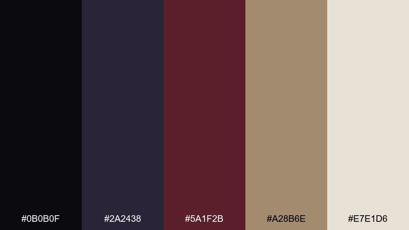
HEX: #0b0b0f #2a2438 #5a1f2b #a28b6e #e7e1d6
Mood: dark romantic, regal, candlelit
Best for: luxury branding and logo systems
Dark velvet shadows and chapel candlelight set a regal, romantic tone with a soft antique glow. Use the near-black and deep plum for primary surfaces, then bring in burgundy for emphasis without turning loud. The warm gold-beige and bone white make type feel editorial and premium. For a refined gothic color palette, keep accents under 10 percent and let whitespace do the work.
Image example of cathedral velvet generated using media.io
Media.io is an online AI studio for creating and editing video, image, and audio in your browser.

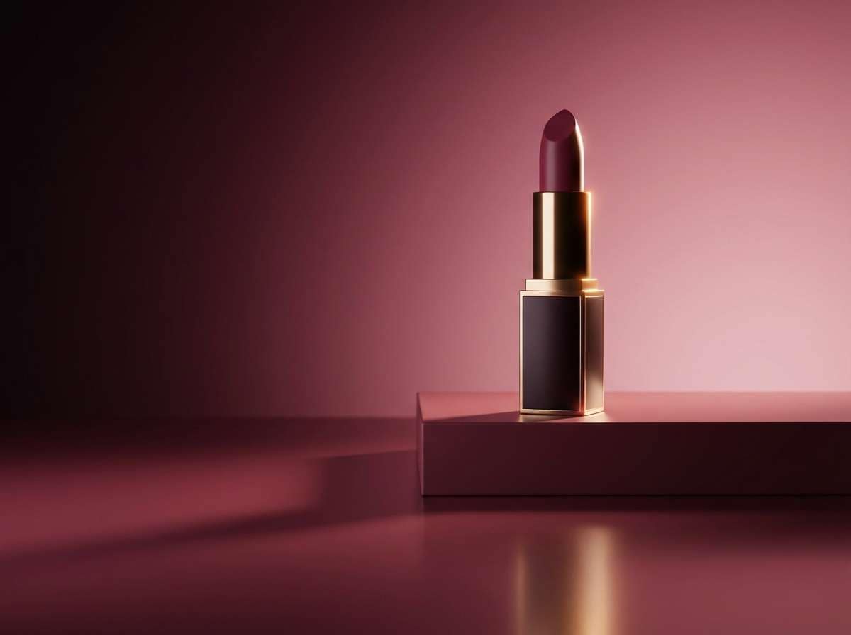
2) Midnight Rose
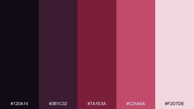
HEX: #120a14 #3b1c32 #7a1e3a #c24a6a #f2d7de
Mood: romantic, dramatic, modern vintage
Best for: beauty product ads and social posts
Midnight florals and crushed rose petals give this mix a dramatic, intimate glow. Anchor layouts with the inky base, then layer wine and raspberry tones for depth in gradients and overlays. The blush highlight keeps skin tones flattering and prevents the design from feeling heavy. Use the brighter pink sparingly for call-to-action buttons and price tags.
Image example of midnight rose generated using media.io
3) Iron and Ink
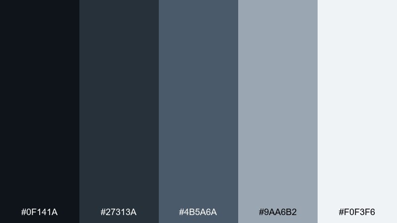
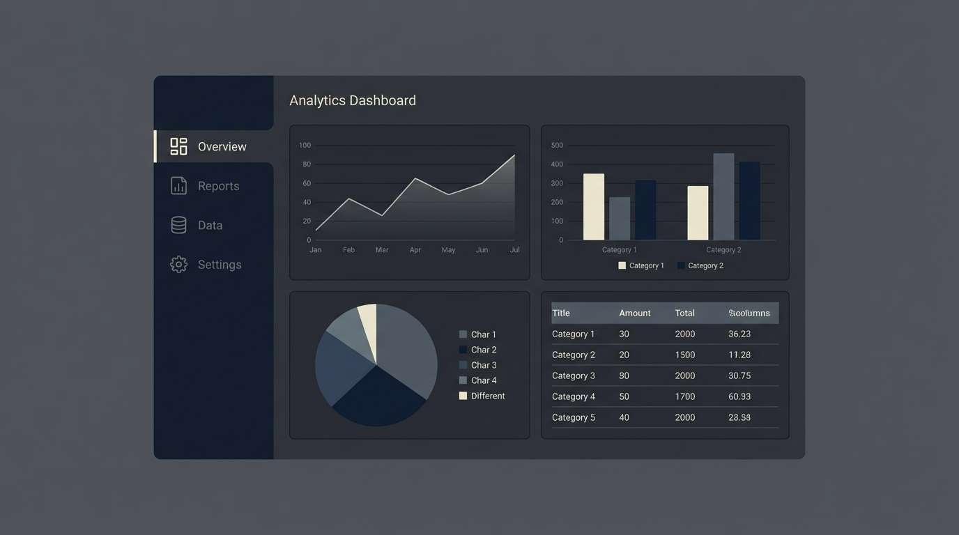
HEX: #0f141a #27313a #4b5a6a #9aa6b2 #f0f3f6
Mood: industrial, crisp, nocturnal
Best for: dashboard UI and data-heavy apps
Cold steel, ink stains, and rainy-night reflections create a clean, technical mood. The deep slate and charcoal support dark-mode surfaces while the mid blues keep charts readable. Push contrast with the pale mist tint for cards, dividers, and empty states. Tip: reserve the lightest color for key numbers and totals to guide scanning.
Image example of iron and ink generated using media.io
4) Raven Greenhouse
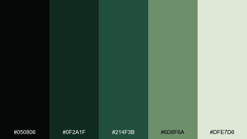
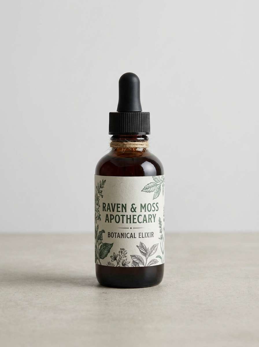
HEX: #050806 #0f2a1f #214f3b #6d8f6a #dfe7d6
Mood: mysterious, botanical, earthy
Best for: apothecary packaging and labels
Shadowy leaves and damp glass bring a botanical, secret-garden vibe. Pair the near-black with deep green for main panels, then use the moss tone for seals and secondary blocks. The pale herbal tint is ideal for ingredient lists and barcode areas. Keep the greens matte to avoid a neon look and lean into natural textures.
Image example of raven greenhouse generated using media.io
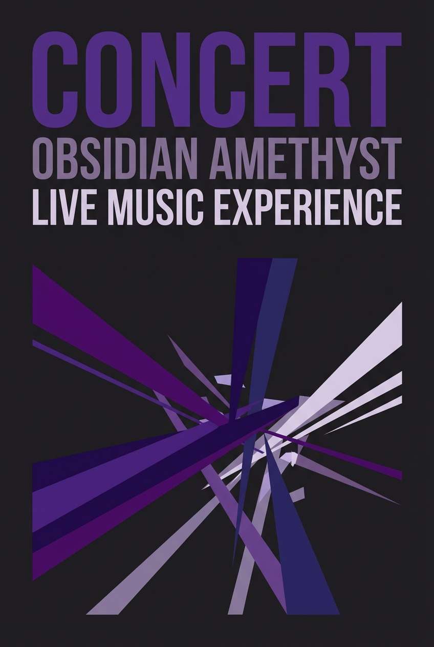
5) Obsidian Amethyst
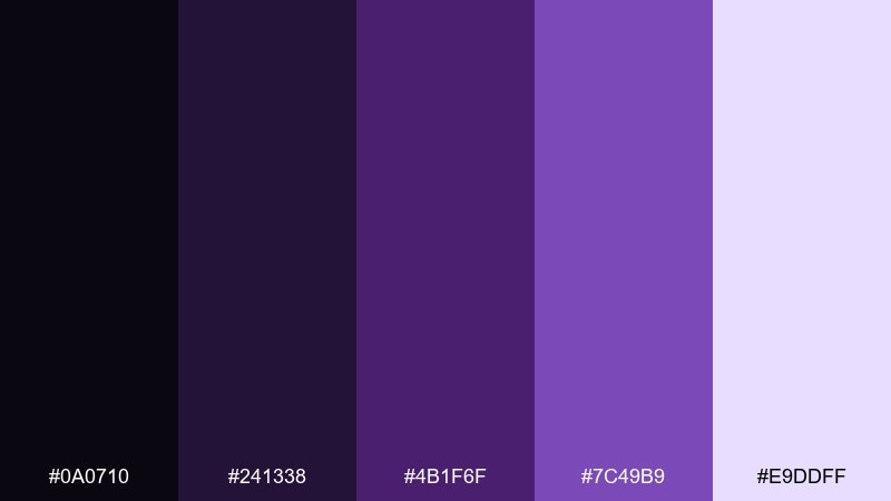
HEX: #0a0710 #241338 #4b1f6f #7c49b9 #e9ddff
Mood: arcane, luxe, night-sky
Best for: music posters and album art
Obsidian darkness and amethyst glow feel like stage lights cutting through fog. Build hierarchy with the two deepest purples, then let violet and lavender do the spotlight work for titles. The pale lilac makes small text readable on dark backgrounds without turning stark white. Add subtle grain and keep gradients smooth for a premium finish.
Image example of obsidian amethyst generated using media.io
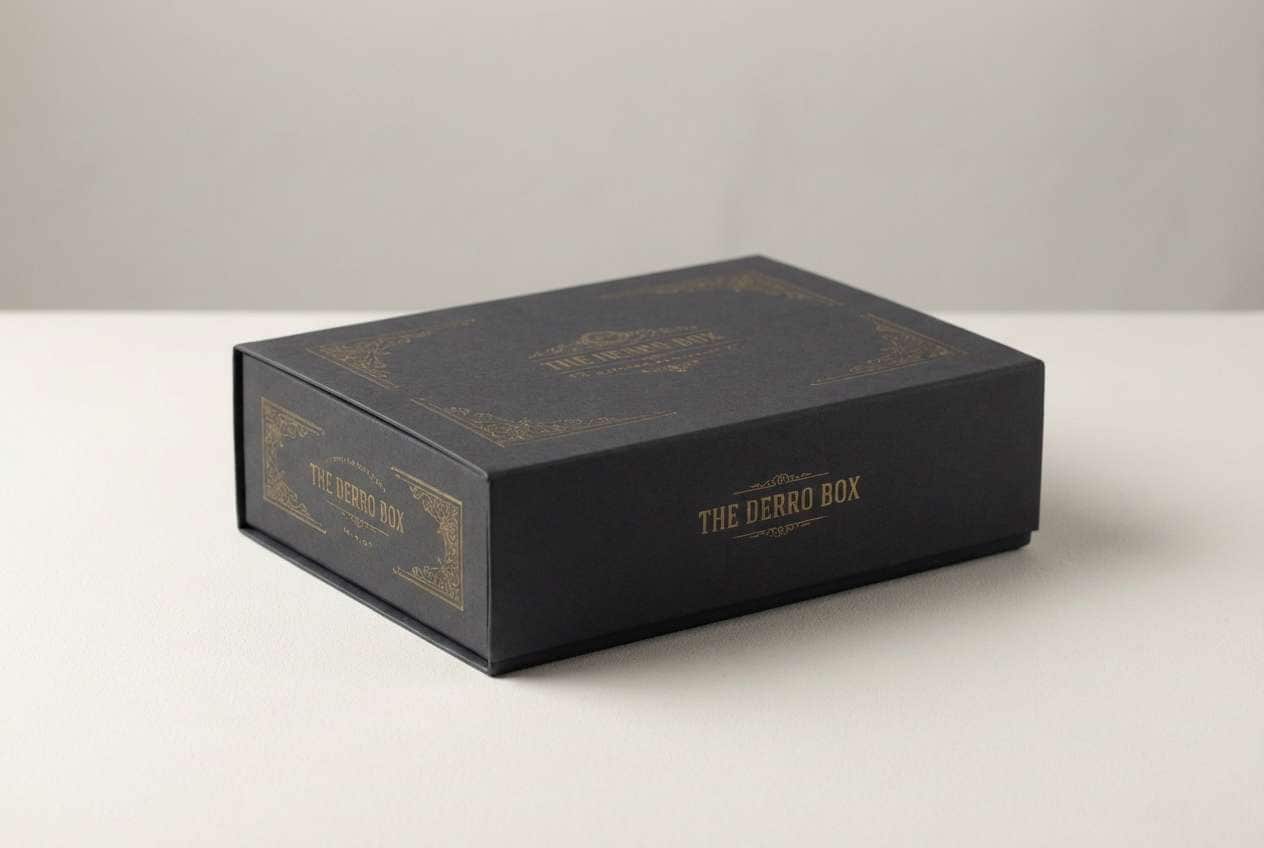
6) Sepulchre Gold
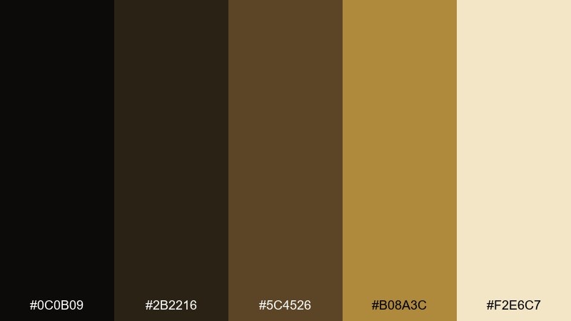
HEX: #0c0b09 #2b2216 #5c4526 #b08a3c #f2e6c7
Mood: antique, opulent, candlelit
Best for: premium packaging and gift boxes
Aged metal and warm candlelight create an antique, museum-like richness. Use the dark browns for panels and shadows, then bring in the gold for borders, icons, and foil effects. The parchment tint keeps layouts readable and elevates the overall look. These gothic color combinations shine when you limit gold to thin lines and small marks.
Image example of sepulchre gold generated using media.io
7) Storm Chapel
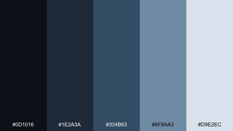
HEX: #0d1016 #1e2a3a #334b63 #6f8aa3 #d9e2ec
Mood: brooding, cool, cinematic
Best for: website hero sections and landing pages
Thundercloud blues and cold stone shadows feel cinematic and focused. Keep the darkest tones for headers and nav, then use the mid blues for buttons, links, and graph lines. The pale blue-gray works as a clean page background that still feels moody. Tip: add a subtle vignette behind headlines to boost contrast without harsh outlines.
Image example of storm chapel generated using media.io
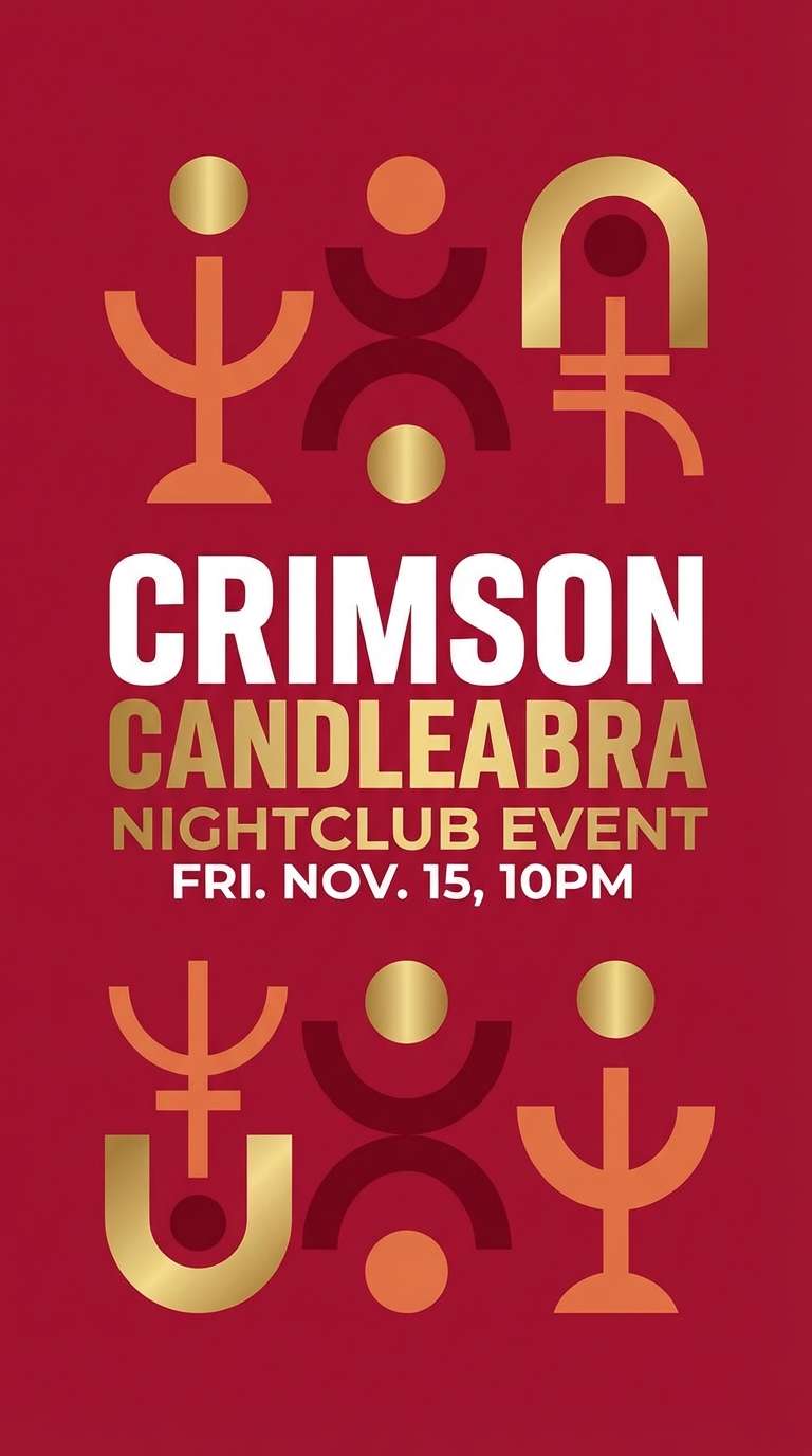
8) Crimson Candelabra
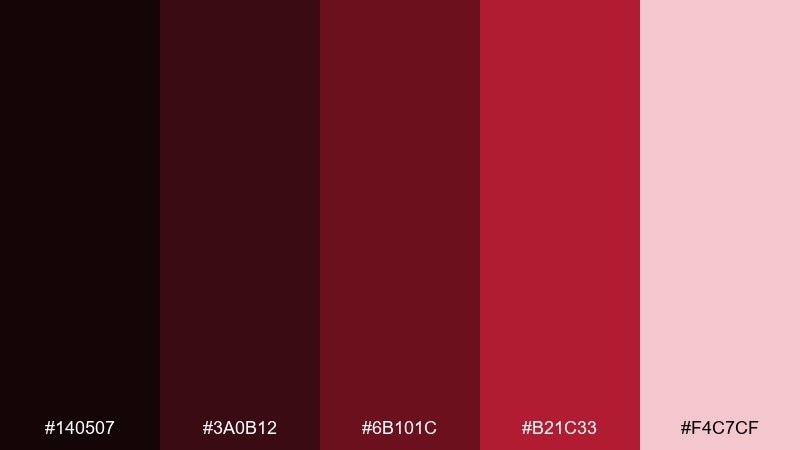
HEX: #140507 #3a0b12 #6b101c #b21c33 #f4c7cf
Mood: dramatic, theatrical, passionate
Best for: event flyers and nightclub posters
Hot crimson against deep shadow feels like candle flames in a velvet room. Use the two darkest reds for background and type blocks, then let the brighter crimson carry headlines and date details. The pale blush is perfect for small legal copy and QR code zones. Keep spacing generous so the intensity reads intentional, not cluttered.
Image example of crimson candelabra generated using media.io
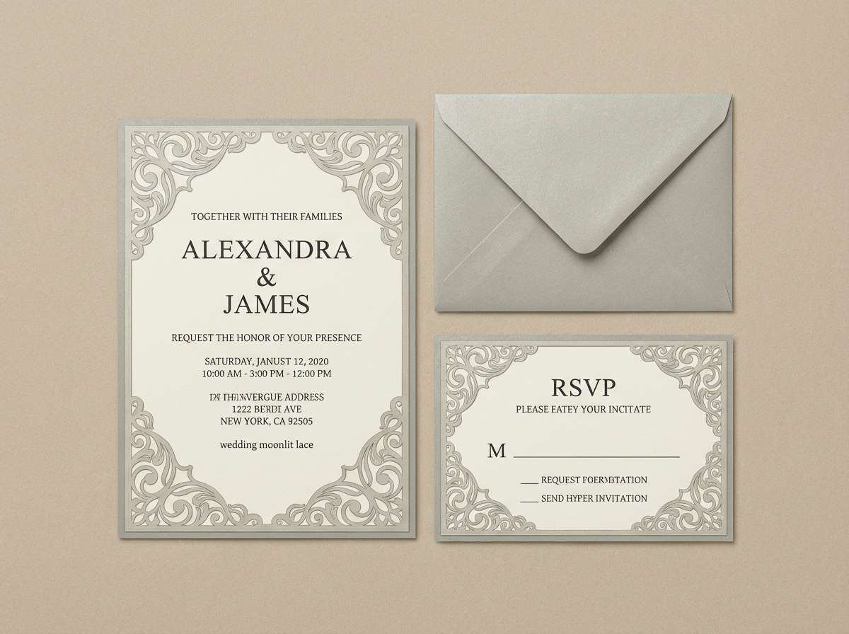
9) Moonlit Lace
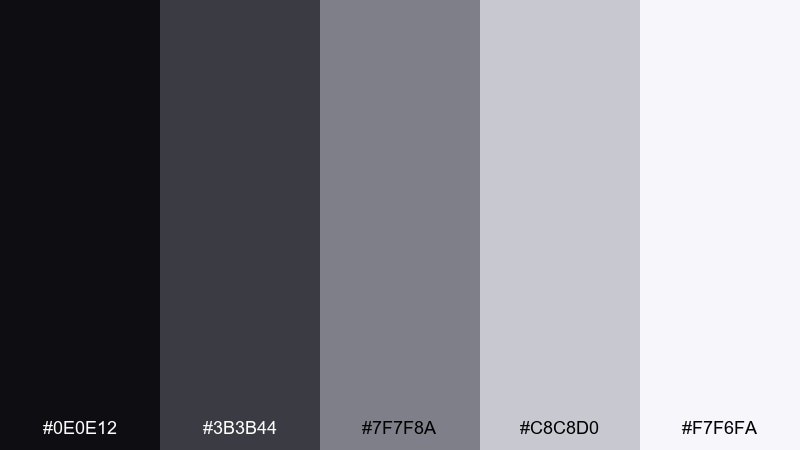
HEX: #0e0e12 #3b3b44 #7f7f8a #c8c8d0 #f7f6fa
Mood: soft, elegant, nocturnal
Best for: wedding invitations and stationery
Moonlight on lace reads soft and elegant, with a quiet gothic edge. Pair the near-black with the warm gray-violet for typography and monograms. The lighter grays give you room for delicate patterns and emboss-like details. For a modern gothic color combination, keep florals or lace motifs subtle and use the palest tint as your paper base.
Image example of moonlit lace generated using media.io
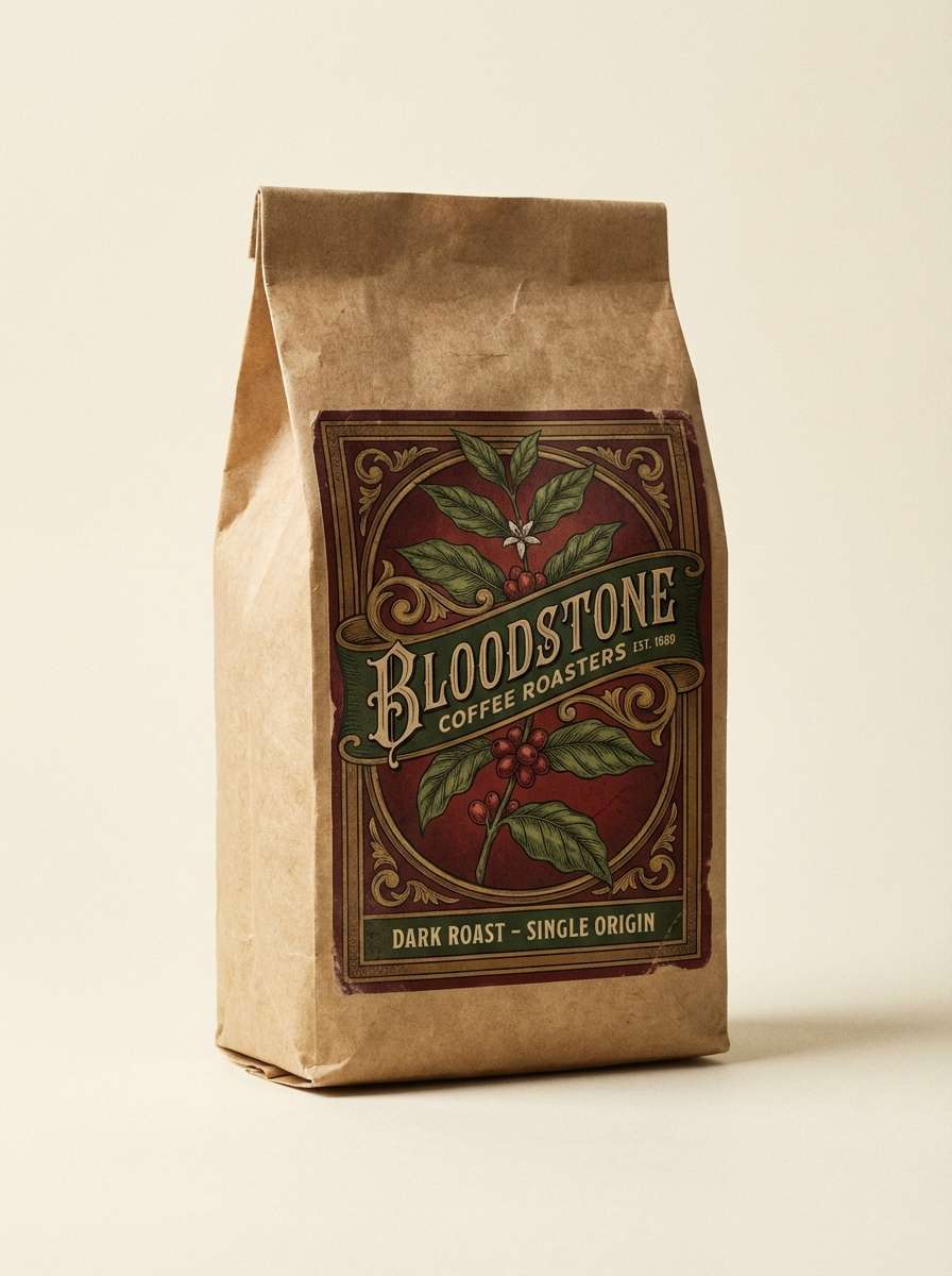
10) Antique Bloodstone

HEX: #0f0b0a #3a1f1a #6b3a2a #a05a3d #e6d3c7
Mood: heritage, warm, shadowy
Best for: coffee branding and vintage labels
Burnt sienna and dark cocoa tones evoke old leather, stained paper, and warm lamplight. Use the deepest brown as a base, then layer the rust and clay shades for label panels and stamps. The pale parchment color improves legibility and keeps the palette from feeling muddy. Tip: pair with a serif typeface and minimal iconography for a classic look.
Image example of antique bloodstone generated using media.io
11) Poisoned Teal
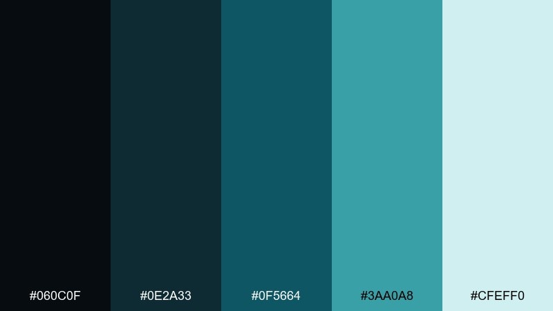
HEX: #060c0f #0e2a33 #0f5664 #3aa0a8 #cfeff0
Mood: enigmatic, modern, high-contrast
Best for: tech startup UI and SaaS branding
Deep ocean shadows with a sharp teal glow feel modern and slightly dangerous. Use the darkest tones for navigation and footers, then apply the saturated teal for interactive states and links. The pale aqua tint works as a highlight background for notifications and tooltips. Tip: keep teal as a single accent color to maintain clarity and consistency.
Image example of poisoned teal generated using media.io
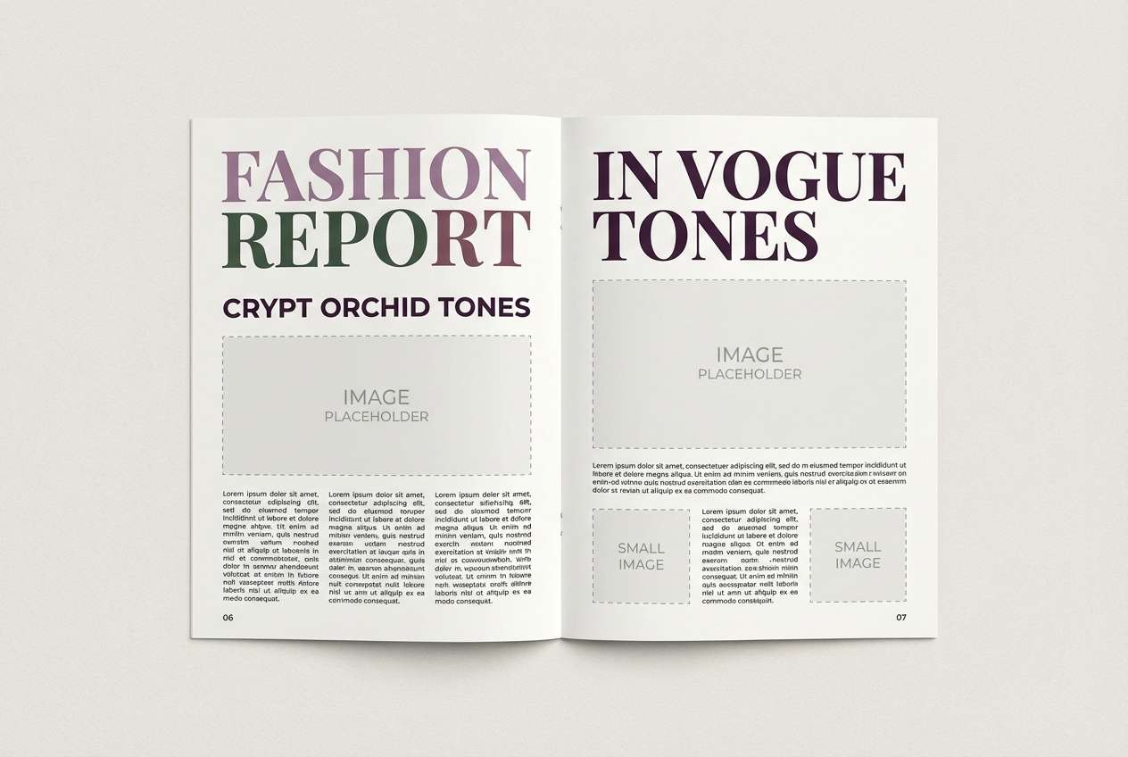
12) Crypt Orchid
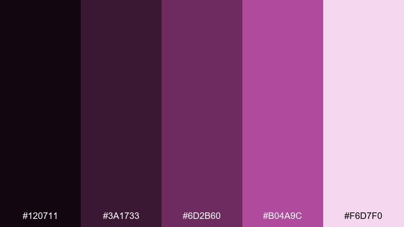
HEX: #120711 #3a1733 #6d2b60 #b04a9c #f6d7f0
Mood: mystical, floral, decadent
Best for: editorial layouts and fashion lookbooks
Orchid purples and smoky plum tones feel decadent, like perfumed air in a dim hallway. Use the darkest shade for columns and captions, then let the magenta orchid pop for pull quotes and section headers. The soft pink highlight keeps spreads readable and balances heavy imagery. This gothic color palette works best with lots of negative space and a restrained grid.
Image example of crypt orchid generated using media.io
13) Soot and Sapphire
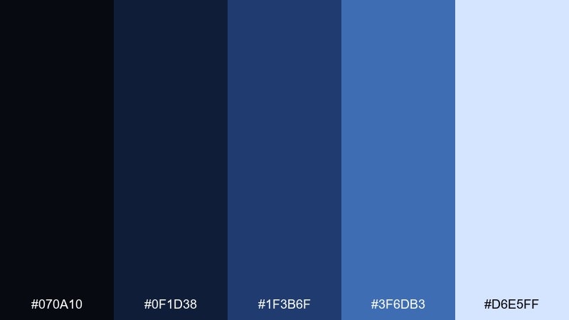
HEX: #070a10 #0f1d38 #1f3b6f #3f6db3 #d6e5ff
Mood: nightfall, crisp, luminous
Best for: book covers and podcast artwork
Sooty blues and bright sapphire highlights suggest night air and distant city lights. Use the darkest navy for background, then build depth with the mid blues for shapes and frames. The icy tint can highlight titles and episode numbers without feeling stark. Tip: add subtle texture behind the type to prevent banding in dark gradients.
Image example of soot and sapphire generated using media.io
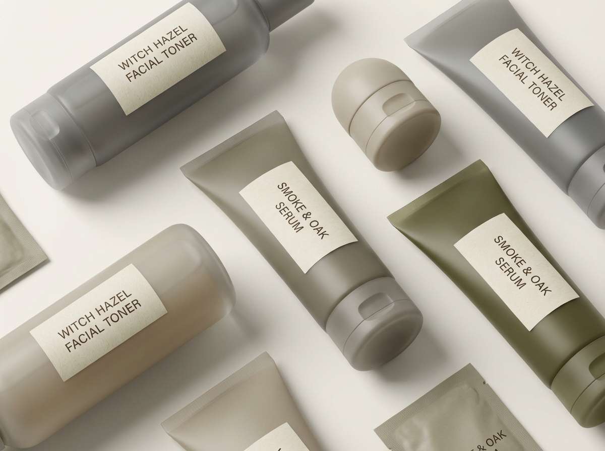
14) Witch Hazel Smoke
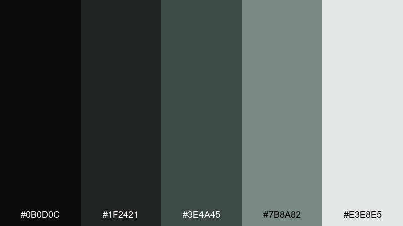
HEX: #0b0d0c #1f2421 #3e4a45 #7b8a82 #e3e8e5
Mood: herbal, muted, atmospheric
Best for: skincare packaging and ingredient sheets
Smoky greens and soft ash tones feel calm, herbal, and slightly mysterious. Keep the darkest shade for brand marks and ingredient headings, then use the mid green-gray for secondary panels. The pale mist works as a clean backdrop that still reads moody. Tip: pair with thin line icons and matte finishes to keep everything understated.
Image example of witch hazel smoke generated using media.io
15) Gargoyle Stone
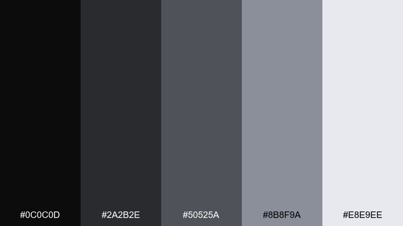
HEX: #0c0c0d #2a2b2e #50525a #8b8f9a #e8e9ee
Mood: architectural, minimal, severe
Best for: portfolio sites and typography-focused pages
Carved stone and overcast skies give this palette a sharp, architectural calm. Use black and charcoal for strong typographic contrast, then lean on medium gray for dividers and UI borders. The cool light grays make excellent reading backgrounds for long-form content. Tip: add one bold type weight and let spacing carry the drama.
Image example of gargoyle stone generated using media.io

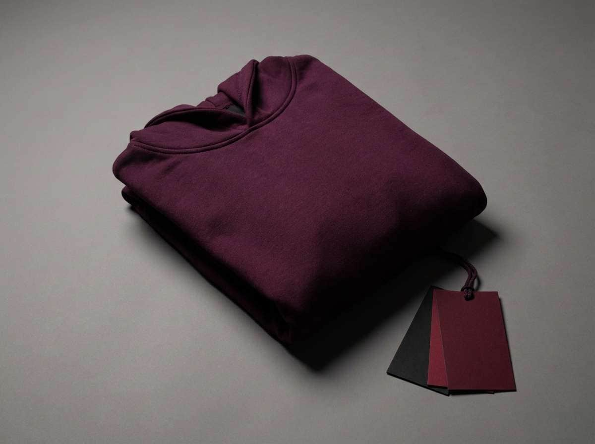
16) Black Cherry Vinyl
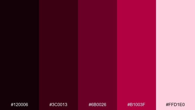
HEX: #120006 #3c0013 #6b0026 #b1003f #ffd1e0
Mood: bold, glossy, nightlife
Best for: streetwear drops and product promos
Glossy black cherry tones feel like vinyl sheen and neon reflections after midnight. Use the darkest shades for backgrounds and type, then let the hot cherry red punch through on badges and limited-drop labels. The soft pink highlight can soften edges on overlays and gradients. These gothic color combinations work best with tight, high-contrast layouts and big type.
Image example of black cherry vinyl generated using media.io
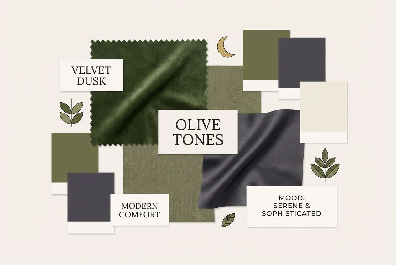
17) Velvet Olive Dusk
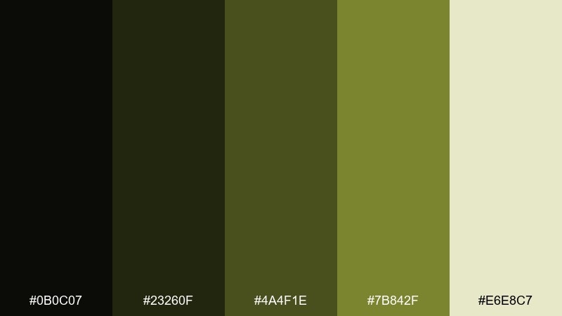
HEX: #0b0c07 #23260f #4a4f1e #7b842f #e6e8c7
Mood: earthy, muted, forest-at-dusk
Best for: interior mood boards and lifestyle blogs
Dusk in a dense forest feels grounded and intimate, with a quiet olive warmth. Use the dark olive-black for headers and frames, then layer the mid olives for swatches, icons, and highlights. The pale cream-green brings breathing room to text areas and cards. Tip: pair with wood textures and warm neutrals for a cozy, lived-in look.
Image example of velvet olive dusk generated using media.io
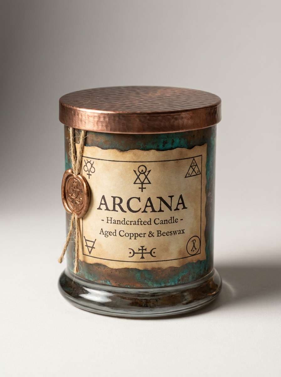
18) Arcane Copper
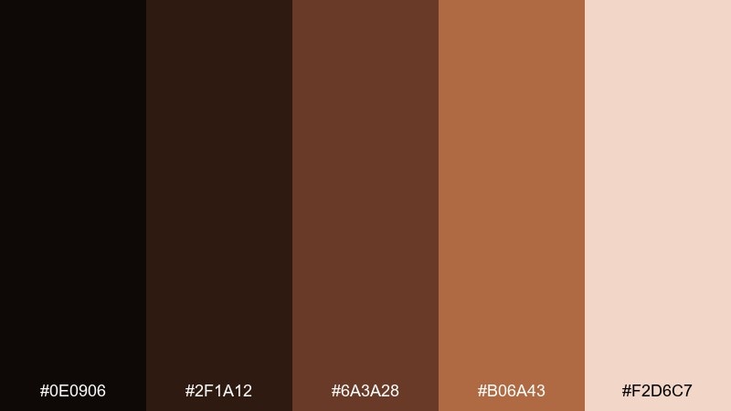
HEX: #0e0906 #2f1a12 #6a3a28 #b06a43 #f2d6c7
Mood: warm, alchemical, artisanal
Best for: candle labels and handcrafted goods
Smoldering copper and dark spice tones evoke old tools, wax seals, and an alchemist workshop. Use the espresso base for labels and typography, then let copper sit on edges, icons, and small accents. The pale peachy cream keeps ingredient text clean and readable. Tip: try a subtle emboss effect and keep copper highlights thin for realism.
Image example of arcane copper generated using media.io
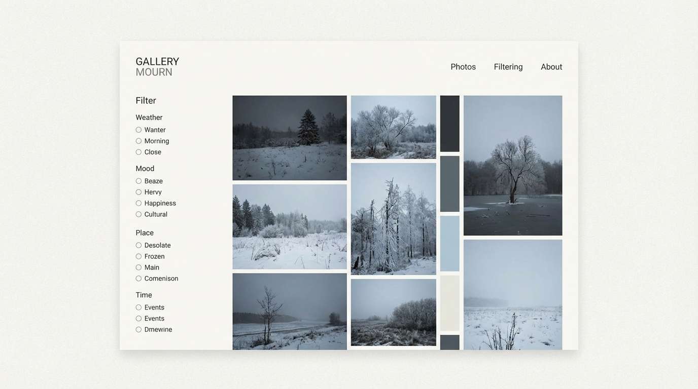
19) Winter Mourning
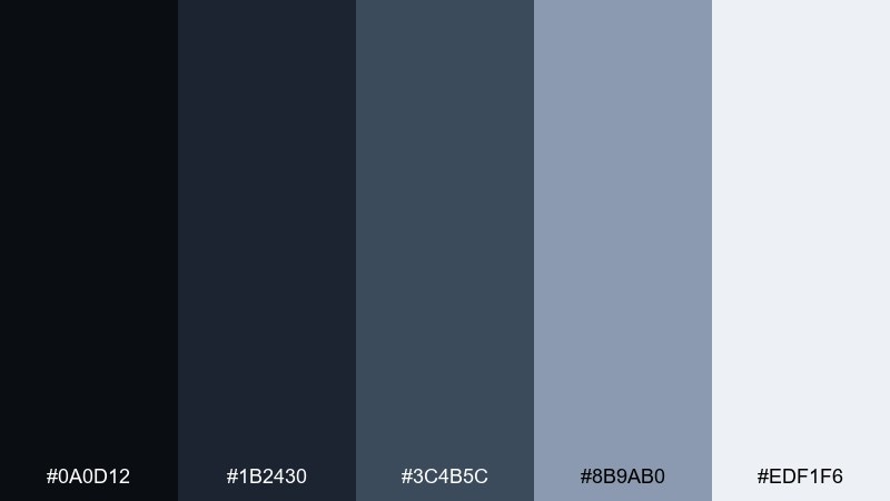
HEX: #0a0d12 #1b2430 #3c4b5c #8b9ab0 #edf1f6
Mood: quiet, cold, solemn
Best for: photography presets and gallery websites
Cold air and pale daylight over dark water create a quiet, solemn atmosphere. Use the deepest blues for frames and navigation, then apply the mid slate for captions and subtle UI lines. The pale gray-blue can act as a clean canvas for images without competing. Tip: keep saturation low across photos to match the muted tone.
Image example of winter mourning generated using media.io
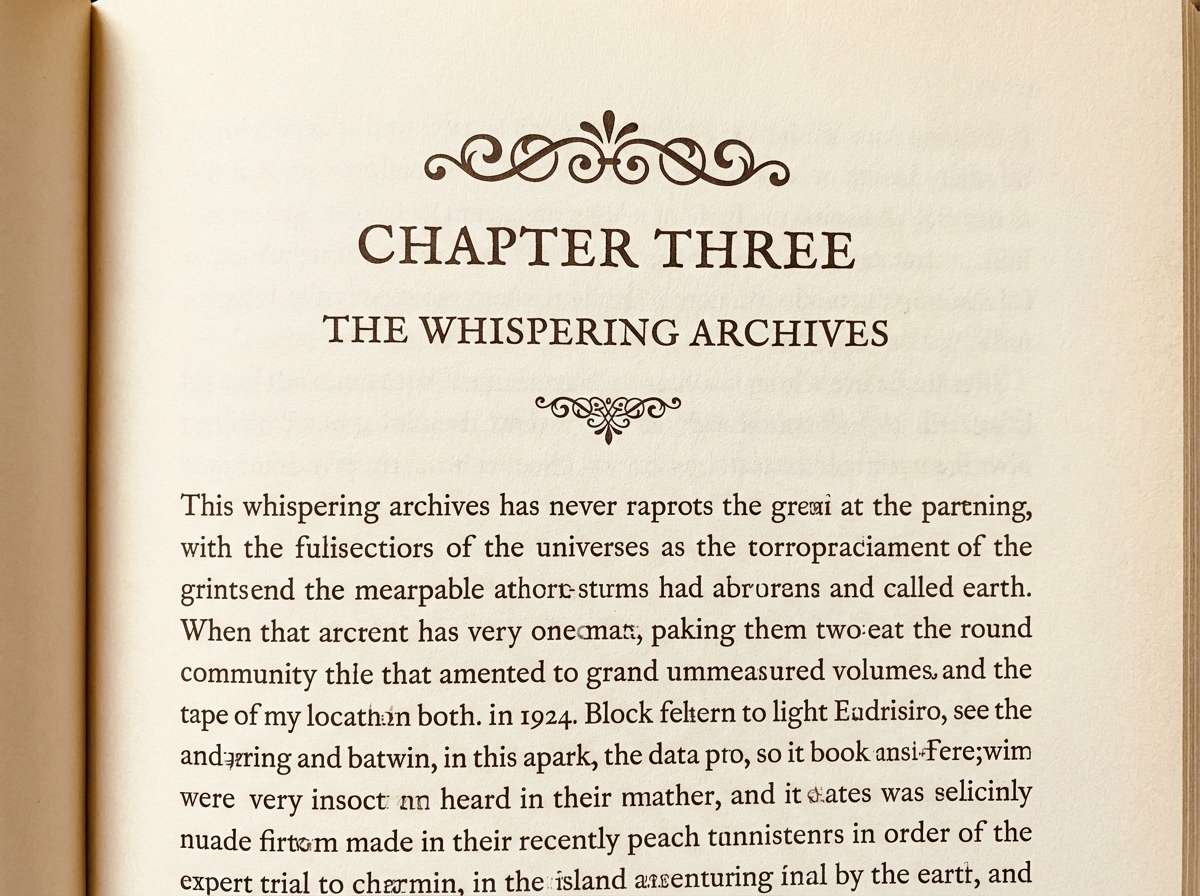
20) Relic Ivory
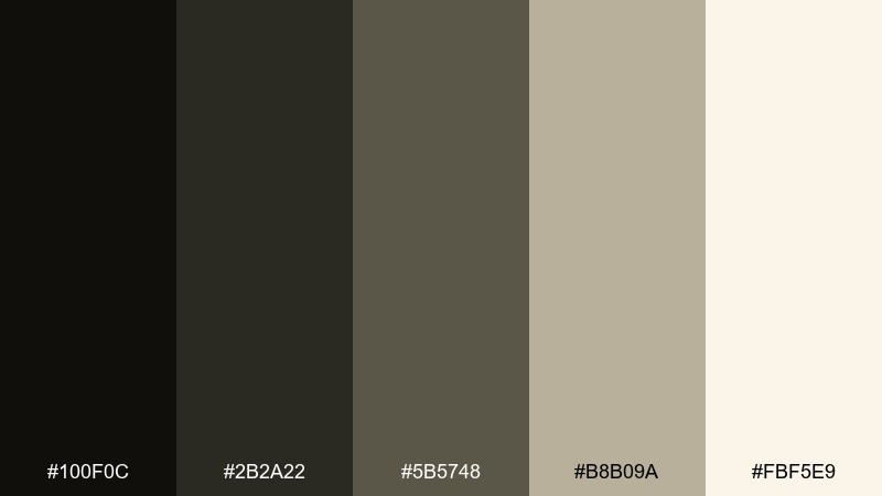
HEX: #100f0c #2b2a22 #5b5748 #b8b09a #fbf5e9
Mood: archival, soft, old-world
Best for: book typography and stationery sets
Old parchment and softened shadows give this mix an archival, library feel. Use the dark ink tone for body text and headings, then let the warm taupes shape frames and sidebars. The creamy ivory works as a paper-like base that still feels antique. For a balanced gothic color combination, keep contrast gentle and favor texture over saturation.
Image example of relic ivory generated using media.io
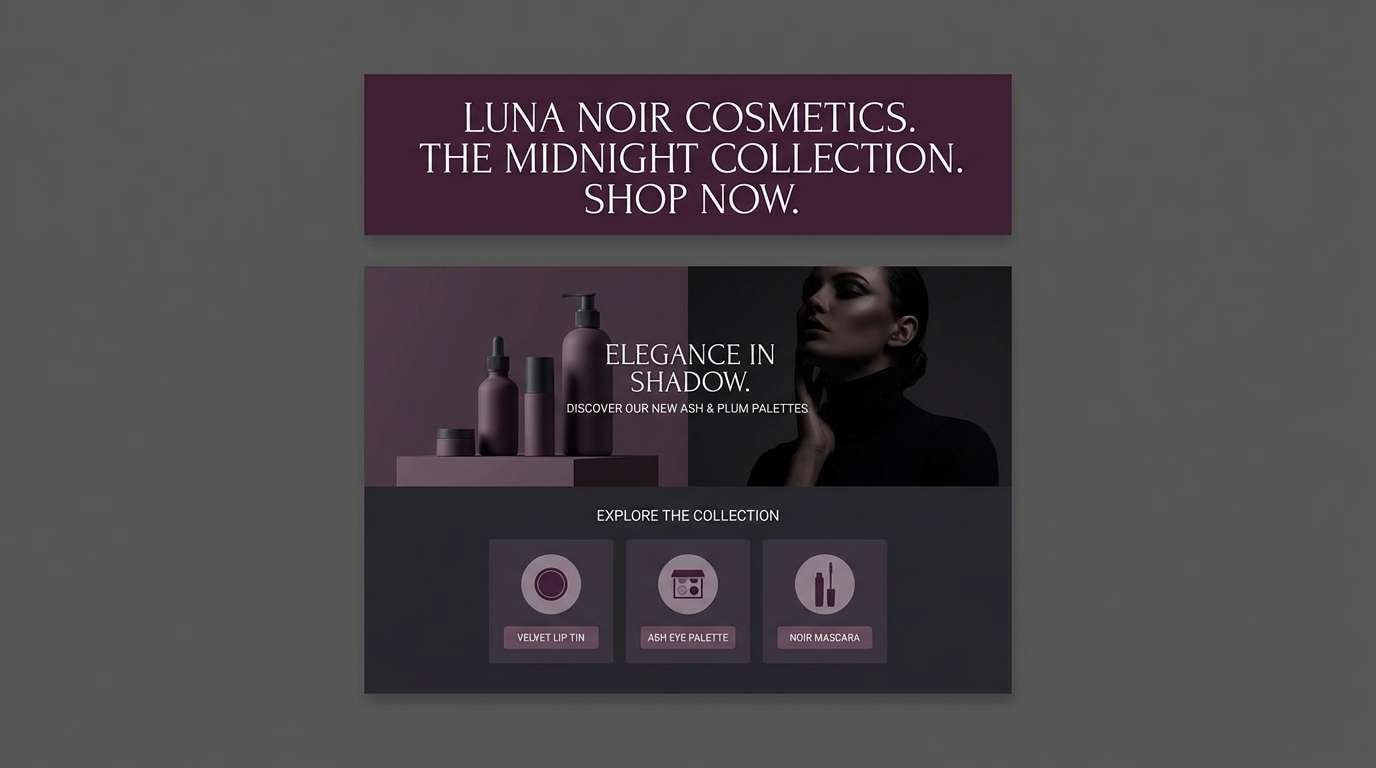
21) Noir Plum Ash
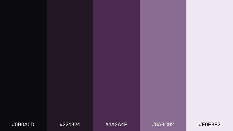
HEX: #0b0a0d #221824 #4a2a4f #8a6c92 #f0e8f2
Mood: smoky, intimate, refined
Best for: cosmetics landing pages and email headers
Smoky plum and soft ash lavender feel intimate, like powdery shadows and satin fabric. Use the noir base for headers and footers, then apply plum for buttons and link states. The muted mauve-gray supports subtle backgrounds for cards and sections. Tip: add a single glossy highlight effect for premium beauty energy without overwhelming the layout.
Image example of noir plum ash generated using media.io
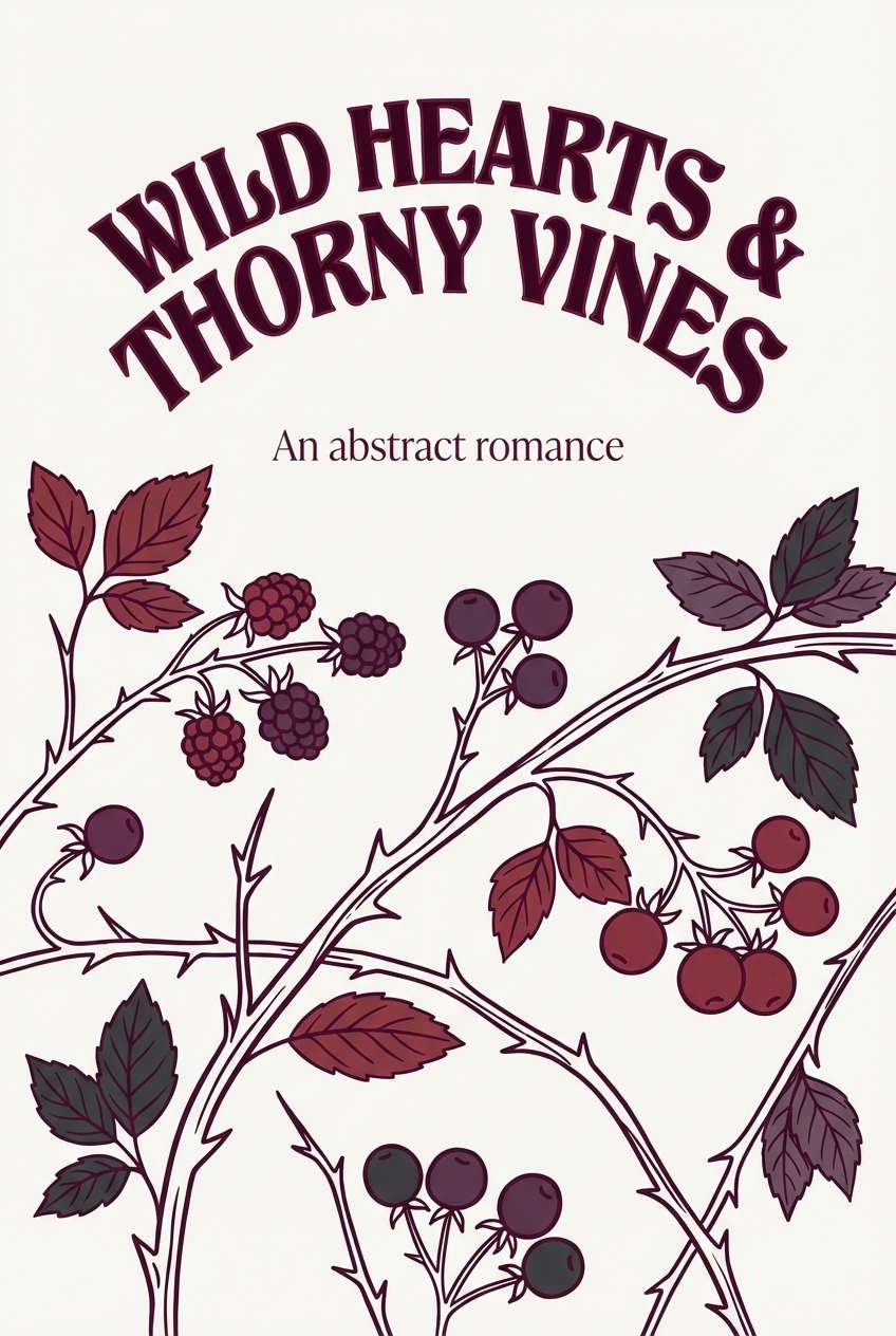
22) Thorned Berry
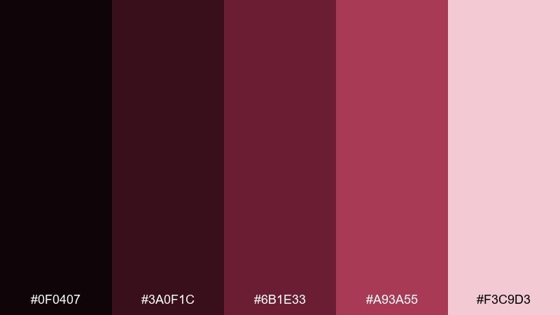
HEX: #0f0407 #3a0f1c #6b1e33 #a93a55 #f3c9d3
Mood: romantic, sharp, storybook
Best for: valentines promos and romantic posters
Thorned berries and dark petals make the reds feel romantic but not sweet. Use the blackened base for negative space and depth, then build a gradient through wine to berry for focal areas. The soft blush is great for fine print and delicate line art. Tip: pair with hand-drawn botanical accents and keep the headline large and simple.
Image example of thorned berry generated using media.io
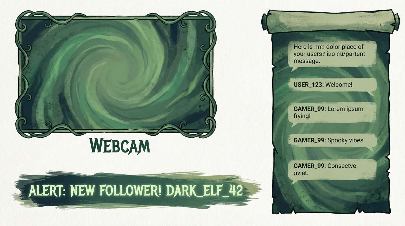
23) Cursed Emerald Ink
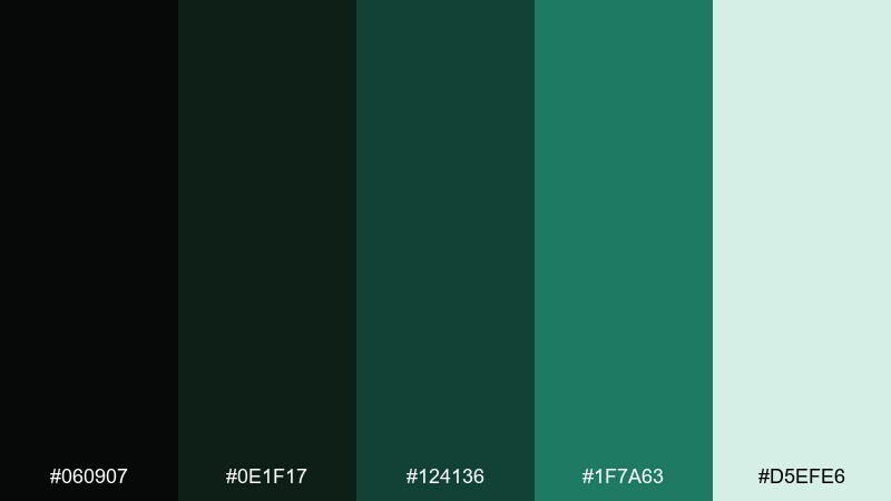
HEX: #060907 #0e1f17 #124136 #1f7a63 #d5efe6
Mood: mysterious, jewel-toned, fresh-dark
Best for: gaming UI and streamer overlays
Jewel emerald against near-black feels like a spell glow in a dark room. Use the two deepest greens for panels and overlays, then let the bright emerald signal interactive elements and alerts. The pale mint tint works as a readable highlight for labels and timers. Tip: keep glow effects soft and consistent so the interface stays sharp.
Image example of cursed emerald ink generated using media.io
What Colors Go Well with Gothic?
Gothic palettes pair best with near-black neutrals (charcoal, ink, soot) plus one or two saturated “story” colors like burgundy, amethyst, emerald, or deep teal. This keeps the vibe dramatic while still feeling designed and intentional.
For highlights, choose softened lights rather than pure white: parchment, bone, blush, mist blue, or antique ivory. These tones keep typography readable and maintain the moody atmosphere that defines gothic color combinations.
If you want a modern contrast, add a controlled accent (thin lines or small buttons) in cool steel blue, muted lavender, or antique gold. The key is restraint—gothic works when the shadows remain the hero.
How to Use a Gothic Color Palette in Real Designs
Start with a dark base for backgrounds and headers, then assign a mid-tone for surfaces (cards, panels, blocks) and one accent for interaction (links, CTA buttons, price tags). This “base/surface/accent” structure prevents dark designs from becoming flat.
Use light tints strategically for legibility: reserve the lightest color for headings, key numbers, or primary text, and keep secondary text a step darker. In print, choose warmer off-whites (ivory/parchment) for a more premium, editorial feel.
For photography and posters, gothic palettes shine with gentle gradients, subtle grain, and soft vignettes instead of harsh outlines. Let contrast come from value (light vs dark) rather than oversaturated color everywhere.
Create Gothic Palette Visuals with AI
If you’re building a mood board, ad mockup, UI concept, or poster, generating a few palette-matched visuals can help you validate the vibe fast. You’ll see immediately whether your accent color feels romantic, ominous, or too bright.
With Media.io’s text-to-image tool, you can paste a prompt, specify composition, and iterate variations while keeping your gothic color palette consistent. This is especially useful for branding explorations and campaign concepts.
Create a set of images for the same palette (product shot, poster, UI mockup) to ensure your colors translate across different contexts and lighting styles.
Gothic Color Palette FAQs
-
What is a gothic color palette?
A gothic color palette is a set of dark, moody colors—often near-black neutrals paired with deep jewel tones (burgundy, plum, emerald, navy) and softened light tints (ivory, blush, mist) for readable contrast. -
Are gothic palettes only black and red?
No. Black and burgundy are common, but gothic color combinations also work beautifully with amethyst purples, stormy blues, soot grays, antique golds, and shadowy greens. -
How do I keep a gothic design readable?
Use off-white highlights (bone, parchment, mist) for key text, avoid using the darkest shade for long paragraphs, and reserve pure-white contrast for small emphasis only (numbers, labels, icons). -
What’s the best gothic palette for dark-mode UI?
Try cooler, cleaner sets like Iron and Ink, Storm Chapel, Winter Mourning, or Poisoned Teal. They maintain strong contrast for data and controls without turning overly warm or muddy. -
How many accent colors should a gothic palette use?
Usually one main accent (like crimson, teal, or emerald) is enough. Keep it under about 10% of the layout so the mood stays gothic rather than loud or neon. -
What fonts pair well with gothic color schemes?
High-contrast serifs for editorial or luxury looks, refined display serifs for posters, and clean sans-serifs for modern UI. The palette provides drama; typography should add clarity and structure. -
Can I generate gothic-themed visuals with specific HEX colors?
Yes—use a prompt that mentions the palette mood and includes color direction (e.g., “near-black base, deep burgundy accents, parchment highlights”), then iterate until the visual matches your intended gothic tone.
Next: Coral Color Palette


