

Dark color palettes make designs feel intentional: focused typography, controlled contrast, and a premium “after-hours” mood that works across UI, branding, and print.
Below are 20+ dark palette ideas with HEX codes, plus practical pairing tips and AI prompts you can reuse to generate matching visuals fast.
In this article
- Why Dark Palettes Work So Well
-
- midnight ink
- obsidian teal
- noir plum
- stormy harbor
- ember smoke
- galactic grape
- ironwood olive
- velvet sapphire
- cinder rose
- deep forest night
- shadowed copper
- lunar slate
- ravenberry
- dusk neon
- antique inkstone
- black cherry cola
- petrol steel
- twilight sandstone
- quiet dungeon
- smoked indigo denim
- charcoal citrus pop
- What Colors Go Well with Dark?
- How to Use a Dark Color Palette in Real Designs
- Create Dark Palette Visuals with AI
Why Dark Palettes Work So Well
Dark palettes create instant hierarchy: your brightest tint becomes a spotlight for key UI states, headlines, and numbers, while deeper tones keep everything else calm and organized.
They also make colors look richer. Jewel accents, warm metals, and soft pastels tend to feel more premium against charcoal, ink, or midnight backgrounds than they do on white.
Finally, dark schemes are practical for modern screens. When you balance contrast carefully (and avoid pure black everywhere), dark UIs can feel comfortable for long sessions and reduce glare in low-light environments.
20+ Dark Color Palette Ideas (with HEX Codes)
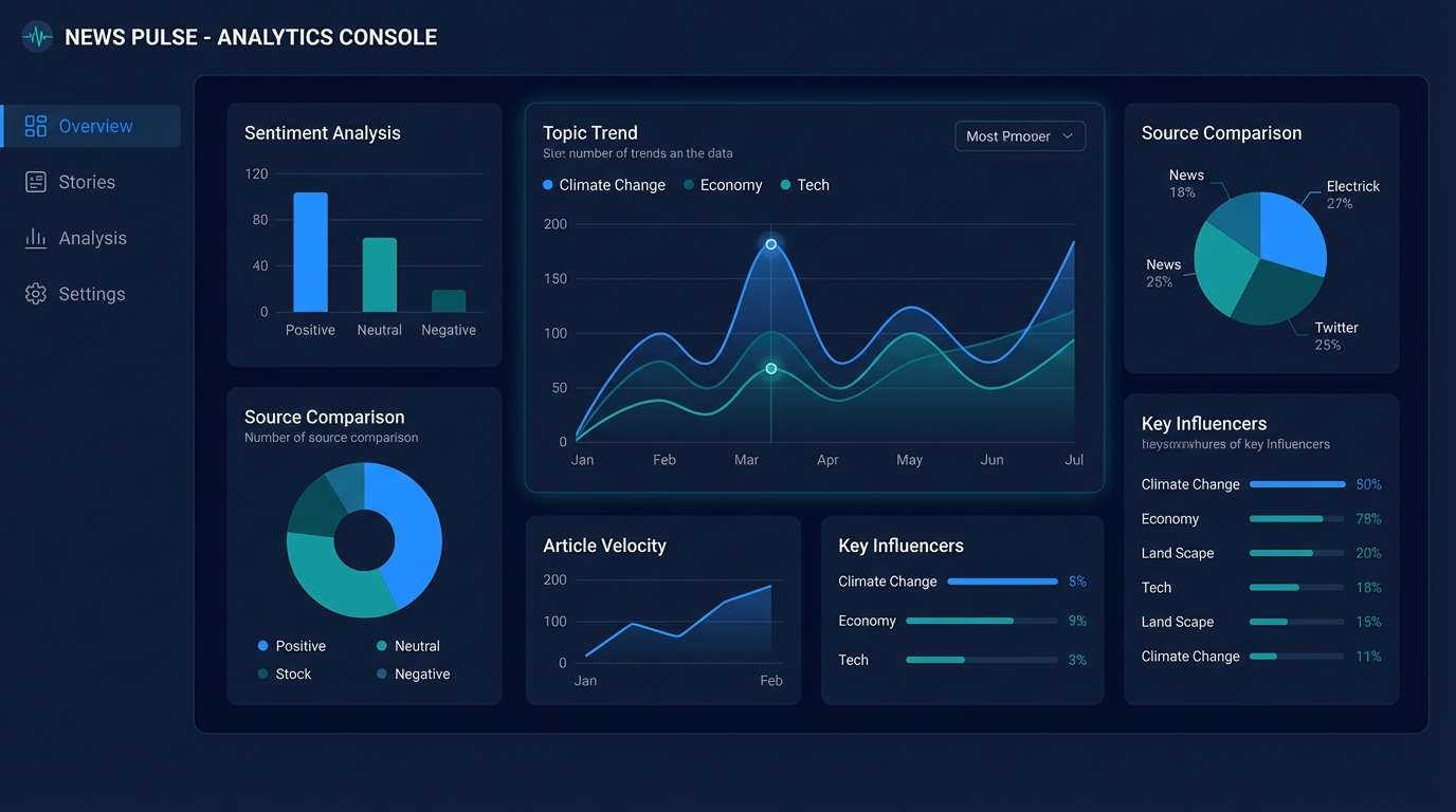
1) Midnight Ink
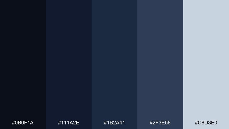
HEX: #0b0f1a #111a2e #1b2a41 #2f3e56 #c8d3e0
Mood: quiet, crisp, editorial
Best for: news app UI and analytics dashboards
Quiet midnight blues and inked grays evoke a calm control-room glow. The pale blue-gray highlight keeps the set readable without breaking the mood. Use it for dashboards, data tables, and navigation-heavy layouts where contrast matters. Pair with thin line icons and a single warm accent like muted copper for alerts. Tip: reserve the lightest tone for key numbers to guide the eye.
Image example of midnight ink generated using media.io
Media.io is an online AI studio for creating and editing video, image, and audio in your browser.

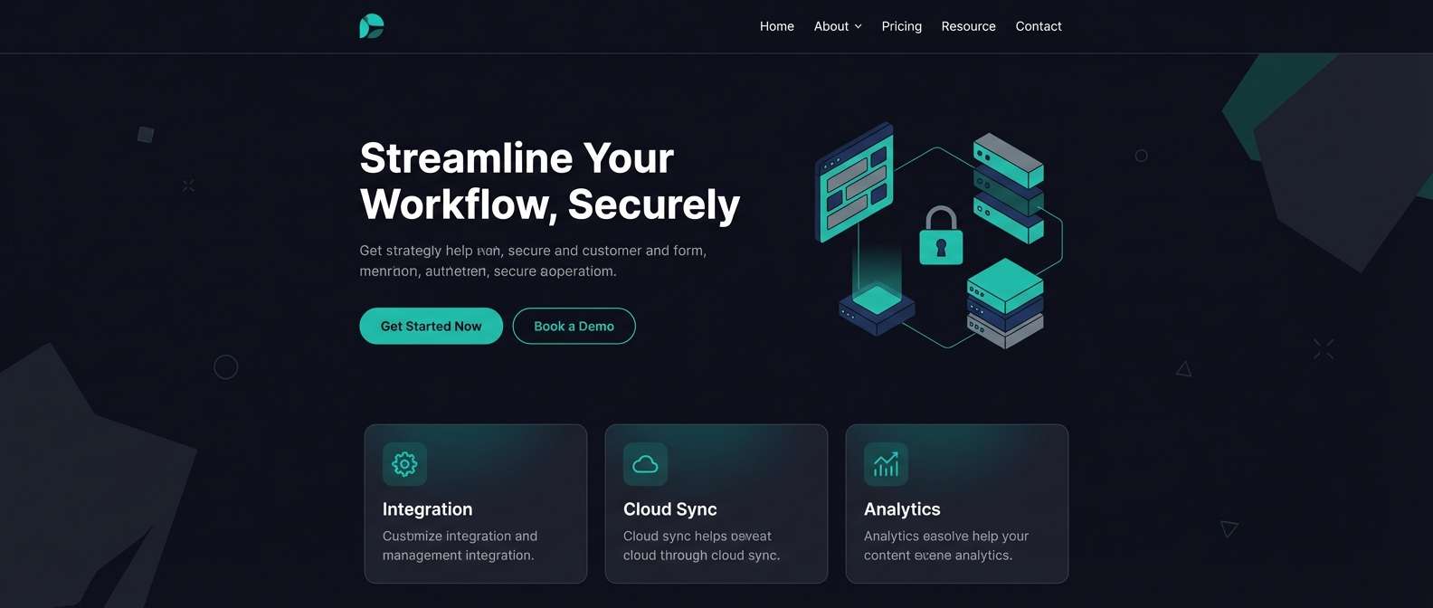
2) Obsidian Teal
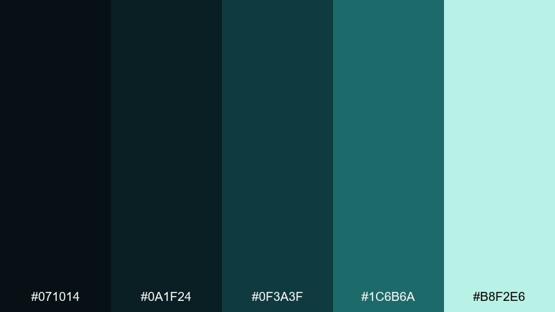
HEX: #071014 #0a1f24 #0f3a3f #1c6b6a #b8f2e6
Mood: sleek, aquatic, high-tech
Best for: SaaS landing pages and feature sections
Sleek obsidian and deep sea-teal tones feel like light moving under water. The bright mint tint is perfect for CTAs and micro-interactions without looking neon. Use it on landing pages with lots of spacing and subtle gradients. Pair with geometric sans type and soft shadow elevations to keep it modern. Tip: keep teal accents to under 10 percent so the page stays premium.
Image example of obsidian teal generated using media.io
3) Noir Plum
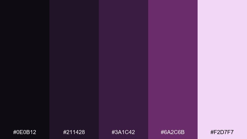
HEX: #0e0b12 #211428 #3a1c42 #6a2c6b #f2d7f7
Mood: dramatic, velvety, luxe
Best for: beauty branding and fragrance ads
Velvety purples against near-black create a plush, after-hours glamour. The soft blush-lilac highlight adds a skincare-like glow for product callouts. Use it in beauty branding, premium labels, and cinematic social creatives. Pair with serif headlines and lots of negative space for a boutique feel. Tip: add a subtle grain texture to avoid flat gradients in dark areas.
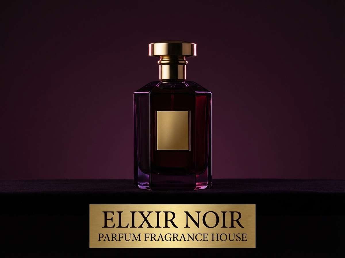
Image example of noir plum generated using media.io
4) Stormy Harbor
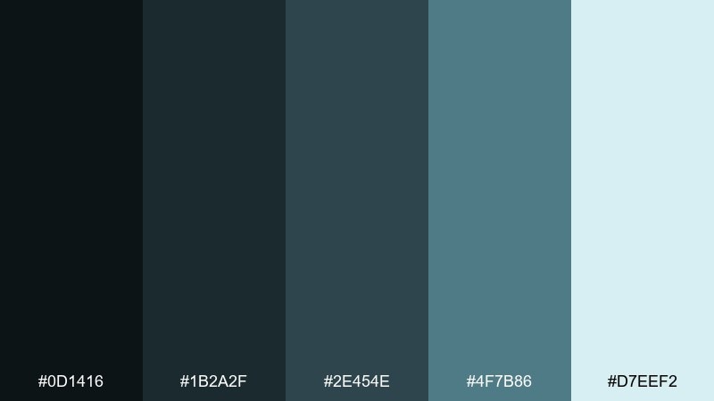
HEX: #0d1416 #1b2a2f #2e454e #4f7b86 #d7eef2
Mood: coastal, grounded, mature
Best for: outdoor gear websites and catalogs
Stormy slate and harbor teal feel rugged, like weathered docks and sea spray. The icy tint keeps layouts airy while staying subdued. Use it for outdoor brands, product catalogs, and sustainability messaging. Pair with warm neutrals like sand or tan in photography to soften the coolness. Tip: use the lightest color as a background band to separate sections cleanly.
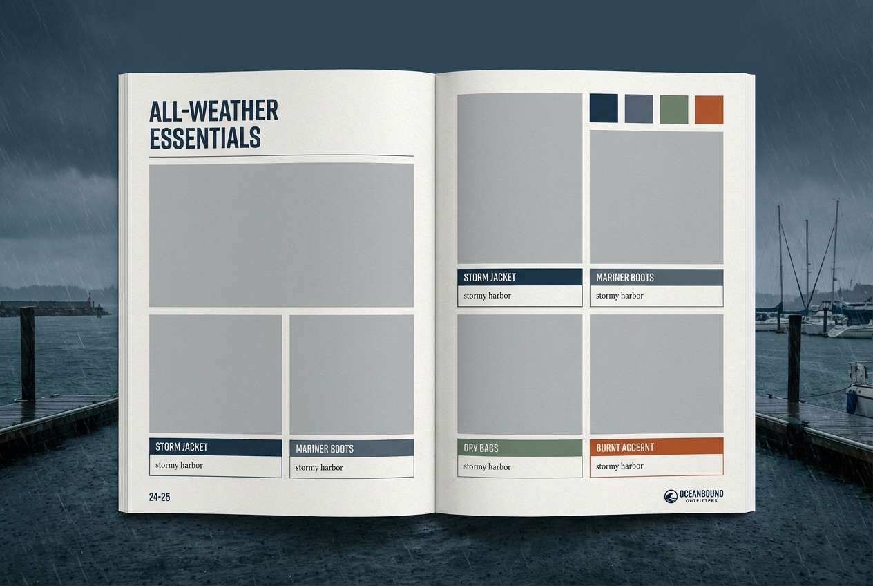
Image example of stormy harbor generated using media.io
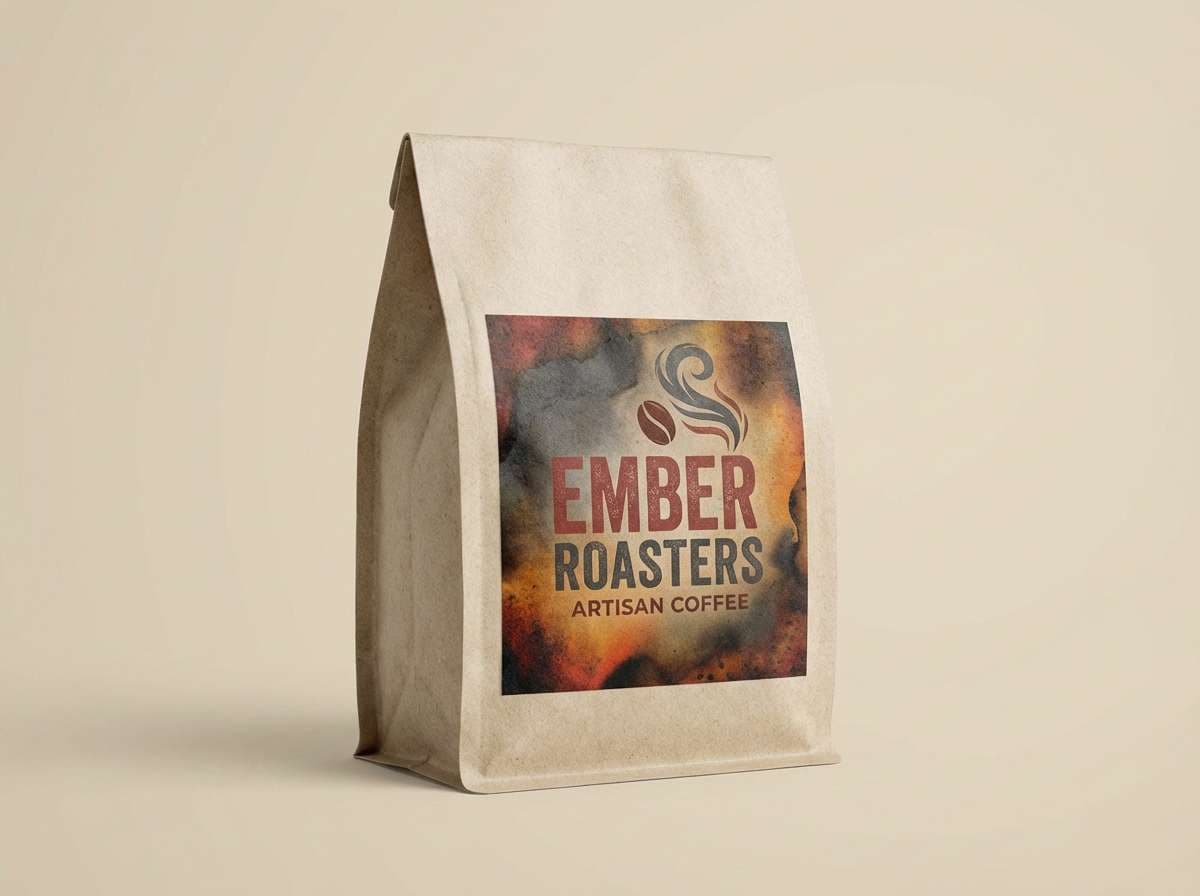
5) Ember Smoke
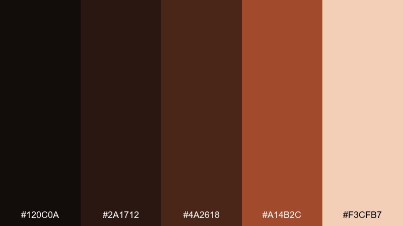
HEX: #120c0a #2a1712 #4a2618 #a14b2c #f3cfb7
Mood: warm, rustic, cinematic
Best for: coffee packaging and artisan food labels
Smoky cocoa and ember browns bring to mind roasted beans and firelight. The pale cream-peach works as a label base for clear readability. Use it for coffee bags, barbecue sauces, and handmade product packaging. Pair with kraft textures and simple iconography to keep it honest and craft-forward. Tip: spot varnish on the ember tone adds instant shelf appeal.
Image example of ember smoke generated using media.io
6) Galactic Grape
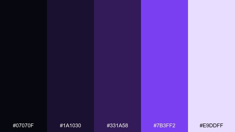
HEX: #07070f #1a1030 #331a58 #7b3ff2 #e9ddff
Mood: futuristic, electric, playful
Best for: music event posters and nightlife promos
Electric grape highlights against space-black feel like neon signage in a late-night alley. These dark color combinations shine on posters where you need instant energy and legibility from a distance. Use the violet as the hero, then let the pale lavender carry dates and venue details. Pair with bold condensed type and simple geometric shapes for a club-ready look. Tip: keep gradients subtle so the purple stays crisp in print.
Image example of galactic grape generated using media.io

7) Ironwood Olive
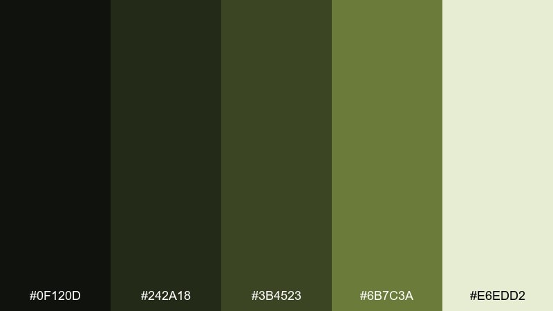
HEX: #0f120d #242a18 #3b4523 #6b7c3a #e6edd2
Mood: earthy, tactical, understated
Best for: workwear branding and utilitarian web design
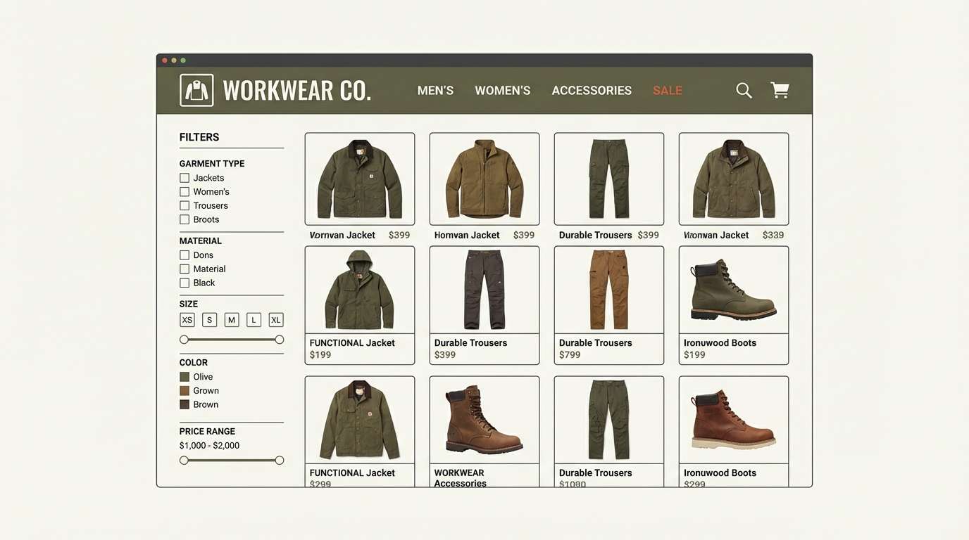
Iron greens and olive shadows feel practical, like canvas jackets and field gear. The pale khaki lifts typography and makes product details easy to scan. Use it for workwear brands, tool catalogs, or rugged ecommerce themes. Pair with off-white photography backdrops to avoid making the whole page too heavy. Tip: use the mid olive for secondary buttons to keep hierarchy clear.
Image example of ironwood olive generated using media.io
8) Velvet Sapphire
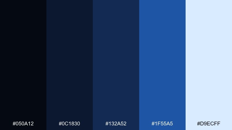
HEX: #050a12 #0c1830 #132a52 #1f55a5 #d9ecff
Mood: clean, confident, corporate
Best for: fintech apps and investor presentations
Sapphire blues over near-black read confident and trustworthy, like a tailored suit. The airy sky tint gives charts and KPIs breathing room. Use it in fintech products, pitch decks, and compliance-heavy interfaces where clarity is crucial. Pair with subtle dividers and a single accent color like soft lime for success states. Tip: keep the brightest blue for links and primary actions only.
Image example of velvet sapphire generated using media.io
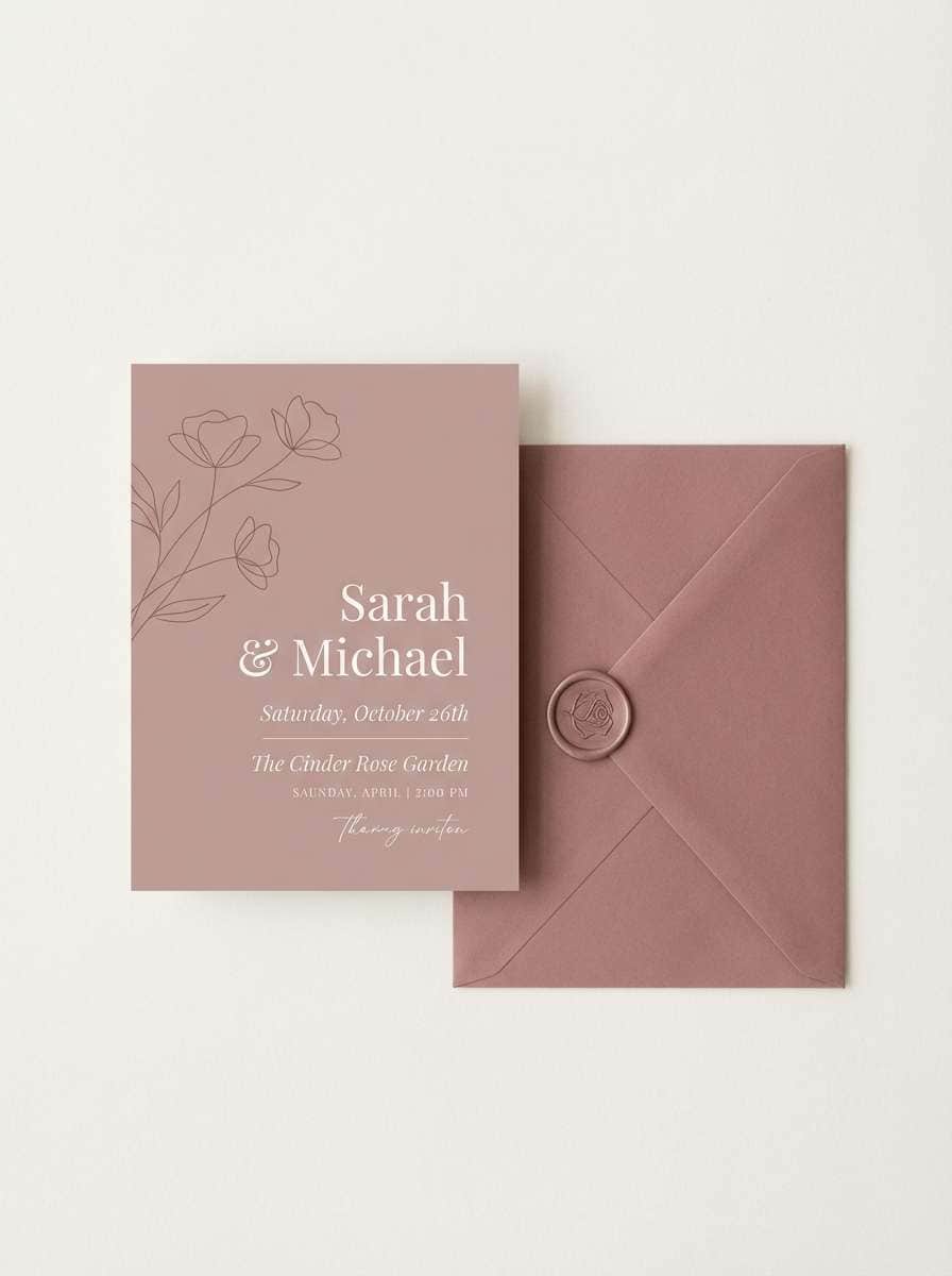
9) Cinder Rose
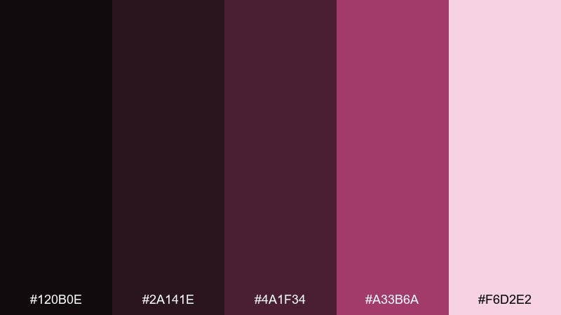
HEX: #120b0e #2a141e #4a1f34 #a33b6a #f6d2e2
Mood: romantic, smoky, modern
Best for: wedding invitations and evening galas
Smoky berry and cinder-black feel like candlelight on velvet petals. The blush highlight keeps text readable for names, dates, and RSVP details. Use it for evening wedding stationery, gala invites, and elegant social stories. Pair with metallic foil effects or a muted gold for instant sophistication. Tip: print on uncoated stock to soften contrast and keep the look tactile.
Image example of cinder rose generated using media.io
10) Deep Forest Night
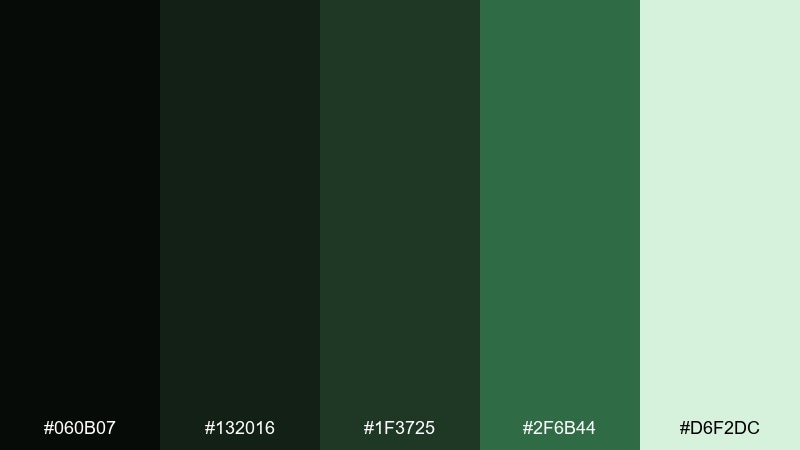
HEX: #060b07 #132016 #1f3725 #2f6b44 #d6f2dc
Mood: natural, calm, restorative
Best for: wellness brands and eco product pages
Pine-shadow greens evoke a quiet forest trail after rain. The minty highlight adds freshness for badges and key benefits. Use it on wellness sites, eco product pages, and subscription boxes that want a grounded feel. Pair with warm neutrals like oat or clay in photography for balance. Tip: apply the lightest green to content cards to keep long reads comfortable.
Image example of deep forest night generated using media.io
11) Shadowed Copper
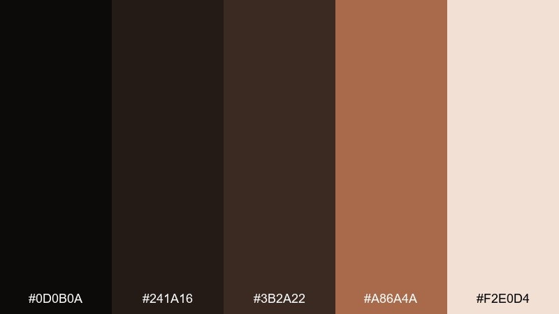
HEX: #0d0b0a #241a16 #3b2a22 #a86a4a #f2e0d4
Mood: industrial, warm, premium
Best for: product packaging and hardware branding
Charred neutrals with copper warmth feel like forged metal and workshop light. The soft beige makes space for specs and fine print. Use it for hardware brands, premium packaging, and minimalist product pages. Pair with macro material photography and clean sans-serif labels for an engineered look. Tip: copper works best as a small accent band or seal, not a full background.
Image example of shadowed copper generated using media.io
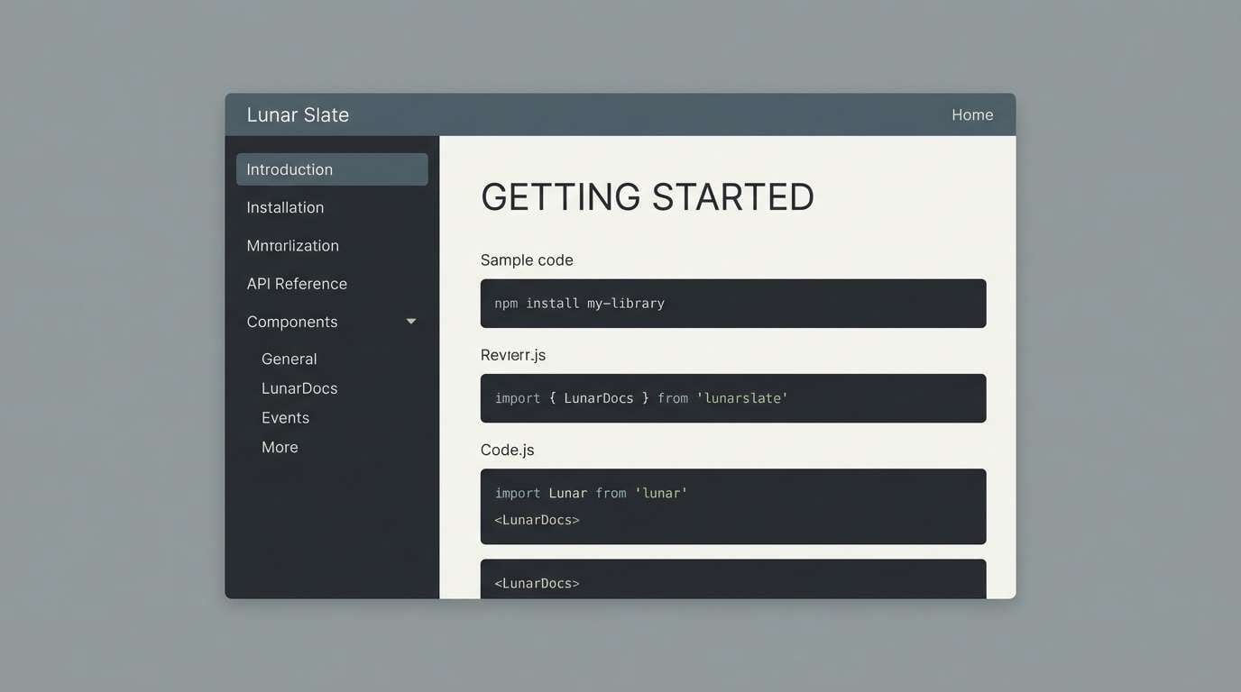
12) Lunar Slate
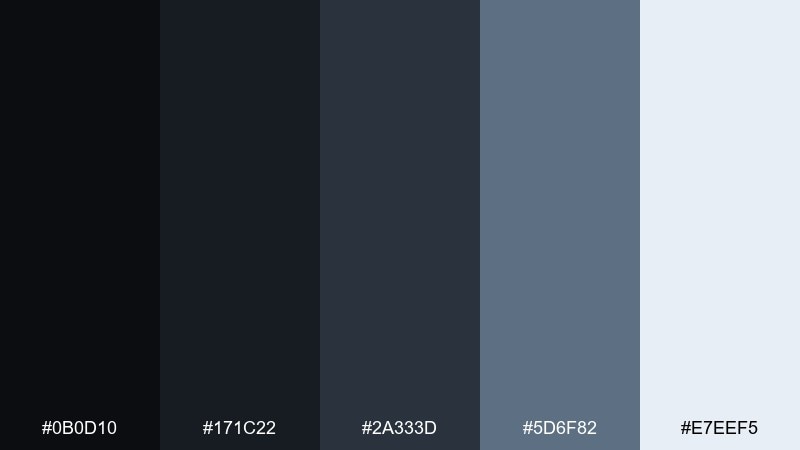
HEX: #0b0d10 #171c22 #2a333d #5d6f82 #e7eef5
Mood: minimal, cool, technical
Best for: documentation sites and developer tools
Cool slates and lunar grays feel precise, like a terminal window under moonlight. The misty near-white makes code snippets and tables easy to parse. Use it for docs, knowledge bases, and tool UIs that need long-session comfort. Pair with a single accent like cyan for links and selected states. Tip: keep body text on the lightest background blocks to reduce eye strain.
Image example of lunar slate generated using media.io
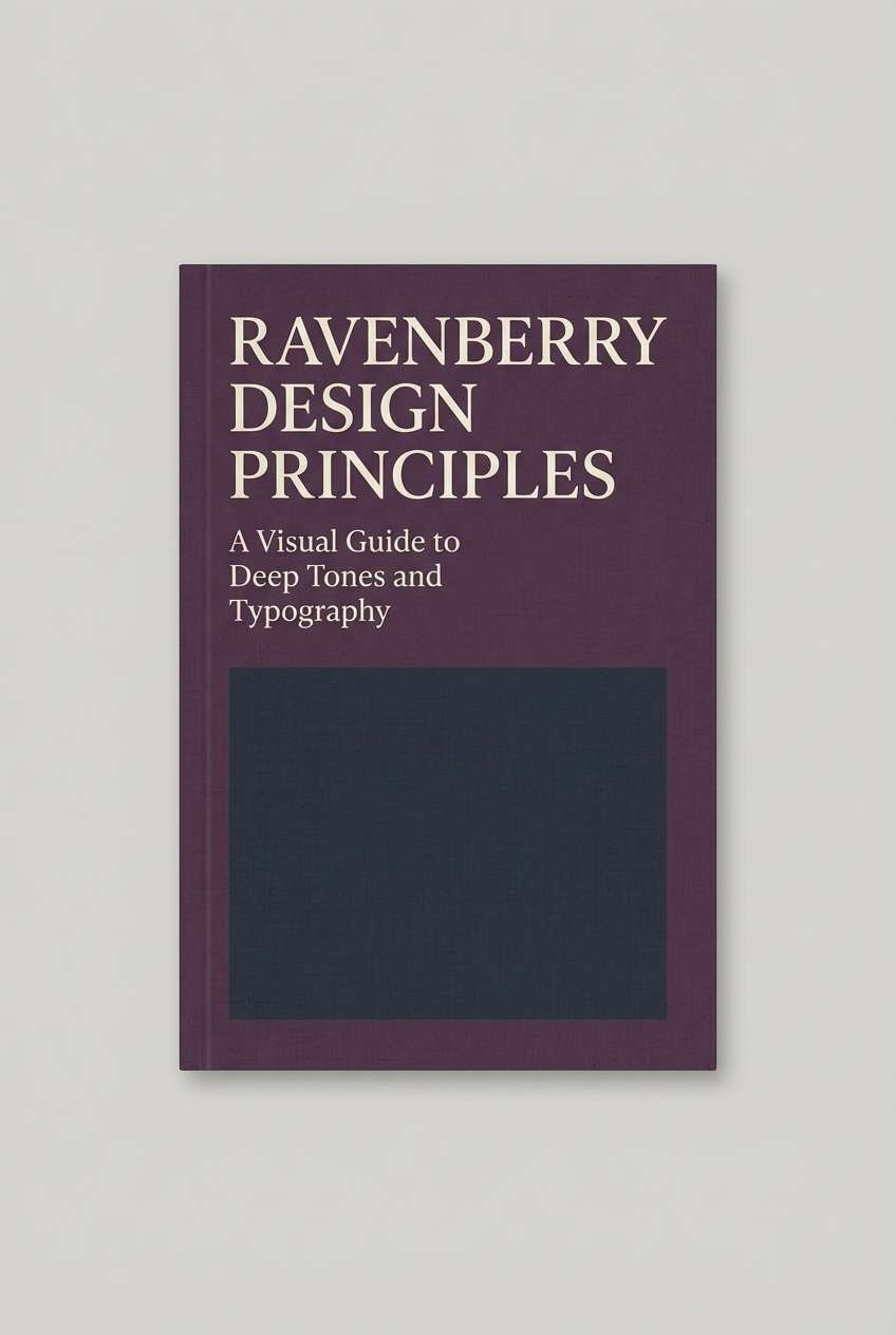
13) Ravenberry
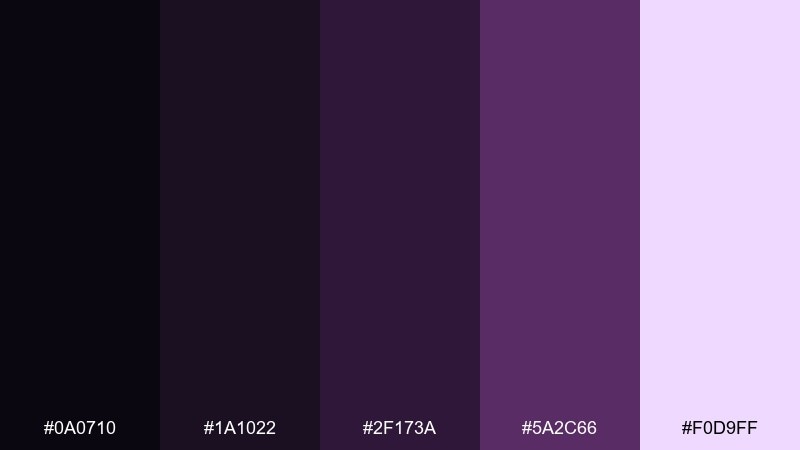
HEX: #0a0710 #1a1022 #2f173a #5a2c66 #f0d9ff
Mood: mysterious, artistic, refined
Best for: book covers and literary posters
Raven-black and berry violets suggest mystery novels and late-night reading. One dark color palette like this excels when you want drama without harsh contrast. Use it on book covers, poetry posters, and cultural event promos. Pair with textured paper effects and a restrained serif to keep it literary. Tip: set the title in the pale lavender, then let deeper purples frame supporting text.
Image example of ravenberry generated using media.io
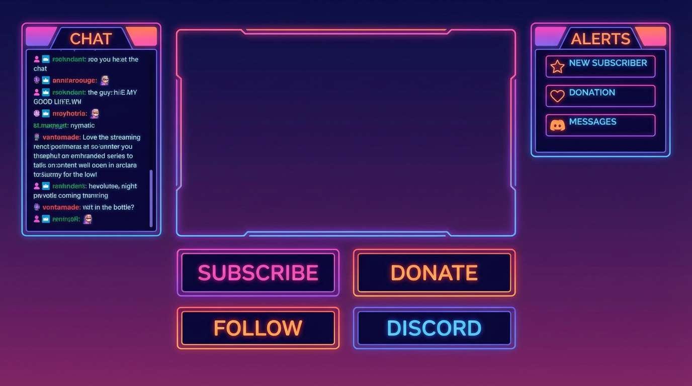
14) Dusk Neon
HEX: #0b0b12 #1f1633 #2d2a6d #ff3ea5 #d7f7ff
Mood: bold, youthful, energetic
Best for: gaming overlays and streamer panels
Deep indigos with a neon magenta hit feel like a city skyline at dusk. The icy tint keeps labels and UI text snappy in compact spaces. Use it for streaming overlays, esports promos, and game launch graphics. Pair with pixel or techno fonts and keep shapes angular for speed. Tip: apply magenta only to highlights like status badges and CTA chips.
Image example of dusk neon generated using media.io
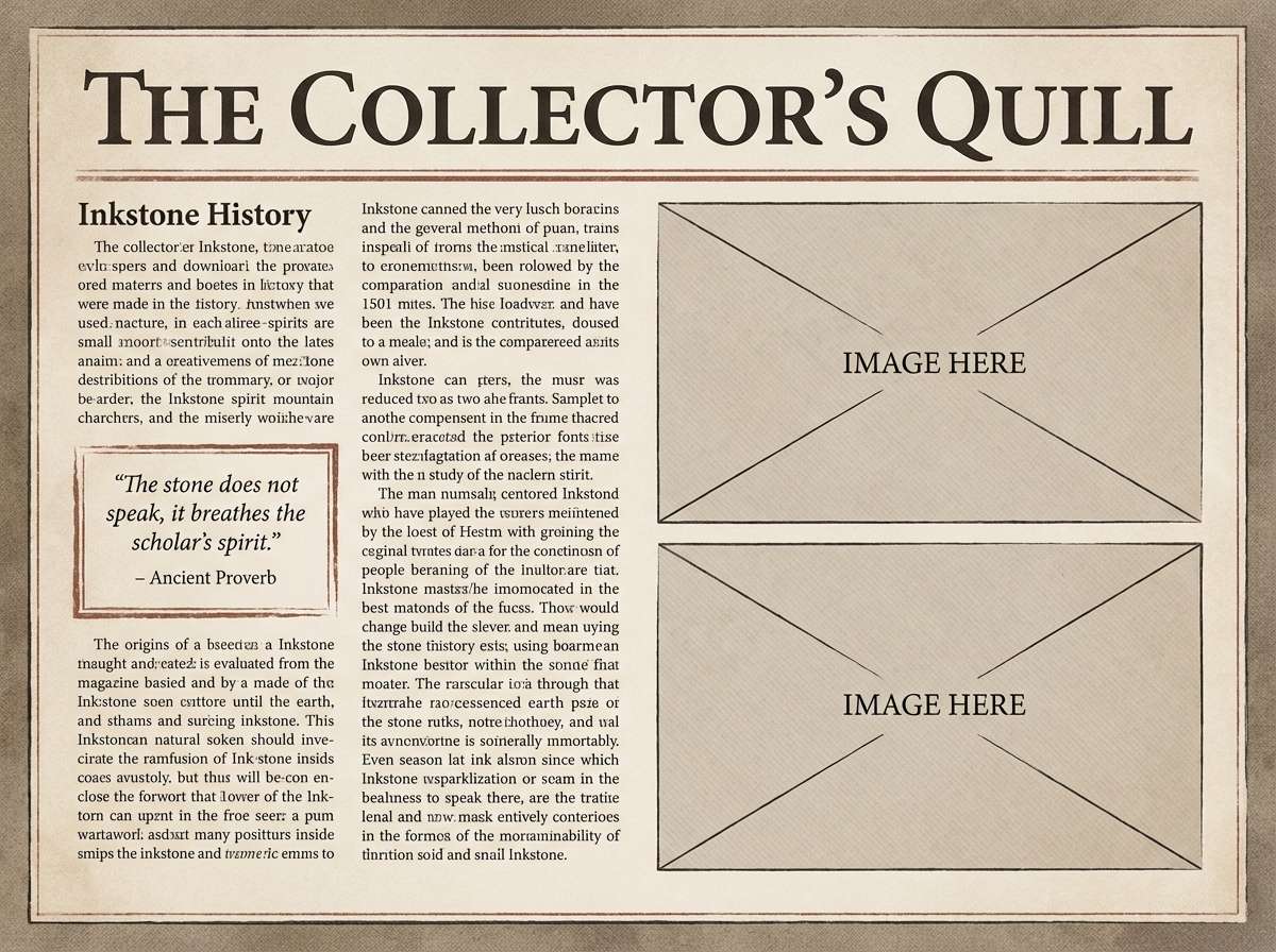
15) Antique Inkstone
HEX: #0f0e0b #23211a #3a372b #7a735a #f1eedf
Mood: heritage, scholarly, warm
Best for: museum brochures and editorial layouts
Inkstone blacks and antique taupes evoke aged pages and archival prints. The warm off-white reads like parchment and makes body copy inviting. Use it for museum brochures, editorial features, and heritage branding. Pair with classic serif typography and subtle rules for structure. Tip: keep imagery slightly desaturated so it blends with the vintage tone.
Image example of antique inkstone generated using media.io
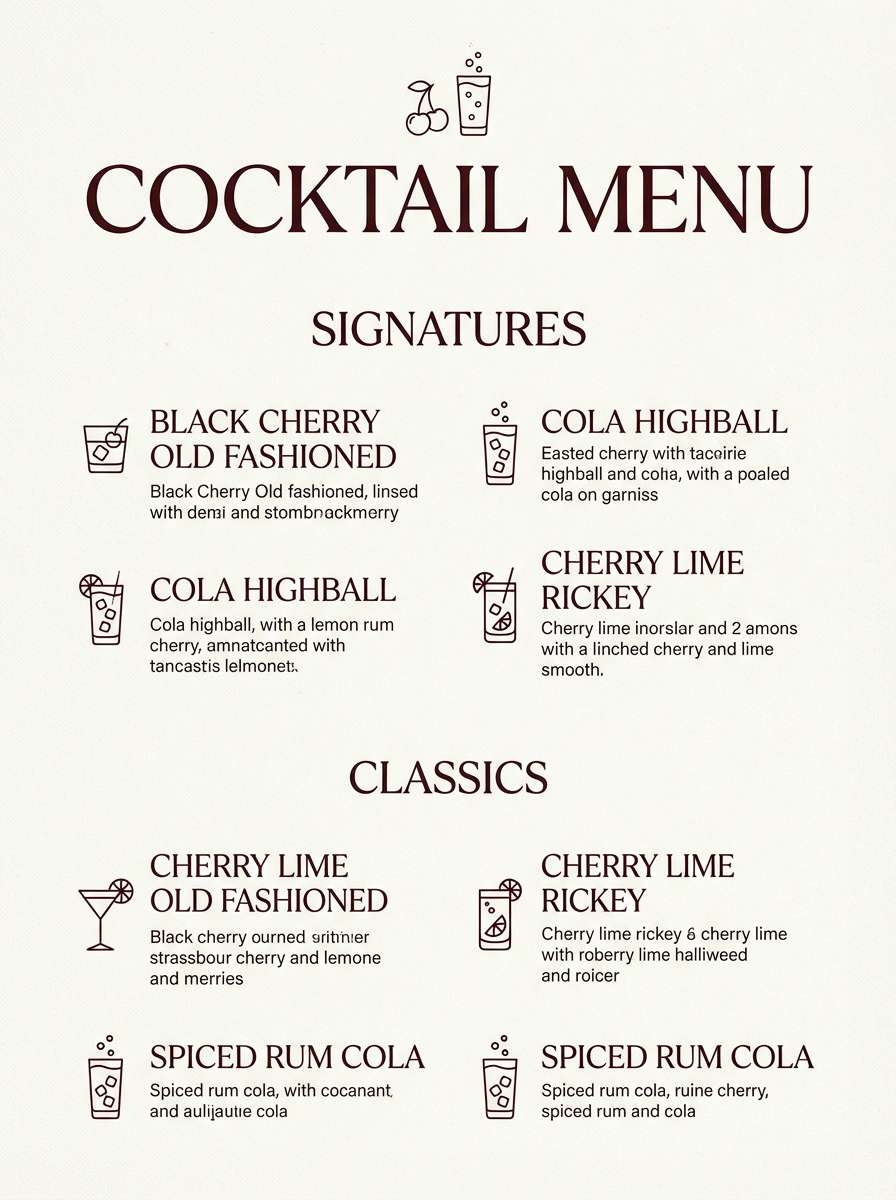
16) Black Cherry Cola
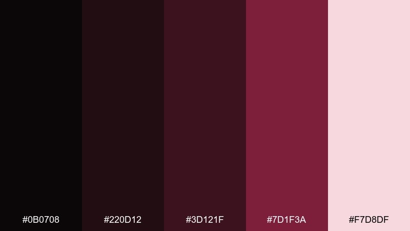
HEX: #0b0708 #220d12 #3d121f #7d1f3a #f7d8df
Mood: sultry, glossy, nightlife
Best for: cocktail menus and bar branding
Black cherry reds over near-black feel glossy, like cola fizz under bar lights. These dark color combinations work best when you want appetite appeal without going loud. Use it for cocktail menus, lounge promos, and bottle labels with a premium vibe. Pair with creamy neutrals and a touch of brass for a classic finish. Tip: use the palest pink only for small text blocks so the menu stays dramatic.
Image example of black cherry cola generated using media.io
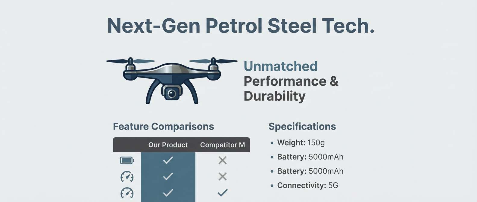
17) Petrol Steel
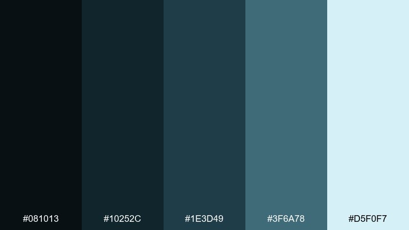
HEX: #081013 #10252c #1e3d49 #3f6a78 #d5f0f7
Mood: urban, modern, resilient
Best for: automotive branding and tech product pages
Petrol blues and steel teals feel urban, like rain on asphalt and brushed metal. The pale aqua keeps spec sheets and feature callouts crisp. Use it for automotive branding, gadget pages, and B2B tech sites. Pair with bold photography and minimal icon sets to match the industrial tone. Tip: use the mid teal for separators and progress states instead of heavy borders.
Image example of petrol steel generated using media.io
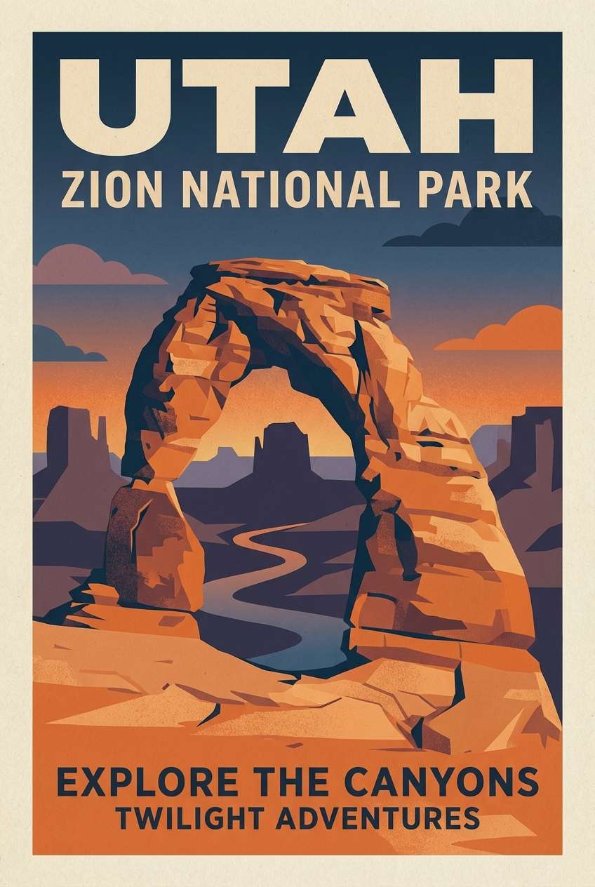
18) Twilight Sandstone
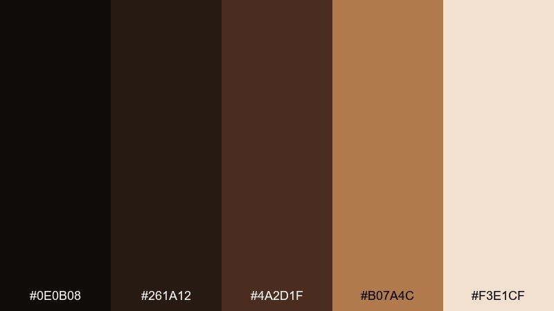
HEX: #0e0b08 #261a12 #4a2d1f #b07a4c #f3e1cf
Mood: desert, warm, cinematic
Best for: travel posters and boutique hotel branding
Twilight browns and sandstone ambers evoke desert sunsets and sun-baked walls. The creamy beige supports readable type for destinations and offers. Use it for travel posters, boutique hotel identities, and lifestyle lookbooks. Pair with deep teal photography accents to create a striking complementary balance. Tip: keep the amber as a focal band behind headlines rather than a full wash.
Image example of twilight sandstone generated using media.io
19) Quiet Dungeon
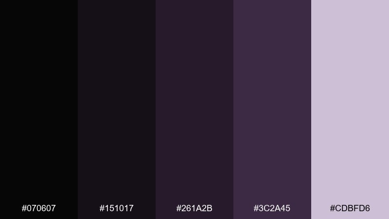
HEX: #070607 #151017 #261a2b #3c2a45 #cdbfd6
Mood: gothic, quiet, atmospheric
Best for: fantasy book covers and game menus
Muted purples and shadowy grays feel like torchlight in a stone corridor. The dusty lavender highlight keeps UI labels and lore text readable. Use it for fantasy covers, tabletop campaigns, and in-game menu screens. Pair with ornate serif titles or subtle runic motifs for mood. Tip: add a gentle vignette so the center content stays the brightest focus.
Image example of quiet dungeon generated using media.io
20) Smoked Indigo Denim

HEX: #0b0e14 #161e2a #23324a #3a5a86 #e3edf9
Mood: casual, trustworthy, contemporary
Best for: fashion ecommerce and lookbook layouts
Smoked indigo and denim blues feel familiar, like a well-worn jacket. The cool near-white keeps product names and pricing clean. Use it for fashion ecommerce, lookbooks, and brand newsletters. Pair with minimal product photography and a subtle off-black for text. Tip: use the medium denim tone for hover states and filters to keep the interface friendly.
Image example of smoked indigo denim generated using media.io
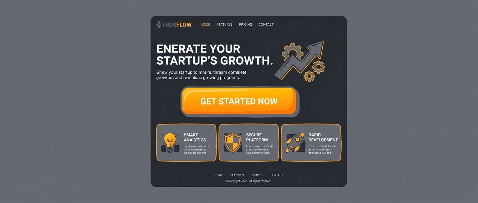
21) Charcoal Citrus Pop
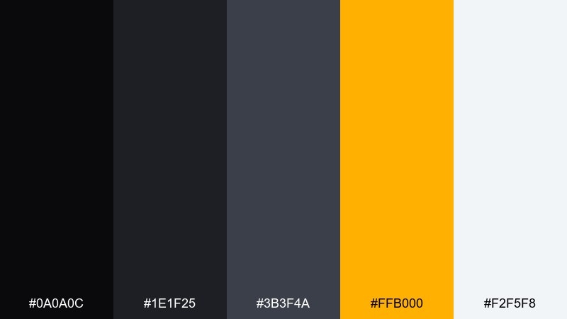
HEX: #0a0a0c #1e1f25 #3b3f4a #ffb000 #f2f5f8
Mood: modern, punchy, confident
Best for: startup branding and CTA-focused pages
Charcoal neutrals with a citrus pop feel bold, like streetwear labels and sharp signage. The bright amber is perfect for primary actions and notification dots. Use it for startup branding, conversion pages, and product tours where you need clear hierarchy. Pair with clean geometric type and simple illustrations to keep it approachable. Tip: keep the amber on buttons and icons only, and let charcoal do the heavy lifting elsewhere.
Image example of charcoal citrus pop generated using media.io
What Colors Go Well with Dark?
Dark neutrals (charcoal, ink, near-black) pair easily with soft off-whites and blue-grays for readable typography and “editorial” structure. If your design feels too heavy, slightly warm the light color (cream or parchment) to make it more inviting.
For accents, jewel tones (violet, teal, sapphire, emerald) look saturated and premium on dark backgrounds. Warm metallics (copper, brass, muted gold) add contrast without the harshness of pure yellow.
For modern product/UI work, keep accents limited: one primary accent for actions, one semantic set for states (success/warn/error), and let the rest stay in dark-to-mid neutrals.
How to Use a Dark Color Palette in Real Designs
Start by choosing your “canvas” (the darkest two shades) and reserve them for large areas like page background, hero sections, or app shells. Then assign a mid-tone to cards, panels, or navigation so components separate without needing thick borders.
Use the lightest tint strategically: headings, key metrics, and interactive text. On dark themes, tiny type can blur—so bump font weight slightly and avoid ultra-thin strokes for icons.
Finally, test contrast in context. A dark palette looks great in swatches but can fail in real layouts if highlights are overused; keep bright accents scarce so they maintain meaning and impact.
Create Dark Palette Visuals with AI
If you’re building a landing page, poster, or packaging concept, generate on-brand mockups by reusing the prompts above and swapping in your product, layout type, and aspect ratio.
With Media.io Text to Image, you can quickly iterate: try different lighting words (rim light, soft shadow, neon glow), adjust “no device frame” for clean previews, and keep the background plain for easy compositing.
Once you like a direction, generate a few variations and pick the one with the best contrast and spacing—dark themes reward subtlety.
Dark Color Palette FAQs
-
What is a dark color palette?
A dark color palette is a set of colors built around deep values (near-black, charcoal, midnight blues/greens) with a small range of lighter tints for readable text and highlights. -
How do I keep a dark design readable?
Use a lightest tint for body text and key UI labels, place text on slightly lighter panels instead of pure black, and avoid using bright accents as paragraph text. -
Is pure black (#000000) good for backgrounds?
Often no. Pure black can cause harsh contrast and banding; try near-black shades (like #0b0d10 or #0b0f1a) to keep the look softer and more premium. -
What accent colors work best on dark palettes?
Jewel tones (teal, violet, sapphire), warm metals (copper/brass), and clean “ice” tints (blue-white) tend to pop without looking cheap when used sparingly. -
How many accent colors should a dark UI use?
Typically one main accent for primary actions plus a small set for status states (success/warning/error). Too many bright accents reduce hierarchy on dark backgrounds. -
What’s a quick way to generate matching dark-themed mockups?
Use Media.io’s text-to-image tool and start from a prompt that already specifies “dark interface,” “plain background,” and a clear layout type (dashboard, poster, packaging), then iterate the accent color and lighting. -
Do dark palettes print well for posters and invitations?
Yes, if you avoid overly subtle gradients and keep text contrast strong. For print, consider adding a slight texture/grain and test a proof so deep shadows don’t fill in.


