Dark blue green sits right between navy and teal, so it can feel both trustworthy and refreshing at the same time. It’s a go-to for modern UIs, premium branding, and interiors that want depth without going full black.
Below are 20 curated dark blue green palettes with HEX codes, plus practical pairing advice and real-use ideas you can apply to websites, packaging, and spaces.
In this article
Why Dark Blue Green Palettes Work So Well
Dark blue green palettes feel grounded like navy, but they also carry the natural calm of green. That mix makes them versatile: serious enough for finance and tech, yet approachable for wellness, hospitality, and lifestyle brands.
They also create strong contrast systems. Deep blue-greens can anchor navigation, headers, and typography, while lighter sea-glass tints and warm off-whites keep layouts readable and modern.
Finally, dark blue green tends to look “premium” in both digital and print. It pairs beautifully with soft neutrals, brushed metals, and muted pastels, giving you depth without harshness.
20+ Dark Blue Green Color Palette Ideas (with HEX Codes)
1) Midnight Kelp
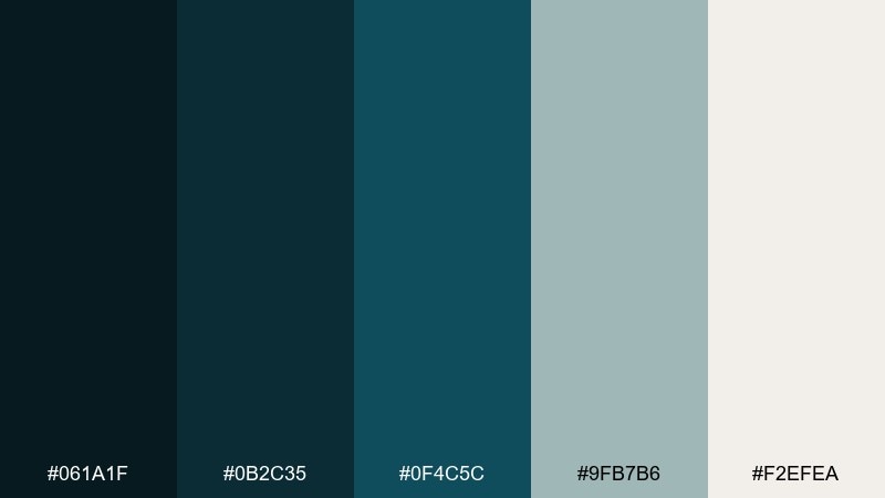
HEX: #061A1F #0B2C35 #0F4C5C #9FB7B6 #F2EFEA
Mood: moody, polished, oceanic
Best for: finance UI dashboard
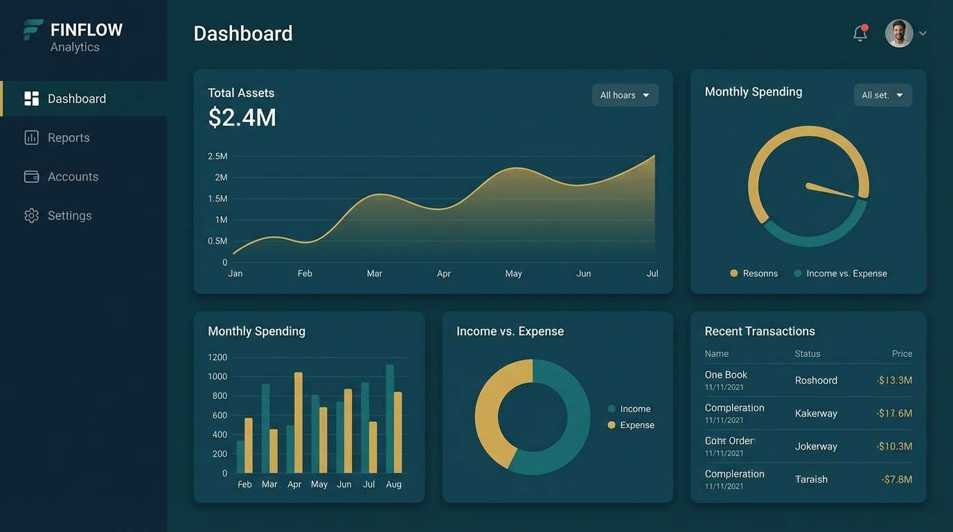
Moody and ocean-deep, these tones feel like kelp forests under moonlight. Use the near-black and deep teal for navigation and data panels, then lift readability with pale stone backgrounds. Pair with thin white dividers and soft teal highlights to keep charts crisp. Tip: reserve the lightest shade for empty states and tooltips so the interface breathes.
Image example of midnight kelp generated using media.io
Media.io is an online AI studio for creating and editing video, image, and audio in your browser.

2) Harbor Mist
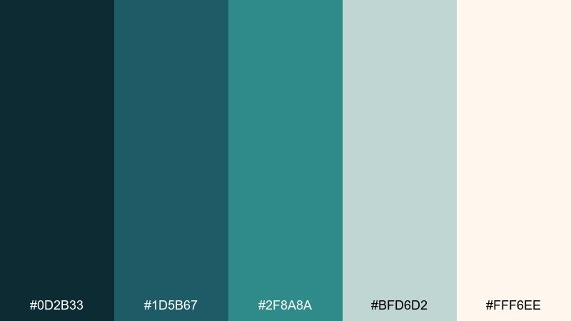
HEX: #0D2B33 #1D5B67 #2F8A8A #BFD6D2 #FFF6EE
Mood: calm, airy, coastal
Best for: spa brand identity
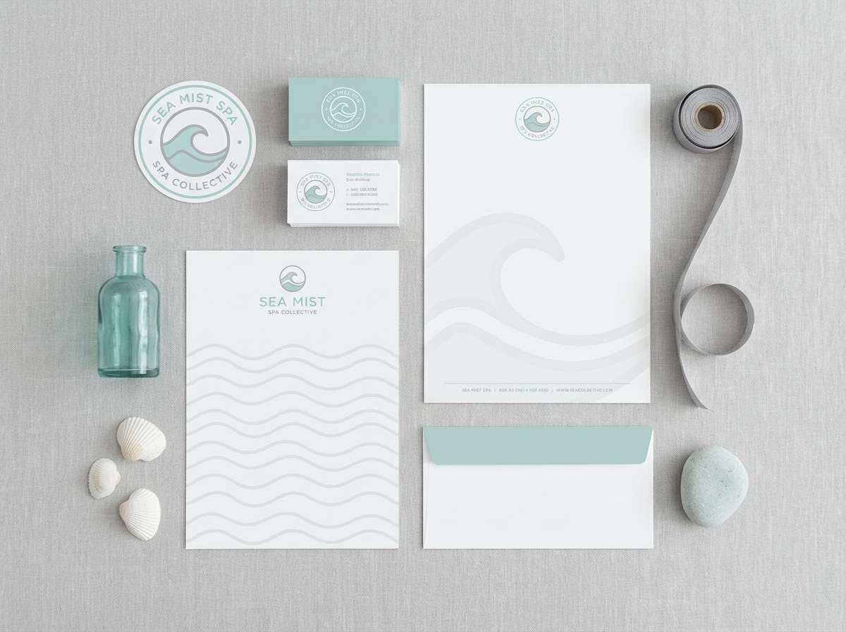
Calm and hazy like morning fog rolling across a harbor, this mix reads fresh without feeling cold. The mid-teals work well for logos and secondary marks, while the misty grey-green softens backgrounds. Pair with warm off-white paper textures and minimal line art for a premium, quiet look. Tip: keep the brightest teal for call-to-action accents so the brand stays serene.
Image example of harbor mist generated using media.io
3) Alpine Fjord
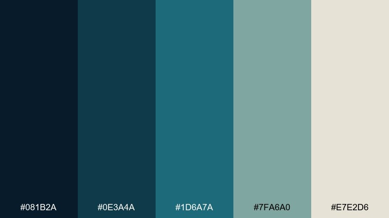
HEX: #081B2A #0E3A4A #1D6A7A #7FA6A0 #E7E2D6
Mood: crisp, outdoorsy, refined
Best for: outdoor gear website
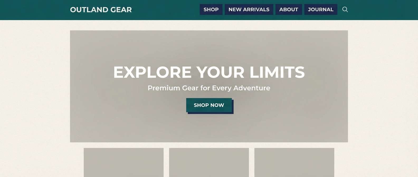
Crisp and bracing, it evokes a fjord at high altitude with steel-blue water and evergreen shadows. This dark blue green color palette is ideal for hero headers, product sections, and technical specs where contrast matters. Pair it with warm sand neutrals to keep the page from feeling too cold, and use the soft green-grey for secondary text blocks. Tip: apply the darkest shade to sticky nav and the mid-teal to hover states for a confident, outdoorsy UI.
Image example of alpine fjord generated using media.io
4) Inked Pine
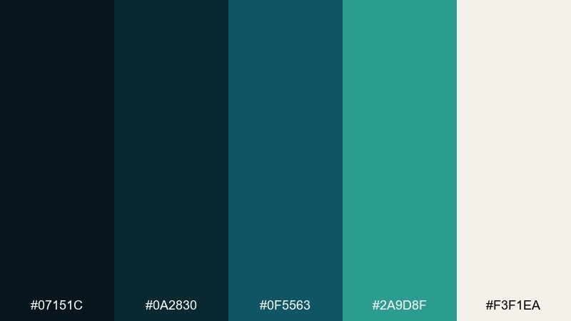
HEX: #07151C #0A2830 #0F5563 #2A9D8F #F3F1EA
Mood: bold, modern, energetic
Best for: tech startup landing page
Bold and inky, these shades feel like pine needles dipped in midnight paint. The bright teal adds energy without turning neon, making it strong for buttons and key stats. Pair with a warm off-white background and plenty of whitespace to keep the landing page premium. Tip: limit the accent teal to one primary action per section for a cleaner conversion path.
Image example of inked pine generated using media.io

5) Deep Lagoon
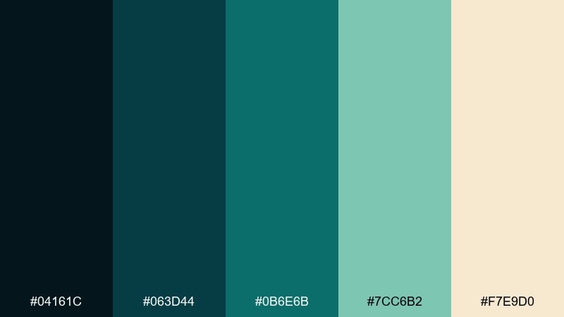
HEX: #04161C #063D44 #0B6E6B #7CC6B2 #F7E9D0
Mood: tropical, lush, inviting
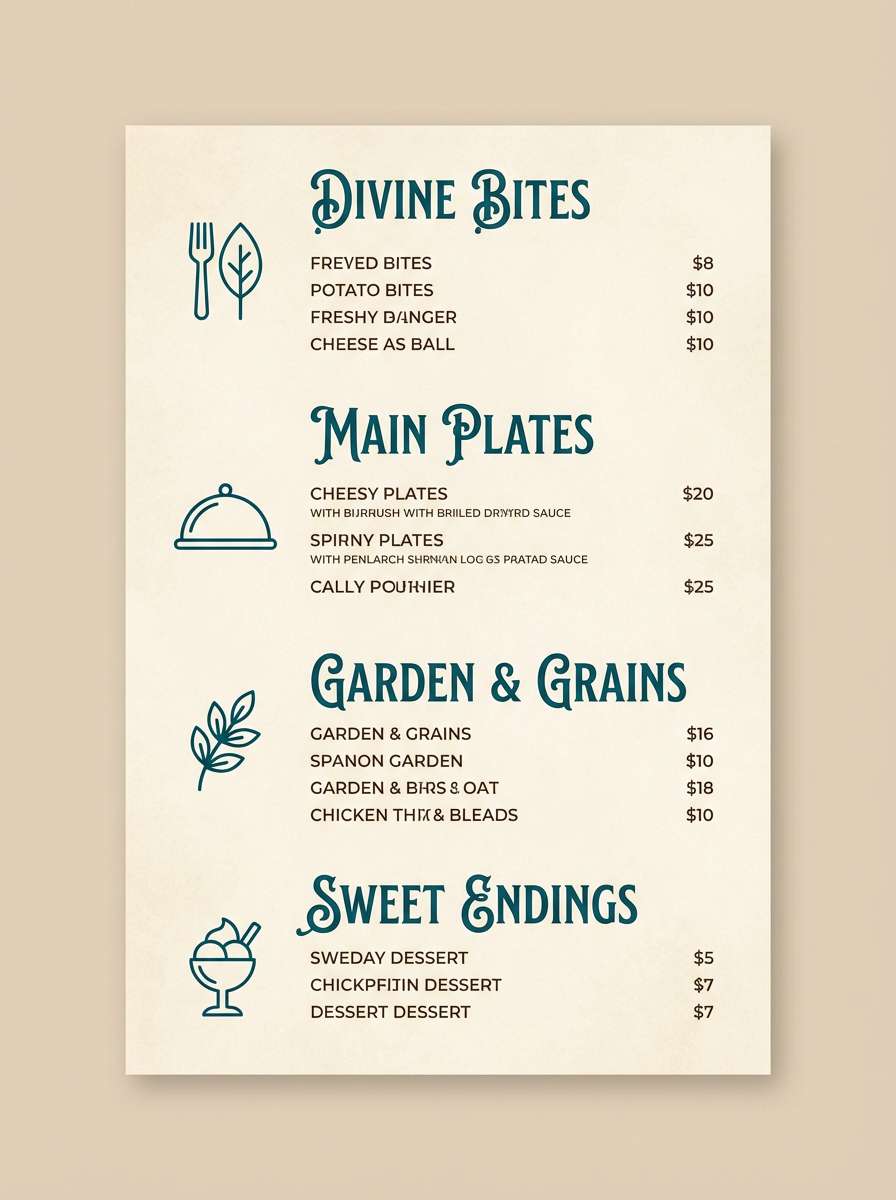
Best for: restaurant menu design
Lush and tropical, it brings to mind a quiet lagoon with sunlight hitting shallow water. Use the darkest tones for section headers and borders, then let the seafoam green brighten price blocks and callouts. Pair with warm parchment and subtle grain to feel handcrafted rather than corporate. Tip: add small botanical line icons in the mid-teal to tie categories together.
Image example of deep lagoon generated using media.io
6) Vintage Nautical
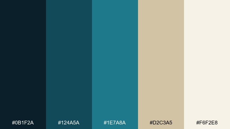
HEX: #0B1F2A #124A5A #1E7A8A #D2C3A5 #F6F2E8
Mood: classic, heritage, maritime
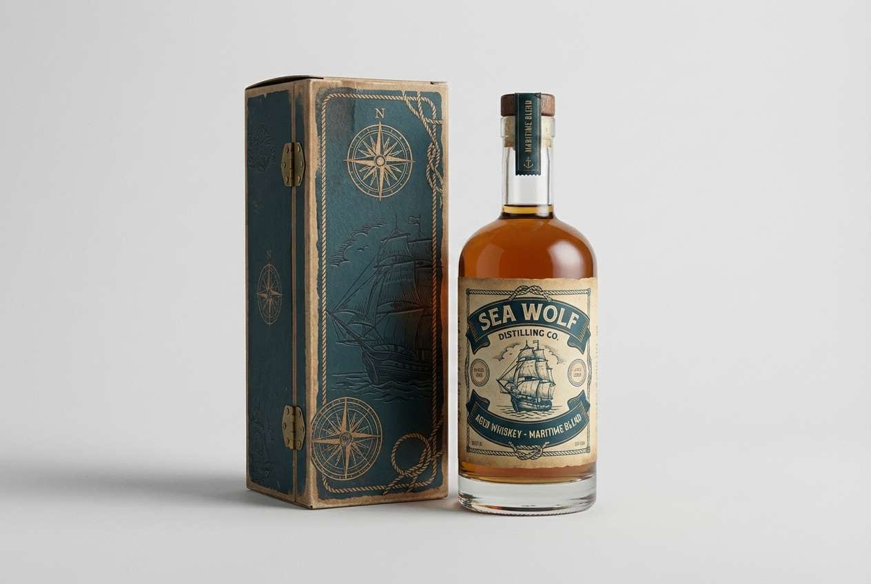
Best for: whiskey label packaging
Classic and heritage-leaning, it feels like weathered boat paint and aged canvas. These dark blue green color combinations shine on labels where you want tradition with a modern edge. Pair with off-white stock, embossed details, and a touch of warm sand to echo vintage navigation charts. Tip: keep typography in near-black and use the mid-teal for filigree and border rules.
Image example of vintage nautical generated using media.io
7) Rainy Conservatory
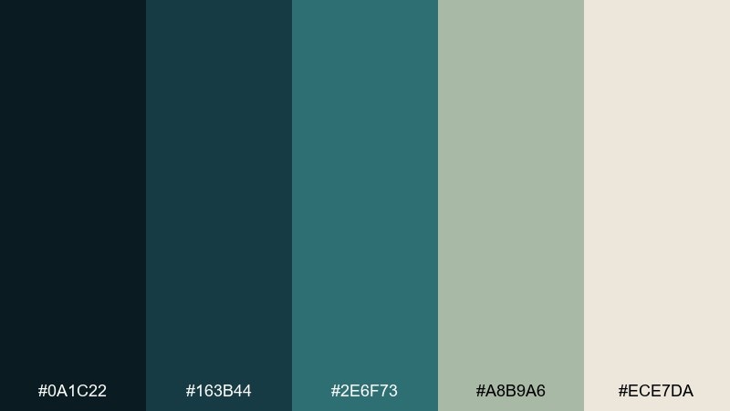
HEX: #0A1C22 #163B44 #2E6F73 #A8B9A6 #ECE7DA
Mood: soft, botanical, cozy
Best for: botanical illustration set
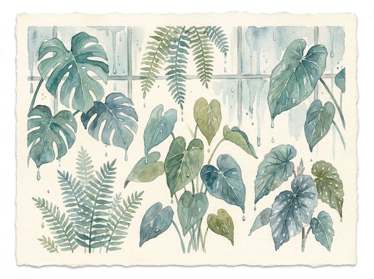
Soft and botanical, it suggests raindrops on greenhouse glass and damp leaves. The muted sage keeps the palette gentle, while the deeper teals add structure for stems and shadowed foliage. Pair with warm cream paper and light pencil textures for a natural, calm finish. Tip: use the darkest shade sparingly for the deepest shadow areas to keep the watercolor feel.
Image example of rainy conservatory generated using media.io
8) Nordic Library
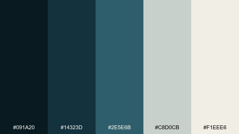
HEX: #091A20 #14323D #2E5E6B #C8D0CB #F1EEE6
Mood: quiet, academic, minimalist
Best for: editorial magazine spread
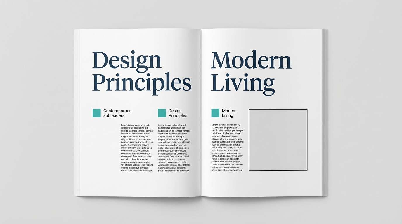
Quiet and academic, these tones feel like a Nordic reading room with slate walls and soft daylight. The blue-green mids work beautifully for pull quotes and section markers without distracting from long-form text. Pair with off-white margins, restrained serif headlines, and thin rules for a modern editorial rhythm. Tip: use the grey-green as a gentle background for sidebars and footnotes.
Image example of nordic library generated using media.io
9) Sea Glass Velvet
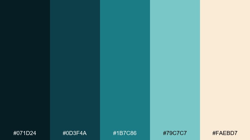
HEX: #071D24 #0D3F4A #1B7C86 #79C7C7 #FAEBD7
Mood: fresh, silky, uplifting
Best for: skincare product ad
Fresh and silky, it brings sea-glass shimmer against a deep velvet base. The brighter aqua is perfect for highlighting ingredients and benefits, while the dark teal keeps the ad feeling premium. Pair with warm beige to flatter skin tones and avoid a sterile look. Tip: use a gradient from deep teal to aqua behind the product to add depth without clutter.
Image example of sea glass velvet generated using media.io
10) Night Garden
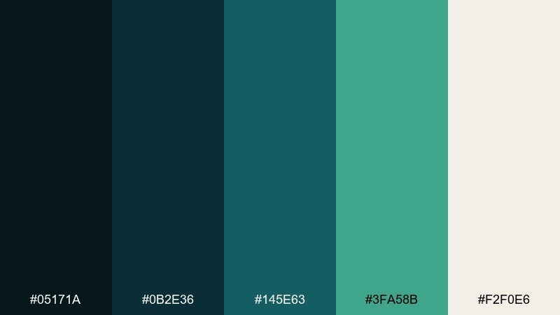
HEX: #05171A #0B2E36 #145E63 #3FA58B #F2F0E6
Mood: mysterious, elegant, organic
Best for: wedding invitation suite
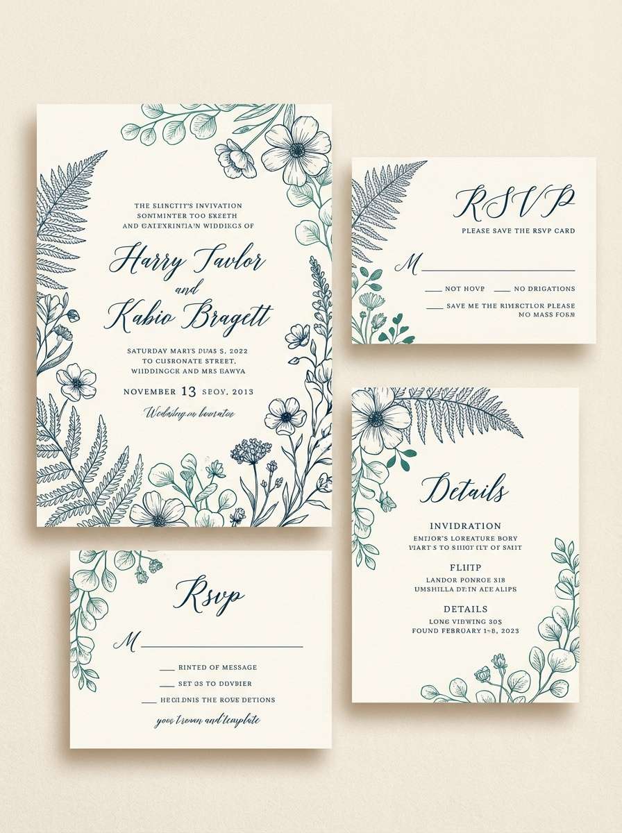
Mysterious and elegant, it feels like a garden ceremony after dusk with lantern light on leaves. Use the darkest shade for names and headings, then bring in the green-teal accent for monograms or floral line art. Pair with warm ivory paper and subtle foil details for a romantic finish. Tip: keep accent ink to one or two elements per card so the suite stays timeless.
Image example of night garden generated using media.io
11) Stormy Marina
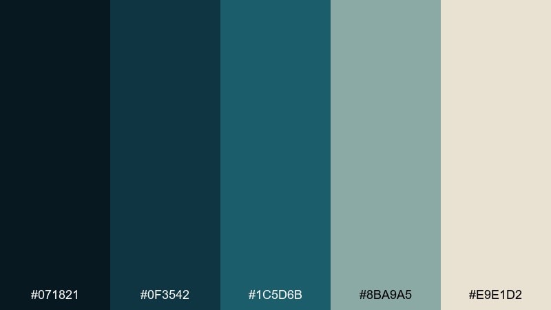
HEX: #071821 #0F3542 #1C5D6B #8BA9A5 #E9E1D2
Mood: dramatic, steady, sophisticated
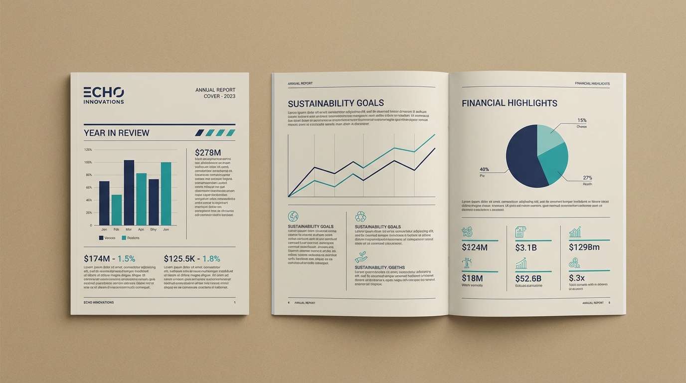
Best for: corporate annual report
Dramatic but steady, it reads like a storm rolling through a marina and settling into calm. The blue-greens make charts and section dividers feel confident, while the warm neutral prevents the layout from going icy. Pair with clean sans serif type and plenty of spacing for a modern corporate tone. Tip: assign one teal to data series and keep the rest monochrome for clarity.
Image example of stormy marina generated using media.io
12) Emerald Abyss
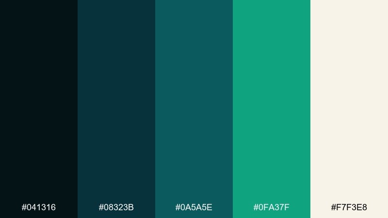
HEX: #041316 #08323B #0A5A5E #0FA37F #F7F3E8
Mood: luxury, high-contrast, bold
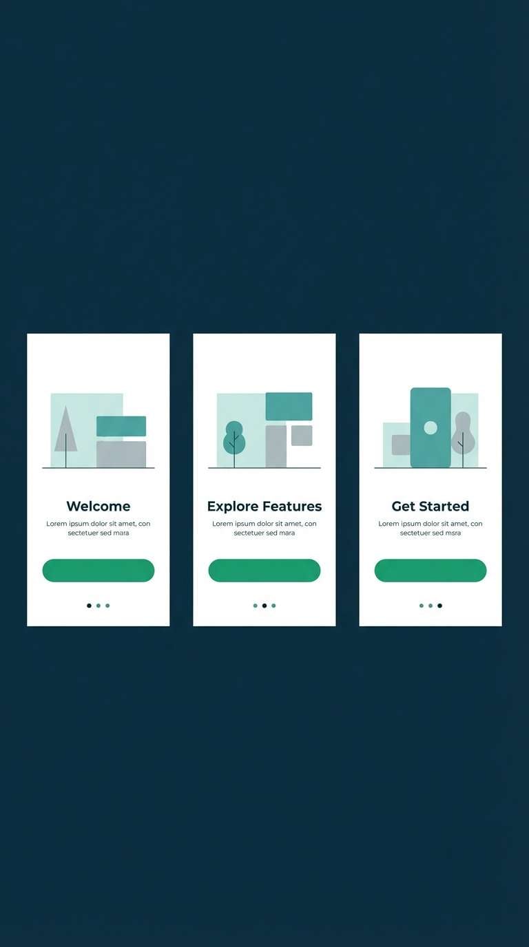
Best for: premium app onboarding
Luxurious and high-contrast, it suggests an emerald glow rising from deep water. The vivid green is best used as a micro-accent for progress indicators and key actions, while the dark base makes text pop. Pair with warm off-white screens to avoid fatigue and keep the experience friendly. Tip: use the bright shade for a single onboarding highlight per screen to guide attention.
Image example of emerald abyss generated using media.io
13) Slate Eucalyptus
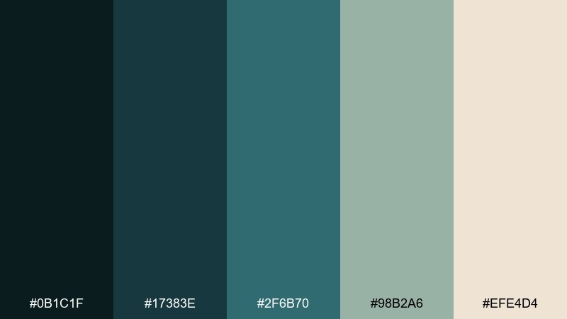
HEX: #0B1C1F #17383E #2F6B70 #98B2A6 #EFE4D4
Mood: grounded, natural, modern
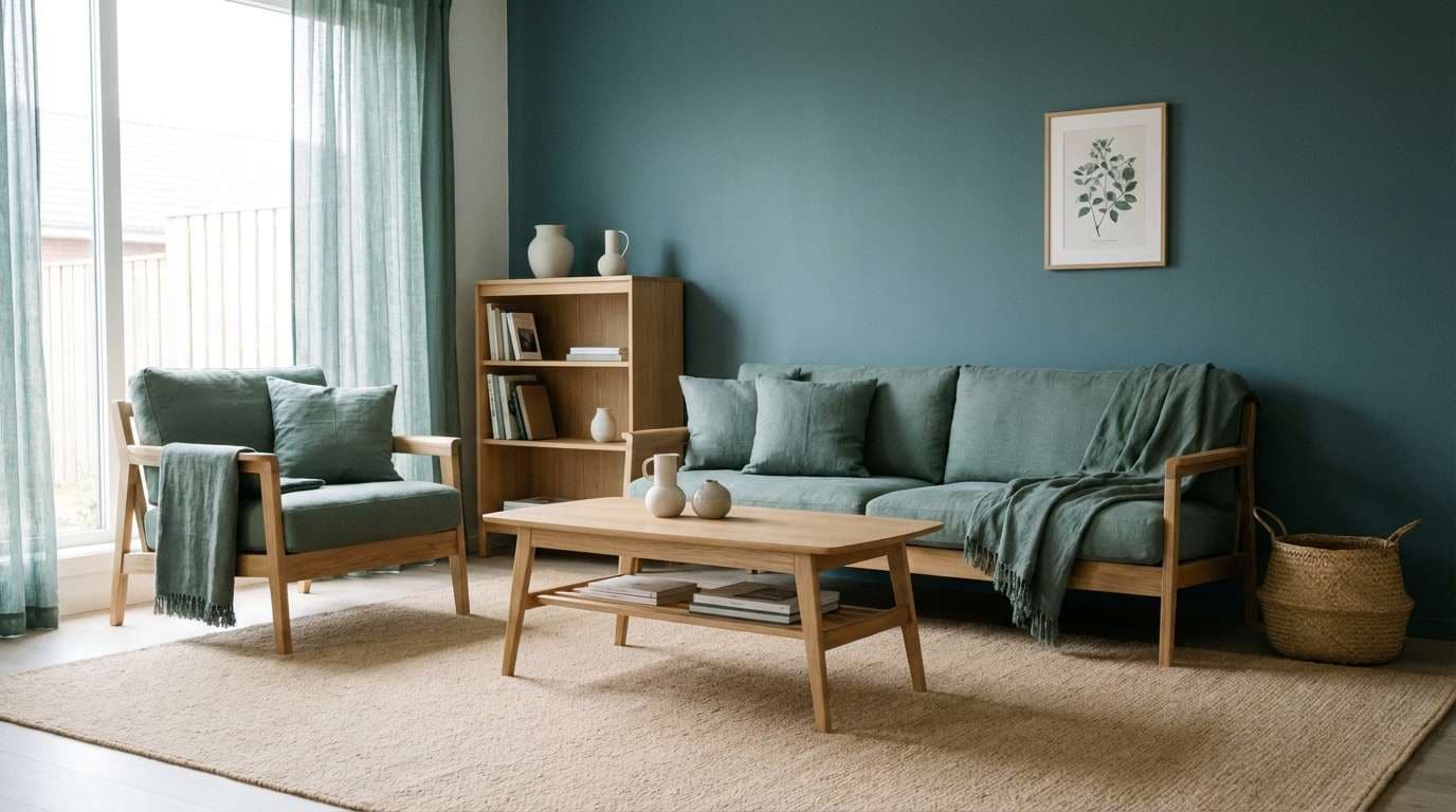
Best for: living room interior styling
Grounded and natural, it feels like eucalyptus leaves against slate stone. Use the dark teal as an accent wall or built-in cabinetry color, then soften with warm beige textiles and light wood. Pair with brushed brass hardware to add gentle warmth without overpowering the cool tones. Tip: repeat the muted sage in cushions and artwork so the room looks intentional, not themed.
Image example of slate eucalyptus generated using media.io
14) Coastal Blueprint
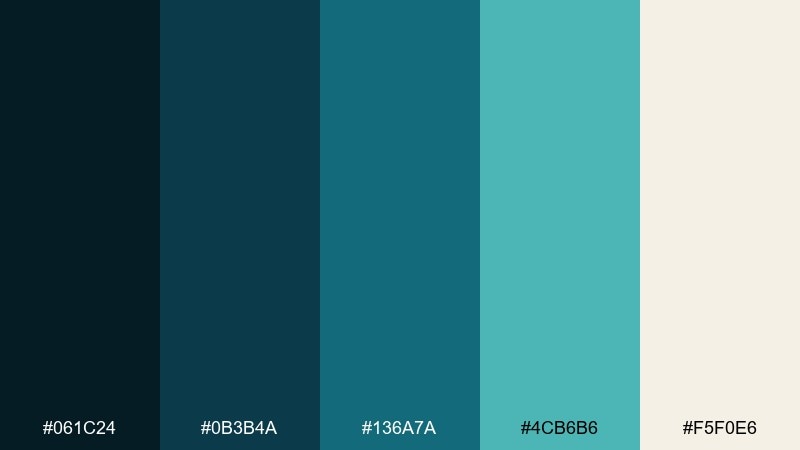
HEX: #061C24 #0B3B4A #136A7A #4CB6B6 #F5F0E6
Mood: clean, structured, contemporary
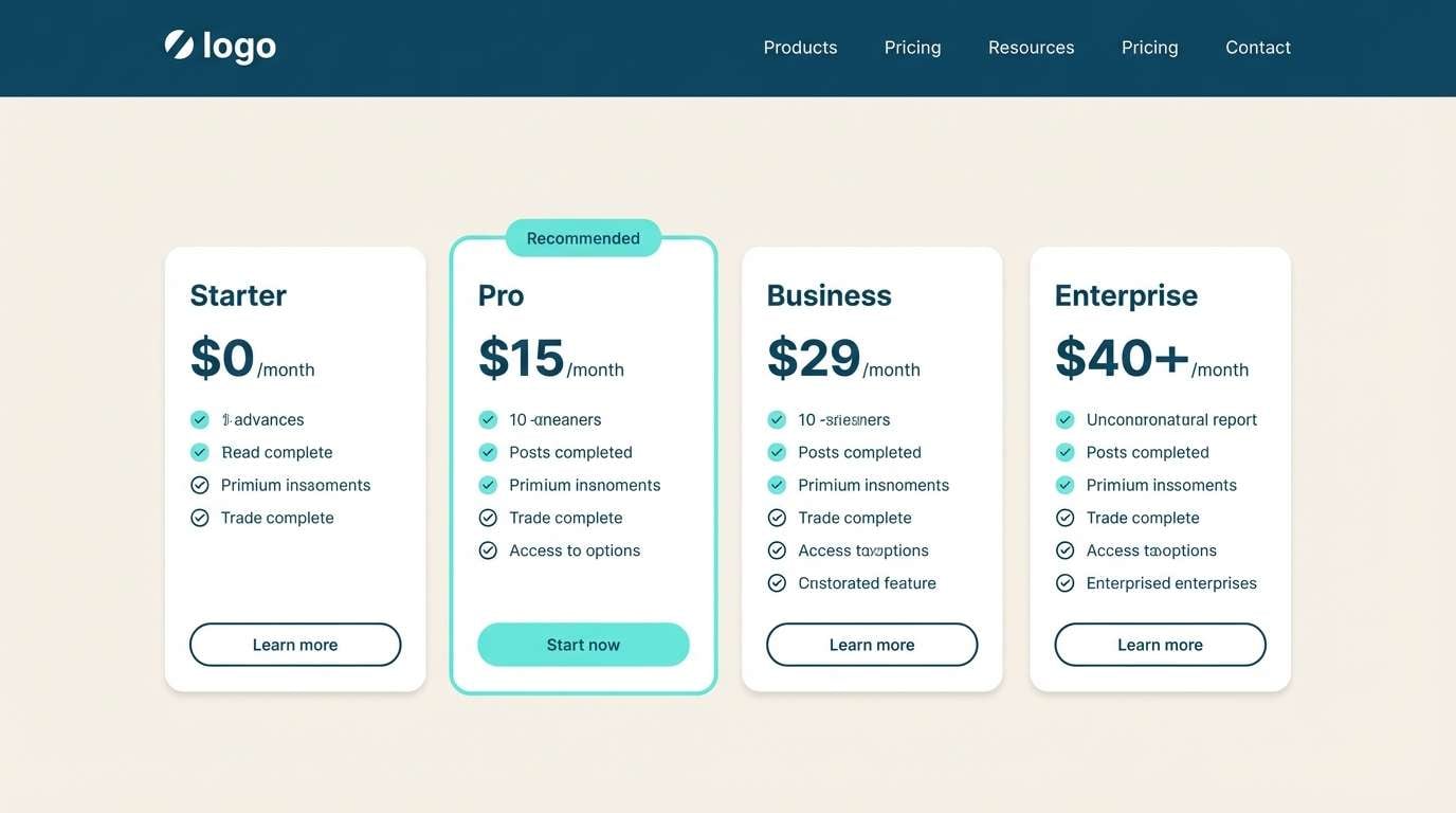
Best for: SaaS pricing page UI
Clean and structured, it recalls a coastal blueprint with precise lines and ocean ink. The darker tones are perfect for headers and pricing card outlines, while the aqua keeps badges and toggles lively. Pair with a warm off-white base and subtle shadows to maintain a trustworthy SaaS feel. Tip: use the aqua only for the recommended plan to make the decision effortless.
Image example of coastal blueprint generated using media.io
15) Peacock Shadow
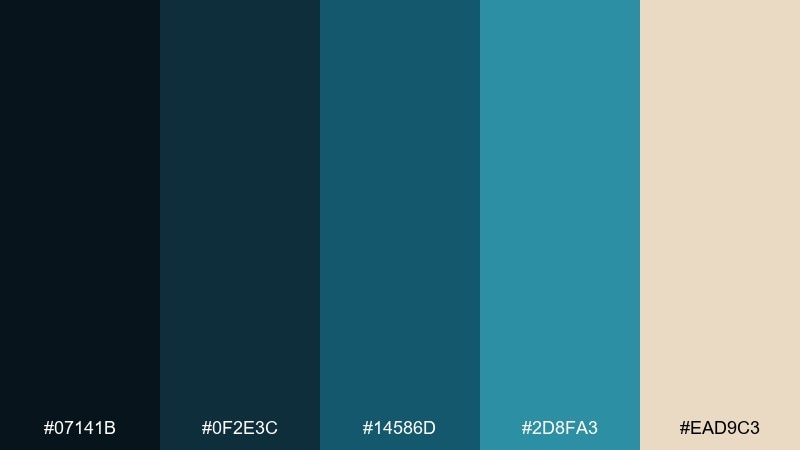
HEX: #07141B #0F2E3C #14586D #2D8FA3 #EAD9C3
Mood: artful, confident, slightly retro
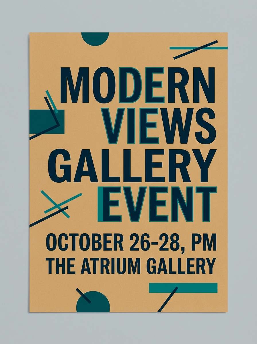
Best for: gallery event poster
Artful and confident, it feels like a peacock feather seen in low light. This dark blue green color palette works beautifully for bold typographic posters where you want drama without pure black. Pair with a warm tan background and oversized sans serif type for a contemporary gallery vibe. Tip: keep the brightest teal for one focal element, like the date or venue, to control hierarchy.
Image example of peacock shadow generated using media.io
16) Deep Forest Denim
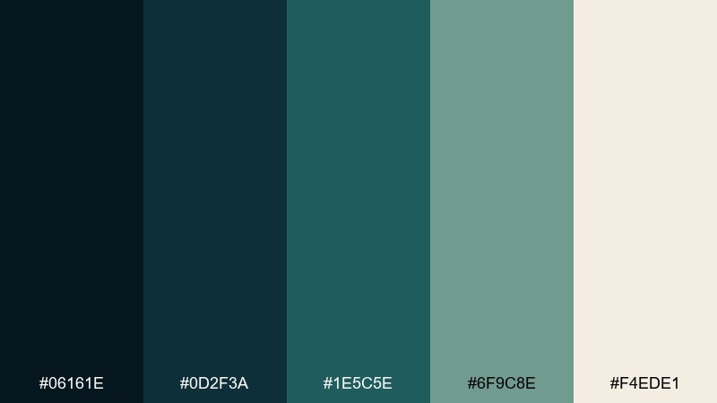
HEX: #06161E #0D2F3A #1E5C5E #6F9C8E #F4EDE1
Mood: rugged, relaxed, outdoorsy
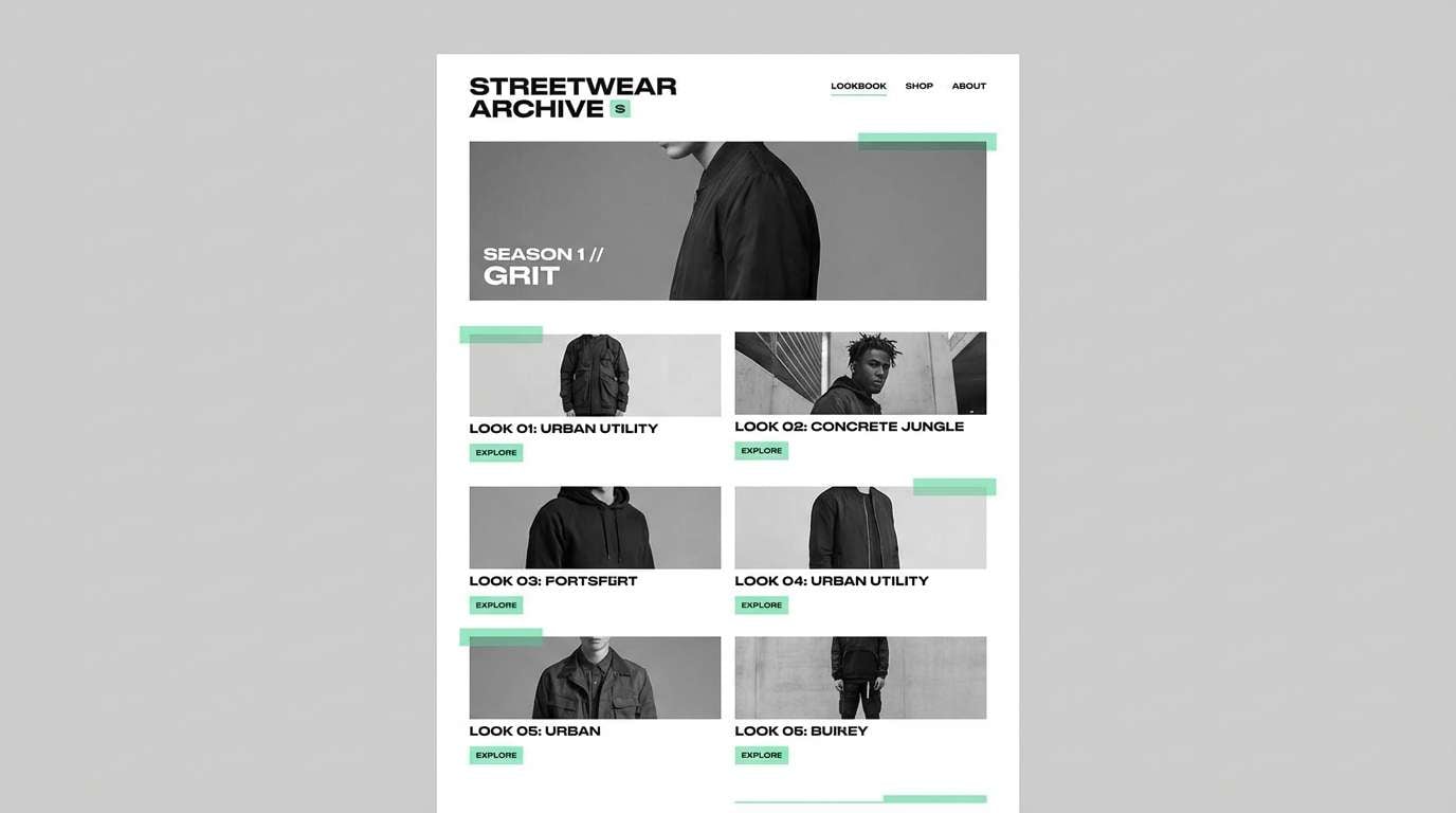
Best for: streetwear lookbook
Rugged and relaxed, it suggests forest shade mixed with worn denim. Use the darkest tones for spreads and captions, then lean on the muted green for secondary backgrounds and graphic blocks. Pair with off-white negative space and simple grid layouts to keep the lookbook clean. Tip: add a single warm neutral panel every few pages to break up the cool run.
Image example of deep forest denim generated using media.io
17) Museum Teal
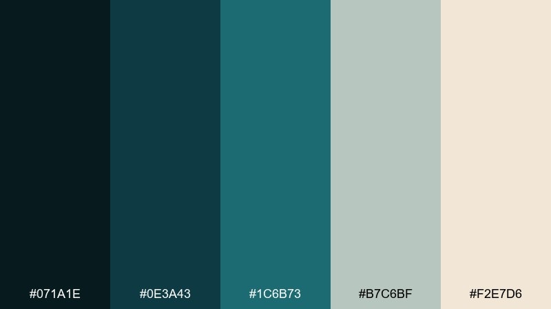
HEX: #071A1E #0E3A43 #1C6B73 #B7C6BF #F2E7D6
Mood: curated, quiet, upscale
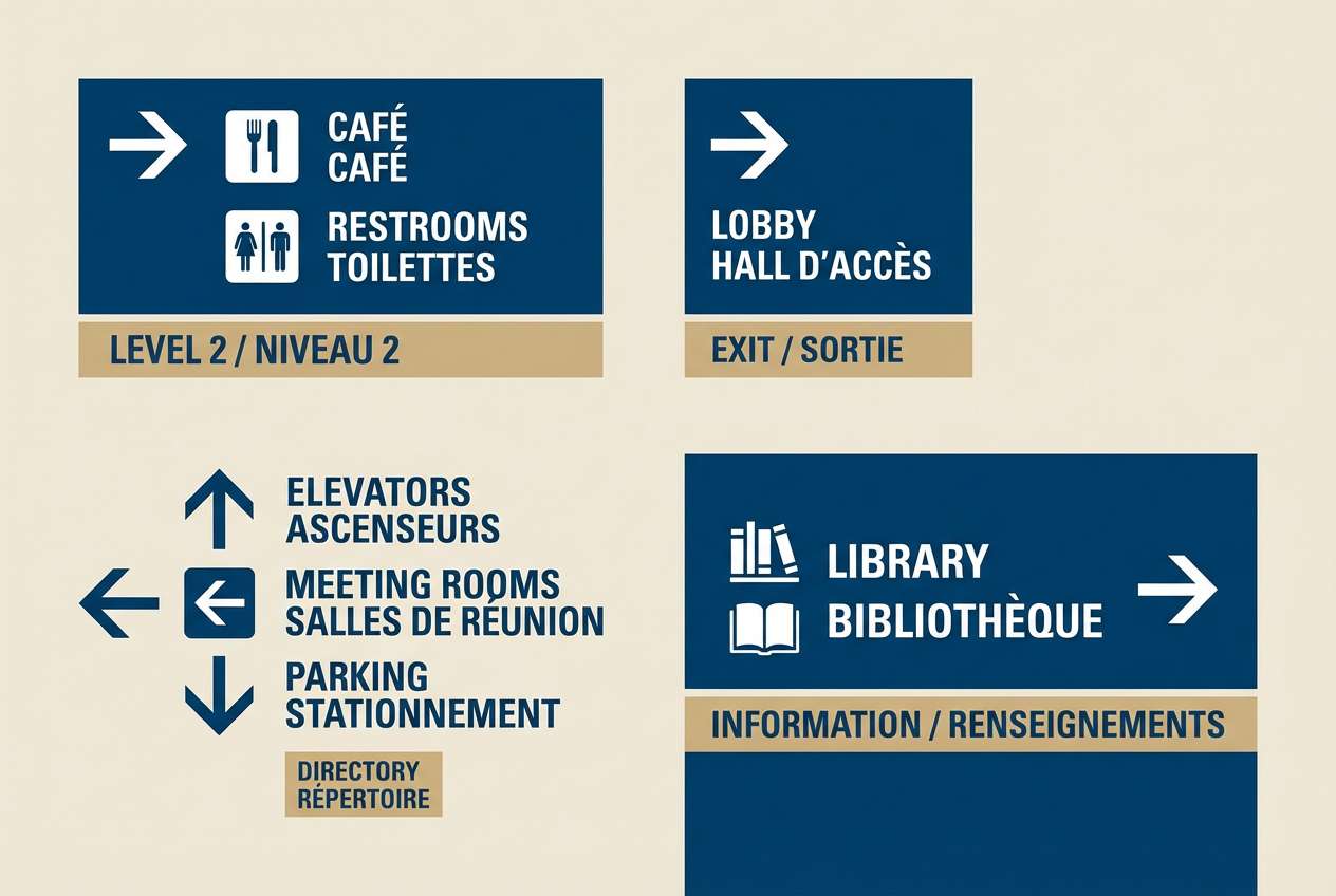
Best for: museum exhibit wayfinding
Curated and quiet, it feels like gallery walls, patina, and soft spotlights. The mid-teal is strong for directional signage and section color-coding, while the pale grey-green keeps backgrounds calm. Pair with warm beige and clear iconography so visitors can scan quickly. Tip: test contrast at distance and reserve the darkest tone for critical labels only.
Image example of museum teal generated using media.io
18) Arctic Spruce
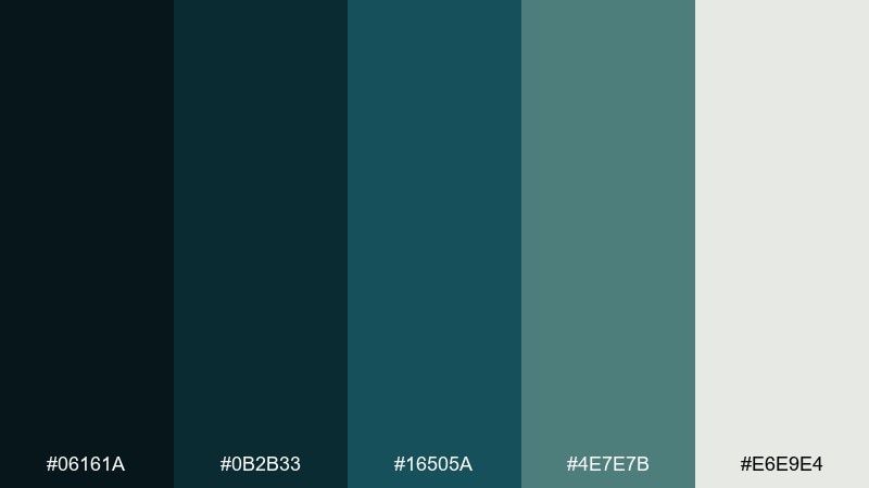
HEX: #06161A #0B2B33 #16505A #4E7E7B #E6E9E4
Mood: cool, minimal, breathable
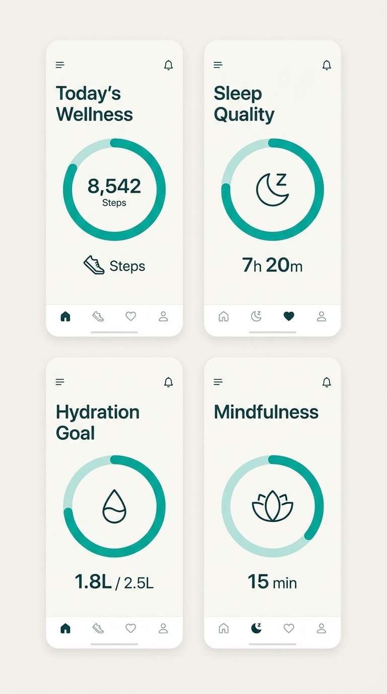
Best for: health app UI
Cool and breathable, it resembles spruce needles against pale winter light. Use the near-black teal for primary text and headers, then the softer teal for charts and progress rings. Pair with the icy off-white as the main canvas to keep the UI feeling clean and reassuring. Tip: keep saturation low on secondary elements so health metrics stay the star.
Image example of arctic spruce generated using media.io
19) Blue Juniper Clay
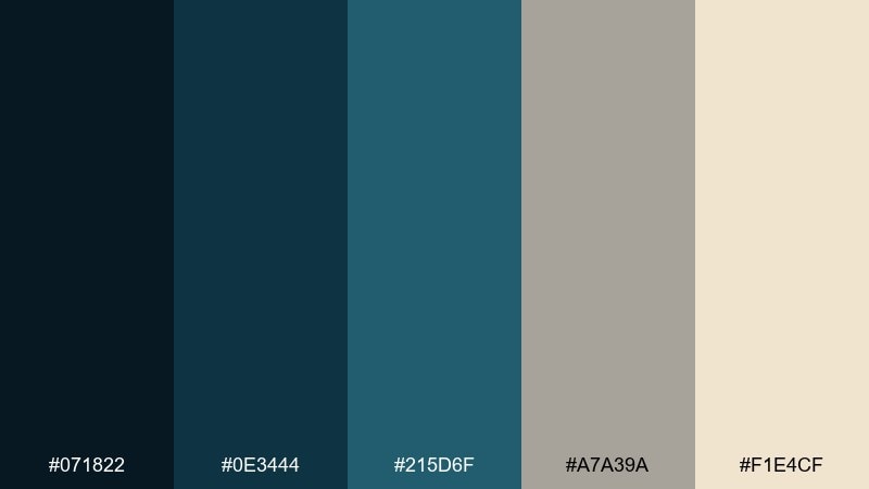
HEX: #071822 #0E3444 #215D6F #A7A39A #F1E4CF
Mood: earthy, modern, balanced
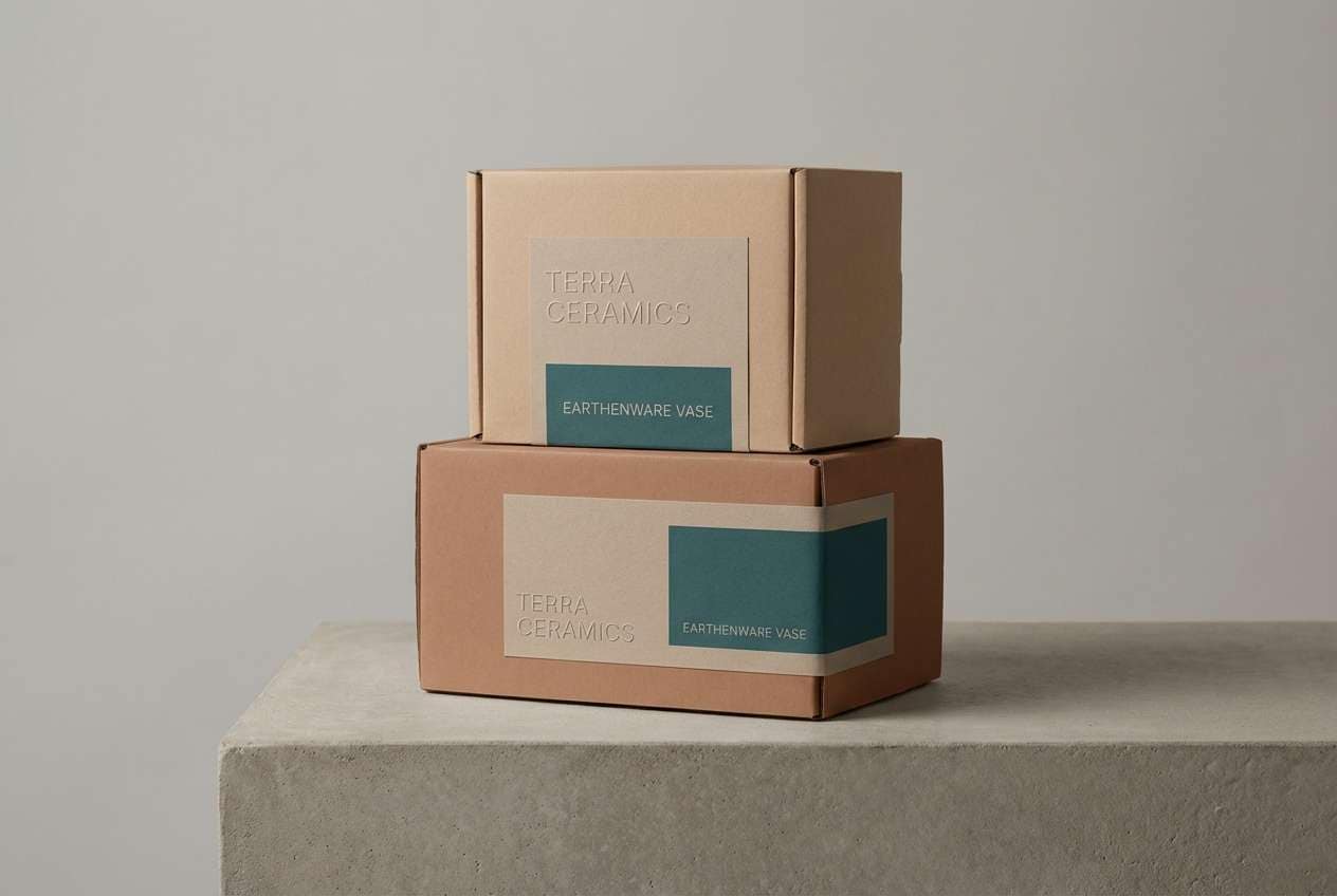
Best for: ceramics product packaging
Earthy and modern, it blends juniper-blue depth with clay-like warmth. These dark blue green color combinations look especially good on matte boxes and wrap labels where texture matters. Pair with natural kraft stock, understated typography, and a small teal mark to suggest craftsmanship. Tip: keep the warm beige as the dominant field and use deep teal for brand blocks and seals.
Image example of blue juniper clay generated using media.io
20) Eclipse Botanica
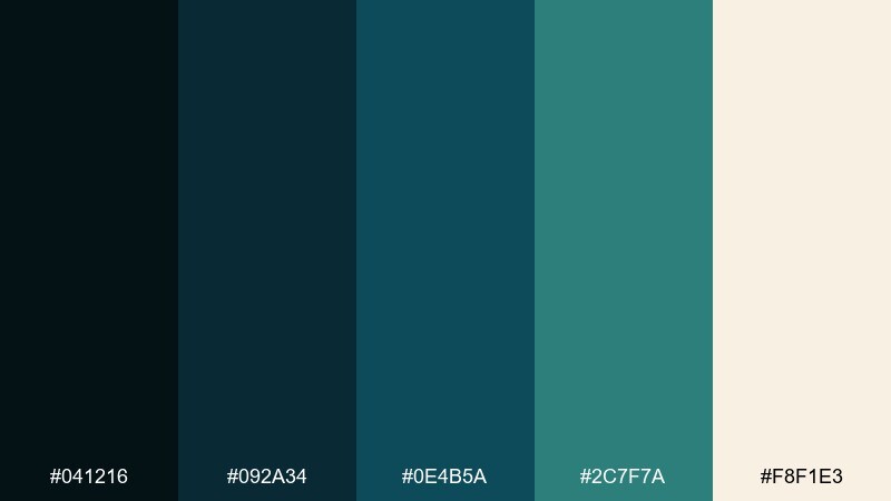
HEX: #041216 #092A34 #0E4B5A #2C7F7A #F8F1E3
Mood: mysterious, natural, cinematic
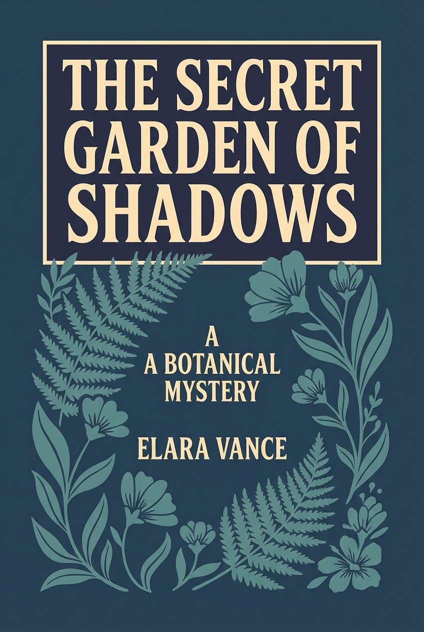
Best for: book cover design
Mysterious and cinematic, it feels like an eclipse over a botanical garden. The dark base supports bold title type, while the softer teals work for illustrated leaves or subtle gradients. Pair with warm cream to keep the cover readable in thumbnails and print. Tip: use one high-contrast teal highlight on the title to create a strong focal point.
Image example of eclipse botanica generated using media.io
What Colors Go Well with Dark Blue Green?
Warm neutrals are the easiest win: ivory, cream, sand, and parchment make dark blue green feel softer and more premium. They also improve readability in UI by keeping contrast high without the starkness of pure white.
For accent colors, try muted coral, terracotta, copper, or blush to add warmth and human energy. If you want a crisp modern look, pair dark blue green with pale aqua, foggy grey-greens, or cool off-whites to keep everything clean and coastal.
For bold highlights, use mustard or golden tones sparingly—just enough for emphasis on buttons, badges, or key data points—so the palette stays sophisticated rather than loud.
How to Use a Dark Blue Green Color Palette in Real Designs
In branding, use a deep blue green as your primary “trust” color (logos, headers, packaging panels), then add one lighter teal for supporting elements like icons and secondary marks. Keep a warm neutral as the dominant background to prevent the system from feeling heavy.
In UI design, dark blue greens excel in navigation bars, dashboards, and dark-mode surfaces because they reduce glare compared to true black. Assign a single bright teal (or emerald) as a consistent interactive color for CTAs, toggles, and active states.
In interiors, treat dark blue green like a modern navy: great for an accent wall, built-ins, or tile. Balance it with light wood, warm textiles, and a small amount of brass or warm stone to keep the room inviting.
Create Dark Blue Green Palette Visuals with AI
If you want to see these palettes in context, generate quick mockups—like landing pages, posters, product ads, or room scenes—using text prompts. This helps you validate contrast, mood, and hierarchy before committing to final design assets.
With Media.io’s text-to-image tool, you can iterate fast: swap backgrounds, adjust lighting, or test different accent placements while keeping the same dark blue green core. It’s especially helpful when you need multiple concepts for clients or A/B tests.
Dark Blue Green Color Palette FAQs
-
What is “dark blue green” as a color family?
Dark blue green is a deep range between navy and teal, often perceived as oceanic or evergreen-toned. It typically includes near-black teals, deep cyan-leaning blues, and muted blue-green midtones. -
Is dark blue green good for modern UI design?
Yes. Dark blue green works well for headers, sidebars, and dashboard surfaces because it feels professional and reduces harsh contrast compared to pure black. Use a warm off-white background (or soft neutrals) to keep text readable. -
What accent color pairs best with dark blue green?
Mustard/gold, terracotta, and coral create strong warm contrast, while aqua and seafoam keep a clean coastal look. Choose one accent and use it consistently for CTAs or key highlights. -
How do I keep a dark blue green palette from looking too cold?
Add warm neutrals (cream, beige, parchment), natural textures, or warm metallics like brass. In digital layouts, use slightly warm whites instead of pure #FFFFFF. -
Can I use dark blue green for branding in finance or tech?
Absolutely. It communicates stability like navy, but feels more contemporary and human than traditional corporate blues. Pair it with restrained typography and clear contrast rules for a premium, trustworthy identity. -
What’s a common mistake when using dark blue green palettes?
Overusing saturated teals everywhere. Keep deep blue-greens as structural colors, then reserve the brightest teal/emerald for a small number of interactive or focal elements so hierarchy stays clear. -
How can I preview dark blue green palettes in real scenes quickly?
Generate mockups with an AI text-to-image tool using prompts like “SaaS pricing page UI” or “living room with teal accent wall,” then refine the prompt to match your brand mood and lighting.


