Champagne is a soft, warm neutral that brings instant polish to modern design. It sits between beige and cream, so it reads light, airy, and premium without feeling stark.
Below are champagne color palette ideas with HEX codes you can use for weddings, branding, UI, interiors, and seasonal visuals—plus prompts to generate matching images in Media.io.
In this article
- Why Champagne Palettes Work So Well
-
- brunch bubbles
- velvet toast
- pearl wedding
- minimal gallery
- sunlit linen
- rose gold fizz
- coastal champagne
- art deco lounge
- soft sage table
- mocha meringue
- blush candlelight
- modern serif editorial
- studio skincare
- autumn sparkle
- botanical cream
- nightfall neutrals
- kids party pastels
- luxury boutique
- warm clay home
- retro aperitif
- What Colors Go Well with Champagne?
- How to Use a Champagne Color Palette in Real Designs
- Create Champagne Palette Visuals with AI
Why Champagne Palettes Work So Well
Champagne works because it’s a warm neutral with enough softness to feel friendly, yet enough refinement to feel luxurious. It complements both minimal modern layouts and romantic, decorative styles.
In design systems, champagne is an easy “background builder”: it supports typography, product photography, and illustrations without competing for attention. It also blends seamlessly with blush, gold, sage, teal, and deep browns.
Most importantly, champagne keeps visuals readable. With the right dark anchor (espresso, charcoal, deep green), you get clean contrast while maintaining a calm, premium tone.
20+ Champagne Color Palette Ideas (with HEX Codes)
1) Brunch Bubbles
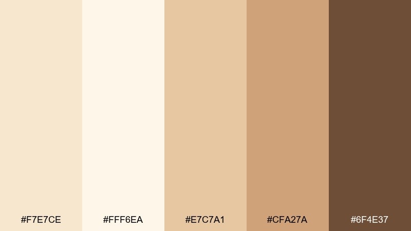
HEX: #f7e7ce #fff6ea #e7c7a1 #cfa27a #6f4e37
Mood: light, welcoming, cafe-chic
Best for: brunch cafe menu and social posts
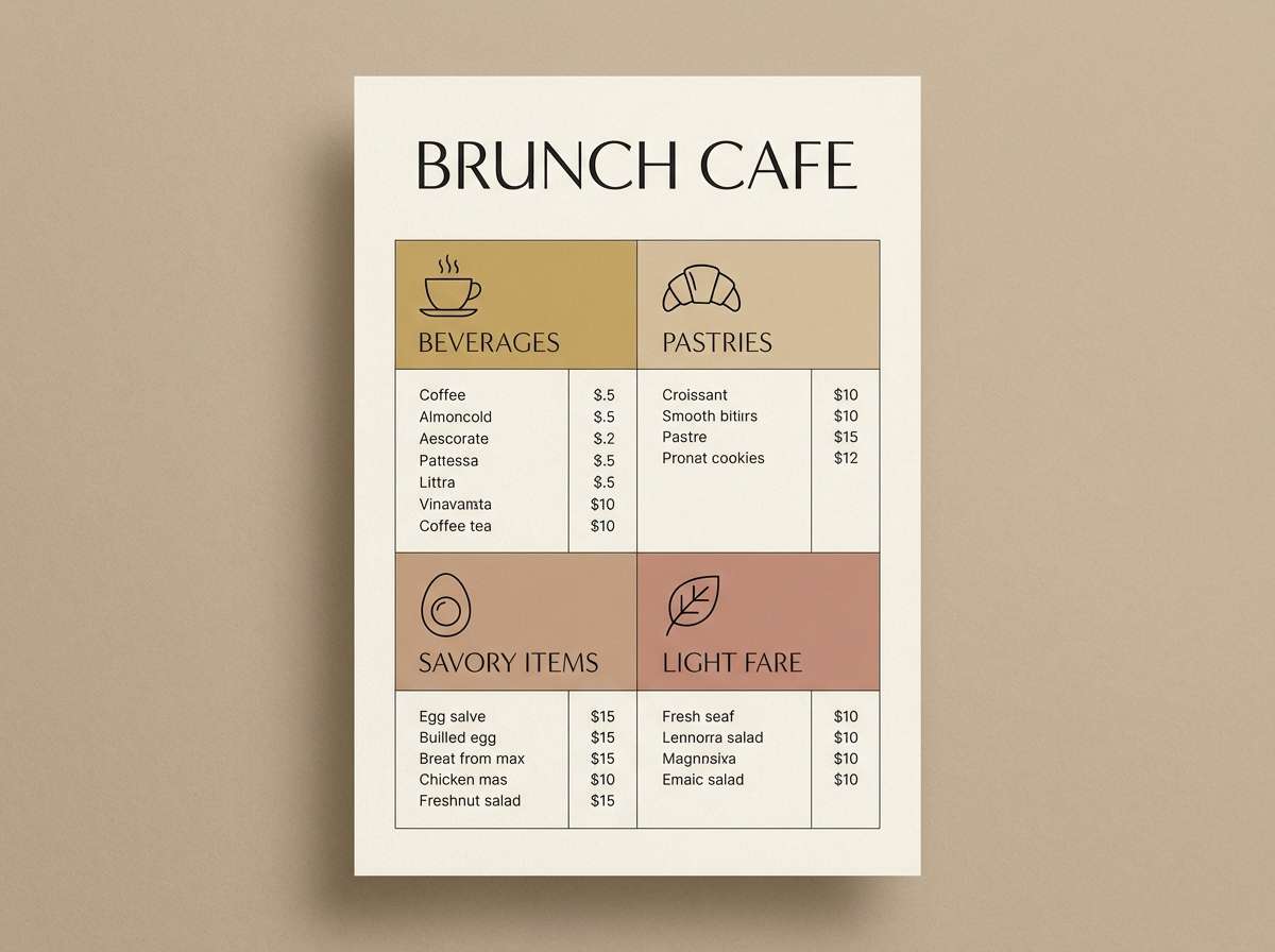
Airy cream tones with toasted caramel feel like morning light on linen and fresh pastries. Use it for menus, Instagram templates, or lifestyle banners where readability matters. Pair the deeper coffee brown with lots of whitespace to anchor headings and prices. Tip: keep the darkest shade for text only, and let the mid caramel work as subtle dividers.
Image example of brunch bubbles generated using media.io
Media.io is an online AI studio for creating and editing video, image, and audio in your browser.

2) Velvet Toast
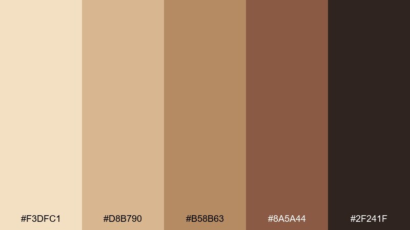
HEX: #f3dfc1 #d8b790 #b58b63 #8a5a44 #2f241f
Mood: cozy, grounded, sophisticated
Best for: warm interior styling and hospitality branding
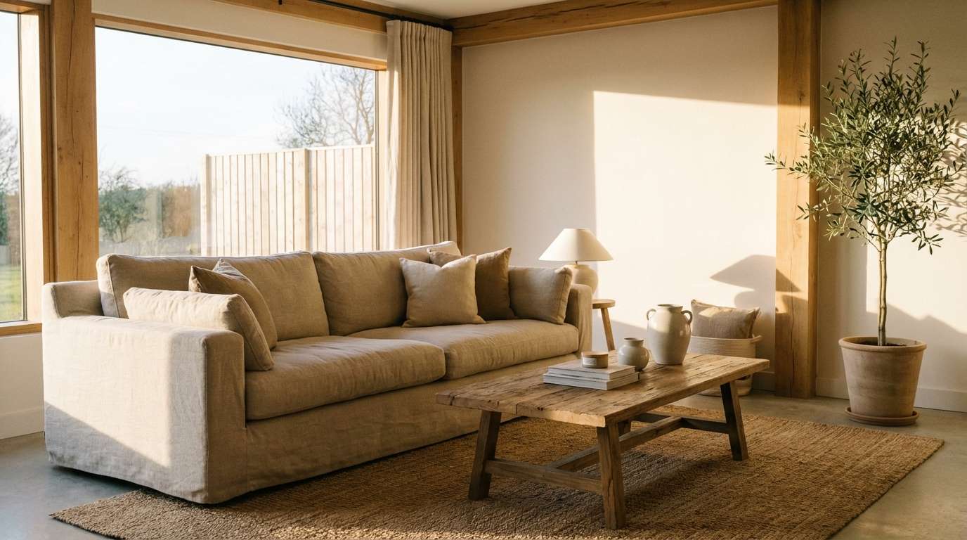
Velvety beige and deep roast browns evoke a quiet lounge and buttery toast at dusk. These tones work beautifully for cafe brands, boutique hotels, or cozy interior moodboards. Balance the palette by using the lightest cream for backgrounds and the darkest espresso for logos and type. Tip: add texture like paper grain or fabric to make the mid browns feel richer without getting heavy.
Image example of velvet toast generated using media.io
3) Pearl Wedding
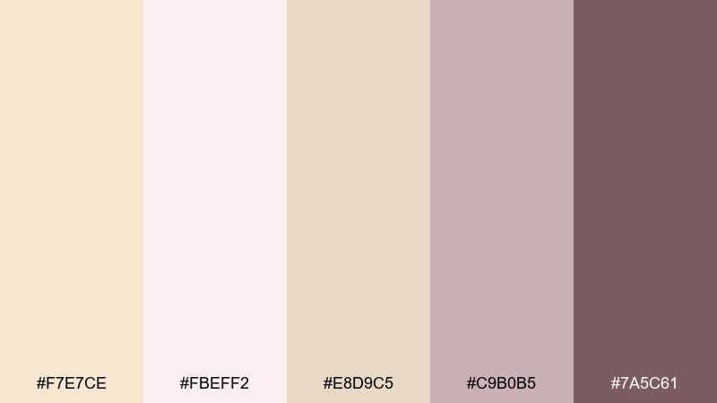
HEX: #f7e7ce #fbeff2 #e8d9c5 #c9b0b5 #7a5c61
Mood: romantic, delicate, timeless
Best for: wedding invitations and ceremony stationery
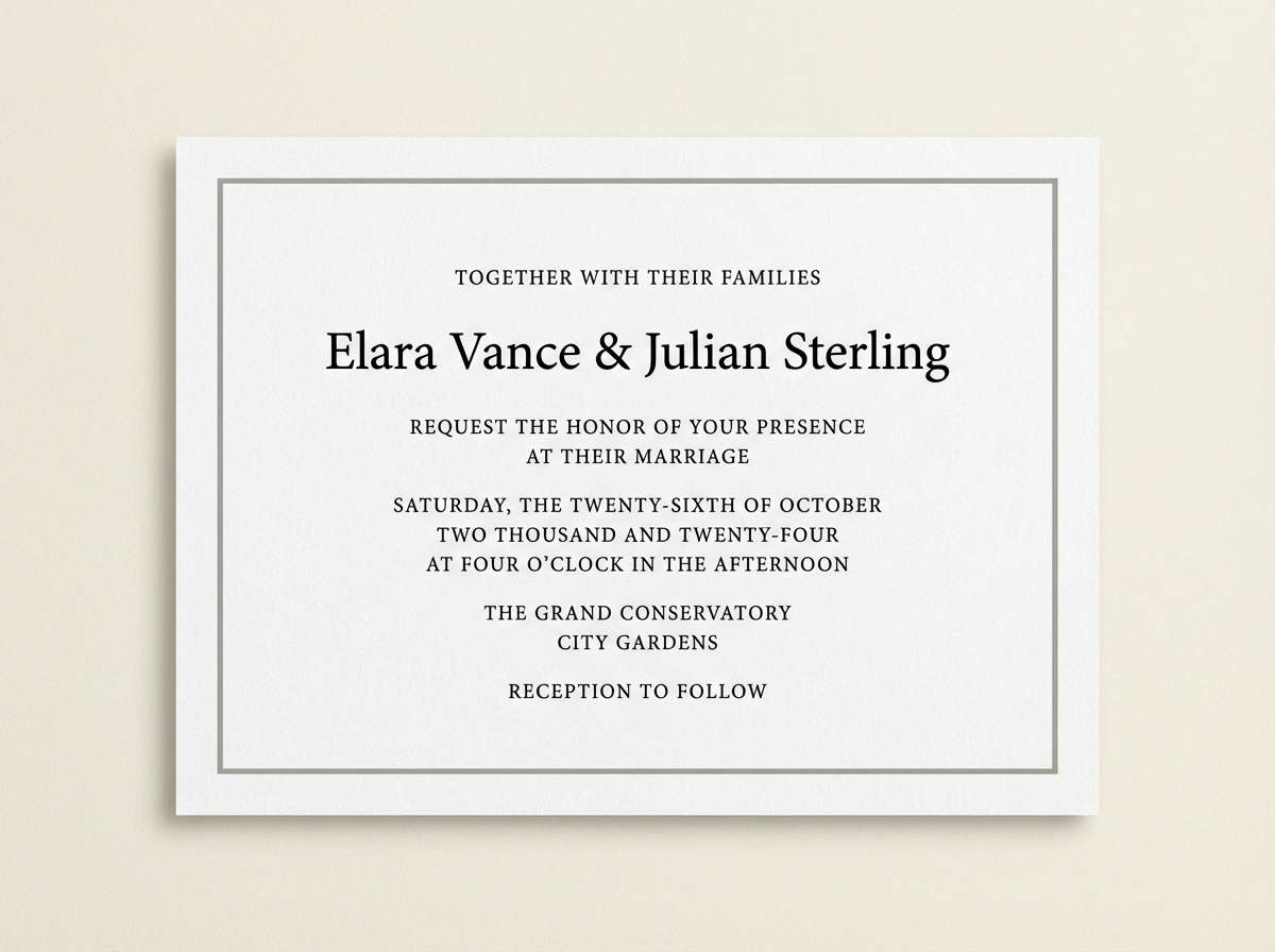
Soft pearl and blush hues feel like silk ribbons, rose petals, and candlelit vows. This champagne color palette shines on invitations, RSVP cards, and seating charts with classic typography. Pair the muted mauve with the warm cream to keep details legible while staying airy. Tip: use the darkest mauve for names and dates, and reserve blush for thin lines and wax-seal accents.
Image example of pearl wedding generated using media.io
4) Minimal Gallery
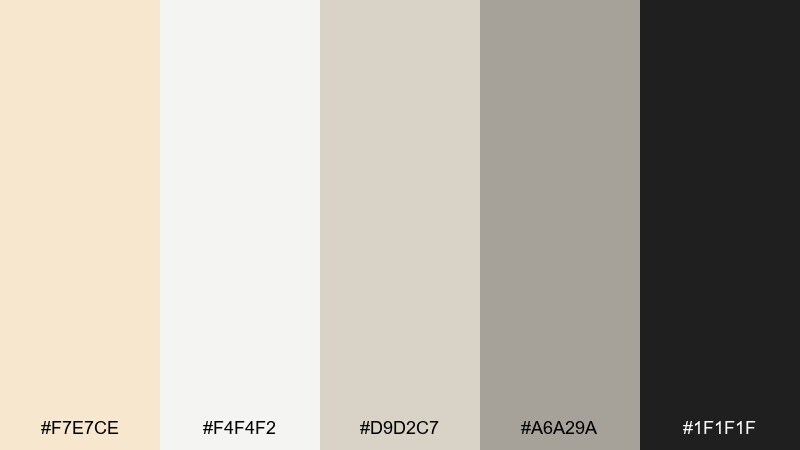
HEX: #f7e7ce #f4f4f2 #d9d2c7 #a6a29a #1f1f1f
Mood: modern, clean, curated
Best for: portfolio websites and gallery-style UI
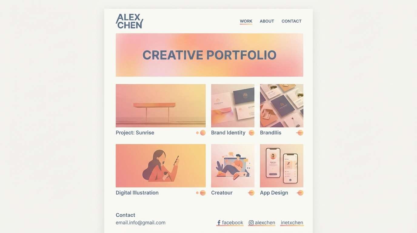
Quiet neutrals and crisp charcoal evoke white walls, framed prints, and calm negative space. Use these tones for portfolios, architecture sites, or product pages that need a premium, minimal feel. Let the soft cream do the heavy lifting as the background, then use charcoal for CTAs and navigation. Tip: keep contrast accessible by avoiding light gray text on cream for body copy.
Image example of minimal gallery generated using media.io
5) Sunlit Linen
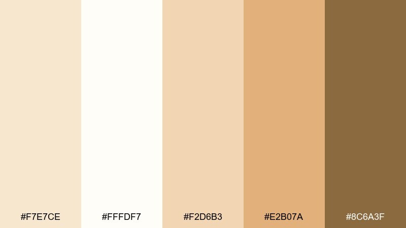
HEX: #f7e7ce #fffdf7 #f2d6b3 #e2b07a #8c6a3f
Mood: bright, optimistic, airy
Best for: lifestyle blogs and home decor visuals
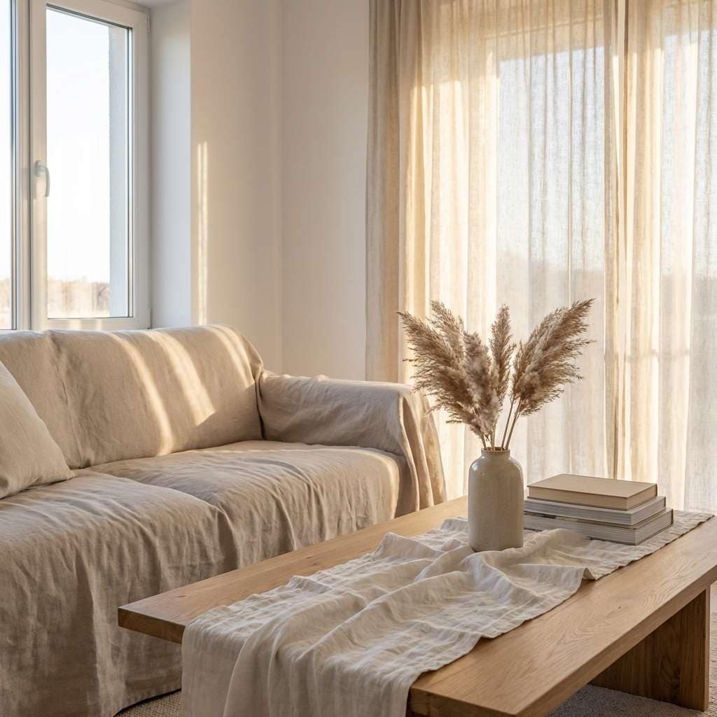
Warm linen creams and honeyed golds feel like sunlight drifting across a tidy room. It works well for blog headers, moodboards, and home decor graphics that should look inviting but not loud. Pair the honey tone with the soft white for gentle highlights, then use the olive-brown accent for buttons or captions. Tip: keep gradients subtle so the palette stays breezy rather than brassy.
Image example of sunlit linen generated using media.io
6) Rose Gold Fizz
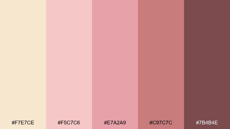
HEX: #f7e7ce #f5c7c6 #e7a2a9 #c97c7c #7b4b4e
Mood: playful, chic, celebratory
Best for: beauty branding and promo graphics
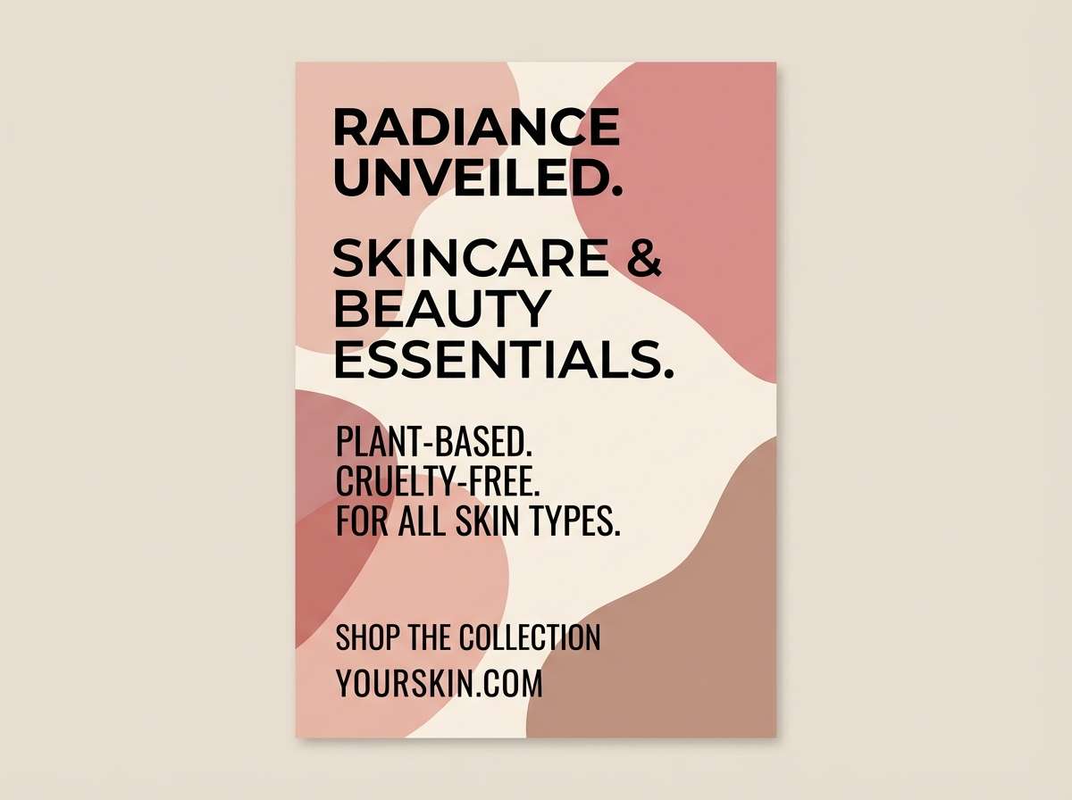
Blush sparkle and soft warmth bring to mind rosé bubbles and glossy makeup packaging. These champagne color combinations are perfect for cosmetics promos, salon branding, and influencer-style templates. Use the pale cream as a base, then pop the deeper rose for price tags, badges, and key benefits. Tip: limit the darkest berry to small accents so the look stays light and feminine.
Image example of rose gold fizz generated using media.io
7) Coastal Champagne
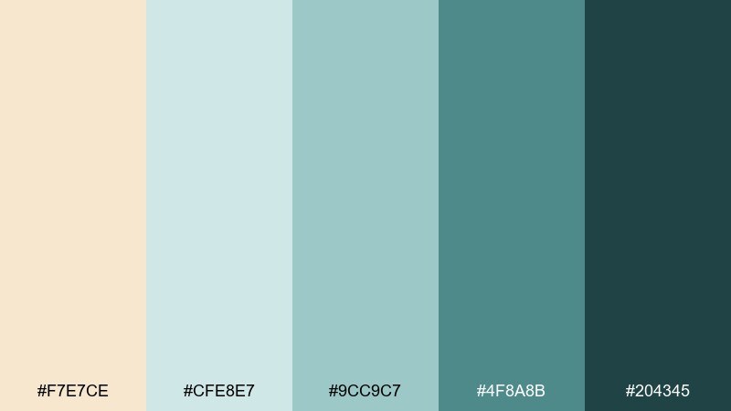
HEX: #f7e7ce #cfe8e7 #9cc9c7 #4f8a8b #204345
Mood: fresh, breezy, resort-ready
Best for: travel content and spa branding
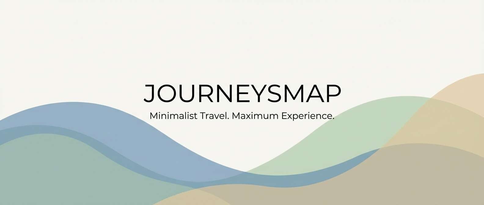
Cool sea glass tones paired with soft cream feel like a beachfront suite and salty air. Use this mix for spa websites, resort email headers, or travel thumbnails where calm is the goal. Pair the teal midtone with warm cream to avoid a sterile look, and keep the deep green-blue for logos or footer areas. Tip: add plenty of white spacing so the aqua shades look clean and premium.
Image example of coastal champagne generated using media.io
8) Art Deco Lounge
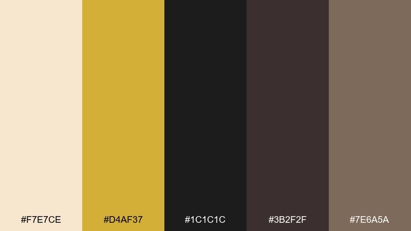
HEX: #f7e7ce #d4af37 #1c1c1c #3b2f2f #7e6a5a
Mood: glam, dramatic, vintage-modern
Best for: cocktail bar menus and event posters
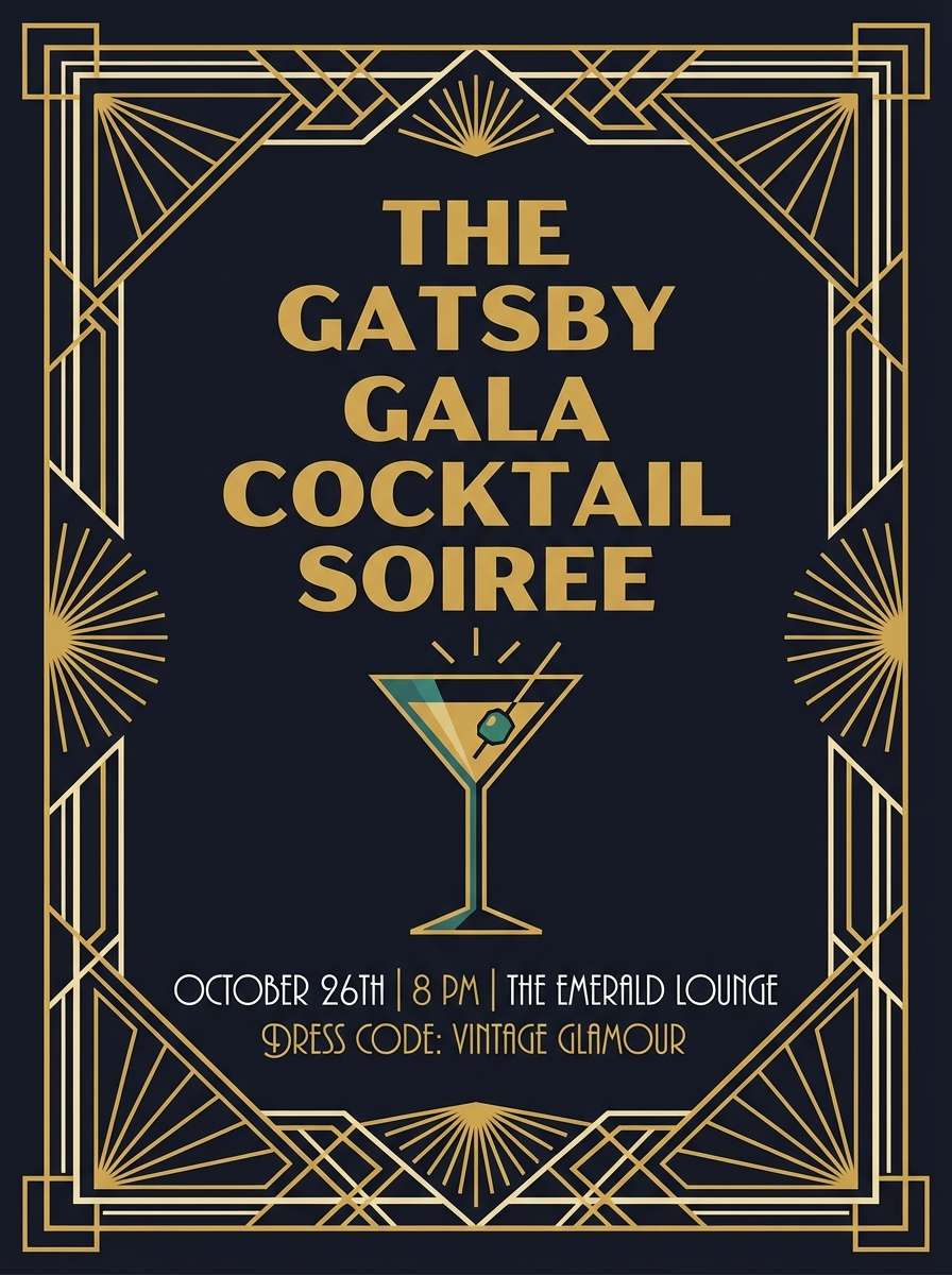
Gilded gold and inky black evoke a late-night lounge with brass details and velvet shadows. This champagne color scheme works best when you lean into contrast: cream for negative space, black for type, and gold for framing. Pair it with geometric lines or art deco patterns to amplify the mood. Tip: use gold sparingly on key highlights so it reads as luxe, not loud.
Image example of art deco lounge generated using media.io
9) Soft Sage Table
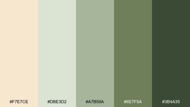
HEX: #f7e7ce #dbe3d2 #a7b59a #6e7f5a #3b4a35
Mood: natural, calm, rustic-elegant
Best for: farm-to-table brands and seasonal menus
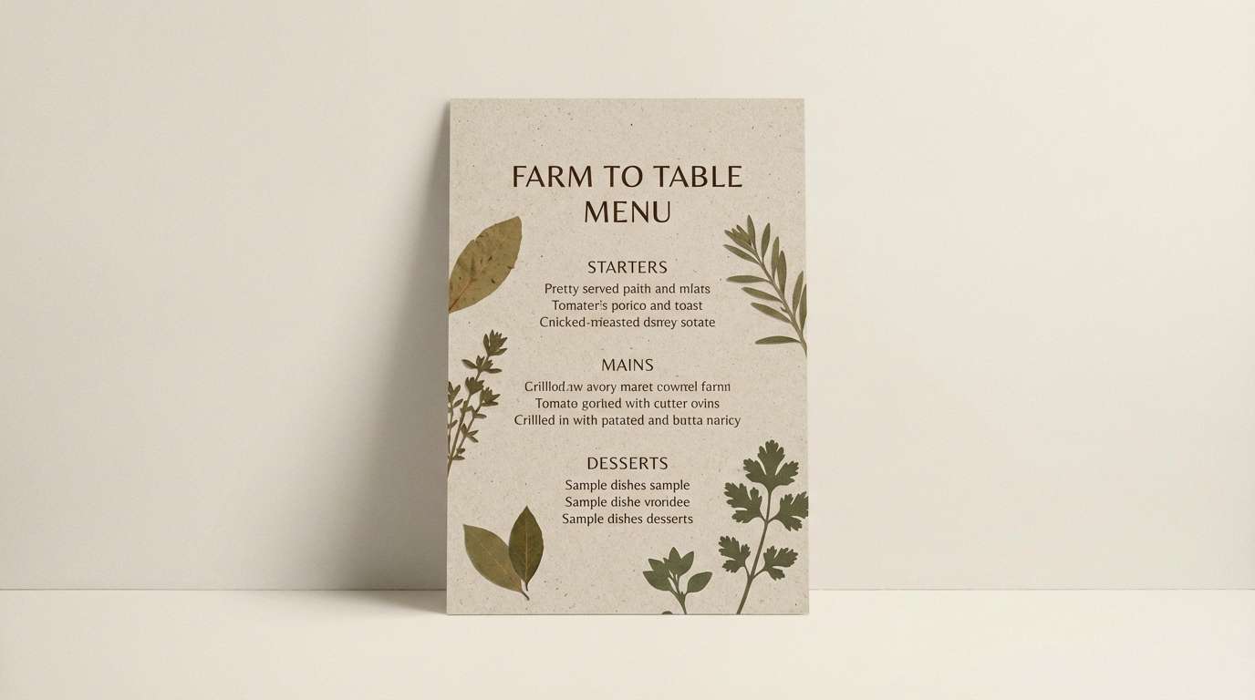
Sage greens with warm cream feel like a garden brunch and ceramic plates on wood. The palette suits organic food brands, farmers market signage, and eco-minded packaging. Pair the light cream with the pale sage for a soft base, then use the deep green for stamps, icons, or ingredient callouts. Tip: keep photography warm so the greens stay earthy rather than cold.
Image example of soft sage table generated using media.io
10) Mocha Meringue
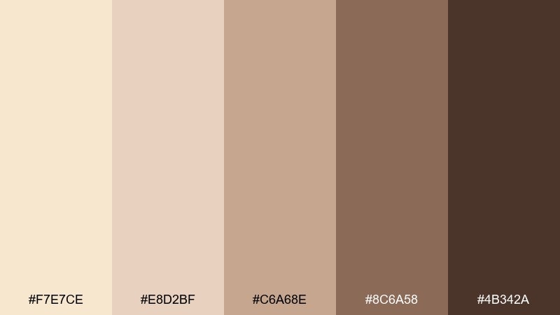
HEX: #f7e7ce #e8d2bf #c6a68e #8c6a58 #4b342a
Mood: creamy, comforting, refined
Best for: coffee packaging and bakery labels
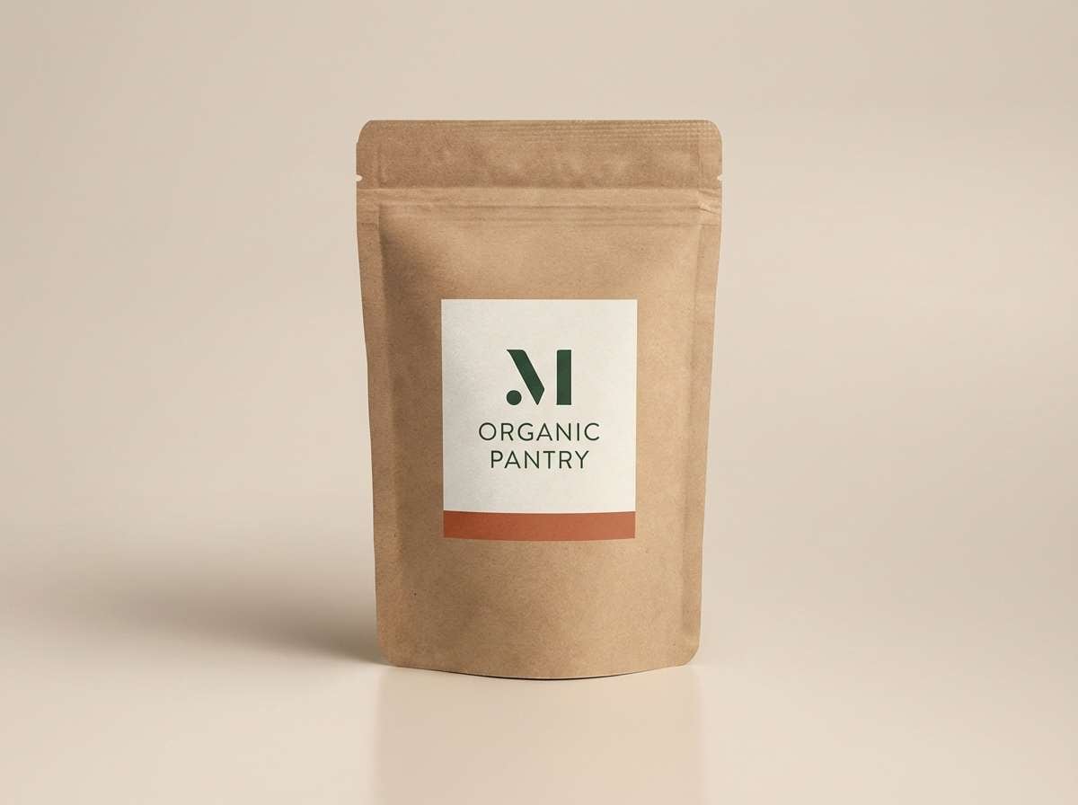
Creamy mocha shades evoke whipped meringue, cocoa dust, and warm ceramic mugs. Use it on coffee labels, bakery boxes, or product listings that need a cozy premium feel. Pair the mid tan with the light cream for background panels, and keep the dark mocha for brand marks and ingredients. Tip: choose one warm accent color per label to avoid a muddy look.
Image example of mocha meringue generated using media.io
11) Blush Candlelight
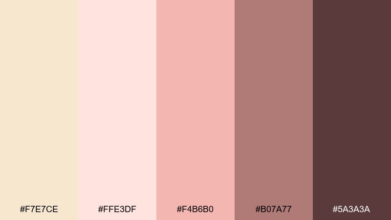
HEX: #f7e7ce #ffe3df #f4b6b0 #b07a77 #5a3a3a
Mood: soft, intimate, romantic
Best for: valentines promos and dinner event flyers
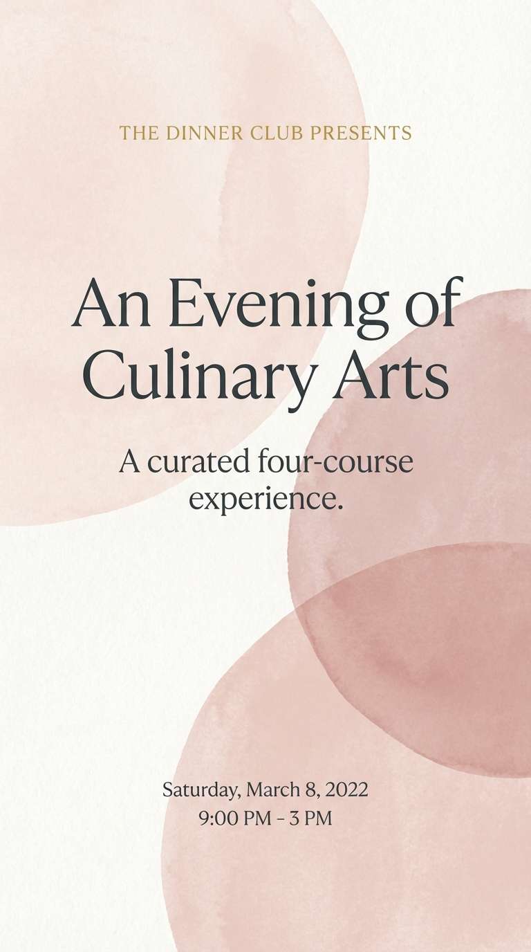
Warm blush and candlelit rose feel like satin table runners and dim restaurant light. These tones work well for dinner invites, seasonal promos, and romantic brand moments. Pair the pale cream with blush for backgrounds, then use the deeper wine-rose for headlines and dates. Tip: add a subtle paper texture to make the soft pinks look less sugary and more refined.
Image example of blush candlelight generated using media.io
12) Modern Serif Editorial
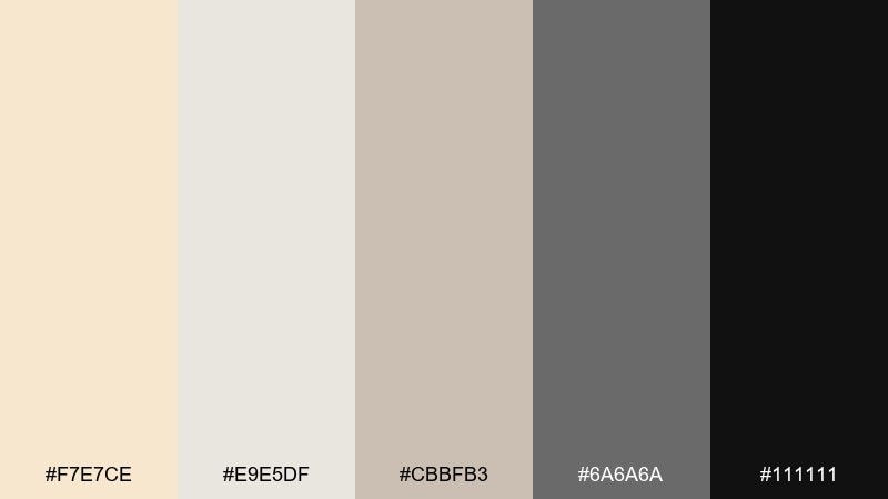
HEX: #f7e7ce #e9e5df #cbbfb3 #6a6a6a #111111
Mood: editorial, polished, contemporary
Best for: magazine layouts and brand guidelines
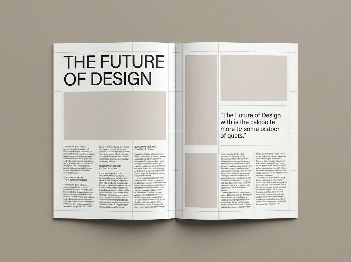
Creamy neutrals and crisp black feel like a modern magazine spread with sharp serif headlines. Use it for lookbooks, brand books, and editorial PDFs where hierarchy is key. Pair the off-white and warm beige for page backgrounds, then rely on true black for titles and pull quotes. Tip: keep gray for captions only so the layout stays high-contrast and premium.
Image example of modern serif editorial generated using media.io
13) Studio Skincare
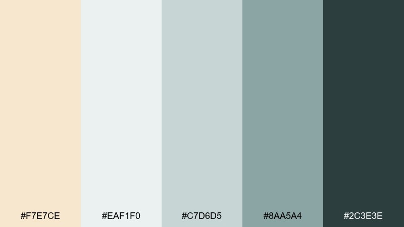
HEX: #f7e7ce #eaf1f0 #c7d6d5 #8aa5a4 #2c3e3e
Mood: clean, soothing, clinical-luxe
Best for: skincare packaging and ecommerce product pages
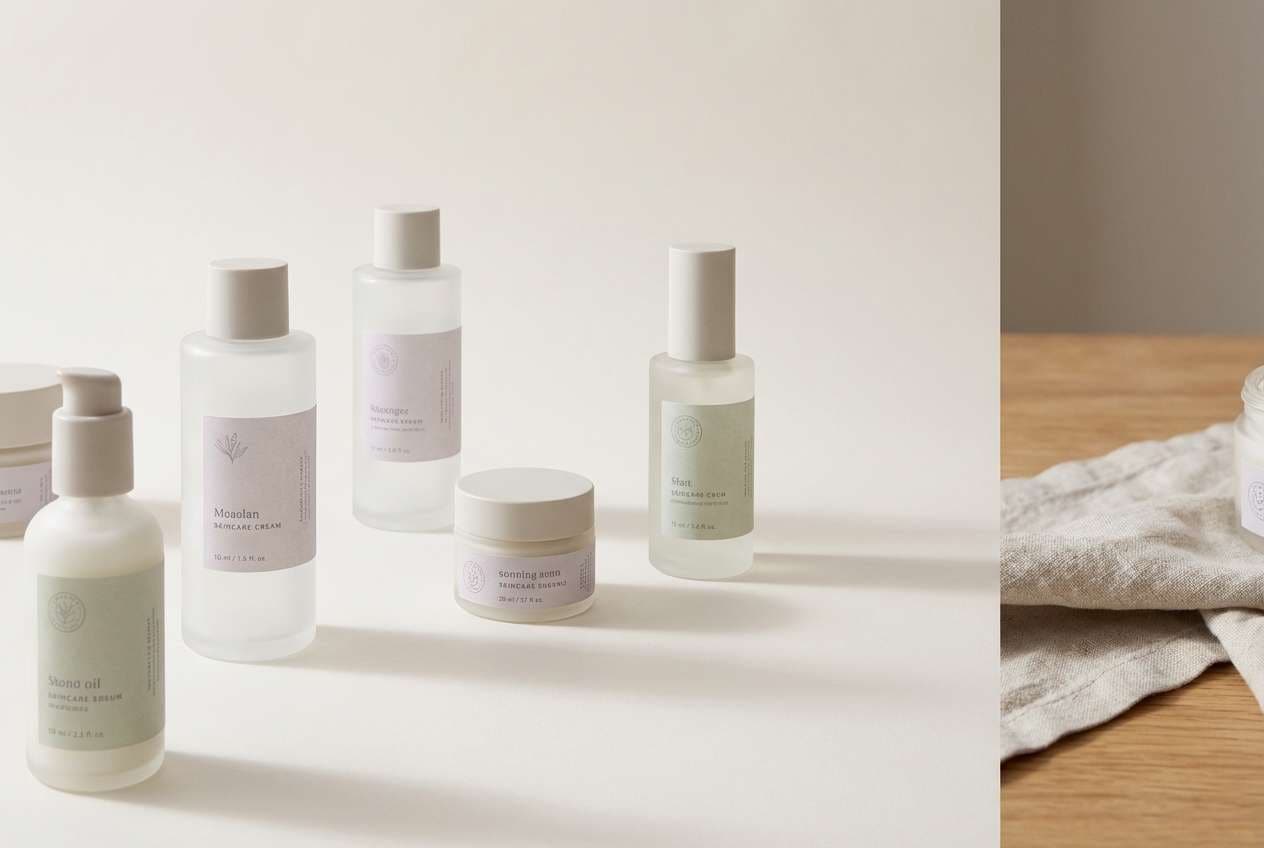
Cool spa greens with creamy warmth suggest fresh cotton, glass bottles, and a calm studio counter. These tones are ideal for skincare packaging, ingredient diagrams, and minimalist product pages. Pair the soft mint-gray with cream for backgrounds, then use the deep teal for claims, icons, and buttons. Tip: keep typography thin and consistent to match the airy, hygienic feel.
Image example of studio skincare generated using media.io
14) Autumn Sparkle
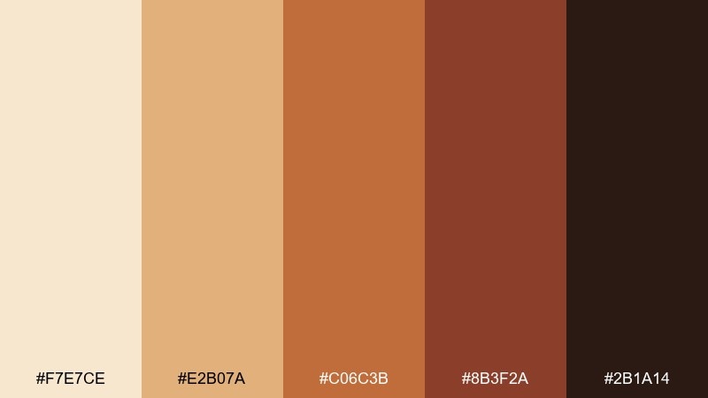
HEX: #f7e7ce #e2b07a #c06c3b #8b3f2a #2b1a14
Mood: warm, bold, seasonal
Best for: fall campaigns and fashion lookbooks
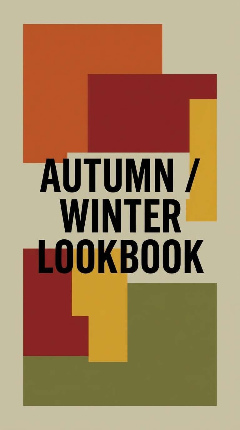
Golden caramel and spiced terracotta feel like crisp leaves, leather boots, and late-afternoon glow. This champagne color palette is great for autumn drops, email banners, and lookbook covers that need warmth without neon. Pair the cream with the deepest brown for strong contrast, then let terracotta lead as the hero accent. Tip: avoid using all warm midtones at once; pick one standout shade and keep the rest supportive.
Image example of autumn sparkle generated using media.io
15) Botanical Cream
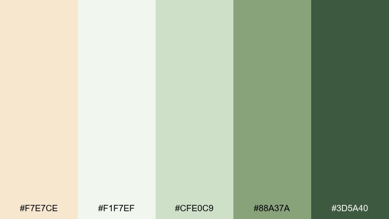
HEX: #f7e7ce #f1f7ef #cfe0c9 #88a37a #3d5a40
Mood: fresh, botanical, gentle
Best for: eco brands and spring illustrations
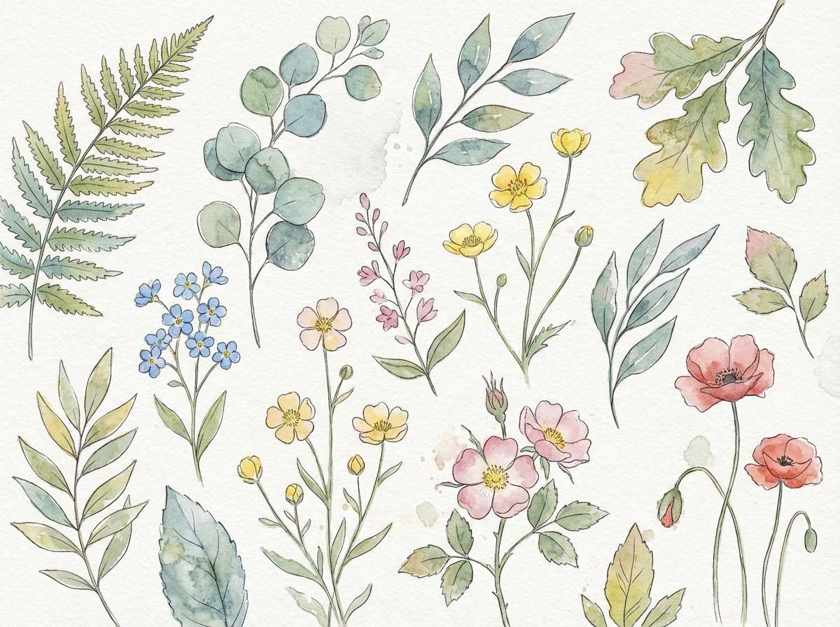
Creamy neutrals with leafy greens evoke new growth, herb gardens, and airy mornings. Use it for eco-friendly packaging, wellness blog graphics, or seasonal campaign art. Pair the pale green with cream to keep layouts bright, then add the forest tone for stamps and headings. Tip: botanical line art or watercolor textures make these greens feel softer and more organic.
Image example of botanical cream generated using media.io
16) Nightfall Neutrals
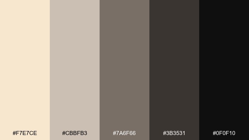
HEX: #f7e7ce #cbbfb3 #7a6f66 #3b3531 #0f0f10
Mood: moody, sleek, understated
Best for: dark-mode dashboards and premium apps
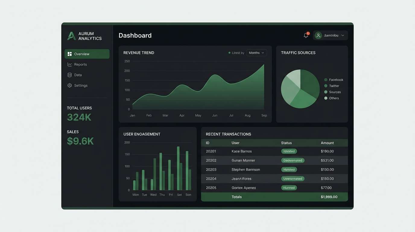
Smoky taupes and near-black create a refined nightfall vibe with a soft warm glow. Use these tones for dark-mode UI, analytics dashboards, or premium membership pages. Pair the champagne-like cream as a highlight color for cards and tags, and keep the darkest shade for backgrounds. Tip: use the mid gray-taupe for borders and dividers to avoid harsh lines.
Image example of nightfall neutrals generated using media.io
17) Kids Party Pastels
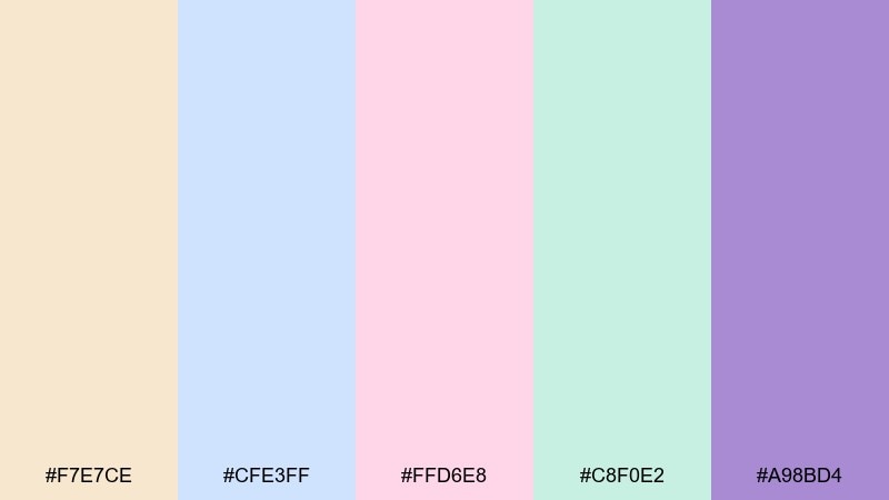
HEX: #f7e7ce #cfe3ff #ffd6e8 #c8f0e2 #a98bd4
Mood: cheerful, soft, playful
Best for: birthday invitations and family event prints
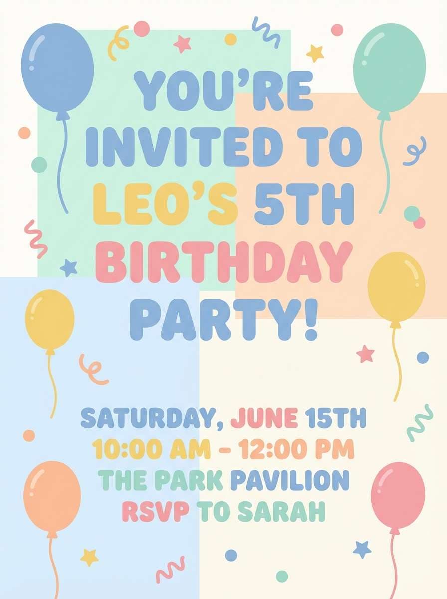
Sweet pastels with a warm neutral base feel like confetti, frosting, and paper lanterns. These colors suit kids invites, party posters, and school event flyers that should stay bright but not neon. Pair the cream with baby blue for backgrounds, then use lavender for key details like time and location. Tip: keep shapes simple and rounded so the palette reads friendly and modern.
Image example of kids party pastels generated using media.io
18) Luxury Boutique
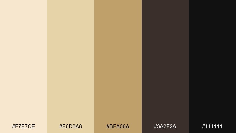
HEX: #f7e7ce #e6d3a8 #bfa06a #3a2f2a #111111
Mood: luxury, confident, timeless
Best for: boutique retail branding and packaging
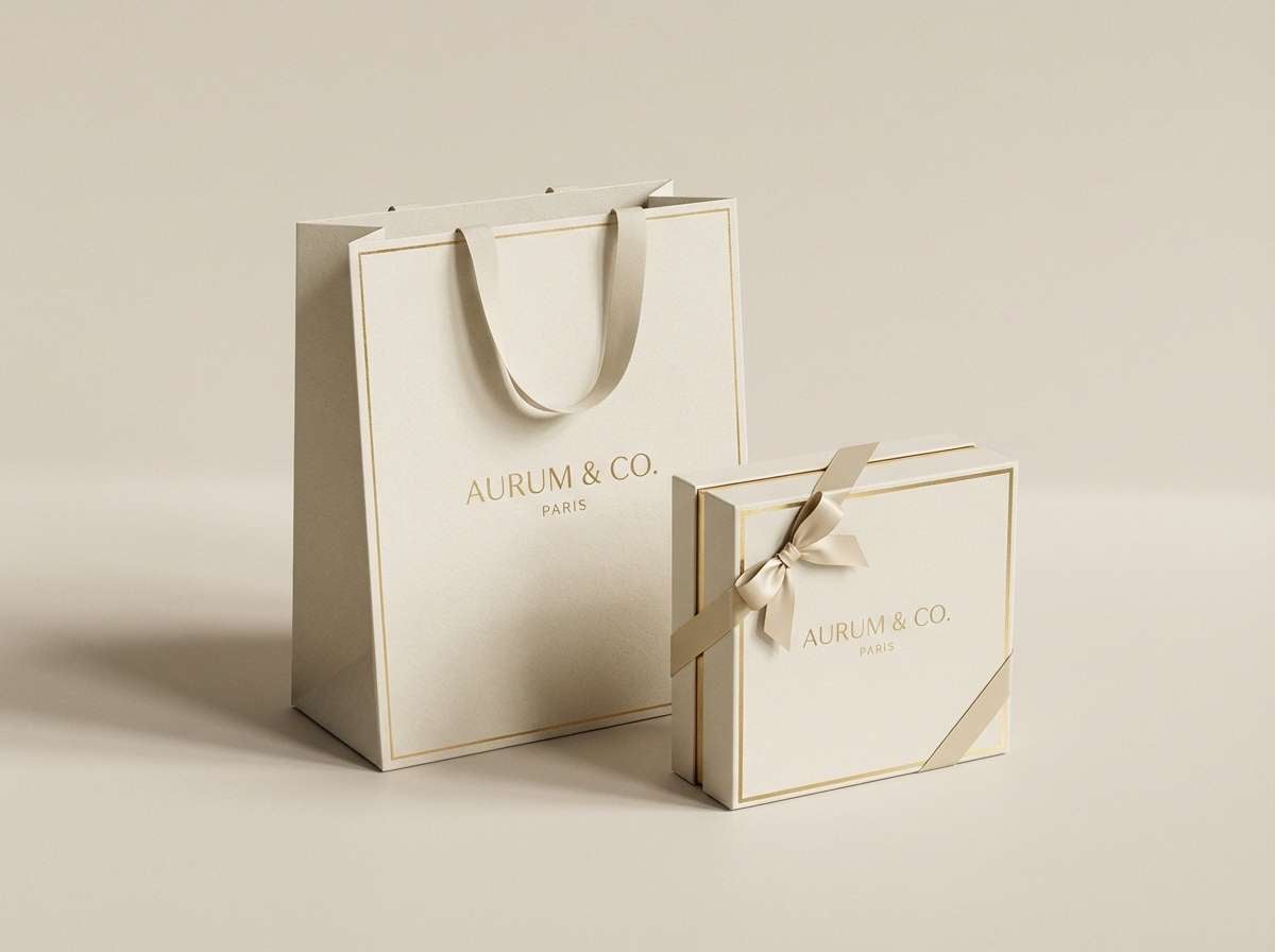
Warm golds and deep espresso tones evoke polished wood, satin ribbon, and a quiet boutique atmosphere. Use it for logos, shopping bags, and premium packaging where a classic feel matters. Pair the pale cream with black for clean contrast, then reserve gold for foils, monograms, and small highlights. Tip: keep backgrounds matte so metallic accents stand out naturally.
Image example of luxury boutique generated using media.io
19) Warm Clay Home
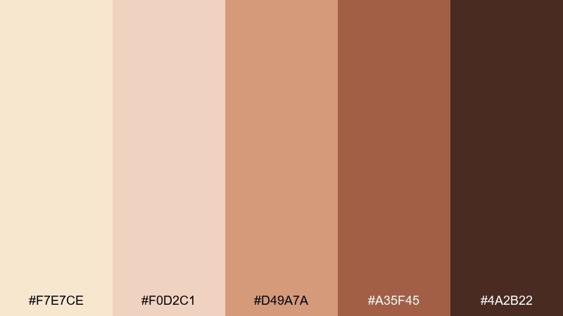
HEX: #f7e7ce #f0d2c1 #d49a7a #a35f45 #4a2b22
Mood: earthy, welcoming, handcrafted
Best for: home decor brands and interior palettes
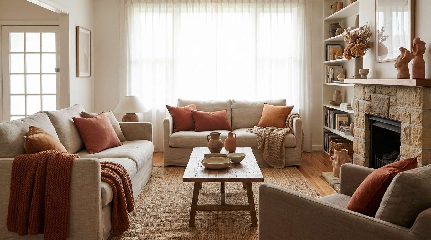
Clay pinks and earthy browns feel like handmade pottery and sun-baked walls. Use these tones for interior styling guides, decor storefronts, or maker brands that want warmth with depth. Pair the soft cream with clay for large surfaces, then use the deep brown for type and framing elements. Tip: add natural materials like wood and linen in imagery to keep the palette cohesive.
Image example of warm clay home generated using media.io
20) Retro Aperitif
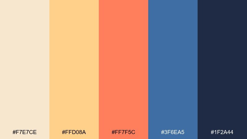
HEX: #f7e7ce #ffd08a #ff7f5c #3f6ea5 #1f2a44
Mood: retro, energetic, stylish
Best for: cocktail posters and summer brand campaigns
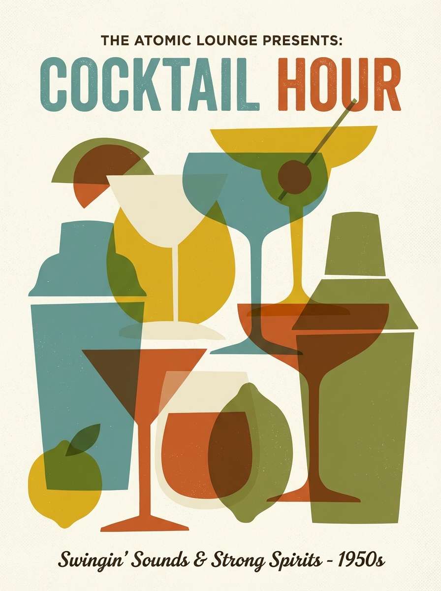
Creamy warmth with punchy citrus and deep navy feels like a vintage aperitif label and a summer sunset. Use it for posters, social ads, or event graphics that need a lively accent without losing polish. Pair navy with cream for strong readability, then let coral or orange take the spotlight for buttons and badges. Tip: keep shapes bold and flat to lean into the retro vibe.
Image example of retro aperitif generated using media.io
What Colors Go Well with Champagne?
Champagne pairs naturally with other warm neutrals like ivory, beige, camel, caramel, and espresso—great for calm, tonal layouts. Add charcoal or true black when you need crisp readability and a more modern edge.
For romantic accents, blush, dusty rose, mauve, and rose-gold tones keep the warmth consistent. If you want a fresher contrast, try sea-glass teal, sage, olive, or deep forest green to balance champagne’s softness.
For bolder moments, champagne also plays well with navy and terracotta. The key is to pick one strong accent color and let champagne stay dominant as the airy base.
How to Use a Champagne Color Palette in Real Designs
Start by assigning champagne (or a near-champagne cream) to large surfaces: page backgrounds, cards, packaging base, or invitation paper tone. This creates a premium “canvas” that makes typography and imagery feel intentional.
Next, choose one dark anchor (espresso, charcoal, deep green-blue) for text, logos, and UI components like navigation and primary buttons. Keep mid-tones for borders, dividers, and secondary panels so the design doesn’t turn muddy.
If you’re adding metallic vibes, use gold as a highlight rather than a fill color—frames, icons, thin rules, or small badges. This keeps champagne looking elegant instead of overly yellow.
Create Champagne Palette Visuals with AI
Want matching images for your champagne palette (menus, posters, mockups, product scenes, or UI concepts)? Turn your palette into consistent visuals by generating designs from text prompts.
In Media.io, you can iterate quickly: keep the prompt style the same, swap a few keywords (minimal, editorial, botanical, art deco), and reuse your HEX colors as guidance for a cohesive set.
Once you find a look you like, generate variations for different formats—social posts, banners, vertical stories, and thumbnails—without rebuilding the design from scratch.
Champagne Color Palette FAQs
-
What is the HEX code for champagne color?
A common champagne HEX is #F7E7CE, which is a warm, creamy beige often used as the base tone in champagne palettes. -
Is champagne closer to beige or gold?
Champagne is closer to beige/cream, but with a soft golden warmth. It’s less saturated than gold and usually works best as a light neutral background. -
What colors complement champagne for a wedding palette?
Blush, dusty rose, mauve, warm ivory, and metallic gold are classic pairings. For a modern twist, add sage or deep charcoal for contrast. -
What’s a good dark contrast color for champagne backgrounds?
Espresso brown, charcoal, deep teal, or near-black provide strong readability on champagne. For body text, aim for high contrast rather than light gray. -
Can champagne work in UI and app design?
Yes—use champagne as a soft background or card color, then anchor the interface with charcoal/black text and one accent (teal, rose, or olive) for CTAs and states. -
How do I keep a champagne palette from looking flat?
Add one deeper anchor shade, introduce subtle texture (paper grain, linen, soft shadow), and use a single accent color for hierarchy—buttons, badges, or key highlights. -
What’s the difference between champagne and ivory?
Ivory is usually lighter and more neutral/creamy, while champagne has a warmer beige-gold undertone. Champagne typically feels richer and more “luxe.”


