


 ChatGPT
 Perplexity
 Gemini
 Claude
 Grok
Grok
Black and gold is a classic luxury pairing: deep, light-absorbing blacks make metallic accents feel brighter, sharper, and more intentional. The result is a high-contrast palette that instantly signals premium quality.
Below are 20+ black gold color palette ideas with HEX codes you can use for branding, dark mode UI, packaging, invitations, and more—plus AI prompts to generate matching visuals in seconds.
In this article
- Why Black Gold Palettes Work So Well
-
- gilded noir
- art deco evening
- velvet gold rush
- midnight trophy
- champagne onyx
- modern regal
- black gold minimal ui
- museum gala
- industrial luxe
- cosmic bullion
- warm marble gold
- espresso gilt
- smoky gold gradient
- orchid accent luxe
- emerald crown
- sunset brass
- sapphire prestige
- pearl black tie
- vintage ledger
- neon gold night
- black gold botanica
- What Colors Go Well with Black Gold?
- How to Use a Black Gold Color Palette in Real Designs
- Create Black Gold Palette Visuals with AI
Why Black Gold Palettes Work So Well
Black builds instant depth and focus, while gold adds a “signal” color that reads as premium—especially when you keep it as an accent rather than a fill. That contrast helps logos, headlines, and key UI states stand out with minimal visual clutter.
Gold also carries material associations (foil, brass, jewelry, trophies), so even flat digital designs can feel tactile and elevated. Pairing it with warm neutrals (champagne, cream) keeps the palette refined instead of harsh.
In practice, black gold palettes are flexible: they can look vintage (Art Deco), modern (minimal UI), or organic (botanical) depending on the supporting neutrals and secondary accent colors you choose.
20+ Black Gold Color Palette Ideas (with HEX Codes)
1) Gilded Noir
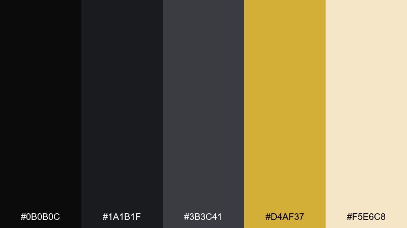
HEX: #0B0B0C #1A1B1F #3B3C41 #D4AF37 #F5E6C8
Mood: sleek, upscale, dramatic
Best for: Luxury branding and premium packaging
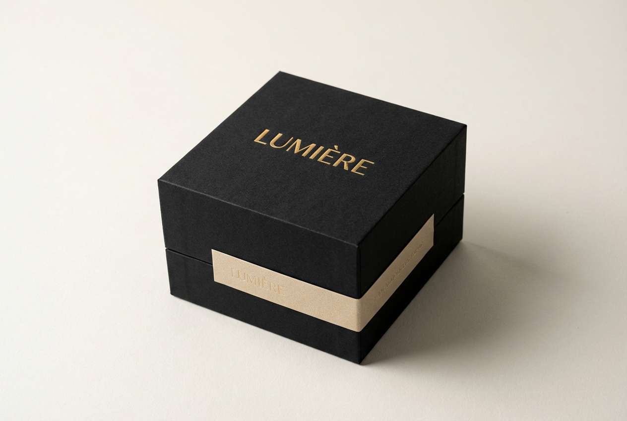
Sleek and upscale, it feels like a candlelit boutique with gold foil catching the light. Use the deepest black for backgrounds and let the metallic gold lead headlines, seals, and trims. Creamy champagne softens the contrast for labels and short copy. Tip: keep gold to 10 to 15 percent of the layout so it reads as premium, not loud.
Image example of gilded noir generated using media.io
Create palette-perfect visuals with Media.io. Powered by Wan 2.7 Image, it helps you generate and edit images with precise color control, consistent tones, and ready-to-use styles in your browser.

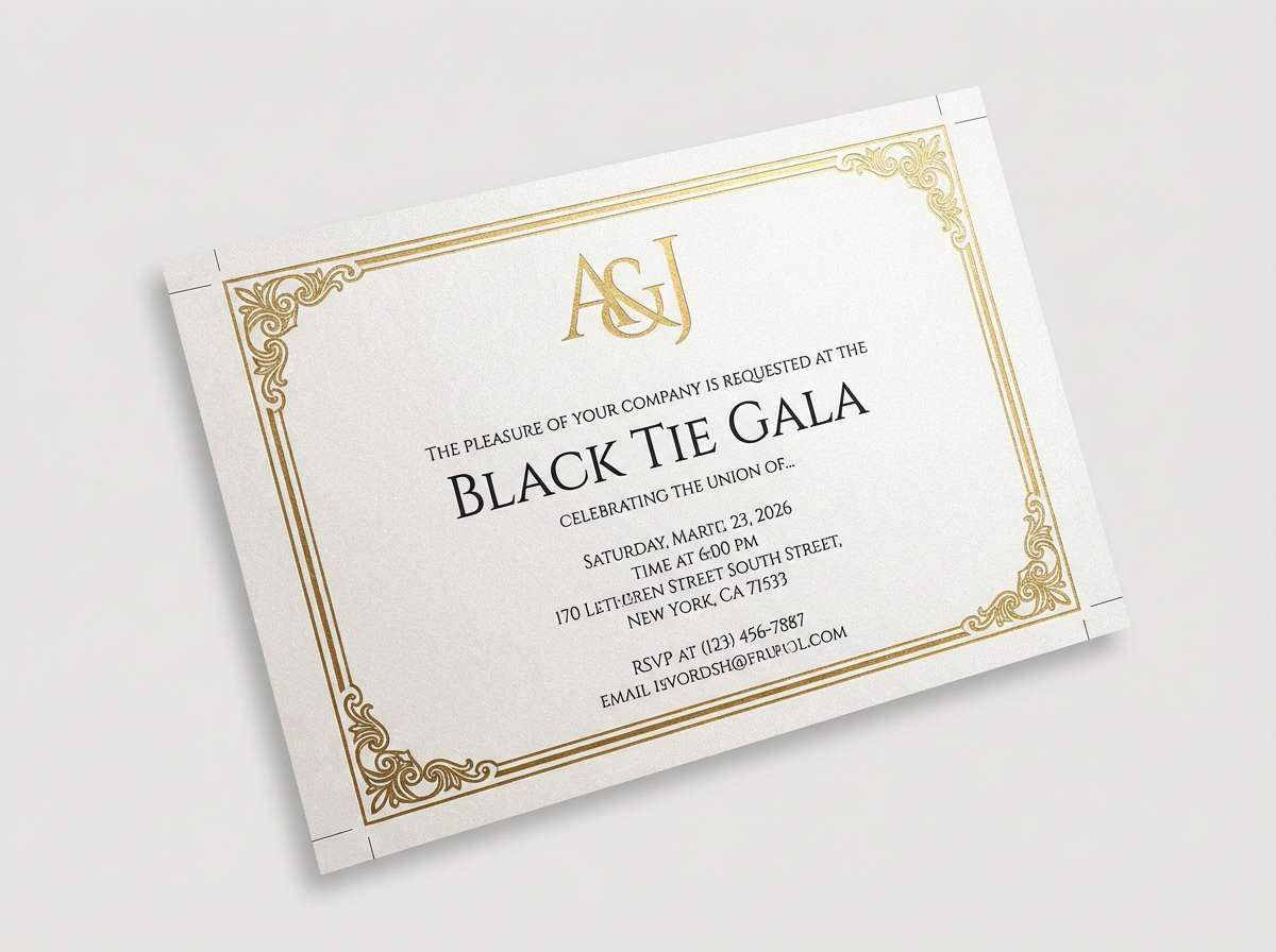
2) Art Deco Evening
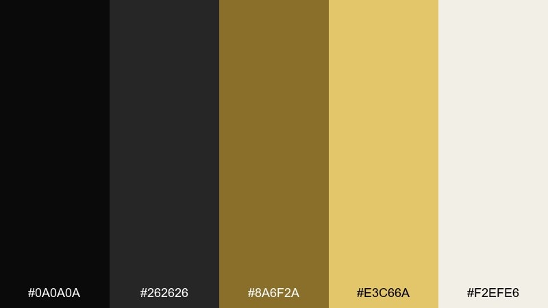
HEX: #0A0A0A #262626 #8A6F2A #E3C66A #F2EFE6
Mood: glam, vintage, theatrical
Best for: Gala invitations and event posters
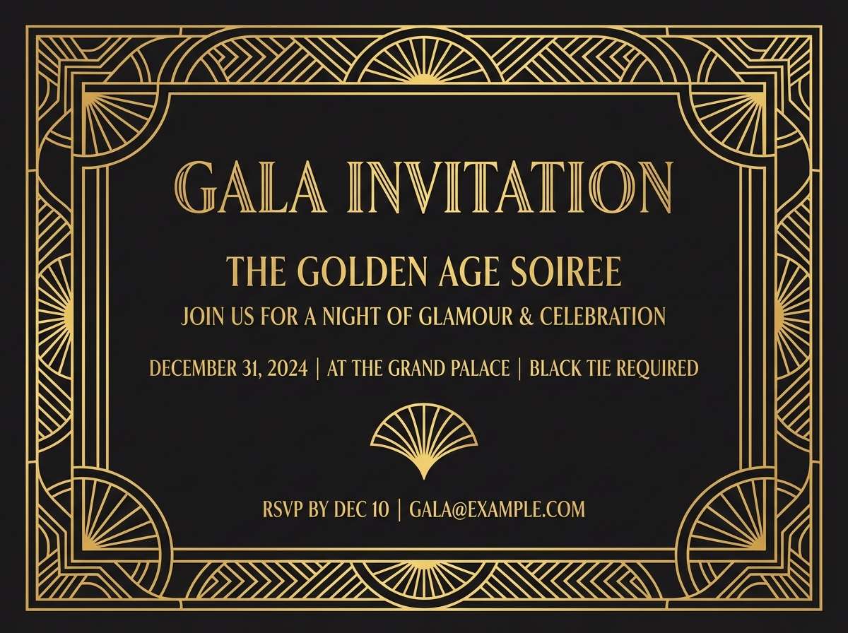
Glam and theatrical, it evokes Art Deco foyers, brass fixtures, and sharp geometry. Pair the warm golds with a crisp off-white so typography stays readable. Use charcoal as a secondary background to create layered frames and borders. Tip: lean into symmetrical layouts and thin linework to make the metallic tones feel intentional.
Image example of art deco evening generated using media.io
3) Velvet Gold Rush
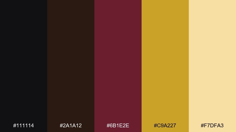
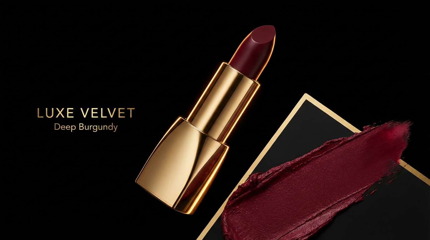
HEX: #111114 #2A1A12 #6B1E2E #C9A227 #F7DFA3
Mood: opulent, warm, seductive
Best for: Beauty campaigns and boutique social ads
Opulent and warm, it reads like velvet curtains with a flash of bullion. These black gold color combinations shine in beauty work where rich shadows make metallic highlights pop. Pair the burgundy sparingly for blush tones, callouts, or limited-edition badges. Tip: use the pale gold for skin-safe contrast on buttons and captions.
Image example of velvet gold rush generated using media.io
4) Midnight Trophy
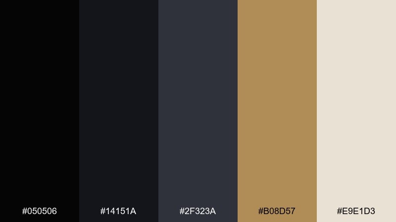
HEX: #050506 #14151A #2F323A #B08D57 #E9E1D3
Mood: confident, sporty, bold
Best for: Sports awards graphics and winner announcements
Bold and confident, it feels like a trophy case under arena lights. Use near-black for the canvas, then bring in brass for medals, dividers, and rank numbers. The warm off-white keeps names and stats easy to scan. Tip: reserve the brightest neutral for the top winner tier to create instant hierarchy.
Image example of midnight trophy generated using media.io

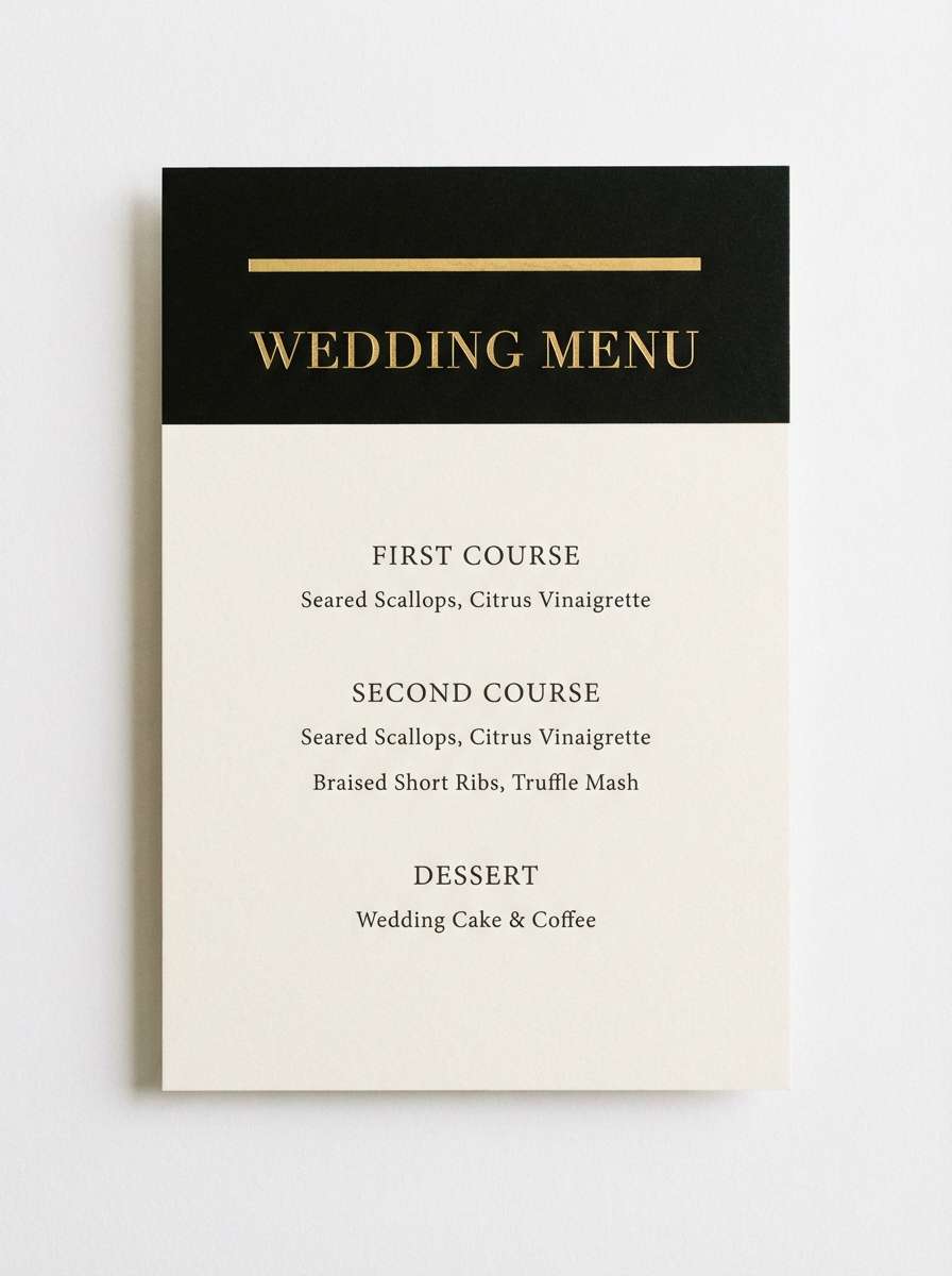
5) Champagne Onyx
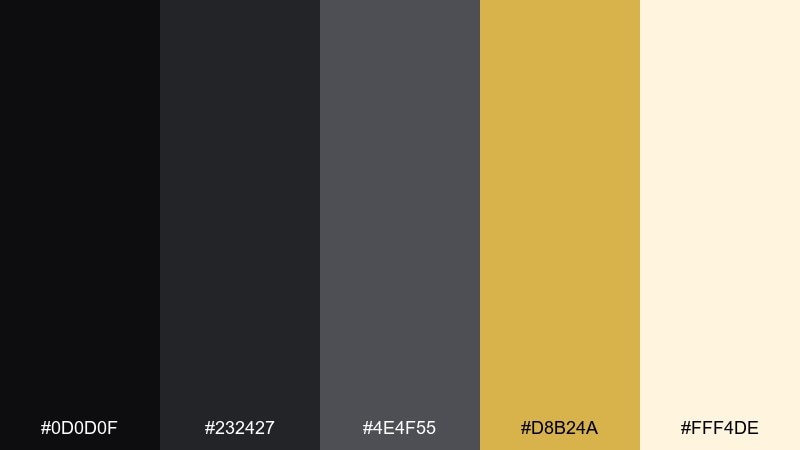
HEX: #0D0D0F #232427 #4E4F55 #D8B24A #FFF4DE
Mood: refined, airy, modern
Best for: Wedding stationery and upscale menus
Refined and airy, it suggests sparkling champagne against glossy onyx. The creamy white gives plenty of room for elegant type, while gold adds just enough celebration. Keep the mid-gray for fine rules, section headings, and subtle icons. Tip: print gold as a spot foil for menus and name cards to elevate the finish.
Image example of champagne onyx generated using media.io
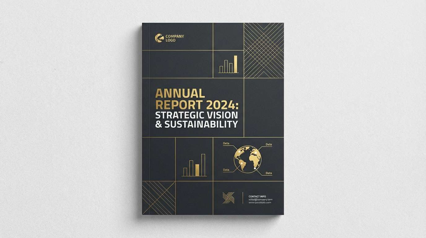
6) Modern Regal
HEX: #0E0F12 #1F232B #2E3542 #D4AF37 #DDE3EA
Mood: corporate, polished, trustworthy
Best for: Business decks and corporate reports
Polished and trustworthy, it feels like a boardroom at night with city lights outside. Use the cool grays to build clean charts and tables that still look premium on dark backgrounds. Gold works best as a controlled accent for key metrics, highlights, and section markers. Tip: keep body text in the pale gray for legibility without stark white glare.
Image example of modern regal generated using media.io
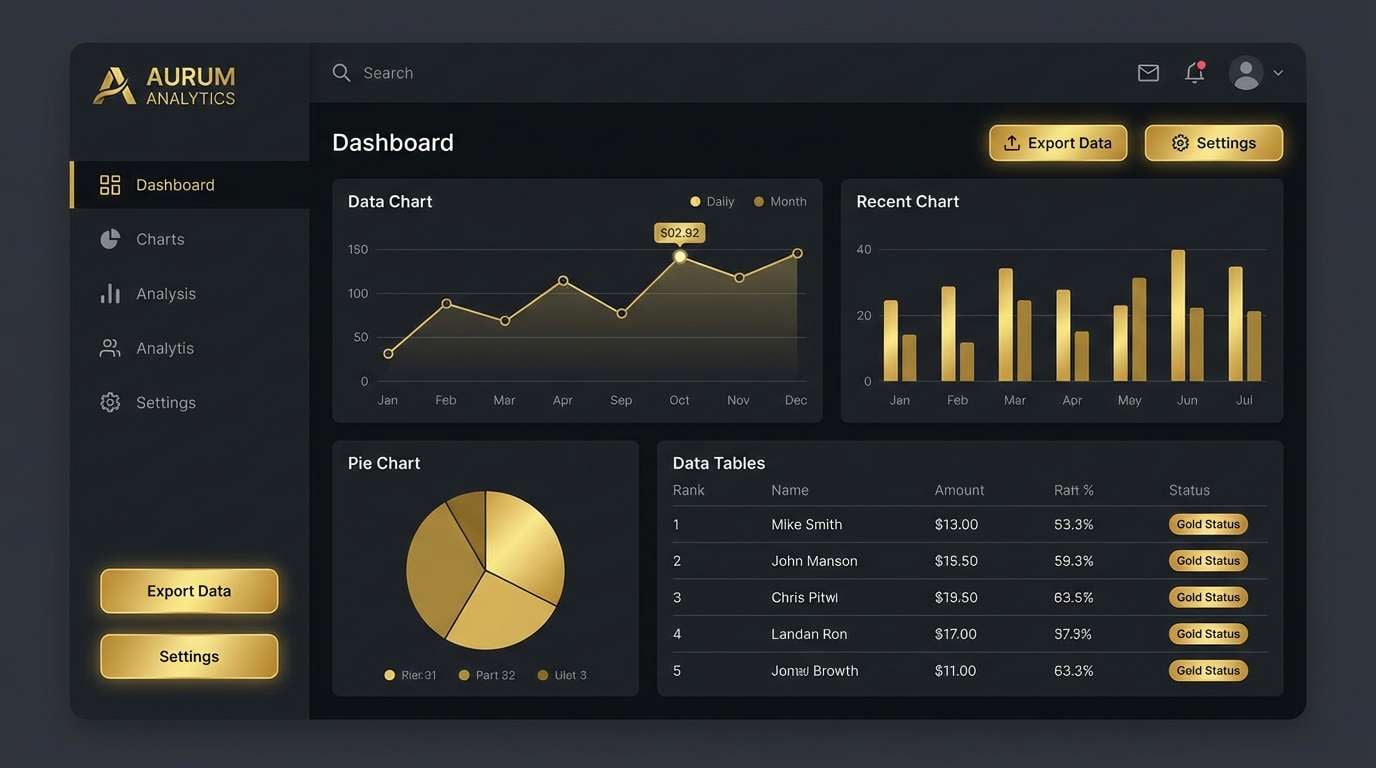
7) Black Gold Minimal UI
HEX: #0A0B0D #16181D #2A2F38 #CFAE3D #AEB6C2
Mood: focused, high-tech, minimal
Best for: SaaS dashboards and dark mode UI
Focused and high-tech, it looks like a dim control room with precise golden indicators. A black gold color scheme works best when gold is limited to active states like buttons, toggles, and progress bars. Use slate tones for cards and separators so the interface stays calm and readable. Tip: pair the light gray with a slightly larger font weight to reduce eye strain on dark surfaces.
Image example of black gold minimal ui generated using media.io
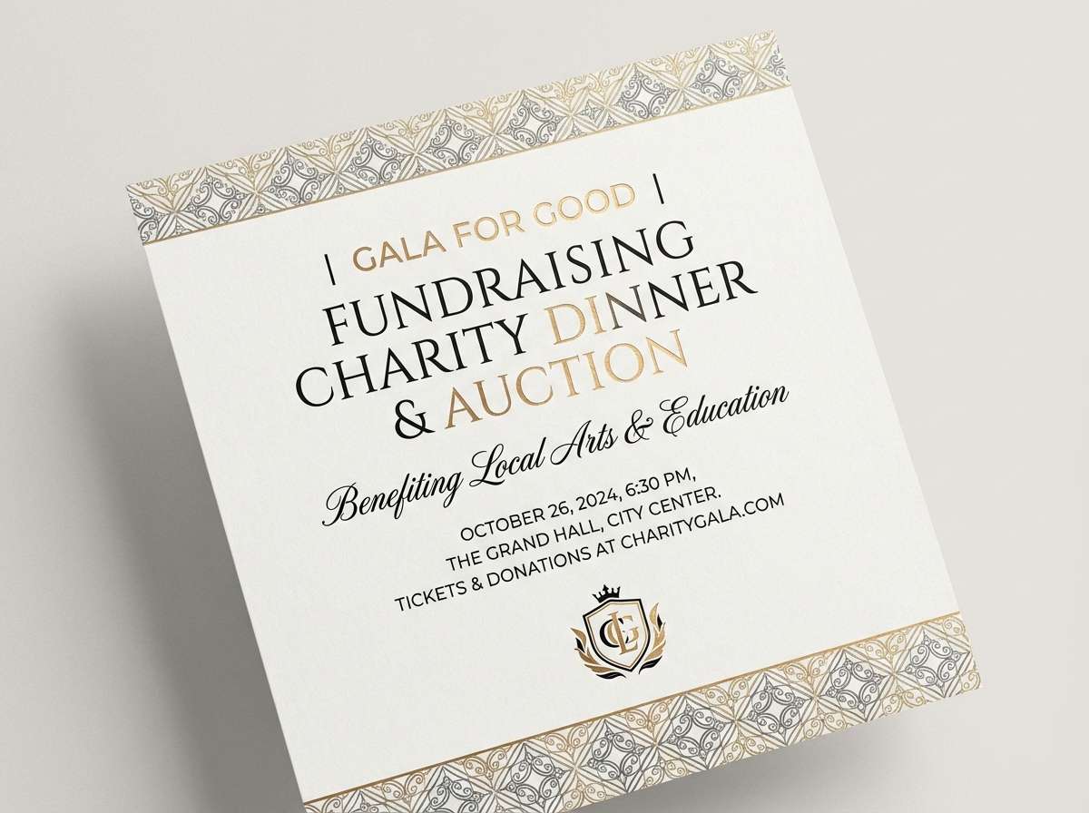
8) Museum Gala
HEX: #090909 #1E1B16 #5A4A2A #E0BF66 #F6F1E7
Mood: elegant, cultured, timeless
Best for: Museum events and fundraising campaigns
Elegant and timeless, it brings to mind gallery walls, framed plaques, and warm spotlighting. Use the creamy neutral for long-form text and ticket details, then anchor with black for headings. The earthy brown-gold works beautifully for subtle patterns and background textures. Tip: add thin gold rules to separate sections without making the layout feel busy.
Image example of museum gala generated using media.io
9) Industrial Luxe
HEX: #0C0D0F #2B2E34 #5C616A #BFA14A #E6E7EA
Mood: urban, rugged, premium
Best for: Tech hardware packaging and landing pages
Urban and rugged, it feels like brushed metal and concrete with a premium badge. The cool grays keep it industrial, while gold adds a high-end finish for key features. Use the light neutral for spec tables and microcopy so it stays crisp against the dark base. Tip: choose one gold tone for all CTAs to keep the page consistent.
Image example of industrial luxe generated using media.io
10) Cosmic Bullion
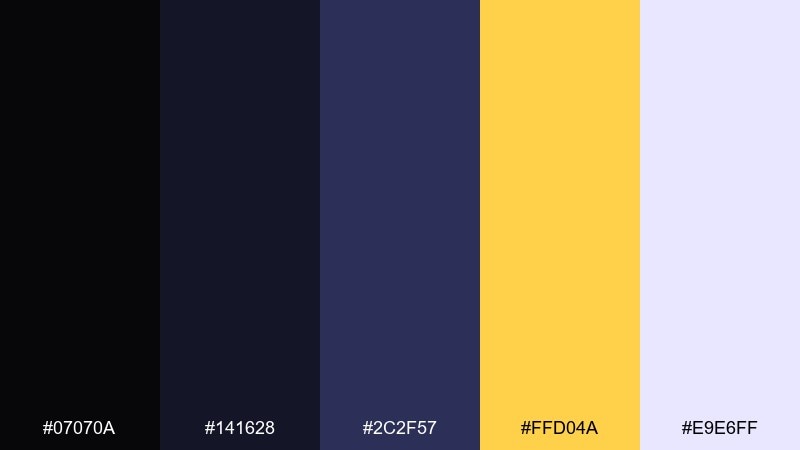
HEX: #07070A #141628 #2C2F57 #FFD04A #E9E6FF
Mood: futuristic, dreamy, luminous
Best for: Music posters and night event promos
Futuristic and dreamy, it looks like starlight cutting through a midnight sky. Use the deep indigo to add depth behind black while keeping the vibe electric. Bright gold reads like neon when used for titles and date stamps. Tip: add a soft glow effect to gold text for posters, but keep body copy flat for clarity.
Image example of cosmic bullion generated using media.io

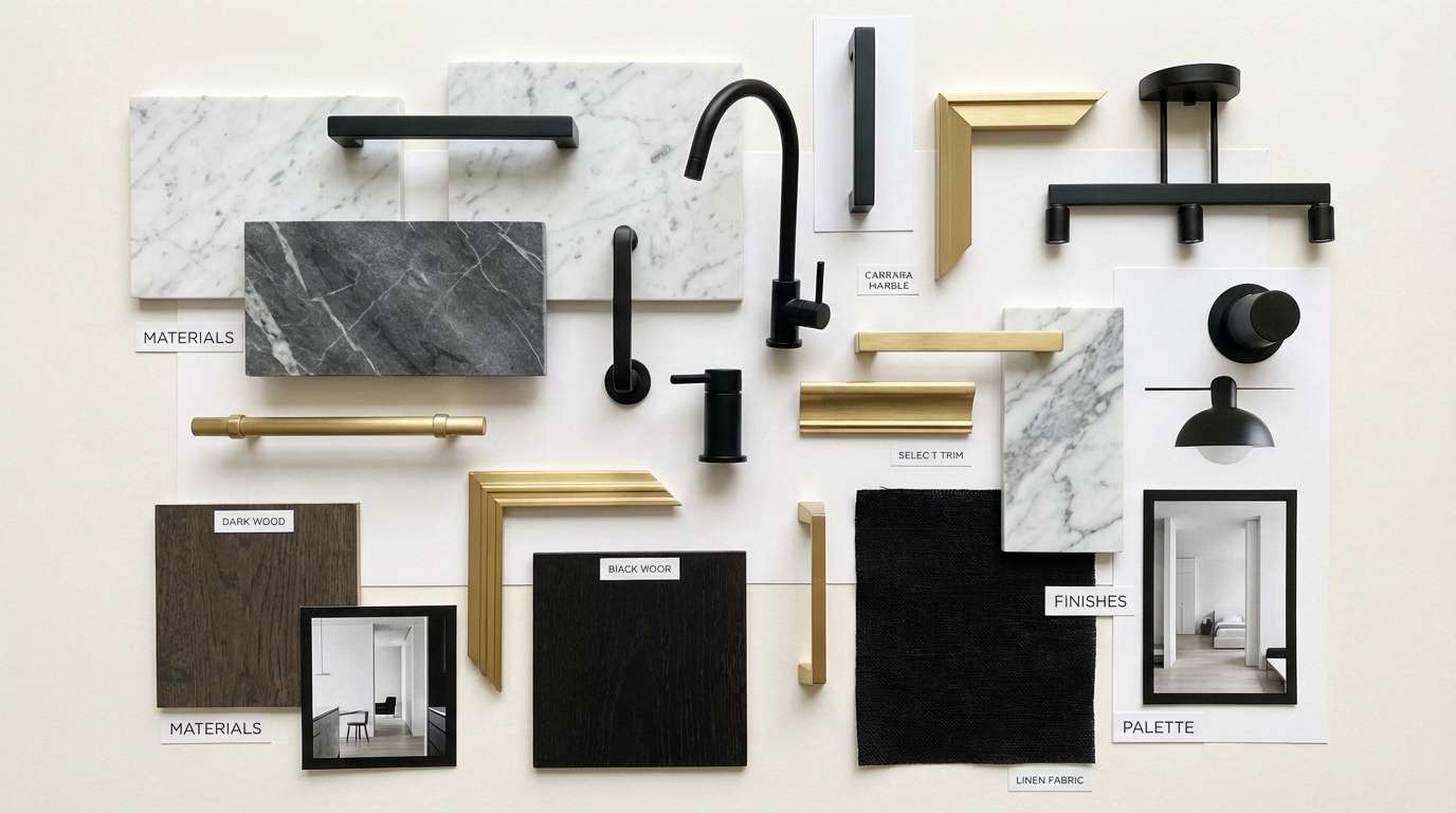
11) Warm Marble Gold
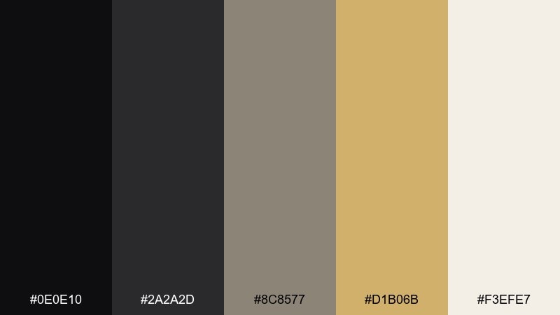
HEX: #0E0E10 #2A2A2D #8C8577 #D1B06B #F3EFE7
Mood: calm, architectural, upscale
Best for: Interior mood boards and home decor brands
Calm and architectural, it recalls warm marble veining next to brushed gold fixtures. These black gold color combinations suit interiors when you balance dark anchors with plenty of soft stone neutrals. Use the taupe-gray for secondary surfaces like text blocks, rugs, or UI cards. Tip: place gold as hardware, trim, or tiny icons rather than large fills to keep it sophisticated.
Image example of warm marble gold generated using media.io
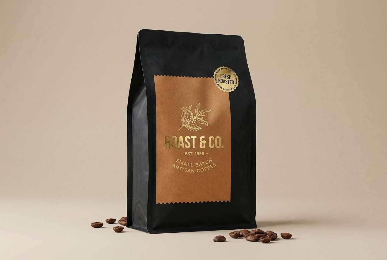
12) Espresso Gilt
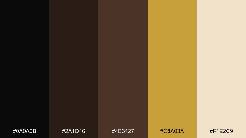
HEX: #0A0A0B #2A1D16 #4B3427 #C8A03A #F1E2C9
Mood: cozy, artisanal, rich
Best for: Coffee packaging and cafe menus
Cozy and rich, it feels like espresso crema with a gilded rim. The browns bring warmth that softens black without losing contrast. Use gold for roast notes, origin badges, and premium tiers. Tip: pair the cream tone with textured paper stock to make menus and labels feel handcrafted.
Image example of espresso gilt generated using media.io
13) Smoky Gold Gradient
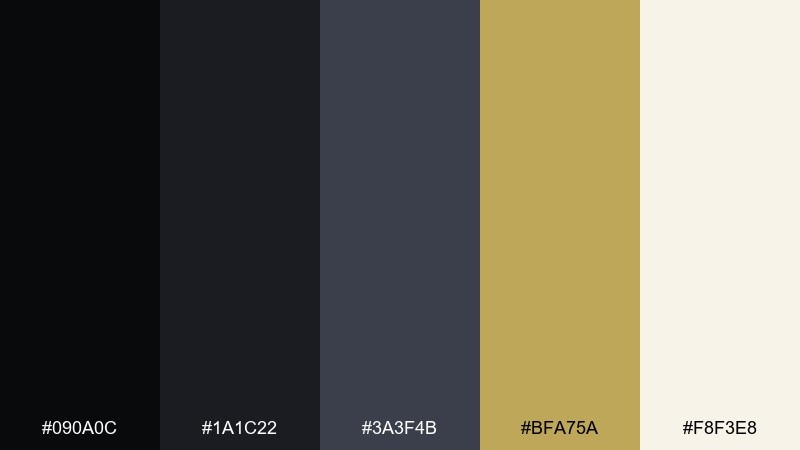
HEX: #090A0C #1A1C22 #3A3F4B #BFA75A #F8F3E8
Mood: moody, cinematic, smooth
Best for: Video thumbnails and cinematic title cards
Moody and cinematic, it resembles smoke drifting across a spotlight. Build depth by layering charcoal and slate, then land key text in warm gold for instant focus. The pale neutral helps keep subtitles readable without harsh white. Tip: add a subtle vignette to dark corners so gold elements feel brighter.
Image example of smoky gold gradient generated using media.io
14) Orchid Accent Luxe
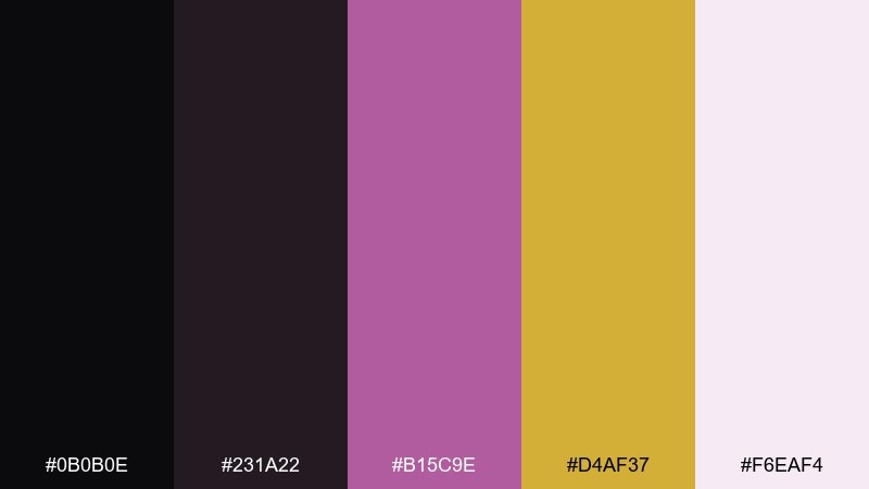
HEX: #0B0B0E #231A22 #B15C9E #D4AF37 #F6EAF4
Mood: fashion-forward, playful, luxe
Best for: Fashion lookbooks and beauty editorials
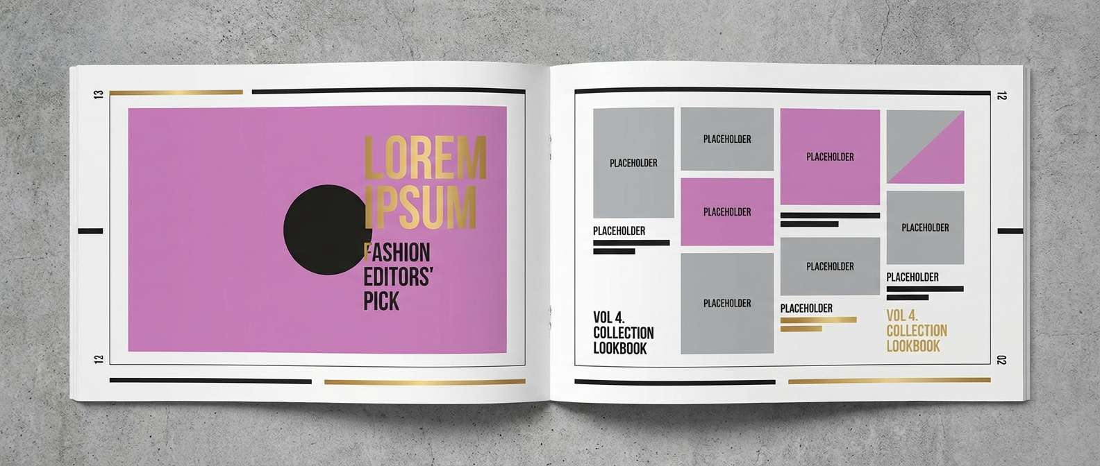
Fashion-forward and luxe, it feels like silk, perfume, and a pop of orchid lipstick. Keep black as the runway backdrop and let orchid appear in small, deliberate accents. Gold works well for rule lines, page numbers, and logo marks in editorial layouts. Tip: limit orchid to one or two elements per page so the palette stays refined.
Image example of orchid accent luxe generated using media.io
15) Emerald Crown
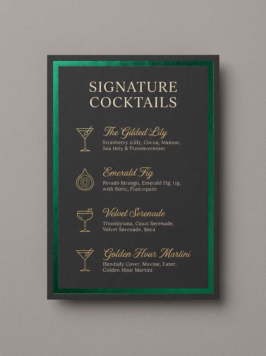
HEX: #070809 #0F2A22 #0E7A5F #D7B24B #EAF5F1
Mood: royal, fresh, confident
Best for: Hospitality branding and cocktail menus
Royal and fresh, it brings to mind emerald cocktails in a dim lounge. Use the green as the hero accent for highlights, while gold acts as the premium finish for borders and icons. Keep plenty of pale minty-white for menu readability and spacing. Tip: pair gold with thin lines and small symbols to avoid overpowering the green.
Image example of emerald crown generated using media.io
16) Sunset Brass
HEX: #0C0B0A #3B2A1E #B87333 #D4AF37 #F7E3C8
Mood: sunlit, earthy, premium
Best for: Lifestyle product ads and artisanal goods
Sunlit and earthy, it recalls late-afternoon glow on brass and leather. The copper note warms up the dark base for more approachable luxury. Use gold for logos and key claims, then let the pale beige carry supporting text. Tip: keep copper on secondary elements like stickers or ribbons so gold stays the main metallic.
Image example of sunset brass generated using media.io
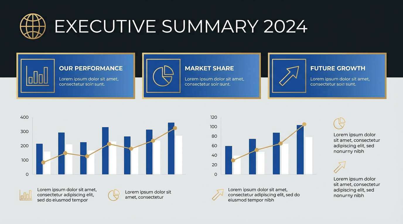
17) Sapphire Prestige
HEX: #07070B #141A2E #1B3A6B #D4AF37 #E8EEF9
Mood: executive, cool, confident
Best for: Fintech branding and presentation templates
Cool and confident, it feels like midnight blue suits with a gold tie pin. A black gold color scheme gains clarity here by letting sapphire carry secondary panels and charts. Use the icy near-white for dense information and long slides. Tip: keep gold for highlights only, so data visualization stays honest and readable.
Image example of sapphire prestige generated using media.io
18) Pearl Black Tie
HEX: #0B0B0C #1D1E22 #70727A #D9B85A #FAF7F0
Mood: formal, crisp, timeless
Best for: Black-tie invitations and formal programs
Formal and crisp, it evokes tuxedos, pearl jewelry, and clean ballroom lighting. Use the pearl white for most of the page to keep it airy, then ground headers in black. Gold reads best as a refined frame, monogram, or divider line. Tip: choose one classic serif for titles and a simple sans for details to keep it timeless.
Image example of pearl black tie generated using media.io
19) Vintage Ledger
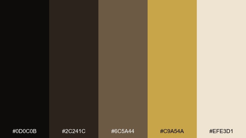
HEX: #0D0C0B #2C241C #6C5A44 #C9A54A #EFE3D1
Mood: heritage, warm, crafted
Best for: Whiskey labels and heritage brand identities
Heritage and crafted, it feels like aged paper, ink stamps, and a gold seal on a ledger. Use the warm browns to introduce story and authenticity around the black base. Gold should mark authenticity cues like batch numbers, crests, and award icons. Tip: add subtle grain or letterpress textures to the light neutral for a true vintage finish.
Image example of vintage ledger generated using media.io
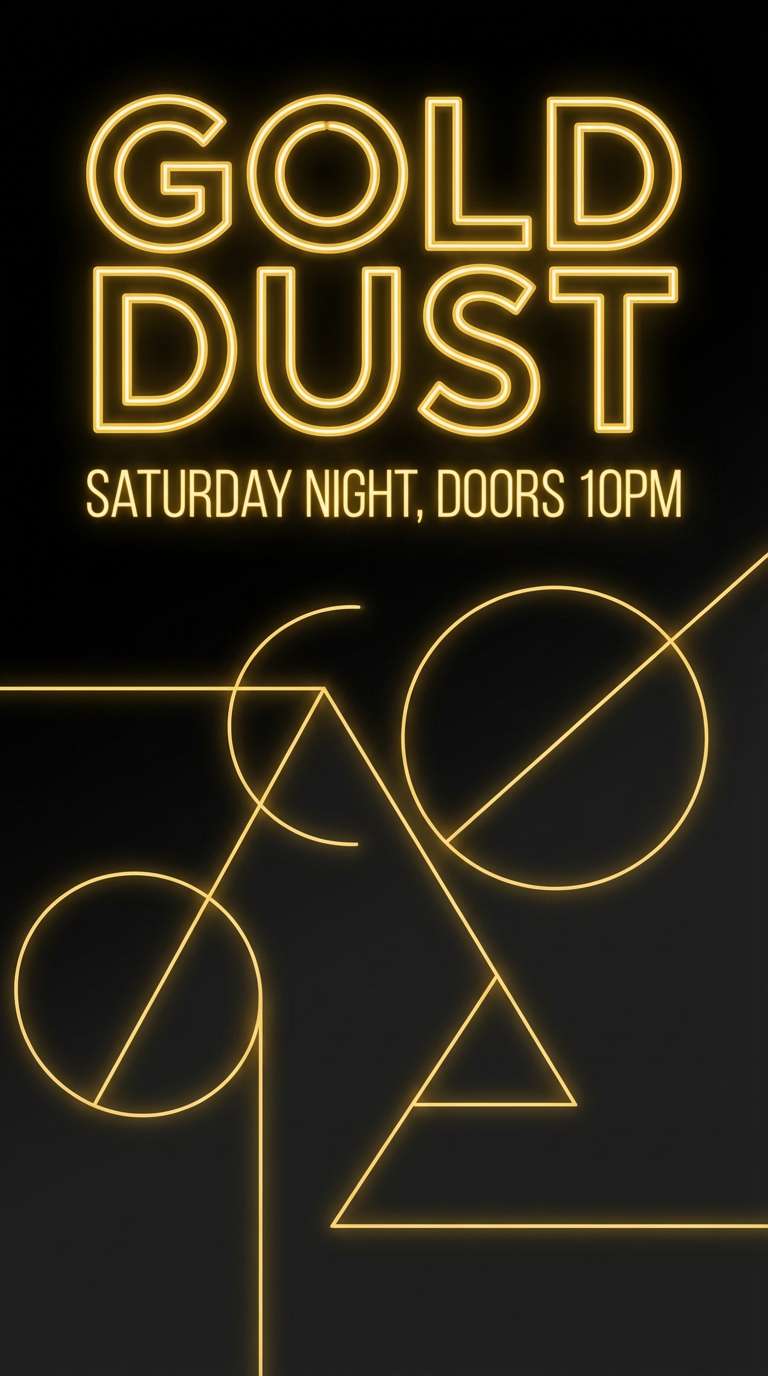
20) Neon Gold Night
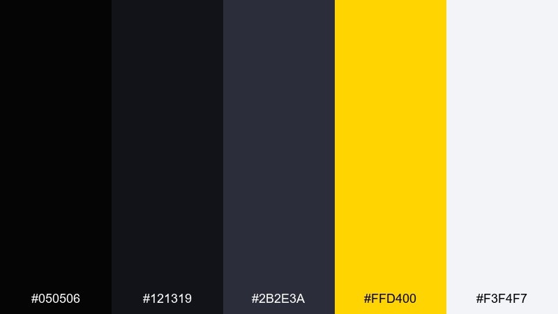
HEX: #050506 #121319 #2B2E3A #FFD400 #F3F4F7
Mood: bold, energetic, nightlife
Best for: Club flyers and digital promo graphics
Bold and energetic, it looks like neon signage cutting through night fog. Black gold color combinations like this work when you treat bright yellow as a punchy spotlight, not a full background. Use the pale gray for secondary text so the flyer stays readable on screens. Tip: keep the yellow for one focal element, like the event name or date, to avoid visual noise.
Image example of neon gold night generated using media.io
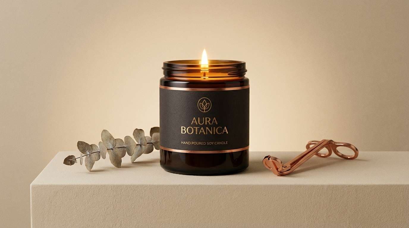
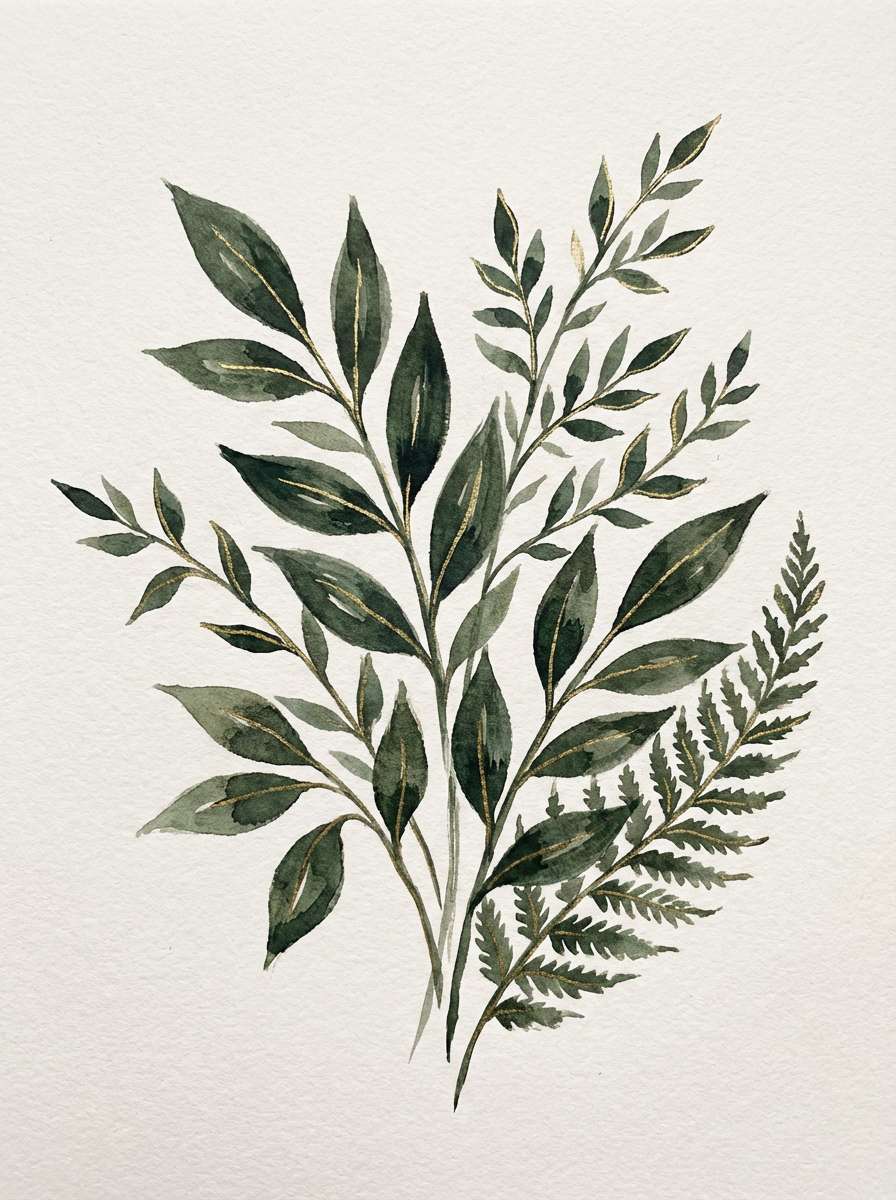
21) Black Gold Botanica
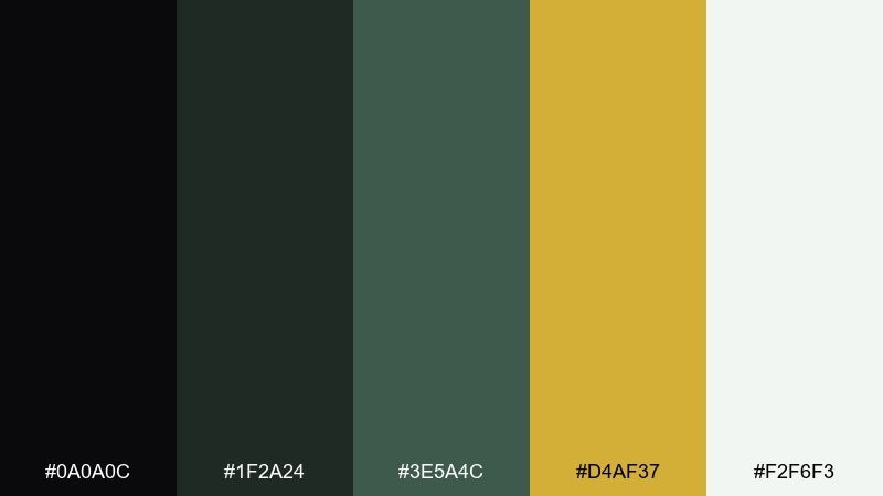
HEX: #0A0A0C #1F2A24 #3E5A4C #D4AF37 #F2F6F3
Mood: moody, natural, elegant
Best for: Botanical illustrations and spring campaign art
Moody and natural, it feels like deep foliage lit by a golden sunrise. Use dark tones for stems and shadows, then apply gold as delicate leaf edges or pollen-like highlights. The soft off-white keeps the composition airy and modern. Tip: keep gold as a watercolor wash effect rather than solid blocks for a more organic finish.
Image example of black gold botanica generated using media.io
What Colors Go Well with Black Gold?
Soft neutrals (champagne, cream, pearl, warm gray) are the easiest partners for black and gold because they keep contrast readable while preserving a luxe, editorial feel. They also give gold room to shine without looking overly saturated.
For more personality, add a single accent hue: emerald for cocktail-lounge energy, sapphire for executive polish, orchid for fashion-forward punch, or copper for an earthy handcrafted vibe. The key is to keep gold as the “premium” highlight and let the accent color do the storytelling.
If you’re designing for screens, choose slightly muted light tones instead of pure white to reduce glare on dark backgrounds and make gold accents feel smoother.
How to Use a Black Gold Color Palette in Real Designs
Treat gold like jewelry: small, high-impact placements work best. Use it for logos, borders, icons, key numbers, or CTAs—while black and charcoal handle backgrounds and layout structure.
Build hierarchy with neutrals. Keep long-form text in off-white or light gray, reserve the brightest neutral for the most important content, and use mid-grays for dividers, tables, and secondary UI surfaces.
For print, gold foil or spot metallic inks can elevate invitations, menus, and packaging dramatically. For digital, mimic metal with subtle gradients and careful contrast—without relying on large gold blocks.
Create Black Gold Palette Visuals with AI
If you want your palette to look consistent across ads, posters, packaging mockups, and UI concepts, generating visuals from a single art direction prompt is a fast way to explore options. Start with one palette above, then iterate on lighting (studio, spotlight, neon glow) and materials (foil, velvet, marble).
With Media.io, you can create black-gold themed images directly in your browser—great for mood boards, pitch decks, and quick brand explorations. Keep prompts specific about textures (matte black, gold foil, brushed brass) for the most realistic results.
Once you have a few strong outputs, reuse the same prompt structure to produce a cohesive set of assets for your campaign or UI system.
Black Gold Color Palette FAQs
-
What HEX code is commonly used for “metallic gold” in design?
A widely used digital “gold” is #D4AF37. Keep in mind true metallic effects require gradients (digital) or foil/spot inks (print), but #D4AF37 is a strong starting point for luxe accents. -
How much gold should I use in a black and gold palette?
Use gold sparingly—often 5–15% of the layout. Let black/charcoal do the heavy lifting for backgrounds and structure, then use gold only for highlights like logos, dividers, badges, and CTAs. -
What background color works best with gold accents?
Near-black and charcoal backgrounds (not pure #000000 everywhere) usually look more premium and readable. Pair them with an off-white or light gray for text so the gold accents feel intentional rather than noisy. -
Is black and gold a good choice for dark mode UI?
Yes—if you treat gold as an interaction color (active states, key buttons, progress indicators). Use slate/charcoal surfaces for cards and separators, and keep body text in light gray for comfort. -
What colors pair well with black gold besides neutrals?
Try one accent hue: emerald (fresh, hospitality), sapphire (executive, fintech), orchid (fashion/beauty), or copper (earthy, artisanal). Keep it limited so gold stays the premium signal. -
How do I make gold look “expensive” in digital designs?
Use controlled contrast, subtle gradients, and realistic material cues (foil shine, brushed brass texture, soft glow on highlights). Avoid filling large areas with flat yellow; it can read cheap compared to restrained metallic accents. -
Does black and gold work for print invitations and packaging?
It’s one of the best combinations for print. Matte black stock plus gold foil or spot metallic ink creates a tactile, premium finish—especially when paired with champagne or pearl whites for readable typography.
Next: Brown Blue Color Palette


