

Brown and blue is one of those rare pairings that feels both natural and designed. You get earthy stability from brown, plus clarity and confidence from blue—perfect for modern brands, interiors, and UI.
Below are 20 brown blue color palette ideas with HEX codes, plus quick usage tips and AI prompts you can remix on Media.io.
In this article
- Why Brown Blue Palettes Work So Well
-
- harbor cocoa
- denim and walnut
- stormy saddle
- coastal clay
- midnight mocha
- vintage workwear
- riverbank suede
- bluejay bark
- dusty indigo latte
- arctic timber
- cobalt truffle
- rainy cabin
- blueprint leather
- museum espresso
- clay pot sky
- nautical roastery
- slate and sienna
- copper lagoon
- prairie dusk
- inkstone caramel
- What Colors Go Well with Brown Blue?
- How to Use a Brown Blue Color Palette in Real Designs
- Create Brown Blue Palette Visuals with AI
Why Brown Blue Palettes Work So Well
Brown brings warmth, texture, and a sense of craft—think wood, leather, coffee, clay, and stone. Blue adds structure, calm, and credibility, which is why it’s so common in digital products and professional branding.
Put together, brown and blue balance “human” and “modern.” The blue side keeps layouts feeling clean and organized, while brown prevents the design from becoming too cold or corporate.
This combination also scales beautifully across mediums: it can look premium on packaging, welcoming in interiors, and highly readable in UI—especially when paired with soft off-whites for breathing room.
20+ Brown Blue Color Palette Ideas (with HEX Codes)
1) Harbor Cocoa
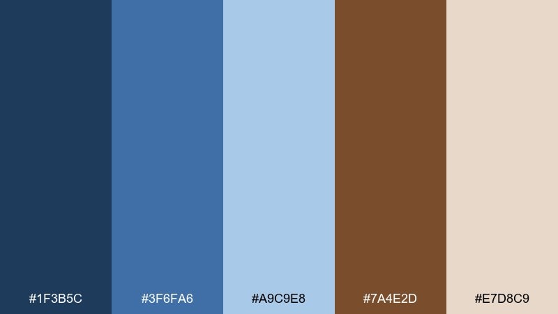
HEX: #1F3B5C #3F6FA6 #A9C9E8 #7A4E2D #E7D8C9
Mood: calm, coastal, grounded
Best for: coastal hotel branding
Calm seaside energy meets warm driftwood, like a harbor at golden hour. Use the deep blue for logos and headers, then let cocoa brown anchor type and icons. Creamy sand works as the main background to keep everything airy. Tip: keep the light blue to small accents so the brand still feels premium.
Image example of harbor cocoa generated using media.io
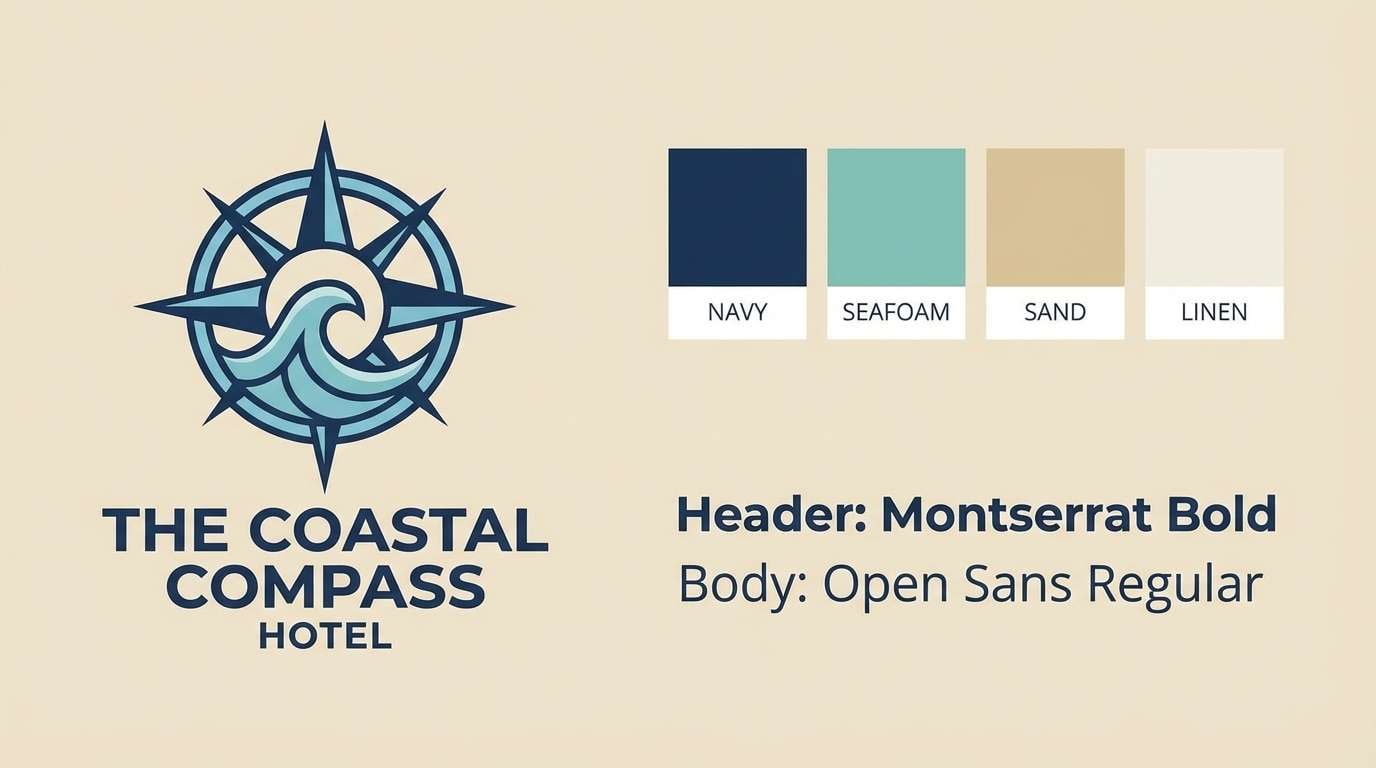
Media.io is an online AI studio for creating and editing video, image, and audio in your browser.

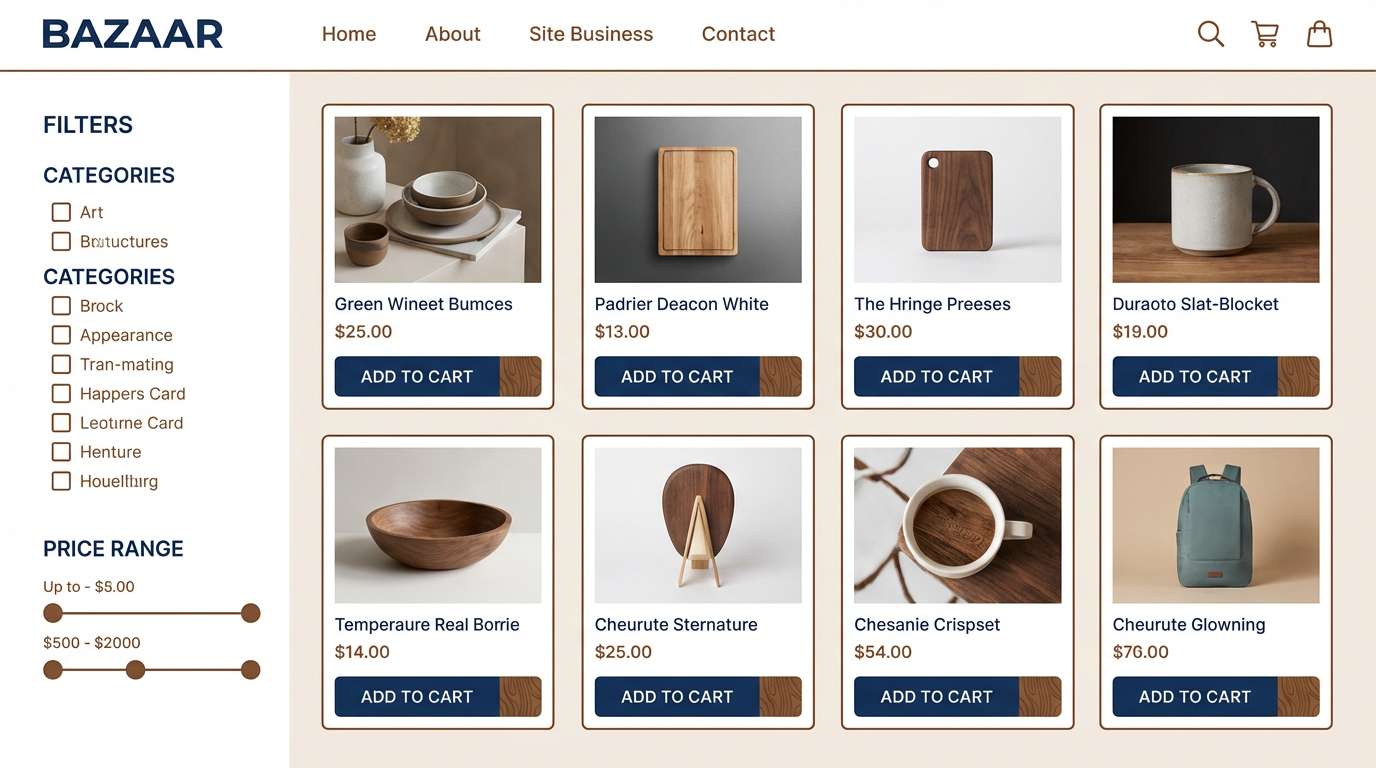
2) Denim and Walnut
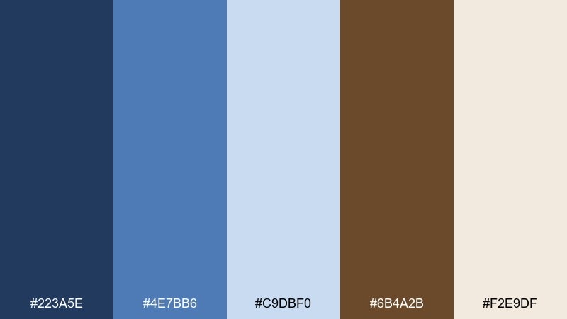
HEX: #223A5E #4E7BB6 #C9DBF0 #6B4A2B #F2E9DF
Mood: casual, reliable, modern
Best for: casual ecommerce ui
Easygoing denim blues paired with walnut warmth feel familiar and trustworthy. Put the darkest blue on navigation and primary buttons, and use the soft blue for hover states and cards. Walnut adds a tactile accent for price tags, badges, or selected filters. Tip: reserve the brown for emphasis so calls to action stay clear.
Image example of denim and walnut generated using media.io
3) Stormy Saddle
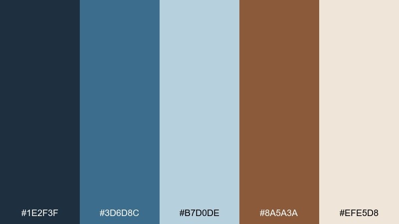
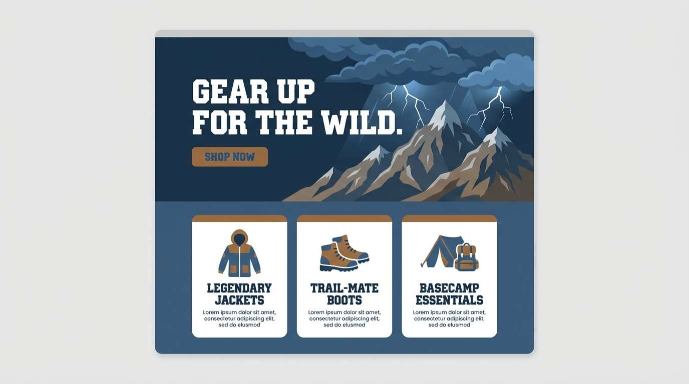
HEX: #1E2F3F #3D6D8C #B7D0DE #8A5A3A #EFE5D8
Mood: moody, adventurous, rustic
Best for: outdoor gear landing page
Moody sky blues and worn saddle leather evoke a trail ride under shifting clouds. For a brown blue color palette like this, keep the darkest tone for hero text and top bars, then let the pale blue open up sections. The leather brown shines on highlights such as shipping info, ratings, and feature icons. Tip: add generous whitespace so the mood stays rugged but still readable.
Image example of stormy saddle generated using media.io
4) Coastal Clay
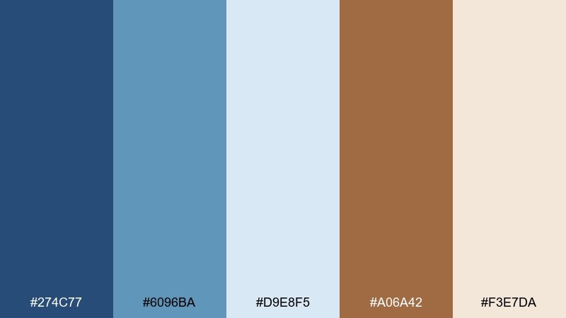
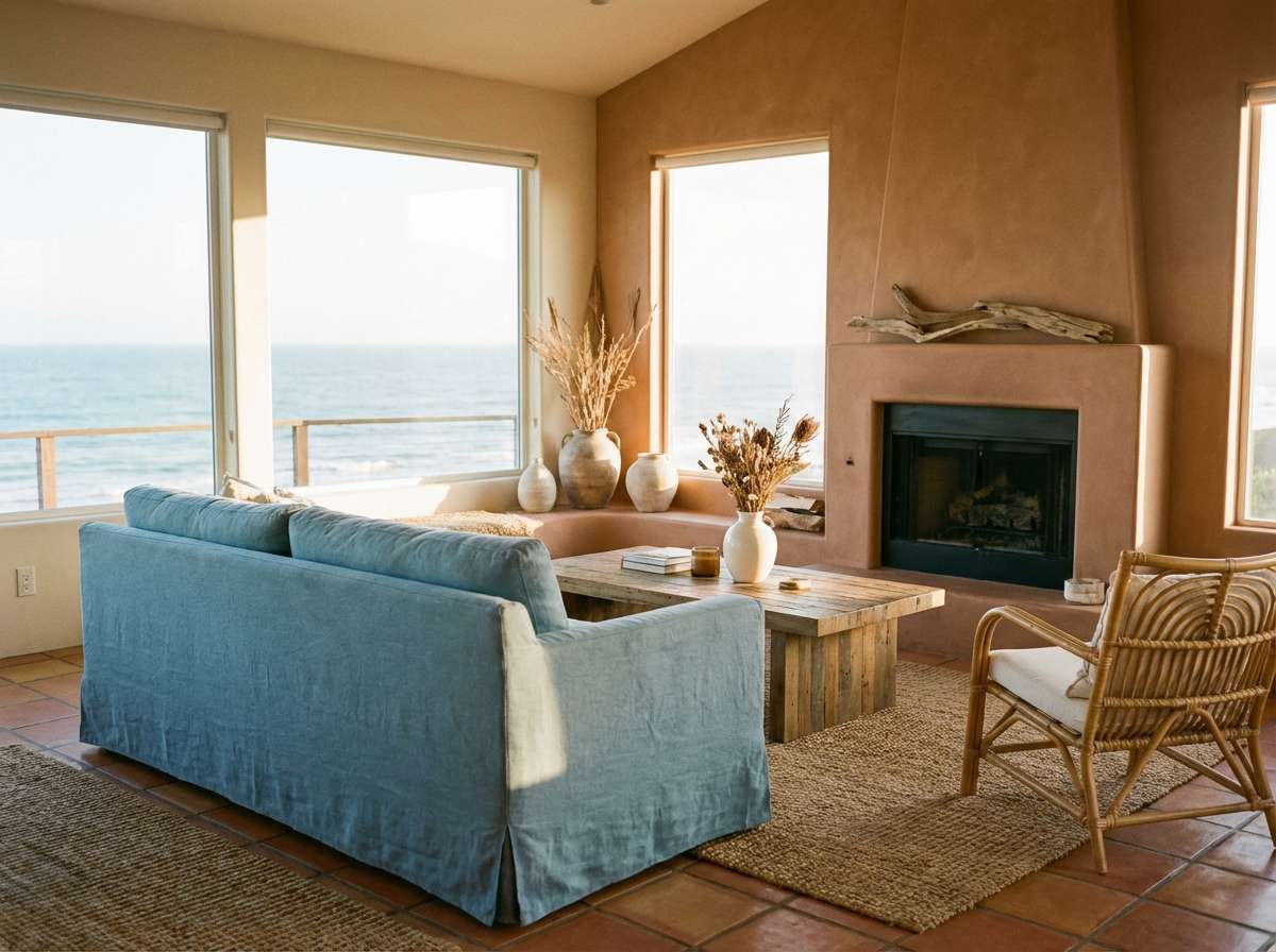
HEX: #274C77 #6096BA #D9E8F5 #A06A42 #F3E7DA
Mood: sunlit, relaxed, natural
Best for: living room interior styling
Sunlit blues and clay browns feel like painted shutters beside terracotta planters. Use the softest tones on walls and textiles, then bring in the deeper blue through cabinetry, art, or a statement rug. Clay brown works best in wood furniture, leather, and ceramic decor. Tip: repeat the same blue twice in small decor pieces to make the room feel intentional.
Image example of coastal clay generated using media.io
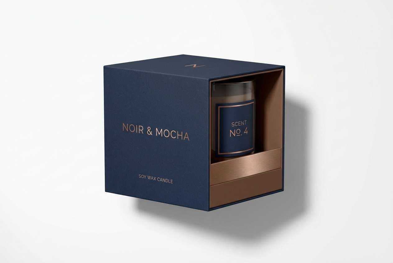
5) Midnight Mocha

HEX: #0F2A43 #2F5D8A #8FB7D6 #4B2F22 #EADFD6
Mood: luxurious, intimate, cinematic
Best for: luxury candle packaging
Deep midnight blue with mocha brown reads like velvet and roasted coffee in low light. Let the dark blue dominate the label and box for a premium base, then add mocha as a foil or embossed detail. The lighter blues are perfect for subtle patterns or secondary information. Tip: use one metallic ink alongside the darkest shade to elevate the finish.
Image example of midnight mocha generated using media.io
6) Vintage Workwear

HEX: #1D3557 #457B9D #DCE8F2 #7B4B2A #F5EFE6
Mood: heritage, sturdy, hardworking
Best for: workwear poster design
Heritage blues and tough brown feel like indigo jackets and oiled leather boots. These brown blue color combinations work best with bold type, simple icons, and a slightly textured off-white base. Use the mid blue for secondary blocks and the dark blue for headlines to keep hierarchy clean. Tip: add a single stamp-style badge in brown to reinforce the vintage vibe.
Image example of vintage workwear generated using media.io

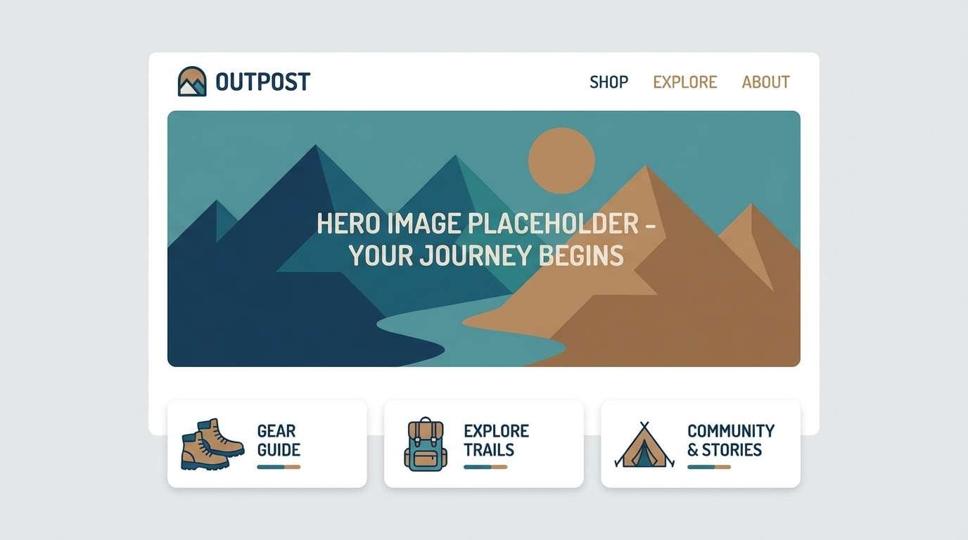
7) Riverbank Suede
HEX: #214E6B #6FA3C1 #CFE2EE #8C6239 #F0E6DA
Mood: fresh, outdoorsy, approachable
Best for: outdoor brand website ui
Fresh river blues with suede brown feel like a hike that ends at the waterline. Use the darkest blue for navigation and headings, and keep the pale tones for spacious section backgrounds. Suede brown is a great accent for tabs, small badges, and secondary buttons. Tip: pair with simple line icons to maintain a clean, modern trail aesthetic.
Image example of riverbank suede generated using media.io
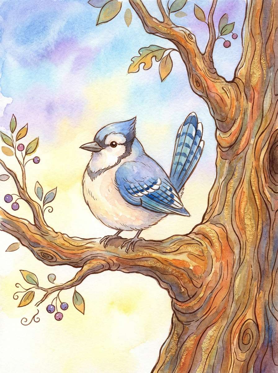
8) Bluejay Bark
HEX: #2A4D8F #6EA0D6 #D7E7F7 #7A5B3E #F6F0E8
Mood: playful, friendly, storybook
Best for: kids book illustration
Bright bluejay feathers and warm tree bark make a cheerful, storybook pairing. Use the stronger blue for characters and focal objects, while the soft blue supports skies and gentle shadows. Bark brown brings cozy grounding for trunks, nests, and outlines. Tip: keep outlines thin and let the palette do the contrast work.
Image example of bluejay bark generated using media.io
9) Dusty Indigo Latte
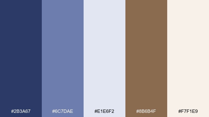
HEX: #2B3A67 #6C7DAE #E1E6F2 #8B6B4F #F7F1E9
Mood: soft, romantic, refined
Best for: wedding invitation suite
Dusty indigo and latte brown feel like linen, dried florals, and twilight vows. Use the indigo for names and key details, then soften the page with pale lavender-blue as a background wash. Latte brown works well for monograms, borders, and RSVP accents. Tip: print the darkest ink slightly lighter than pure navy to keep it delicate.
Image example of dusty indigo latte generated using media.io
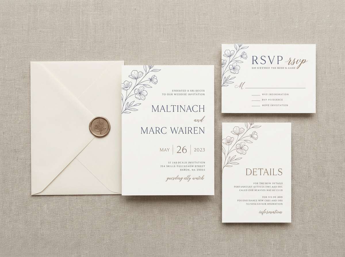
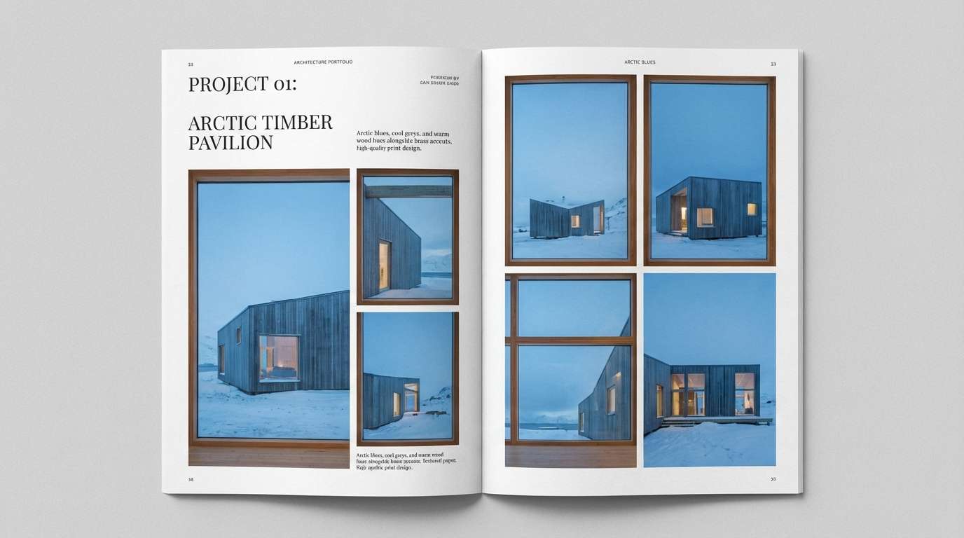
10) Arctic Timber
HEX: #102A43 #4A90C2 #E6F0FA #6A4B3A #F2ECE6
Mood: crisp, architectural, minimal
Best for: architecture portfolio editorial
Crisp arctic blues with timber brown feel like glass facades against warm wood interiors. Use the near-white tones for page space and grid structure, then bring in the deep blue for section titles and captions. Timber brown works beautifully as a subtle highlight for pull quotes or project tags. Tip: keep photos slightly cool-toned so the blue accents feel cohesive.
Image example of arctic timber generated using media.io
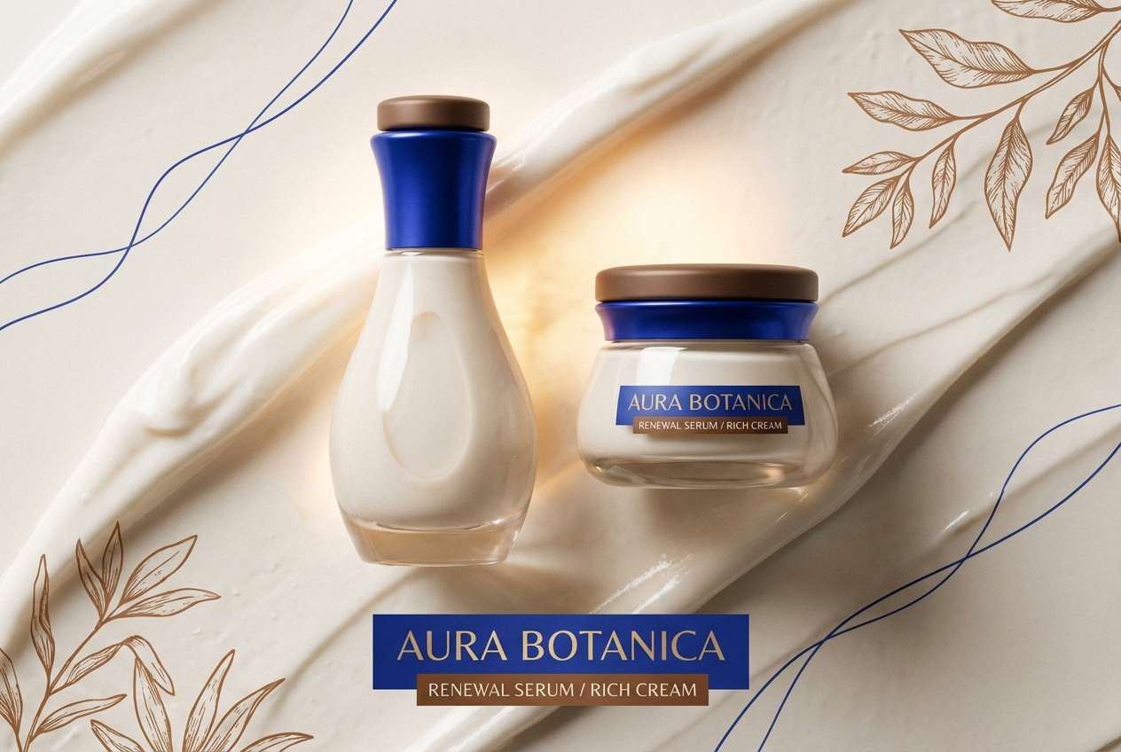
11) Cobalt Truffle

HEX: #143D66 #2F80C0 #CFE5F5 #5C3A2E #F3E6DD
Mood: polished, confident, upscale
Best for: skincare product ad
Cobalt shine and truffle warmth suggest glossy glass, rich creams, and a boutique counter display. For bold brown blue color combinations, let cobalt lead headlines and key claims, while truffle supports ingredient callouts and subtle shadows. The pale blue and cream keep the layout breathable and modern. Tip: use soft gradients sparingly to make the product look more luminous.
Image example of cobalt truffle generated using media.io
12) Rainy Cabin
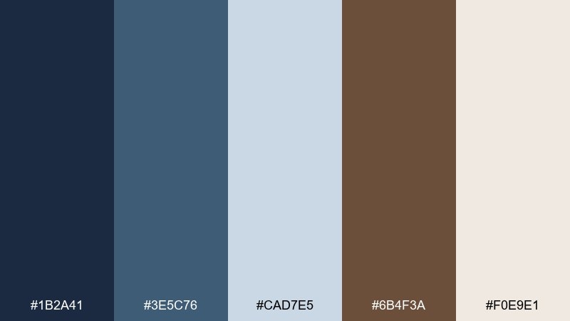
HEX: #1B2A41 #3E5C76 #CAD7E5 #6B4F3A #F0E9E1
Mood: cozy, quiet, contemplative
Best for: productivity dashboard ui
Quiet rainy blues with cabin brown feel like a mug on a windowsill and soft wool nearby. Use the mid blue for panels and cards, with the darkest shade for headings and active states. Cabin brown is ideal for warning notes, small highlights, or a warm progress indicator. Tip: keep contrast high on data tables so the mood stays cozy without sacrificing clarity.
Image example of rainy cabin generated using media.io
13) Blueprint Leather
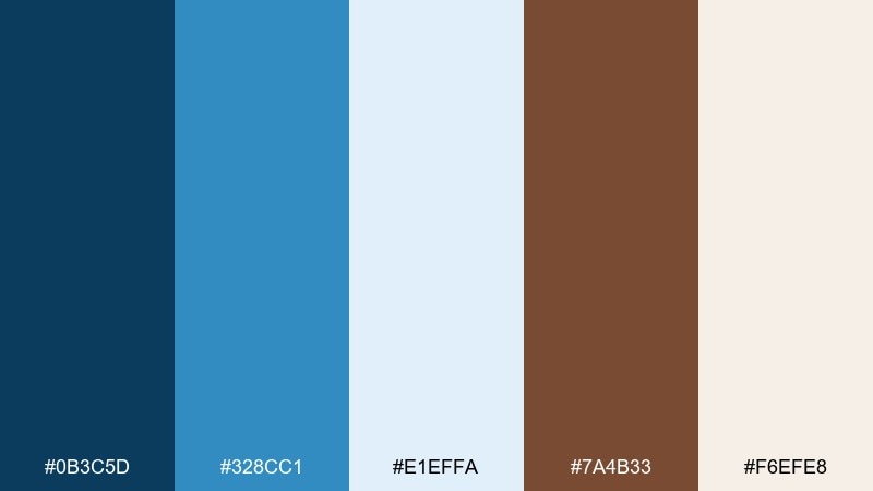
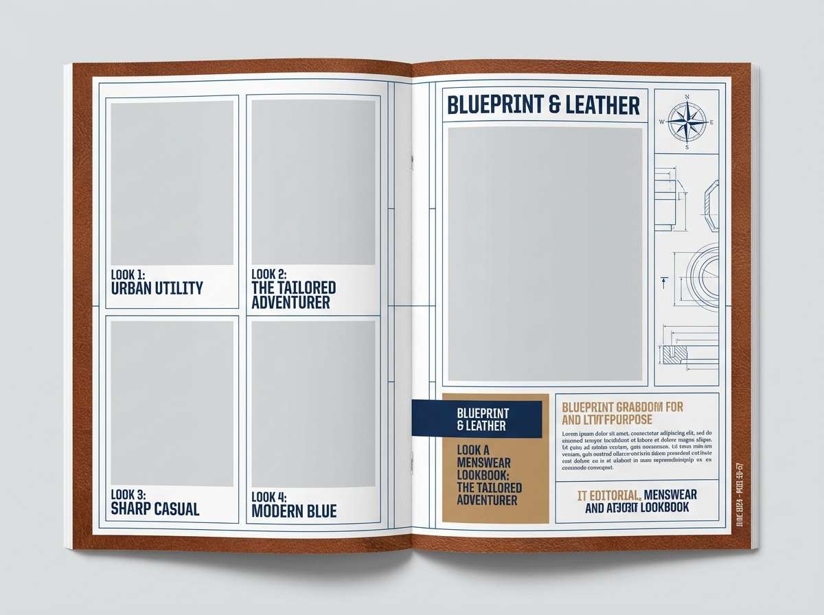
HEX: #0B3C5D #328CC1 #E1EFFA #7A4B33 #F6EFE8
Mood: technical, sharp, masculine
Best for: menswear lookbook layout
Blueprint blues paired with leather brown feel precise, tailored, and a little bold. Use the darkest blue for page structure and section dividers, then let the brighter blue highlight product names or sizing details. Leather brown works best on small labels, belt or shoe callouts, and subtle icons. Tip: keep typography clean and condensed to match the structured vibe.
Image example of blueprint leather generated using media.io
14) Museum Espresso

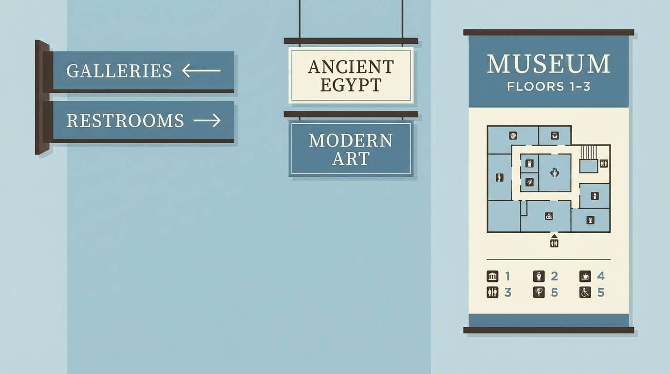
HEX: #1E3A5F #5A88B5 #DCEAF6 #4A2D22 #F4EEE7
Mood: cultured, classic, curated
Best for: museum exhibit signage system
Curated gallery blues and espresso brown evoke placards, polished wood, and quiet halls. For a brown blue color palette that feels refined, let espresso handle typography and wayfinding icons while the blues set calm panels and section headers. Use the pale tones for maps and long-form text areas to avoid visual fatigue. Tip: stick to one blue for signage backgrounds and reserve the second blue for accessibility highlights.
Image example of museum espresso generated using media.io
15) Clay Pot Sky
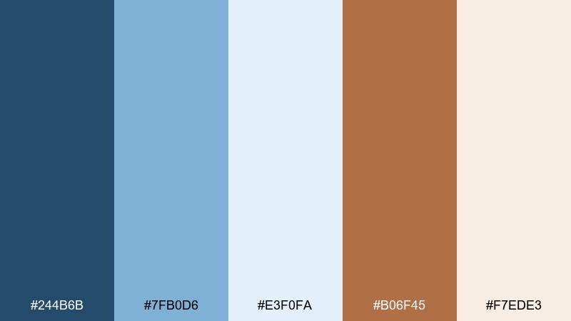
HEX: #244B6B #7FB0D6 #E3F0FA #B06F45 #F7EDE3
Mood: handmade, bright, welcoming
Best for: ceramics shop social ad
Handmade clay warmth under a clear sky feels optimistic and craft-forward. Use the blue tones for clean backgrounds and text overlays, then let clay brown take the spotlight on the product itself. The lighter neutrals help photos look natural and true to color. Tip: keep copy short and use the mid blue for a single, high-contrast call to action.
Image example of clay pot sky generated using media.io
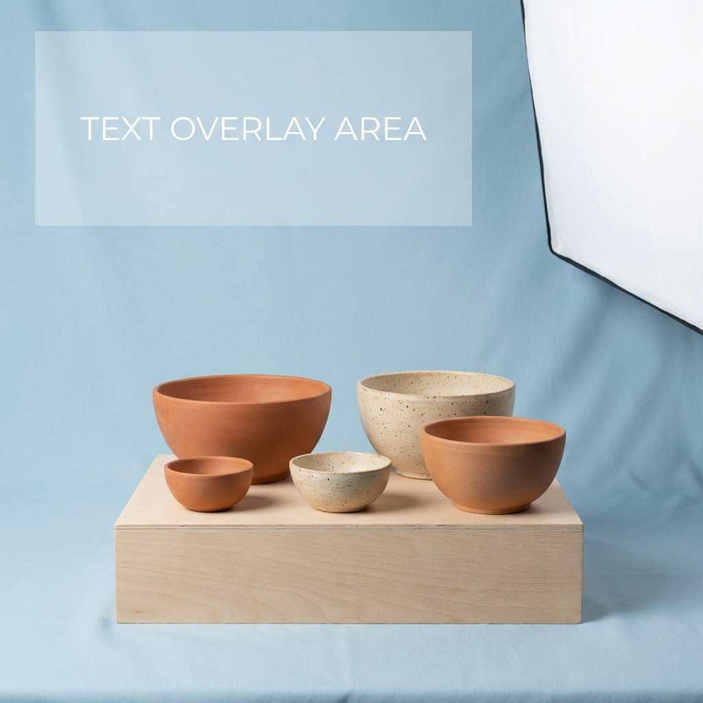
16) Nautical Roastery
HEX: #12324B #2E6FA3 #BFD8EC #7D4E2F #F2E6DB
Mood: bold, artisan, maritime
Best for: coffee bag packaging
Bold nautical blues with roasted brown feel like sea air outside a small roastery. Use the dark blue as the main bag color for shelf impact, then add roasted brown for badges like origin, roast level, and tasting notes. The light blue works for subtle wave patterns without overwhelming the typography. Tip: keep one large, readable label area so the packaging stays practical in retail.
Image example of nautical roastery generated using media.io
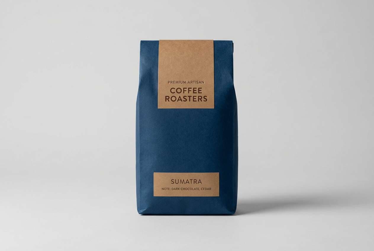
17) Slate and Sienna
HEX: #2A3D4F #5B7C99 #D7E4EF #8A5A44 #F5EFE8
Mood: professional, steady, understated
Best for: finance web app ui
Understated slate blues with sienna brown feel steady and no-nonsense. Use the darker blue for navigation, charts, and key metrics, while the pale tone keeps dashboards open and calm. Sienna works best for alerts, selected states, and small emphasis tags without feeling aggressive. Tip: avoid using sienna on large backgrounds so the interface stays crisp.
Image example of slate and sienna generated using media.io
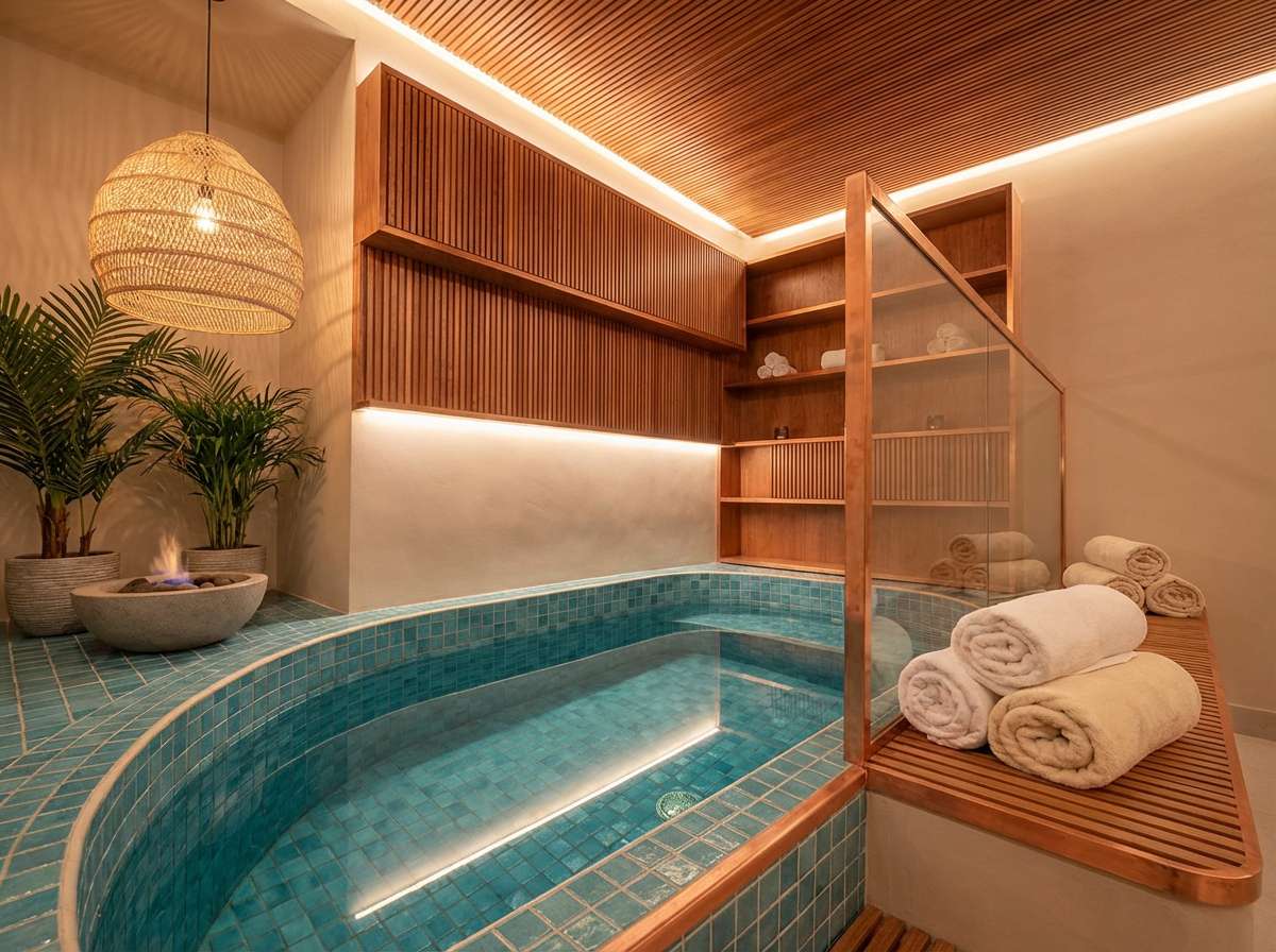
18) Copper Lagoon
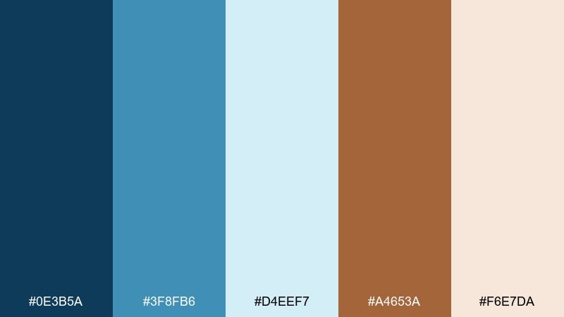
HEX: #0E3B5A #3F8FB6 #D4EEF7 #A4653A #F6E7DA
Mood: fresh, restorative, boutique
Best for: spa interior direction
Cool lagoon blues with copper brown feel restorative, like mineral water and warm stones. Use the lightest tone for walls and towels, then introduce the deeper blue through tile, glass, or artwork. Copper brown shines in wood slats, brass fixtures, and small decor pieces. Tip: keep lighting warm so the blues read soothing rather than cold.
Image example of copper lagoon generated using media.io
19) Prairie Dusk
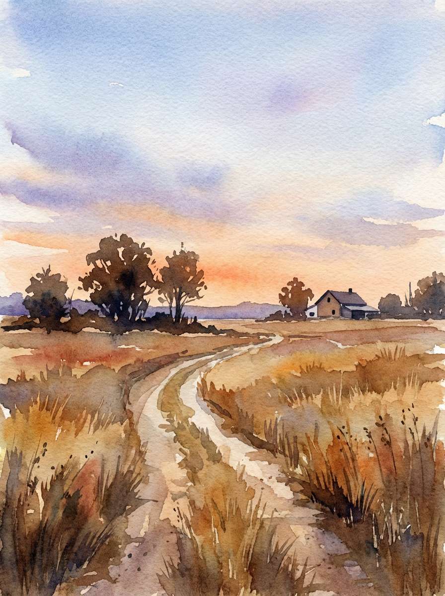
HEX: #22324A #6B8FB6 #E2ECF6 #9A6B4A #F7F0E8
Mood: gentle, nostalgic, wide-open
Best for: landscape watercolor print
Gentle dusk blues and prairie browns feel like tall grass under a fading sky. Use the pale tones for washes and paper-like space, then build depth with the darker blue in distant hills or clouds. The warm brown is perfect for foreground textures and soft shadows. Tip: layer transparent strokes so the palette stays airy and calm.
Image example of prairie dusk generated using media.io
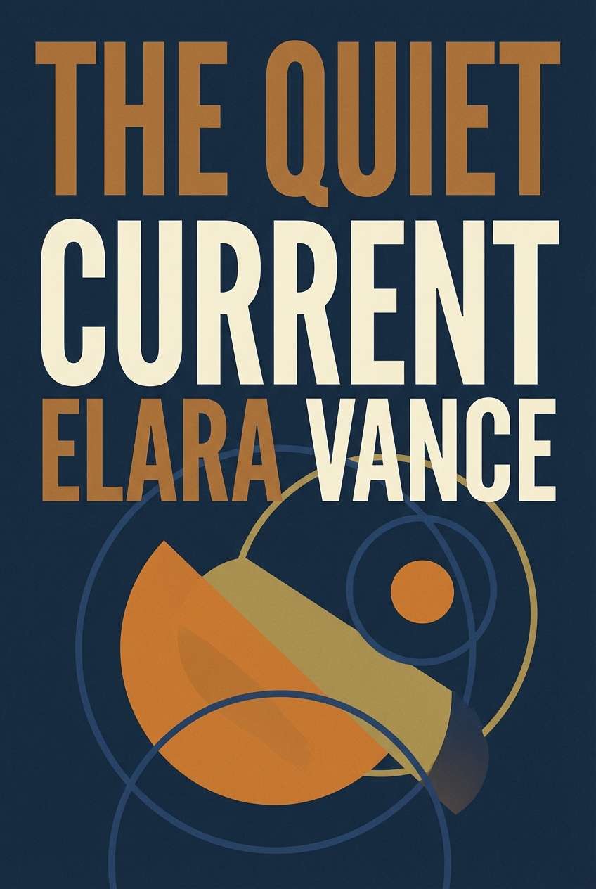
20) Inkstone Caramel
HEX: #12263A #3C78A8 #D9EAF8 #8B5A3C #F4E9DD
Mood: literary, elegant, modern classic
Best for: book cover design
Inkstone blue with caramel brown feels literary and timeless, like crisp pages and a leather bookmark. Use the darkest shade for the title and spine elements, while the brighter blue adds modern contrast in shapes or illustrated details. Caramel brown works well for author name, small ornaments, or a subtle frame. Tip: keep the cover simple and let one bold typographic element carry the design.
Image example of inkstone caramel generated using media.io
What Colors Go Well with Brown Blue?
Soft off-whites and warm creams are the easiest add-on colors for a brown blue color palette because they keep the scheme bright, readable, and flexible across print and screens.
For a richer look, try muted greens (sage, olive) to amplify the earthy side, or add a restrained metallic (gold/brass) for premium packaging and hospitality branding.
If you need more contrast in UI, a cool gray or charcoal can tighten the system and improve hierarchy—especially for text, dividers, and data-heavy components.
How to Use a Brown Blue Color Palette in Real Designs
Start by assigning roles: let a deep blue handle structure (headers, navigation, hero text), keep a light blue or off-white as your main background, and use brown as an accent for warmth and emphasis.
In interiors, scale matters: lighter blues and creams work well on large surfaces (walls, rugs), while browns shine in tactile materials like wood, leather, and ceramics. Repeat one blue in small decor elements so the room feels intentional.
For branding and packaging, pick one “lead” color (often navy or cobalt), then use brown for seals, badges, or secondary typography. This keeps the identity modern while still feeling crafted and grounded.
Create Brown Blue Palette Visuals with AI
If you want to preview how brown and blue will look in a real scene—like a landing page, packaging mockup, or room—AI visuals help you test direction before committing to final design.
Use the prompts above as templates: swap product type, style keywords (minimal, vintage, editorial), and aspect ratio to match your use case, then iterate until the palette feels right.
Media.io makes it simple to generate on-brand palette mockups directly in your browser—no installs required.
Brown Blue Color Palette FAQs
-
Why do brown and blue look good together?
Brown adds warmth and an organic, tactile feel, while blue adds calm and structure. Together they create balanced contrast that can feel both modern and approachable. -
Is a brown blue color palette good for branding?
Yes. Blue communicates trust and clarity, and brown signals authenticity and craft. This is a strong mix for hospitality, outdoors, coffee, heritage goods, and premium lifestyle brands. -
What shade of blue pairs best with brown?
Navy and slate blues pair especially well with medium-to-dark browns for a classic look. Lighter sky or powder blues work best when you add a cream/off-white to keep the palette airy. -
How do I keep brown from making a design look dull?
Use brown as an accent (badges, icons, small UI states) and let blue or off-white dominate larger areas. Adding a light neutral background also keeps the overall design feeling clean. -
What neutral goes best with brown and blue?
Warm off-whites and sandy creams blend naturally with both hues and improve readability. Cool grays can work too, especially for dashboards and data-heavy UI, but keep them subtle. -
Are brown and blue good for UI design?
They can be excellent when you define clear roles: deep blue for primary actions and navigation, light blue/cream for surfaces, and brown for secondary emphasis. Always check contrast for accessibility. -
How can I generate palette mockups quickly?
Use Media.io text-to-image: paste a prompt (like the examples above), keep your five HEX colors nearby for reference, and iterate on style keywords (minimal, editorial, rustic) until it matches your brand.
Next: Gray Brown Color Palette


