

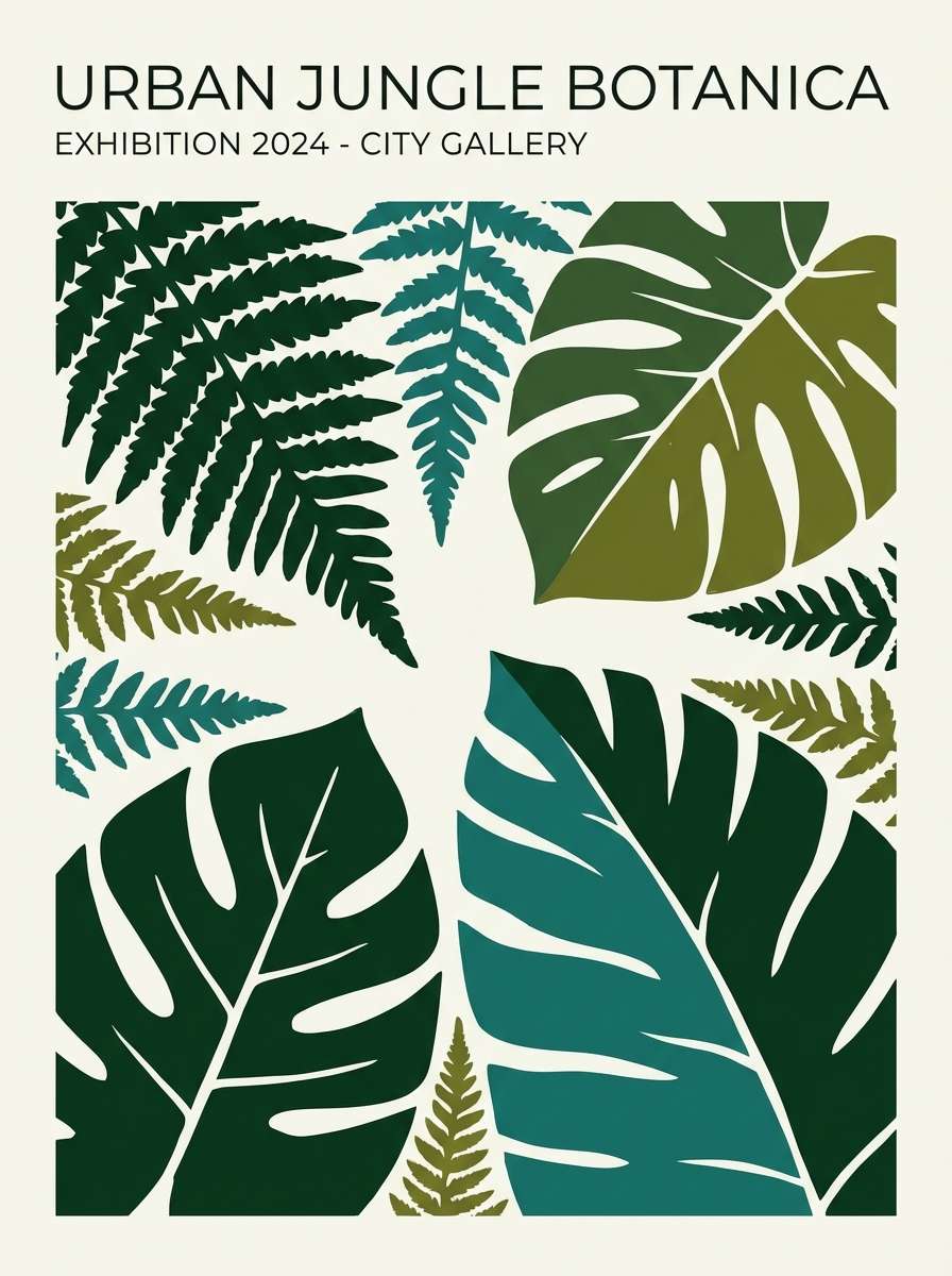
Black and green is a high-impact pairing that can feel sleek, natural, or futuristic depending on the green you choose. From deep forest tones to icy aquas, the contrast stays strong and readable.
Below are 20 black green color palette ideas with HEX codes, plus ready-to-use AI prompts you can plug into Media.io to generate matching visuals for your next design.
In this article
Why Black Green Palettes Work So Well
Black gives structure, hierarchy, and instant contrast—while green brings emotion: nature, growth, health, or energy. Together, they create palettes that feel grounded but still modern.
Because green spans such a wide range (olive, emerald, mint, neon), you can dial the vibe from premium and editorial to sporty and tech-forward without changing the core pairing.
In UI and branding, black green color combinations are especially effective for legibility and “signal design”: the dark tones hold the layout, and greens guide attention to actions, states, or key information.
20+ Black Green Color Palette Ideas (with HEX Codes)
1) Midnight Fern
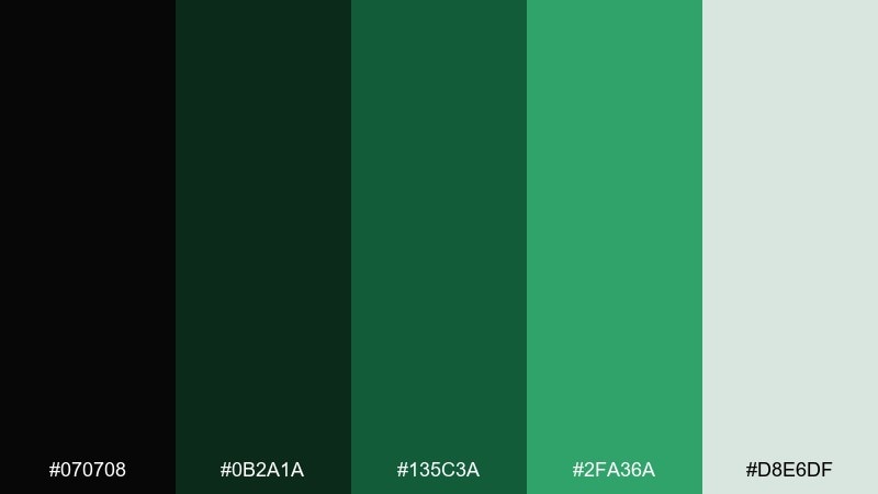
HEX: #070708 #0B2A1A #135C3A #2FA36A #D8E6DF
Mood: moody, calm, natural
Best for: branding, editorial covers, moody landing pages
Moody woodland tones feel like a late-night hike under pine canopies. Use the near-black as a base, then layer forest and fern greens for depth and hierarchy. Pair it with clean off-whites to keep text readable and layouts airy. Tip: reserve the brighter green for primary buttons or key data points to avoid visual noise.
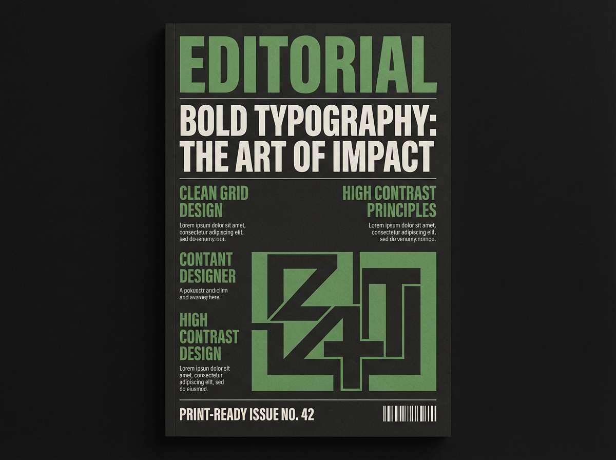
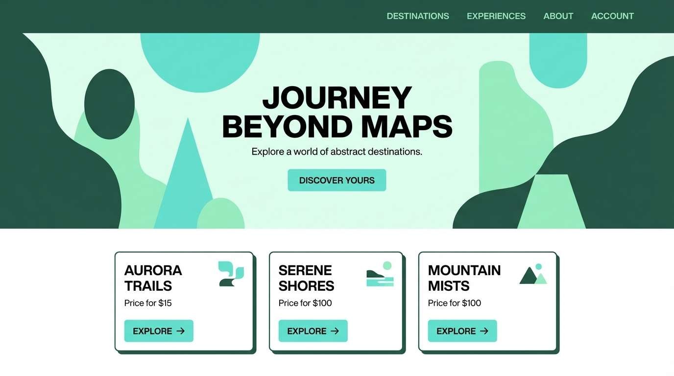
Image example of midnight fern generated using media.io
Media.io is an online AI studio for creating and editing video, image, and audio in your browser.

2) Neon Moss
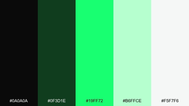
HEX: #0A0A0A #0F3D1E #19FF72 #B6FFCE #F5F7F6
Mood: electric, youthful, high-contrast
Best for: gaming promos, tech posters, stream overlays
Electric moss greens pop like glow sticks against a dark stage. Lean on the black and deep green for structure, then let the neon do the signaling work. Soft mint and near-white keep the palette from feeling too harsh in large blocks. Tip: add the neon only to badges, prices, or CTAs so the glow stays special.
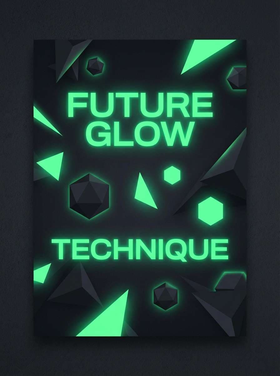
Image example of neon moss generated using media.io
3) Jade Shadow
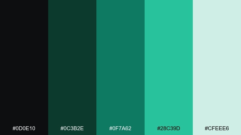
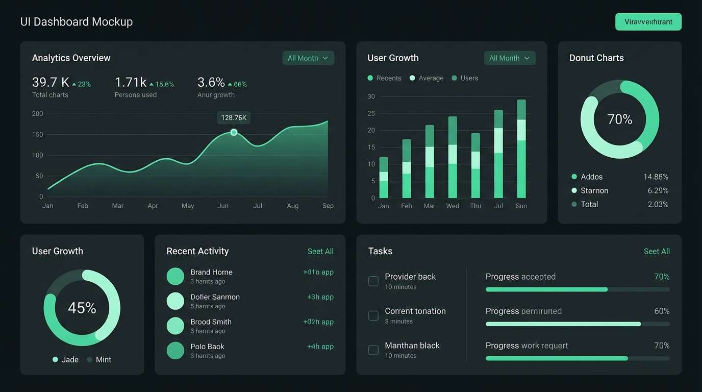
HEX: #0D0E10 #0C3B2E #0F7A62 #28C39D #CFEEE6
Mood: sleek, polished, premium
Best for: fintech dashboards, luxury packaging accents, app UI
Sleek jade highlights feel like light catching on cut glass. This black green color palette works best when the darkest tones carry navigation and containers, while jade and mint guide attention. Pair it with minimal iconography and generous spacing for a premium look. Tip: use the bright jade for active states and keep secondary actions muted.
Image example of jade shadow generated using media.io
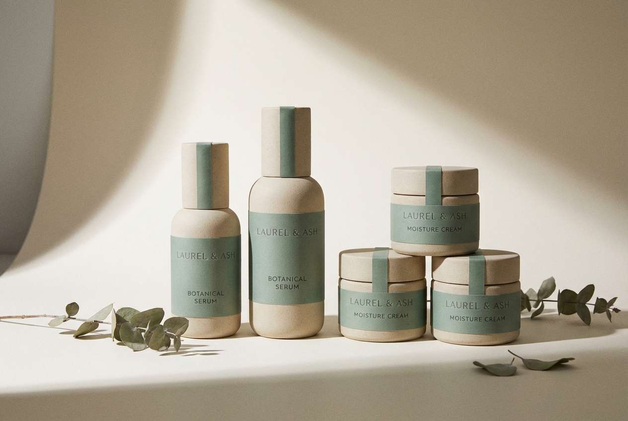
4) Eucalyptus Ink
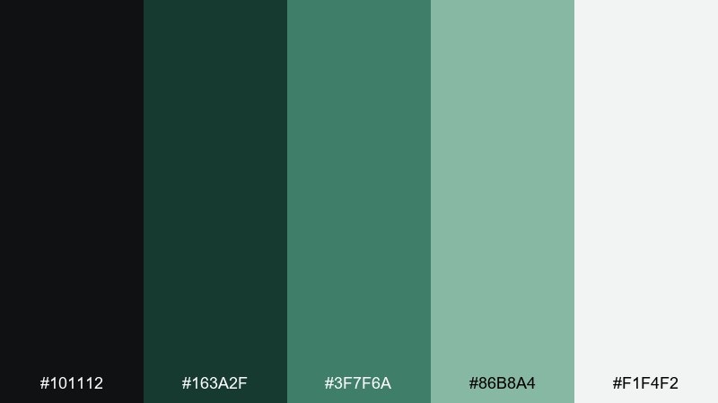
HEX: #101112 #163A2F #3F7F6A #86B8A4 #F1F4F2
Mood: fresh, spa-like, sophisticated
Best for: wellness branding, skincare packaging, clinic websites
Fresh eucalyptus greens evoke steam, clean towels, and quiet rituals. Build a calm base with ink-black and deep green, then soften sections with muted eucalyptus and pale neutrals. It pairs beautifully with simple line illustrations and soft gradients. Tip: keep product labels mostly neutral and use green for trust cues like seals or icons.
Image example of eucalyptus ink generated using media.io
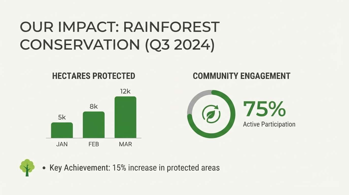
5) Rainforest Minimal
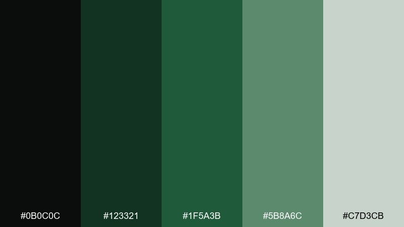
HEX: #0B0C0C #123321 #1F5A3B #5B8A6C #C7D3CB
Mood: grounded, minimal, organic
Best for: interior mood boards, eco product pages, pitch decks
Grounded rainforest greens feel like shaded leaves and wet stone. Use the darkest tones for headers and frames, then step through the mid-greens for sections and callouts. The soft gray-green works well as a background to reduce glare and keep focus on content. Tip: add texture with subtle paper grain or recycled-material photography to reinforce the eco vibe.
Image example of rainforest minimal generated using media.io
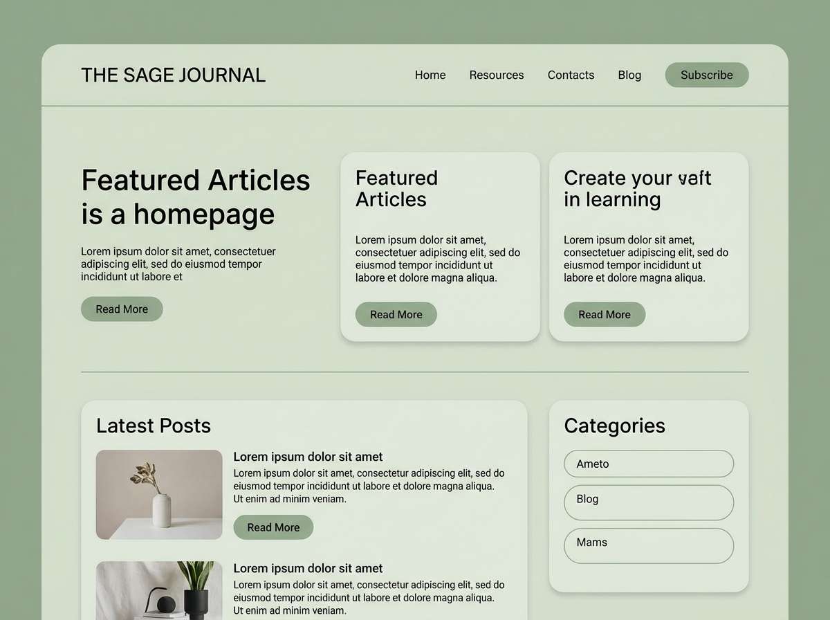
6) Sage Onyx
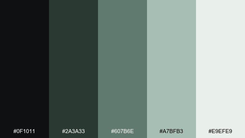
HEX: #0F1011 #2A3A33 #607B6E #A7BFB3 #E9EFE9
Mood: soft, mature, understated
Best for: lifestyle blogs, stationery, calm UI themes
Soft sage and onyx read like tailored fabric and quiet mornings. These black green color combinations shine in content-heavy layouts where you need gentle contrast without harsh edges. Pair with warm neutrals in photography and rounded sans-serif type for an approachable feel. Tip: use the light sage as your main surface color and save onyx for text and dividers.
Image example of sage onyx generated using media.io
7) Cyber Lime
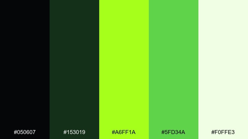
HEX: #050607 #153019 #A6FF1A #5FD34A #F0FFE3
Mood: bold, sporty, energetic
Best for: fitness ads, esports branding, event graphics
Bold lime hits like stadium lights cutting through smoke. Keep large areas dark to preserve legibility, then punch in lime for urgency and motion. Pair it with tight spacing, angular shapes, and crisp outlines for a performance feel. Tip: avoid using the brightest lime for long text blocks; keep it for numbers, highlights, and icons.
Image example of cyber lime generated using media.io

8) Botanical Noir
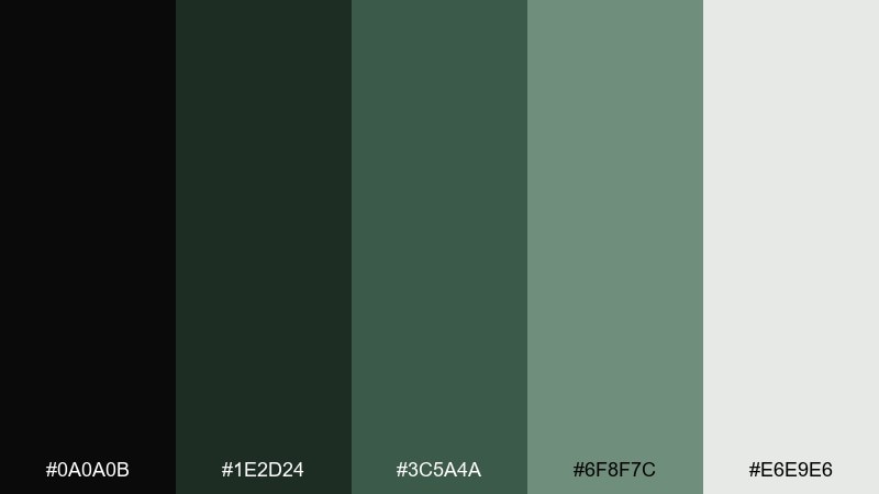
HEX: #0A0A0B #1E2D24 #3C5A4A #6F8F7C #E6E9E6
Mood: dramatic, editorial, earthy
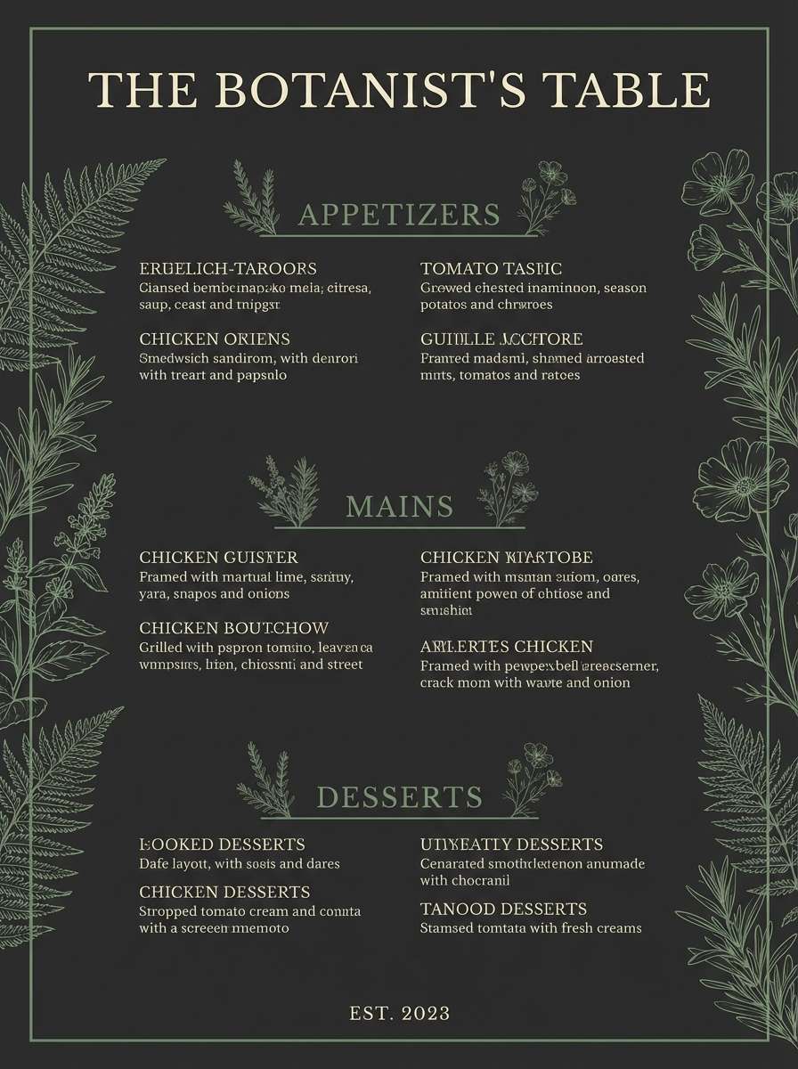
Best for: restaurant menus, wine labels, lookbooks
Dramatic botanical shades feel like pressed leaves on dark paper. Use noir tones for backgrounds and borders, then bring in dusty greens for typography and decorative motifs. It pairs nicely with serif headlines, foil details, or subtle botanical illustrations. Tip: keep one light neutral margin or panel so menus and layouts never feel too heavy.
Image example of botanical noir generated using media.io
9) Alpine Spruce
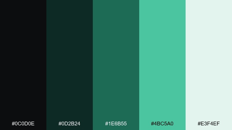
HEX: #0C0D0E #0D2B24 #1E6B55 #4BC5A0 #E3F4EF
Mood: crisp, outdoorsy, confident
Best for: travel websites, outdoor gear ads, maps
Crisp spruce and glacier-tinted greens suggest cold air and clean trails. A black green color combination like this works well for navigation-heavy pages, where deep tones anchor the UI and bright aqua-green marks routes or actions. Pair it with thin line icons and plenty of whitespace to keep it modern. Tip: use the aqua-green sparingly for hover states and key markers so it reads as a signal color.
Image example of alpine spruce generated using media.io
10) Mint Graphite
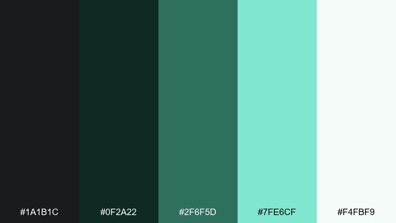
HEX: #1A1B1C #0F2A22 #2F6F5D #7FE6CF #F4FBF9
Mood: clean, modern, tech-forward
Best for: SaaS onboarding, data apps, UI kits
Clean mint against graphite feels like glassy interfaces and clear status feedback. Use graphite for typography and primary surfaces, then layer deep teal-green for panels and secondary buttons. Mint works best as a success cue, progress fill, or subtle glow behind key metrics. Tip: keep contrast strong by placing mint on graphite, not on mid-tone greens.
Image example of mint graphite generated using media.io
11) Emerald Velvet
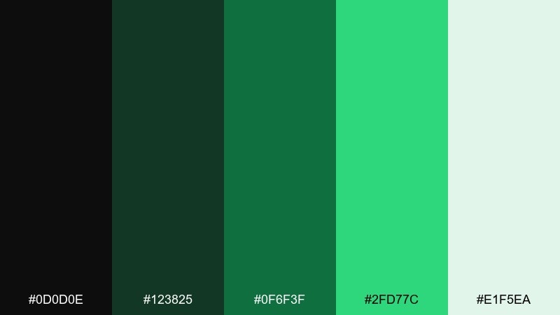
HEX: #0D0D0E #123825 #0F6F3F #2FD77C #E1F5EA
Mood: luxurious, bold, celebratory
Best for: premium product ads, nightlife posters, gift packaging
Velvety emeralds feel like spotlighted fabric and cocktail-bar glamour. Anchor layouts in near-black, then bring in rich emerald for headlines and brand marks. The bright green is best as a sparkle accent for badges, limited editions, or key offers. Tip: combine with soft gradients and plenty of breathing room to keep it upscale, not loud.
Image example of emerald velvet generated using media.io
12) Seaweed Stone
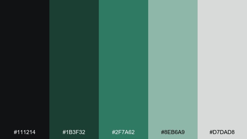
HEX: #111214 #1B3F32 #2F7A62 #8EB6A9 #D7DAD8
Mood: coastal, grounded, quiet
Best for: eco apps, sustainable packaging, editorial spreads
Coastal seaweed greens and stone neutrals feel like tide pools and driftwood. This black green color palette is a solid pick for brands that want nature cues without going overly bright. Pair it with kraft textures, muted photography, or minimalist illustration. Tip: use the stone gray as your main background and reserve the darkest shade for type and icons.
Image example of seaweed stone generated using media.io
13) Matcha Charcoal
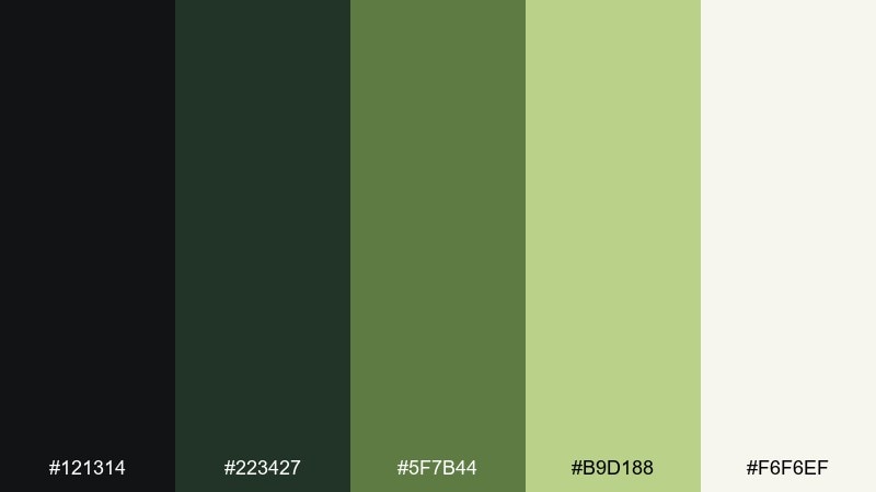
HEX: #121314 #223427 #5F7B44 #B9D188 #F6F6EF
Mood: cozy, earthy, friendly
Best for: cafe menus, recipe blogs, food packaging
Cozy matcha and charcoal tones evoke warm mugs and handmade ceramics. Use charcoal for text and borders, then let matcha and olive greens soften sections and highlights. It pairs well with off-white paper backgrounds and simple hand-drawn icons. Tip: keep greens slightly desaturated in large areas so food photography stays the hero.
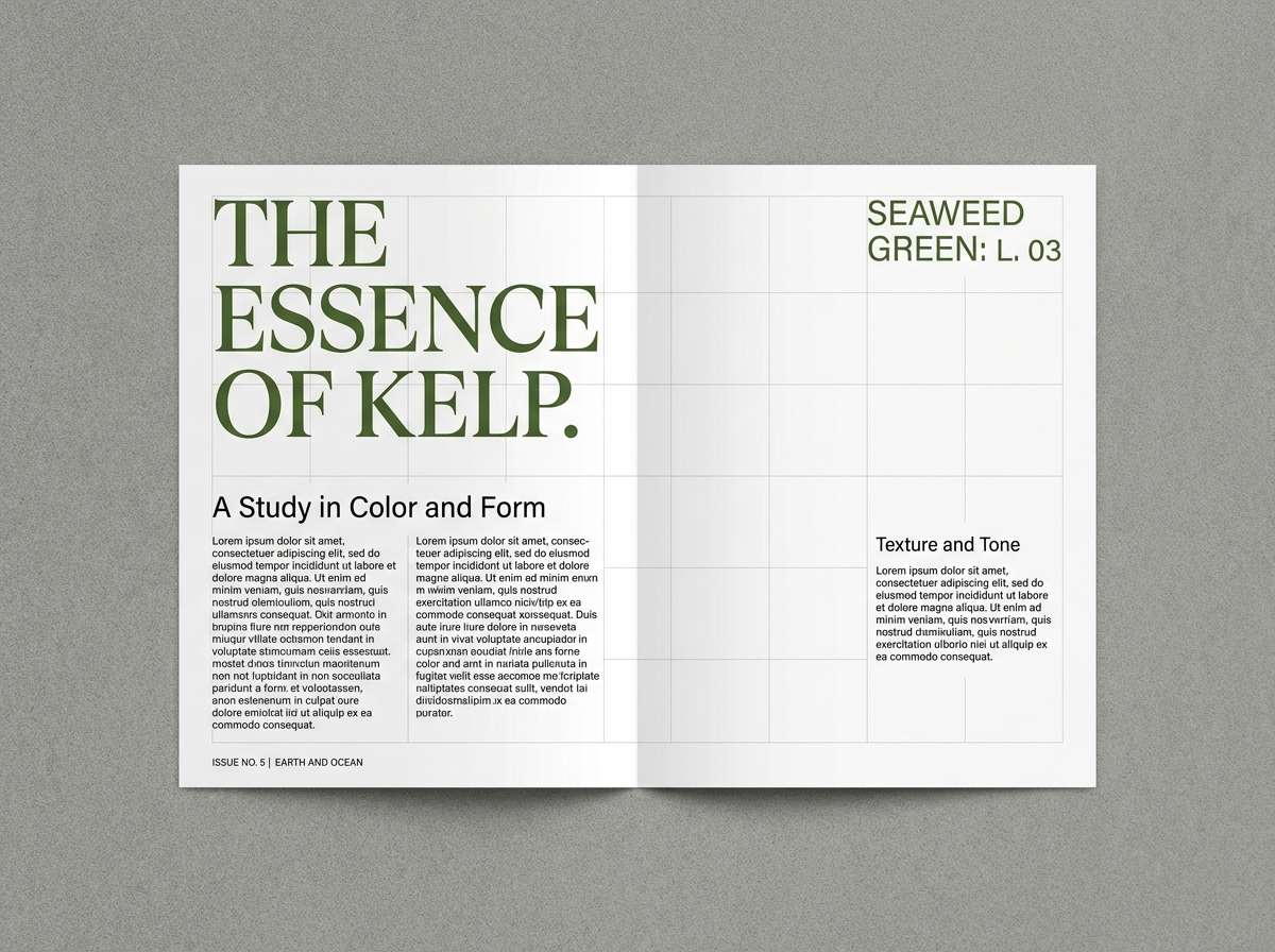
Image example of matcha charcoal generated using media.io
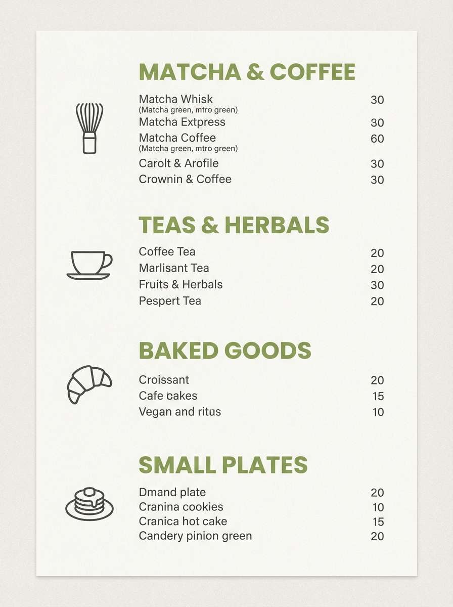
14) Olive Studio
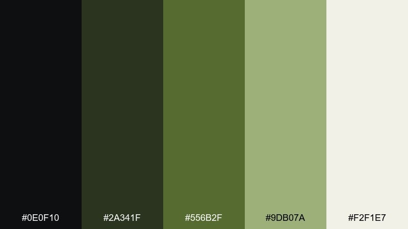
HEX: #0E0F10 #2A341F #556B2F #9DB07A #F2F1E7
Mood: vintage, creative, understated
Best for: brand mood boards, photography presets, studio websites
Vintage olives and soft neutrals feel like film grain and sun-faded canvas. Start with the dark tones for headers and navigation, then build a gentle ladder of olive shades for sections. Pair it with warm lighting in photos and slightly textured backgrounds for a handmade studio vibe. Tip: keep the light neutral as the dominant color to prevent olive from turning too heavy.
Image example of olive studio generated using media.io
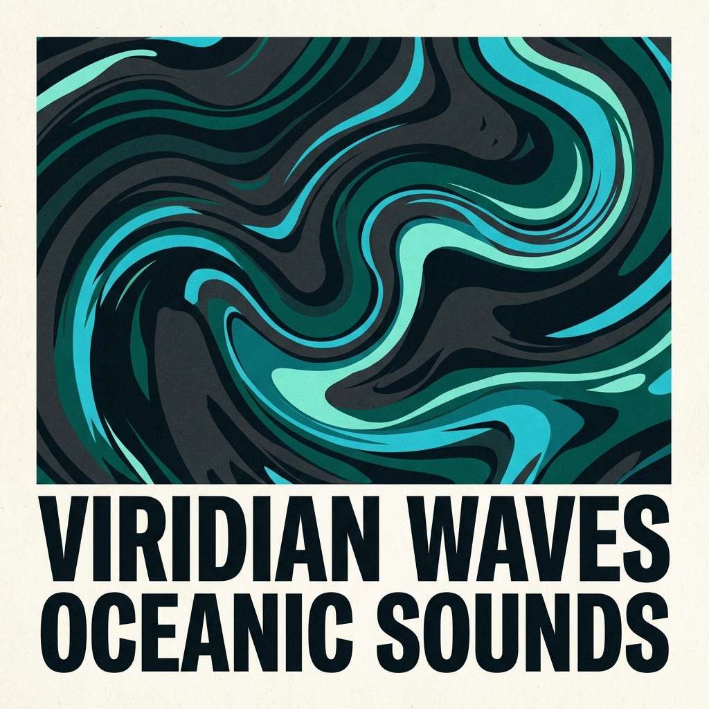
15) Viridian Dusk
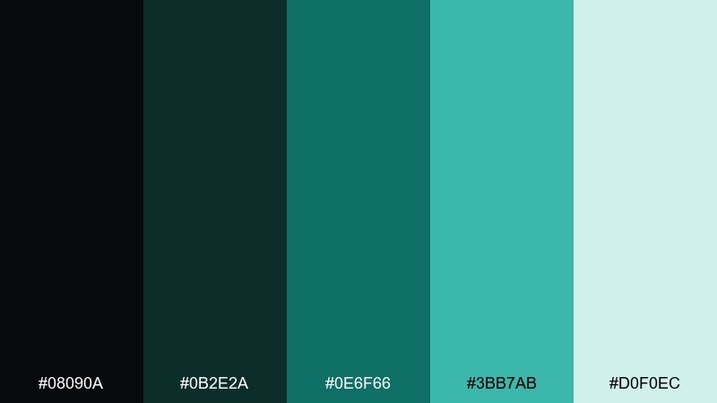
HEX: #08090A #0B2E2A #0E6F66 #3BB7AB #D0F0EC
Mood: mysterious, aquatic, modern
Best for: music covers, creative portfolios, nightlife branding
Mysterious viridian shades feel like deep water under city lights. Use the darkest tones for backgrounds and frames, then bring in teal-viridian for focal blocks and links. The pale aqua keeps typography crisp and helps create layered depth. Tip: add subtle gradients from dark to teal in hero areas to boost the dusk vibe without clutter.
Image example of viridian dusk generated using media.io
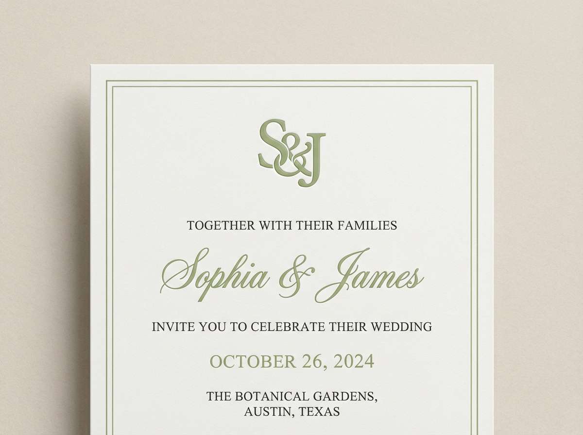
16) Pistachio Blacktie
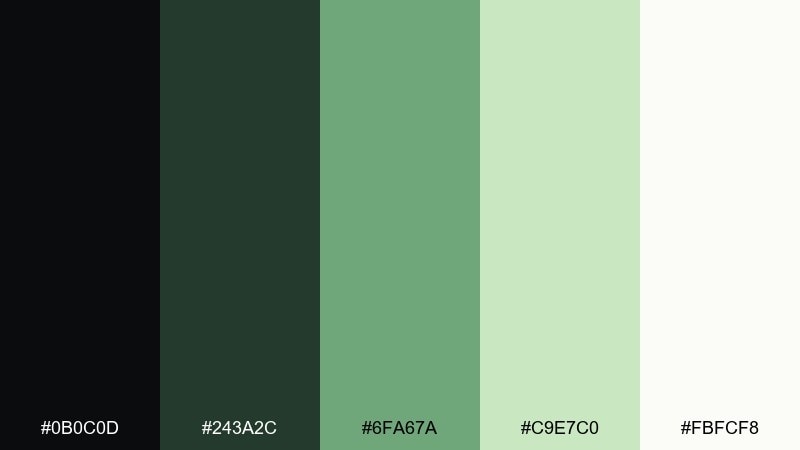
HEX: #0B0C0D #243A2C #6FA67A #C9E7C0 #FBFCF8
Mood: elegant, airy, celebratory
Best for: wedding invites, event branding, modern stationery
Elegant pistachio feels like fresh florals against formal blacktie details. Black green color combinations like these shine on stationery when you balance dark type with soft green fields and plenty of negative space. Pair it with thin serif headings and minimal monograms for a refined finish. Tip: print the darkest tone as text and use pistachio only in borders, crests, or subtle patterns.
Image example of pistachio blacktie generated using media.io
17) Deep Jungle Print
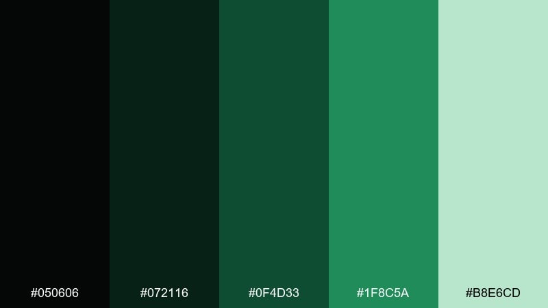
HEX: #050606 #072116 #0F4D33 #1F8C5A #B8E6CD
Mood: lush, adventurous, bold
Best for: botanical posters, apparel prints, festival graphics
Lush jungle greens feel like layered leaves and humid air. Use the near-black for outlines and typography, then let the mid and bright greens build a strong pattern rhythm. It pairs well with oversized botanical shapes and high-contrast type. Tip: keep the light mint as negative space within the pattern so the print stays readable from a distance.
Image example of deep jungle print generated using media.io
18) Glacier Green Night
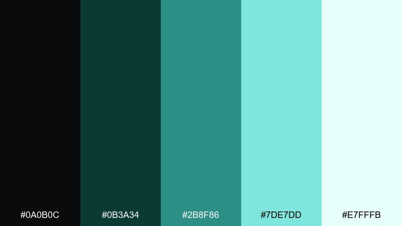
HEX: #0A0B0C #0B3A34 #2B8F86 #7DE7DD #E7FFFB
Mood: icy, futuristic, clean
Best for: security tools, analytics UI, sci-fi promos
Icy greens against night-dark tones suggest glass, steel, and cold clarity. Use the darkest shades for structure, then apply aqua highlights to graphs, alerts, and active states. Pair it with thin dividers and high-contrast typography for a sharp, reliable feel. Tip: keep the brightest aqua limited to one UI role, like success or active, to avoid confusion.
Image example of glacier green night generated using media.io
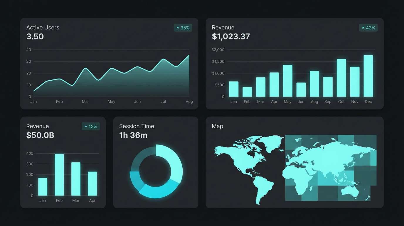
19) Bamboo Industrial
HEX: #141516 #1D3A2A #3A7A4A #9DDC9B #EEF5EE
Mood: practical, eco-tech, sturdy
Best for: hardware branding, sustainability reports, product one-pagers
Sturdy greens feel like bamboo fibers paired with industrial metal. Use the dark charcoal and deep green for credibility, then bring in brighter greens to highlight features and specs. It pairs well with simple diagrams, grids, and monochrome product photography. Tip: keep the lightest neutral as the main page background to maintain a clean, report-ready look.
Image example of bamboo industrial generated using media.io

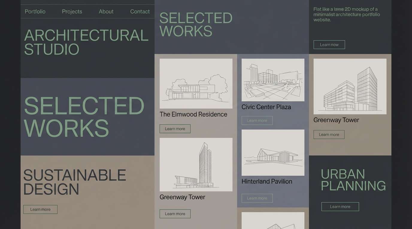
20) Cypress Smoke
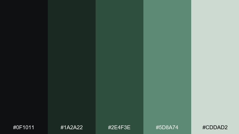
HEX: #0F1011 #1A2A22 #2E4F3E #5D8A74 #CDDAD2
Mood: quiet, refined, timeless
Best for: architect portfolios, minimalist brands, interior accents
Quiet cypress greens and smoky neutrals feel like concrete, wood, and soft shadows. Use the darkest tones for type and framing, with mid greens for subtle section breaks and UI states. Pair it with warm materials in imagery, like oak and linen, to keep it inviting. Tip: add one small high-contrast accent per page, like a single green link style, for consistent rhythm.
Image example of cypress smoke generated using media.io
What Colors Go Well with Black Green?
Neutrals are the easiest match: off-white, warm white, stone gray, and graphite help black green palettes stay readable and balanced. They’re especially useful for backgrounds, long-form text, and spacing.
For extra polish, add metallic accents (gold, brass, or silver) to push the look premium, or use wood/kraft-inspired beiges for an eco, tactile feel. If you want a modern pop, small doses of icy aqua or mint can brighten the palette without breaking the mood.
When you need contrast beyond green, try muted oranges or terracottas as a complementary accent—use sparingly for labels, badges, or highlights so the design still reads “black + green” first.
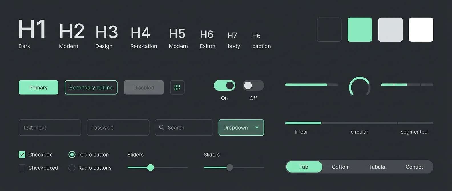
How to Use a Black Green Color Palette in Real Designs
Start by assigning roles: use black/charcoal for typography and main surfaces, mid-greens for sections and UI containers, and the brightest green for CTAs, active states, or key metrics. This keeps hierarchy clear and prevents “too much green” from flattening your layout.
For print (menus, packaging, invites), let a light neutral handle most of the page area and use greens as borders, headings, and motifs. For digital products, keep contrast high by placing bright greens on near-black rather than on mid-tone greens.
If the palette feels heavy, add breathing room: larger margins, thinner dividers, and lighter background panels. Black green designs tend to look best when the composition is simple and intentional.
Create Black Green Palette Visuals with AI
Want visuals that match your palette perfectly? Generate posters, UI mockups, packaging shots, or editorial layouts using the included prompts above, then tweak a few keywords (style, lighting, typography) to fit your brand.
In Media.io, you can iterate quickly: keep the same prompt structure and swap only the green tone (emerald, sage, neon lime) to explore multiple directions while staying consistent.
Once you find a look, reuse the prompt as a repeatable “visual recipe” for campaigns, social posts, landing pages, and product updates.
Black Green Color Palette FAQs
-
What does a black and green color palette communicate?
It typically signals strength and structure (black) paired with growth, nature, or “go/active” cues (green). Depending on the shade, it can feel eco-friendly and calm (sage/forest) or high-energy and techy (neon/lime). -
Is black and green a good combination for branding?
Yes—especially for brands that want a modern, grounded look with clear contrast. Use black/charcoal as the base for logos and typography, and reserve green for recognizable accents like icons, highlights, and CTAs. -
Which green works best with black: emerald, olive, or mint?
Emerald feels premium and bold, olive feels earthy and vintage, and mint feels clean and tech-forward. The “best” choice depends on your audience and where the color appears (UI states vs. large backgrounds vs. print). -
How do I keep black green designs from looking too dark?
Add a light neutral (off-white, stone, pale gray-green) for backgrounds and spacing. Limit saturated greens to small areas, and use clear hierarchy so the darkest tones don’t dominate every section. -
What accent colors pair well with black and green?
Off-whites and grays are safest for balance. For extra character, try gold/brass for a luxury feel, kraft beige for an organic look, or muted orange/terracotta for a complementary pop used sparingly. -
Are black green palettes good for UI and dashboards?
They’re excellent for dark mode because they offer strong contrast and natural “status” signaling (success, active, progress). Use the brightest green consistently for one main role (like primary actions) to avoid confusing users. -
How can I generate matching images for a black green palette?
Use Media.io Text-to-Image with a prompt that describes your layout/style and explicitly mentions dark charcoal/black bases plus the green tone you want (fern, jade, neon, mint). Then iterate by adjusting only one variable at a time (lighting, texture, typography).


