

Black purple palettes are the shortcut to instant mood—luxury, mystery, nightlife energy, or sleek dark-mode focus. They’re bold enough to feel premium, yet flexible enough to work across posters, packaging, and UI.
Below are 20+ curated black and purple palette ideas with HEX codes, plus image prompts you can use to generate matching visuals in seconds.
In this article
- Why Black Purple Palettes Work So Well
-
- midnight orchid
- velvet eclipse
- neon amethyst night
- gamer shadow glow
- blackberry gold dust
- moonlit lilac vows
- gothic plum ink
- ultraviolet conference
- astral minimal brand
- dark mode iris ui
- noir berry lipstick
- royal grape bistro
- cyber plum circuit
- ink and amethyst streetwear
- shadow lavender quote card
- synthwave vinyl
- quiet mauve night
- obsidian violet deck
- cosmic berry cosmetics
- arcane ui icons
- night gallery portfolio
- What Colors Go Well with Black Purple?
- How to Use a Black Purple Color Palette in Real Designs
- Create Black Purple Palette Visuals with AI
Why Black Purple Palettes Work So Well
Black brings instant contrast and structure, while purple adds emotion—ranging from romantic lavender to electric violet. Together, they create designs that feel intentional and high-impact without relying on busy graphics.
This pairing also scales beautifully across mediums: deep blacks hold space for typography, and purple can act as a subtle tint, a gradient bridge, or a standout accent for CTAs and highlights.
Most importantly, black and purple are adaptable. You can push them toward luxury with soft lilacs and gold, toward tech with mint or cyan, or toward nightlife with neon magenta and glow effects.
20+ Black Purple Color Palette Ideas (with HEX Codes)
1) Midnight Orchid
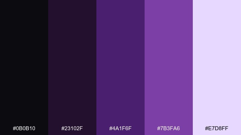
HEX: #0B0B10 #23102F #4A1F6F #7B3FA6 #E7D8FF
Mood: mysterious, luxe
Best for: beauty branding and dark hero headers
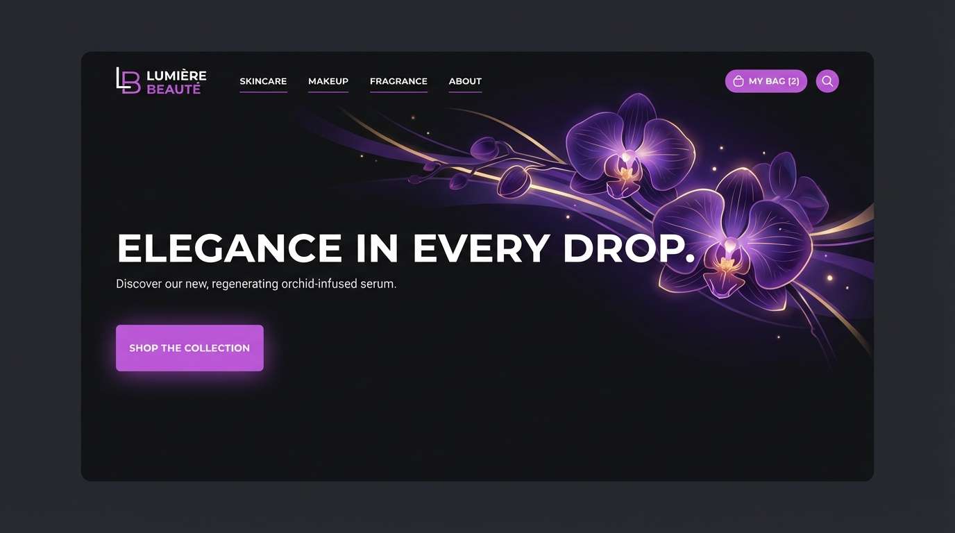
Moody and cinematic, these tones feel like velvet curtains and orchid petals under spotlights. Use it for premium beauty, fragrance, or boutique landing pages where contrast needs to feel intentional. Pair the pale lavender with plenty of black space to keep the look airy, not heavy. Usage tip: reserve the brightest tint for CTAs and highlights so the purple stays elegant.
Image example of midnight orchid generated using media.io
Media.io is an online AI studio for creating and editing video, image, and audio in your browser.

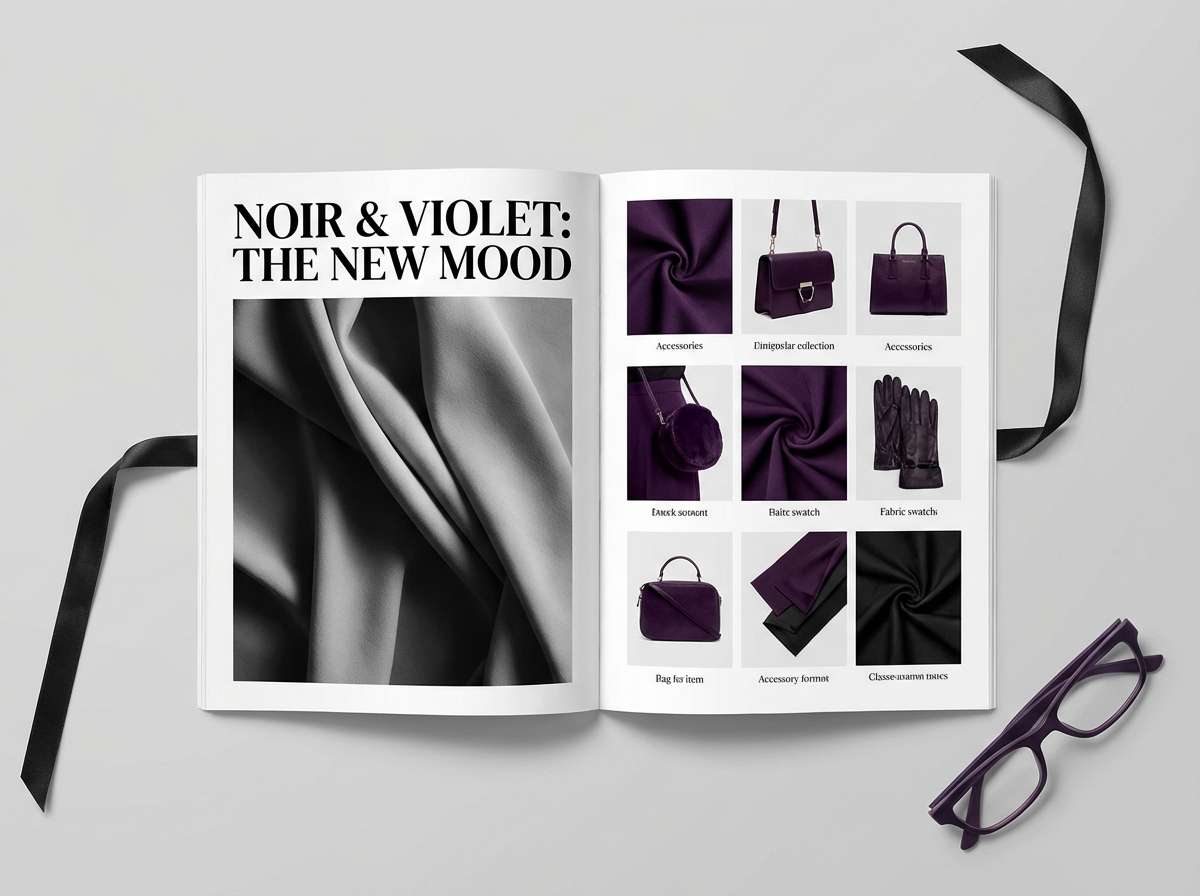
2) Velvet Eclipse
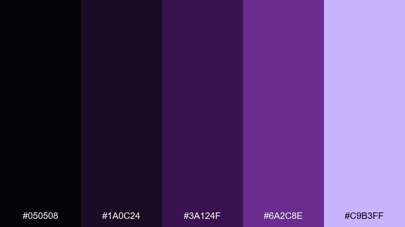
HEX: #050508 #1A0C24 #3A124F #6A2C8E #C9B3FF
Mood: dramatic, editorial
Best for: magazine layouts and fashion lookbooks
Dramatic and glossy, it evokes late-night editorials, studio shadows, and rich velvet fabric. The deep plum works beautifully for headlines, while the soft lilac keeps body text and captions readable. Pair with crisp white margins and minimal grids for a high-fashion feel. Usage tip: keep purple gradients subtle to avoid banding in print exports.
Image example of velvet eclipse generated using media.io
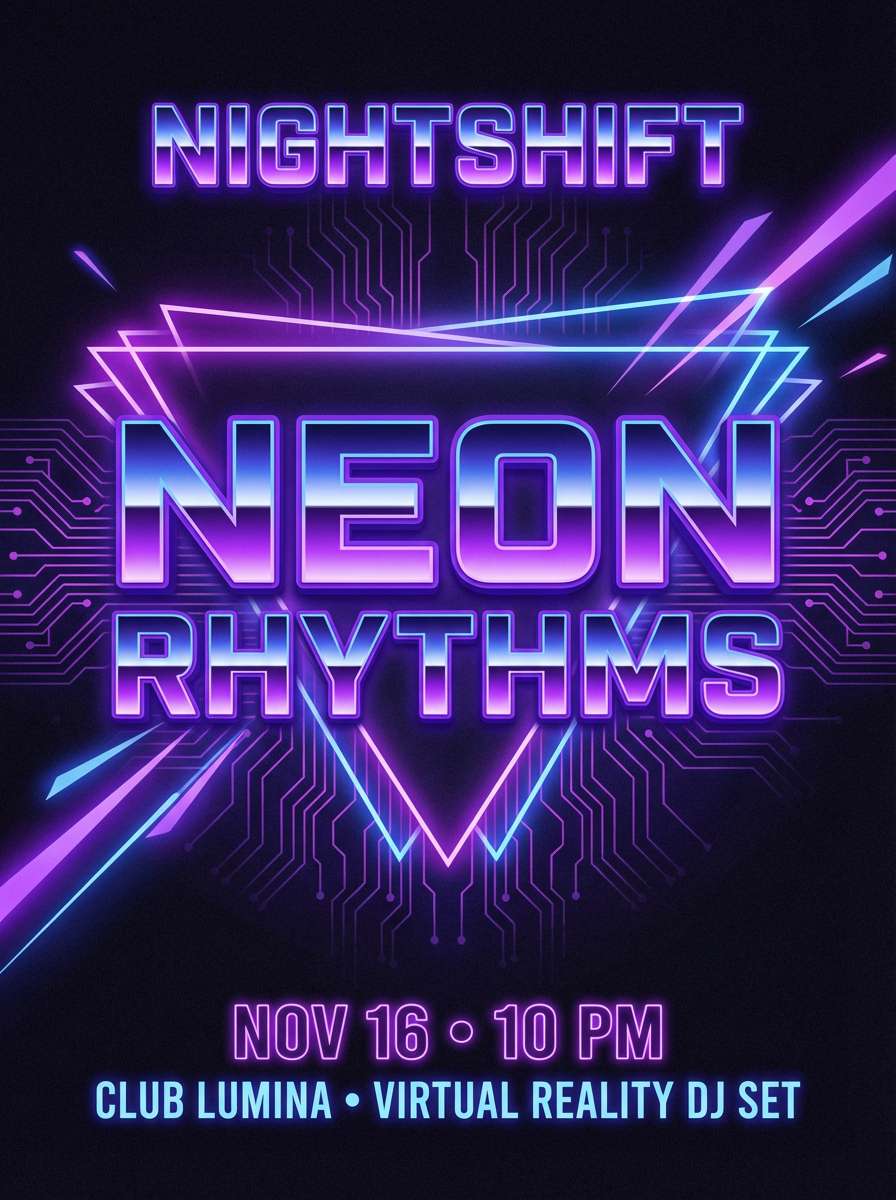
3) Neon Amethyst Night
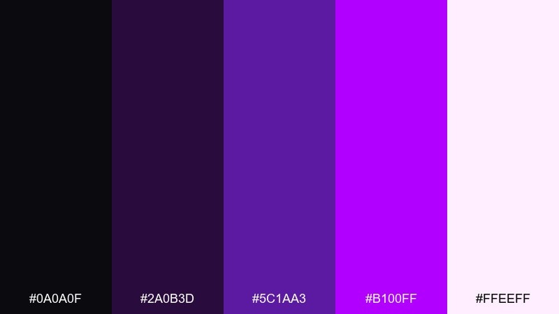
HEX: #0A0A0F #2A0B3D #5C1AA3 #B100FF #FFEEFF
Mood: electric, nightlife
Best for: club posters and event promos
Electric and restless, it feels like neon signage reflecting on wet pavement at midnight. This black purple color palette is ideal for club posters, DJ lineups, and bold social ads where glow effects sell the vibe. Pair the hot violet with clean sans-serif type and keep the off-white for dates and venue details. Usage tip: add a soft outer glow only to one accent element so the layout stays readable from afar.
Image example of neon amethyst night generated using media.io
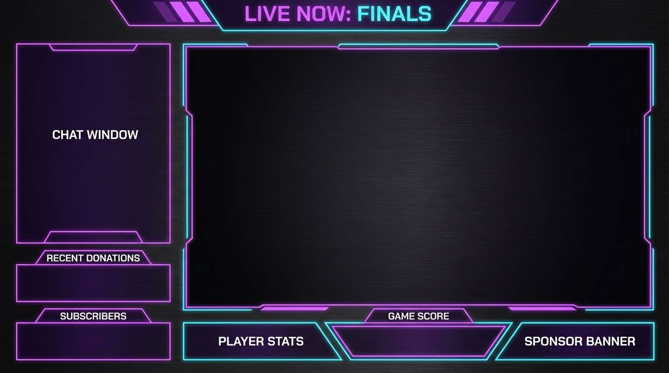
4) Gamer Shadow Glow
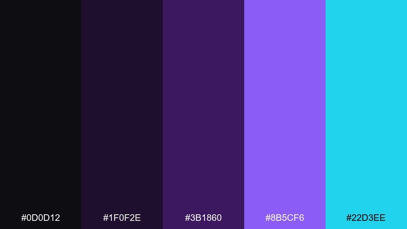
HEX: #0D0D12 #1F0F2E #3B1860 #8B5CF6 #22D3EE
Mood: energetic, futuristic
Best for: stream overlays and esports graphics
Energetic and futuristic, it brings to mind RGB lighting, holographic UI, and neon reflections. The cyan accent adds speed and clarity against the darker violets, perfect for stream overlays and alerts. Pair it with geometric shapes and thin strokes to keep the layout sharp. Usage tip: use cyan sparingly for status states (live, online, wins) so it stays impactful.
Image example of gamer shadow glow generated using media.io
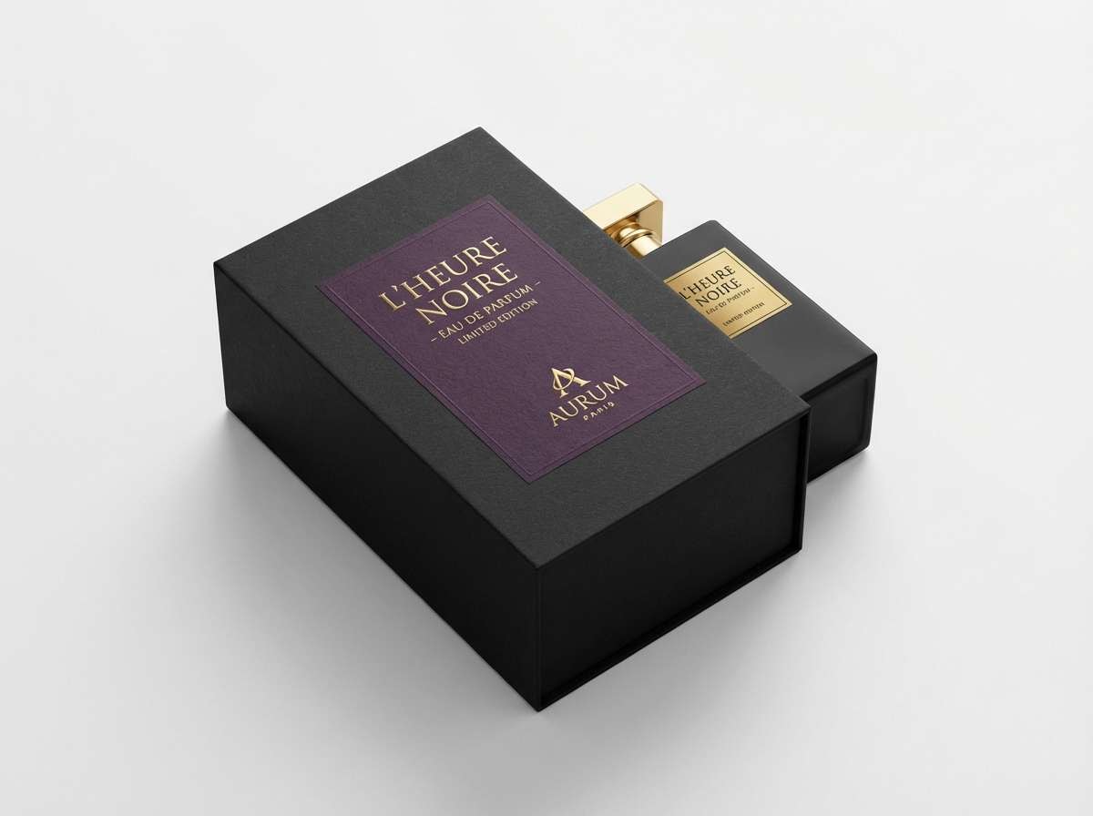
5) Blackberry Gold Dust
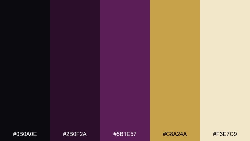
HEX: #0B0A0E #2B0F2A #5B1E57 #C8A24A #F3E7C9
Mood: opulent, warm
Best for: perfume ads and premium packaging
Opulent and warm, it suggests blackberry syrup, candlelight, and gold foil catching a subtle sparkle. These black purple color combinations shine on perfume ads, jewelry tags, and premium unboxing moments. Pair the gold with plenty of near-black to make metallic finishes feel expensive rather than loud. Usage tip: print-test the gold tone and consider spot-foil for the most believable luxury effect.
Image example of blackberry gold dust generated using media.io
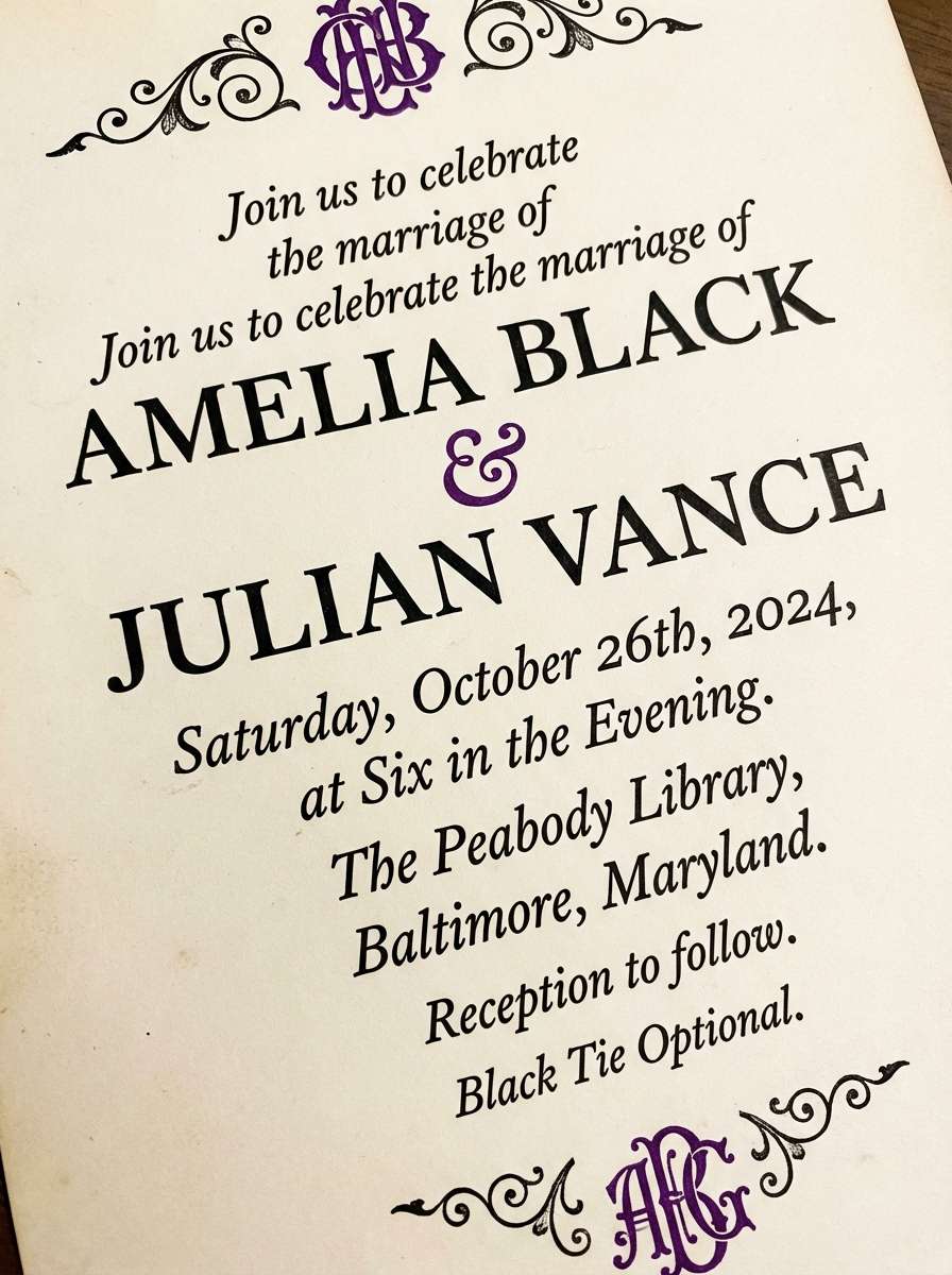
6) Moonlit Lilac Vows
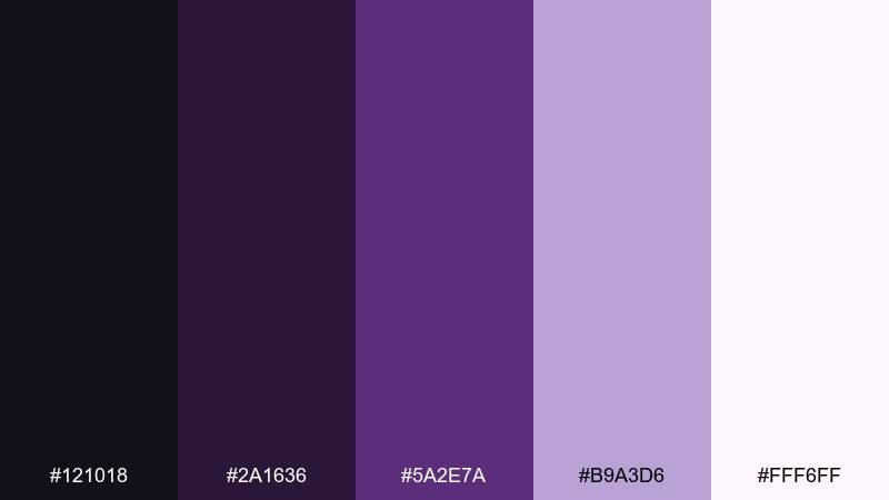
HEX: #121018 #2A1636 #5A2E7A #B9A3D6 #FFF6FF
Mood: romantic, nocturnal
Best for: wedding invitations and evening stationery
Romantic and nocturnal, it feels like lilacs under moonlight with soft ink on textured paper. The gentle lavender keeps the palette dreamy while the deeper violet grounds headings and monograms. Pair with serif typography and a touch of embossing for a refined, intimate look. Usage tip: keep the darkest shade for names and titles so small details don’t disappear in print.
Image example of moonlit lilac vows generated using media.io
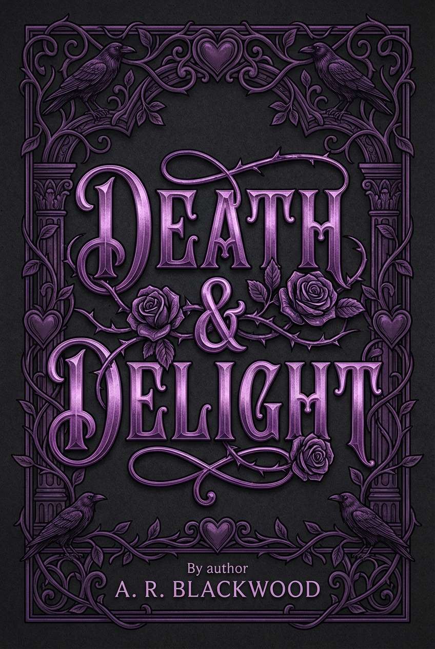
7) Gothic Plum Ink
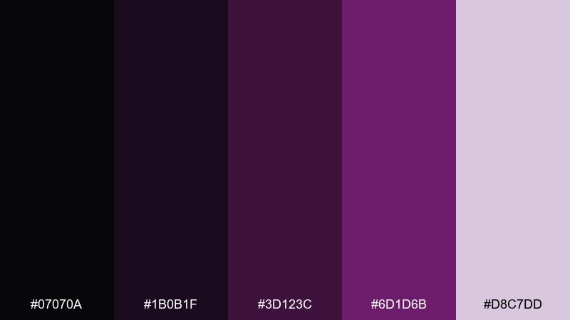
HEX: #07070A #1B0B1F #3D123C #6D1D6B #D8C7DD
Mood: gothic, literary
Best for: book covers and dark romance art
Gothic and literary, it recalls plum ink, antique bindings, and candlelit chapters. The dusty mauve adds softness so the design can feel romantic rather than harsh. Pair with subtle paper grain and minimal ornament to keep it modern. Usage tip: set the title in high-contrast light text and use purple only for flourishes and separators.
Image example of gothic plum ink generated using media.io
8) Ultraviolet Conference
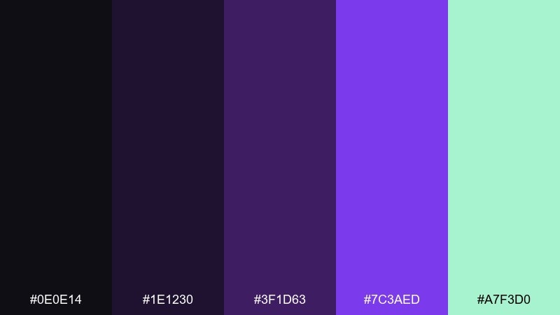
HEX: #0E0E14 #1E1230 #3F1D63 #7C3AED #A7F3D0
Mood: modern, confident
Best for: tech event flyers and keynote slides
Modern and confident, it feels like stage lighting on a dark auditorium with crisp type on screen. The minty accent adds a fresh tech edge that helps charts, icons, and badges stand out. Pair with clean sans fonts and spacious layouts to avoid visual clutter. Usage tip: keep accent usage consistent (one highlight color) across the whole deck for a cohesive system.
Image example of ultraviolet conference generated using media.io

9) Astral Minimal Brand
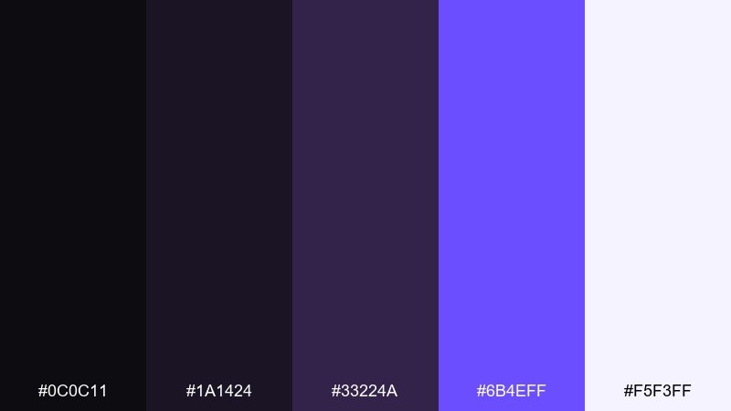
HEX: #0C0C11 #1A1424 #33224A #6B4EFF #F5F3FF
Mood: clean, cosmic
Best for: startup branding and logo systems
Clean and cosmic, it reads like starlight on a clear night—minimal, but quietly bold. The bright violet works well for a signature brand mark, while the off-white keeps interfaces and stationery feeling polished. Pair with thin line icons and plenty of whitespace for a modern identity kit. Usage tip: create a single violet gradient for hero moments, then stick to flat tints elsewhere.
Image example of astral minimal brand generated using media.io
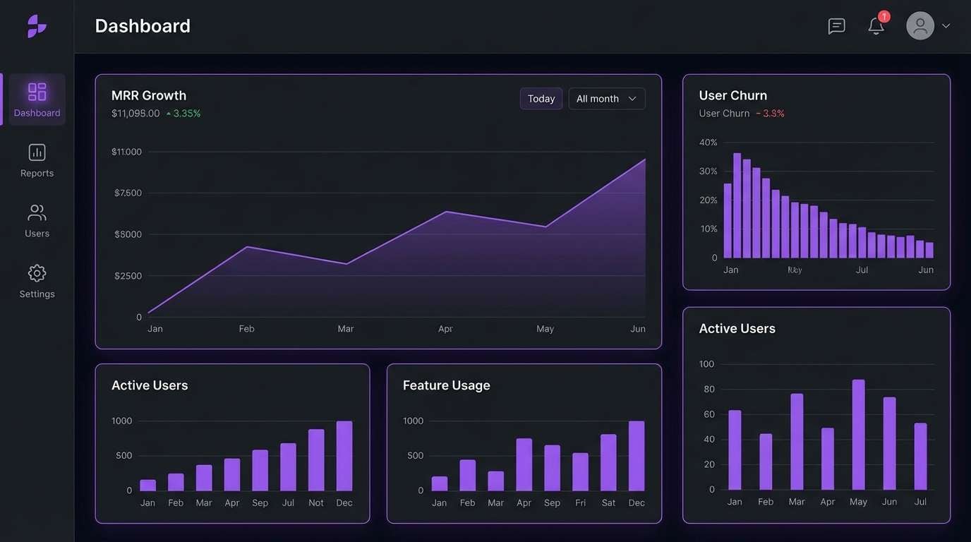
10) Dark Mode Iris UI
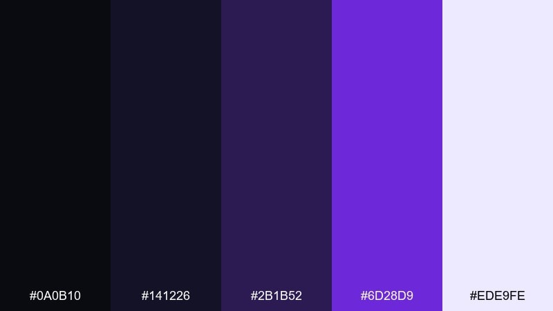
HEX: #0A0B10 #141226 #2B1B52 #6D28D9 #EDE9FE
Mood: sleek, focused
Best for: saas dashboards and dark mode apps
Sleek and focused, it feels like a dim control room where data glows just enough to stay readable. This black purple color palette works especially well for dashboards, analytics screens, and dark mode settings. Pair the light lavender with clear hierarchy—labels, values, then charts—so the interface stays calm. Usage tip: use the saturated purple for active states only, and keep everything else in muted tints.
Image example of dark mode iris ui generated using media.io
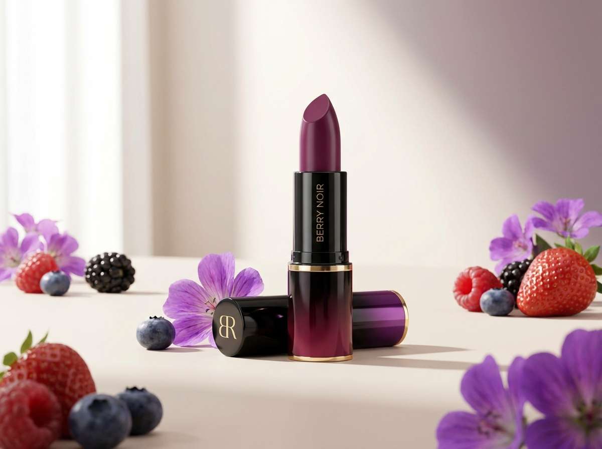
11) Noir Berry Lipstick
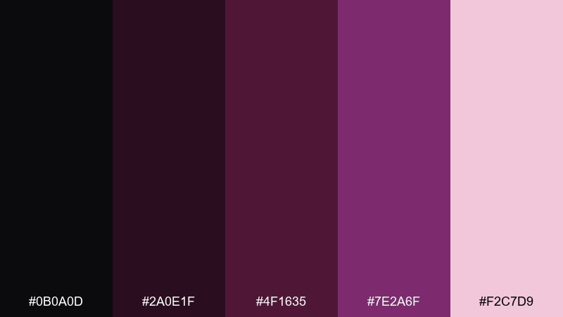
HEX: #0B0A0D #2A0E1F #4F1635 #7E2A6F #F2C7D9
Mood: sensual, chic
Best for: cosmetics launches and product pages
Sensual and chic, it brings up berry lipstick, soft-focus lighting, and sleek black compacts. The blush tint keeps the palette approachable, especially for product pages and email headers. Pair with glossy product photography and minimal copy for a premium look. Usage tip: keep text primarily in off-white or pale blush, and use the deeper berry only for emphasis.
Image example of noir berry lipstick generated using media.io
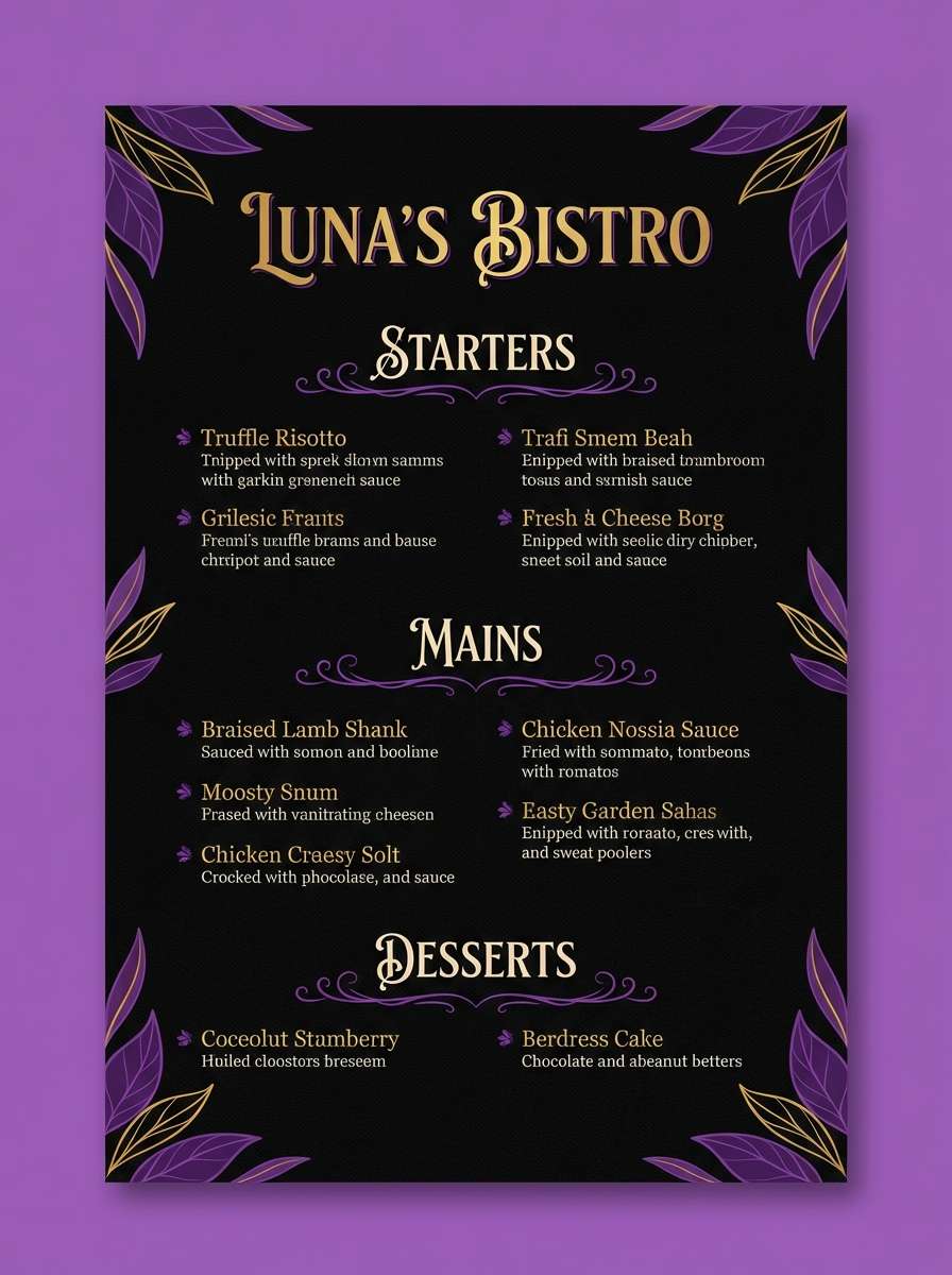
12) Royal Grape Bistro

HEX: #0D0B10 #1F1224 #3D1A43 #6E2E8A #E9D5FF
Mood: cozy, upscale
Best for: restaurant menus and wine bars
Cozy and upscale, it feels like a candlelit bistro with a glass of red and a violet velvet banquette. The lighter lavender helps menus stay readable while still feeling intimate. Pair with warm neutrals (cream paper, brass details) to soften the dark base. Usage tip: set section dividers in the mid purple so the layout guides the eye without shouting.
Image example of royal grape bistro generated using media.io
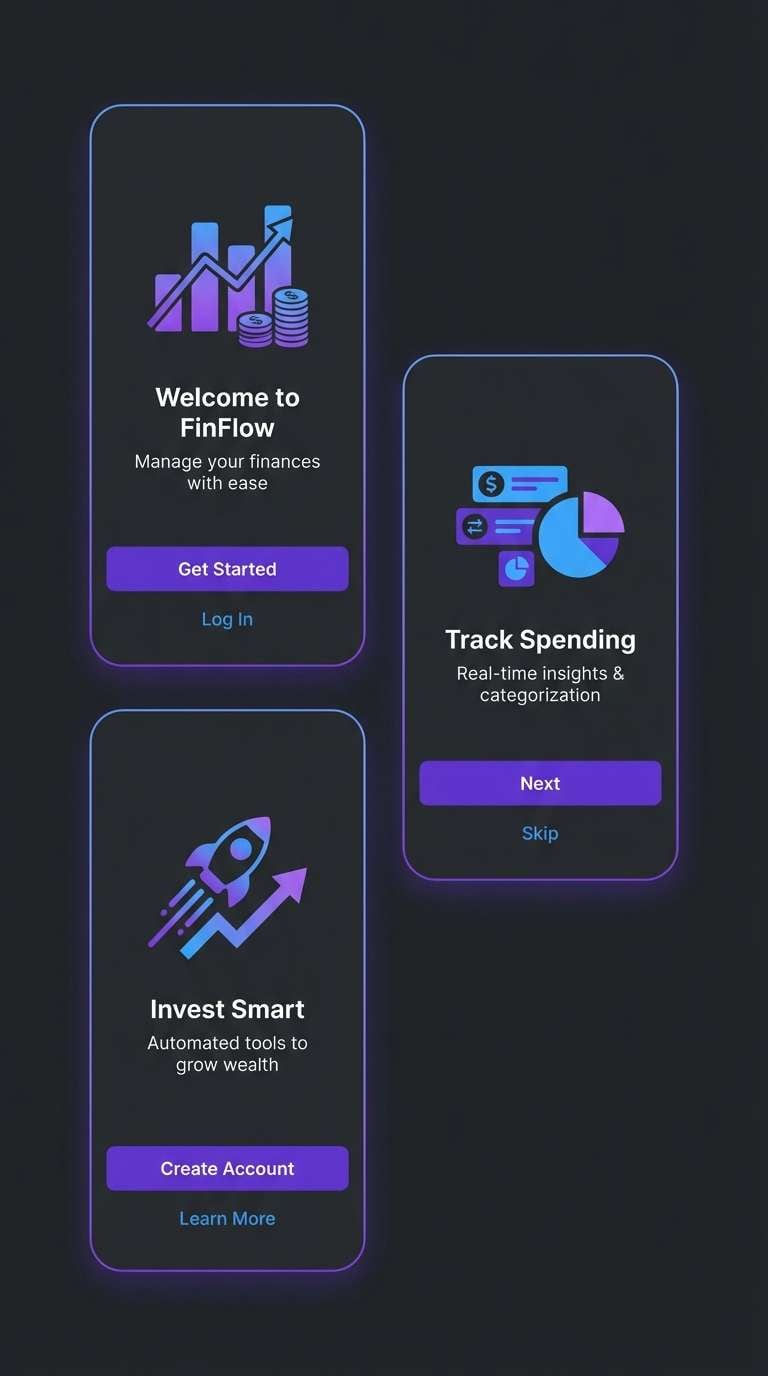
13) Cyber Plum Circuit
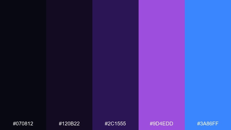
HEX: #070812 #120B22 #2C1555 #9D4EDD #3A86FF
Mood: techy, bold
Best for: app onboarding screens and fintech UI
Techy and bold, it looks like glowing circuitry on a dark board with a punch of electric blue. This black purple color scheme suits onboarding screens where you want contrast without going full neon. Pair it with simple illustrations and rounded UI components for a friendly edge. Usage tip: use blue as the secondary action color and keep purple for primary actions to avoid mixed signals.
Image example of cyber plum circuit generated using media.io
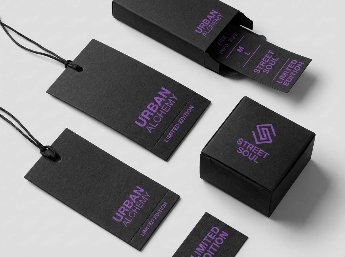
14) Ink and Amethyst Streetwear

HEX: #0B0B0F #17111F #2D1A3A #5B2A86 #F4F1FF
Mood: urban, minimal
Best for: streetwear tags and lookbook covers
Urban and minimal, it feels like ink-stamped labels and purple accents on matte fabric. The muted amethyst reads modern and wearable, making it great for hangtags, small logos, and lookbook typography. Pair with monochrome photography and a single bold type family to keep it clean. Usage tip: test the mid purple on textured stock so it doesn’t sink into the paper grain.
Image example of ink and amethyst streetwear generated using media.io
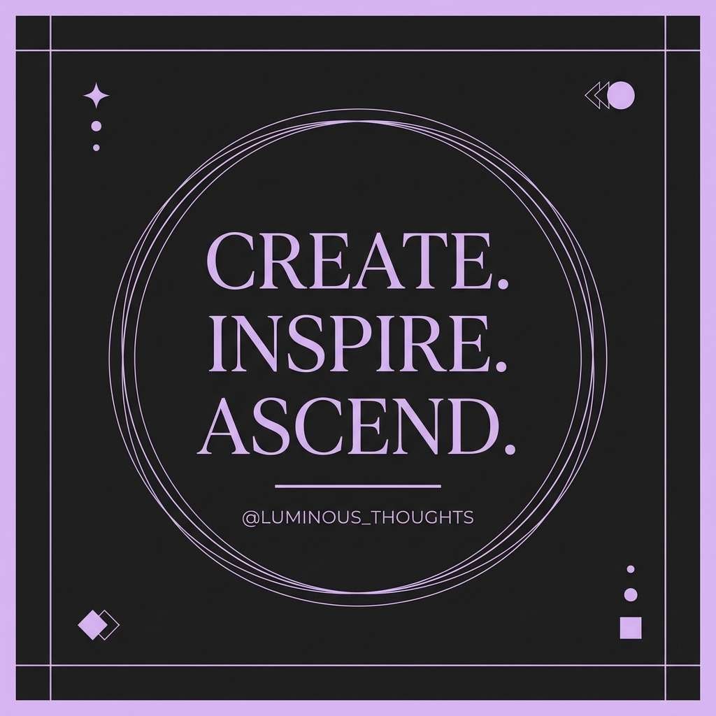
15) Shadow Lavender Quote Card

HEX: #0E0D12 #20162B #3A2452 #8E63CE #F7F2FF
Mood: soft, introspective
Best for: social media quotes and story templates
Soft and introspective, it reads like a late-night journal page with a lavender highlighter. These black purple color combination ideas work well for quote cards, announcements, and calm content that still needs contrast. Pair with subtle gradients and generous line spacing for an airy feel. Usage tip: keep the background nearly black and use the light tint for the quote to maximize readability on mobile.
Image example of shadow lavender quote card generated using media.io
16) Synthwave Vinyl
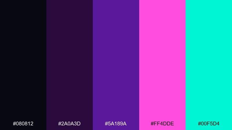
HEX: #080812 #2A0A3D #5A189A #FF4DDE #00F5D4
Mood: retro, punchy
Best for: album covers and music promo art
Retro and punchy, it channels synthwave lights, glossy vinyl sleeves, and neon gridlines. The hot magenta and aqua add instant energy, especially for music drops and tour announcements. Pair with bold display type and simple shapes so the colors do the talking. Usage tip: limit gradients to backgrounds and keep type in solid light tints for crisp legibility.
Image example of synthwave vinyl generated using media.io
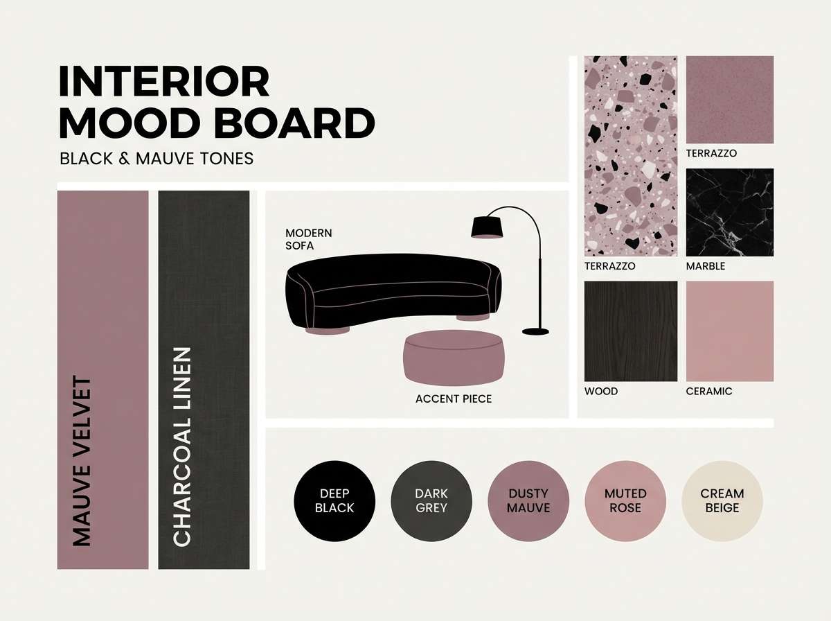
17) Quiet Mauve Night
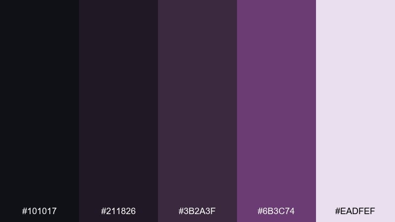
HEX: #101017 #211826 #3B2A3F #6B3C74 #EADFEF
Mood: calm, intimate
Best for: interior mood boards and boutique blogs
Calm and intimate, it feels like soft lamp light over mauve textiles and dark wood. The subdued purples are easy to live with, which makes them great for lifestyle blogs and interior mood boards. Pair with warm beige photography and minimal icons for a gentle, upscale tone. Usage tip: use the light tint for card backgrounds so long-form text doesn’t feel heavy.
Image example of quiet mauve night generated using media.io
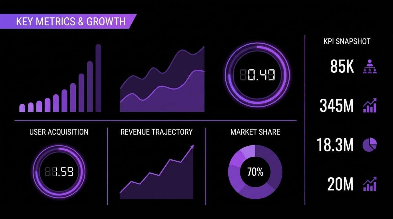
18) Obsidian Violet Deck
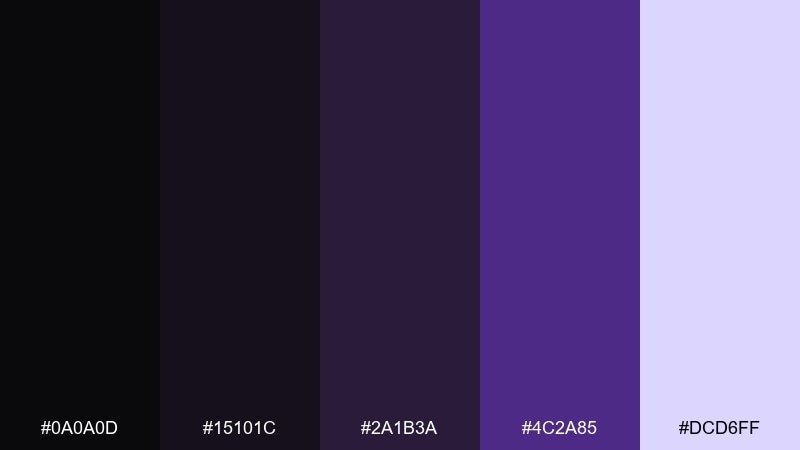
HEX: #0A0A0D #15101C #2A1B3A #4C2A85 #DCD6FF
Mood: professional, sleek
Best for: startup pitch decks and presentations
Professional and sleek, it resembles obsidian stone with a polished violet edge. The near-black makes charts and screenshots feel consistent, while the pale tint keeps slides readable in bright rooms. Pair with one accent shape style (lines or pills) to create a repeatable system. Usage tip: keep purple to headings and key numbers so the audience remembers the takeaways.
Image example of obsidian violet deck generated using media.io
19) Cosmic Berry Cosmetics
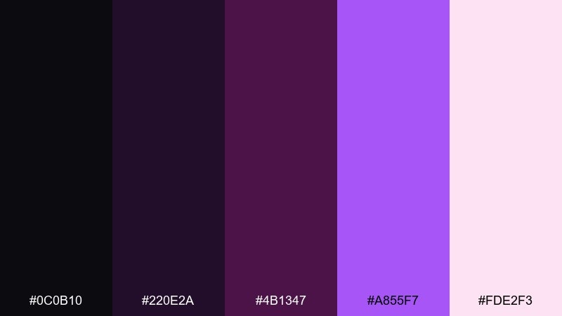
HEX: #0C0B10 #220E2A #4B1347 #A855F7 #FDE2F3
Mood: playful, glam
Best for: cosmetic packaging sets and launch ads
Playful and glam, it feels like cosmic shimmer with a berry gloss finish. These black purple color combinations are great for cosmetic sets where you want drama without losing softness. Pair with clean sans typography and glossy highlights to lean into the glam. Usage tip: keep the palest pink for background or negative space so product names stay easy to read.
Image example of cosmic berry cosmetics generated using media.io
20) Arcane UI Icons
HEX: #090A0F #1A1230 #2F1B63 #7C3AED #F8FAFC
Mood: mystical, sharp
Best for: game UI icon sets and HUD elements
Mystical and sharp, it suggests spellbooks, polished obsidian, and magical highlights. The bright violet is perfect for active states, rare items, or notifications in a HUD. Pair with simple icon geometry and consistent stroke widths so the color carries the drama. Usage tip: keep most icons in light gray-white and reserve violet for rarity tiers or power states.
Image example of arcane ui icons generated using media.io
21) Night Gallery Portfolio
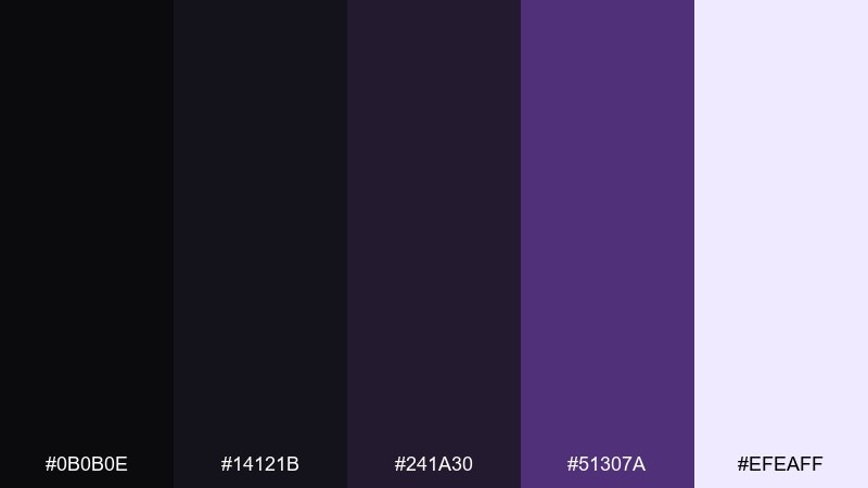
HEX: #0B0B0E #14121B #241A30 #51307A #EFEAFF
Mood: artful, understated
Best for: photography portfolios and gallery sites
Artful and understated, it feels like a quiet gallery room where the work gets the spotlight. The soft lavender-white keeps navigation and captions legible without pulling attention from images. Pair with neutral photo borders and restrained hover states for a refined experience. Usage tip: set the accent purple only on links and selected filters so the interface stays invisible.
Image example of night gallery portfolio generated using media.io
What Colors Go Well with Black Purple?
To keep black purple from feeling too heavy, add airy tints like lavender, lilac-white, or soft blush. These lighten typography areas and improve readability—especially in dark UI or poster layouts.
For a sharper, modern edge, pair purple-black with cool accents such as mint green, cyan, or electric blue. These hues create a “tech glow” effect and help interactive elements stand out.
For luxury branding, warm complements work best: gold, champagne, or creamy neutrals. Keep metallic tones minimal and let black carry most of the visual weight so the palette stays expensive, not busy.
How to Use a Black Purple Color Palette in Real Designs
Start with near-black as your foundation (backgrounds, large blocks, negative space), then use 1–2 purple steps for hierarchy (headlines, dividers, cards). Save the most saturated violet for moments that need attention, like active states or CTAs.
If you’re working in UI, choose purples with enough separation from black so components don’t blend together. Use the lightest tint for text and surfaces, and keep color usage consistent across states (default, hover, active).
For print, test dark purples and gradients early—deep violets can shift depending on paper and export settings. When in doubt, use flat tints for key elements and reserve gradients for large background areas.
Create Black Purple Palette Visuals with AI
If you want matching visuals for your black purple palette—posters, UI mockups, packaging shots, or social templates—AI generation is a fast way to explore variations without starting from scratch.
Use the prompts above as-is, then swap keywords like “luxury,” “nightclub,” “dashboard,” or “studio shot” to steer the vibe. You can also keep the same palette but change aspect ratios to fit stories, thumbnails, or banners.
Generate a few options, pick one hero direction, and reuse it across your campaign for a cohesive purple-black aesthetic.
Black Purple Color Palette FAQs
-
What does a black and purple color palette communicate?
Most often it signals luxury, mystery, and creativity. Dark bases feel premium and controlled, while purple adds emotion—ranging from romantic (lavender) to electric (neon violet). -
Is black purple a good choice for dark mode UI?
Yes—black paired with muted purples can create a sleek, focused dark mode. Use light lavender or off-white for text, and reserve saturated purple for active states (buttons, toggles, selected nav items). -
What accent colors work best with purple and black?
Cool accents like mint green, cyan, and electric blue add clarity and “tech energy.” For a warmer luxury feel, use gold/champagne or creamy neutrals as a restrained accent. -
How do I keep a black purple palette from looking too gothic?
Add airy tints (lilac-white, blush, pale lavender), increase whitespace, and use clean typography. Keeping ornaments minimal and using purple as a controlled accent helps the look stay modern. -
Which purple should I use for CTAs on a black background?
Choose a brighter, saturated violet (or a mint/cyan accent) with strong contrast against black. Keep the CTA color consistent across the page so users learn what’s clickable. -
Do black-to-purple gradients work well for posters and backgrounds?
They can look striking, especially for nightlife or futuristic styles. Use smooth, subtle gradients to avoid banding, and keep important text in solid light colors for legibility. -
Can I generate matching black purple visuals for my brand quickly?
Yes—use Media.io text-to-image with a clear prompt (design type, lighting/style, and aspect ratio). Generate multiple variations, then reuse the best direction as a consistent visual system.
Next: Mint Green Color Palette


