

Black and blue is a timeless pairing: black adds structure and depth, while blue brings clarity, energy, and trust. Together, they create sleek palettes that feel modern without looking trendy.
In UI, branding, and posters, black blue tones can shift from calm and corporate to cyberpunk and electric—simply by adjusting saturation and contrast.
In this article
Why Black Blue Palettes Work So Well
Black blue color combinations are naturally high-contrast, which makes hierarchy easy: dark bases create strong foundations, and blues draw attention to the most important elements.
Blue also carries strong psychological cues—trust, stability, and competence—while black signals sophistication and control. That blend works across industries, from fintech to fashion.
Finally, black and blue adapt well to both dark mode and print: you can go neon and punchy, or muted and corporate, while keeping a consistent, premium feel.
20+ Black Blue Color Palette Ideas (with HEX Codes)
1) Midnight Harbor
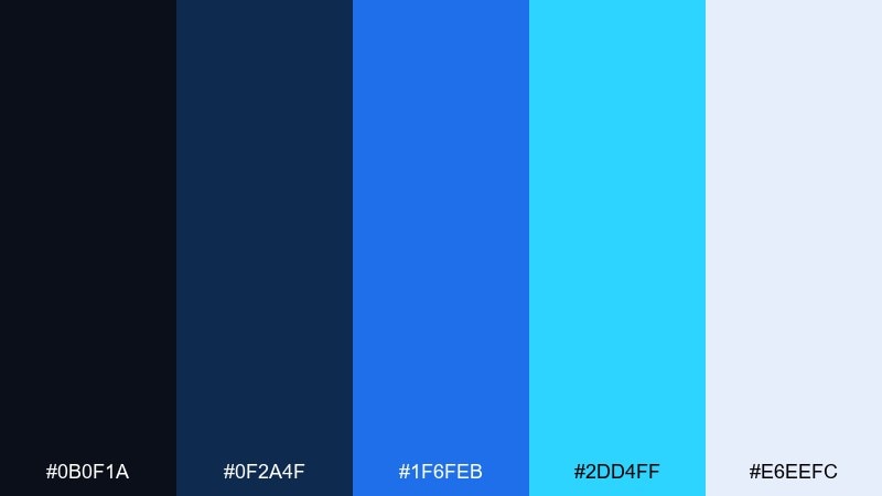
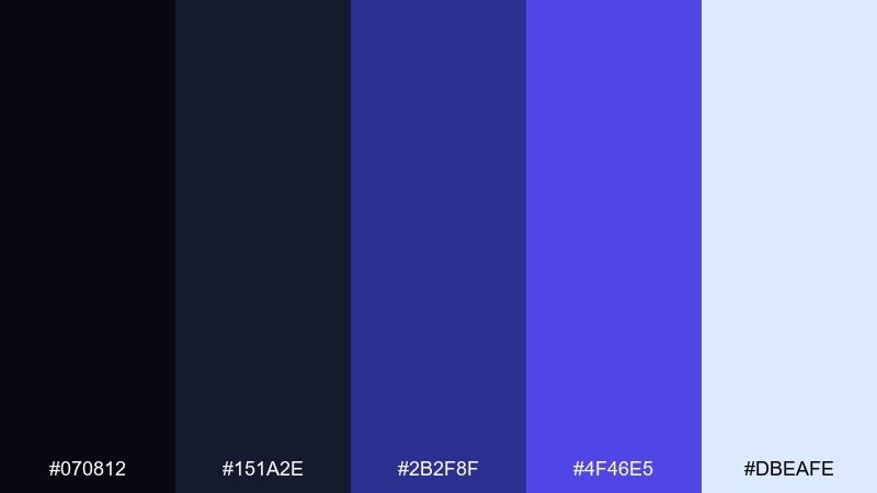
HEX: #0b0f1a #0f2a4f #1f6feb #2dd4ff #e6eefc
Mood: moody, crisp, nautical
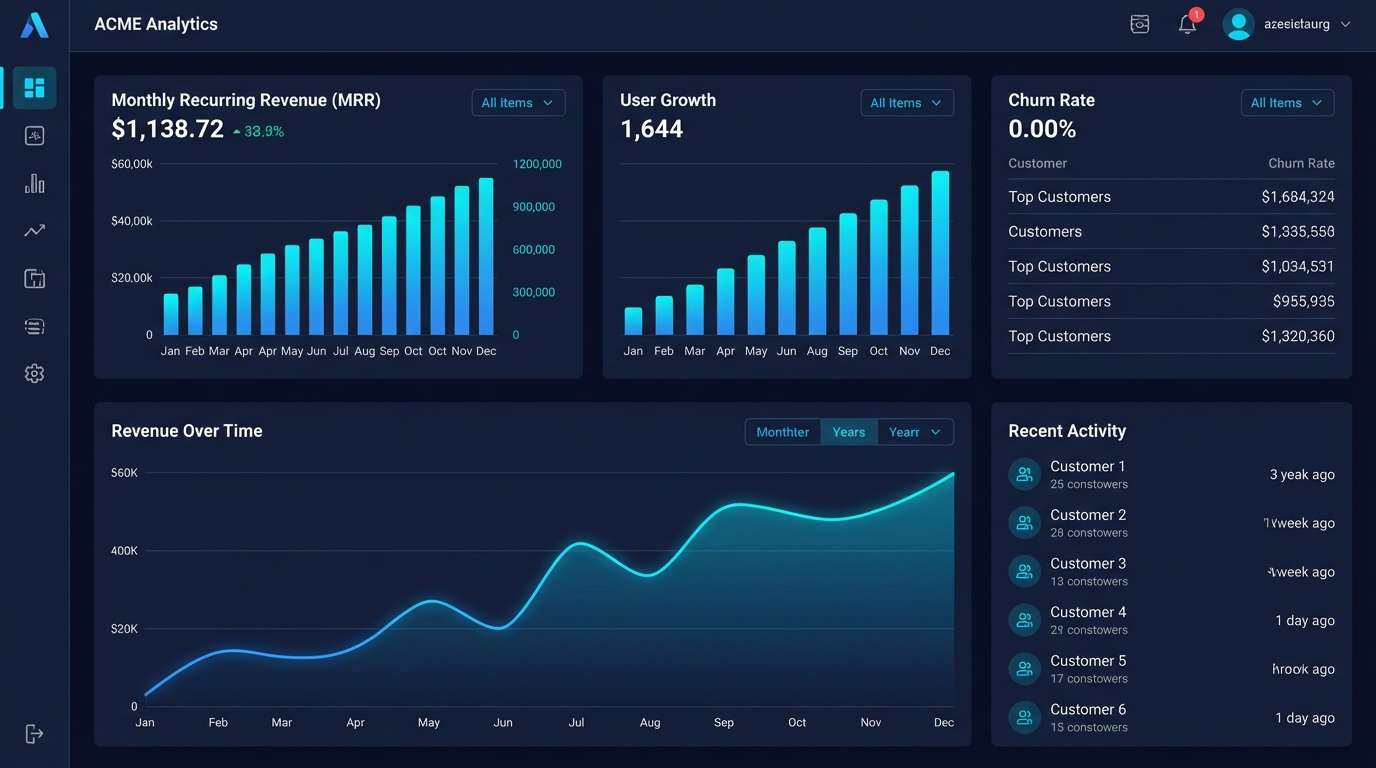
Best for: saas dashboard ui
Moody harbor-at-night vibes meet crisp, modern clarity. The inky base keeps layouts grounded while the bright blues highlight primary actions and key metrics. Pair with clean sans typography and subtle line icons for a sharp product feel. Usage tip: reserve the cyan for status highlights so it stays punchy.
Image example of midnight harbor generated using media.io
Media.io is an online AI studio for creating and editing video, image, and audio in your browser.

2) Neon Navy
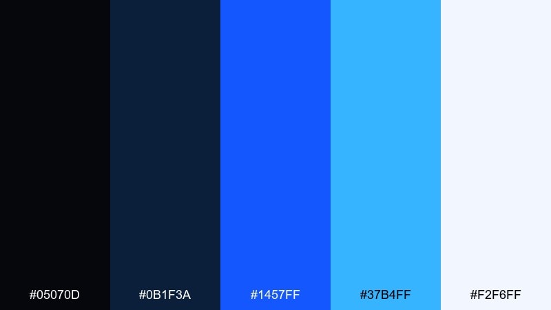
HEX: #05070d #0b1f3a #1457ff #37b4ff #f2f6ff
Mood: energetic, techy, high-contrast
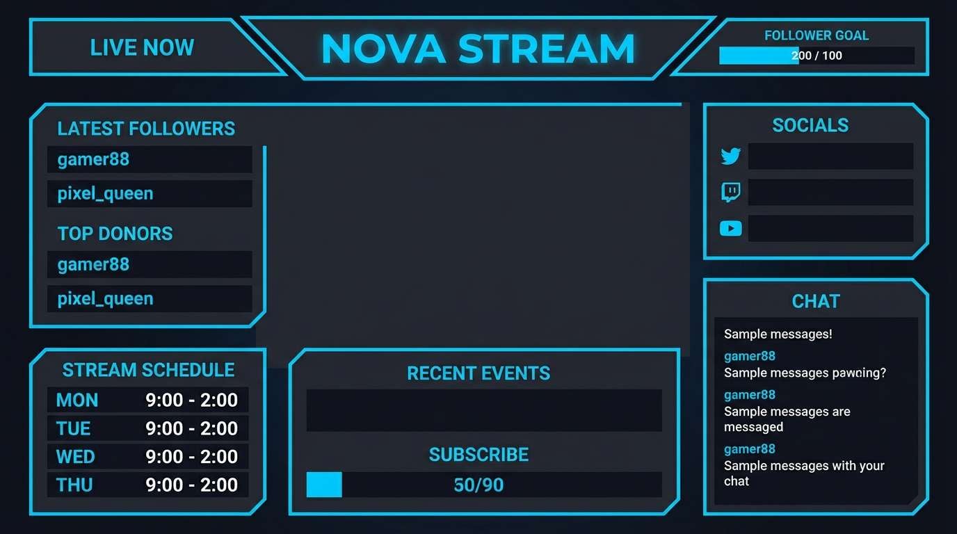
Best for: gaming streamer overlay
Energetic neon blues against deep navy feel like a late-night esports arena. These black blue color combination choices work best when you keep the background nearly black and let the electric hues frame key areas. Pair with condensed type and sharp geometric shapes for momentum. Usage tip: apply the brightest blue only to calls to action and badges to avoid glare.
Image example of neon navy generated using media.io
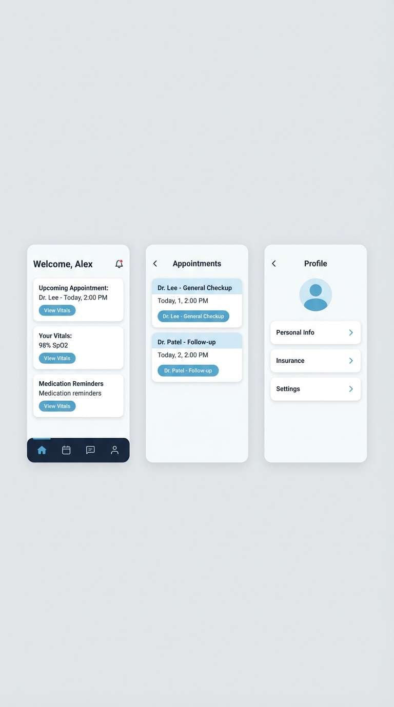
3) Arctic Ink
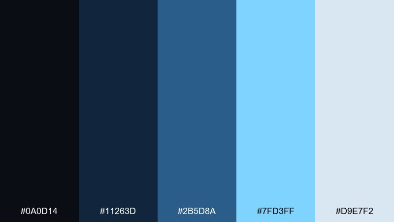
HEX: #0a0d14 #11263d #2b5d8a #7fd3ff #d9e7f2
Mood: cool, minimal, airy
Best for: healthcare app ui
Cool ink tones with an arctic lift create a calm, trustworthy feel. The pale blue-gray works well for cards and empty states, while the darker blues keep navigation readable. Pair with rounded UI components and generous spacing for a friendly clinical look. Usage tip: use the lightest shade as your default surface to reduce eye fatigue.
Image example of arctic ink generated using media.io
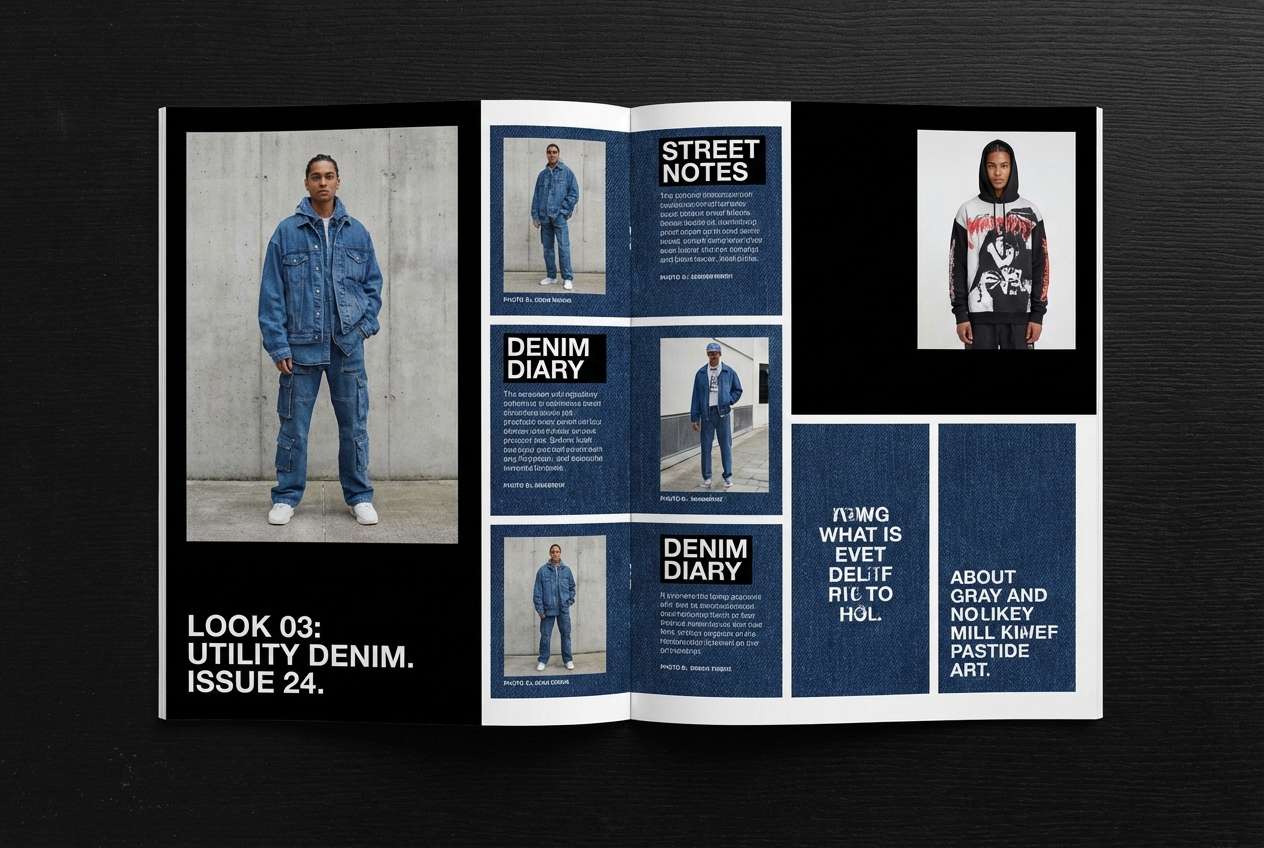
4) Denim Eclipse
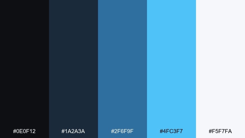
HEX: #0e0f12 #1a2a3a #2f6f9f #4fc3f7 #f5f7fa
Mood: urban, friendly, modern
Best for: streetwear lookbook
Urban denim blues fading into an eclipse-dark base feel effortless and wearable. This black blue color palette is great for lookbooks where photography needs a strong but not harsh frame. Pair with off-white text blocks and minimal grids to keep pages airy. Usage tip: treat the mid denim tone as your dominant brand color and the bright blue as a seasonal accent.
Image example of denim eclipse generated using media.io
5) Cobalt Circuit
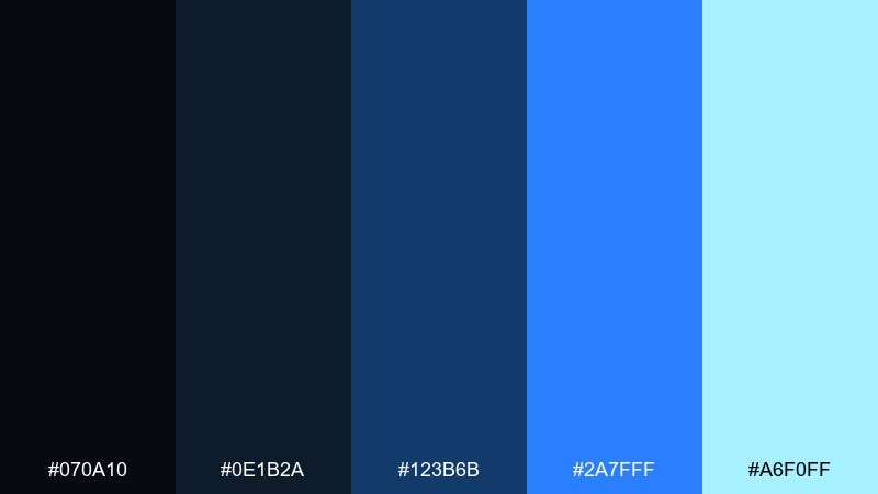
HEX: #070a10 #0e1b2a #123b6b #2a7fff #a6f0ff
Mood: futuristic, precise, bold
Best for: fintech landing page
Futuristic cobalt lines over a near-black base evoke circuitry and speed. The saturated blue reads confidently for buttons, charts, and hero headlines. Pair with subtle gradients and thin strokes to keep it premium rather than loud. Usage tip: add plenty of negative space so the cobalt does not overpower body text.
Image example of cobalt circuit generated using media.io

6) Sapphire Smoke
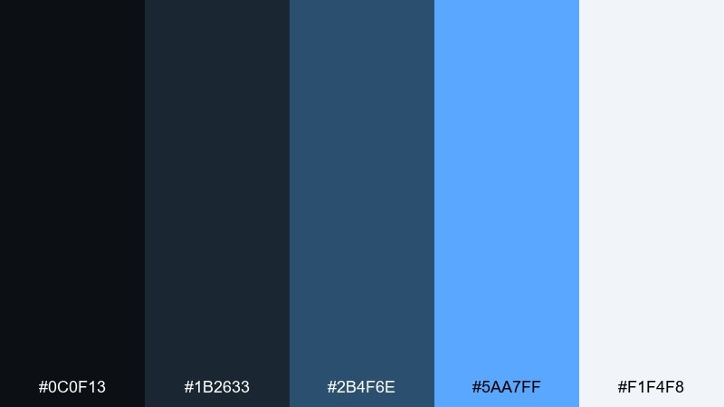
HEX: #0c0f13 #1b2633 #2b4f6e #5aa7ff #f1f4f8
Mood: soft, polished, corporate
Best for: b2b pitch deck
Smoky charcoals and sapphire blues feel polished and executive. The muted mid-tones keep slides readable, while the brighter blue works as a consistent highlight for key numbers. Pair with grayscale photography and simple infographics for a confident narrative. Usage tip: keep headers in the brightest blue and body text in near-white for quick scanning.
Image example of sapphire smoke generated using media.io
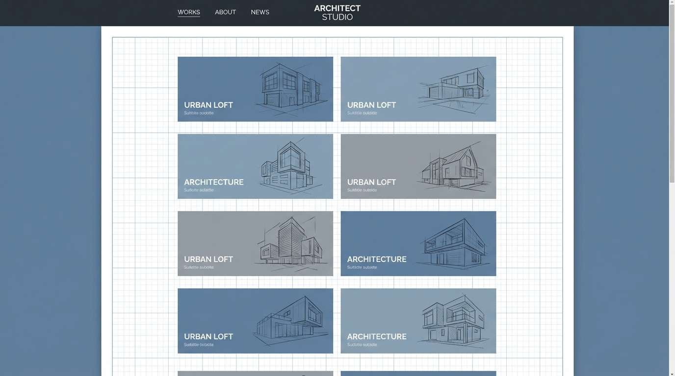
7) Blueprint Noir
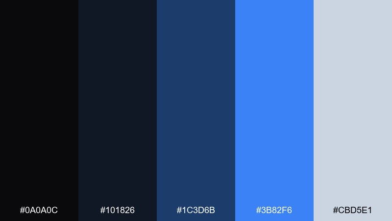
HEX: #0a0a0c #101826 #1c3d6b #3b82f6 #cbd5e1
Mood: structured, industrial, confident
Best for: architecture portfolio
Structured blueprint blues over noir shadows feel technical and intentional. The gray-blue makes an excellent grid and caption color without competing with images. Pair with thin rules, monochrome drawings, and plenty of whitespace for a gallery-like rhythm. Usage tip: use the deepest black for full-bleed dividers to separate projects cleanly.
Image example of blueprint noir generated using media.io
8) Ocean Ledger
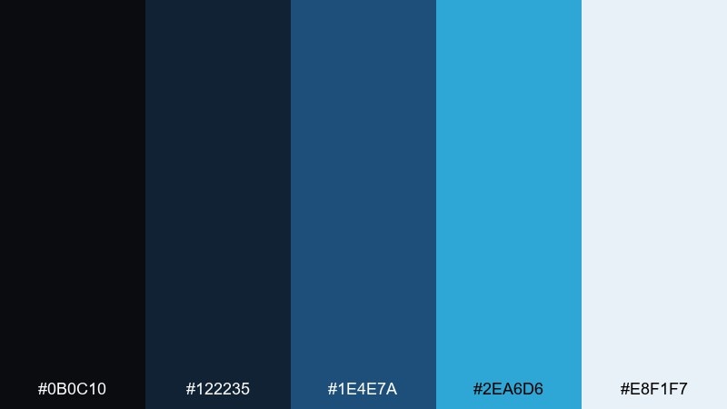
HEX: #0b0c10 #122235 #1e4e7a #2ea6d6 #e8f1f7
Mood: clean, reliable, fresh
Best for: accounting app ui
Clean ocean blues with ledger-like depth signal clarity and order. These black blue color combinations are ideal for tables, filters, and dashboards where hierarchy matters. Pair with light surfaces for content areas and use the darker shades only for navigation and totals. Usage tip: keep the teal-blue for positive states and confirmations to build intuitive meaning.
Image example of ocean ledger generated using media.io
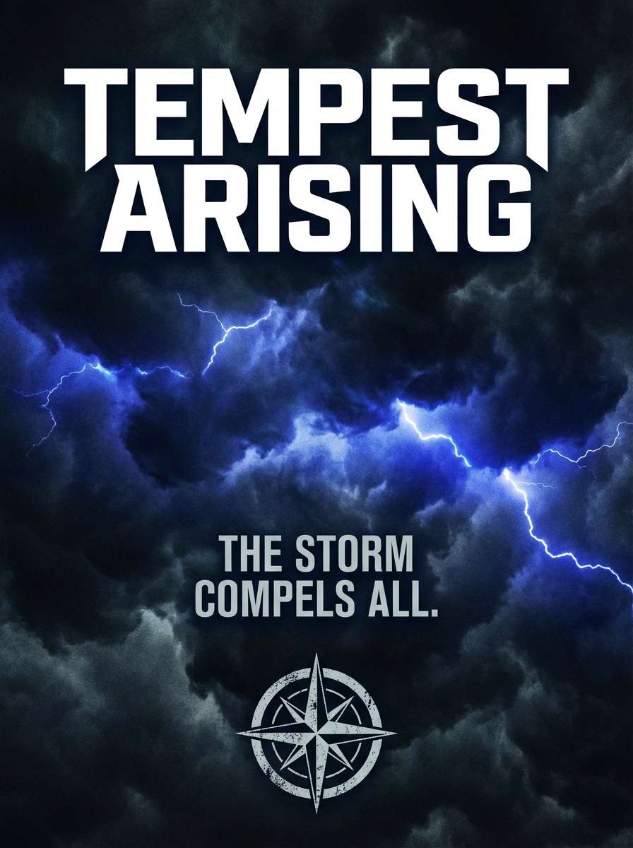
9) Stormy Ultramarine
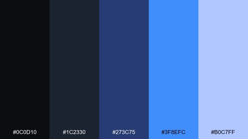
HEX: #0c0d10 #1c2330 #273c75 #3f8efc #b0c7ff
Mood: dramatic, cinematic, bold
Best for: movie poster design
Storm clouds and ultramarine lightning make the mood instantly cinematic. The deep neutrals hold heavy type well, while the bright blue creates a spotlight effect for titles. Pair with grain textures and high-contrast imagery for drama. Usage tip: add a subtle blue glow behind the main headline to boost legibility.
Image example of stormy ultramarine generated using media.io
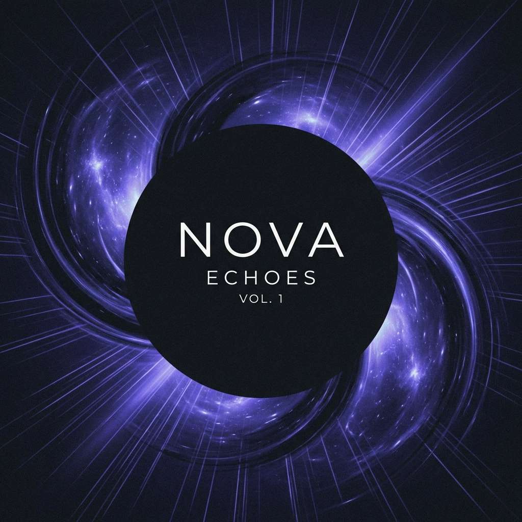
10) Celestial Deep
HEX: #070812 #151a2e #2b2f8f #4f46e5 #dbeafe
Mood: mystical, premium, night-sky
Best for: music album cover
Celestial indigo and deep space shadows feel dreamy and premium. The violet-blue adds a cosmic twist that works beautifully with minimalist symbols and abstract shapes. Pair with silver-white typography and subtle star-like speckles for texture. Usage tip: keep artwork centered and let the darkest tone create a soft vignette.
Image example of celestial deep generated using media.io
11) Glacier Shadow
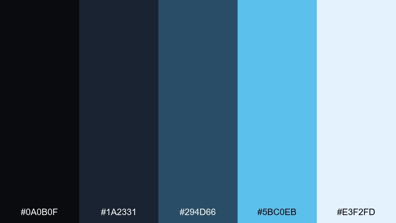
HEX: #0a0b0f #1a2331 #294d66 #5bc0eb #e3f2fd
Mood: refreshing, calm, modern
Best for: wellness brand packaging
Glacier blues with shadowed depth feel refreshing and clean. The darker tones add sophistication, while the icy highlight reads as pure and breathable on packaging. Pair with matte finishes and minimal labeling for a spa-like shelf presence. Usage tip: use the pale blue as the main label background and keep black text small but crisp.
Image example of glacier shadow generated using media.io
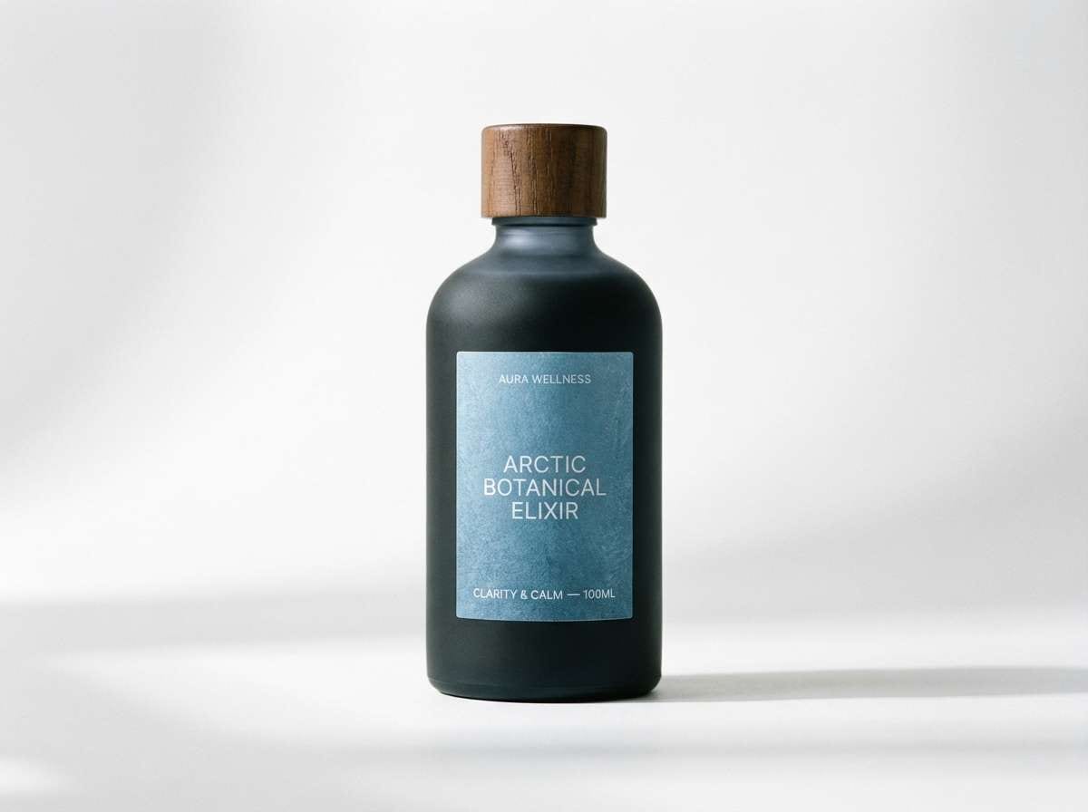
12) Indigo Carbon
HEX: #090a0c #1a1f2b #2d3a5a #3d74ff #e0e7ff
Mood: sleek, technical, understated
Best for: developer documentation site
Carbon blacks with indigo highlights feel quietly technical, like a well-tuned editor theme. This mix supports long-form reading thanks to gentle contrast and cool, consistent accents. Pair with monospace snippets, subtle code block borders, and plenty of line height. Usage tip: keep links in the bright indigo and avoid using it for large fills.
Image example of indigo carbon generated using media.io
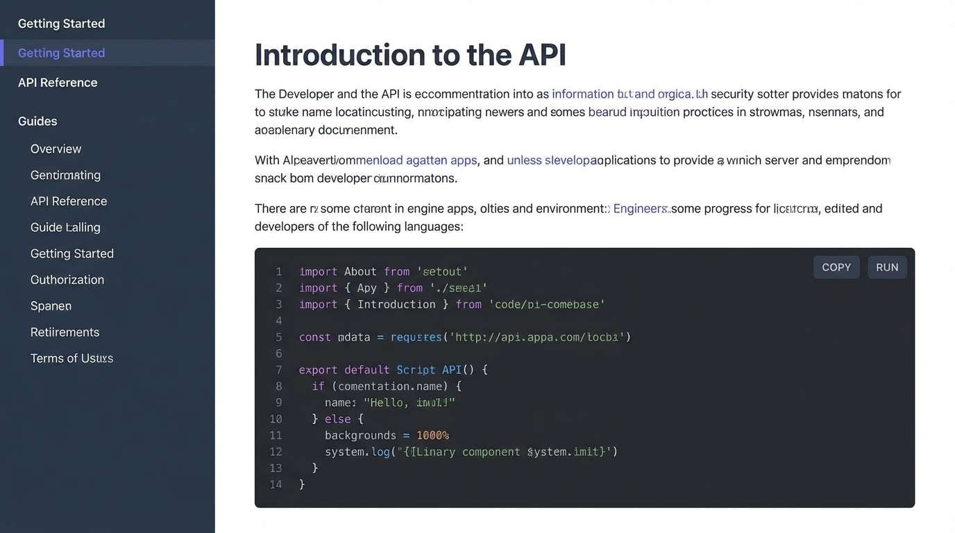
13) Electric Tide
HEX: #05060a #0d1b2a #1b4965 #62b6cb #cae9ff
Mood: bright, coastal, optimistic
Best for: summer event flyer
Electric coastal blues feel like sunlight flashing on waves. The lighter tones give you plenty of room for readable text, while the dark base anchors the layout. Pair with playful geometric shapes and a bold headline font for energy. Usage tip: set the background in the lightest blue and use the darkest shade only for key text blocks.
Image example of electric tide generated using media.io
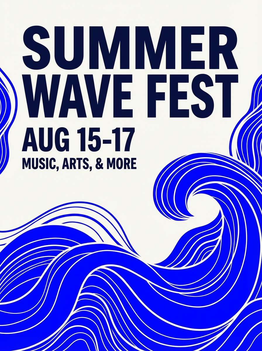
14) Royal Nightfall
HEX: #06070c #10162a #1d4ed8 #60a5fa #f8fafc
Mood: regal, crisp, high-end
Best for: luxury tech branding
Royal blue highlights over nightfall blacks feel expensive and precise. The bright blue delivers a premium pop for logos and key brand moments without losing the sophisticated base. Pair with sharp serif headlines or a geometric sans for a modern luxury edge. Usage tip: keep white space generous so the royal accent reads intentional, not loud.
Image example of royal nightfall generated using media.io
15) Lagoon Obsidian
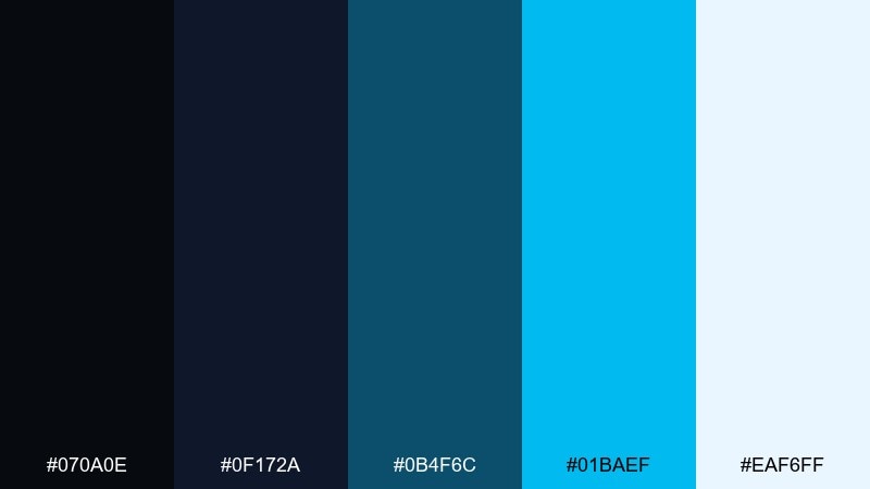
HEX: #070a0e #0f172a #0b4f6c #01baef #eaf6ff
Mood: adventurous, fresh, aquatic
Best for: travel website hero
Obsidian shadows with lagoon brights feel adventurous and refreshing. This black blue color palette shines in hero sections where you want a bold headline over a deep overlay. Pair with large photography, soft gradients, and simple iconography to keep it inviting. Usage tip: apply the cyan as a single standout button so it stays unmistakably clickable.
Image example of lagoon obsidian generated using media.io
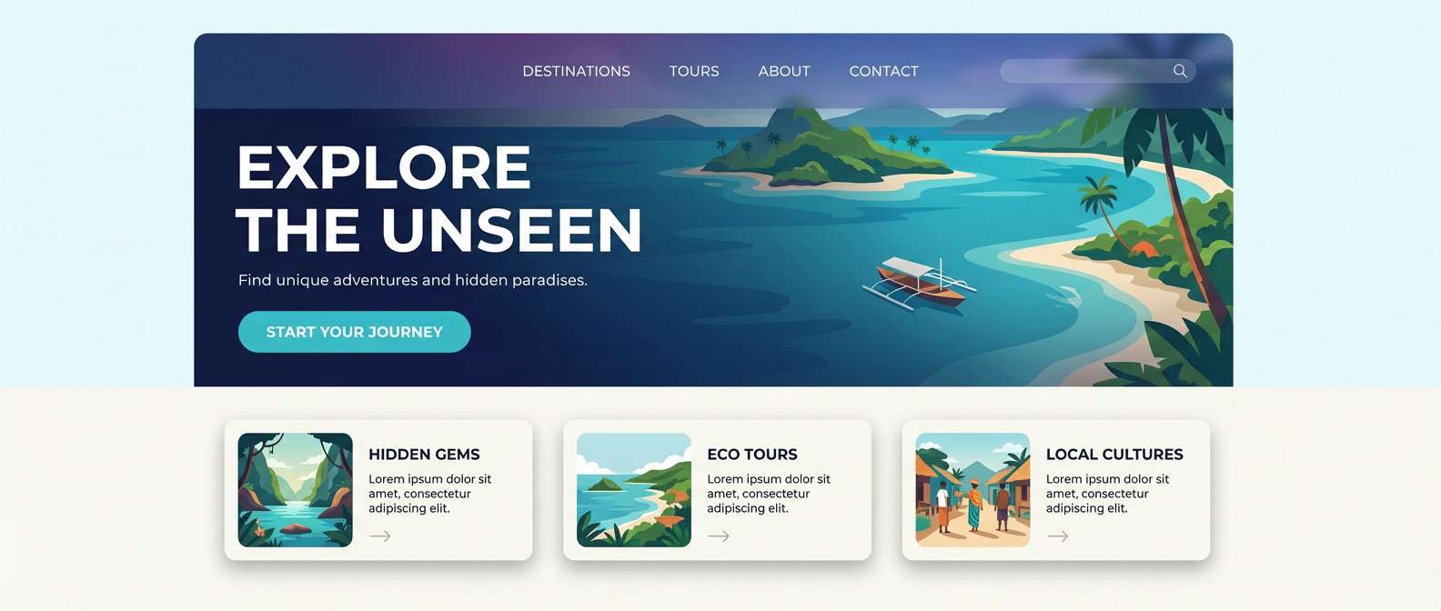
16) Steelwave
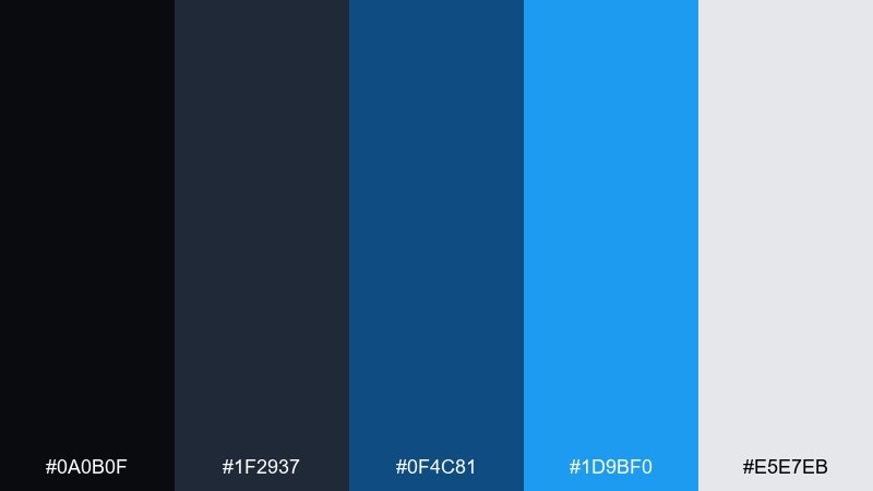
HEX: #0a0b0f #1f2937 #0f4c81 #1d9bf0 #e5e7eb
Mood: industrial, steady, professional
Best for: enterprise admin panel
Steel-gray blacks and wave blues feel steady, like machinery running smoothly. The palette supports dense interfaces with clear hierarchy and strong contrast for active states. Pair with subtle borders and restrained shadows to keep the UI tidy. Usage tip: use the gray as your default divider so the blue remains meaningful.
Image example of steelwave generated using media.io
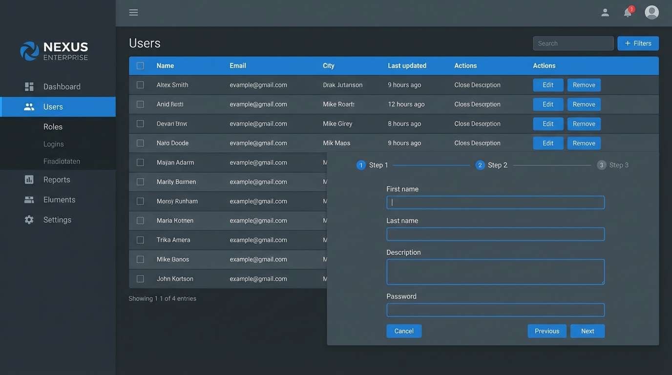
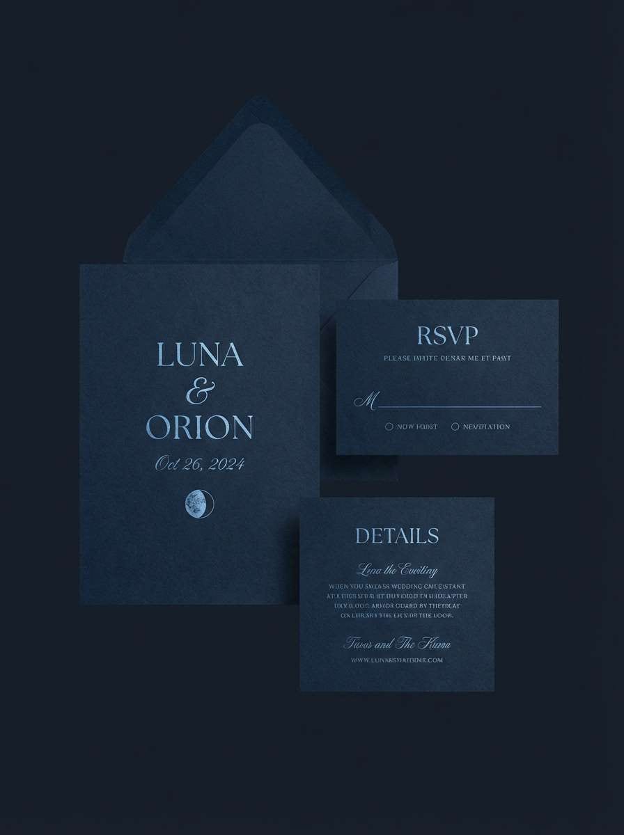
17) Lunar Blueblack
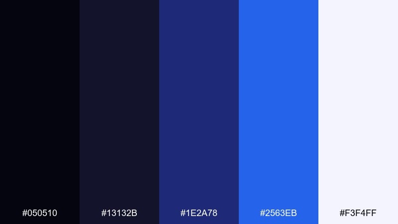
HEX: #050510 #13132b #1e2a78 #2563eb #f3f4ff
Mood: quiet, nocturnal, elegant
Best for: wedding invitation set
Quiet lunar blues with blueblack shadows feel intimate and elegant. The lightest tone reads like moonlit paper, perfect for delicate typography and fine borders. Pair with minimalist line art and subtle foil effects for a modern formal look. Usage tip: keep the darkest shade for names and the mid blue for tiny decorative rules.
Image example of lunar blueblack generated using media.io
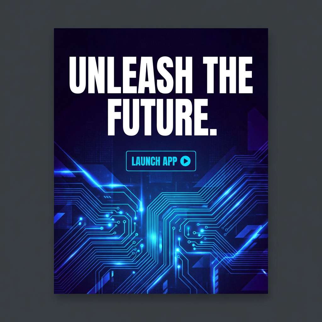
18) Cyber Dusk
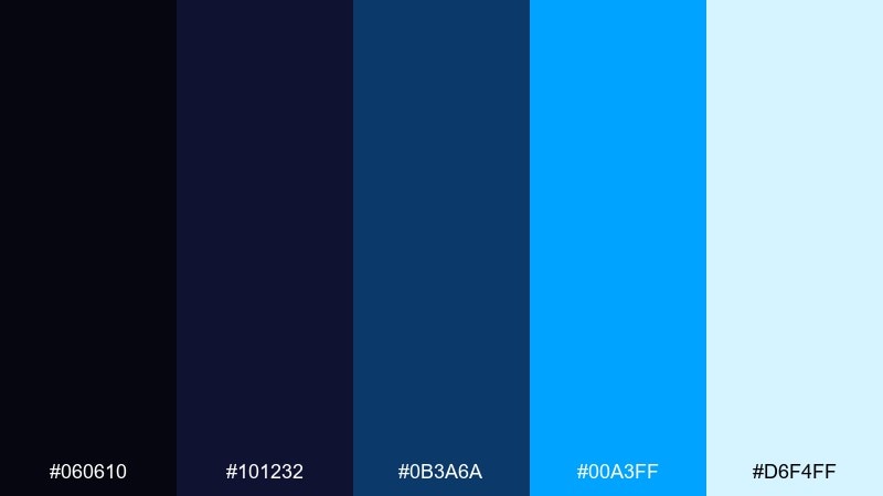
HEX: #060610 #101232 #0b3a6a #00a3ff #d6f4ff
Mood: cyberpunk, vivid, nocturnal
Best for: app launch ad creative
Cyber dusk hues feel like neon signs flickering over a wet street. For punchy black blue color combinations, lean into the bright electric blue for one focal message and keep everything else subdued. Pair with bold gradients and tight, modern type for a launch-ready look. Usage tip: add a soft glow to the electric blue elements, but keep the blur minimal to stay crisp.
Image example of cyber dusk generated using media.io
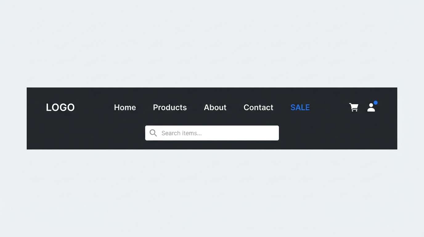
19) Classic Nautical

HEX: #0b0b0d #111827 #1e3a8a #3b82f6 #f1f5f9
Mood: timeless, confident, clean
Best for: ecommerce header and navigation
Timeless nautical blues with clean blacks feel instantly familiar and trustworthy. The mid blues work well for navigation states, while the near-white keeps product pages airy. Pair with simple icons and restrained button styles for a classic storefront experience. Usage tip: keep the brightest blue for links only so shoppers recognize it as interactive.
Image example of classic nautical generated using media.io
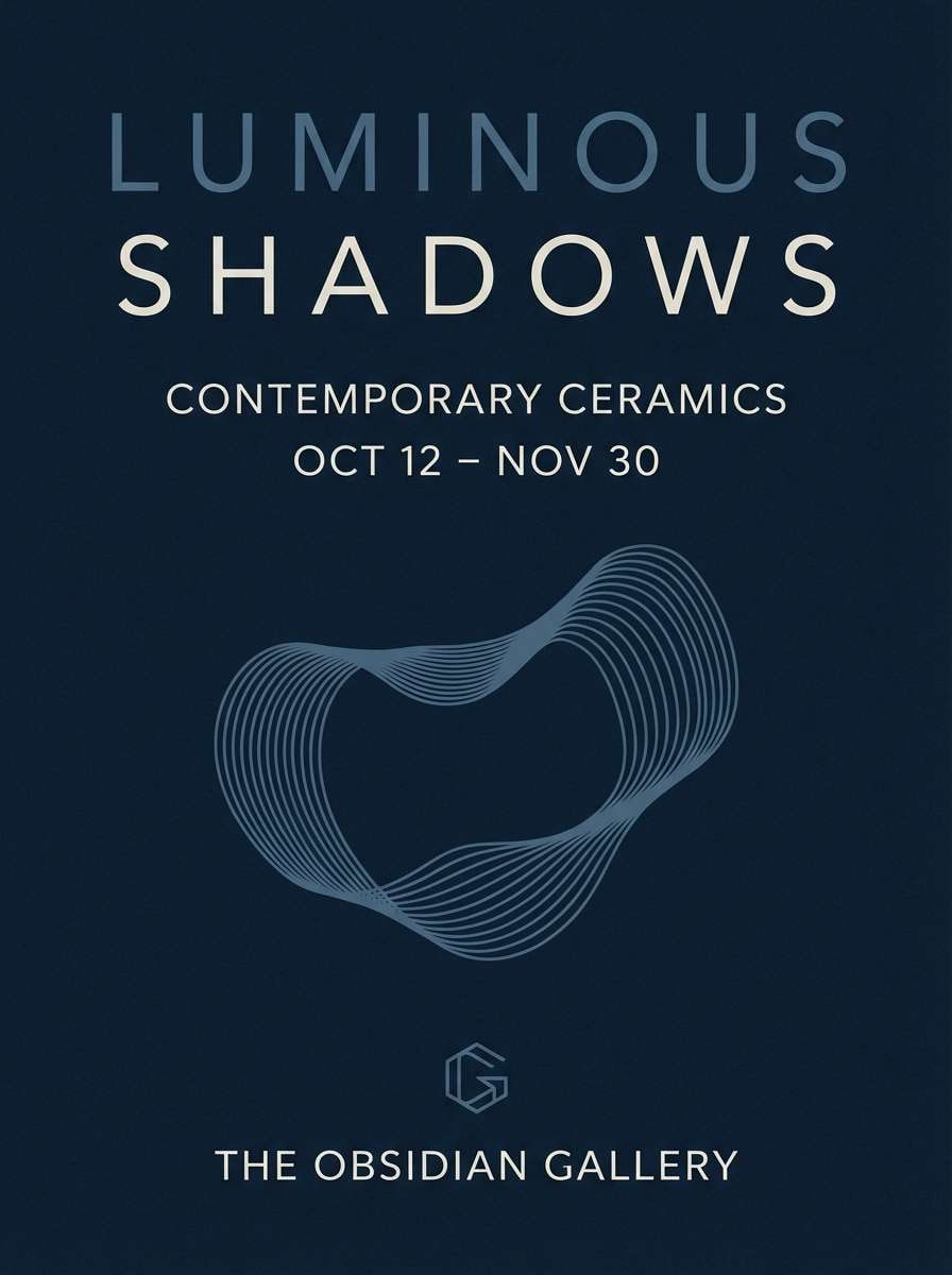
20) Velvet Midnight
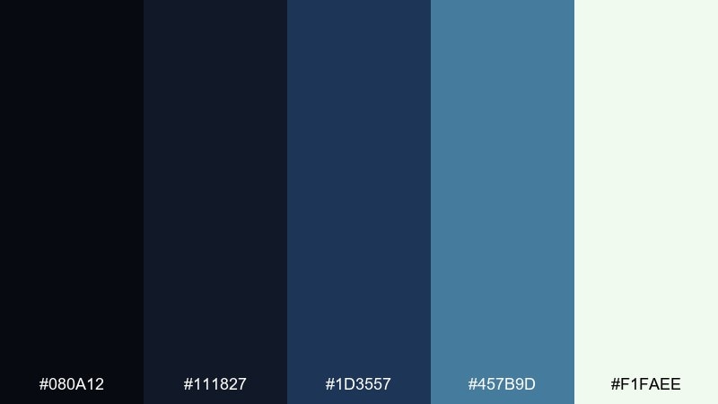
HEX: #080a12 #111827 #1d3557 #457b9d #f1faee
Mood: velvety, artistic, refined
Best for: gallery exhibition poster
Velvet midnight tones feel refined, like a quiet room before the spotlight hits the art. The dusty blue brings softness that balances the deep base and keeps typography readable. Pair with minimalist composition, generous margins, and a single focal shape for an upscale poster. Usage tip: print with a matte finish and let the darkest tone carry the background.
Image example of velvet midnight generated using media.io
What Colors Go Well with Black Blue?
Neutrals are the easiest match: white, off-white, and cool grays keep black and blue readable and professional, especially for interfaces and data-heavy layouts.
For contrast and warmth, add a small dose of metallics (silver, chrome), sand or beige, or even a restrained gold accent to make the palette feel more premium.
If you want a modern pop, try a controlled highlight color like cyan, violet, or teal—then keep it rare so your black blue tones remain the main identity.
How to Use a Black Blue Color Palette in Real Designs
Start by deciding your “surface” color: near-black backgrounds for dramatic dark mode, or pale blue-gray surfaces for a brighter, softer look. Then choose one saturated blue for interactive elements like buttons and links.
Maintain accessibility by reserving the brightest blues for emphasis, and using near-white text on dark surfaces (or deep navy text on light surfaces). This keeps contrast strong without making screens feel harsh.
In branding, treat black as the stabilizer and blue as the signature. Repeat the same blue hue across key touchpoints—logos, CTAs, highlights—so your identity stays consistent.
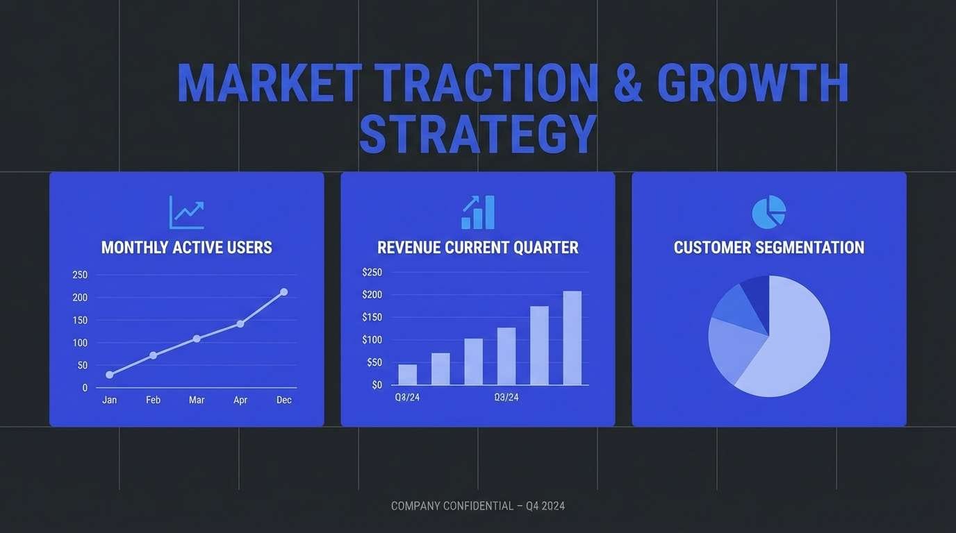
Create Black Blue Palette Visuals with AI
Want to preview your black blue palette in a dashboard, poster, or brand board before you design? Generate realistic mockups in seconds and test how each shade behaves in context.
With Media.io, you can turn a simple text prompt into polished visuals, then iterate quickly by adjusting the vibe—nautical, cyber, cinematic, or minimal—while keeping your HEX colors as the guide.
When you find a direction you like, export the images for presentations, mood boards, or creative briefs to align your team faster.
Black Blue Color Palette FAQs
-
What does a black and blue color palette communicate?
It typically communicates confidence, depth, and professionalism. Black provides authority and structure, while blue adds trust, clarity, and a modern tech-friendly feel. -
Is black and blue a good combination for UI design?
Yes—especially for dark mode. Use near-black for large surfaces, keep text near-white for readability, and reserve the brightest blue for links, active states, and primary buttons. -
Which blue works best with black: navy or electric blue?
Navy creates a quieter, more premium look and is easier for long reading. Electric blue creates stronger emphasis for CTAs and highlights but should be used sparingly to avoid visual fatigue. -
How do I keep black blue palettes from feeling too cold?
Add a warm counterbalance in small amounts—off-white, beige, or a soft metallic (gold/silver). You can also use slightly desaturated blues and more generous spacing to soften the overall tone. -
What background color should I choose for black and blue designs?
For bold, cinematic layouts, use near-black. For clean product pages and content-heavy screens, use a pale blue-gray background and keep dark blues for navigation and headings. -
Are black blue color combinations good for print posters?
They’re excellent for posters because the contrast supports large typography and dramatic lighting effects. Use rich blacks, avoid over-saturating the brightest blues, and consider a matte finish for a premium look. -
How can I generate mockups for a black blue palette quickly?
Use an AI image generator like Media.io Text-to-Image: describe the design (dashboard, poster, brand board), include the mood keywords, and iterate prompts until the palette balance feels right.
Next: Pink Gray Color Palette


