AI Chart Generator + Nano Banana Pro
Transform Text into Stunning Charts with AI Chart Generator
Create professional charts from text instantly using Media.io’s AI Chart Generator powered by Nano Banana Pro. Turn any idea, data point, or written description into flowcharts, pie charts, bar graphs, Gantt charts, and more — all automatically designed and visually ready in seconds. No coding, no manual design — just clear, smart, and beautiful data visuals that tell your story.
Create Your AI Chart Photo Instantly ↗
Mangas created by Media.io powered by Nano Banana Pro
AI Chart Prompt Collection – Turn Text into Smart Data Visuals
Advanced AI Chart Generator · AI Flowchart Creator · AI Chart from Text · AI Pie Chart · AI Bar Chart · Nano Banana Pro Chart Prompts
📊 AI Chart Prompts
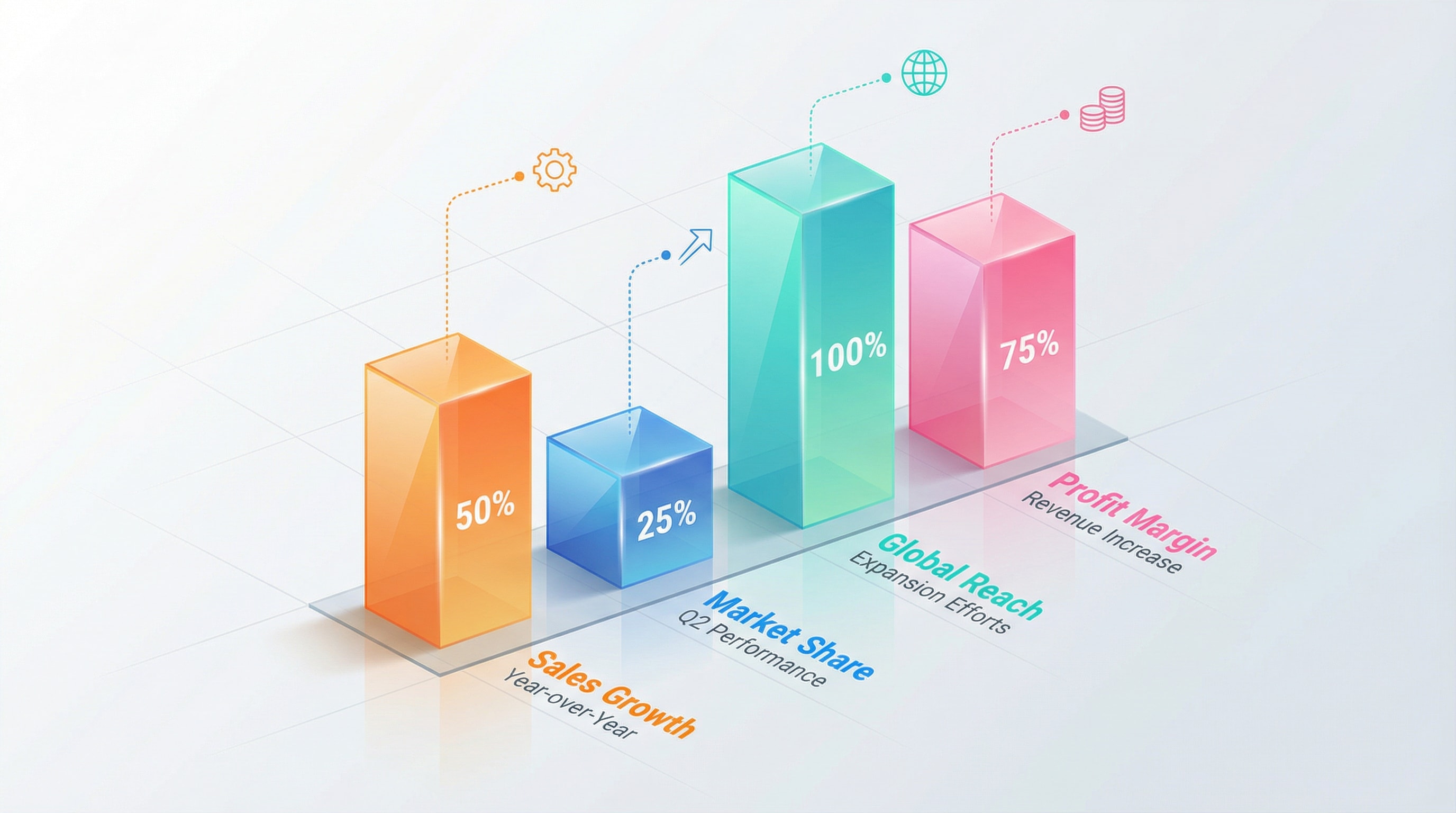
1. 3D Isometric Gradient Bar Chart Infographic
A modern 3D isometric bar chart infographic with four tall translucent columns in different gradient colors (orange, blue, cyan-green, and pink). Each column has a glossy reflective surface, soft lighting, and a subtle shadow on the ground. The bars show percentages (50%, 25%, 100%, 75%) displayed clearly on the front face. Above each bar floats a thin dotted line leading to a small minimalist icon. The background is clean, light, and professional with a soft gradient. Text labels and descriptions appear below each bar in bright contrasting colors. Highly polished, corporate infographic style, smooth gradients, sharp edges, high resolution.
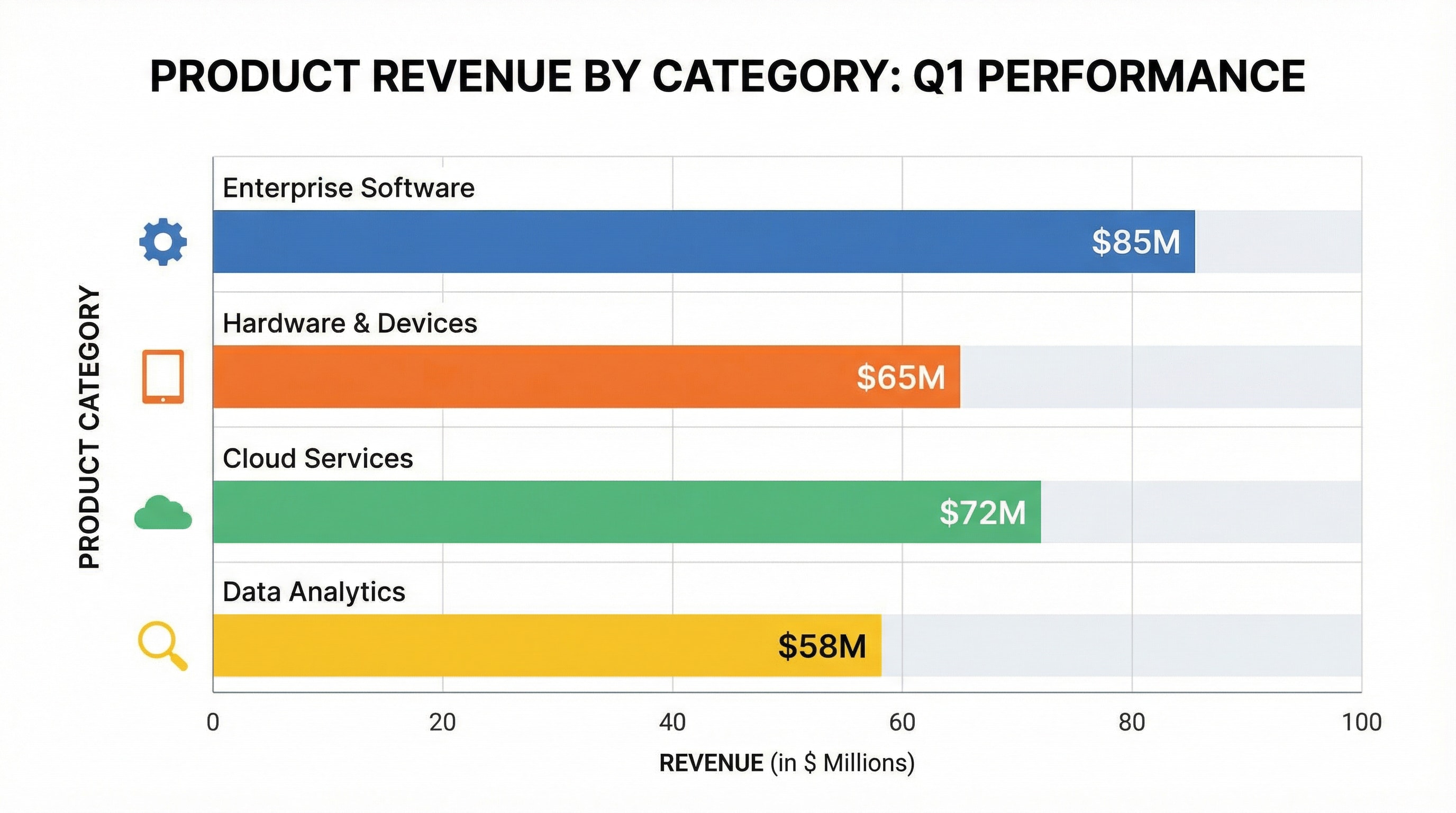
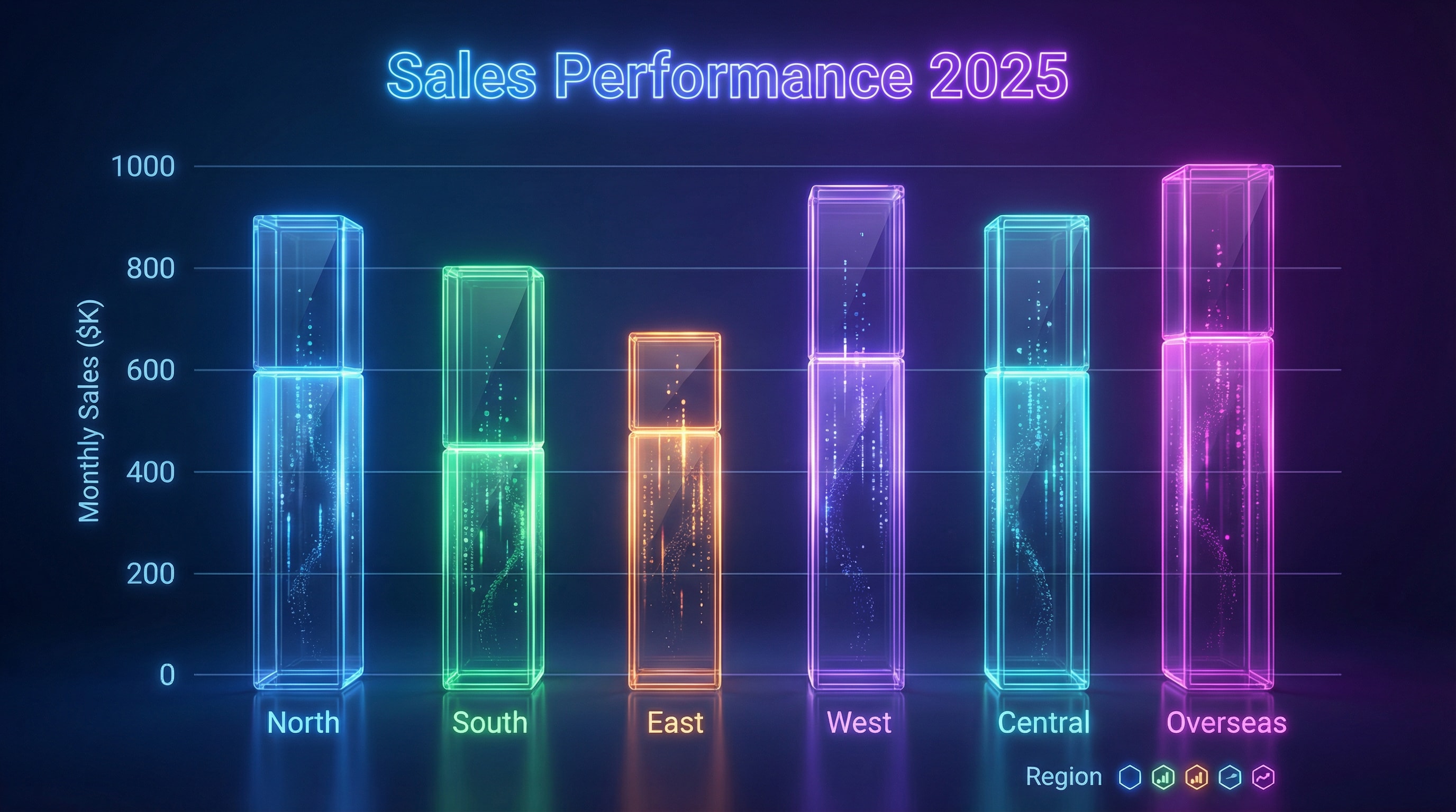
2. Business Bar Chart (Sales or Revenue)
Create a professional infographic-style bar chart visualizing product revenue by category. Each bar is labeled with values and category names on a clean white background. Include a bold title, clear axis labels, color-coded bars (blue, orange, green, yellow), and subtle grid lines. Use flat corporate design, balanced spacing, and vector-style layout, similar to business dashboards. --no blur --no 3d realism --no people --style infographic --style flat --ar 16:9 --v 5; theme: "business infographic", color harmony: "corporate flat palette"
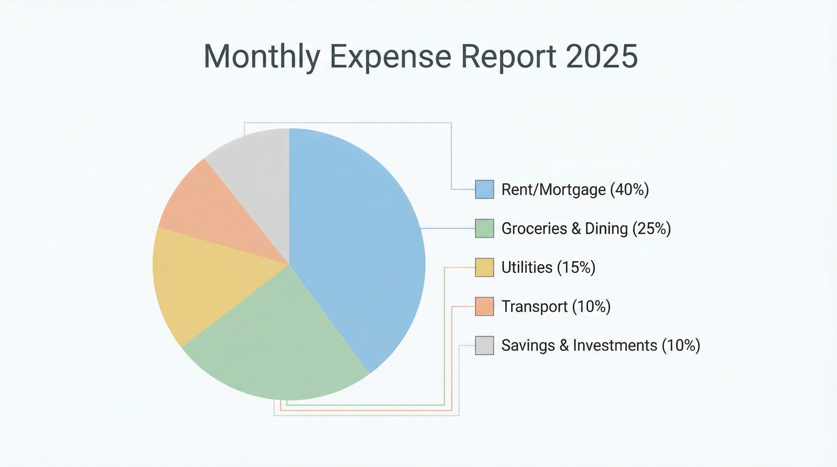
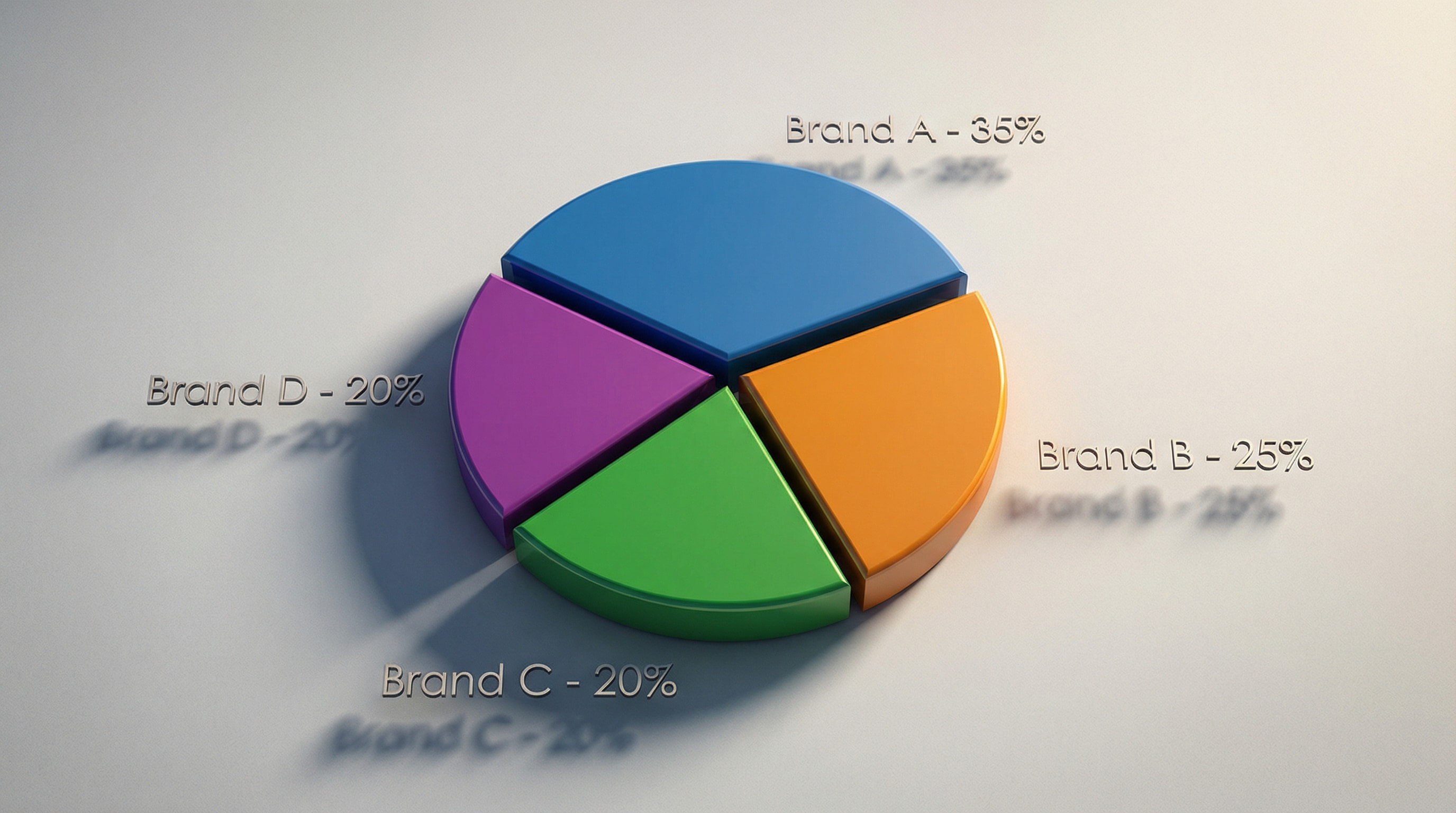
3. Modern Pie Chart for Report
Generate a flat vector pie chart infographic showing expense breakdown by sub-category. Include readable legends beside each slice with percentage labels. Use a minimalist layout, pastel colors, and corporate typography on a white workspace background. Add a header title “Monthly Expense Report 2025”. --no blur --no 3d realism --no people --style infographic --style flat --ar 16:9 --v 5; theme: "business infographic", color harmony: "corporate flat palette"
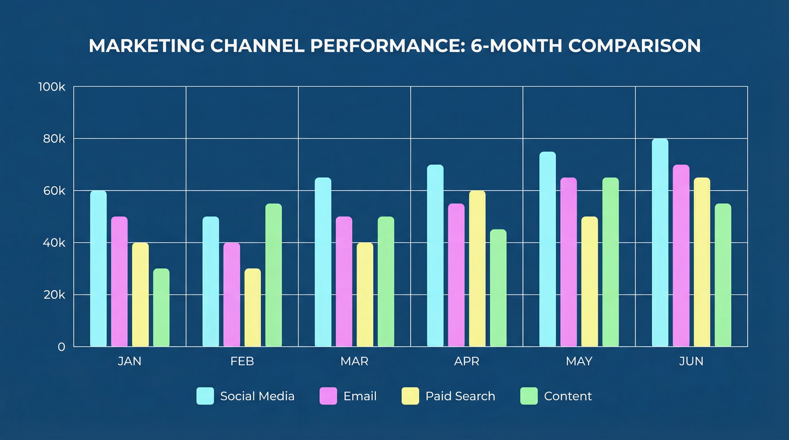
4. Clustered Column Chart (Marketing Performance)
Create a clustered column chart infographic comparing marketing channels over 6 months. Bars grouped by month, labeled clearly at bottom; title at top center. Clean gridlines, minimal legend below chart, consistent spacing and alignment. Use deep blue background, white text, and light neon accent bars. Flat data-visualization aesthetic, suitable for professional slides. --ar 16:9 --style clean infographic --v 5 --no blur --no 3d realism --no people --style infographic --style flat --ar 16:9 --v 5; theme: "business infographic", color harmony: "corporate flat palette"
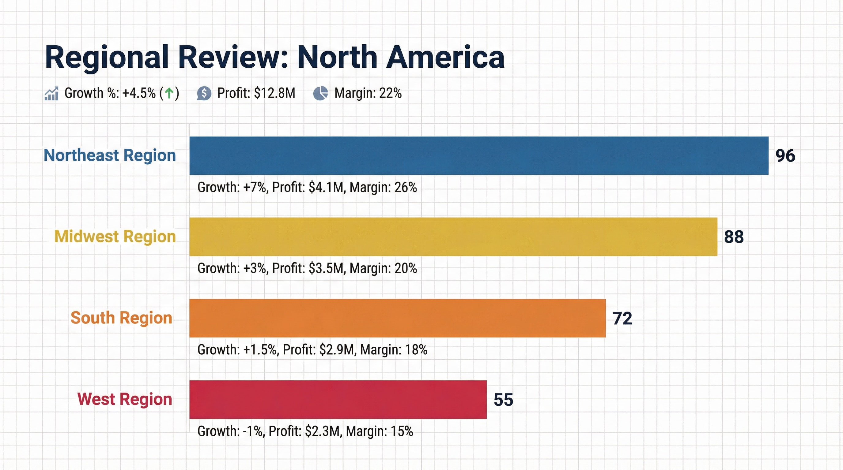
5. Regional Comparison Chart (Horizontal Bars)
Design a horizontal bar chart infographic showing regional performance in North America. Use color-coded bars (red, orange, yellow, blue), numeric labels aligned to bar ends. Add section header “Regional Review: North America”, include small subtext metrics (growth %, profit, margin). Professional dashboard look, white and gray grid background, vector flat style. --no blur --no 3d realism --no people --style infographic --style flat --ar 16:9 --v 5; theme: "business infographic", color harmony: "corporate flat palette"
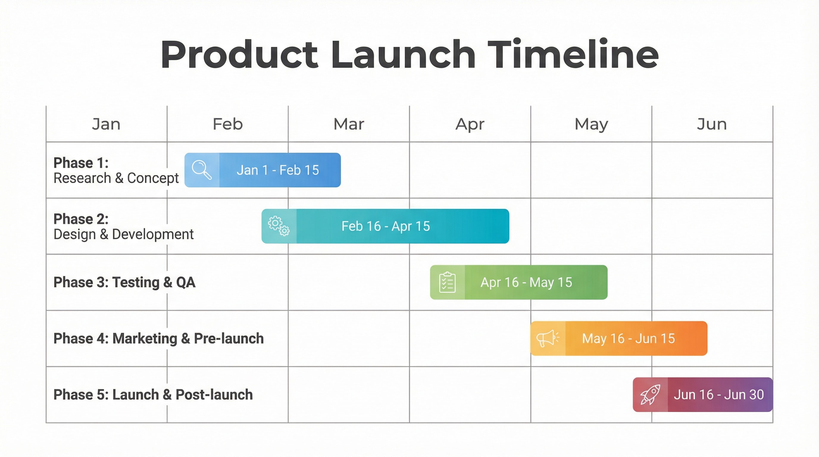
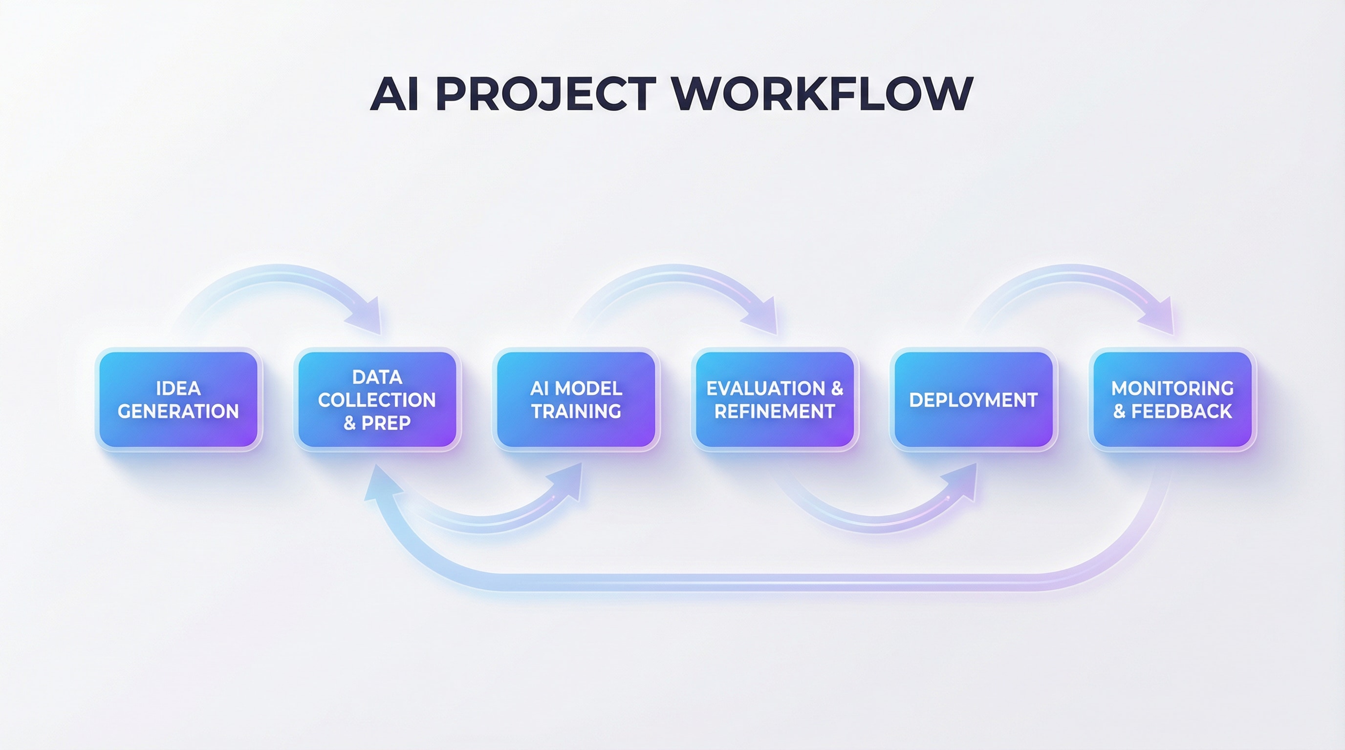
6. Gantt Project Timeline Chart
Generate a modern Gantt chart showing project phases from Jan to Jun. Horizontal bars represent each milestone, colored in gradient tones, labeled with task names and dates. White background, gray gridlines, bold header “Product Launch Timeline”. Flat minimalist corporate style, vector infographic design. --no blur --no 3d realism --no people --style infographic --style flat --ar 16:9 --v 5; theme: "business infographic", color harmony: "corporate flat palette"
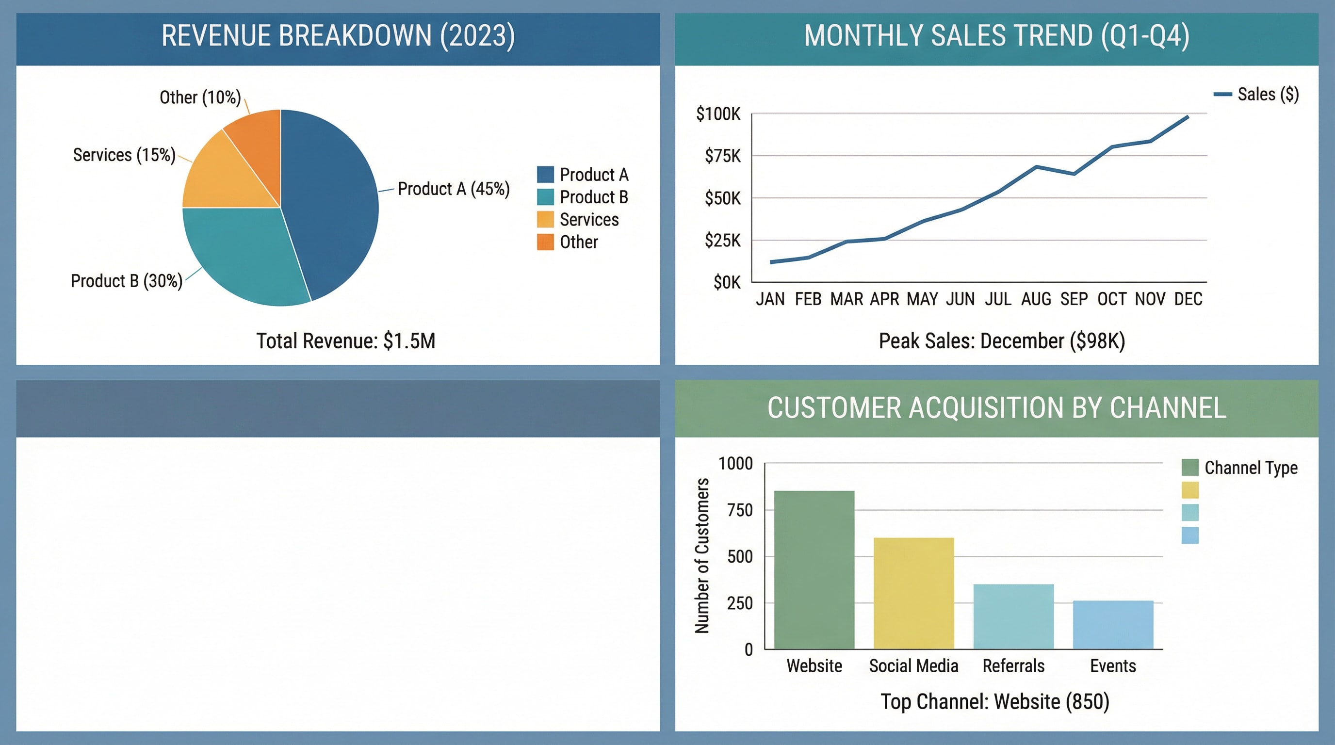
7. Data Visualization Infographic (Mixed Chart)
Create a composite data infographic combining pie, line, and bar charts on one canvas. Each section separated with colored panels, readable legends, and clear typography. Overall style: clean, vector-based, infographic aesthetic with consistent alignment. Suitable for a business annual report or data storytelling presentation. --ar 16:9 --v 5 --style infographic --quality 2 --no blur --no 3d realism --no people --style infographic --style flat --ar 16:9 --v 5; theme: "business infographic", color harmony: "corporate flat palette"
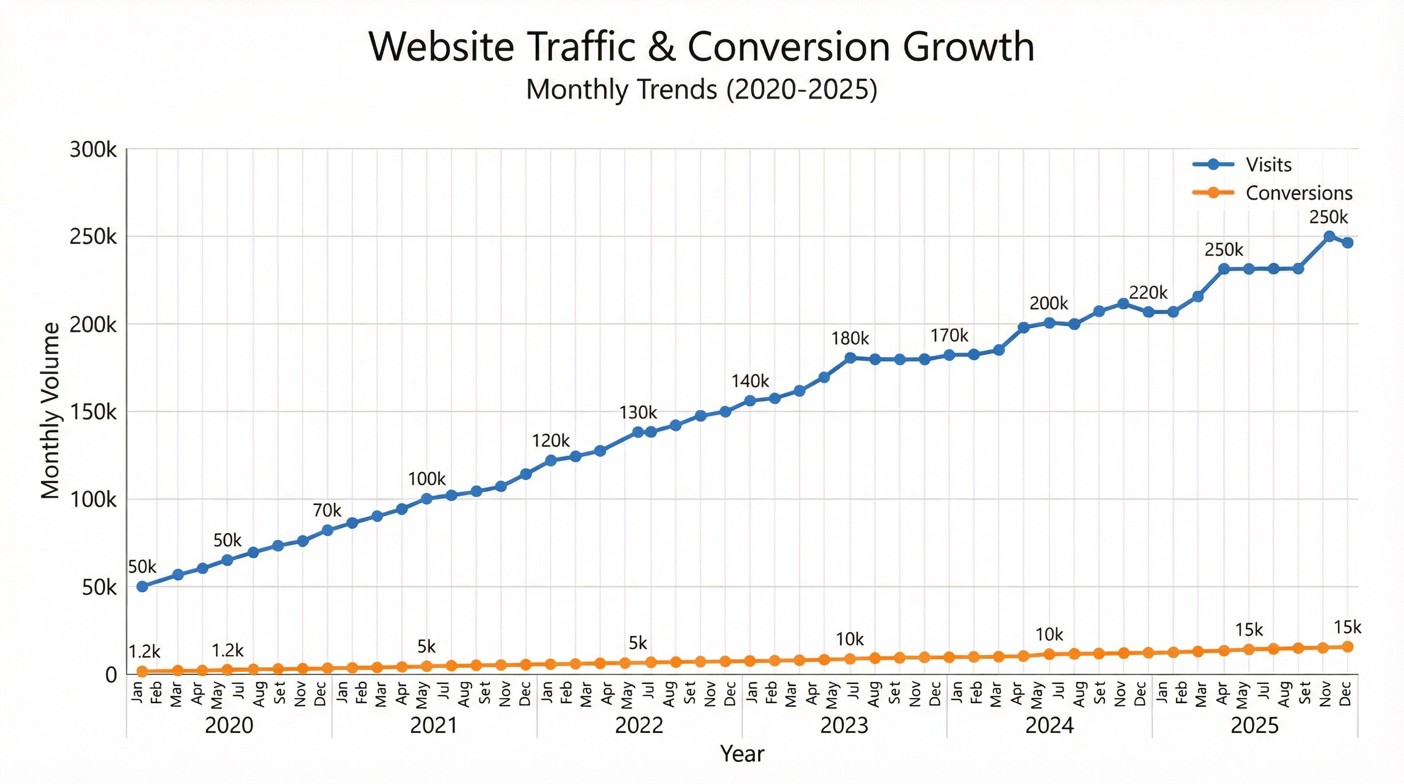
8. Statistical Line Chart (Trends Over Time)
Create a clean, modern line chart infographic showing monthly website traffic trends from 2020–2025. Use two colored lines (blue for visits, orange for conversions) with small circular data points and value labels. Add a chart title “Website Traffic & Conversion Growth”, axis labels, and light gridlines. Keep background white, font professional, spacing balanced. Flat corporate infographic style, ideal for digital marketing dashboards. --ar 16:9 --style infographic --v 5 --quality 2 --no blur --no 3d realism --no people --style infographic --style flat --ar 16:9 --v 5; theme: "business infographic", color harmony: "corporate flat palette"
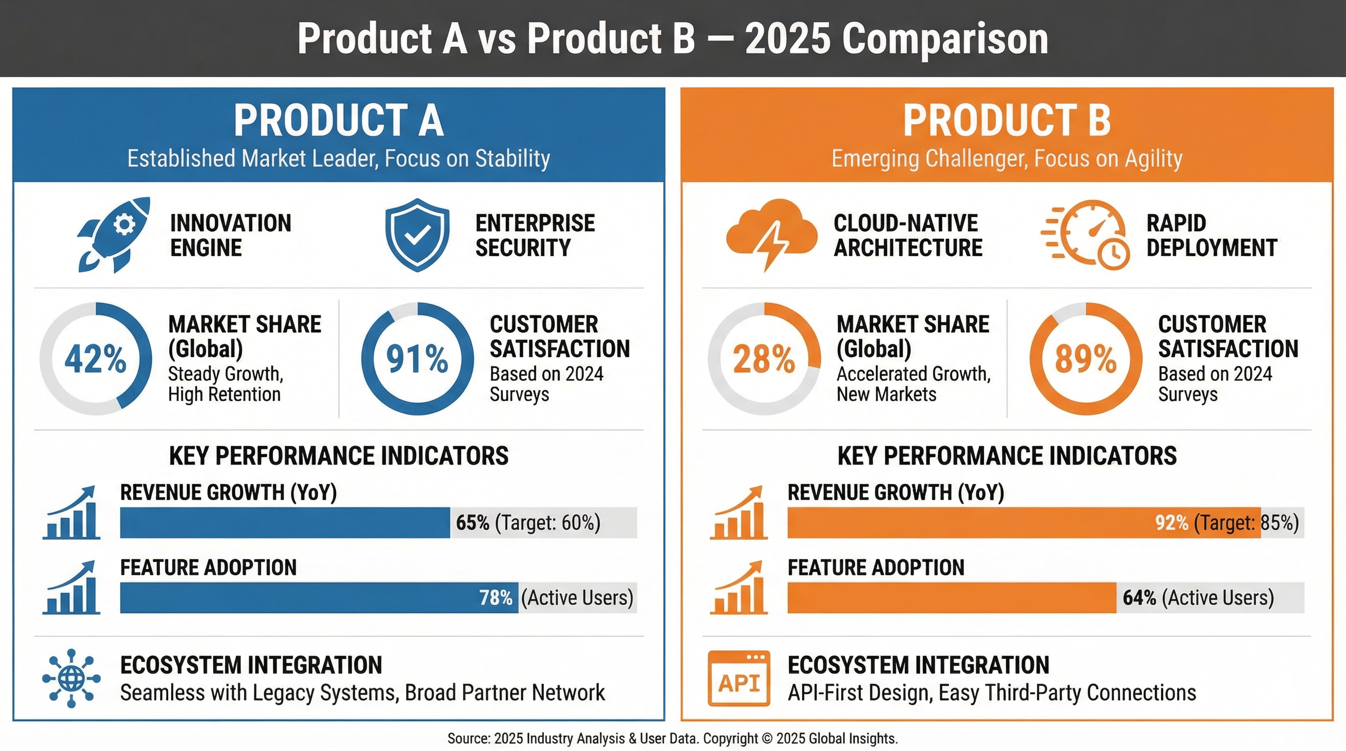
9. Comparison Infographic (Two-Column Split)
Design a side-by-side comparison infographic showing two competing products or regions. Split layout vertically with contrasting color panels (blue vs. orange). Include icons, percentage metrics, and labeled bar charts under each section. Title at the top center: “Product A vs Product B — 2025 Comparison”. Use flat data visualization design, vector icons, clear typography, corporate minimal look. --ar 16:9 --style infographic --v 5 --quality 2 --no blur --no 3d realism --no people --style infographic --style flat --ar 16:9 --v 5; theme: "business infographic", color harmony: "corporate flat palette"
Why Creators Love Media.io’s AI Chart Generator
Turn your words, ideas, or data into beautiful, intelligent charts in seconds. With Nano Banana Pro’s advanced text-to-visual engine, you can create everything from flowcharts to pie charts—accurate, stylish, and instantly ready to share.

From Text to Chart in One Step
Let AI visualize your ideas instantly. Stop wasting time dragging shapes or setting colors. Simply type a short prompt like “show monthly sales by region” and the AI Chart Generator transforms your text into a ready-to-use chart. Powered by Nano Banana Pro, it understands context, detects chart type automatically, and designs it with perfect proportions and readability.

Upload a Photo, Get a Professionally Designed Layout
Flowcharts, pie charts, bar graphs, Gantt charts—create them all with one click. Whether you need to illustrate workflows, project timelines, or marketing results, Media.io AI Chart Generator adapts to your needs. Its intelligent layout engine ensures each chart looks clean, balanced, and professional—without any design skills required.

Designed for Real Workflows
Built for teams, marketers, and creators who move fast. Use it to prepare reports, pitch decks, project updates, or classroom visuals. The generator produces charts that match your tone—modern, branded, and data-driven—so you can focus on insights instead of formatting. Export or share visuals anywhere, instantly.

Precision and Creativity Combined
Smart data understanding meets artistic design. Unlike traditional generators, Nano Banana Pro not only converts text but interprets meaning—choosing colors, spacing, and layout that communicate your story effectively. Every chart feels alive: accurate enough for analytics, expressive enough for storytelling.
FAQs About
AI Chart Photo
What is an AI Chart Generator and how does it work?


An AI Chart Generator is a smart tool that converts your text, ideas, or data into charts automatically. Simply describe what you want—like “show quarterly revenue by product”—and the AI will detect the right chart type (bar, pie, or flowchart), visualize it with balanced layout and colors, and deliver a polished result in seconds. Media.io’s Nano Banana Pro engine ensures accuracy and creative design in every output.
Can I generate charts directly from text or a prompt?
Yes! With Media.io AI Chart Generator, you can turn any sentence or short description into a visual chart. Just write what you want to show—no need for spreadsheets or templates. The AI automatically interprets your text and builds flowcharts, pie charts, Gantt charts, bar graphs, and more—all ready to download or share.
What types of charts can the AI create?
Our AI chart generator supports multiple formats, including flowcharts, bar charts, pie charts, line graphs, organizational charts, and Gantt charts. Whether you’re managing projects, visualizing workflows, or presenting marketing data, Media.io instantly delivers a chart that fits your purpose and style.
Is it free to use the AI Chart Generator?
You can try the AI chart generator free with limited credits. Simply upload or enter your text and see how AI converts it into stunning visuals. For advanced customization and unlimited access, Media.io offers flexible premium options tailored to professionals, marketers, and educators.
Is my data safe when using Media.io AI tools?
Absolutely. Media.io automatically deletes all uploaded and generated content within seven days, ensuring full privacy protection. Your text, charts, and any uploaded data are never shared or stored beyond this period. We take user security and confidentiality seriously—your creative work stays completely private.