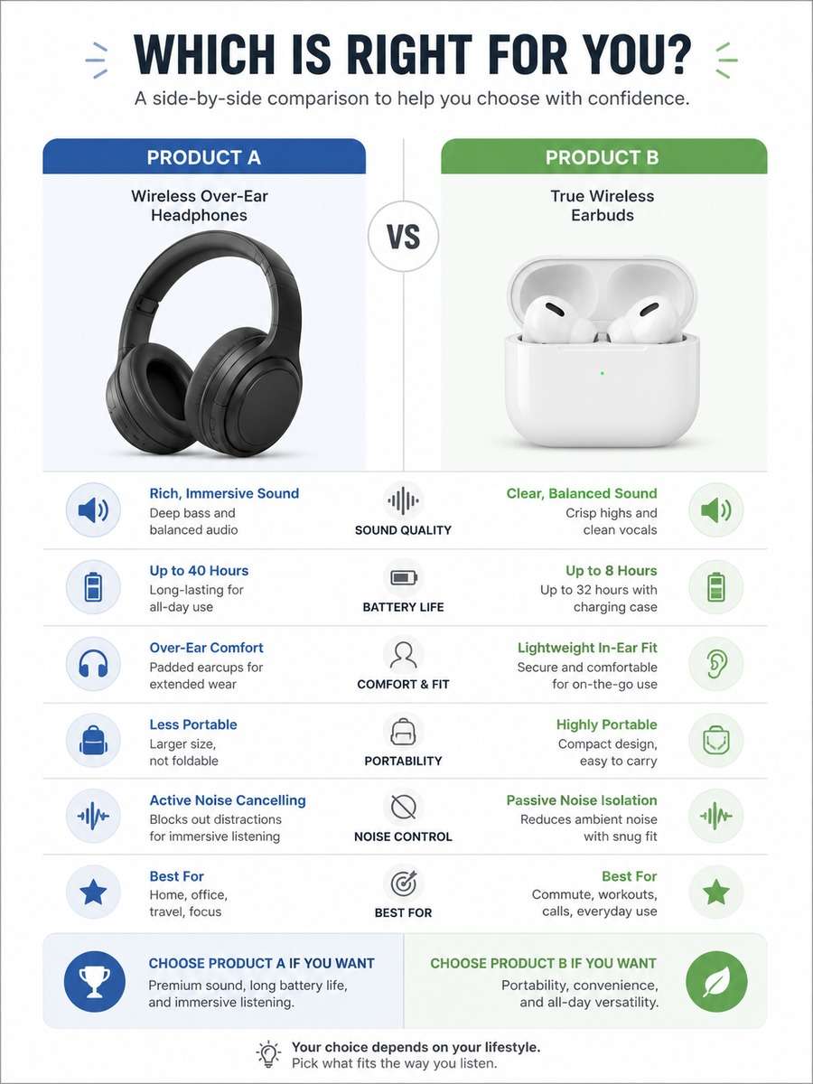
Create Better Visuals with ChatGPT and Gemini AI Comparison Infographic Prompts
Comparison infographics make complex choices easier to understand at a glance. Whether you want to compare products, features, timelines, pricing, performance, or pros and cons, the right AI comparison infographic prompt helps you build a visual that feels structured, readable, and polished. Use the prompt ideas below to generate eye-catching infographic layouts for marketing, education, business, and social content.
Stunning AI comparison infographic generated with Media.io - powered by
Nano Banana Pro.
How to Create Comparison Infographics in 3 Steps
Follow these simple steps to turn comparison infographic prompts into high-quality AI visuals in Media.io.
1
Pick a comparison style
Choose the format that matches your topic, such as side-by-side columns, split-screen comparisons, pros and cons, before-and-after, or feature tables.
2
Paste and customize a prompt
Use one of the prompts below, then edit the subject, color palette, icons, labels, and data points to fit your brand or content goal.
3
Generate and refine your visual
Create the infographic, review hierarchy and spacing, then regenerate with clearer sections, stronger contrast, or more precise labeling if needed.
Best ChatGPT and Gemini Comparison Infographic Prompts Ideas & Examples
Minimal Product Comparison Infographic
A clean modern comparison infographic showing two consumer products side by side, centered composition, balanced columns, headline area, feature icons, short labels, subtle brand-neutral color coding, white background, editorial layout, highly readable typography style, polished vector infographic aesthetic --ar 3:4
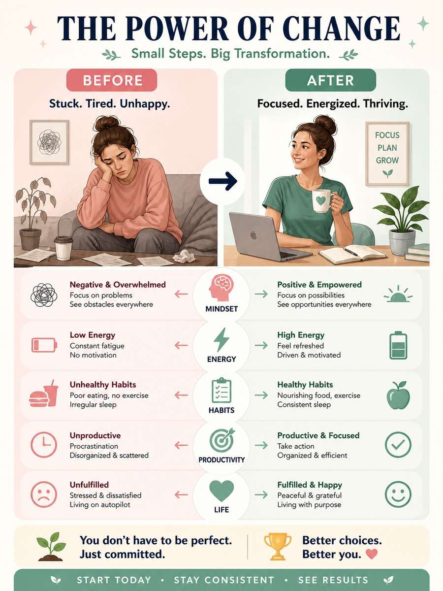
Before and After Transformation Chart
A before and after infographic poster with two clearly divided vertical sections, centered layout, visual transformation story, labeled comparison points, arrows and icons, neat spacing, modern pastel palette, professional infographic design, easy-to-scan structure --ar 3:4
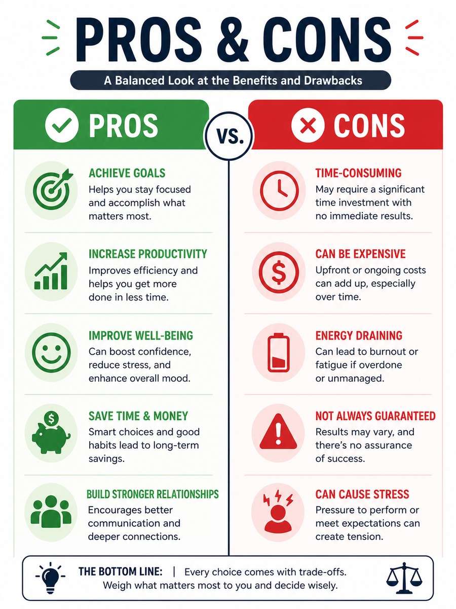
Pros and Cons Infographic
A polished pros and cons infographic with a centered split layout, left side benefits, right side drawbacks, green and red accent colors, clear section headers, simple icons, bullet-style comparison points, clean white background, modern flat design infographic --ar 3:4
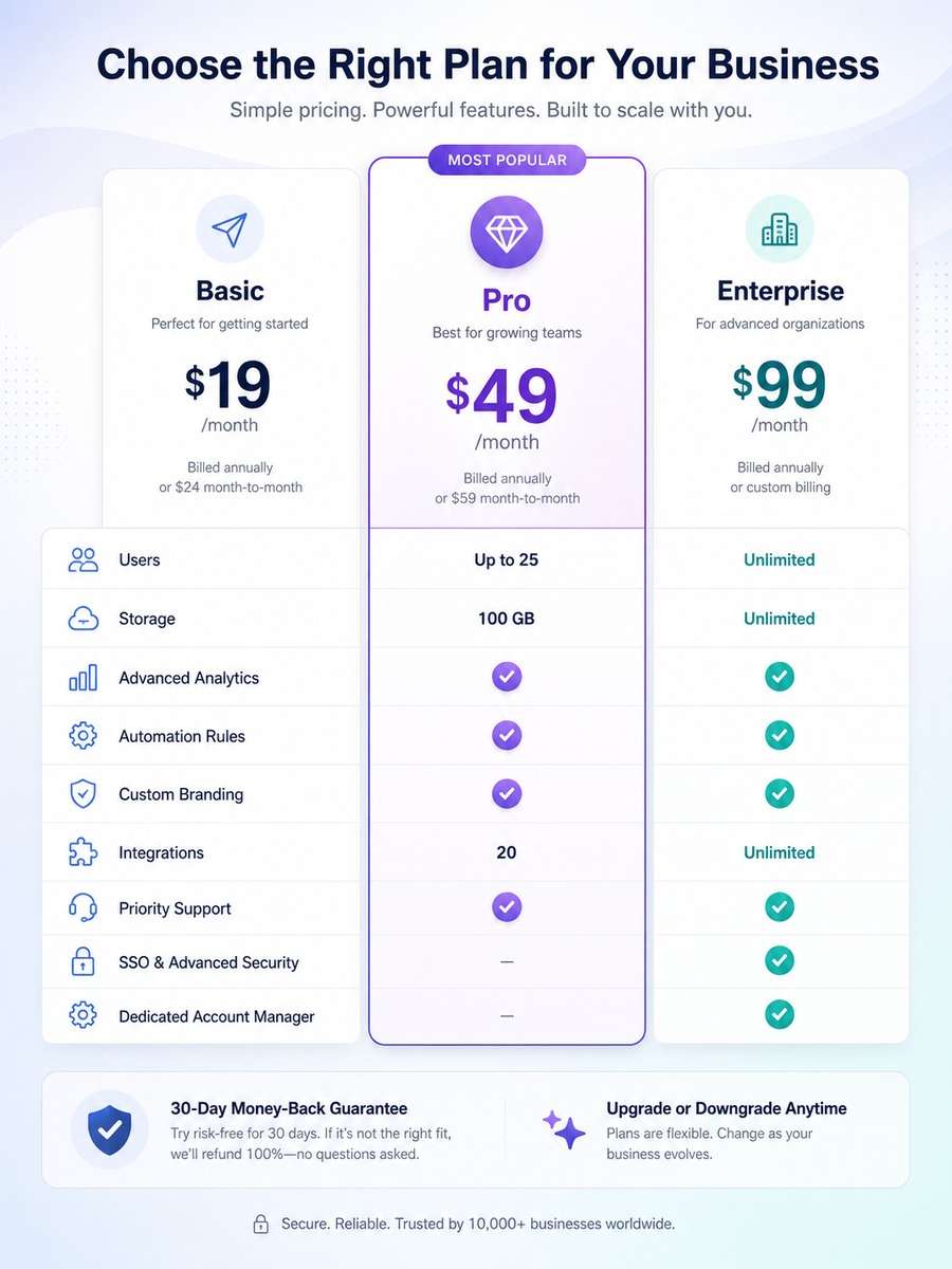
Pricing Plan Comparison Poster
A pricing comparison infographic with three centered plan columns, highlighted middle option, feature checkmarks, pricing badges, clean card layout, soft gradients, modern SaaS visual style, highly legible comparison structure, premium business infographic look --ar 3:4
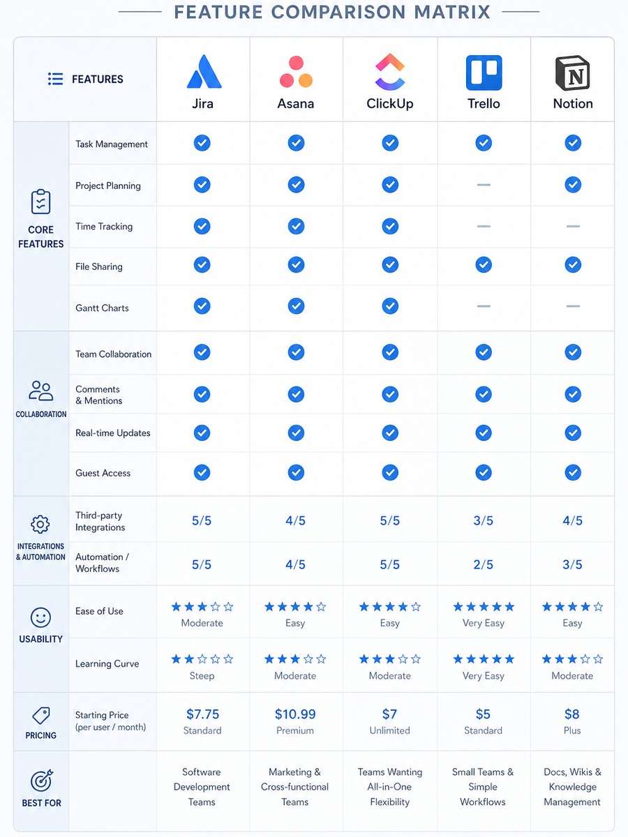
Feature Comparison Matrix
A feature comparison matrix infographic with centered layout, rows and columns clearly separated, product icons across the top, category labels on the side, visual checkmarks and ratings, minimal blue-gray palette, clean grid system, professional tech infographic style --ar 3:4
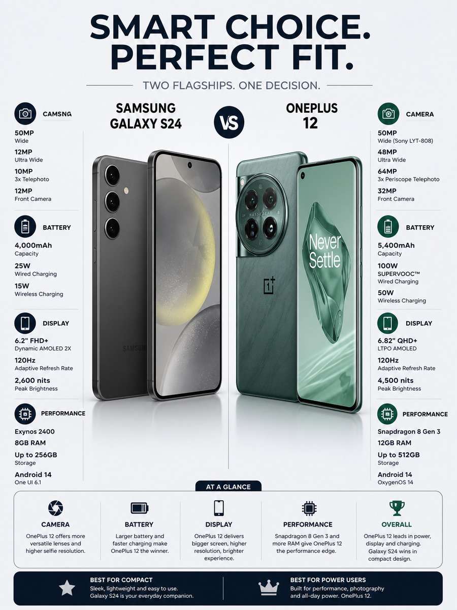
Smartphone Comparison Infographic
A sleek smartphone comparison infographic showing two phones side by side in the center, feature callouts for camera, battery, display, and performance, premium dark-on-light tech styling, tidy labels, icon-supported specs, magazine-quality infographic poster --ar 3:4
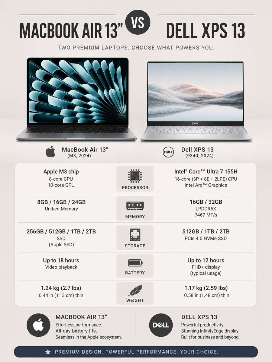
Laptop Specs Comparison Layout
A modern laptop comparison infographic poster with two centered devices and structured spec sections below, processor, memory, storage, battery, and weight comparisons, elegant typography, subtle shadows, neutral professional palette, clean editorial infographic composition --ar 3:4
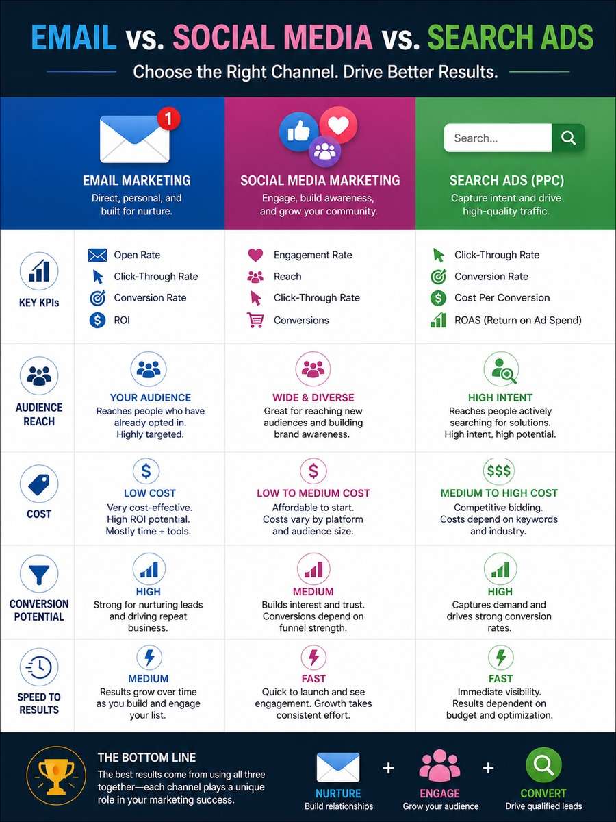
Marketing Channel Comparison Visual
A digital marketing comparison infographic comparing email, social media, and search ads, centered three-column layout, KPI icons, audience reach, cost, conversion, and speed sections, bright accent colors, professional business infographic design, clear visual hierarchy --ar 3:4
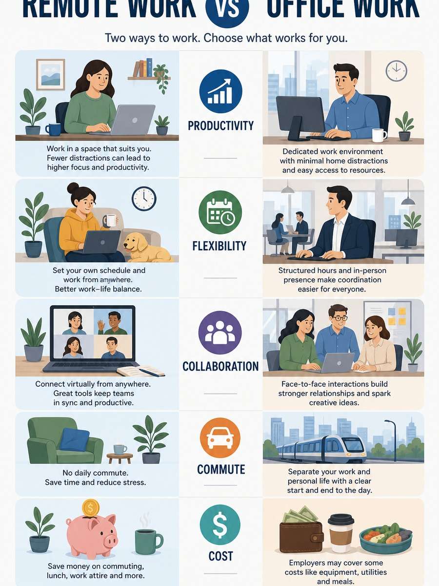
Remote Work vs Office Work Infographic
A remote work versus office work comparison infographic with two centered illustrated sections, productivity, flexibility, collaboration, commute, and cost categories, balanced icons, modern flat illustrations, soft corporate palette, readable infographic poster layout --ar 3:4
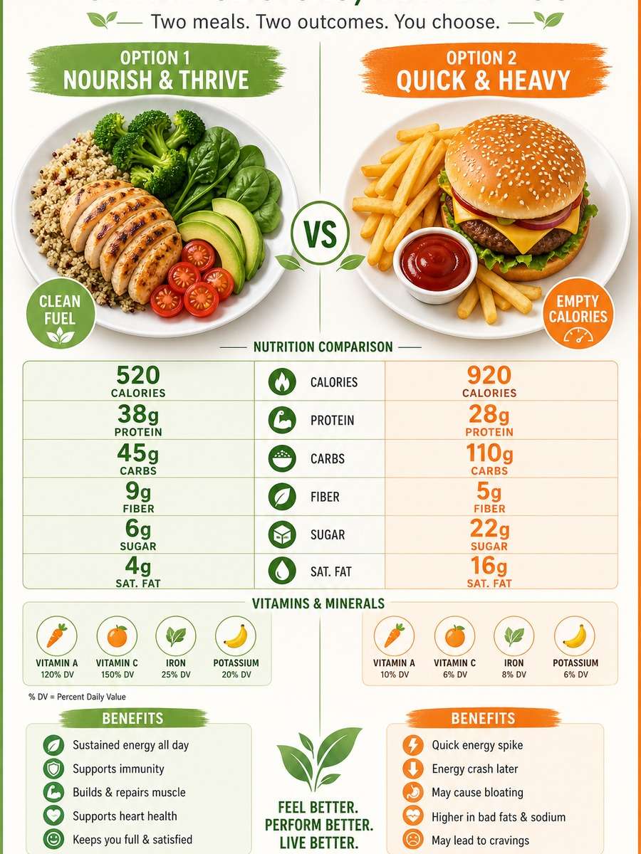
Healthy Food Comparison Chart
A healthy food comparison infographic comparing two meal options side by side, centered plates, nutrition labels, calories, protein, carbs, vitamins, and benefits sections, fresh green and orange palette, clean wellness poster aesthetic, easy-to-read data blocks --ar 3:4
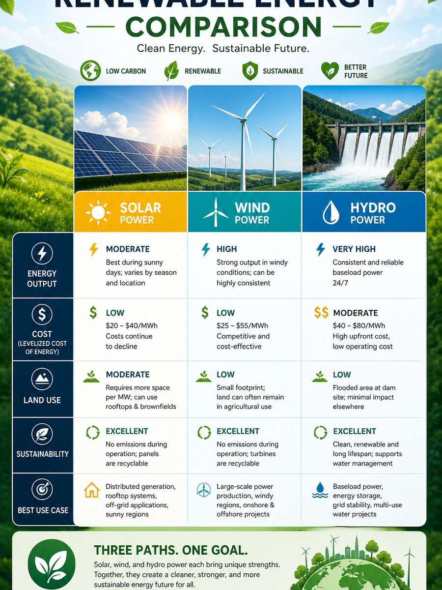
Renewable Energy Comparison Infographic
A renewable energy comparison infographic featuring solar, wind, and hydro power in centered columns, energy output, cost, land use, and sustainability metrics, eco-friendly iconography, crisp modern layout, bright clean environmental infographic design --ar 3:4
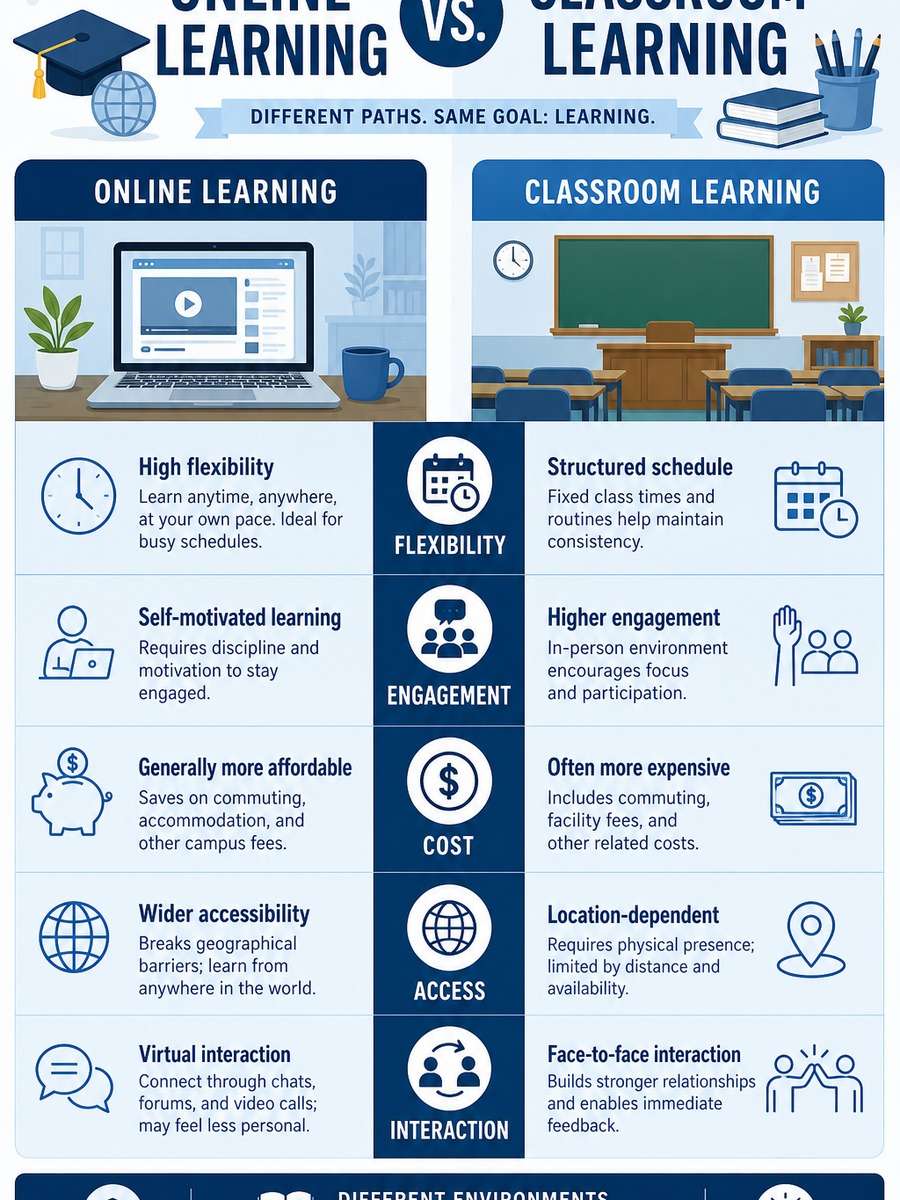
Education Methods Comparison Poster
An education comparison infographic contrasting online learning and classroom learning, centered split-screen design, categories for flexibility, engagement, cost, access, and interaction, academic icon set, calm blue palette, organized infographic poster with strong readability --ar 3:4
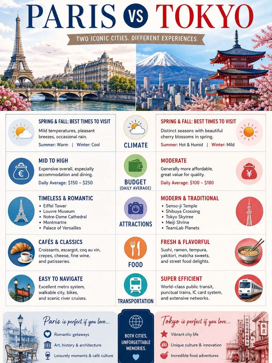
Travel Destination Comparison Infographic
A travel destination comparison infographic showing two cities side by side in a centered layout, climate, budget, attractions, food, and transportation categories, illustrated landmarks, colorful yet refined design, magazine-style travel infographic poster --ar 3:4
Fitness Program Comparison Design
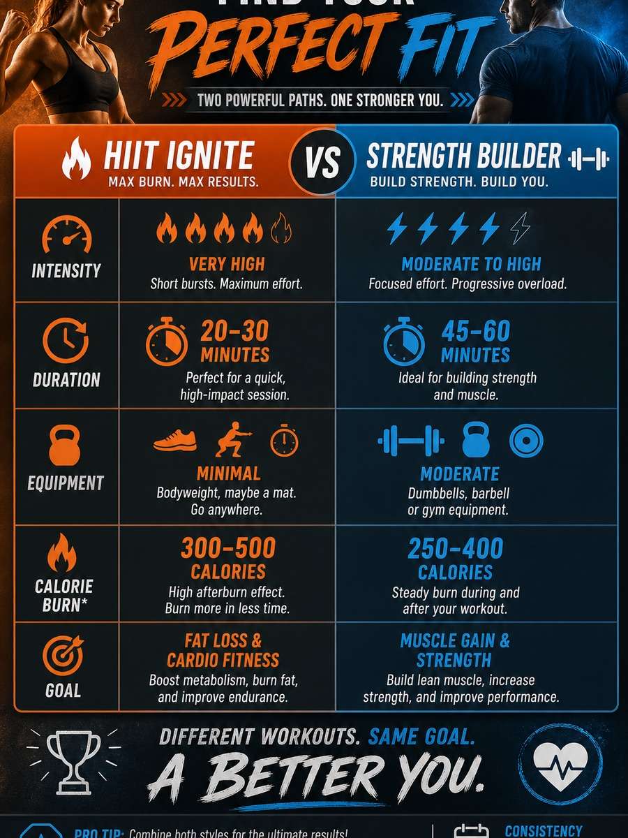
A fitness program comparison infographic with two centered workout plans, intensity, duration, equipment, calorie burn, and goal sections, energetic color accents, clean icons, sporty but organized visual style, professional health infographic composition --ar 3:4
Budget vs Premium Service Comparison
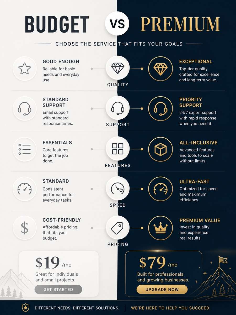
A budget versus premium service comparison infographic with centered vertical split layout, quality, support, features, speed, and pricing callouts, elegant contrast between simple and premium styling, clean labels, polished brand-ready infographic poster --ar 3:4
Traditional vs AI Workflow Infographic
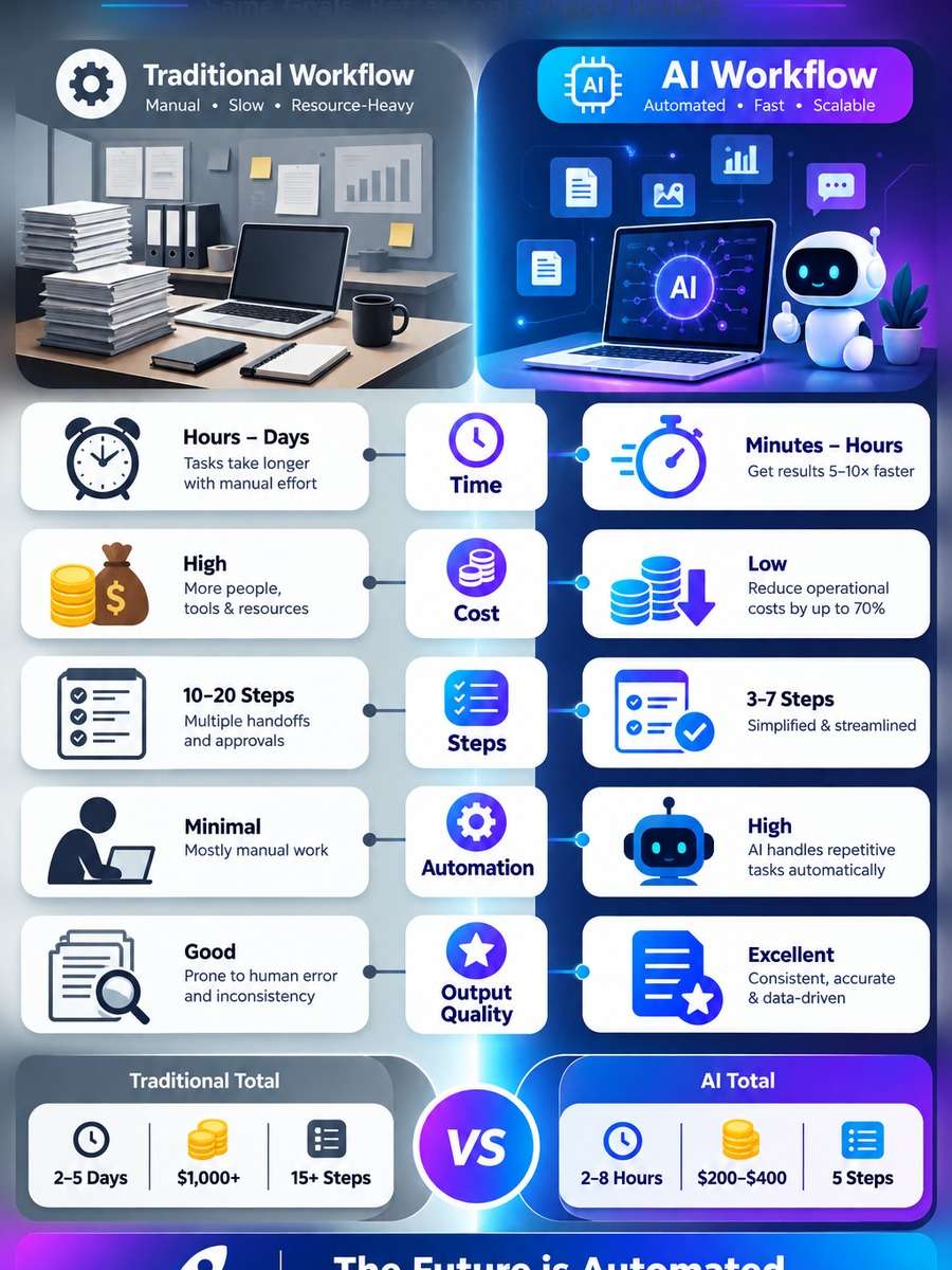
A traditional workflow versus AI workflow comparison infographic, centered dual-path layout, time, cost, steps, automation, and output quality categories, smart tech icons, modern gradient accents, editorial business infographic style, highly structured and readable --ar 3:4
Website Builder Comparison Chart
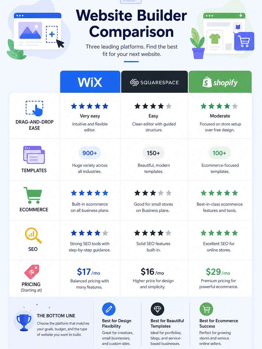
A website builder comparison infographic comparing three platforms, centered column layout, drag-and-drop ease, templates, ecommerce, SEO, and pricing sections, web design icons, fresh startup palette, clean card-based infographic structure --ar 3:4
Data Visualization Style Comparison
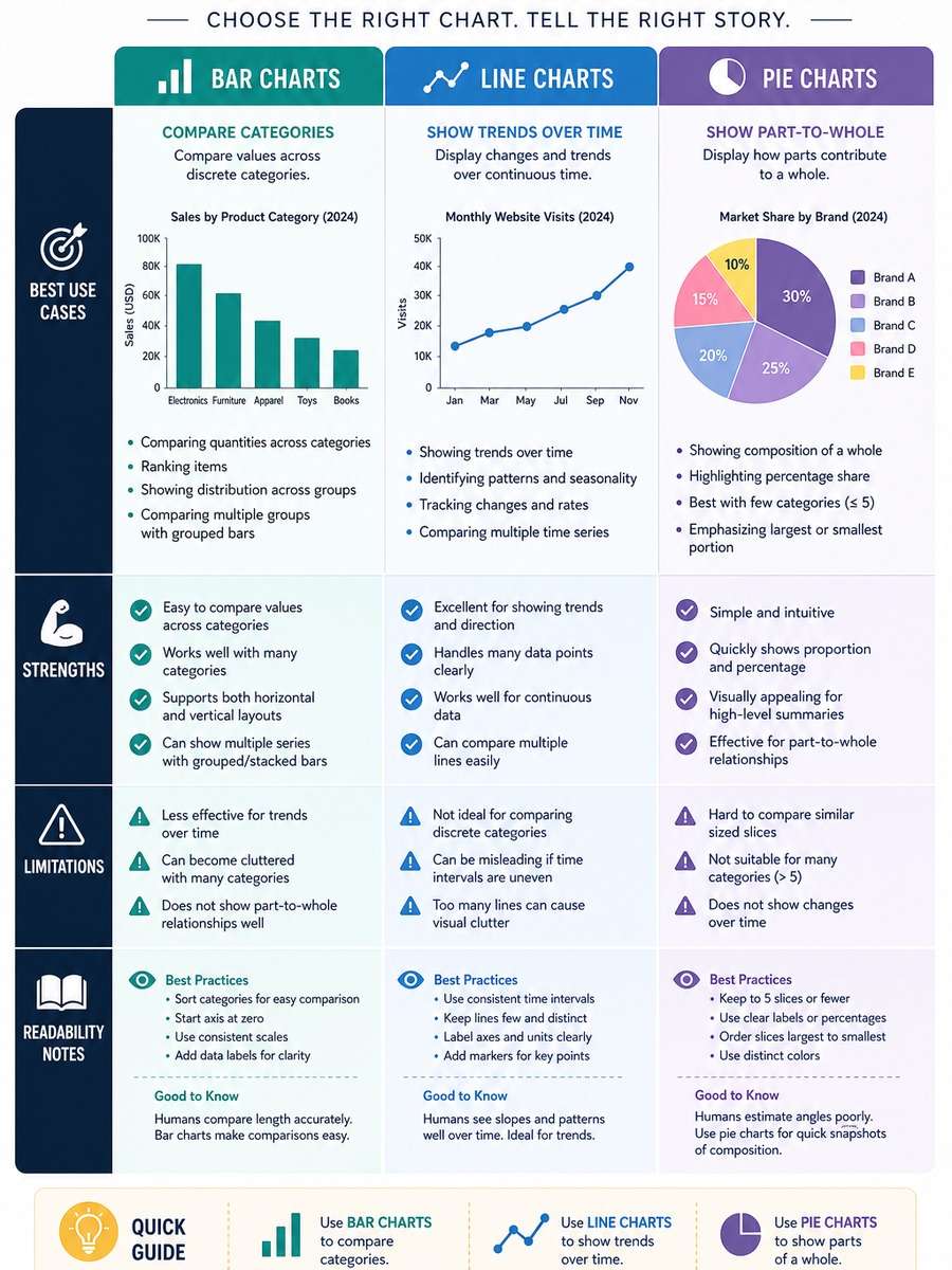
A data visualization comparison infographic showing bar charts, line charts, and pie charts in a centered educational layout, best use cases, strengths, limitations, and readability notes, academic yet modern design, crisp labels, visual teaching poster --ar 3:4
Skincare Product Comparison Poster
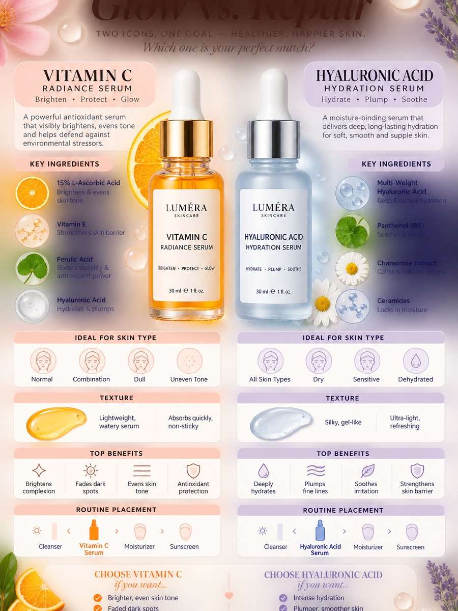
A skincare product comparison infographic with two centered bottles and ingredient comparison blocks, skin type, texture, benefits, and routine placement categories, soft beauty palette, premium editorial styling, clean feminine infographic layout --ar 3:4
Project Management Tool Comparison
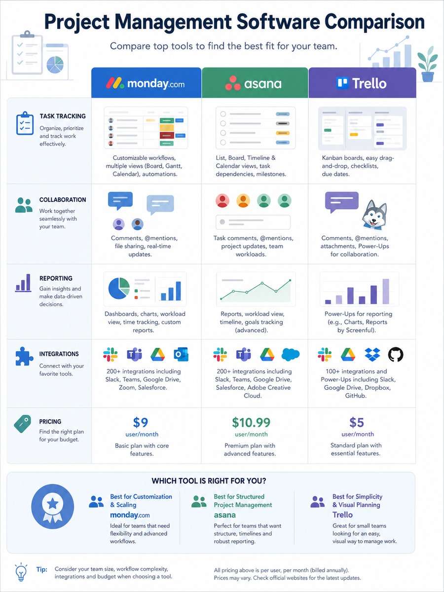
A project management software comparison infographic with three centered tool columns, task tracking, collaboration, reporting, integrations, and pricing sections, business iconography, calm modern palette, clean enterprise infographic design with clear hierarchy --ar 3:4
Credit Card Comparison Infographic
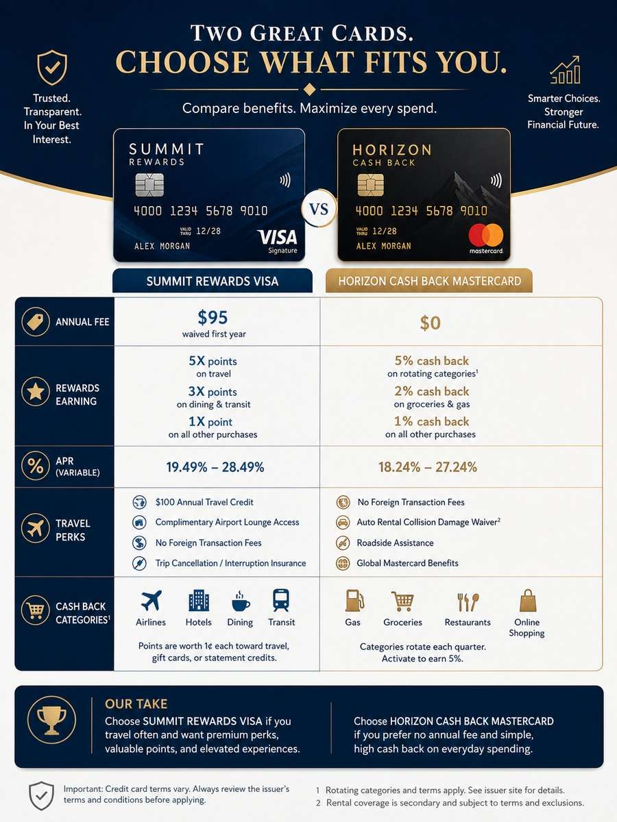
A credit card comparison infographic poster with two centered cards, annual fee, rewards, APR, travel perks, and cashback categories, sleek finance design, navy and gold accents, precise icon labels, trustworthy editorial infographic style --ar 3:4
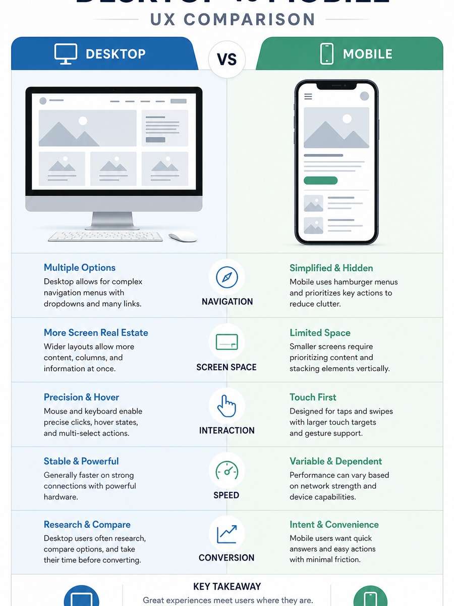
Desktop vs Mobile UX Comparison
A desktop versus mobile user experience comparison infographic with centered split layout, navigation, screen space, interaction, speed, and conversion sections, UI wireframe illustrations, modern product design aesthetic, clear structured infographic presentation --ar 3:4
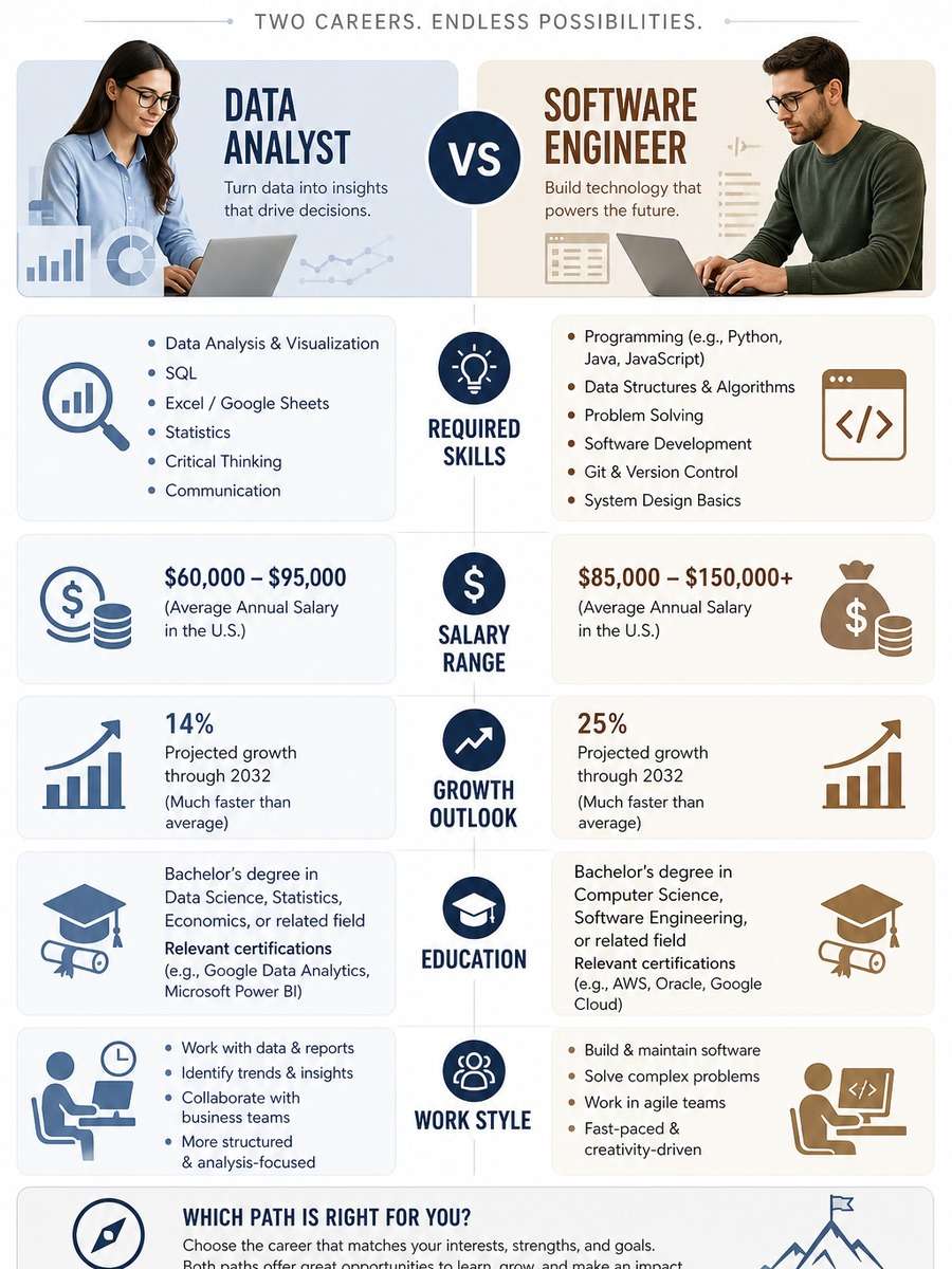
Career Path Comparison Chart
A career path comparison infographic showing two professions side by side in a centered layout, required skills, salary range, growth outlook, education, and work style sections, professional icons, modern neutral palette, polished career guidance poster --ar 3:4
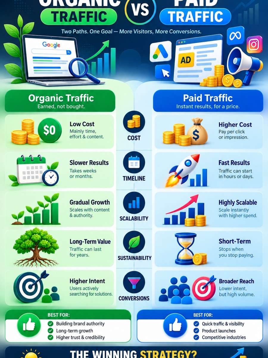
Organic vs Paid Traffic Infographic
An organic versus paid traffic comparison infographic with centered two-column structure, cost, timeline, scalability, sustainability, and conversion sections, digital marketing iconography, bold but clean palette, modern analytical infographic design --ar 3:4
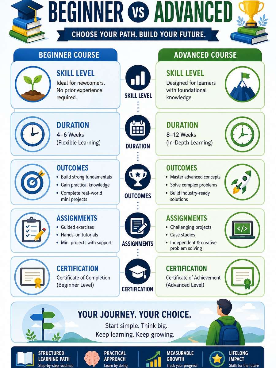
Beginner vs Advanced Course Comparison
A beginner versus advanced course comparison infographic poster with two centered paths, skill level, duration, outcomes, assignments, and certification sections, academic icons, structured learning roadmap style, clean colorful infographic composition --ar 3:4
How to Write Better Comparison Infographic Prompts
The best comparison infographic prompts tell the model what is being compared, how the layout should be organized, and what visual cues make the differences easy to understand.
Simple prompt formula
Start with the infographic type: side-by-side, split-screen, matrix, before-and-after, or pros and cons.
Name the subjects being compared clearly.
Add comparison categories such as price, features, speed, quality, or benefits.
Specify layout, color coding, icons, and typography style.
Finish with a clean design direction and the required aspect ratio.
Prompt tips for clearer infographic results
Use words like centered layout, balanced columns, clear headers, and readable labels to improve structure.
Ask for simple iconography and visual hierarchy so the infographic feels organized instead of crowded.
Limit the number of comparison points if you want a cleaner and more premium-looking result.
Mention your preferred style, such as minimal, editorial, corporate, educational, or colorful social media design.
If the first result feels busy, regenerate with more whitespace, fewer elements, and stronger section separation.
Why Choose Media.io for Comparison Infographic Prompts
Why use Media.io for comparison infographic prompt generation
Fast infographic concept generation
Turn a single prompt into polished comparison visuals in seconds, ideal for marketing drafts, presentations, blog graphics, and social content.
Flexible design styles
Generate comparison infographics in clean corporate, educational, startup, editorial, or bold promotional styles without building layouts manually.
Better prompt experimentation
Test different structures like side-by-side charts, before-and-after posters, and feature matrices to find the clearest visual format for your topic.
Easy for teams and creators
Create high-impact comparison graphics quickly for campaigns, product pages, client pitches, classroom materials, and content workflows.
FAQs About
Comparison Infographic Prompts
1. What are comparison infographic prompts?
Comparison infographic prompts are text instructions used to generate visuals that compare two or more subjects. They help define layout, categories, style, icons, and design hierarchy so the result is easier to read.
2. How do I write a strong comparison infographic prompt?
Be specific about the subjects, the comparison categories, and the layout style. Adding terms like centered columns, clear section headers, icon labels, and clean whitespace usually improves the final output.
3. Can I use these prompts for business and marketing content?
Yes. These prompts work well for product comparisons, pricing visuals, service breakdowns, workflow differences, educational explainers, and campaign assets.
4. Why should every prompt include a layout direction?
Infographics rely on structure. A prompt with layout instructions gives the model a stronger framework, which helps produce balanced compositions with better readability and clearer visual comparisons.
5. Can I customize these prompts for my brand?
Absolutely. You can change subjects, categories, colors, icon styles, and overall design tone to match your audience, brand identity, or publishing platform.
Why Creators Love Media.io's Comparison Infographic Prompts?
Alex M.
Photographer
Natural Travel Realism. The prompts helped me create polished images with believable lighting, complete framing, and enough local detail to feel intentional.
Maya J.
Designer
Easy to Adapt. I could change the city, outfit, or light direction without losing the structure of the prompt.
Jordan P.
Creator
Great for Social Posts. The 3:4 framing made the images easy to use in feed posts and campaign cards.